Posted on Leave a comment

Martin Visser ( 1922-2009 )

Famous for his dutch designs. Especially his Martin Visser couch is a design classic, but Visser was so much more than a designer. Martin Visser build one of the most important private art collections in the world. Specializing in die Neue Wilden and Minimal art, his collection was after his death on the wish list of all the major and  important museums in the Netherlands. He was one of the first to collect Cobra, He recognized the importance of Keith Haring and was one of the first to collect Kiefer at a large scale. Visser’s life was art and the House Visser was designed by Gerrit Rietveld and the adjustments to the house done by Aldo van Eyck.

What is more to say about him.., He worked together with the greats in dutch design like Kho Liang Ie and Wim Crouwel. He knew all the great german painters from the eighties and conceptual art and land art had no mysteries to him. Visser was a force in the dutch art world and the Kroller Muller MUseum can show why he was such an important collector because they received the gift of 400 works from the Martin Visser collection. www.ftn-books.com has some nice publications on the Martin Visser collection.

OLYMPUS DIGITAL CAMERA

Posted on Leave a comment

Wim Crouwel..design of the Atelier series for the Stedelijk Museum.

Schermafbeelding 2018-02-17 om 11.33.47

The focus of this blog is on the covers of a very impressive series Wim Crouwel designed for the Stedelijk Museum during a period of roughly 14 years in the Sixties and Seventies ( between 1965 and 1979). This series has the typical Crouwel layout and typography and beside these elements these designs are ” clean” without any frills ….just function. These were done when the Total Design agency had their “GOLDEN YEARS” and Wim Crouwel was one of the most important members of Total Design ( founded in 1963). This is a great series of 16 publications . Some with loose pages in portfolio, others in the shape of posters or just ordinary booklets, but all have the quality design Wim Crouwel stands for. Most of these publications are available at www.ftn-books.com and if your are looking for other Crouwel publications search for them at the same site.


Posted on Leave a comment

Jean Gorin (1899-1981) and Wim Crouwel

Schermafbeelding 2017-12-19 om 11.29.02

Jean Gorin , a typical 50’s /60’s artist has stayed a little obscure outside France, but this is undeserved. His art is influenced by Piet Mondrian and Constructivism , but has developed into an art typical of Jean Gorin.

Schermafbeelding 2017-12-19 om 11.40.27

This was recognized by Willem Sandberg who gave Gorin a solo presentation in the Stedelijk Museum Amsterdam in 1967. Here it is getting more interesting from my point of view, because together with this exhibition one of the very very best Wim Crouwel designed catalogues ever was published. The catalogue typically Crouwel sized was partly printed in black and the other part of the text on the cover executed in embossed printing. Together with the design of the catalogue itself it has become an exquisite artist book on Jean Gorin which is still available at www.ftn-books.com


Posted on Leave a comment

Friso Kramer and the Result chair

Schermafbeelding 2018-03-12 om 15.39.47

A year ago i devoted a blog to Friso Kramer and his designs. Todays blog is on just one obeject by Friso Kramer….the RESULT chair. a design icon and one of the great dutch designs from last century. This chair was made for a very long time by Ahrend and designed while he was working for this company in the 50’s. Production was ended some 10 years ago, but now a danish company together with Ahrend has given a new life to this design with a reedition of this magnificent and versatile chair. This made me once again realize the importance of Ahrend and specially the work that Friso Kramer has done for them. the Result chair and the Pyramid table by Wim Rietveld are both classics, but there is no doubt that they will fit in any contemporary interior, because both these designs are time less. www.ftn-books.com has added a nice title on both these designs.


Posted on Leave a comment

Benno Wissing (1923-2008)

Schermafbeelding 2018-01-11 om 14.42.10

In the dutch museum and art scene there are some classical partnerships regarding the design of museumpublications. There are Willem Sandberg and Wim Crouwel who bot worked in different decades for the Stedelijk Museum. There is again Wim Crouwel and Walter Nikkels who worked for the van Abbemuseum. There are Donald Janssen and Gracia Lebbink who had their designs published by the Gemeentemuseum Den Haag and there is Benno Wissing ( one of the founders of Total Designs) who worked almost exclusively for the Boymans Van Beuningen Museum Rotterdam during 3 decades.

Bernard (Benno) Wissing was a Dutch designer, painter, graphic artist and architect. He trained as a painter at the Art Academy in Rotterdam.

Schermafbeelding 2018-01-11 om 14.51.56

He began his career in 1949 as a designer for the Museum Boijmans in Rotterdam under VP Ebbinge Wubbe. He designed catalogs and posters and established exhibitions. He was one of the founders of Total Design which he worked from 1964 to 1972.

Benno Wissing is for me one of the greatest names in dutch design, but still stands in the shadow of Crouwel and Sandberg. Undeservedly, because his designs are true ” classics”. Just search for Wissing at www.ftn-books.com and find some excellent examples of his truly great designs.

Posted on Leave a comment

Dick Elffers (1910-1990)

Schermafbeelding 2018-01-03 om 17.10.05

Dick Elffers is one of the great dutch designers from last century. If you compare his works , they best can be compared with the designs by Willem Sandberg. Colorful designs and sometimes they look torn figures like the ones Sandberg uses. If ever there is a combination which is known outside the Netherlands it is the designs he made for the HOLLAND FESTIVAL.

These posters are highly recognizable as Elffers designs and are among the best that are published in the Netherlands in the last century. Perhaps not as well know as Sandberg and Crouwel, but certainly very important as a designer and quintessential for the ducth design mouvement that followed the 50’s from last century.

Of course www.ftn-books.com has some great Dick Elffers titles in its inventory

Posted on 1 Comment

Mathias Fels (1922-2009)… galeriste extraordinaire

Schermafbeelding 2017-10-13 om 17.14.30

One of the great gallery owners of our town was Mathias Fels. Her started the gallery in 1955 and the gallery has since become one of the leading galleries in the world. With the death of Mathias Fels the gallery stopped, but until that date they organized some very important exhibitions and with these exhibitions catalogues were published using special designs, papers and in many cases special covers . The covers in some cases being original lithographs. As one of the leading art scene figures, Fels has become an icon for many gallery owners and together with gallery Denise Rene in Paris he always had a keen eye to present new modern artists in his gallery.

www.ftn-books.com has some beautiful and important Fels publications available.

corneille fels a

You can find an excellent interview( in french)  with Fels at:

http://www.visuelimage.com/ch/fels/

Posted on Leave a comment

Paul Renner (1878-1956) and ….the FUTURA typeface

Schermafbeelding 2017-11-05 om 14.15.24

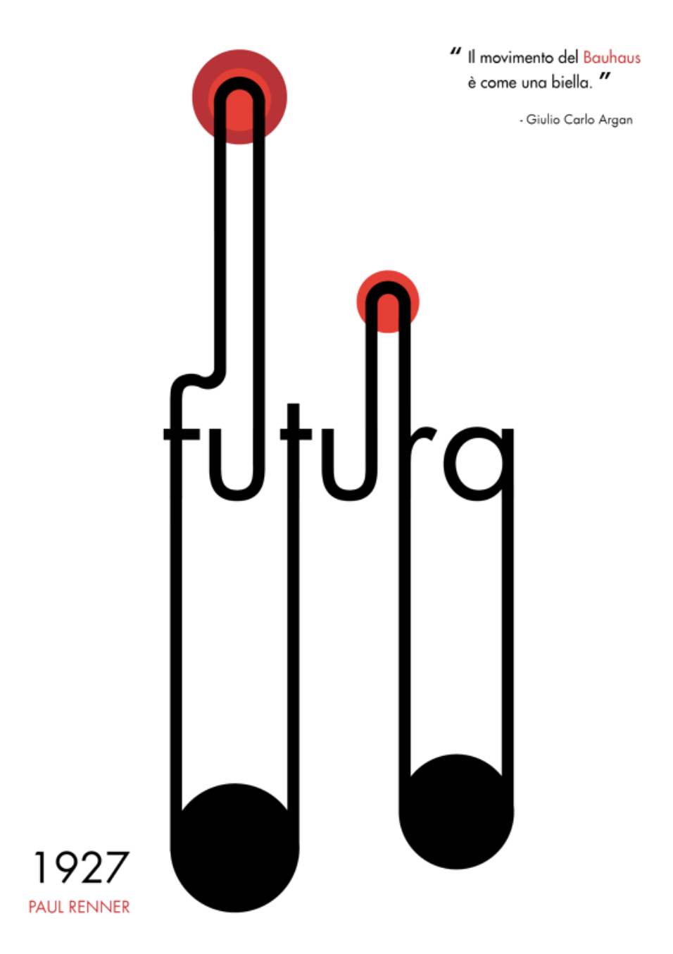
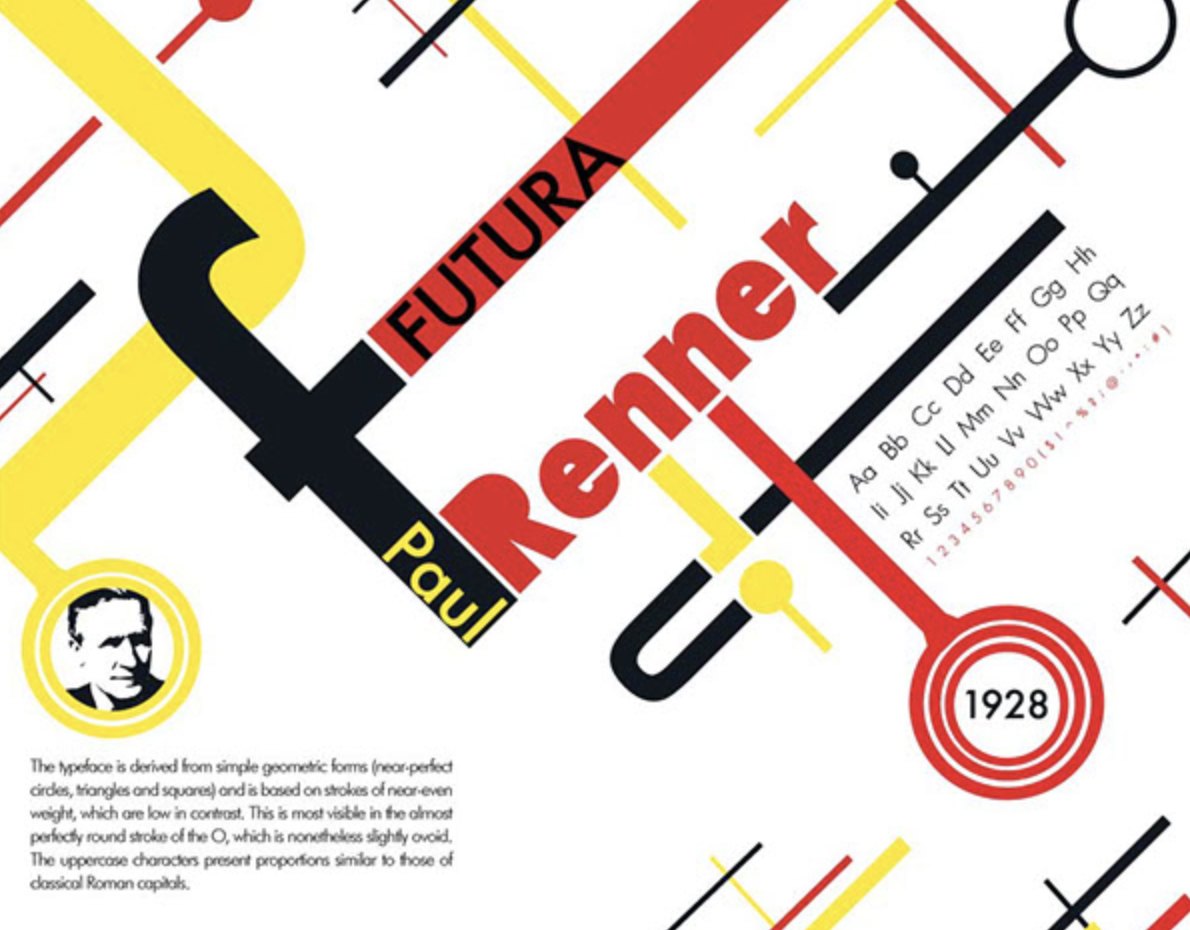
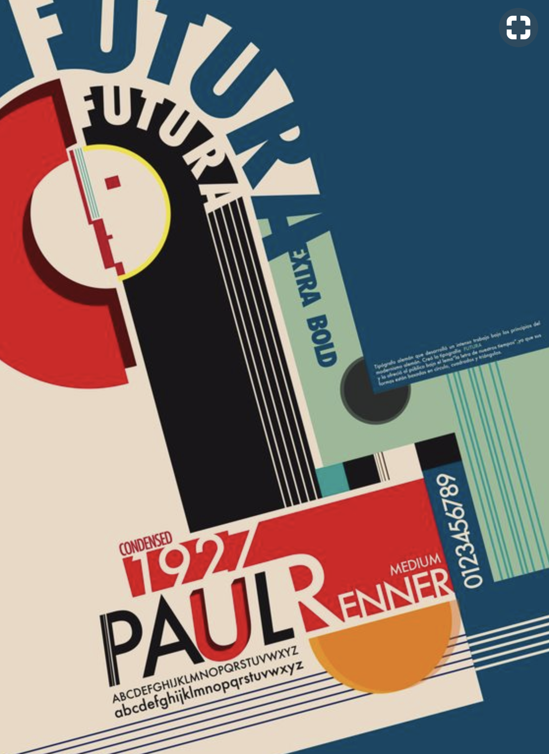
If ever a typeface by Paul Renner is known to the large public it must be the Futura. A typical Art Deco type typeface which is nowadays a classic and easily can substitute the very popular Helvetica and is present aas a standard font on practically every computer. The Futura dates from 1927 when it was first launched by Paul Renner.

Schermafbeelding 2017-11-05 om 14.19.17

On August 9, 1878, Paul Friedrich August Renner was born in Wernigerode which then was located in the Prussian state. His father was an evangelical theologian who is reason behind his strict Protestant upbringing. He grew up to develop a German sense of leadership, responsibility and duty. Renner received his formal education from a secondary school, Gymnasium. After nine years of learning Greek and Latin, Renner opted to study arts at several different academies. In 1926, he accepted the position of the head at the Printing Trade School in Münich. Later he established and became director of the Master School for Germany’s Printers. While studying, he grew suspicious of abstract art form and developed repulsion for some forms of modern culture including dancing, cinema and jazz.

However, Renner was equally fascinated by the functionalist strain in modernism. Therefore, it would not seem wrong to perceive Renner’s work as a bridge between nineteenth and twentieth century tradition. One example can be his successful attempt at merging two fundamentally different typefaces together such as Roman typeface and Gothic. Moreover, he was a significant member of German Work Federation. He lent his expertise in developing a new set of guidelines for good book design. He was closely associated with another noted typographer Jan Tschichold. They both became part of the ongoing heated ideological and artistic debates. Renner took a stand against Nazi movement and made his position very clear and public through his scandalous booklet, titled Kulturbolschewismus(Cultural Bolshevism). It was published in 1932 and overtly condemned Nazi’s cultural policy.

In 1933, when Nazi rose to power they dismissed Renner from his post at the school and labeled him an intellectual subversive, a ‘Cultural Bolshevist’. He went into a period of internal exile after his arrest. Renner aspired to communicate his opinion of culture and tried to influence it through his writing, teaching and designing. He utilized his intellect and aesthetic skills to alter the fundamental landscape of material and spiritual form of life. As to communicate his view of high cultural standards, he invested his creative talent in applied arts designing books and typefaces. Furthermore, being a voracious reader, Renner’s ideals were influenced by prominent scholarly figures, such as Nietzsche, Goethe, Kant and Schiller. He began writing from 1908 onwards and prolifically produced work on design and typography.

Renner’s notable works include Die Kunst der Typographie (The Art of Typography) and Typografie als Kunst (Typography as Art). In these works he set the guideline for sophisticated book designs. Additionally, he played a significant role in inventing the popular Futura. The modern typographers even in the present time used this geometric sans-serif font frequently. Another one of his creations, Architype Renner is evolved from his early experimental exploration of geometric letterforms. His Steile Futura typeface was later transformed into Tasse which came out posthumously. Paul Renner’s valuable contribution to graphic design and typography includes works, such as Das moderne Buch, Vom Geheimnis der Darstellung, Ordnung und Harmonie der Farben and typefaces Renner Antiqua and Ballade.

www.ftn-books.com has a great book on Renner available

renner

Posted on Leave a comment

Thomas Schütte (1954)… Two reasons to love.

Schermafbeelding 2017-10-26 om 11.57.41

For me there are two personal reasons to love the works by Thomas Schütte. The first reason for me is his architectural art. Always trying to find a different approach to architecture makes his works interesting and in the same category as the architectural works by John Hejduk.

Secondly there is his publications. Meticulously designed books. Published by the best publishers, printed by the best printers and from start to finish typical Thomas Schütte productions. These books are among the best art books published in the last 50 years and i am proud to have some of them in my inventory of www.ftn-books.com