
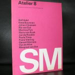
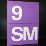
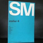
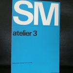
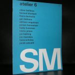
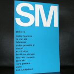
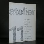
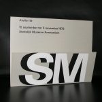
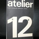
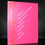
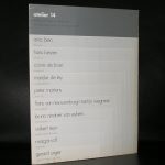
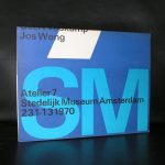
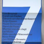
The focus of this blog is on the covers of a very impressive series Wim Crouwel designed for the Stedelijk Museum during a period of roughly 14 years in the Sixties and Seventies ( between 1965 and 1979). This series has the typical Crouwel layout and typography and beside these elements these designs are ” clean” without any frills ….just function. These were done when the Total Design agency had their “GOLDEN YEARS” and Wim Crouwel was one of the most important members of Total Design ( founded in 1963). This is a great series of 16 publications . Some with loose pages in portfolio, others in the shape of posters or just ordinary booklets, but all have the quality design Wim Crouwel stands for. Most of these publications are available at www.ftn-books.com and if your are looking for other Crouwel publications search for them at the same site.


References:
Suquamish casino
References:
https://pads.zapf.in/s/BxcJIzwwCh
References:
Buy anabolic steroids online with credit card
References:
http://219.157.255.213:25311/zenaidamurakam
References:
Online black jack
References:
https://diego-maradona-ar.org/user/dangerrotate0/
References:
What is a possible side effect as a result of the presence of anabolic steroids in male users?
References:
https://git.sskuaixiu.com/claritadelossa
Hey there! I’m at work surfing around your blog from my new apple iphone!
Just wanted to say I love reading through your blog and look
forward to all your posts! Carry on the great work!
References:
https://squareblogs.net/priestjar3/200-bonus-10-min-auszahlung
where can i buy anabolic steroids
References:
moparwiki.win
References:
Fairway casino
References:
https://atomcraft.ru/user/systemburn52/
References:
Lady luck casino vicksburg ms
References:
https://www.tikosatis.com/index.php?page=user&action=pub_profile&id=651037
References:
Cash casino
References:
https://mediakota.id/heboh-koraborasi-peran-karakter-angelina-dsm-reza-moore-dan-nauva/
References:
Play blackjack online
References:
https://graph.org/Lucky-Green-Casino-Best-Slots–Bonuses-04-20
References:
Safe trusted online casinos australia casinos
References:
Blackjack strategy trainer
References:
https://casino-royale-peter-sellers.online-spielhallen.de/
References:
Prime casino
References:
https://sheraton-cairo-hotel-and-casino.online-spielhallen.de/
References:
Erlangen
References:
https://malina-casino.online-spielhallen.de/
References:
Bremerhaven
References:
https://ricardos-casino.online-spielhallen.de/
References:
Mannheim
References:
https://dress-code-monte-carlo-casino.online-spielhallen.de/
References:
Remscheid
References:
https://hard-rock-hotel-and-casino-hollywood-florida.online-spielhallen.de/
References:
No deposit bonus forex
References:
https://graph.org/Can-Anyone-Go-Into-Crown-Casino-Sydney-04-27
References:
American roulette wheel
References:
https://graph.org/Aristocrat-Poker-Machine-For-Sale-Australia-04-27
References:
Udbetalingsrater
References:
https://gitea.waterworld.com.hk/rudy31e3745213
Really enjoyed this post—Crouwel’s Atelier series for the Stedelijk comes through as more than just “graphic design,” especially when you unpack how the modular, typographic system was meant to shape the way people actually navigate and interpret exhibitions. I’ve always found Crouwel at his best when you can feel the grid doing double duty: it’s both a visual language and an organizational tool. It also made me think about how rare it is to see a museum identity built with such a clear logic for future reuse—almost like the system was designed to scale with the collections. ConceptViz
The functionalist minimalism of Crouwel’s Atelier series really stands out—stripping away all frills to focus purely on typography and layout. It’s fascinating how those clean, no-nonsense designs from the Total Design golden years still feel so relevant today.
PIX or USDT for fast withdrawals? the streamer scene keeps flipping on this.
The Atelier series really showcases Crouwel’s commitment to “clean” typography and function over form, especially during Total Design’s golden years. It’s fascinating how he managed to keep the covers so distinct yet unified across 14 years.
Crouwel’s relentless commitment to function over frills in the Atelier series really set a new standard for graphic design. It’s fascinating how those clean, typographic solutions from the Total Design golden years still feel so relevant today.
**Design Impact** Wim Crouwel’s work on the Atelier series is a masterclass in functionalist design. His adherence to clean typography and structure during Total Design’s golden years sets a high standard for modernist aesthetics.
The way Crouwel reduced the Atelier series to pure function—stripping away all decorative frills while maintaining such strong typographic clarity—feels remarkably prescient for today’s design landscape. It’s fascinating to think those 1960s and 70s constraints became the blueprint for modernist design principles we still see echoed in digital interfaces.
The Atelier series’ uncompromising, function-first typographic approach really showcases Crouwel’s signature design philosophy at Total Design. It’s fascinating to see how those 1965–1979 covers maintained such clean layouts without frills across 14 years of work.
**The Timelessness of Crouwel’s “Clean” Functionality** It’s fascinating how Wim Crouwel’s strict adherence to function over frills in the Atelier series (1965–1979) anticipates modern design principles. The Total Design agency’s “golden years” produced work that remains visually striking precisely because it rejected decoration in favor of pure typography. This series is a masterclass in how constraints can drive creativity.
Crouwel’s relentless pursuit of functional clarity across 14 years of the Atelier series is a masterclass in design purity. The absence of frills in those covers really highlights how Total Design’s golden years were defined by putting structure before decoration.
The Atelier series is a masterclass in functional design — Crouwel’s restraint across 14 years, stripping away frills while maintaining typographic clarity, feels especially relevant today given how much we overcomplicate visual communication.
The Atelier series’ rigorous, function-first typography perfectly captures Total Design’s golden era—Crouwel’s restraint was decades ahead of its time.
The Atelier series really showcases Crouwel’s commitment to functional design — the restrained typography and lack of decorative elements must have been striking for the Stedelijk’s audience in the 1960s. It’s fascinating to think these covers were created during Total Design’s golden years, a period that clearly helped cement Crouwel’s reputation as a master of clean, purposeful layout.
References:
Bodog casino play.kkk24.kr
References:
Casino prague
References:
https://enelcypher.com/best-online-casino-bonus-australia-top-casino-promos-2026/
I’ve been surfing online more than 3 hours today, yet I never found any interesting article like yours. It’s pretty worth enough for me. In my view, if all web owners and bloggers made good content as you did, the net will be much more useful than ever before.
Great post, keep up the good work, I hope you don’t mind but I’ve added on my blog roll.