Posted on Leave a comment

Sigurdur Gudmundsson (1942)

Schermafbeelding 2018-02-22 om 12.08.55

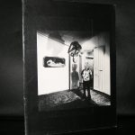
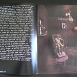
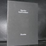
Gudmundsson has a loyal following in the Netherland. That must be because he has been present in multiple group exhibitions and solo exhibitions in both museums and art galleries. The Stedelijk Museum presented this artist on several occasions and the catalogues’/ artist books published with these are in high demand. The “Circles” book for instance has been sdold out with me for over 5 years and i have not found another copy at a reasonable price. The same with ” Situations” sold out and nowhere to be found anymore.

Gudmundssons works fascinate. These are symbiosis of IN SITU and performance. Making this a true conceptual artis whose works have been spread all over the world.

Gudmundsson studied in the Netherlands at ao Ateliers 63 and after that study settled in the Netherlands and launched his career in the 1960s as a member of the legendary Icelandic SÚM group. His public sculptures can now be found widely, including in Rotterdam, Groningen and Den Haag in the Netherlands. He later became a teacher at the AKI in Enschede. He is now living in China, the artist prides himself of having been a foreigner for the past 50 years and i am curious to learn how this does influence his works. www.ftn-books.com has still some nice Gudmundsson titles available.

Posted on Leave a comment

Julian Schnabel (1951) …the photographer

Schermafbeelding 2018-02-20 om 11.39.27

I knew the works by Julian Schnabel from the exhibition he had at the Stedelijk Museum Amsterdam in 1982 ( catalogue available at www.ftn-books.com). An impressive exhibition of large Schnabel painting, but what i did not not know until some 15 years ago is that Schnabel is also a very gifted photographer. His portraits have a rare quality and make you feel really close to the subject. For instance the Rourke portrait is filled with action and the Lou Reed one makes you feel happy … Reed as a liberated spirit is a rarity.

Books on his photography are rare, i know there exists one title on his Polaroid photo’s, but that is the only title i know of. If you know of more titles let me know, since i am very interested on a personal level to add a book on his photography to my personal collection.

Posted on Leave a comment

Wim Crouwel..design of the Atelier series for the Stedelijk Museum.

Schermafbeelding 2018-02-17 om 11.33.47

The focus of this blog is on the covers of a very impressive series Wim Crouwel designed for the Stedelijk Museum during a period of roughly 14 years in the Sixties and Seventies ( between 1965 and 1979). This series has the typical Crouwel layout and typography and beside these elements these designs are ” clean” without any frills ….just function. These were done when the Total Design agency had their “GOLDEN YEARS” and Wim Crouwel was one of the most important members of Total Design ( founded in 1963). This is a great series of 16 publications . Some with loose pages in portfolio, others in the shape of posters or just ordinary booklets, but all have the quality design Wim Crouwel stands for. Most of these publications are available at www.ftn-books.com and if your are looking for other Crouwel publications search for them at the same site.


Posted on Leave a comment

Mark Prent (1947)

Schermafbeelding 2018-02-13 om 09.36.46

Yesterday, Polish born artist Mark Prent contacted me about the Stedelijk Museum catalogue i have for sale on his exhibition in 1978. A never had studied the catalogue in detail before. But is a “dark’ catalogue which reflects the work of Prent in an excellent way. His works are “dark”

have a look at www.markprent.com and see for yourself what i mean

Mark Prent works consist of life-moulded mixed media, polyester resin and fiberglass casts of human models in sometimes disturbing poses and juxpositions. Mark Prent has consistently maintained throughout the years, that his sculptures and installations do not carry intentional messages. Despite the powerfully grotesque imagery that he has employed, interpretation is left to the viewer. Prent developed his own unique technique of layering to give a heightened realism to his figures; thus giving rise to the label “Extended Realism”. When he later became concerned about the toxicity of polyester resin, he began to experiment with other materials, developing innovative techniques for recreating that trademark quality of virulent realism. This venture into new materials led him in many new directions in his own work and ultimately, to become a technical resource for other artists as well.

Having followed his education in the US and exhibitions in Amsterdam , Berlin and Montreal his works are known all over the world, but because of their “Dark” nature never have become popular.

In 2005 Prent began a new series of video-taped performance pieces in collaboration with videographer/son Jesse Real Prent. In this series, Prent’s own body becomes a living, interacting component of his nightmarish scenarios. He continues to produce new sculptures in his Vermont studio. www.ftn-books.com  has the Stedelijk Museum Mark Prent catalogue available.

Posted on Leave a comment

Tomitaro Nachi (1924-2007)

nachi cata f

Tomitaro Nachi was one of the first japanese artist ever to have an exhibition in the Stedelijk Museum. Wim Crouwel designed the catalogue for his exhibition and what makes it extra special is that the catalogue included a rare and beautiful multiple. There is wonderful short movie about this artist which was made at the time of his exhibition at the Stedelijk Museum in 1974.

The catalogue shines. It is like a minimal artist book and reflects the spirit of “Zero” and Kinetic art and was forgotten by most until recently it was sold at a local book auction and fetched a steep price of euro 120,– because it had the original multiple included. www.ftn-books.com has both copies available. The one with and the one without the multiple. Both are worth collecting, but as lng as it is there i would chose the one with the multiple included.

Posted on Leave a comment

William Klein (1928) a master of abstract photography

Schermafbeelding 2018-02-07 om 13.49.11

I found an excellent biography on Artnet on William Klein, but for me the importance of Klein is the fact that William Klein made a stunning catalogue together with Wim Crouwel for his 1967 exhibition in the Stedelijk Museum Amsterdam. The catalogue has some very bold typography and the use of the bright yellow in contrast with the black and white photograph in the back makes it for me a classic. Here is the Artnet bio.

OLYMPUS DIGITAL CAMERA

William Klein is an American artist known for his unconventional style of abstract photography depicting city scenes. Although similar in subject matter to other street photographers such as Diane Arbus and Saul Leiter, as well as fashion photographers Irving Penn and Richard Avedon, Klein’s images break from established modes. “I came from the outside, the rules of photography didn’t interest me. There were things you could do with a camera that you couldn’t do with any other medium—grain, contrast, blur, cock-eyed framing, eliminating or exaggerating grey tones and so on,” he reflected. “I thought it would be good to show what’s possible, to say that this is as valid of a way of using the camera as conventional approaches.” Born on April 19, 1928 in New York, NY, Klein studied painting and worked briefly as Fernand Léger’s assistant in Paris, but never received formal training in photography. His fashion work has been featured prominently in Vogue magazine, and has also been the subject of several iconic photo books, including Life is Good and Good for You In New York (1957) and Tokyo (1964). In the 1980s, he turned to film projects and has produced many memorable documentary and feature films, such as Muhammed Ali, The Greatest (1969). Klein currently lives and works in Paris, France. His works are held in the collections of The Museum of Modern Art in New York, the National Gallery of Art in Washington, D.C., and the Art Institute of Chicago, among others.

There are more titles on or with contributions by William Klein available at www.ftn-books.com

Posted on Leave a comment

Jean Gorin (1899-1981) and Wim Crouwel

Schermafbeelding 2017-12-19 om 11.29.02

Jean Gorin , a typical 50’s /60’s artist has stayed a little obscure outside France, but this is undeserved. His art is influenced by Piet Mondrian and Constructivism , but has developed into an art typical of Jean Gorin.

Schermafbeelding 2017-12-19 om 11.40.27

This was recognized by Willem Sandberg who gave Gorin a solo presentation in the Stedelijk Museum Amsterdam in 1967. Here it is getting more interesting from my point of view, because together with this exhibition one of the very very best Wim Crouwel designed catalogues ever was published. The catalogue typically Crouwel sized was partly printed in black and the other part of the text on the cover executed in embossed printing. Together with the design of the catalogue itself it has become an exquisite artist book on Jean Gorin which is still available at www.ftn-books.com


Posted on Leave a comment

Then I ducked my Head and the lights went out, and two guns blazed in the Dark……

Schermafbeelding 2018-02-04 om 09.45.35

This brilliant title is given by William N. Copley to a painting he made in 1966. Copley must be one of the wittiest artists.

copley title

He had no trouble at all in finding or coming up with original titles. ( a little like Piet Dirkx/ follow the Piet Dirkx daily at this blog). I love Copley and artists who can come up with original and fun titles for their works. Compare the above and for example” Mount Venus and the Hula-Hula Graces in the Glade” to titles like composition I and composition II. This does not mean that “composition” is a worse painting, but when there is a story in a title it says something about the artist himself. Looking for some more great titles for paintings? visit www.ftn-books.com for other Copley publications.

( and search within my blog to find another blog on Copley)

Posted on Leave a comment

Friso Kramer and the Result chair

Schermafbeelding 2018-03-12 om 15.39.47

A year ago i devoted a blog to Friso Kramer and his designs. Todays blog is on just one obeject by Friso Kramer….the RESULT chair. a design icon and one of the great dutch designs from last century. This chair was made for a very long time by Ahrend and designed while he was working for this company in the 50’s. Production was ended some 10 years ago, but now a danish company together with Ahrend has given a new life to this design with a reedition of this magnificent and versatile chair. This made me once again realize the importance of Ahrend and specially the work that Friso Kramer has done for them. the Result chair and the Pyramid table by Wim Rietveld are both classics, but there is no doubt that they will fit in any contemporary interior, because both these designs are time less. www.ftn-books.com has added a nice title on both these designs.


Posted on Leave a comment

Peter Blake (1932) … a British Pop-Art artist

Schermafbeelding 2018-01-28 om 10.13.16

Peter Blake is known by the dutch art lovers as one of the first Pop Art artist who had the opportunity to exhibit at the Stedelijk Museum, Together with this exhibition an excellent catalogue designed by Wim Crouwel was published , bu apart from that his work is becoming more and more important every year. The same with Paolozzi works , this Pop Art is original and authentic and where it was almost forgotten 30 years ago it is now considered among the best art from the 60’s.

Without knowing, many people have admired Peter Blake’s works and are familiar with it . This, because he was the painter and designer of the Beatles Sgt Pepper  album. He even made a second version for Liverpool being cultural capital of Europe in 2008.

In the original 1967 work, the Beatles form the centrepiece wearing colourful military-style outfits while their wax models also feature. However, in the 2012 piece, the faces of Ringo Starr and the late John Lennon and George Harrison have all been omitted.

And even Sir Paul McCartney has been relegated to the third row – one behind his daughters Stella, the fashion designer, and Mary, the photographer. Blake, known as the Godfather of Pop Art, has put his own face and images of his family where the Fab Four once stood.

Blake painted several album sleeves. He designed the sleeve for Sgt. Pepper’s Lonely Hearts Club Band with his wife Jann Haworth, the American-born artist whom he married in 1963 and divorced in 1979. The Sgt. Pepper’s sleeve has become an iconic work of pop art, much imitated and Blake’s best-known work. Producing the collage necessitated the construction of a set with cut-out photographs and objects, such as flowers, centred on a drum (sold in auction in 2008) with the title of the album. Blake has subsequently complained about the one-off fee he received for the design (£200[5][6]), with no subsequent royalties. Blake made sleeves for the Band Aid single, “Do They Know It’s Christmas?” (1984), Paul Weller’s Stanley Road (1995) and the Ian Dury tribute album Brand New Boots and Panties (2001; Blake was Dury’s tutor at the Royal College of Art in the mid-60s). He designed the sleeves for Pentangle’s Sweet Child and The Who’s Face Dances (1981), which features portraits of the band by a number of artists.

There are some excellent publications on Blake available at www.ftn-books.com