Posted on Leave a comment

Julian Schnabel (1951) …the photographer

Schermafbeelding 2018-02-20 om 11.39.27

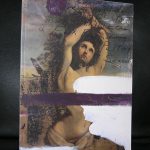
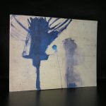
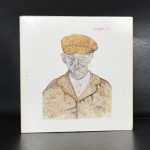
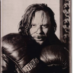
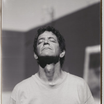
I knew the works by Julian Schnabel from the exhibition he had at the Stedelijk Museum Amsterdam in 1982 ( catalogue available at www.ftn-books.com). An impressive exhibition of large Schnabel painting, but what i did not not know until some 15 years ago is that Schnabel is also a very gifted photographer. His portraits have a rare quality and make you feel really close to the subject. For instance the Rourke portrait is filled with action and the Lou Reed one makes you feel happy … Reed as a liberated spirit is a rarity.

Books on his photography are rare, i know there exists one title on his Polaroid photo’s, but that is the only title i know of. If you know of more titles let me know, since i am very interested on a personal level to add a book on his photography to my personal collection.

Posted on 1 Comment

Hans Haacke (1936)

Schermafbeelding 2018-02-19 om 14.56.35

His career spans now a period of nearly 60 years and he has always been a frontrunner in the world of art. Perhaps yu can compare him with Damien Hirts, but do not forget that there is a difference of time between them of 3 decades. Haacke never reached the stature of a Damien Hirst, but when his works emerged and were introduced into the art scene… literally every large and important Modern Art museum in the world wanted a piece of the action. Haacke was “hot”. Moma , Tate and Museum Ludwig all started to collect Hans Haacke at a large scale.

In 1978 Haacke was asked for a one man show at the van Abbemuseum / Eindhoven ( catalogue available at www.ftn-books.com)  and with this show, the Netherlands started to know Hans Haacke as an artist. Nowadays his art is less prominent present in the collections of these large museums, but i am convinced this will change in the not so far away future, because i think Haacke is important for the art of Seventies and Eighties. A forerunner for the art made by the well respected British artist like Hirst and Tracey Emin. Haacke deserves a place among them. His contribution to art is a valuable one and deserves to be recognized as such.

Posted on Leave a comment

Pjeroo Robjee (1945)

Schermafbeelding 2018-02-19 om 14.17.45

The Flemmish Pjeroo Robjee is first of all a writer and secondly a painter. As a writer he is considered to be the Flemmish James Joyce. This is not what i want to write about, but i want to introduce Robjee as a painter to you. Robjee has followed some day courses in painting and started to paint in a very personal way, inventing his own style . What does it look like?… i can not describe it , but i encounter something of illustrations in his paintings. The use of Pop Art colors combined with the simplicity of Botero. Shake it and the result is Robjee.

This mix of styles resulted in an invitation by the Belgian gallery Lens Fine art , where he had at least 2 exhibitions in 1975 and 1977. Both publications with these Robjee shows are available at www.ftn-books.com.

I really do not know what to think about these Robjee paintings, but somehow they fascinate me and must be considered as an important cultural heritage for Belgium since Robjee is an important writer who had also another quality…. he made some great timeless paintings that still fascinate.


Posted on 1 Comment

Wim Crouwel..design of the Atelier series for the Stedelijk Museum.

Schermafbeelding 2018-02-17 om 11.33.47

The focus of this blog is on the covers of a very impressive series Wim Crouwel designed for the Stedelijk Museum during a period of roughly 14 years in the Sixties and Seventies ( between 1965 and 1979). This series has the typical Crouwel layout and typography and beside these elements these designs are ” clean” without any frills ….just function. These were done when the Total Design agency had their “GOLDEN YEARS” and Wim Crouwel was one of the most important members of Total Design ( founded in 1963). This is a great series of 16 publications . Some with loose pages in portfolio, others in the shape of posters or just ordinary booklets, but all have the quality design Wim Crouwel stands for. Most of these publications are available at www.ftn-books.com and if your are looking for other Crouwel publications search for them at the same site.


Posted on Leave a comment

Agnes Martin …the Islands (2004)

Schermafbeelding 2018-01-14 om 11.23.46

Yesterday i spoke about the Josef Albers Museum in Bottrop and their excellent poster publications. Today i will present the very best of them. It is the magnificent Agnes Martin poster for the “the ISLANDS’ exhibition. Executed as an original silkscreen this poster is a true work of art.

martin islands poster a

Publisher: Quadrat /Josef Albers Museum, 2011 Measurements: 31.4 x 24 inches Condition: mint-

This is a highly collectable and important poster> not only because the exhibition was important, but because of the printing technique this is a masterpiece.

Poster and exhibition catalogue are both available through www.ftn-books.com

catalogue design by Walter Nikkels