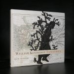
The South African born William Kentridge is not the usual mediocre artist you may have heard of. His focus differs from others. His preferred medium is paper to make drawings, graphic art and animated films.
These animated films are truly impressive and strong animations filled with a messages that stay with you for a very long time once you have seen it.. They are constructed by filming a drawing, making erasures and changes, and filming it again. He continues this process meticulously, giving each change to the drawing a quarter of a second to two seconds’ screen time. A single drawing will be altered and filmed this way until the end of a scene. These palimpsest-like drawings are later displayed along with the films as finished pieces of art.
These animated films have become one of the pillars of his art, but that does not mean that his other works are not interesting. They are equally interesting but are perhaps a little less special than his animated films. One thing they share with the animeted films. They are filled with the “social injustice” Kentridge experienced through the decades in South Africa.
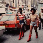
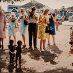
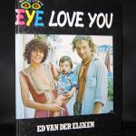
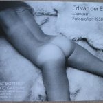
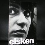
A just reason to devote another blog to Ed van der Elsken. Van der Elsken is without a doubt one of our greatest photographers from last century, but what makes van der Elsken special for me personally is that his photographs are the scenes and events i remember from my youth. Artistically they are among the very best, but emotionally there is an extra quality for me personally. The exhibitions showing a selection of his best color photography is now on show at the Nederlands Fotomuseum in Rotterdam ( https://www.nederlandsfotomuseum.nl) and is very well worth visiting. In the cellar there is an extra asset to this exhibition….. a 15 minute slideshow which is among the very best and informative slide shows i have ever seen. The exhibition is on view until the 6th of October 2019.
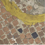
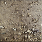
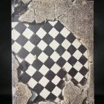
I think it was Hans Locher as a curator who brough the works by Mark Boyle for the first time to the Netherlands. I remember the exhibition was reviewed and it made me go to the Haags Gemeentemuseum. It was the time of music by the Soft Machine and shows with liquid slides to accompany the music. Upstairs in the rooms of the museum were the objects/ earth by Mark Boyle. Boyle made exact replcias of the soli and pavements he found interesting and hang them on the wall like paintings. I thought and think these objects are still fascinating and to my knowledge Boyle is still unique in his approach to art.
These so called earth studies were highly accurate painted casts that operate somewhere between painting and sculpture – involve the meticulous re-creation of randomly chosen areas of the Earth’s surface using resin and fibreglass (as well as real materials from the site) and have been exhibited internationally. Past shows have included the British Pavilion at the XXXIX Venice Biennale in 1978, Beyond Image – Boyle Family (Hayward Gallery, London) in 1986 and Boyle Family (Scottish National Gallery of Modern Art, Edinburgh) – a major retrospective held in 2003.
www.ftn-books.com has several Mark Boyle and Boyle family catalogues available.
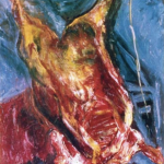
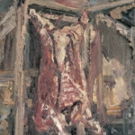
Soutine is what you call an artists artist. Somebody who fame grew because of the admirations of his contemporary artists. For me personally stands for three moments in time . All related to art. The first was a moment i witnessed the auction of a Soutine painting in the mid Seventies nad i was amazed because it fetched an unexpected serious high bid, The second was when i read the spectacular story by Roald Dahl. The one in which a sailor is tatooed on his back by Soutine and an art dealer who tries to obtain this painting and last the timne i visited a dutch gallery and saw a painting of a dead ox by Marc Mulders and it instantly reminded of the Soutine paintings i had seen at one time. ( left Soutine/ right Marc Mulders)
Now i finally have another Soutine catalogue available. Soutine publications are scarce and this one is once again part of my inventory . Now it is for sale at www.ftn-books.com . This is the first one i found in the last 10 years.
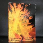
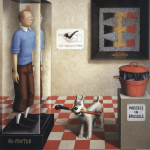
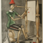
Mix Gino Severini with Hergé and put in some of the great poster art of the 20th century and you will have an idea of the works of Sigfrido Martin Begue. He is the third of the lesser known artists i would like to propose to you.
The first time i heard about Begue was when he was having an exhibition at the Living Room. I did not see the exhibition myself, but years later i acquired the catalogue for my inventory and saw for the first time why thsi artist is so attractive to me.
It is is this mix of the absurd and the comic like style i like so much. Just take a look at these 2 examples and you know exactly what i am talking about.
Born in Switzerland , but working for most part of her artistic life in Berlin, Favre has gathered a loyal following of collectors. Her work is a typical feminal mix of abstraction and story telling.
Within the composition there are always recognizable elements, but background and even some of the props in the painting can be purely abstract.
Valérie Favre makes up stories and tells us these stories, gradually mixing in their sociopolitical influences: war, death, suffering, as well as a few well-known suicides mingling with hybrid creatures in quest of sex, both masculine and feminine. In this way, her works can be seen as a kind of index of the world’s fears and anxieties. Yet, as the artist treats these anxieties with the derisory irony of a piece of paper, she also imposes a distancing from them, a distance from which rises humor.
Outside Germany her art is hardly known and certainly deserves to be known much better.
For the next three blogs i have chosen lesser known artist, but i think they are still important. The first is Gunda Förster.
Gunda Forster and Francois Morellet were presented in one exhibition at the Bundestag in Germany. A just decission since both are very much related to eachother. Where Morellet presented his figurative works ,Gunda Förster presented her Konkret ones.
The works of Gunda Förster define visibility as the elementary organization of space, light and time. Seeing is movement, which encounters the movement of the seen.
One walks along benighted streets, past darkened and brightly lit windows, rooms illuminated by the flickering of television screens, under lighted billboard advertisements and neon signs, between the headlights of moving automobiles. In the way the gaze turns from the stars, whose light has outlived their extinguishment, Gunda Förster’s works with light remove the plastic phenomenon from things occurring. The images of urban tranquillity, behind each window a life, drawn to and distracted by advertisement, on its way from one location to another, are wiped away with a gesture of minimalistic reduction. The pure form arising out of this regards itself as compatible with the artistic realm and designs it as one set aside for art – a cross-section of the producer’s and the observer’s experiences.
That Förster’s recent works with 35 mm. slides can be understood as a shift to narrative or representational image forms is as self-evident as taking the images transmitted via television for reality. The concepts interspersed into Variations of chance play into the futility of an observation intent on finding meaning.
Both the presentation, a projection time of one to two seconds per slide with fadeovers, and the quality of the images and concepts evade the presumptive reliability of the pairing of photography and text. The words come across as slogans which allow the bid to vanish into a surplus of possible connotations. The image fragments do not tack meanings onto the concepts (found language fragments), but rather strengthen their repellancy as typefaces depicting only potentially significant language sounds, which in turn reinforce the impression that the more or less blurred representationalism of the slides (for the most part people photographed from television screens) merely refers to the tautology of the visible and of light.
The continually shifting references between word and word, word and image, image and image render any compulsive production of meaning futile. The observer is left with the single insight: that his understanding fails on account of an incomprehensible compositional principle. Indeed, the impression of merely accidental and unstable word and image combinations could be described in a complex mathematical form as a sequence of variations – and, hence, as the visualization of a musical idea.
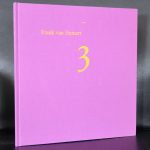
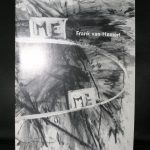
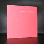
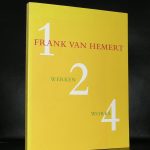
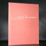
Because i have a long time admiration for the works by Frank van Hemert , i started to collect his publications and since 2007 i even could buy a painting and some drawings by the artist. In the meantime i visited many bookmarkets and whenever i find a book by van Hemert , i can not resist it and I buy it. I am almost complete now for my own library, but i have bought so many of his titles that i have now several double or triple in my lown ibrary. These i have now put up for sale, so please take a look at www.ftn-books.com to find some very nice van Hemert titles available.
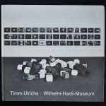
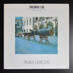
Timm Ulrichs (born in 1940) is considered one of the most influential German conceptual and action artists. He writes concrete poetry, makes performance art, and works as a sculptor.
For his work, Timm Ulrichs has received numerous international prizes, but in a conscious gesture of rejection, he withdrew from the art market. Even though his early performances and happenings have art historical significance in terms of determining an avant-garde art after 1960, his entire oeuvre is often only known to insiders. As an artist’s artist, Timm Ulrichs is widely respected.
Ulrichs has been active as a self-proclaimed “total artist” since 1959 when he displayed himself in a glass box and determined himself “the first living artwork”. In that year, he established the Werbezentrale für Totalkunst, Banalismus und Extemporismus [Advertising agency for total art, banalism, and extemporism] in Hanover, which was to serve the propagation, development and production of total art. Under the motto “art is life, life is art”, he called himself “the perfect gesamtkunstwerk”. www.ftn-books.com has two Ulrichs titles available.
Artist/ Author: Oliver Boberg
Title : Memorial
Publisher: Oliver Boberg
Measurements: Frame measures 51 x 42 cm. original C print is 35 x 25 cm.
Condition: mint
signed by Oliver Boberg in pen and numbered 14/20 from an edition of 20