Posted on Leave a comment

Sigmar Polke (1941-2010)

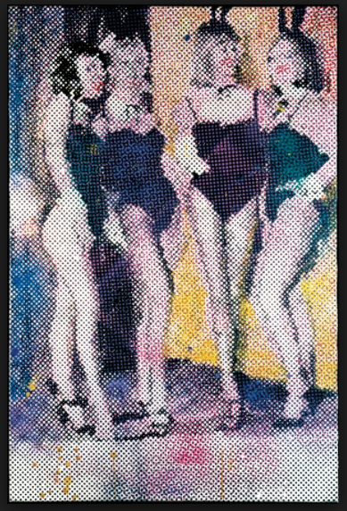
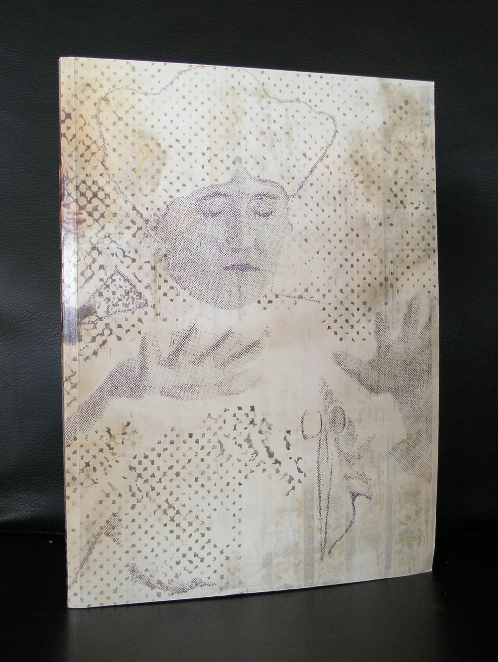
It took a long time for me to finally appreciate the art by Sigmar Polke, but once i did i became a fan and realized that he must be one of the true great artists from last century. Born in the middle of WWII he soon became in the early sixties one of the leading German artists that started their career after this terrible war. The trademark of his works became the use of polka dots in grids as an overlay and he stayed with the use of these polka dots technique throughout his entire career. Side stepping to photography and almost monochrome paintings his oeuvre became very diversified, but always recognizable. Turning point for me was the Polke i saw within a Beyeler Museum exhibition. I do not remember which show it was, but i remember the technique of the polka dots as an overlay to the picture, which reminded me to Marcel van Eeden. Where van Eeden uses small intimate sizes, Polke uses large canvasses. Magnified pictures within a different context are part of his works and sometimes even lean towards surrealism. There is one work i have to see sometime in my life. It is the work he created for the reopening of the Reichstag in Berlin in 1999. When i visit Berlin this will be a must see for me.

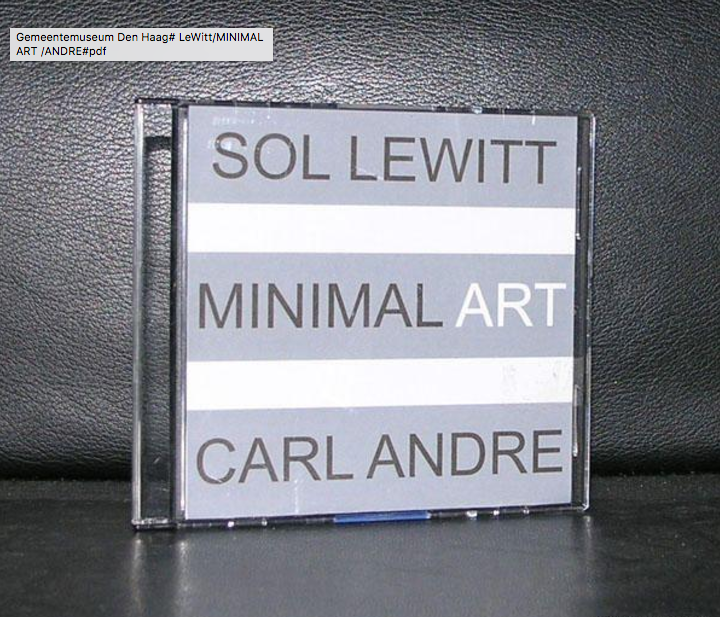
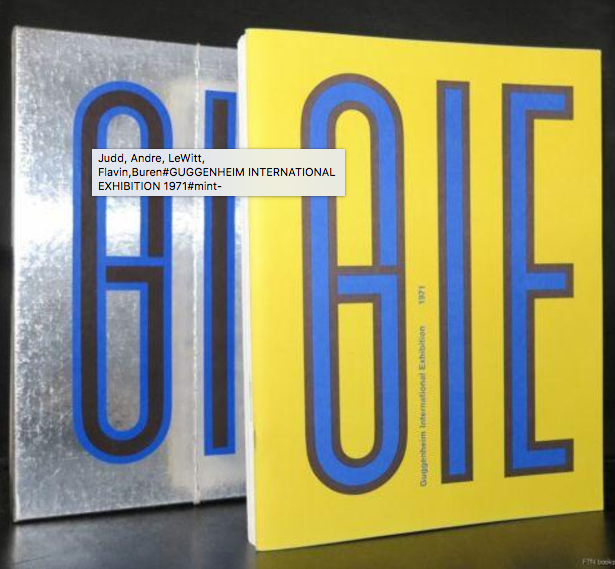
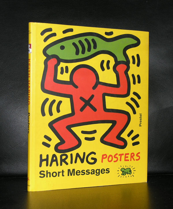
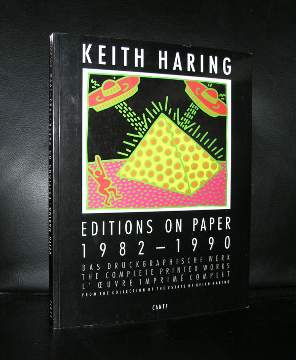
There are some nice publications in the inventory of www.ftn-books.com


Posted on Leave a comment

Erik Andriesse (1957-1993)

Schermafbeelding 2017-03-18 om 13.59.24

Exceptional talent, a great dutch artist and one of the greats in Dutch Modern Art. Andriesse died at the age of 35 in 1993 and left us some very impressive works of art. His most important themes were flowers and skulls. The equivalent for him of life and death. Admirer of Salvador  Dali, educated at the Ateliers 63, he soon became one of the most talented young artists in the Netherlands. He did not want to paint abstract paintings and chose for realism instead. Flowers and skulls being the centre of his works but also, lobsters, shells and apes. All his subjects were related to nature around us and he made wonderful paintings out of them. A large archive can be found on the internet at http://www.erikandriesse.nl

One of his techniques was to paint animals and use dead models to paint/draw them as accurately as possible. There is a nice video on YouTube  in which Marc Mulders and Erik Andriesse discuss this technique and some footage is shown while Erik is at work. A tremendous artist of whom some books are available at www.ftn-books.com

On the Andriesse site there is a nice text by Marlene Dumas in which she describes the works by Andriesse and concludes that not all of his works are naturalistic:

Nightmares of Beauty

Once upon a time there lived a boy called Erik Andriesse, who distinguished himself from the passionless people around him by glowing in the dark. Now the country he lived in was a quite dark. Artists however would talk about the extraordinary light in that country.

During the 80’s all the artists were interested in the artificiality of life. A picture of a flower was much more interesting than the flower itself. Very few people still believed that everything that existed was part of nature itself. People lived in cities. Artists lived in their studios. Places filled with books, bottles and talk about art and artists and what was relevant and what was not.

And they forgot to love…

But Erik was aware of the fire that eats at the heart, while the clock ticks at night. The shortage of time, the repetitive movements of desire, the energy of the body watched by death. Flowers larger than life, dreams larger than life.

Nightmares of beauty.

He was ignored by the calculators, whose blood did not rise, when they saw his exotic death-dances on paper, but he continued on his own impatient way. Erik is not a conceptual artist. Erik is not an associative artist. He is not interested in displaying the cultural-historical aspects of his subject-matter. But Erik is also not the naturalist he seems to be. He even shows similarities (at times) to Spiderman, the comic-strip hero. Erik is not a cultural barbarian or a primitive. He reflects on the good, the bad and the ugly of the artworld and the synthetic problems of painting.

MARLENE DUMAS, 1986


Posted on Leave a comment

Lucio Fontana (1899-1968)

Schermafbeelding 2017-03-17 om 12.12.33

For me , he is one of the greatest from Last century. Lucio Fontana has had a long career in art and joined several groups, before he became part of the ZERO mouvement.

https://youtu.be/tOPR5YDVpUo

After ZERO he stayed true to his new found form of art in which monochrome paintings were slashed with a sharp Stanley knife or manipulated with his fingers,thus altering the surface with other materials and objects. Glass was one of his favorites to use. Fontana did not become very old, but in his art career of over 40 years he was one of the front runners in Modern Art. Willem Sandberg admired him very much and because of the importance of Zero and this admiration for Fontana, Fontana received his first Amsterdam monographic exhibition in the Stedelijk Museum in 1967. Catalogue design by Wim Crouwel makes this the perfect combination for a great publication. Sandberg/Crouwel and Fontana combined in one publication is hard to beat. Since 1967 , Fontana featured in many group exhibitions on Zero and had solo exhibitions all over the world. Art collectors must pay huge sums of money to acquire a Fontana ( if ever there is one for sale/ there was one at Dorotheum and Sothebys last year, they made  specials on youtube  on these paintings)

and Museums that have one in their collection are lucky, because his paintings are nowadays “hors catagorie”. What can be had at reasonable prices? Of course some great publication at www.ftn-books.com and whenever you find a MUSEUMJOURNAAL with the special Fontana cover, do not hesitate and ….BUY IT!!!.


Posted on Leave a comment

the prints of Frank Stella (1936)

Schermafbeelding 2017-03-16 om 09.44.00

Two reasons to devote a blog to Frank Stella. First there is an acquisition by the Gemeentemuseum Den Haag which i do not understand. For me it is a “stand alone” work of art with no relation with other works within the collection and at the time i saw it , i recognized it as a Stella, but was not very impressed by it. I would have thought the Stedelijk Museum Amsterdam would have bought a work by Stella, because it fits in….but at the Gemeentemuseum it looks to be “a stranger at our midst”. Still Frank Stella is a great print maker and one of the reasons for this blog is to point out a very fine publication the Stedelijk Museum has published in 1970. The design was done by Wim Crouwel, but the best is there is a highly original “blind print” used as cover for this great catalogue.

It is one of the most spectacular catalogues from the 70’s with its embossed cover. A special artist cover which relates to one of the first “shaped canvases” use of multiple papers and ink colors. Typical Crouwel design. Book measures 10.8 x 8.2 inches, contains 78 pages plus cover. text in dutch and english.

Frank Stella is an important artist, has made some great works of art, but especially his minimal early works are for me among his best, including this great 1970 catalogue.

The Wim Crouwel / Stella catalogue from 1970 and other Frank Stella publications are available at www.ftn-books.com


Posted on Leave a comment

Dan Flavin (1933-1996)

Schermafbeelding 2017-03-08 om 09.15.29
Dan Flavin


Minimal Art, but for me completely different because of the great change his art makes to its direct environment. Colors, size and composition of the lights change the room  where the light sculptures are exhibited completely.

There must be a wealth of unfinished projects, because Flavin generally conceived his sculptures in editions of three or five, but would wait to create individual works until they had been sold to avoid unnecessary production and storage costs. Until the point of sale, his sculptures existed as drawings or exhibition copies. As a result, the artist left behind more than 1,000 unrealized sculptures when he died in 1996.


His earliest works were exhibited in the van Abbemuseum in 1966. The Netherlands were at that time one of the earliest countries to adopt the Minimal Artists. Major exhibitions by LeWitt, Andre and Judd in the late 60’s  were held in Den Haag and Amsterdam.

Schermafbeelding 2017-03-08 om 09.25.41

Flavin realized his first full installation piece, greens crossing greens (to Piet Mondrian who lacked green), for an exhibition at the Van Abbemuseum, Eindhoven, Netherlands, in 1966. Flavin’s “corridors”, for example, control and impede the movement of the viewer through gallery space. They take various forms: some are bisected by two back-to-back rows of abutted fixtures, a divider that may be approached from either side but not penetrated (the color of the lamps differs from one side to the other). The first such corridor, untitled (to Jan and Ron Greenberg), was constructed for a 1973 solo exhibition at the St. Louis Art Museum, and is dedicated to a local gallerist and his wife. It is green and yellow; a gap (the width of a single “missing” fixture) reveals the cast glow of the color from beyond the divide. In subsequent barred corridors, Flavin would introduce regular spacing between the individual fixtures, thereby increasing the visibility of the light and allowing the colors to mix.[24]

By 1968, Flavin had developed his sculptures into room-size environments of light. That year, he outlined an entire gallery in ultraviolet light at documenta 4 in Kassel, Germany. In 1992, Flavin’s original conception for a 1971 piece was fully realized in a site-specific installation that filled the Solomon R. Guggenheim Museum’s entire rotunda on the occasion of the museum’s reopening.

www.ftn-books.com has many titles on Minimal Art and some on Dan Flavin


Posted on Leave a comment

where is the velum by Keith Haring?


schermafbeelding-2017-03-06-om-16-24-06

Keith Haring had one of his first European exhibitions within the Stedelijk Museum and for this occasion he made a very large ceiling piece/ the VELUM ( 1986), which was there during the exhibitions and for some time after, but….. since the exhibition i have never seen it again! Of course it is possible i have missed it, because i dit not visit the Stedelijk Museum each day  i went to Amsterdam, but it is strange that in 30 years i never have seen it again. It was an extremely large piece by Haring and should be one of the key objects within any collection, because it represents everything the art of Keith Haring has become famous for.  I checked the site of the Stedelijk Museum , but could not find it in the collection. Any readers who can help?

schermafbeelding-2017-03-06-om-16-21-24

The site Widewalls has an excellent description why Keith Haring is important and was one of the key figures in the Grafiti art movement.

The 1990s were a time of change for many social and cultural aspects on a global scale. Art particularly saw many artists bring tremendous change in this period, and Keith Haring was one of them. Drawing and painting murals in public locations, Haring was often philosophical about his approach to creating artwork, and was amazed and inspired by the interaction and feedback he would get from people around him. Although he was young, he had developed a very specific concept of what art should represent, and the ideology carried over through his work would leave an everlasting effect on the street culture in New York City, as well as art as a whole. Along with Jean-Michel Basquiat, Kenny Scharf, Futura 2000 and Richard Hambleton, among others, he was part of the young, up-and-coming group of the American artists who challenged art’s old perceptions.

Fortunately the publications on Haring at www.ftn-books.com did not disappear ( but they can get sold out).


Posted on Leave a comment

Enzo Cucchi (1949)

schermafbeelding-2017-02-28-om-14-54-50

Enzo Cucchi was born in 1949 in Morro d‘Alba, a farming village in the province of Ancona in central Italy. As an autodidactic painter Cucchi won different prices already in his early years even though he was more interested in poetry at the time. He frequently visited poet Mino De Angelis, who was in charge of the magazine „Tau“. Through „La Nuova Foglio di Macerata“, a small publishing house, he met with art critic Achille Bonito Oliva, an important figure in the artist‘s prospective career. In its catalogues „La Nuova Foglio di Macerata“ published writings of artists such as Cucchi’s „Il veleno è stato sollevato e trasportato!“ in 1976. Frequent trips to Rome in the mid-seventies revived Cucchi’s interest in visual arts. He moved to Rome, temporarily abandoned poetry and dedicated himself exclusively to the visual arts. Here Cucchi met with different artists such as Sandro Chia, Francesco Clemente, Mimmo Paladino and Nicola de Maria with whom he began to work in close contact and to establish dialectical and intellectual dialogues.Achille Bonito Oliva was the first to see this young generation of Italian artists of the seventies as a group. Since this group of artists has frequently have ehibitions as a group or as an individual artists in the Netherlands. The Groninger Museum and the Stedelijk Museum had shows during the eighties and nineties and bought several works for their collections. Together with the exhibitions some excellent catalogues were published of which some are available at www.ftn-books.com


Posted on Leave a comment

Anselm Kiefer (1945)

It is 31 years ago that i saw a  work by Kiefer for the first time I and was really impressed . I remember the occasion….the occasion the Anselm Kiefer exhibition at the Stedelijk Museum Amsterdam. Grey, sombre , large paintings with scenes that reminded of war, devastation and ruins .  Later i learned that the German history and the Holocaust were main themes Kiefer always used in his works. The history of Germany being one of the main subjects in his extremely large paintings. The Stedelijk Museum bought one of the paintings for its collection. “Innenraum” is a large painting ( 280 x 311 cm.)  , but small compared to other Kiefer works.

schermafbeelding-2017-02-26-om-10-55-55

The exhibition was a great succes and since i  encountered several other Kiefers in museums. One stands out, impressive and it’s size is overwhelming. ( almost 10 meters in length) and is a must see whenever you visit the North of Spain.

schermafbeelding-2017-02-26-om-11-02-45


Anselm Kiefer

Only with Wind, Time, and Sound (Nur mit Wind, mit Zeit und mit Klang), 1997

Acrylic and emulsion on canvas

473 x 944 x 22 cm

Guggenheim Bilbao Museoa

 ( the following text comes from the Art Story site)

It is the Anselm Kiefer’s monumental, often confrontational canvases were groundbreaking at a time when painting was considered all but dead as a medium. The artist is most known for his subject matter dealing with German history and myth, particularly as it relates to the Holocaust. These works forced his contemporaries to deal with Germany’s past in an era when acknowledgment of Nazism was taboo. Kiefer incorporates heavy impasto and uncommon materials into his pieces, such as lead, glass shards, dried flowers, and strands of hay, many of which reference various aspects of history and myth, German and otherwise. Influenced by his contemporaries Joseph Beuys and Georg Baselitz, as well as by postwar tendencies in Abstract Expressionism and Conceptual art, Kiefer is considered part of the Neo-Expressionist movement, which diverged from Minimalism and abstraction to develop new representational and symbolic languages.

Of course there are some nice publications available at www.ftn-books.com including the Anselm Kiefer / Stedelijk Museum catalogue from 1986
Posted on Leave a comment

Jacques Monory (1924)

Schermafbeelding 2017-02-25 om 11.56.25.png
Monory

Jacques Monory is “world famous” in France, but outside France he is hardly known by anybody. Not many works are to be found outside France and if one is encountered it rarely is in relation with the Figuration Narrative of which mouvement he can be considered as one of the founders. The works that can be found outside France are almost always in relation with international Pop Art scene. In the seventies Monory had a nice exhibition in the Stedelijk Museun. In which he presented paintings with the subject New York….title of the exhibition VELVET JUNGLE / N.Y. a Wim Crouwel designed catalogue. ( catalogue is available at www.ftn-books.com ) But despite his commercial focus on France , time acknowledges the talents and qualities of Monory and his works are now presented all over the world. Recent auction results prove the importance of this typical French artist who was frequently neglected in the last 40 years, but now finds his way to the collections of to the true connaisseur.

Here is a recent list of exhibitions during the last 14 years ( not complete )

  • 2003 : « Extraits », Ludwig Museum de Koblenz, Allemagne
  • 2003 : « Nocturne » espace Paul-Rebeyrolle, Eymoutiers
  • 2004 : « J’ai vécu une autre vie », fondation Jean-Marc et Claudine Salomon, Alex
  • 2005 : « Couleurs », peintures, galerie Laurent Strouk, Paris
  • 2005 : « Détour » ouverture-inauguration du musée d’art contemporain du Val-de-Marne (MAC/VAL), Vitry-sur-Seine
  • 2008 : « Roman-Photo », Maison européenne de la photographie, Paris
  • 2009 : « Tigre », Fondation Maeght, Saint-Paul-de-Vence
  • 2010 : « Évasion », Forteresse de Salses (Cycle Casanova Forever FRAC Pyrénées-Orientales)
  • 2011 : « Jacques Monory photographe  galerie RueVisconti, Paris
  • 2012 : Galerie Iufm Confluence(s), université Lyon1 et galerie Anne-Marie et Roland Pallade, Lyon
  • 2013 : Galerie Nathalie Clouard, Rennes
  • 2013 : « Jean-François Lyotard and Jacques Monory: Screens », Space Studios, Londres
  • 2014 : « Memento Mori », galerie Sonia Zannettacci [note 7], Genève
  • 2014 : « Jacques Monory », L’Aspirateur, lieu d’art contemporain, Narbonne.
  • 2015 : « Jacques Monory », Capucins de Landerneau, Fonds Hélène et Édouard Leclerc pour la culture.
  • 2015 : « Mon cinéma », Fondation Stampfli, Sitgès (Barcelone).
Posted on Leave a comment

Eduardo Paolozzi- Stedelijk Museum catalogue nr. 442

schermafbeelding-2017-02-23-om-14-36-05

There are multiple reasons to like the publication no 442. of the Stedelijk Museum Amsterdam. Published in 1968 on the occasion of the Eduardo Paolozzi exhibition this is a 100% original work of art . A serigraphie by Paolozzi in his typical Pop Art style. Folded as issued and when folded out an impressive large work of art. Design?….by Wim Crouwel who used the backside of the serigraphie for all the information on Paolozzi. A great Pop Art work of art and available at www.ftn-books.com