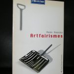
People who follow this blog , know of my love for Ben Vautier. Not only because he is one of the most original and consistent artists from the last 100 years, but also because there is always some humor just around the corner. Unfortunately I have missed the most important Vautier exhibition from the last 10 years. It was held at the Tinguely Museum in Basel :
Ben Vautier. Is everything art?
21.10.2015 – 22.01.2016
Ben Vautier has been on the scene since the late 1950s as an artist, performer, organizer, linguistic inventor, and re-thinker of art. He is one of the pioneers of the Fluxus movement in Europe and, as a comrade-in-arms of the École de Nice, a close friend of artists such as Arman, Yves Klein, Martial Raysse, and others. He is known for his text images, which, using brief, pithy phrases, equally question and challenge life and art. Ben Vautier has the first comprehensive retrospective in Switzerland dedicated to him at the Museum Tinguely. Alongside an overview of the first 20 years of his creativity, Ben sets up in Basel more than 30 rooms as he comments on various social, artistic, and political topics and takes a stance. In total, the show exhibits far in excess of 400 works by the artist, who is still very active to this day.
Still what remains is one of the best and certainly one of the most beautiful books on Vautier’s art. It has a simple brown cover, but is filled with iconic Ben “paintings” from hs first 20 years as an artist and published as only the Suisse can publish art /museum catalogues. The print is exceptionally good, the lay out superb and the contents…..well all BEN, making this one of the most collectable books i recently offered on www.ftn-books.com
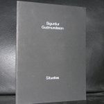
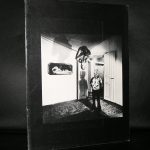
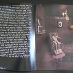
Gudmundsson has a loyal following in the Netherland. That must be because he has been present in multiple group exhibitions and solo exhibitions in both museums and art galleries. The Stedelijk Museum presented this artist on several occasions and the catalogues’/ artist books published with these are in high demand. The “Circles” book for instance has been sdold out with me for over 5 years and i have not found another copy at a reasonable price. The same with ” Situations” sold out and nowhere to be found anymore.
OLYMPUS DIGITAL CAMERA
OLYMPUS DIGITAL CAMERA
Gudmundssons works fascinate. These are symbiosis of IN SITU and performance. Making this a true conceptual artis whose works have been spread all over the world.
Gudmundsson studied in the Netherlands at ao Ateliers 63 and after that study settled in the Netherlands and launched his career in the 1960s as a member of the legendary Icelandic SÚM group. His public sculptures can now be found widely, including in Rotterdam, Groningen and Den Haag in the Netherlands. He later became a teacher at the AKI in Enschede. He is now living in China, the artist prides himself of having been a foreigner for the past 50 years and i am curious to learn how this does influence his works. www.ftn-books.com has still some nice Gudmundsson titles available.
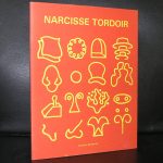
A key figure in the Antwerp art scene and also very well known in the dutch art scene because he is an advisor to the Rijksakademie Amsterdam.
But besides his presence in the art scenes of both the Low Countries, he has become world famous because of his approach to painting. Tordoir considers painting as an act and with this he has had performances in France, the UK, USA , Austria and many more countries, thus introducing his very personal approach to the art of painting to a new art scene each tine he had a performance or an exhibition outside Belgium or the Netherlands.
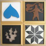
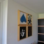
It is hard to find a reasonable priced work by Tordoir, but about 10 years ago i got lucky and bought a tetralogy at a local auction. It is a work typical for the works Tordoir produced during the eighties on which he combined several smaller ” paintings into a unique work of art. This work consists of 4 framed works of abstract figures forming together a unique Narcisse Tordoir. This work is now for sale at FTN art together with the books www.ftn-books.com has on Narcisse Tordoir.
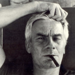
His career spans now a period of nearly 60 years and he has always been a frontrunner in the world of art. Perhaps yu can compare him with Damien Hirts, but do not forget that there is a difference of time between them of 3 decades. Haacke never reached the stature of a Damien Hirst, but when his works emerged and were introduced into the art scene… literally every large and important Modern Art museum in the world wanted a piece of the action. Haacke was “hot”. Moma , Tate and Museum Ludwig all started to collect Hans Haacke at a large scale.
In 1978 Haacke was asked for a one man show at the van Abbemuseum / Eindhoven ( catalogue available at www.ftn-books.com) and with this show, the Netherlands started to know Hans Haacke as an artist. Nowadays his art is less prominent present in the collections of these large museums, but i am convinced this will change in the not so far away future, because i think Haacke is important for the art of Seventies and Eighties. A forerunner for the art made by the well respected British artist like Hirst and Tracey Emin. Haacke deserves a place among them. His contribution to art is a valuable one and deserves to be recognized as such.
Yesterday, Polish born artist Mark Prent contacted me about the Stedelijk Museum catalogue i have for sale on his exhibition in 1978. A never had studied the catalogue in detail before. But is a “dark’ catalogue which reflects the work of Prent in an excellent way. His works are “dark”
have a look at www.markprent.com and see for yourself what i mean
Mark Prent works consist of life-moulded mixed media, polyester resin and fiberglass casts of human models in sometimes disturbing poses and juxpositions. Mark Prent has consistently maintained throughout the years, that his sculptures and installations do not carry intentional messages. Despite the powerfully grotesque imagery that he has employed, interpretation is left to the viewer. Prent developed his own unique technique of layering to give a heightened realism to his figures; thus giving rise to the label “Extended Realism”. When he later became concerned about the toxicity of polyester resin, he began to experiment with other materials, developing innovative techniques for recreating that trademark quality of virulent realism. This venture into new materials led him in many new directions in his own work and ultimately, to become a technical resource for other artists as well.
Having followed his education in the US and exhibitions in Amsterdam , Berlin and Montreal his works are known all over the world, but because of their “Dark” nature never have become popular.
In 2005 Prent began a new series of video-taped performance pieces in collaboration with videographer/son Jesse Real Prent. In this series, Prent’s own body becomes a living, interacting component of his nightmarish scenarios. He continues to produce new sculptures in his Vermont studio. www.ftn-books.com has the Stedelijk Museum Mark Prent catalogue available.
1 year ago i acquired for my inventory two spectacular multiples. These are not cheap, but since last auctions results of both these artists i am even more convinced that these are not overpriced and will be a great addition to any book collection. These two multiples were published in the seventies by Edizioni Flaviana within their series of Zero artist. Here are the links two both blogs i published on these rare multiples.
Being one of the first to have participated as a Zero artist Dancing together with Jan Schoonhoven (in the nude)
and after that building an oeuvre on just one pattern…the Polka dot.
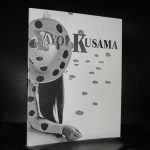
i love these artist that stay true to their belief. Kusama is not the only one. Leblanc, Peeters and Schoonhoven ,all from this generation , stayed true to their art ” inventions” developing it into something very perosmnal , recognizable and in many cases a beautiful and impressive work of art.
Kusama participated in the first ZERO/Nul exhibition in the Stedelijk Museum, but beside that she had her Retrospektives held all over the world including the Tate Modern where a large rRetrospektive was held in 2012. Now she has turned into a grand old lady of Contemporary Art and perhaps together with Louise Bourgeois and Georgia O’Keefe she has given a feminine touch to Modern Art. www.ftn-books.com holds some excellent Kusama titles in its inventory.
I know there are a lot of Panamarenko admirers and the books he had published are collected all over the world. My most recent Panamarenko went all the way to Korea adn i never could expect that in such a far away country there would be an interest in this great artist.
The 3 publications i now announce are found and purchased at my local bookmarket and are all three well worth collecting. You can find them now at www.ftn-books.com
The second day for the extra focus on the classics within the inventory of www.ftn-books.com
This time it is Picasso. Although i personally am not a great fan of Picasso, there are so many others that admire this Spanish artist and for them …take notice that this is the last day that the discount code is valid. Not only the many publicatons on Picasso are sold with a discount of 10%, but all publications and specials within the inventory go with a discount.
use : CLASSIC10 at your checkout and receive the discount.
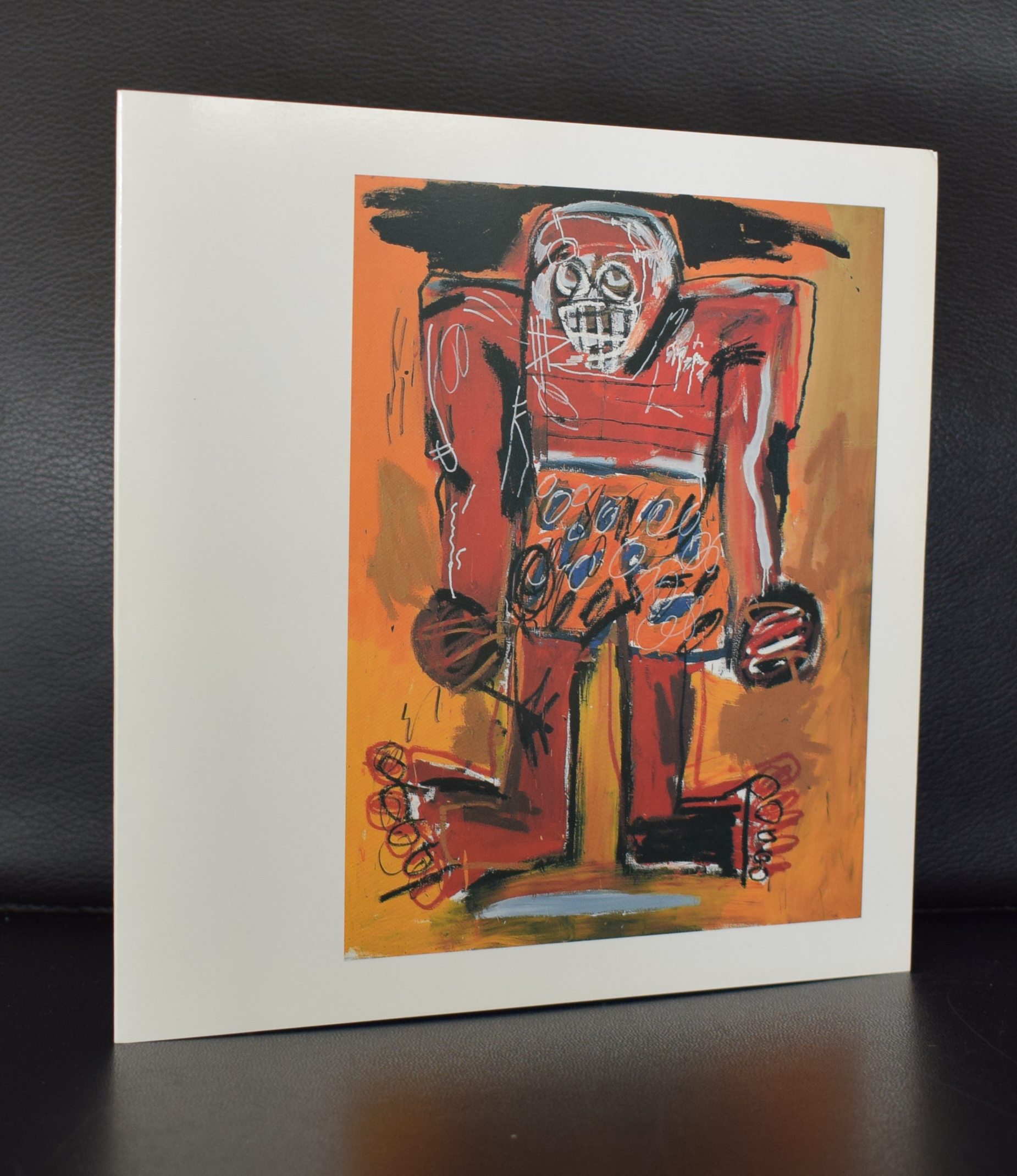
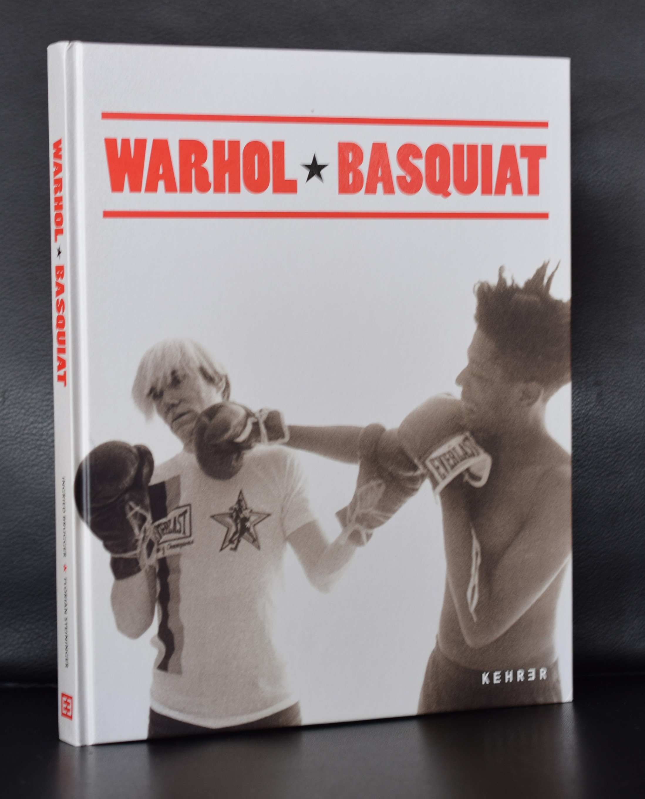
This blog is how i experience books and art and what i read about them and this is certainly an article i want to share with you. The guardian did an excellent article on Basquiat and his Fahion style/ A style which looks random , but was a well thought out way of dressing… Hooray for the Guardian. Here is the article and do not forget that www.ftn-books.com has some nice titles on Jean-Michel Basquiat.
There’s an image of Jean-Michel Basquiat on the cover of the New York Times magazine from 1985. The photo is by Lizzie Himmel; the headline New Art, New Money. The artist, wearing a dark Giorgio Armani suit, white shirt and tie, leans back in a chair, one bare foot on the floor, the other up on a chair. The combination of the suit and the bare feet is typical of the way Basquiat defined his own image; always with an unconventional bent.
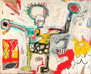
I’ve obsessed over his style when standing in front of Hollywood Africans, a 1983 work from a series where the images relate to stereotypes of African Americans in the entertainment business. It is a banger of a painting and will form part of Basquiat: Boom for Real, a retrospective opening at the Barbican in London this month.
I have a longstanding interest in the way artists dress, from Picasso to Hockney, Georgia O’Keeffe to Robert Rauschenberg, and I think their wardrobes exert as powerful an influence on mainstream fashion as those of any rock or Hollywood stars. These artists carved out instantly recognisable uniforms: clothes that symbolise the same singular point of view as their greatest works, usually with the sense of complete ease that is the holy grail of true style.
FacebookTwitterPinterest
Jean-Michel Basquiat, Untitled 1982, Museum Boijmans Van Beuningen, Rotterdam. On show at the Barbican in London in 2017. Photograph: Jean-Michel Basquiat/Barbican
Basquiat’s wardrobe was distinctive, whether he was in mismatched blazer and trousers with striped shirt and clashing tie, or patterned shirt with a leather jacket pushed off his shoulders. He was perhaps most recognisable in his paint-splattered Armani suits. “I loved the fact that he chose to wear Armani. And loved even more that he painted in my suits,” Giorgio Armani says. “I design clothes to be worn, for people to live in, and he certainly did!”
In many ways, this bricolage approach to clothing is akin to the way he created his art. “His work was a mysterious combination of elements – text and colour, historical reference, abstraction and figurative techniques,” Armani says. “In his life, he also mashed up creative activities – he was a graffiti artist, a musician, an actor, a maker of great artworks. This eclecticism made him a mysterious and unconventional man. That mix made him stand out.”
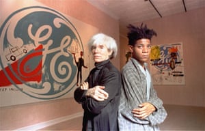
“He was an incredibly stylish artist,” says Barbican curator Eleanor Nairne. “He was very playful about the performative aspects of identity.” He was also aware of the “renewed fixation on celebrity” that coincided with the art boom of the 80s, particularly in New York. He famously appeared in Blondie’s Rapture video, dated Madonna and befriended Andy Warhol.
Andy Warhol and Jean-Michel Basquiat, September 1985. Photograph: Richard Drew/AP
Cathleen McGuigan, who wrote that 1985 New York Times feature, recounts Basquiat at the hip Manhattan hangout Mr Chow’s, drinking kir royal and chatting to Keith Haring while Warhol dined with Nick Rhodes of Duran Duran nearby. “He attracted the attention of Warhol and Bowie, so was endorsed by those who had already achieved that rare style-icon status,” Armani says. “And he had a very unique look – he had hair as distinctive as Warhol’s and wore suits in a way as stylish and relaxed as Bowie.”
Basquiat went on to model in a 1987 Comme des Garçons show wearing a pale blue suit, black buckle sandals, white shirt and white bow tie. Robert Johnston, style director at British GQ, describes Basquiat’s style as “a work of art in itself” and adds: “While meaning no disrespect to his talent, it is hard to imagine he would have taken New York so much by storm if he’d looked more like Francis Bacon.”
Basquiat’s influence on menswear is still felt today. While other icons have referenced his style – Kanye West sported a T-shirt bearing his portrait, Frank Ocean namechecked him in lyrics by Jay-Z, who dressed as him for a Halloween party – there is a more direct effect on fashion. There have been collaborations, via his estate, with the likes of Reebok and Supreme. There’s a photo of Basquiat wearing an Adidas T-shirt with a pinstripe suit which is a template for how the younger generation approach the idea of tailoring. At the S/S 18 shows in Milan, wonky ties with suiting at Marni made me jot down “Basquiat” in my notebook. And with the Barbican show his influence will spread. “The way Basquiat mixed classic tailoring with a downtown nonchalance fits the mood in menswear,” says Jason Hughes, fashion editor of Wallpaper*. “A refined suit worn with an unironed shirt, skewwhiff tie and beaten-up sneakers. The fact that he painted in those suits feels slightly anarchic and nonconformist. I want to wear a suit like that.”
This article appears in the autumn/winter 2017 edition of The Fashion, the Guardian and the Observer’s biannual fashion supplement
Artist/ Author: Oliver Boberg
Title : Memorial
Publisher: Oliver Boberg
Measurements: Frame measures 51 x 42 cm. original C print is 35 x 25 cm.
Condition: mint
signed by Oliver Boberg in pen and numbered 14/20 from an edition of 20