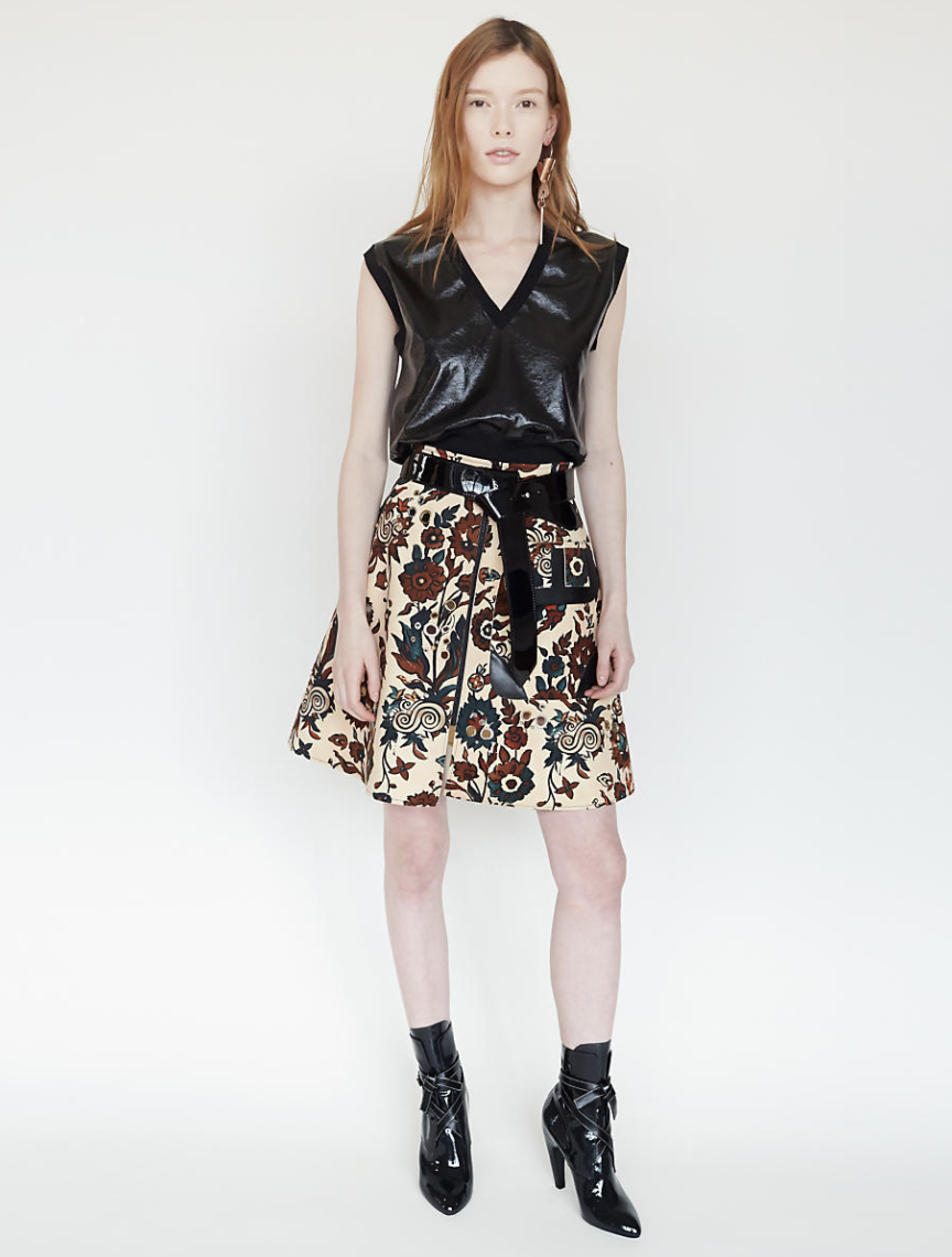
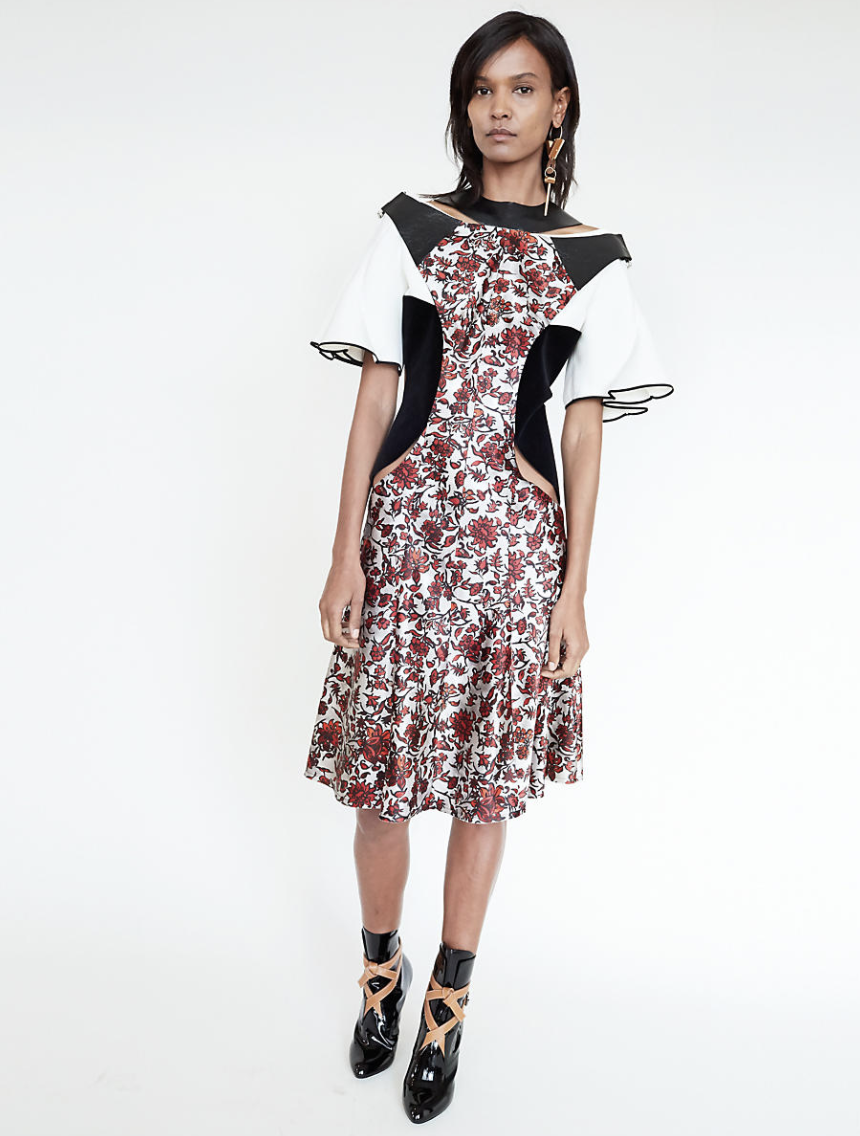
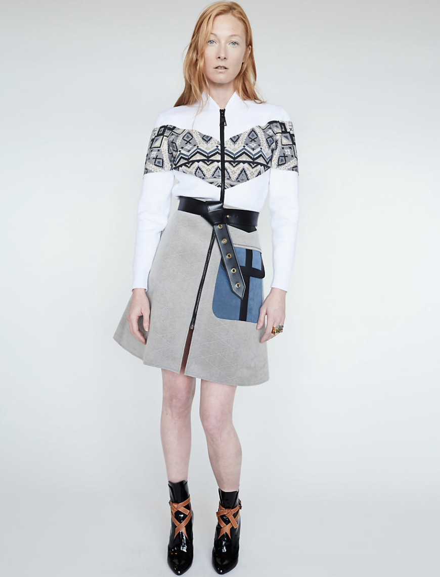
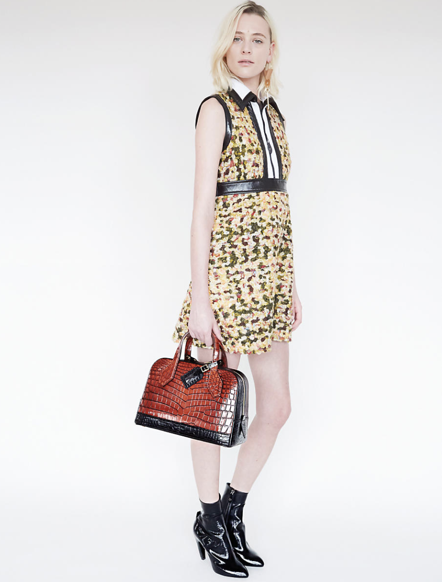
For Nicolas Ghesquiere first Fall 2014 womenswear collection, Louis Vuitton invited German photographer Juergen Teller for a distinctive interpretation of the collection.
Photographed from the House’s Parisian headquarters, with intimate views of the Seine and Eiffel tower, twelve models grace the Fall 2014 women’s collection in edgy attitude.
In this selection, glorious smooth, full-grain leather is contrasted with hybrid materials. Bold, bright colours are juxtaposed with muted halftones. Hand-crafted artisanal techniques are updated with high-tech twist. It was my luck to find a , in pristini/ still sealed condition special edition of this important Louis Vuitton Publication. I did not want to open it, because a collector should want it in this condition, but found some excellent photo’s by Teller on Google to support the quality of this special LOUIS VUITTON edition and perhaps this is the present you are looking for for Christmas.
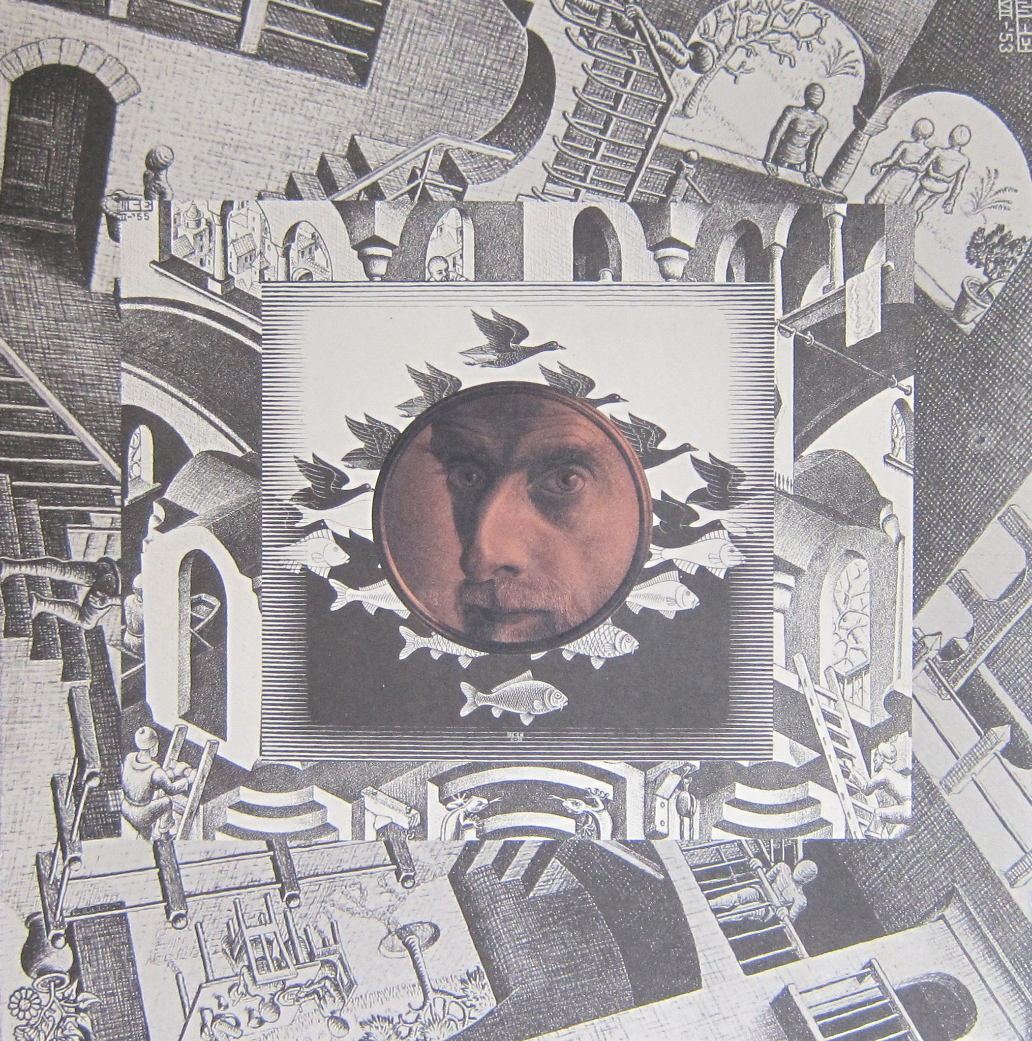
It was 5 years ago that i discovered an Escher title that i never had encountered before.
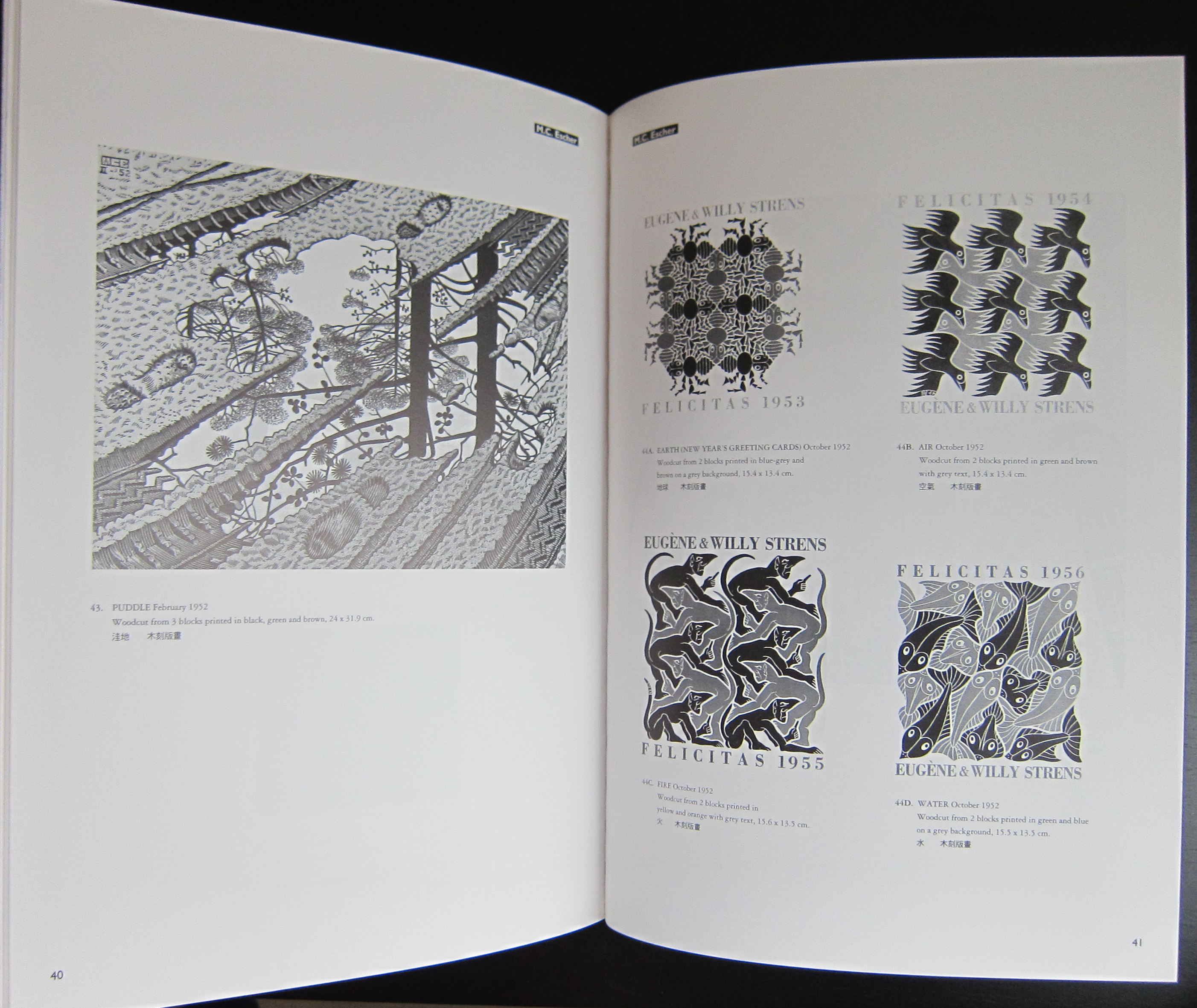
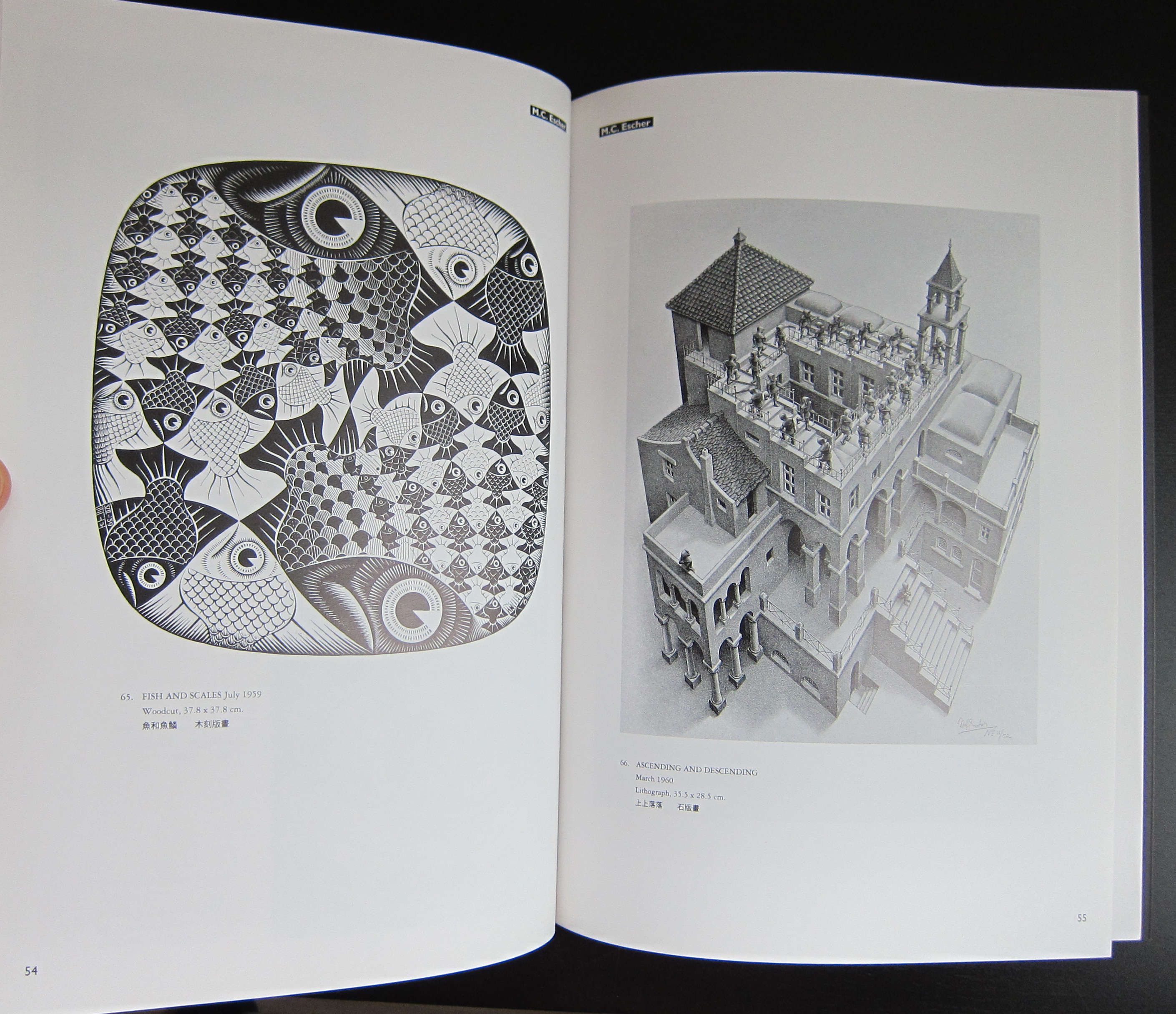
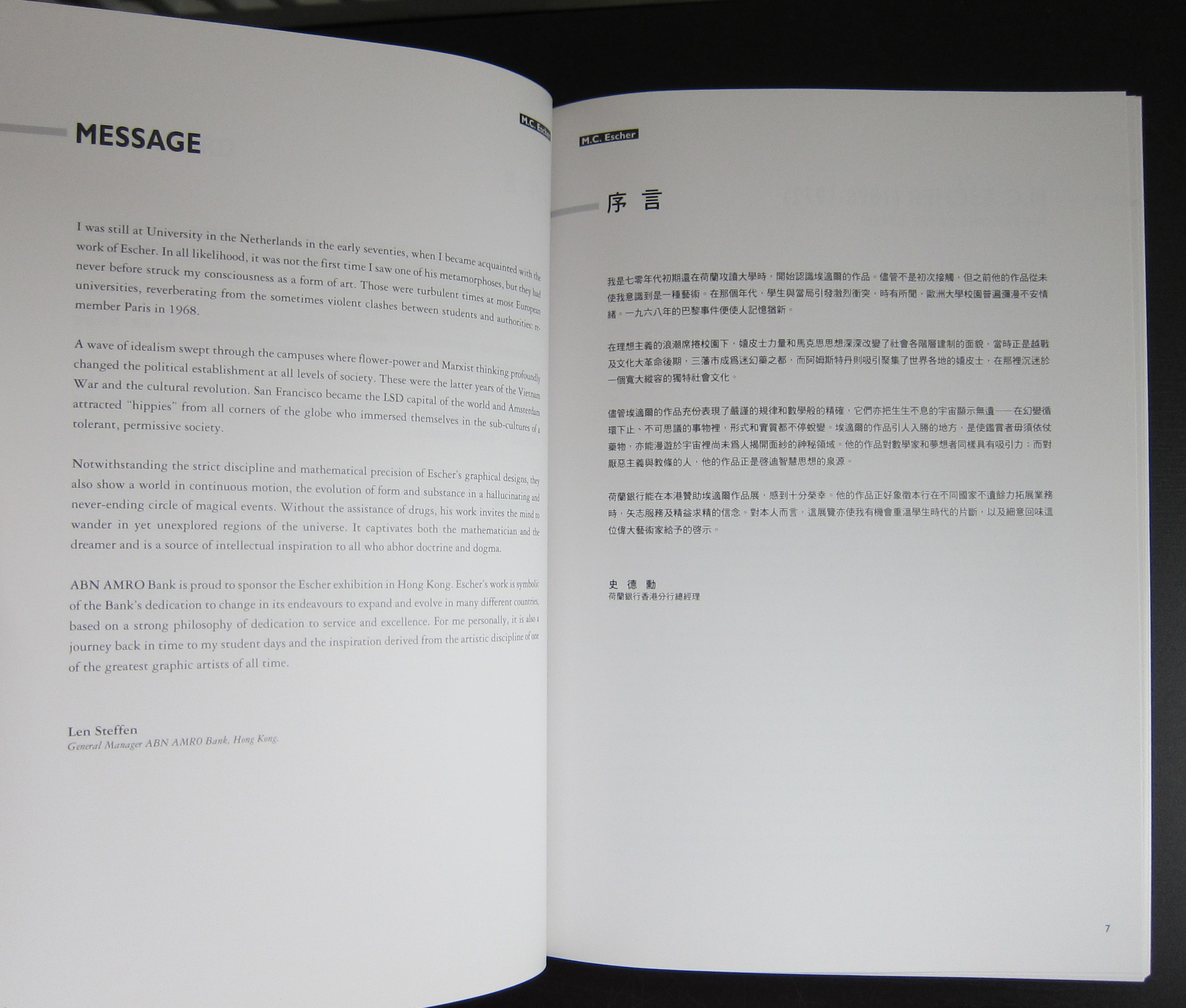
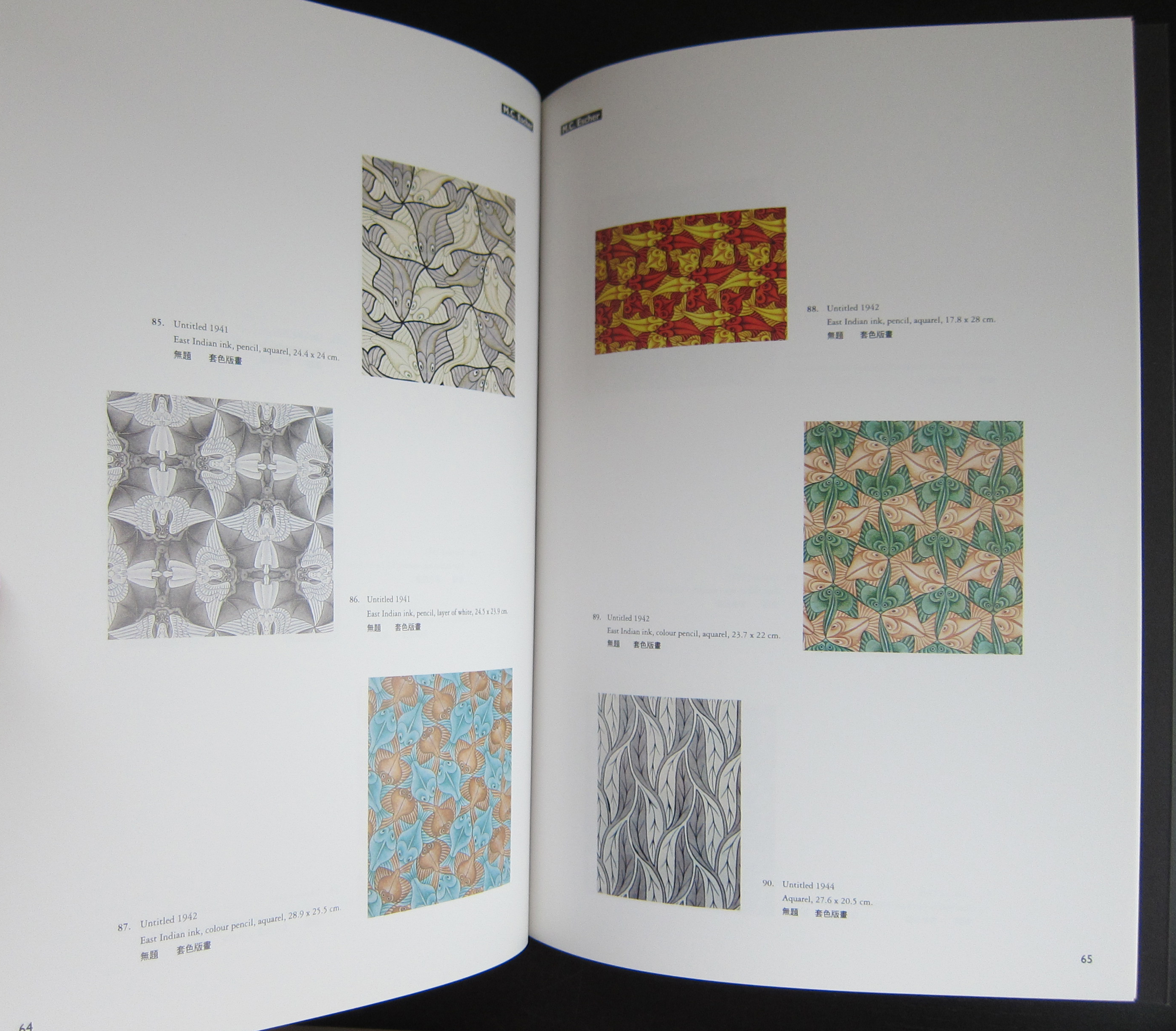
This can be explained easily, because the publications was initiated by the Fung Ping Shan museum, which is now not only a museum but also a University and Art gallery in Hong Kong. Publication by this museum are rare and it is even more exceptional to encounter one of their publications in Europe. This is one of the smaller museums in the world and i do not know how they managed to get an Escher exhibition, but i suspect it was bought from Cordon Art. Cordon Art is the sole owner of the reproduction rights of the works by M.C Escher and probably has still the largest collection of original works by the artist. It was 1994 that this book was published and what strikes me most is that the reproduction and print quality is the best that was possible in those days. The book outshines other Escher publications from that era and is possibly the best that was published on the artist in the nineties. Escher is always present in the inventory of www.ftn-books.com , but this one is rare and probably a one time offer .
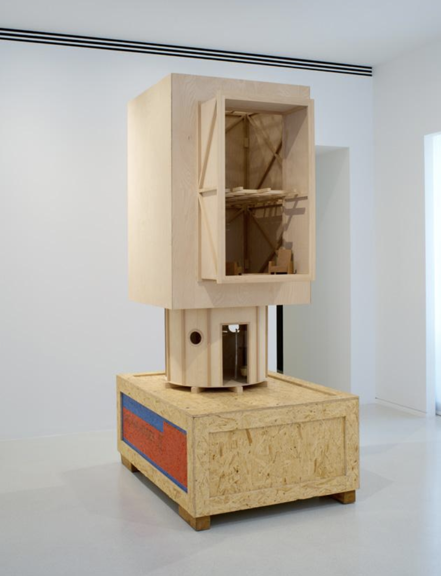
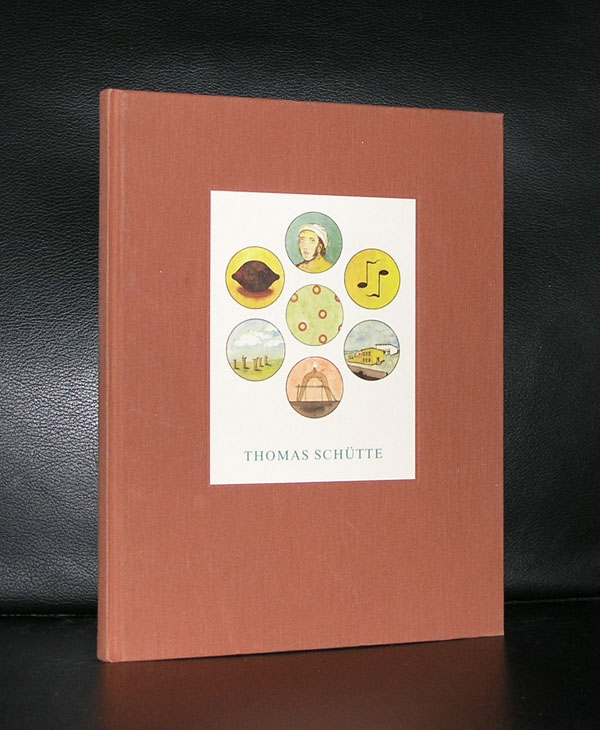
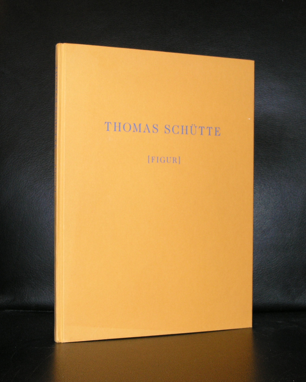
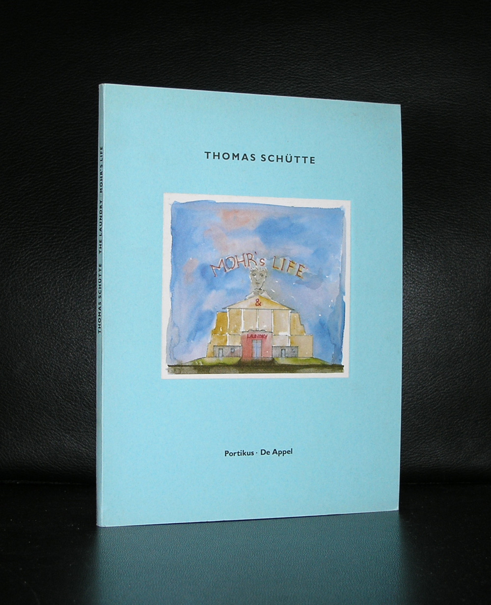
For me there are two personal reasons to love the works by Thomas Schütte. The first reason for me is his architectural art. Always trying to find a different approach to architecture makes his works interesting and in the same category as the architectural works by John Hejduk.
Secondly there is his publications. Meticulously designed books. Published by the best publishers, printed by the best printers and from start to finish typical Thomas Schütte productions. These books are among the best art books published in the last 50 years and i am proud to have some of them in my inventory of www.ftn-books.com
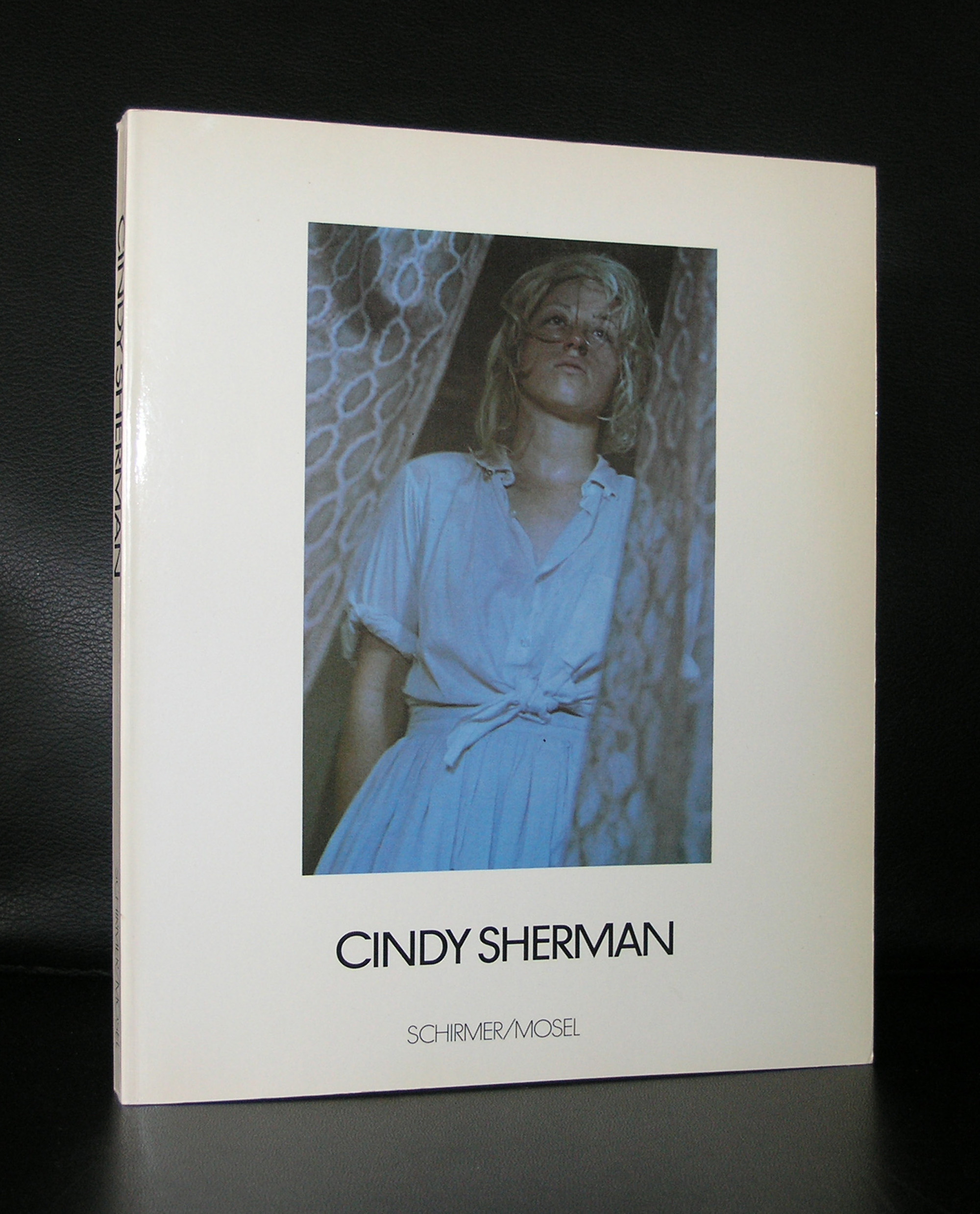
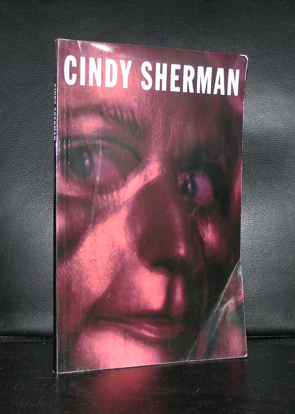
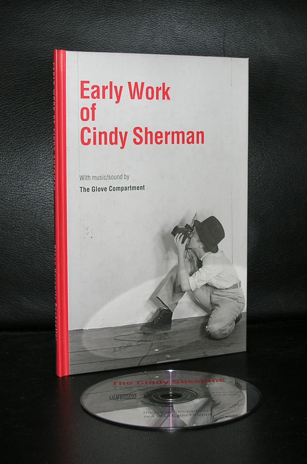
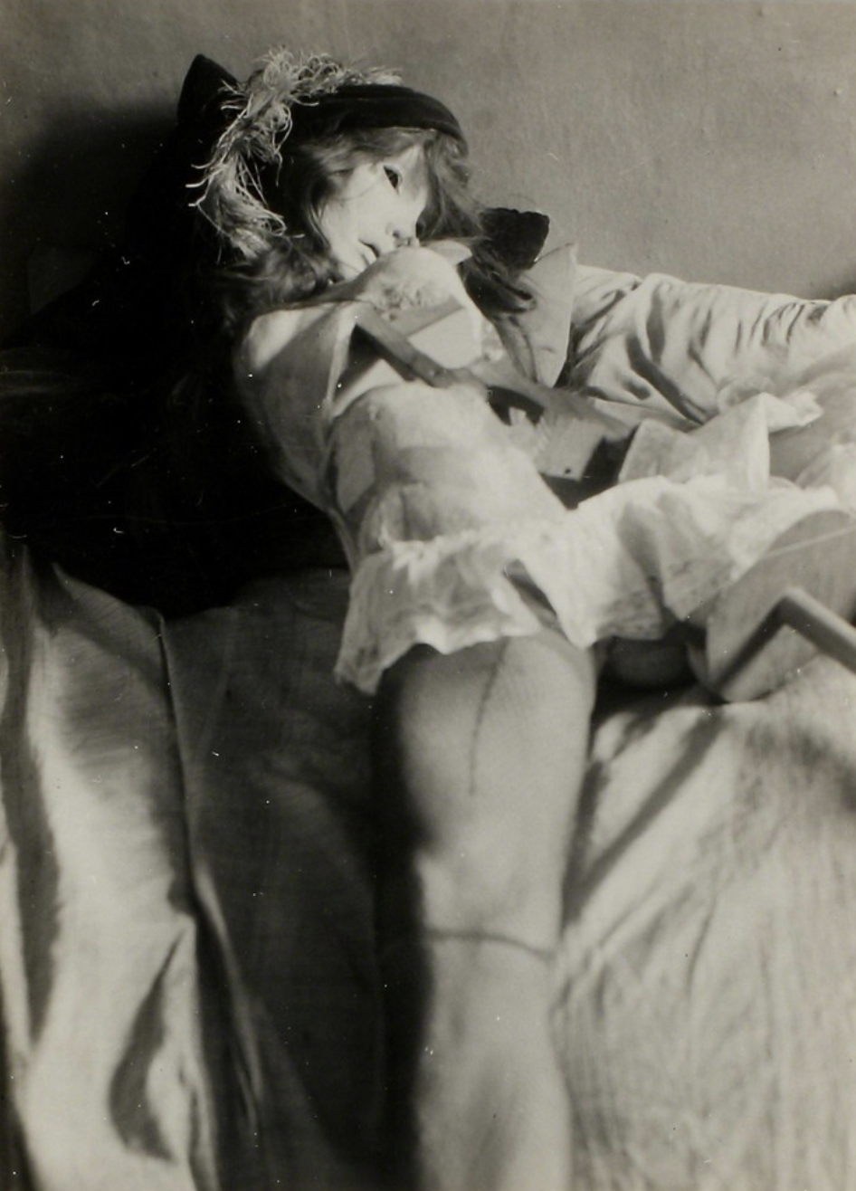
It wasn’t to difficult to find a good portrait of Cindy Sherman on Google, because every picture by Cindy Sherman features …Cindy Sherman. So before the craze of the selfie photography , Sherman already made “perfect” selfies, every time staged in a different setting.
She has become world famous with these photographs and had in the Netherlands on several occasions exhibitions, including the retrospective in the Boymans van Beuningen, which catalogue is available at www.ftn-books.com
OLYMPUS DIGITAL CAMERA
OLYMPUS DIGITAL CAMERA
OLYMPUS DIGITAL CAMERA
OLYMPUS DIGITAL CAMERA
OLYMPUS DIGITAL CAMERA
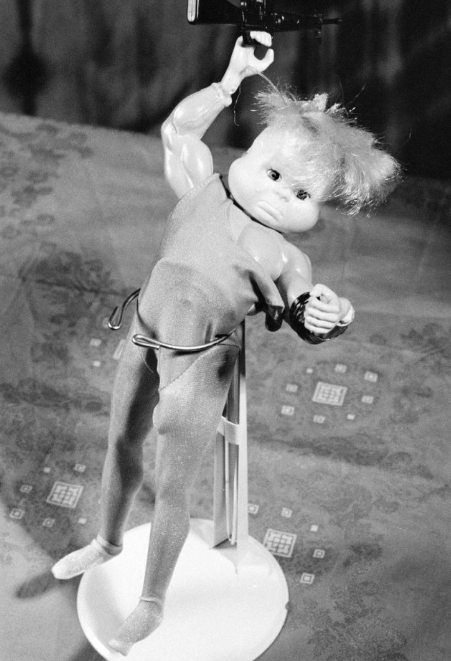
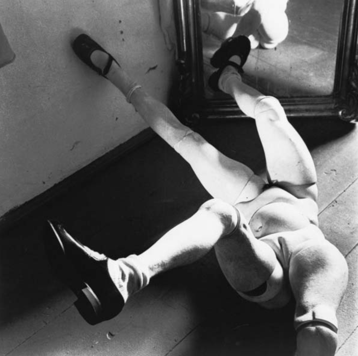
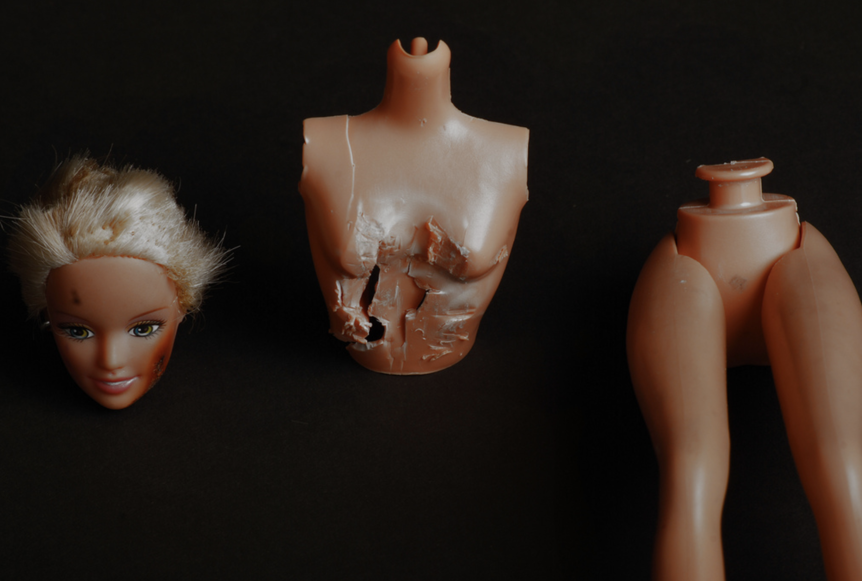
One exception is that at one time in her career she wasn’t present in het photographs. In 1992 Sherman embarked on a series of photographs now referred to as “Sex Pictures.” For the first time, Sherman is entirely absent from these photographs. Instead, she again uses dolls and prosthetic body parts, this time posed in highly sexual poses. Prosthetic genitalia – both male and female – are used often and photographed in extreme close-up. Photographed exclusively in color, these photographs are meant to shock. Sherman continued to work on these photographs for some time and continued to experiment with the use of dolls and other replacements for what had previously been herself.
When i looked closely at these photographs i found a great resemblance with the POUPEE photographs by Hans Bellmer. I might be wrong, but because of this resemblance i find this series much less interesting than the photographs with Sherman in them.
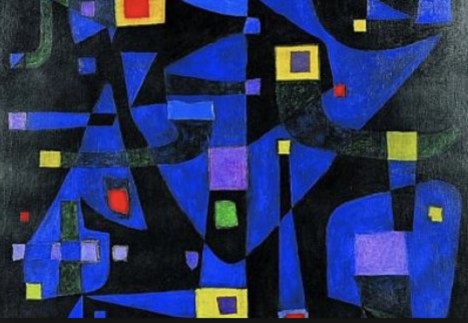
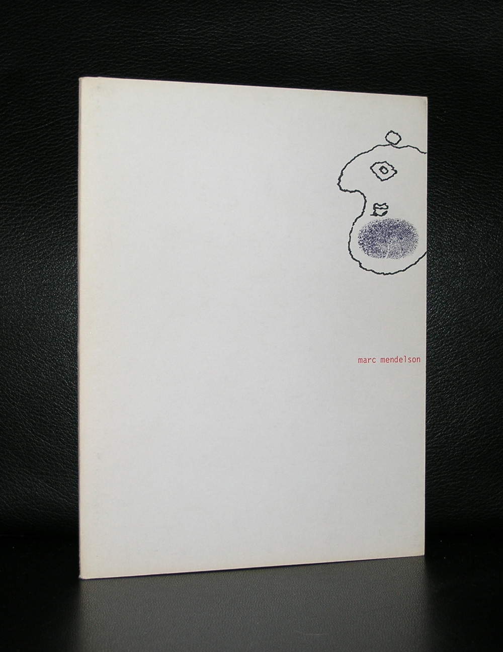
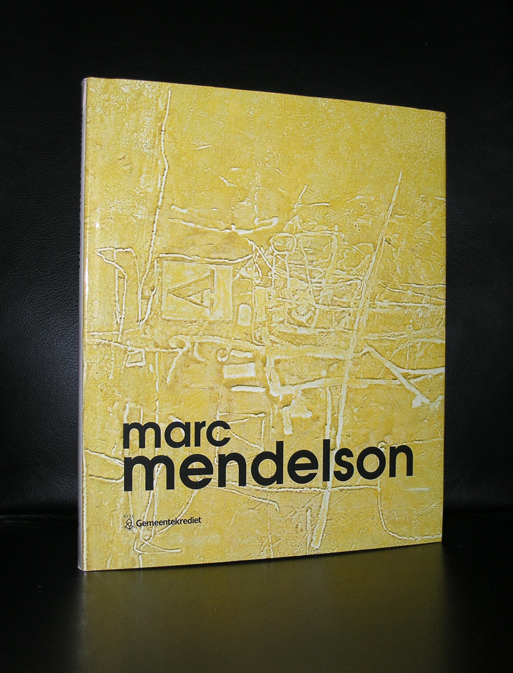
Born in the UK, but worked and lived for most of his life in Belgium. He is considered to be part of the Cobra mouvement, but was not a participating member of the mouvement. Many people know his work without knowing that it is by Mendelson, because the mural in Brussel’s subwaystation “Parc” is by his hand. The development of his style and work is something special because he started as a figurative painter, became an abstract one and for the final part of his life he became a figurative painter again. Personally i stumbled upon his works , because at one time i could buy a large book on him in a remainder sale and became fascinated by his abstract works and maybe i can convince you with this blog too of his qualities as a painter and to read something more about Mendelson after seeing these beautiful abstract paintings.
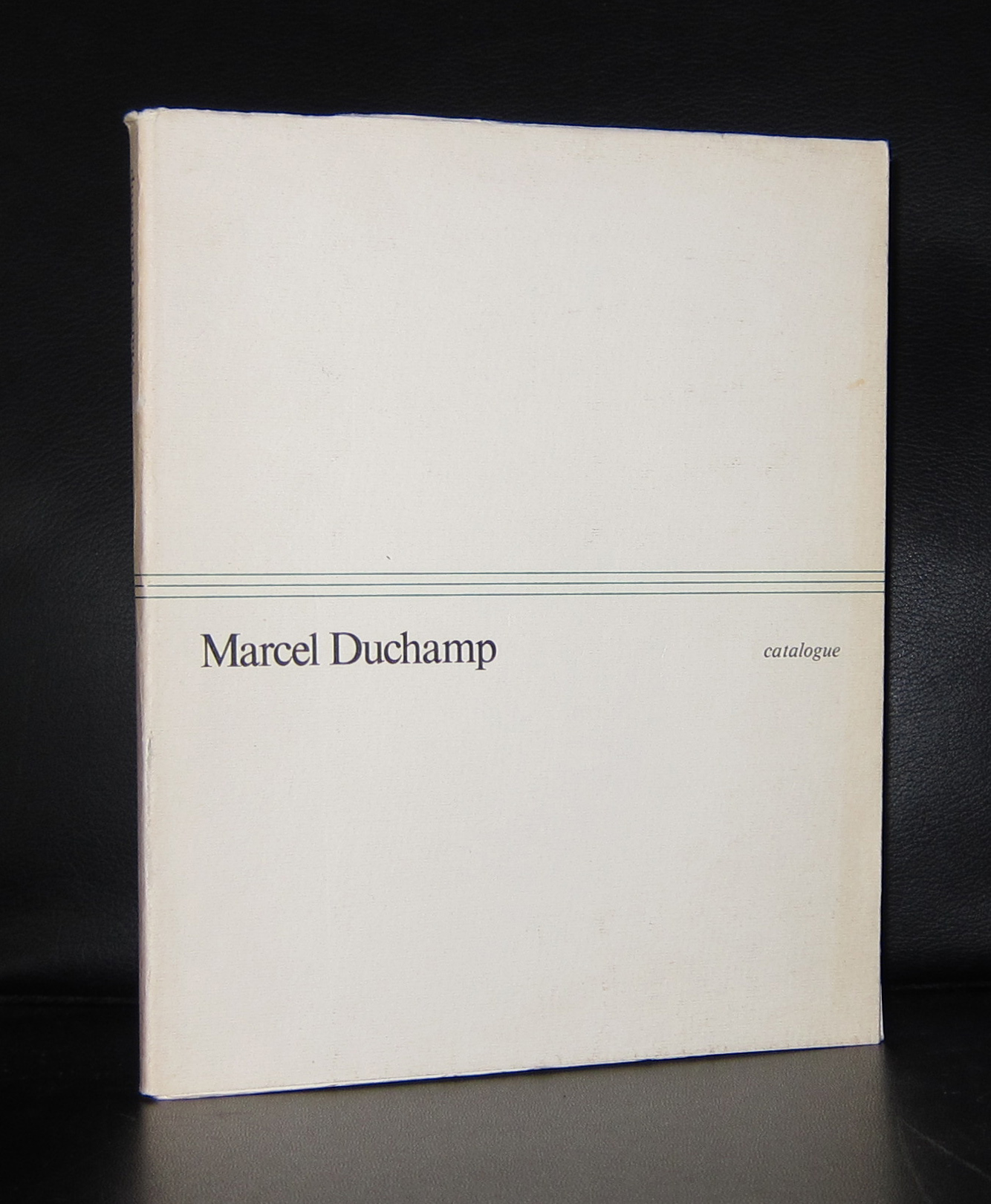
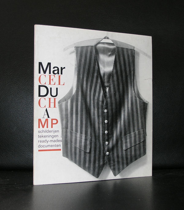
I did not know, but Marcel Duchamp’ s drawn moustache and beard on the Mona Lisa has a title;
L.H.O.O.Q.
The poster with the drawn moustache and beard was recently sold at auction and i noticed the typical and absurd title Duchamp had given it. You can pronounce it as Look but it can also be the abbreviation of the french words ” Elle a chaud au cul”…translation she is horny. Humor by Duchamp , who works are filled with this kind of “jokes”. Duchamps titles are available at www.ftn-books.com
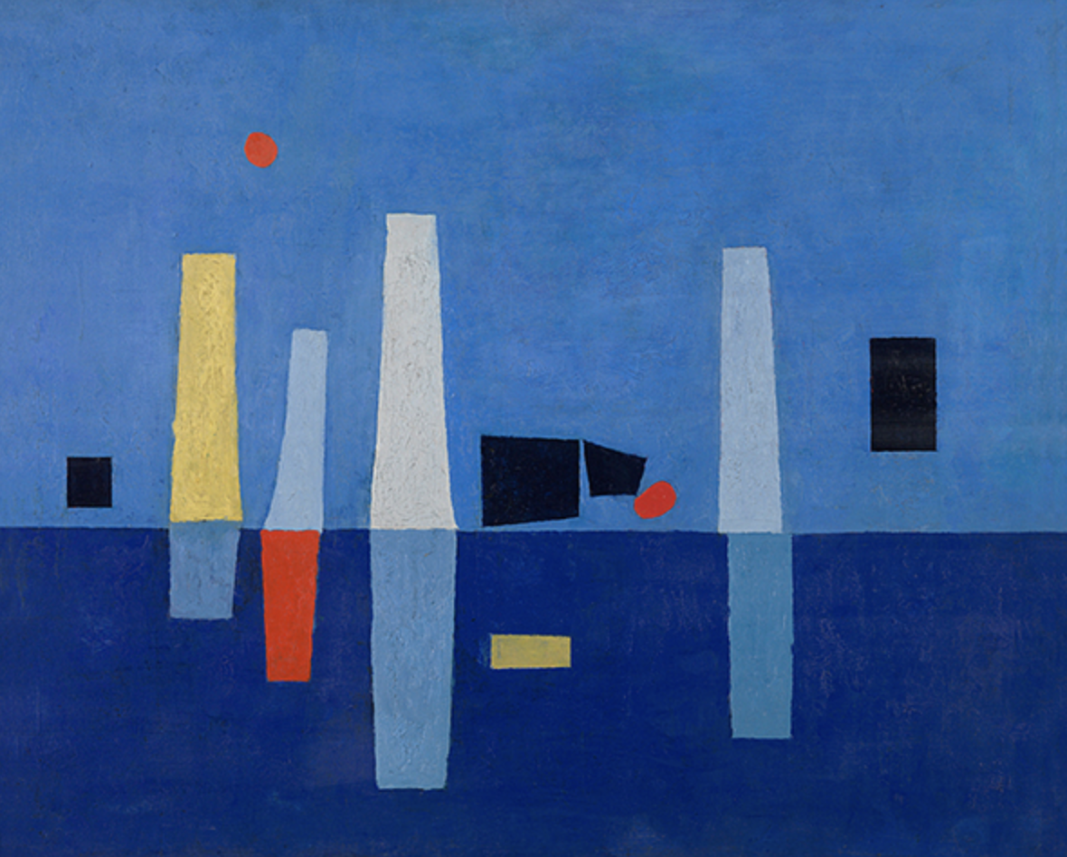
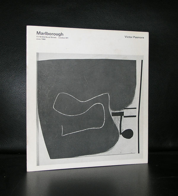
Victor Pasmore (1908 – 1998) was born in Chelsham, Surrey, the son of a well-known physician and mental specialist and an amateur painter. He was educated at Harrow School where he first became seriously interested in painting. Following the sudden death of his father he had to abandon his studies at the Central School of Arts and Crafts where he had studied under A. S. Hartrick, an artist who had worked in France and who knew van Gogh. Pasmore, who had expected to go Oxford and then on to The Slade School of Art, now had to find employment as a clerk in the Public Health Department in London instead, a job he held until 1937.
During this time he joined the London Artists’ Association and had his first solo exhibition at their Cooling Galleries on Bond Street in 1933. In 1937 Pasmore left the Public Health Department and formed an independent art school with fellow artists Claude Rogers, Graham Bell and William Coldstream in Fitzroy Street. The school’s first show in 1938 coincided with its move to 316 Euston Road which led to the art critic Raymond Mortimer to identify them as the Euston Road Group. Pasmore himself moved to a studio at 8 Fitzroy Street, formerly occupied by Sickert and Whistler, and spent his time teaching and painting.
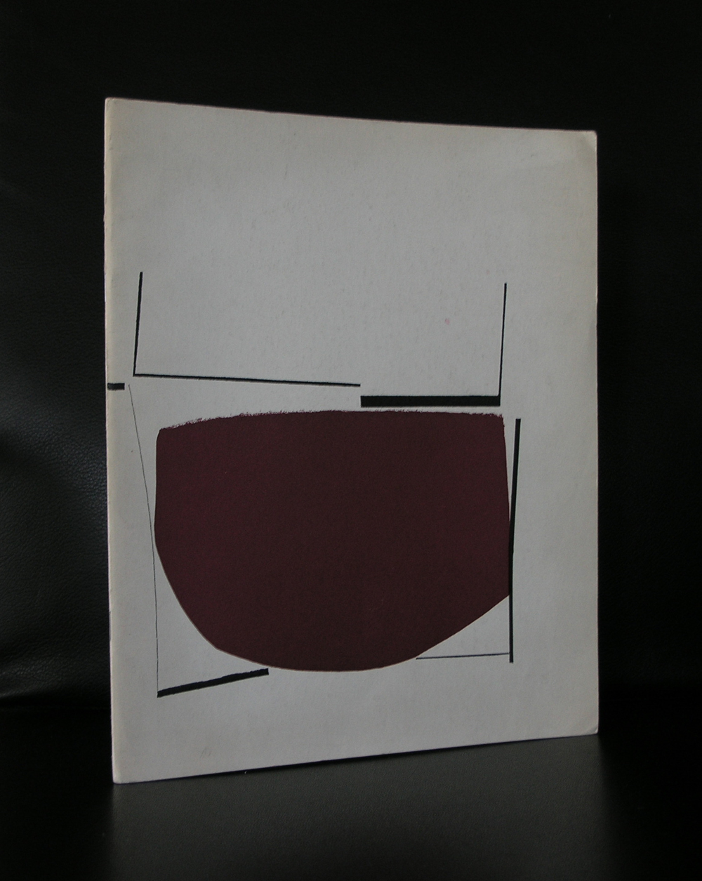
Pasmore abandoned visual representation and developed a purely abstract style in 1947. His work, often in collage and construction of reliefs, pioneered the use of new materials and was sometimes on a large architectural scale. He held his first abstract solo exhibition at the Redfern Gallery, London, in 1948. Herbert Read, an important art critic of the time, described Pasmore’s new style as ‘The most revolutionary event in post-war British art’. In the summer of 1950 he visited St Ives where he became associated with Ben Nicholson and Barbara Hepworth and joined the Penwyth Society, the local exhibiting group. www.ftn-books.com has some nice Pasmore titles available.
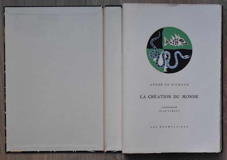
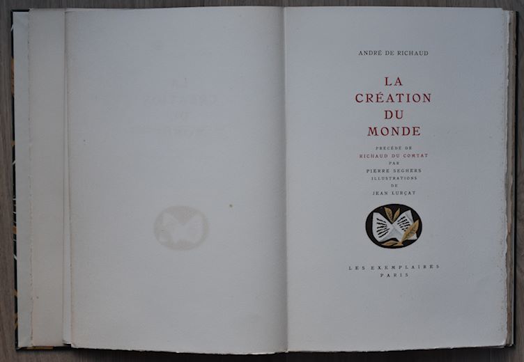
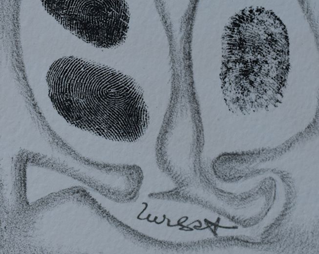
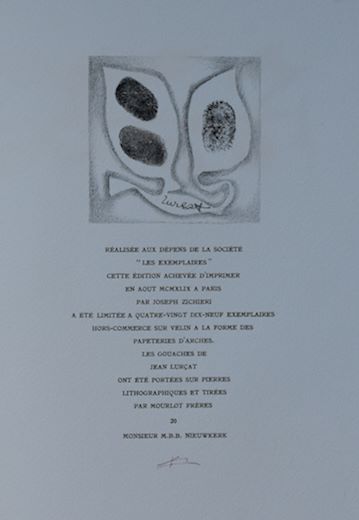
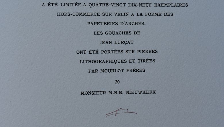
Jean Lurcat, is not forgotten by those who are interested in the art of the 40’s and 50’s from last century. A contemporary and ground breaking artist who’s works can be considered among the best that french art has produces in those decades. When i have to describe his art it would be something in between a Picasso and Matisse style, but totally Lurcat and original. Sandberg recognized his importance and made an exhibition with his works in 1959 in the Stedelijk Museum.
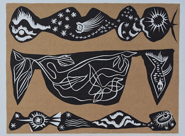
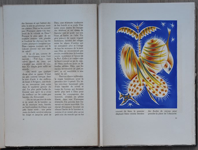
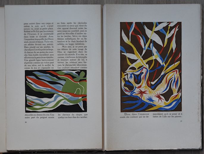
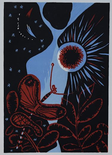
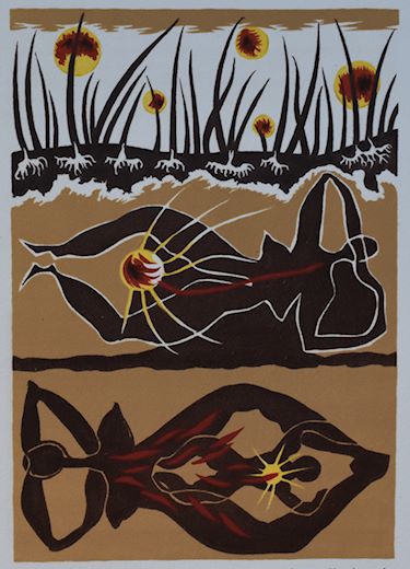
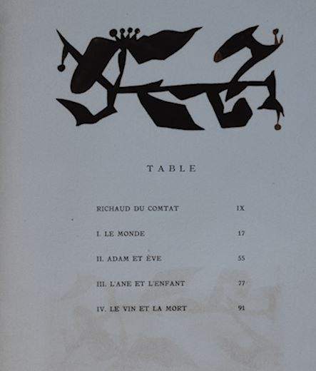
My interest was awakened last year , because i had the opportunity to buy possibly the most important book published with Lurcat lithographs. Published in an edition of only 99 copies, signed by the artist and numbered in print ( This is no. 20). The book LA CREATION DU MONDE, was published by Les Exemplaires with a story by Andre de Richaud and contains in total 56 original lithographs by Jean Lurcat. The book was printed by Mourlot/ Paris who was the leading printer for original lithographs in those days . Because of their qualities they were commissioned by the Galerie Maeght for their art publications too. The book is one of the highlights in my inventory and would grace many art book collection, but as always pictures tell a better story than words. Therefore i give you an impression of this magnificent publication which is now for sale together with the Sandberg designed catalogue at www.ftn-books.com
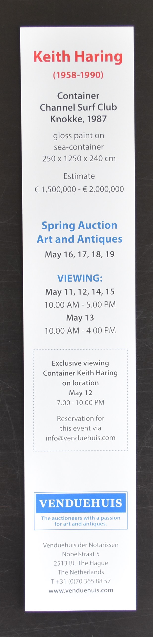
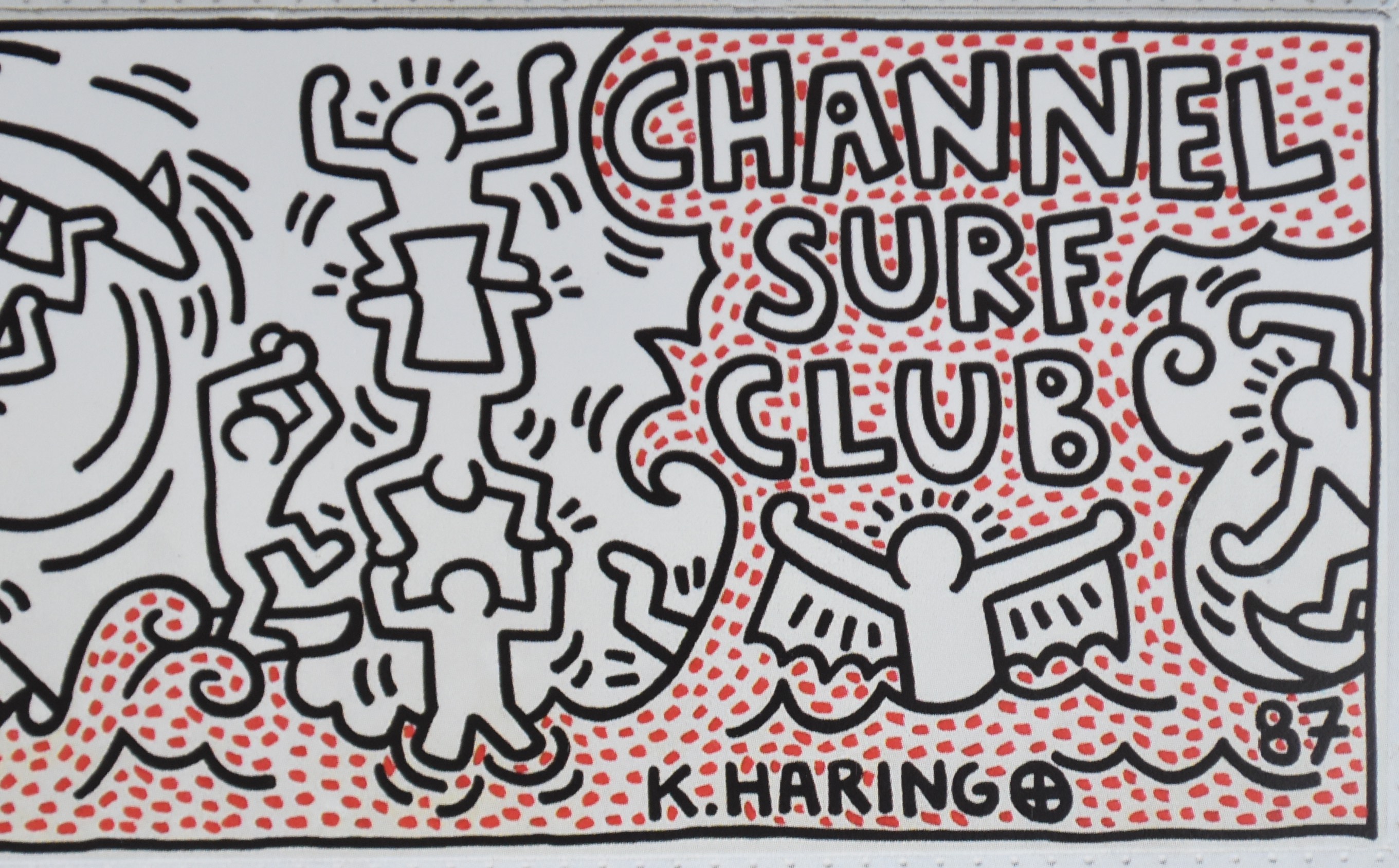
The year 1987, location Channel Surf Club in Knokke Belgium
Quote from the Keith Haring Journals, Penguin 1997, page 221
” I began mural and immediately attract a crowd. By the time i finish, to applause, there are 50-60 people watching. The sun is really hot and i wear sunblock and a hat. The audience is incredible ”
This container mural was put of for sale in last auction season and found in the after sale an appreciative buyer. But to attract more visitors for the auction a bookmark/invite was published of this exceptional piece of art and it is available at www.ftn-books.com.
Below you will find the text as published in the auction catalogue and it is well worth reading.
An important blog on an important subject. The Joods Historisch Museum in Amsterdam shows the complete set of “LEBEN ODER THEATER” the magnificent works by Charlotte Salomon . It is the equivalent of a written diary of her life in Auschwitz before she was murdered. The complete original set is now on show at the Joods Historisch Museum until the 25th of March 2018, but…. not only the complete set is on show, there is another way of viewing the set…..for those who are interested and live to far away you can view the complete set at :
This is what makes the internet worthwhile, so visit this site and convince yourself why this is not only a historical important work, but also a great work of art by a gifted artist.
www.ftn-books.com has the very rare first dutch publication on Charlotte Salomon availablel at www.ftn-books.com
Artist/ Author: Oliver Boberg
Title : Memorial
Publisher: Oliver Boberg
Measurements: Frame measures 51 x 42 cm. original C print is 35 x 25 cm.
Condition: mint
signed by Oliver Boberg in pen and numbered 14/20 from an edition of 20


 The year 1987, location Channel Surf Club in Knokke Belgium