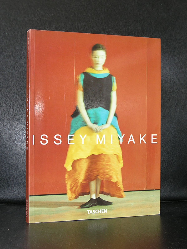
The first time i encountered the name of Issei Miyake was when an exhibition in the Nederlands Kostuummuseum was organized by curator Ietse Mey. The pleated fabrics by Miyake impressed and on a later occasion at the Groninger Museum i became an admirer of his designs.
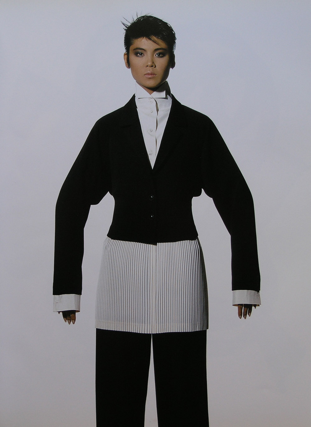
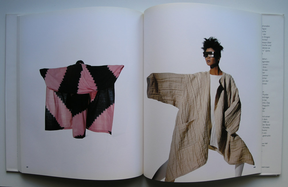
Miyake has not become a mainstream designer and his designs are to complex to be worn in daily life, but he is important and he developed under his own brand name “l’Eau d’Issey” a range of balms and aftershaves which have become highly successful and made him a wealthy man. One publication must be discussed in this blog, because it is one of the best fashion photo books ever and its printing is outstanding and probably the reason why this is such a beautiful book. The fashion designs “shine” and look to float on the white blank pages. The photography is by Irving Penn, who made this the ultimate Issey Miyake book. Highly recommended and available at www.ftn-books.com
A Book market visit yesterday….. and some lucky finds. There is of course the very rare Karl Gerstner: Typographisches Memorandum which i found in very good condition. The copy will be available from today at www.ftn-books.com
I believe that this is the only copy currently on the market
Here are the pictures of this excellent and rare publication by Karl Gerstner.
The other books were perhaps less spectacular and not as rare as the Gerstner book, but it struck me that some great typographical designs were made by the end of sixties and in the early seventies and these are no exception. Please take a look at the photograph and see the covers by some lesser known designers like Philip Luidl, Wim Strijbosch, Hans Barvelink, Louis Emmerik and Siegfried Odermatt. Not the household names you encounter frequently in this blog and not as rare as the Gerstner publications i now have in stock, but great quality designers who made some outstanding covers/books.
Until the end of the month there is a special discount on the Gerstner publications i have in stock. Use GERSTNER10 to receive a 10% discount on the Gerstner publications. Valid until the 31st of March.
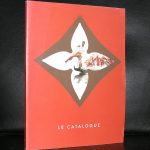
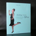
This morning i learned that one of the great fashion designers died. At the time i was working at the Haags Gemeentemuseum, the curator Ietse Mey, organized an exhibition of the fashion by de Givenchy worn by Audrey Hepburn and to enhance the exhibition a film festival was organized at the Filmmuseum with fashion worn by Audrey Hepburn in the movies. At the occasion of the opening i saw both celebrities and it struck me, that even as mrs. Hepburn was already ill at that time, she looked radiant and beautiful. The show was a huge success and one of the first in a long line of fashion exhibitions which were held at the museum. The catalogue is of course completely sold out , but sometimes you will encounter a copy on the book markets. If you find one….do not hesitate to buy it, because it is rare. An edition of only 1000 copies means that it was sold out almost instantly and it was never reprinted.
Blouin has done an excellent biography on de Givenchy. Here is the text of it and if you are looking for more de Givenchy, Hepburn, LVMH /Louis Vuitton publications check www.ftn-books.com
Tributes continue to come in to Hubert de Givenchy, the French couturier whose elegance defined the 1950s and 1960s and the style of Jackie Kennedy, Audrey Hepburn and more. Givenchy died at the age of age 91 in his sleep on Saturday; his death was announced by his namesake fashion house. During his lifetime, he had received the Chevalier de la Légion d’Honneur in 1983, and a lifetime achievement award from the Council of Fashion Designers of America in 1995.
Givenchy was born in 1927 to a religious aristocratic family. He learned the couture “métier” from working for Jacques Fath, Robert Piguet, Lucien Lelong, and Elsa Schiaparelli, before founding his own namesake label. Givenchy would later establish his Parisian atelier across the street from Cristóbal Balenciaga, who was his dear friend and his longtime role model. He was also influenced by Madame Grès and Christian Dior, and inspired by artists. He notably created taffeta evening coats and robes du soir in homage to Joan Miró during the 1970s.
His first collection was presented in February 1952; it featured modern separates, providing more affordable and versatile options than the haute couture looks that were standard in the French fashion world in the middle of the 20th century. Nonetheless, Givenchy also made opulent and heavily embellished garments (with pearls, feathers, and ribbons), impeccable cocktail ensembles, and elegant accessories, notably sumptuous hats. He was known for dressing a wealthy, stylish clientele: Jacqueline Kennedy was a longtime client, as was Grace Kelly and the Duchess of Windsor.
The darling of the Givenchy fashion narrative, however, was Audrey Hepburn. They met when a mutual friend told the designer that Miss Hepburn was keen to be introduced, and Givenchy assumed the lady in question was Katherine Hepburn. Their friendship blossomed despite the misunderstanding, and Givenchy ended up making costumes for Audrey Hepburn’s then-upcoming film, ”Sabrina” (1954)—as well as “Funny Face” (1957), “Breakfast at Tiffany’s” (1961), “Charade” (1963), and “How To Steal a Million” (1966). While Givenchy and Hepburn created many iconic sartorial moments on film, perhaps none rivaled the glamorous wardrobe of Holly Golightly, the onscreen heroine of “Breakfast at Tiffany’s,” who walked down Fifth Avenue wearing dark sunglasses, pearls, evening gloves, and a black Givenchy column dress. (In 2006, the dress was sold at a charity auction at Christie’s in London for six figures).
Givenchy was also associated with various successful perfumes: from the fruity and feminine L’Interdit (created in 1957 for Hepburn) to the heavily floral Amariage (created in 1991).
Givenchy sold his fashion house to the LVMH Group in 1988 and retired after his collection in July 1995. John Galliano succeeded him; less than two years later, he in turn was succeeded by Alexander McQueen, then Julien Macdonald. Riccardo Tisci held the reigns from 2005 until 2017, much to the original designer’s displeasure. Currently, Clare Waight Keller is the label’s Artistic Director.
In March 2016, the fashion house created an archival department to conserve and promote all garments and accessories dating from the original designer’s tenure, from 1952 to 1995. Just last year, the Museum of Lace and Fashion in Calais in northern France celebrated Givenchy’s work and presented 80 beautiful looks and accessories that spanned his career.
The second day for the extra focus on the classics within the inventory of www.ftn-books.com
This time it is Picasso. Although i personally am not a great fan of Picasso, there are so many others that admire this Spanish artist and for them …take notice that this is the last day that the discount code is valid. Not only the many publicatons on Picasso are sold with a discount of 10%, but all publications and specials within the inventory go with a discount.
use : CLASSIC10 at your checkout and receive the discount.
Next June 2018 the former students of the Art Academy in Bari will have their yearly show. Among them is is Giovanni Nicolai to whom i devoted a blog about a year ago. You never know when you are going to visit the beautiful Bari region, but keep in mind that beside great olive oil , food and some wines there is also some modern art to see.
Giovanni Nicolai will be among them with some exquisite paintings and drawings, which show his strength. Portraits of elegant gentleman, classic Italian profiles and great technique make these stand out from the others. A baroque artist in nowadays Italian art scene is rare and for those who like Italian art, these works are well worth to check out.
The second exhibition in which Giovanni will have a presence is in the SO art gallery in Milano. If i have more information on both exhibitions i will let my readers know.
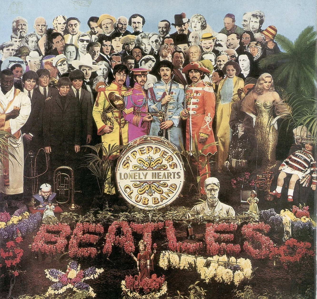
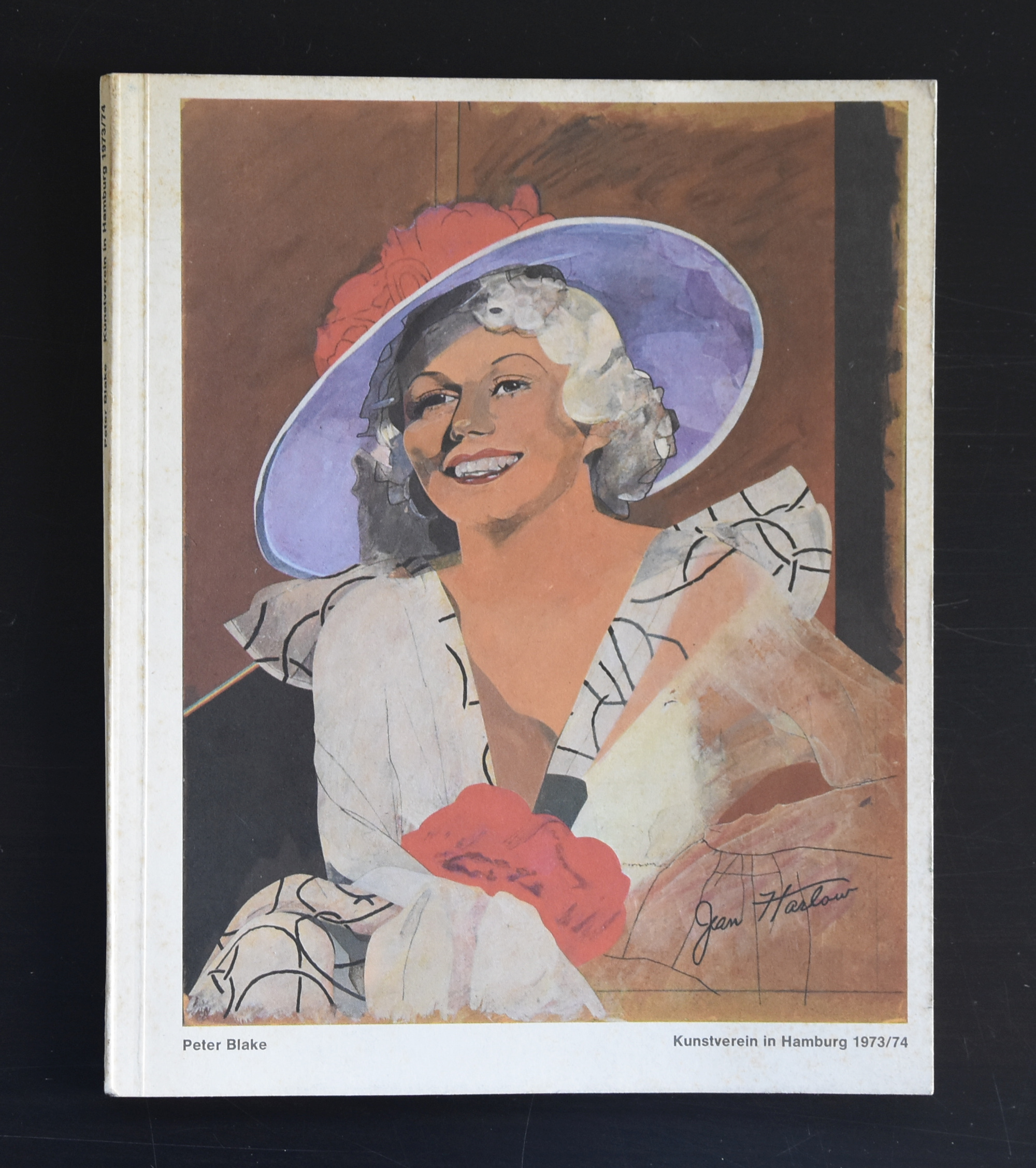
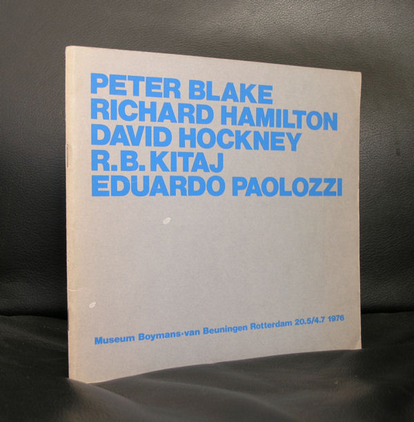
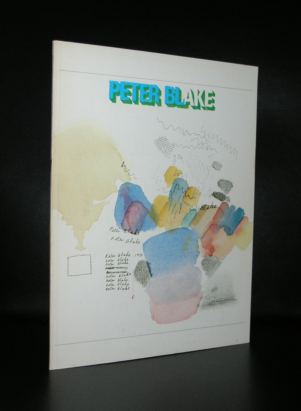
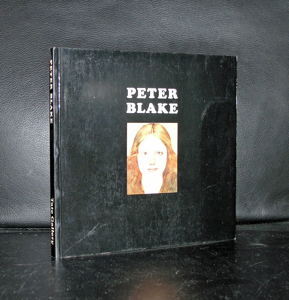
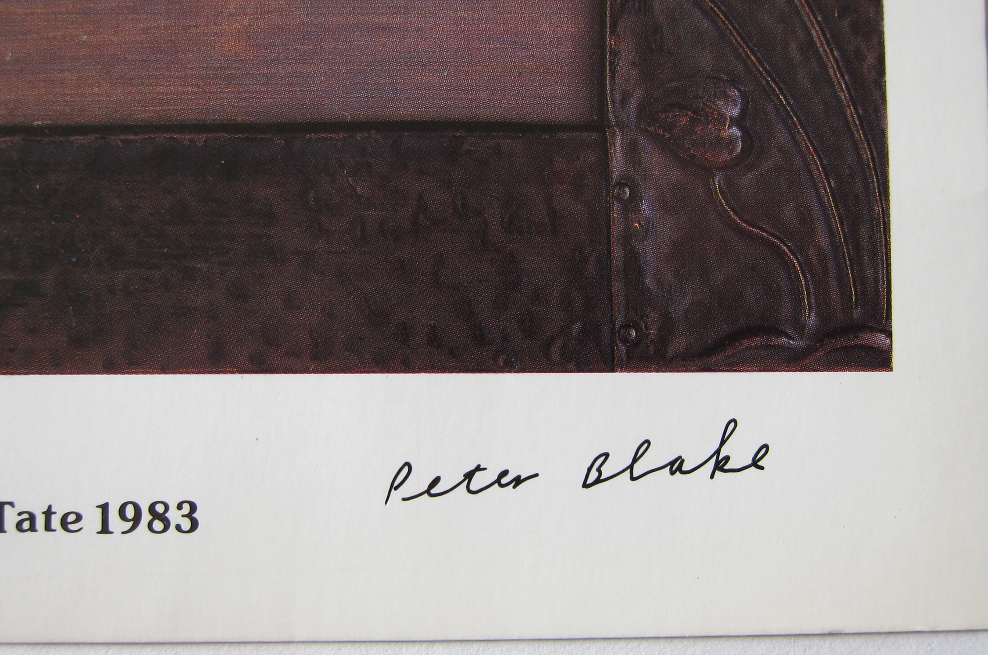
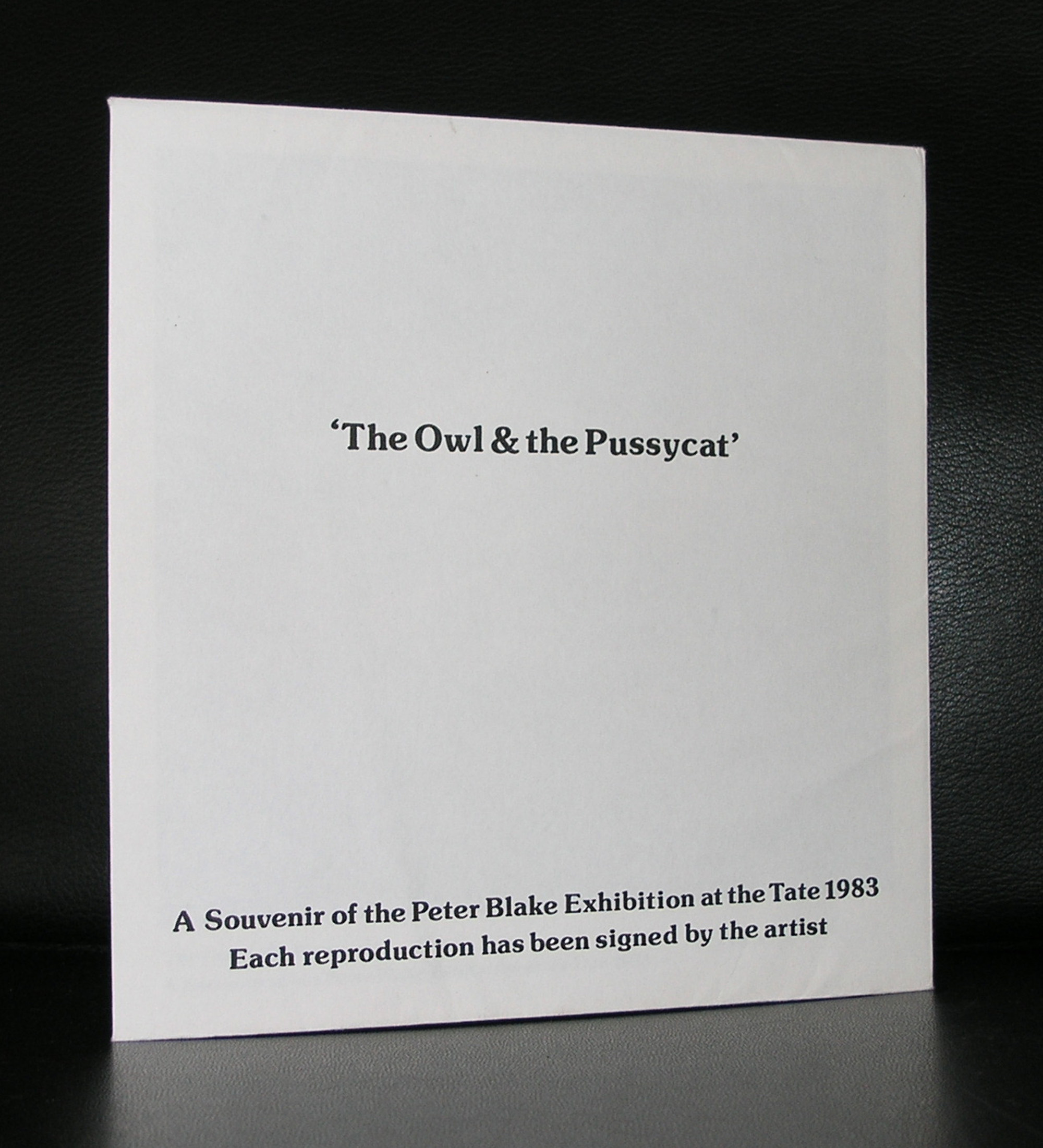
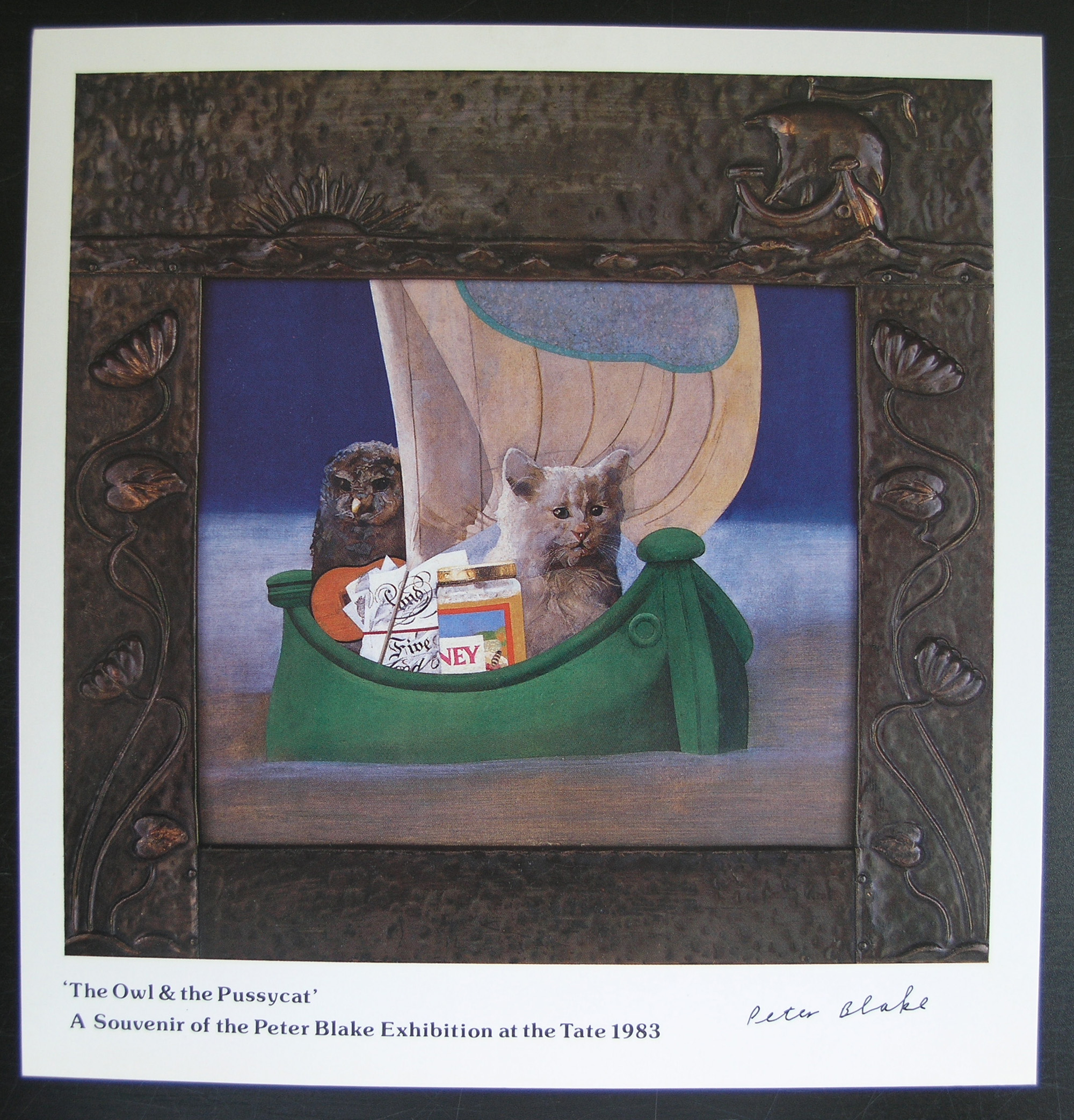
Peter Blake is known by the dutch art lovers as one of the first Pop Art artist who had the opportunity to exhibit at the Stedelijk Museum, Together with this exhibition an excellent catalogue designed by Wim Crouwel was published , bu apart from that his work is becoming more and more important every year. The same with Paolozzi works , this Pop Art is original and authentic and where it was almost forgotten 30 years ago it is now considered among the best art from the 60’s.
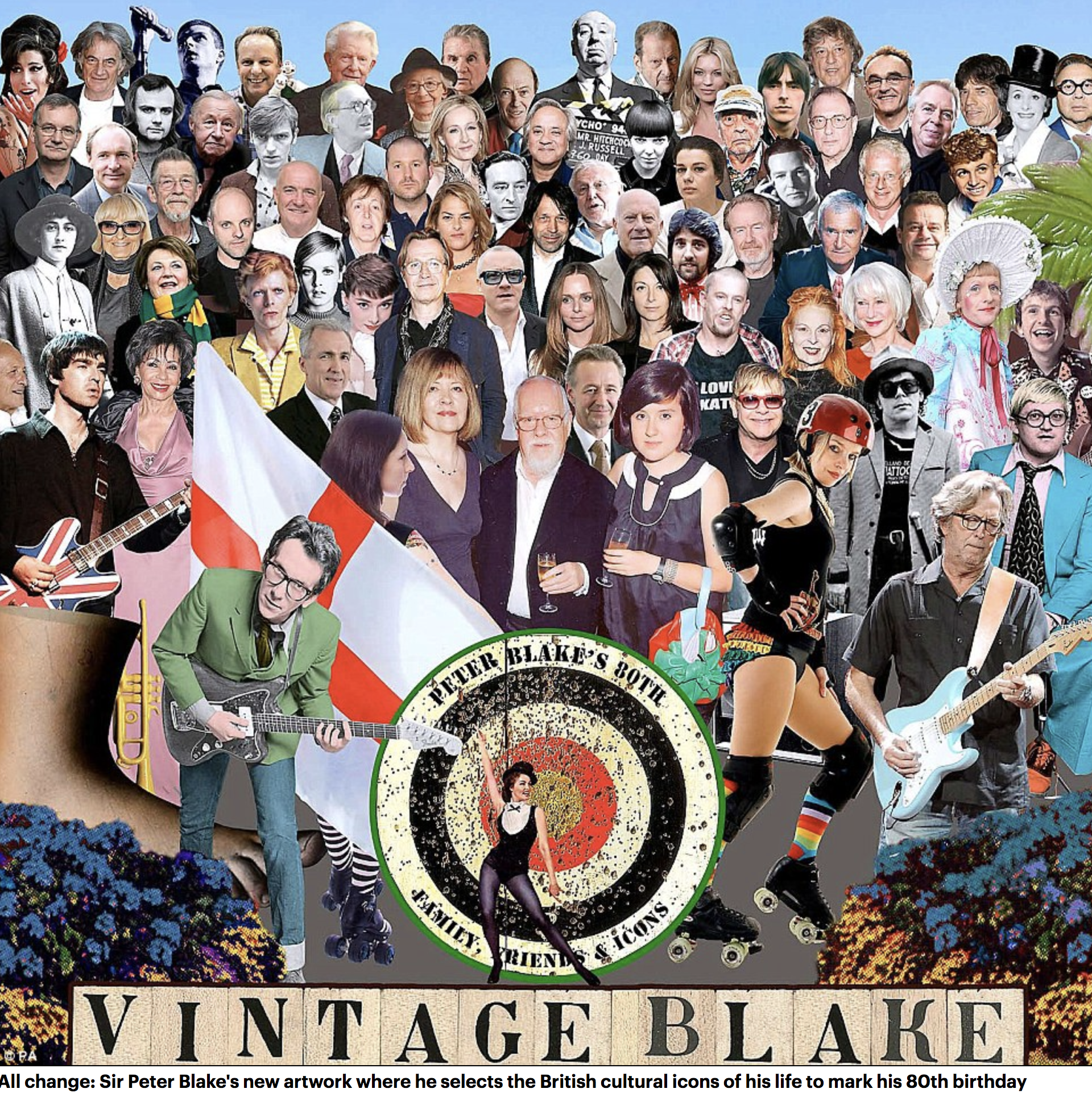
Without knowing, many people have admired Peter Blake’s works and are familiar with it . This, because he was the painter and designer of the Beatles Sgt Pepper album. He even made a second version for Liverpool being cultural capital of Europe in 2008.
In the original 1967 work, the Beatles form the centrepiece wearing colourful military-style outfits while their wax models also feature. However, in the 2012 piece, the faces of Ringo Starr and the late John Lennon and George Harrison have all been omitted.
And even Sir Paul McCartney has been relegated to the third row – one behind his daughters Stella, the fashion designer, and Mary, the photographer. Blake, known as the Godfather of Pop Art, has put his own face and images of his family where the Fab Four once stood.
Blake painted several album sleeves. He designed the sleeve for Sgt. Pepper’s Lonely Hearts Club Band with his wife Jann Haworth, the American-born artist whom he married in 1963 and divorced in 1979. The Sgt. Pepper’s sleeve has become an iconic work of pop art, much imitated and Blake’s best-known work. Producing the collage necessitated the construction of a set with cut-out photographs and objects, such as flowers, centred on a drum (sold in auction in 2008) with the title of the album. Blake has subsequently complained about the one-off fee he received for the design (£200[5][6]), with no subsequent royalties. Blake made sleeves for the Band Aid single, “Do They Know It’s Christmas?” (1984), Paul Weller’s Stanley Road (1995) and the Ian Dury tribute album Brand New Boots and Panties (2001; Blake was Dury’s tutor at the Royal College of Art in the mid-60s). He designed the sleeves for Pentangle’s Sweet Child and The Who’s Face Dances (1981), which features portraits of the band by a number of artists.
There are some excellent publications on Blake available at www.ftn-books.com
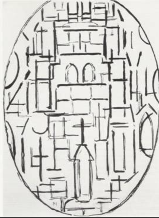
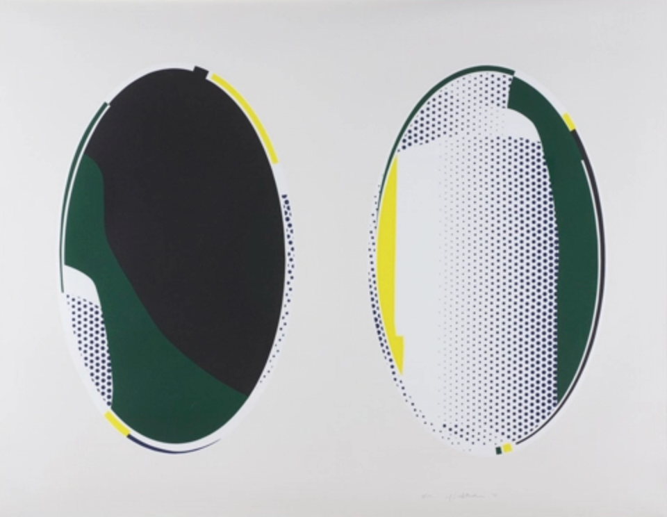
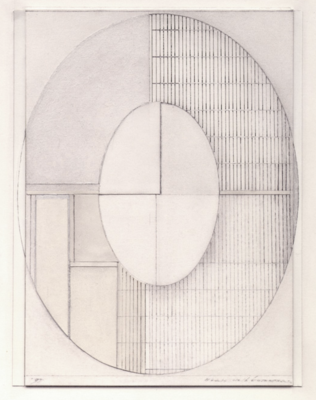
The Oval shape is the less common shape among constructivist, but is was at one time used by some great names in art. Piet Mondriaan used it and also Roy Lichtenstein was a fan and used the shape in his Mirror paintings. Put them beside each other and you will notice similarities between the two. Not only the shape , but also how the space is filled with the composition. I noticed this because a few weeks ago i went to an auction viewing and found the drawings by Henk de Looper for auction. All oval shaped and they really fascinated me.
Here is some information on this forgotten artist who deserves better and is represented by gallery PHOEBUS in Rotterdam.
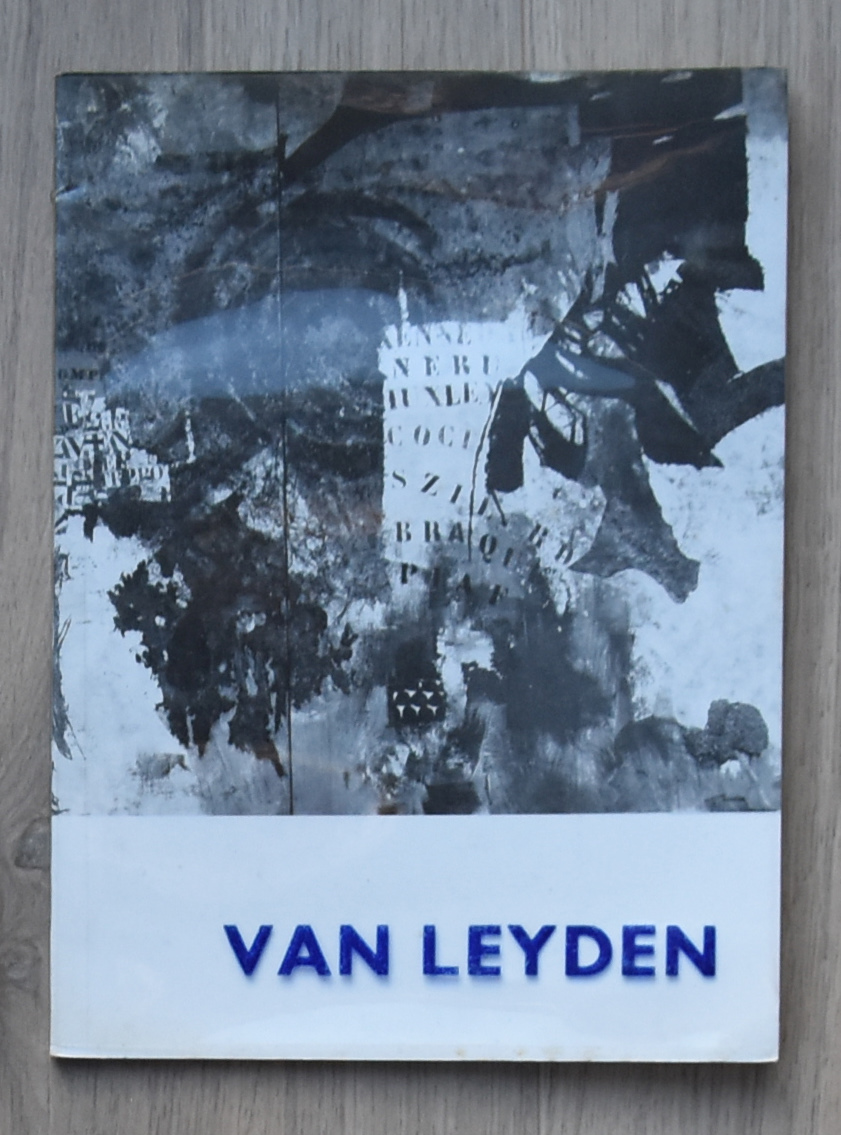
Undeservedly forgotten by most and rarely presented nowadays in exhibitions and gallery presentations. The story of van Leyden is that he fortunately had a loyal group of admirers and collectors, but after trying to give him back his popularity with an exhibition around 2008, it is again complete silence.
Van Leyden was an extremely productive and versatile artist, hugely inspired by his numerous travels: his use of warm colors, striking compositions, and strong rendition – whether figurative or abstract – of people, animals, objects and landscapes made him a thoroughly appreciated artist within a circle of peers and friends to which Picasso, Salvador Dali and Willem de Kooning belonged as well.
It just took a look at a recently acquired catalogue on van Leyden from 1964 and it oozes with quality. Rotella, Villegle and others using the art of collage must have been inspired by van Leyden. Who dares …who presents this great artist again and gives him the stage in Modern Art he deserves to have?
www.ftn-books.com has the Stedelijk Museum and galerie Anderson -Meyer catalogues available for sale.
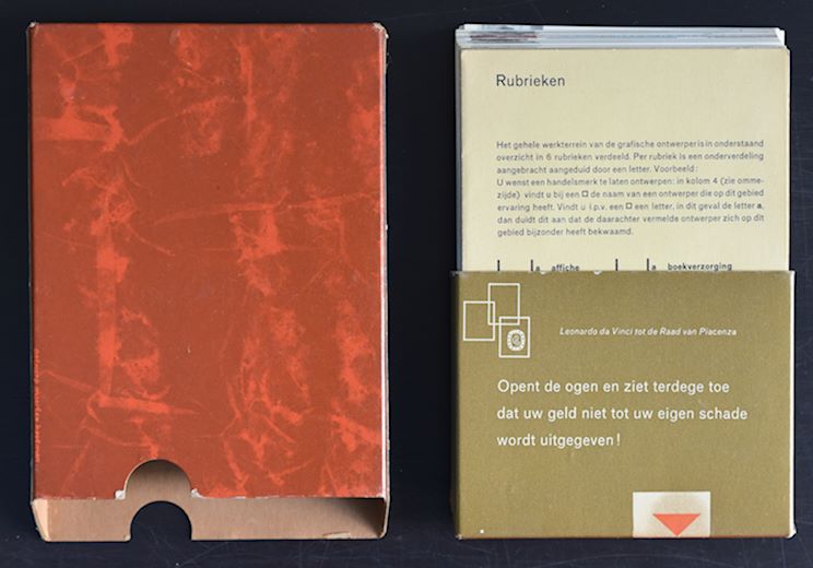
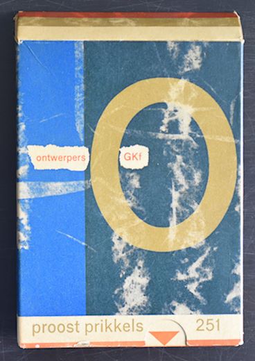
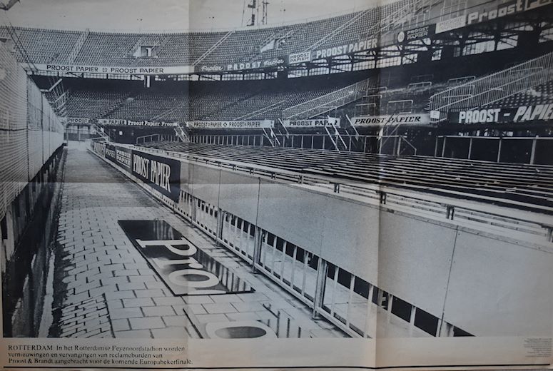
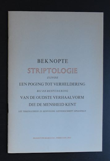
For those working in the printing business, these Proost Prikkels are possible known publications. for the others ….most people do not know them. Proost Prikkels are the publicity prestigious prints by Proost & Brandt paper. There are over 400 of these publications. They appeared irregularly ( between 1936 and the mid eighties), but were always of the highest quality and in most cases related to paper, design and typography. www.ftn-books.com has acquired over 100 numbers of these prestigious publications. Most of them were published between 1960 and 1980. Please mail me the numbers you are looking for and perhaps i have it available among the numbers i acquired. Here are some examples of these Proost Prikkels. the no. 251 is a jubilee publication ( no. 250 was skipped) and contains notecards of 79 dutch designers.
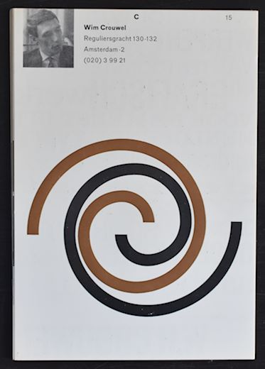
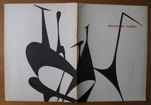
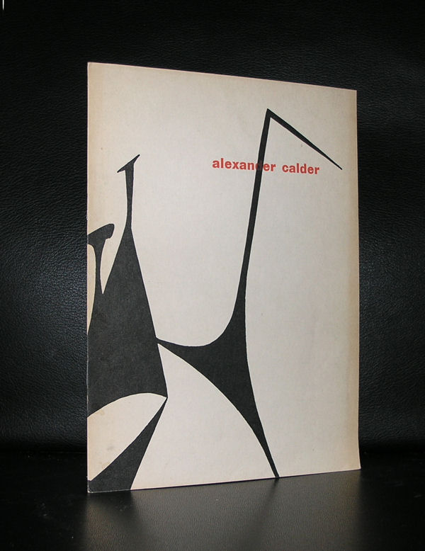
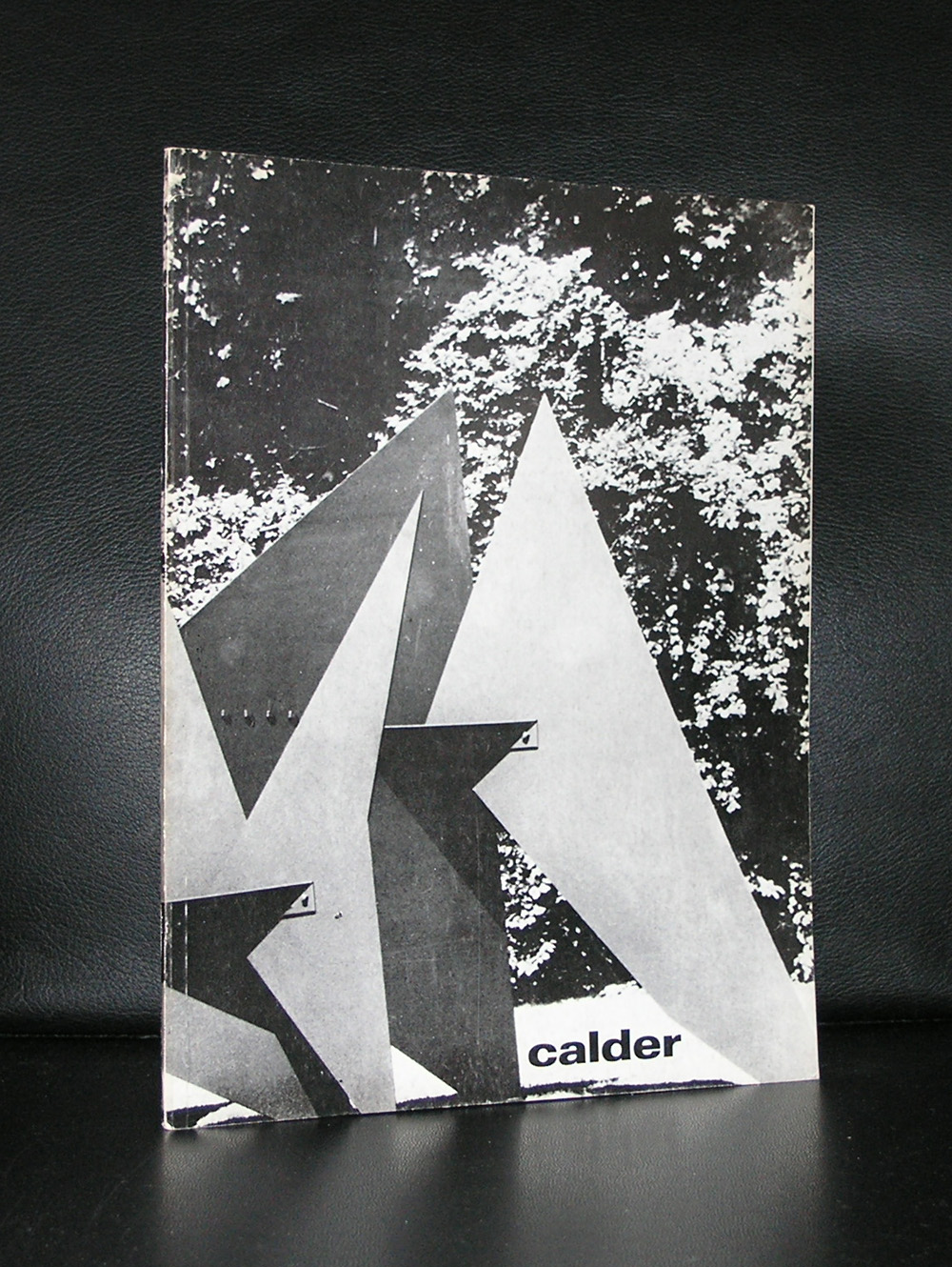
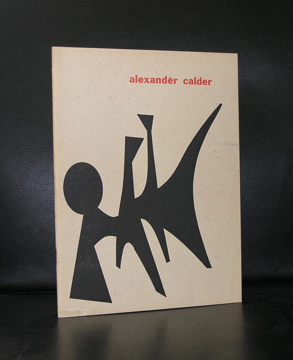
There are 3 Calder catalogues published by the Stedelijk Museum ( 1947,1959 and 1969). 2 of them are available through www.ftn-books.com. The first 2 were designed by Willem Sandberg and the last one by Wim Crouwel. Many colelctors like the 1959 catalogue , this because of the bald design and great prints on the cover, but for me the 1949 is the best, much more subtle and a catalogue that shows the design path Sandberg is going to take. Choice of paper, typography and illustrations make this the perfect early Sandberg publication.
Artist/ Author: Oliver Boberg
Title : Memorial
Publisher: Oliver Boberg
Measurements: Frame measures 51 x 42 cm. original C print is 35 x 25 cm.
Condition: mint
signed by Oliver Boberg in pen and numbered 14/20 from an edition of 20