Posted on Leave a comment

Robert Mapplethorpe

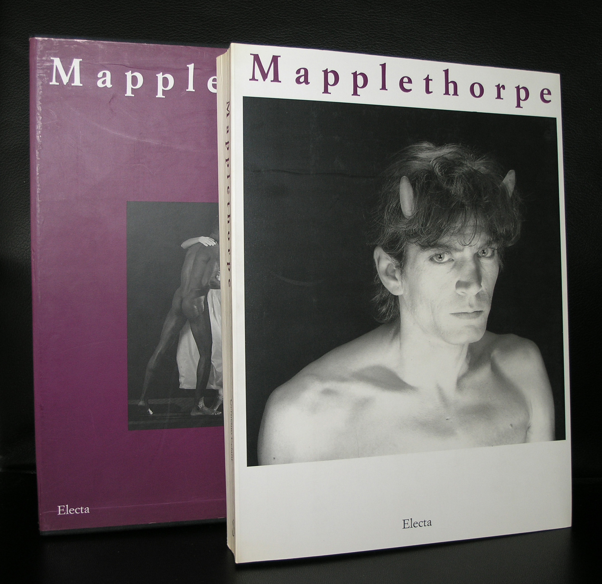
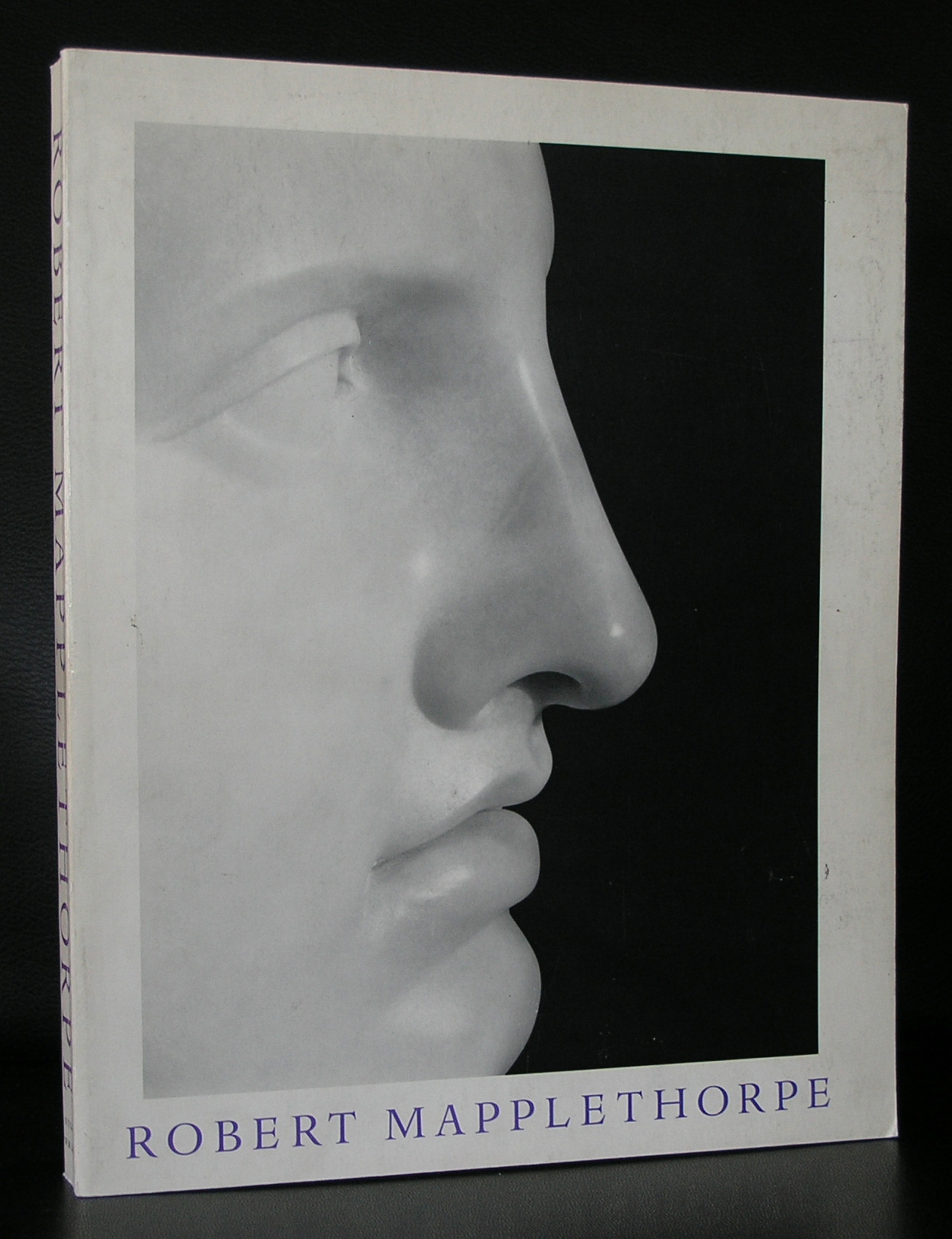
Robert Mapplethorpe…this morning i was reminded of Mapplethorpe, because this evening there will be a documentary on him on dutch television. Mapplethorpe is certainly one of the most iconic photographers from the last 50 years, but for the dutch there were not many occasions one could see his works. There was a show at gallery Jurka in the early eighties and some of his photographs were shown in the Stedelijk Museum. Both i did not see. What is did see was a show in Dusseldorf which included his flower photographs which impressed me a lot. To prepare this blog i wanted to read something on Mapplethorpe. But the best information i found was an excellent biography on the site of the Robert Mapplethorpe Foundation ( www.mapplethorpe.org ). so here is the biography and for a complete picture of Mapplethorpe and its foundation visit their site please.

Robert Mapplethorpe was born in 1946 in Floral Park, Queens. Of his childhood he said, “I come from suburban America. It was a very safe environment and it was a good place to come from in that it was a good place to leave.”

In 1963, Mapplethorpe enrolled at Pratt Institute in nearby Brooklyn, where he studied drawing, painting, and sculpture. Influenced by artists such as Joseph Cornell and Marcel Duchamp, he also experimented with various materials in mixed-media collages, including images cut from books and magazines. He acquired a Polaroid camera in 1970 and began producing his own photographs to incorporate into the collages, saying he felt “it was more honest.” That same year he and Patti Smith, whom he had met three years earlier, moved into the Chelsea Hotel.
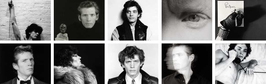
Mapplethorpe quickly found satisfaction taking Polaroid photographs in their own right and indeed few Polaroids actually appear in his mixed-media works. In 1973, the Light Gallery in New York City mounted his first solo gallery exhibition, “Polaroids.” Two years later he acquired a Hasselblad medium-format camera and began shooting his circle of friends and acquaintances—artists, musicians, socialites, pornographic film stars, and members of the S & M underground. He also worked on commercial projects, creating album cover art for Patti Smith and Television and a series of portraits and party pictures for Interview Magazine.

In the late 70s, Mapplethorpe grew increasingly interested in documenting the New York S & M scene. The resulting photographs are shocking for their content and remarkable for their technical and formal mastery. Mapplethorpe told ARTnews in late 1988, “I don’t like that particular word ‘shocking.’ I’m looking for the unexpected. I’m looking for things I’ve never seen before … I was in a position to take those pictures. I felt an obligation to do them.” Meanwhile his career continued to flourish. In 1977, he participated in Documenta 6 in Kassel, West Germany and in 1978, the Robert Miller Gallery in New York City became his exclusive dealer.

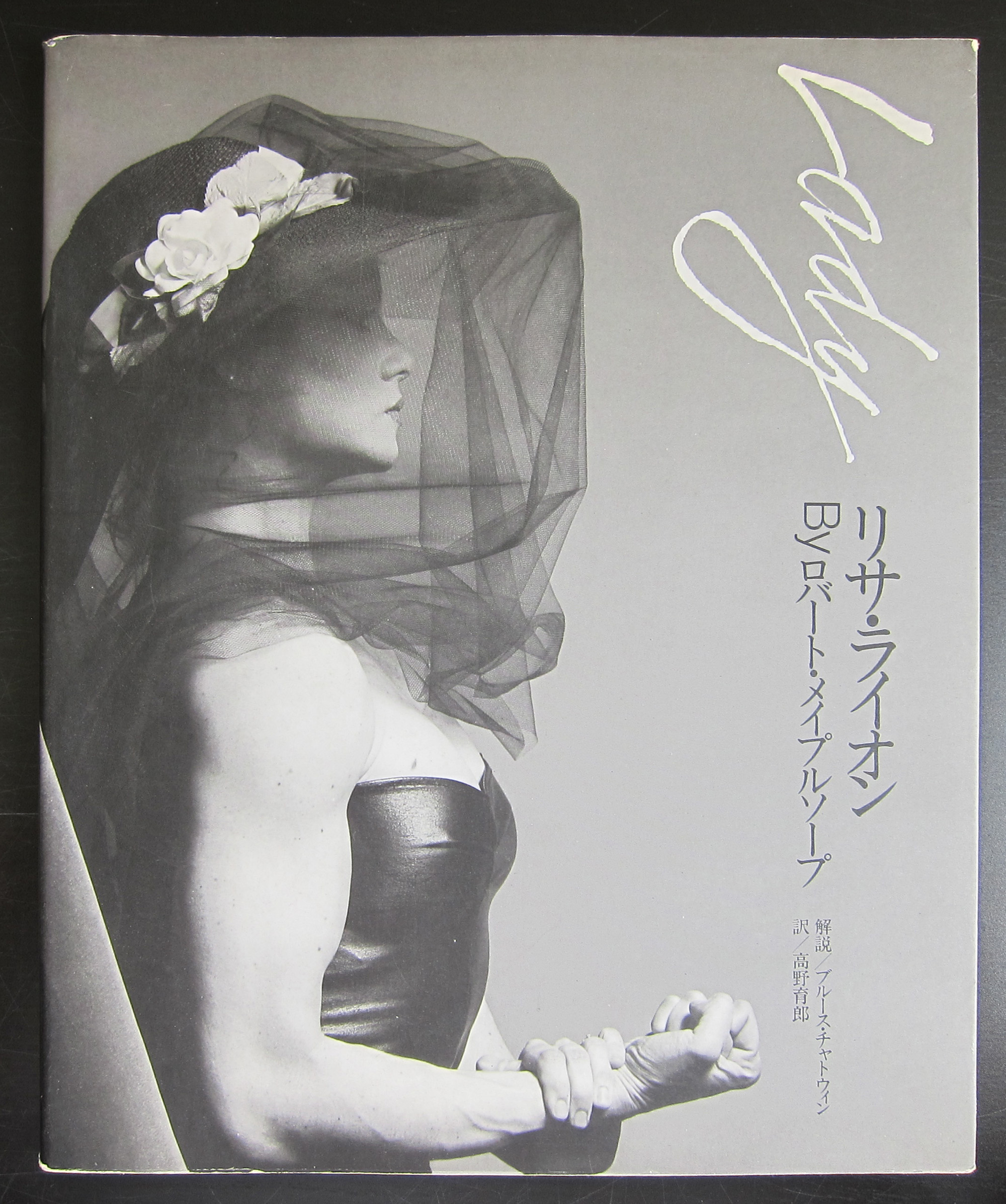
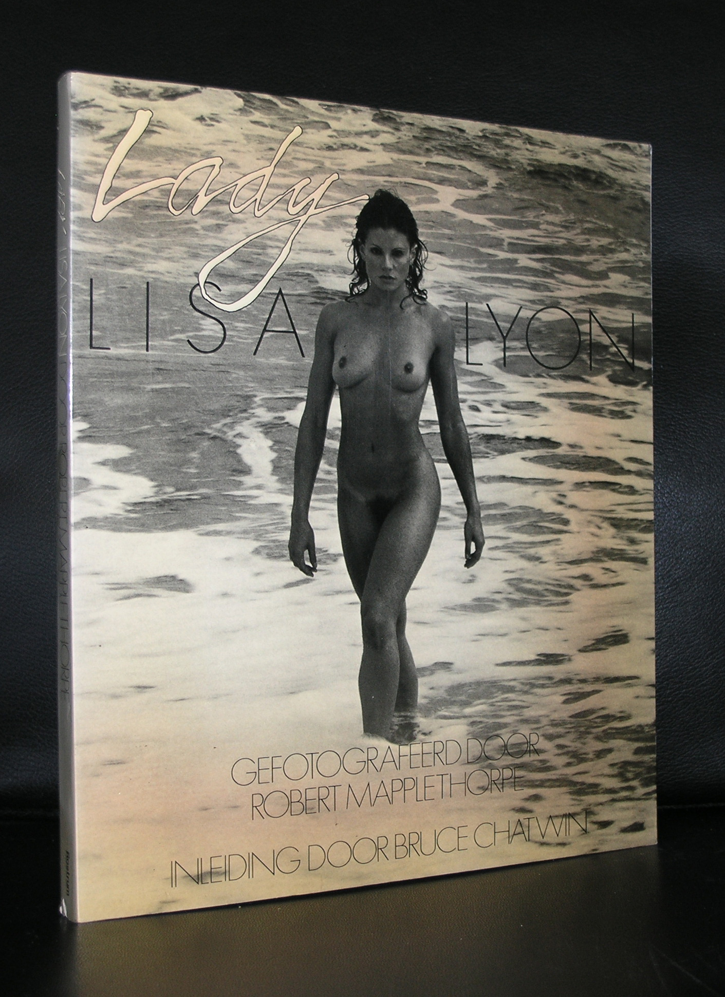
Mapplethorpe met Lisa Lyon, the first World Women’s Bodybuilding Champion, in 1980. Over the next several years they collaborated on a series of portraits and figure studies, a film, and the book, Lady, Lisa Lyon. Throughout the 80s, Mapplethorpe produced a bevy of images that simultaneously challenge and adhere to classical aesthetic standards: stylized compositions of male and female nudes, delicate flower still lifes, and studio portraits of artists and celebrities, to name a few of his preferred genres. He introduced and refined different techniques and formats, including color 20″ x 24″ Polaroids, photogravures, platinum prints on paper and linen, Cibachrome and dye transfer color prints. In 1986, he designed sets for Lucinda Childs’ dance performance, Portraits in Reflection, created a photogravure series for Arthur Rimbaud’s A Season in Hell, and was commissioned by curator Richard Marshall to take portraits of New York artists for the series and book, 50 New York Artists.

That same year, in 1986, he was diagnosed with AIDS. Despite his illness, he accelerated his creative efforts, broadened the scope of his photographic inquiry, and accepted increasingly challenging commissions. The Whitney Museum of American Art mounted his first major American museum retrospective in 1988, one year before his death in 1989.

His vast, provocative, and powerful body of work has established him as one of the most important artists of the twentieth century. Today Mapplethorpe is represented by galleries in North and South America and Europe and his work can be found in the collections of major museums around the world. Beyond the art historical and social significance of his work, his legacy lives on through the work of the Robert Mapplethorpe Foundation. He established the Foundation in 1988 to promote photography, support museums that exhibit photographic art, and to fund medical research in the fight against AIDS and HIV-related infection.

PS. there are of course some nice publications available at www.ftn-books.com


Posted on Leave a comment

Karel Appel and the original litho covers

No….this is not a title for a classic Roald Dahl story, but this is reality. Some museums, but specially the Stedelijk Museum Amsterdam, had a policy to make affordable catalogues for their visitors to accompany their exhibitions in the 50’s and 60’s.

Designed by the best in the business ( Willem Sandberg and Wim Crouwel ) they had the task to produce these catalogues at a low price without being cheap looking. They experimented with low cost papers, small editions, number of pages between 24  and 48, most of the time stapled and a scarce use of color. Only one exception was made ….in some cases an original lithograph by the artist was used as a cover. This is why some of these beautiful catalogues are even more desirable…all because of the original lithograph.

Karel Appel was one of those artist who had his peak in the sixties and was able to demand the best possible catalogues with his exhibitions and Sandberg granted this. The Appel catalogues which were published in the late 50’s and early sixties are among the best from the catalogue series of the Stedelijk and should be present in every serious Karel Appel collection.

Just look at this foldout cover and be convinced yourself that this is special.

appel-litho-sm-b

For the readers of this blog…i have two of the above 1965 catalogues available at

www.ftn-books.com

Posted on Leave a comment

Willem Sandberg exhibition at the Stedelijk Museum Amsterdam (until the 8th of January 2017)

schermafbeelding-2016-11-29-om-15-22-28

Last Sunday we visited the Stedelijk Museum for the Tinguely exhibition ( see blog in a few days) and the Willem Sandberg exhibition. Sandberg was not only the director for over 2 decades at the Stedelijk ( 1945-1963), but also took care of almost all the design and typography for the Stedelijk Museum Amsterdam, which was made during his years as a director. 5 rooms are filled with a multitude of publications. Mostly for the Stedelijk and some for the Israel museum in Tel Aviv.

What struck me most is that his designs are timeless and still belong to the very best designs that were made in last century. The 3rd room was filled with Stedelijk Museum publications and i was proud to find that 100% of the book publications shown in that room was available at www.ftn-books.com.

sandberg-tent-a

This is an exhibition you have to visit when you are a Sandberg admirer and study the publications on show. Beautiful, in many cases handcrafted typography and designs and among the Sandberg designs the very best that were made. It was good to see that so many of these publications still are timeless and of the highest quality and never looked old fashioned. For me Willem Sandberg is still one of the very “greats” in design and typography from the 20th century.

Posted on Leave a comment

Mark Brusse a dutch artist and world famous in….France

schermafbeelding-2016-11-27-om-10-48-43

Mark Brusse has been living in Paris/France now for a very long time , but he originated from the Netherlands, where he started his career as an artist in the 60’s. He is described as a “poetic” artist and works with a multitude of materials. Painting, drawing, etching and making sculptures….. a multi talented artist who was far less appreciated in his home country than in France, where has has lived now for most of his life. This is the reason why many more publications in French can be found on this artist than there are in dutch. The strength of Brusse is his simplicity. Whith a few lines, a small drawing or some well chosen colors he draws your attention into the work and because this poetic simplicity he persuades you to like and admire it. In recent months i myself experienced on at least 2 occasions the strength of his works. The first time was at auction at the Venduehuis where the BLUE SHACK was sold.

schermafbeelding-2016-11-27-om-10-54-09

…. a powerful painting and one i would have loved to have for my collection and the second time was a week ago where some Brusse prints were sold at Bubb Kuyper. These i was lucky enough to buy at a reasonable price and at least 2 of them will be for sale shortly at www.ftn-books.com

….but if you can’t wait for more information look at www.ftn-books.com to find many more publications on Mark Brusse.

Posted on Leave a comment

Roger Raveel (1921-2013)

I am not the greatest fan of Roger Raveel, but occasionally i can appreciate his works. Specially the Beervelde project in the cellar corridors together with his friends from the Nieuwe Figuratie is a highlight. From his early days he has held exhibitions in the Netherlands and therefore a nice set of publications was published in the 60’s and 70’s by galerie Espace, who represented Raveel during these decades. Raveel is one of the great artists in Belgium, but beyond the Belgian borders his works are scarce. There are some in the Stedelijk Museum and van Abbemuseum, but those are the only ones i know of. Given the fact that he is not very well known outside Belgium and the Netherlands, i was surprised to find the number of publications i managed to collect over the years and which are now in my inventory. So if you are looking for Raveel publications please visit www.ftn-books.com

and complete your collection.

Posted on Leave a comment

Daniel Buren

schermafbeelding-2016-11-21-om-17-46-04

For this day’s blog i thought of something more colorful. This to compensate for the rather sombre previous ones and i immediately thought about Daniel Buren, who has done some tremendous beautiful projects with light and color. The latest i have seen of him was 1,5 years ago in Strasbourg where he altered the ceiling with colored panes of glas. I have put together some examples of his projects below, so you can see yourself the impact it has on the space.

One of his projects was during the seventies in the Stedelijk Museum, on which occasion a catalogue was published titles “HIER”.

Is this minimal art?…..possibly, but it is highly recognizable and what is more ….the effect on the space where the colored stripes are applied is extremely large.So i agree with what Wikipedia says about him that he is more a conceptual artist. Many of his art can be seen in public places in France , but the largest collection of Buren’s work is still in French museums like the Centre Georges Pompidou.

Some very nice items by Buren are available at www.ftn-books.com

and yes….the one on the left are expresso cups by illy


Posted on Leave a comment

Mark Tobey (1890-1967)

schermafbeelding-2016-11-17-om-11-55-15

There was a time when i had not heard of Tobey, but since i saw some large works by him in both the Beyeler, Stedelijk Museum….. i am a fan.

It started with the catalogue i acquired 20 years ago. Bought the catalogue because of the Wim Crouwel design ,but was immediately attracted by the works within….They were Tobey’s .

OLYMPUS DIGITAL CAMERA

Tobey is most notable for his creation of so-called “white writing” – an overlay of white or light-colored calligraphic symbols on an abstract field which is often itself composed of thousands of small and interwoven brush strokes. This method, in turn, gave rise to the type of “all-over” painting style made most famous by Jackson Pollock, another American painter to whom Tobey is often compared.

Tobey is working on different sizes but for me his large works are the most impressive. The last 16 years of his live he spend in Basel, which is of course the reason why so many of his works stayed  there. Throughout the years he travelled all over the world.

He was an incessant traveler, visiting Mexico, Europe, Palestine, Israel, Turkey, Lebanon, China and Japan and spread his works this way in an organic way, but the main part of his oeuvre stayed in Switzerland, in Basel where le lived for 16 years.

Here are some locations where his works are part of the collection: Smithsonian American Art Museum, the Tate Gallery in London, the Museum of Modern Art in New York City, the Metropolitan Museum of Art, and the Whitney Museum of American Art. There have been at least four posthumous individual exhibitions of Tobey’s work: National Gallery of Art, Washington, D.C., USA, 1984; Museum Folkwang, Essen, Germany, 1989; Galerie Beyeler, Basel, Switzerland, 1990; and Museo Nacional Centro de Arte Reina Sofía.

The publications below are available at www.ftn-books.com

Posted on Leave a comment

Henk Tas and his staged photography

schermafbeelding-2016-11-16-om-03-06-10

A dutch master in the art of staged photography is Henk Tas. Inspired by many great classic ( Pop & Rock) songs, he places objects from (his) childhood around him in a special setting and instantly it is recognizable as “HENK TAS”. Definitely a personal signature.

The photograph is taken and then , compared with the original setting, enlarged to enormous proportions. It makes you feel like an intruder in the staged scene, participating in it and encountering the figurines which populate it.

In 2001 the Henk Tas publication “Why me Lord” is chosen for the competition ” BEST VERZORGDE BOEKEN 2001″ and is one of the contenders for Best.

The book called ” WHY me LORD ” is still available at www.ftn-books.com.

This is what the jury said about the book and his staged photography:

Best Dutch Book Design 2001

Henk Tas, photographer and grabber at life’s banquet, belongs to that select band of cultural indefatigables. His work has never been completely in vogue, for reasons difficult to fathom, but never completely out of it either. It was relevant during the days of both staged photography and postmodernism, and went down well in New Age circles too.
The theme of Henk Tas’s work is pop music, with the occasional foray into rock’n’roll and blues. Henk Tas is the Rotterdam cowboy. He is second to none in taking plastic figures, artificial flowers and other generally unsightly accessories and infusing them with life. He is, besides, a great colourist. The staged photographs are exuberant in their hues, their synthetic extras embodying the passion of the professional artiste along with the fame and the impermanence immutably bound up with that passion. A great many photographs by Henk Tas and a text apiece by Els Barents, Roel Bentz van den Berg, Ute Eskildsen and Greil Marcus have been brought together by the book’s designer, Rick Vermeulen.

www address: www.henktas.nl


Posted on Leave a comment

Günther Uecker

All you need is a hammer and a bucket of nails….this is what you first think when you see the early ZERO works by Günther Uecker.

Together with Mack and Piene he belongs to the German part of the Zero mouvement.

It is now 15 years that ZERO is collected the world all over, but before this period the works by Uecker could only be seen in some of the larger german Museums.

Now his early Zero works and editions have spread all over the world, all because Zero has become such an important art mouvement.

Outside Germany , Uecker works was first presented in the dutch NUL exhibition from  1962 in the Stedelijk Museum. Together with Mack and Piene he made the light salon, which is still one of the masterpieces of Zero art.

Personally i have a preference for the works by Piene…. Uecker is a great artist, but what troubles me is that Uecker has not progressed with his art… he is still making paintings and objects with nails, cashing the great idea he once had. So an early Uecker for a collection can be one of the highlights, but a later period Uecker is just adding a famous name to a collection. Still there are some nice publications on Uecker at www.ftn-books.com

Posted on Leave a comment

Roman Cieslewicz

schermafbeelding-2016-11-01-om-09-24-30

Another great artist who i forgot to mention in my blog on Topor is Roman Cieslewicz. Cieslewicz was a long time friend of Topor , lived in Paris too and rose to fame in the sixties with his graphic design for Vogue and Elle and the posters he designed for several other events.

For the dutch his work was presented for the first time in the Stedelijk Museum in 1973 . An excellent catalogue designed by Wim Crouwel was published on that occasion. The exhibition showed the strength of this artist, because the main part of the exhibition consisted of poster designs he had made in the previous 20 years.

Cieslewicz is one of those rare artist, who in his life was far less appreciated than in these days. Graphic art students from all over the world have inquired about his books in the last few years, which shows to me his star is on the rise and soon the books on Cieslewicz will become rare collectable items.

catalogue available at www.ftn-books.com