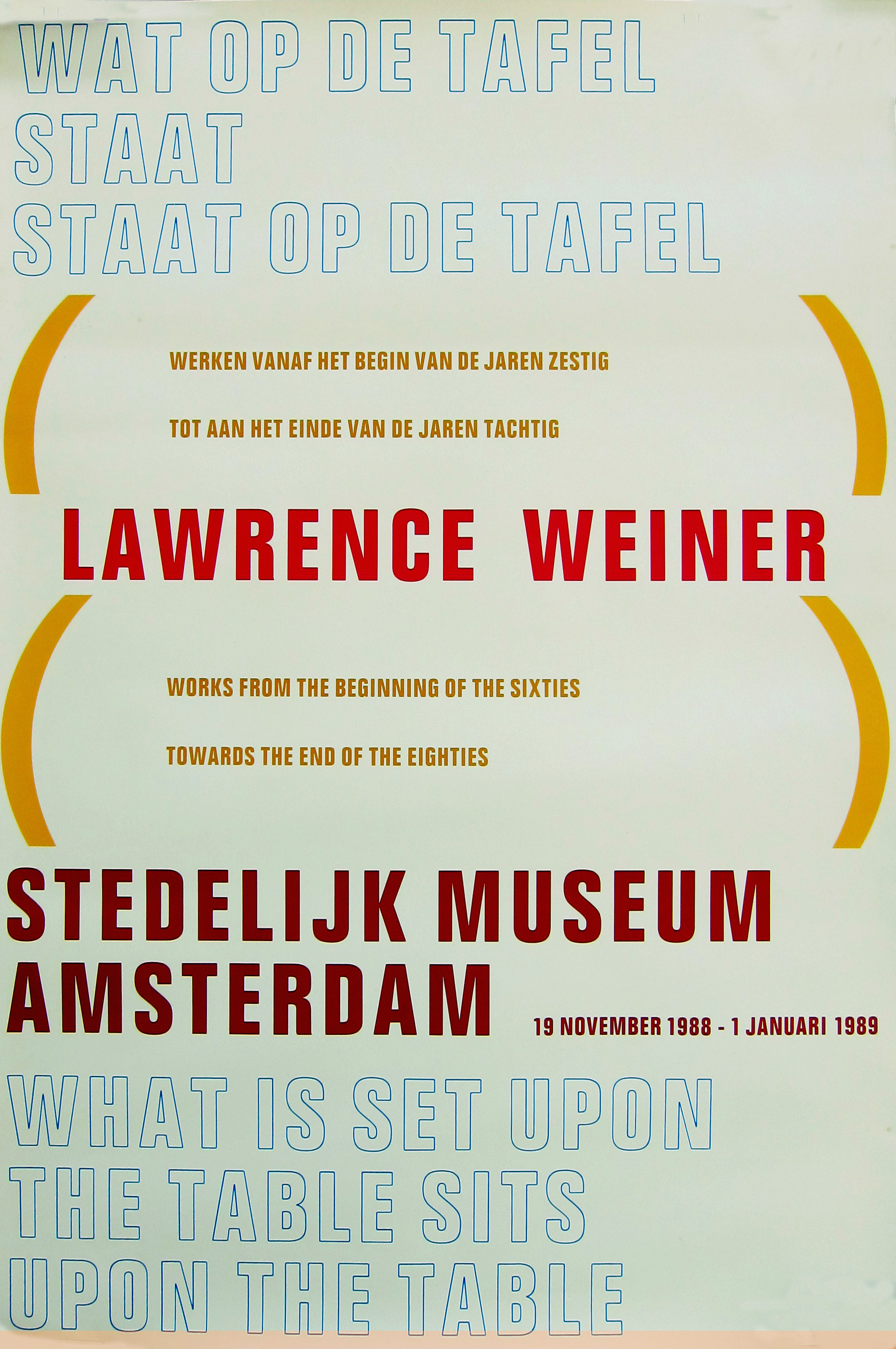
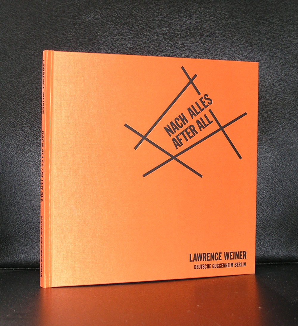
Lawrence Weiner is one the the leading artists within Conceptual Art .
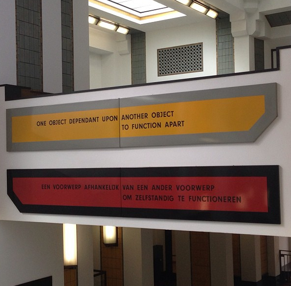
The first time i daily encountered a work by Lawrence Weiner was when curator Flip Bool of the Gemeentemuseum had bought a magnificent large one for the entrance hall. I noticed the forms and strong meaning of the sentences used and learned to appreciate it.
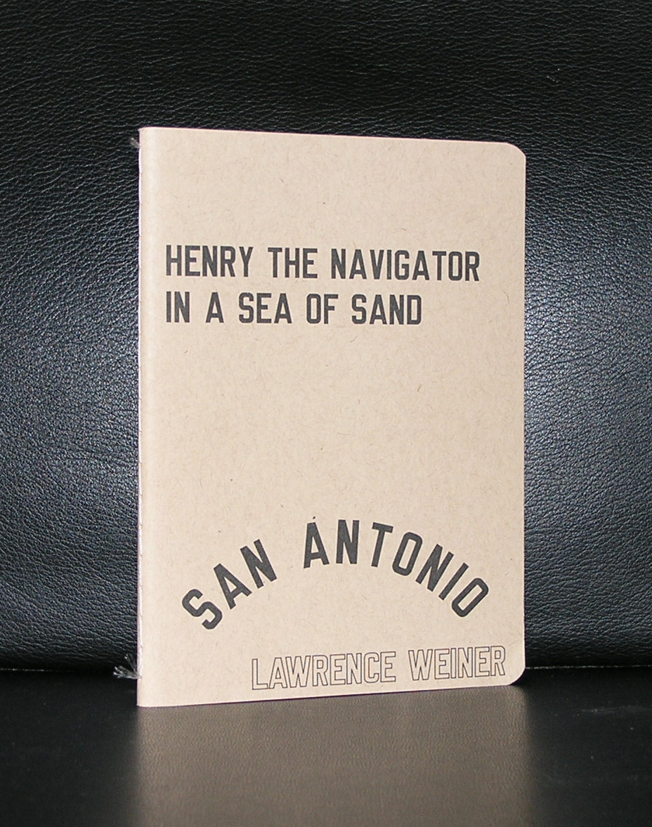
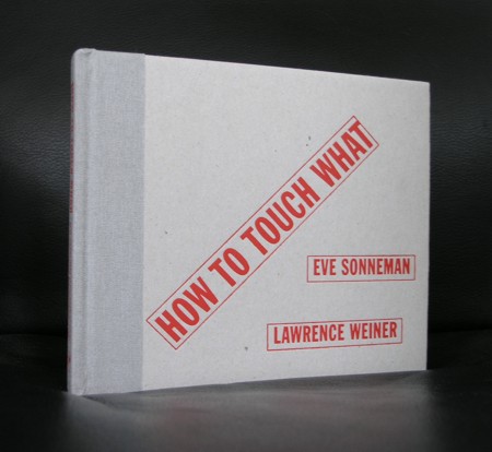
Since, i have been collecting books on Weiner in every possible way . Other museum publications, abroad art locations, galleries and auctions all had some in them, so over the years a small collection was formed and some are available at www.ftn-books.com
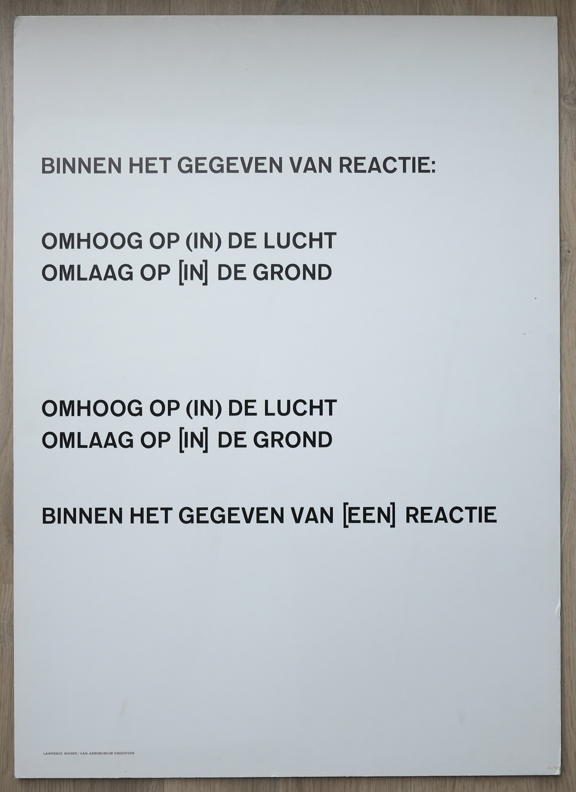
Later i realized that so many publications were published in the Netherlands, because he frequently stayed over here and made contributions to many other museums in the Netherlands. Notably tothe van Abbemuseum and the Stedelijk Museum have. Both have several works by Weiner in their collections.
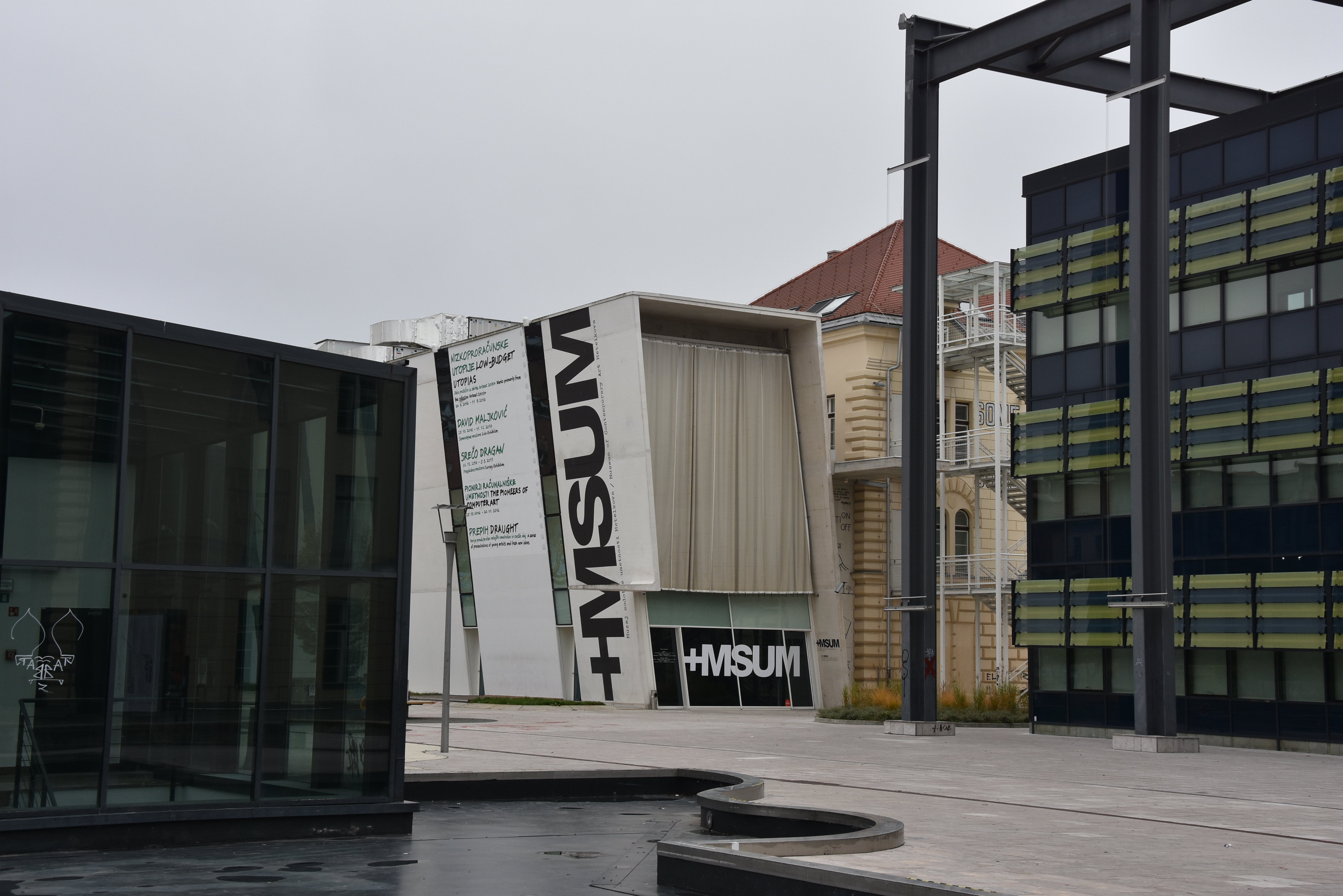
The last time i encountered a work by Weiner (unexpectedly) was in Ljubljana, where at the facade of the Modern Art Museum a large Weiner was fixed. It gave me the same feeling as the one in the Gemeentemuseum. It changes the way you look at something and makes you think about its text…..it is great art.
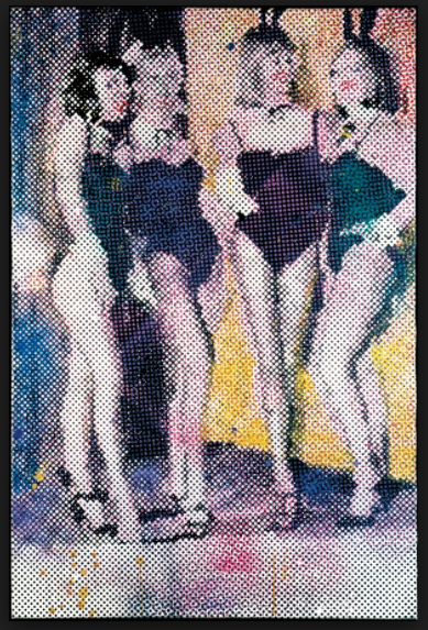
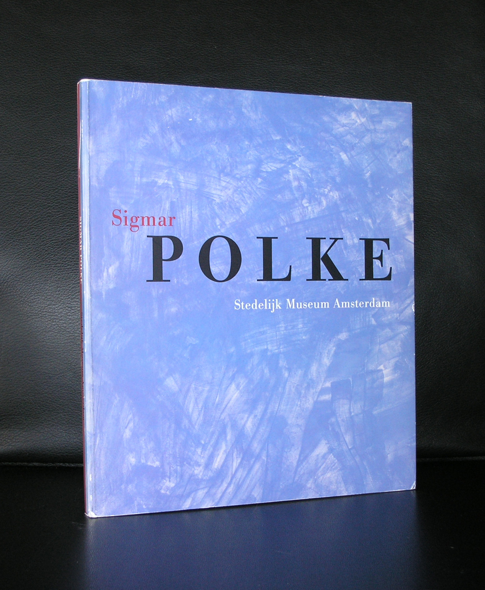
It took a long time for me to finally appreciate the art by Sigmar Polke, but once i did i became a fan and realized that he must be one of the true great artists from last century. Born in the middle of WWII he soon became in the early sixties one of the leading German artists that started their career after this terrible war. The trademark of his works became the use of polka dots in grids as an overlay and he stayed with the use of these polka dots technique throughout his entire career. Side stepping to photography and almost monochrome paintings his oeuvre became very diversified, but always recognizable. Turning point for me was the Polke i saw within a Beyeler Museum exhibition. I do not remember which show it was, but i remember the technique of the polka dots as an overlay to the picture, which reminded me to Marcel van Eeden. Where van Eeden uses small intimate sizes, Polke uses large canvasses. Magnified pictures within a different context are part of his works and sometimes even lean towards surrealism. There is one work i have to see sometime in my life. It is the work he created for the reopening of the Reichstag in Berlin in 1999. When i visit Berlin this will be a must see for me.
OLYMPUS DIGITAL CAMERA
OLYMPUS DIGITAL CAMERA
OLYMPUS DIGITAL CAMERA
There are some nice publications in the inventory of www.ftn-books.com
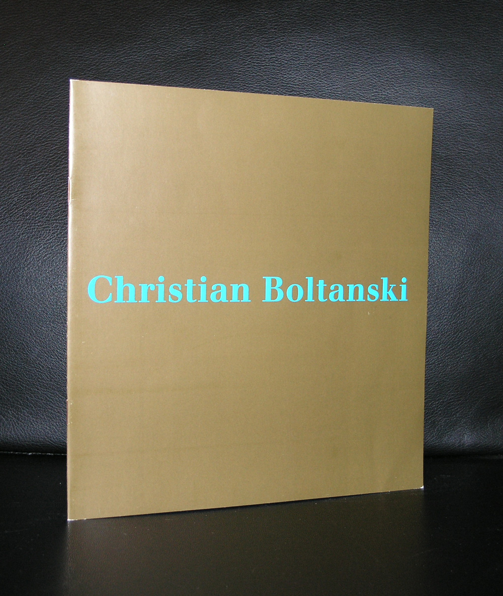
Christian Boltanski participtaed in over 150 exhibitions world wide and his works are in the collections of the DE PONT museum and Stedelijk Museum Amsterdam. 2 reasons to devote this blog to Bo;latnski. Firts is that i acquired and important publication by Boltanski which he designed and contributed. Published by Agnes B, there is a complete series of regularly published magazines titles Points d’Ironie. Boltanski was one of the founders of this highly collectable series and because of this acquisition i remembered the very impressive installation at the Guggenheim Museum Bilbao….”HUMANS”
This is what the Guggenheim says on the installation HUMANS by Christian Boltanski
At once personal and universal in reference, Humans is one of several large-scale works by Boltanski that serve as monuments to the dead, hinting at the Holocaust without naming it explicitly. Through its size and tone, the work evokes the contemplative atmosphere of a small theater or a space for religious observance. The installation consists of more than 1,100 images that the artist rephotographed from sources he had previously used: school portraits, family photographs, newspaper pictures, and police registries. Simultaneously illuminated and obfuscated by dangling lightbulbs, the snapshots provide no context with which to identify or connect the unnamed individuals, or to distinguish the living from the dead or victims from criminals. Each of these traces of human life has been reduced to a uniform size to obscure distinguishing features and to suggest the equality of the photographs’ subjects. The collection of images is installed at random, thereby prohibiting the imposition of a single narrative. Within this haunting environment, Boltanski intermingles emotion and history, juxtaposing innocence and guilt, truth and deception, sentimentality and profundity.
Point d’Ironie and other Boltanski publications are available at www.ftn-books.com
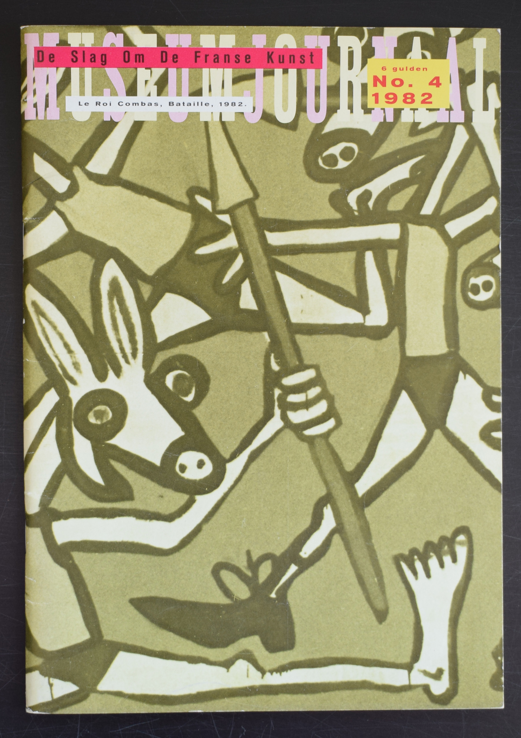
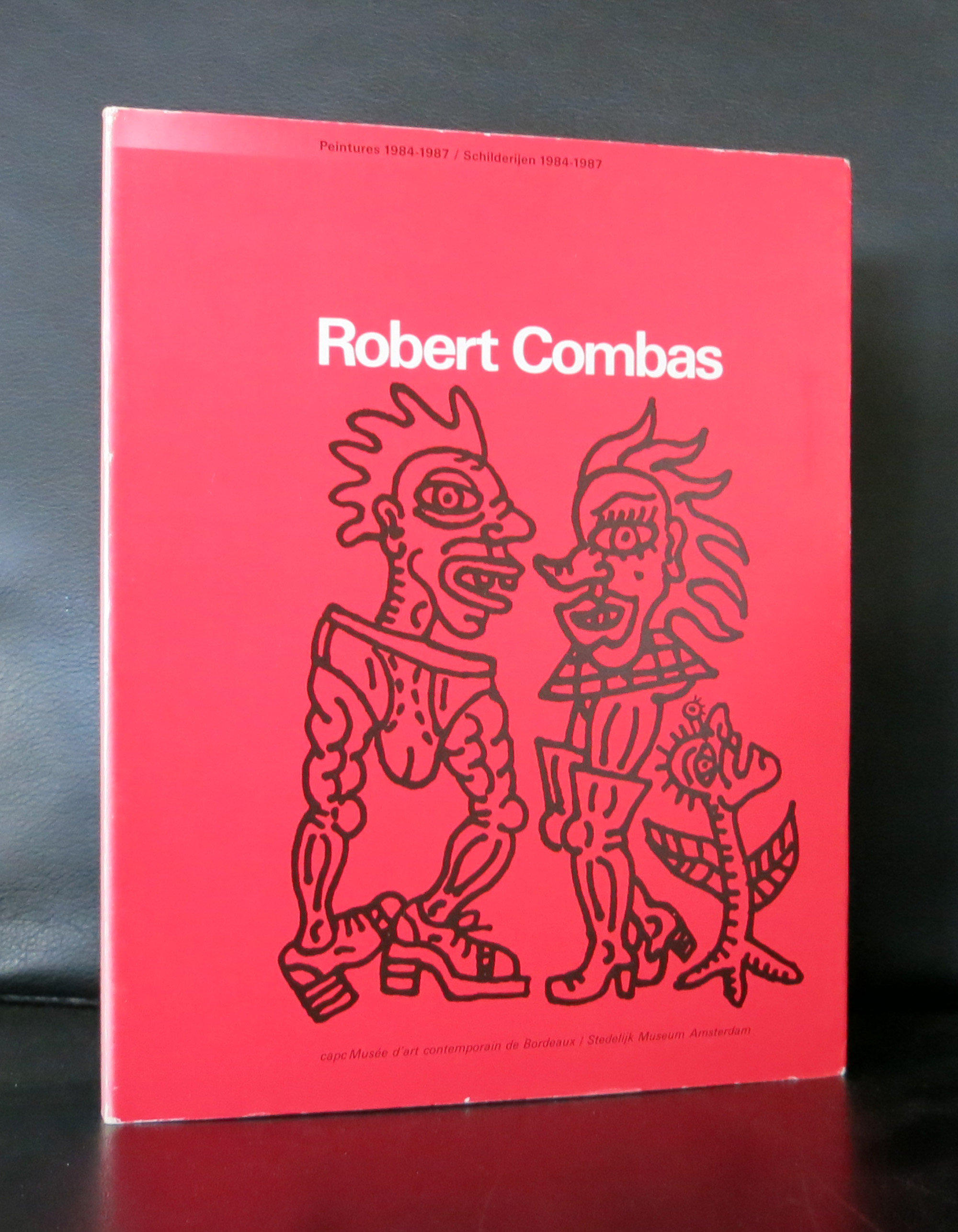
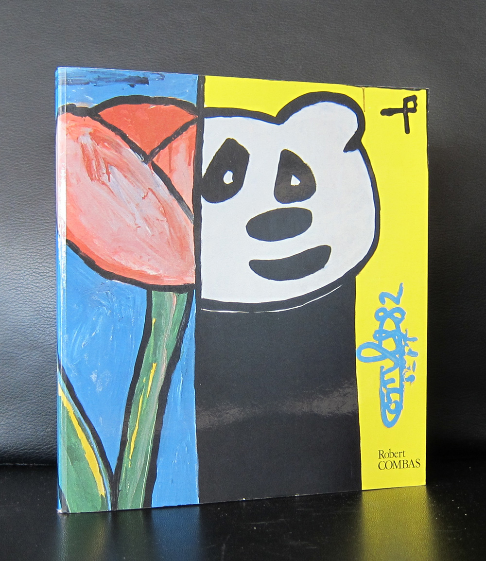
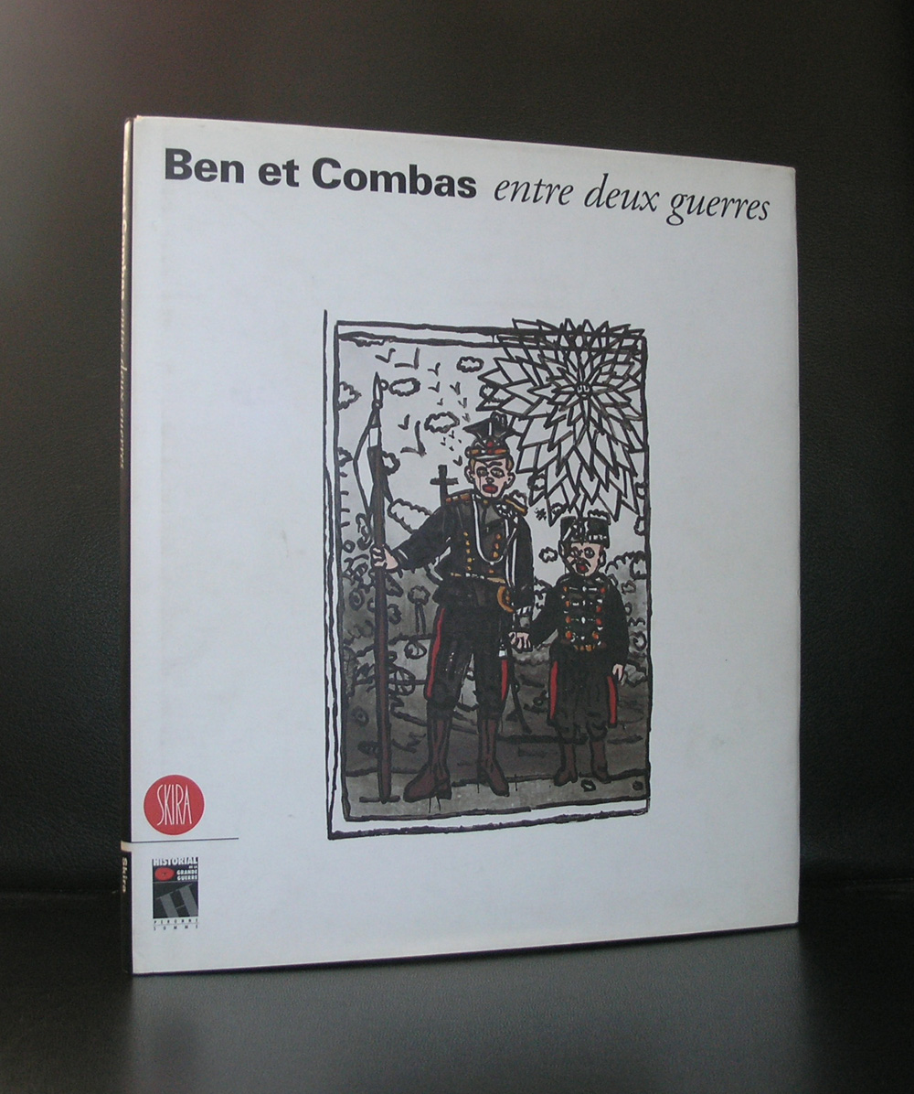
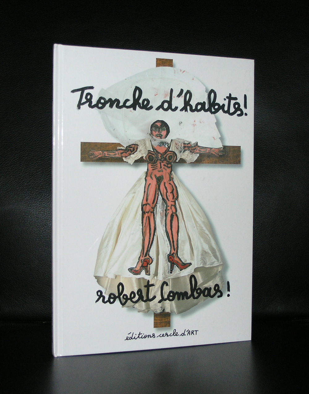
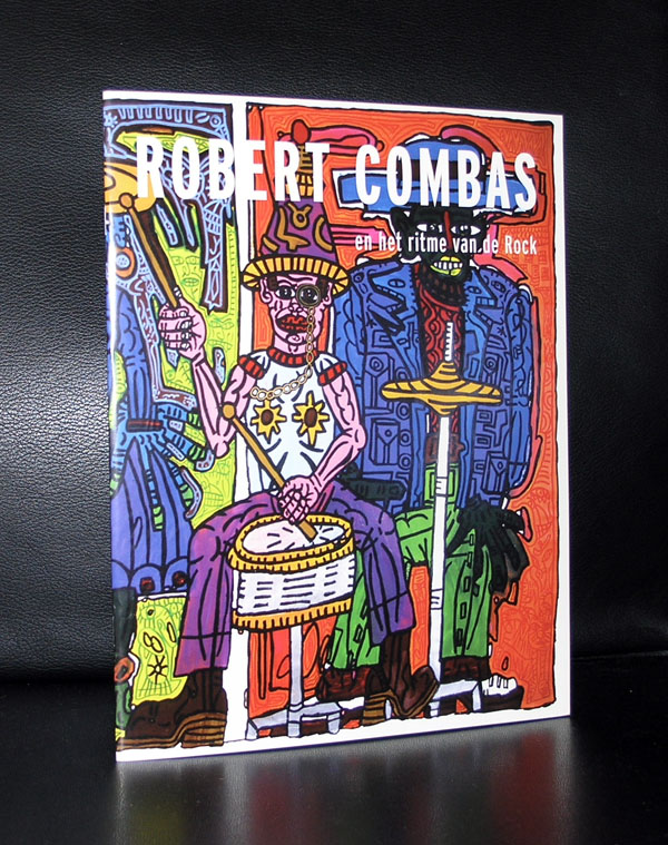
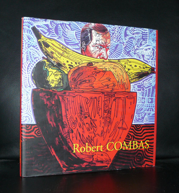
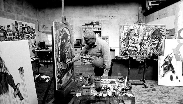
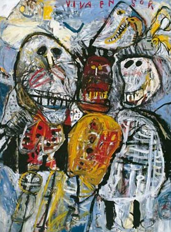
For me Robert Combas is a fun artist. Painting large canvasses with “comic” like figures , thick outlines resulting in a complete style of his own . It is worth visiting his personal site at www.combas.com and what i learned from it, is that Combas makes music too. I did not know this before . He is in a group called LES SANS PATTES and i checked it out at Spotify. A little ambient, a little chansons and some poetry makes this highly original too. This fascinating and versatile artist was a little forgotten outside France, until he had a greatest hits exhibition in the MAC in Lyon in 2012. His paintings can be grouped according to themes, but they all have in common their highly original and recognizable Combas style. If you do not have anything tot do this weekend, visit his personal site and listen to Les Sans Pattes , view them on Youtube and order some great Robert Comas books at www.ftn-books.com
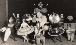
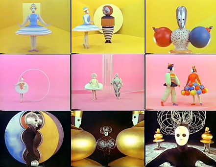
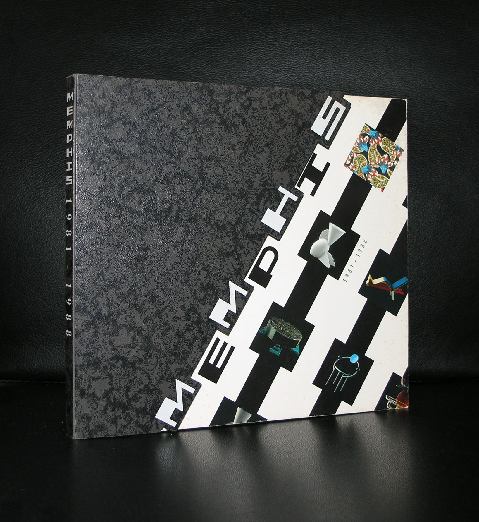
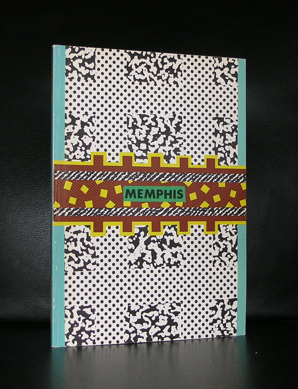
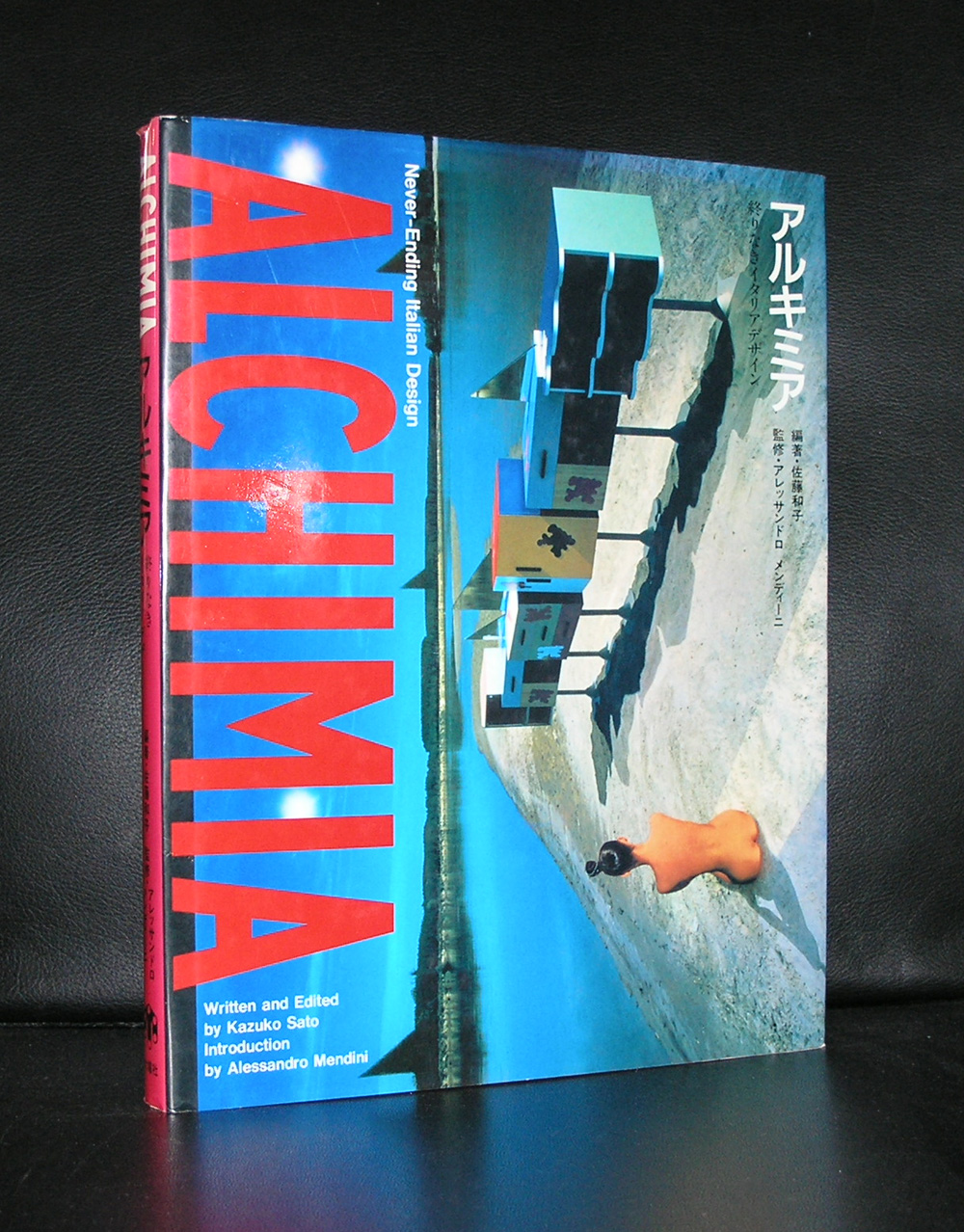
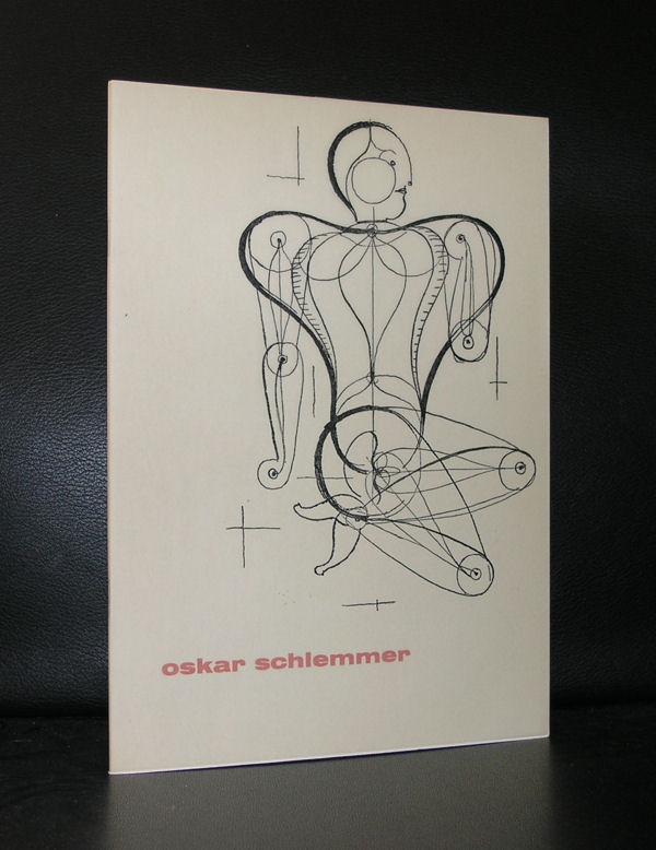
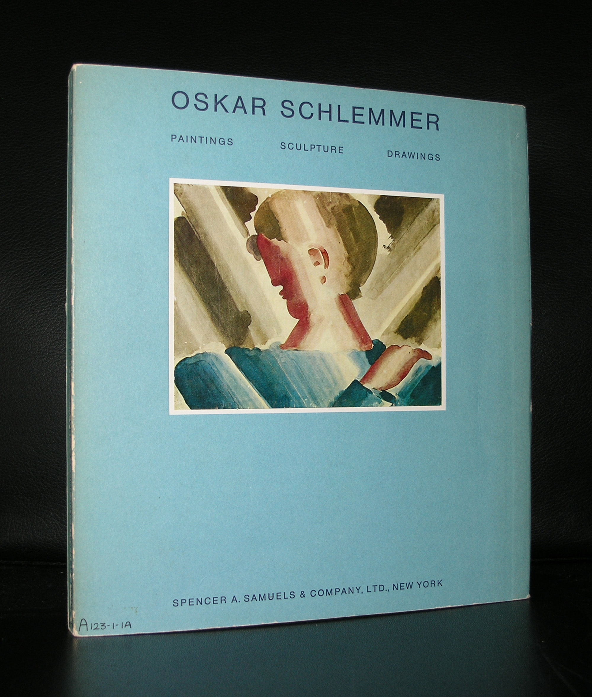
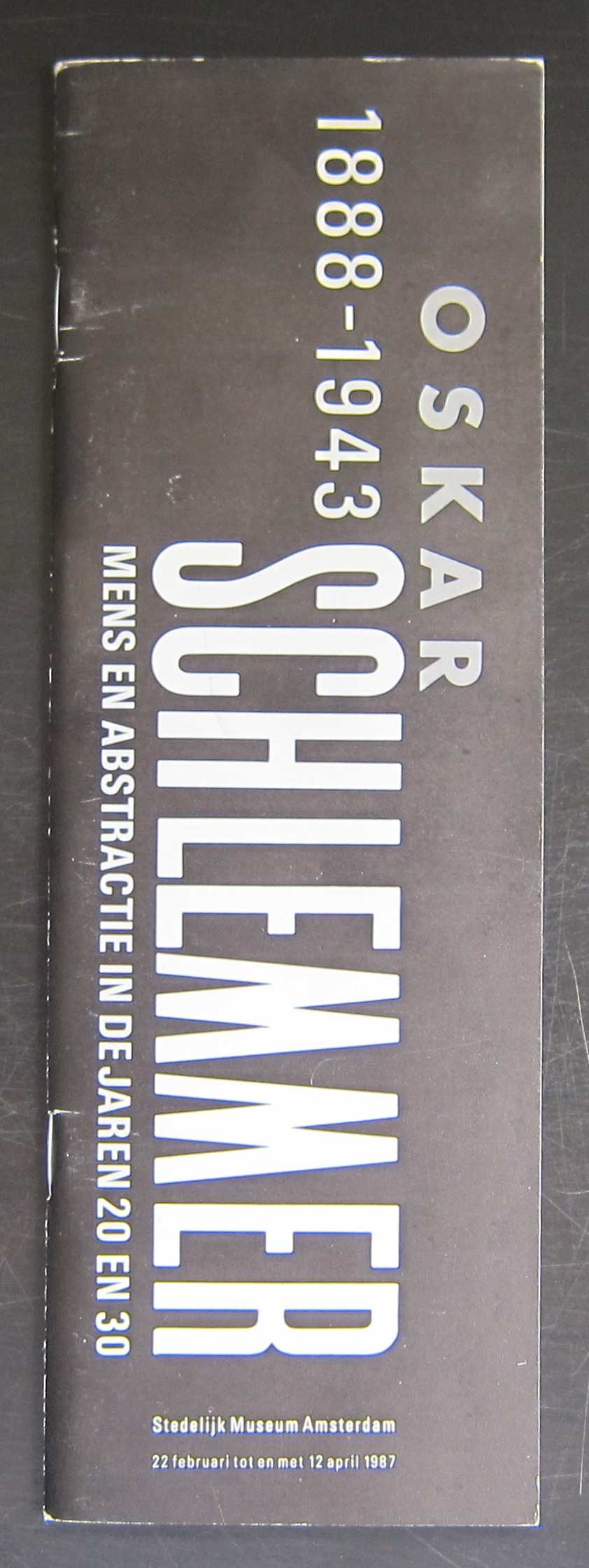
Oskar Schlemmer and the BAUHAUS is the first combination that springs into my mind when i think of this German artist. But Schlemmer is much much more. Cubism, murals and stage design are among the other qualities of Schlemmer. It was in 1987 that the Stedelijk Museum recognized these qualities of Schlemmer and devoted a large exhibition on the artist in which all his qualities were presented in an excellent exhibition. Since this exhibition, many other museum have devoted solo exhibitions to Schlemmer, but the one from the Stedelijk Museum remains one of the very best. One of the second reasons why i devote this blog to Schlemmer, is that for me he was one of the first post-modern artist from the last century. Compare his designs with Alchemia and Memphis designs and you can see for your self the similarities between the two of them. over 60 years apart from each other they look alike and are drawing from the same design ideas. Books are available at www.ftn-books.com
OLYMPUS DIGITAL CAMERA
OLYMPUS DIGITAL CAMERA
OLYMPUS DIGITAL CAMERA
Wim Crouwel designed the Schlemmer catalogue for the Stedelijk Museum and it is one of the very best from the eighties.
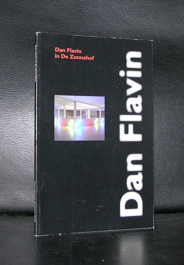
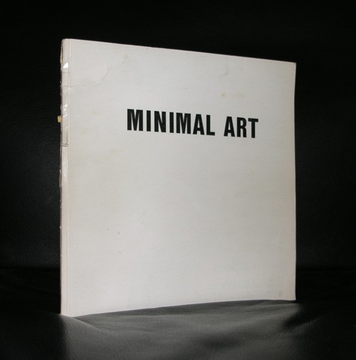
Minimal Art, but for me completely different because of the great change his art makes to its direct environment. Colors, size and composition of the lights change the room where the light sculptures are exhibited completely.
There must be a wealth of unfinished projects, because Flavin generally conceived his sculptures in editions of three or five, but would wait to create individual works until they had been sold to avoid unnecessary production and storage costs. Until the point of sale, his sculptures existed as drawings or exhibition copies. As a result, the artist left behind more than 1,000 unrealized sculptures when he died in 1996.
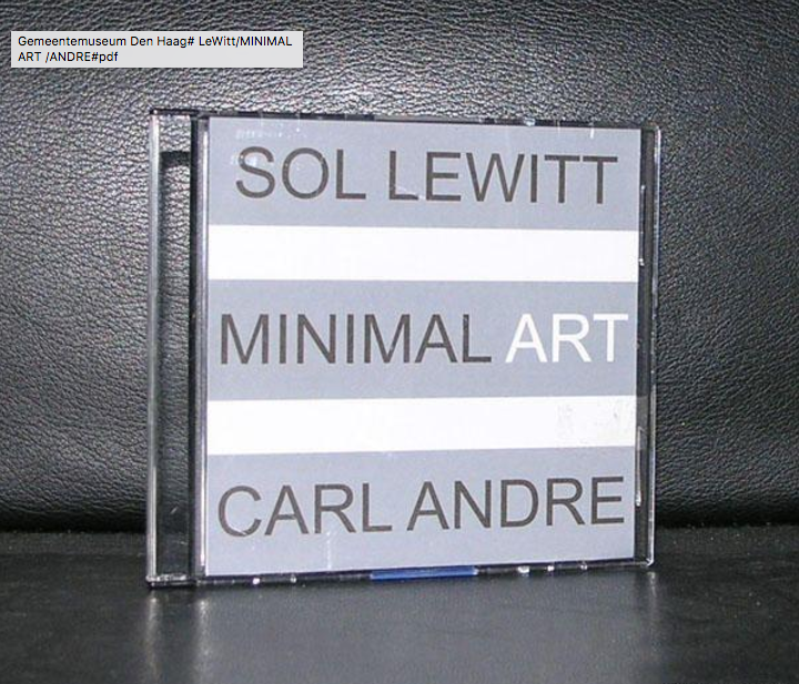
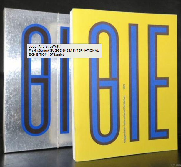
His earliest works were exhibited in the van Abbemuseum in 1966. The Netherlands were at that time one of the earliest countries to adopt the Minimal Artists. Major exhibitions by LeWitt, Andre and Judd in the late 60’s were held in Den Haag and Amsterdam.
Flavin realized his first full installation piece, greens crossing greens (to Piet Mondrian who lacked green), for an exhibition at the Van Abbemuseum, Eindhoven, Netherlands, in 1966. Flavin’s “corridors”, for example, control and impede the movement of the viewer through gallery space. They take various forms: some are bisected by two back-to-back rows of abutted fixtures, a divider that may be approached from either side but not penetrated (the color of the lamps differs from one side to the other). The first such corridor, untitled (to Jan and Ron Greenberg), was constructed for a 1973 solo exhibition at the St. Louis Art Museum, and is dedicated to a local gallerist and his wife. It is green and yellow; a gap (the width of a single “missing” fixture) reveals the cast glow of the color from beyond the divide. In subsequent barred corridors, Flavin would introduce regular spacing between the individual fixtures, thereby increasing the visibility of the light and allowing the colors to mix.[24]
By 1968, Flavin had developed his sculptures into room-size environments of light. That year, he outlined an entire gallery in ultraviolet light at documenta 4 in Kassel, Germany. In 1992, Flavin’s original conception for a 1971 piece was fully realized in a site-specific installation that filled the Solomon R. Guggenheim Museum’s entire rotunda on the occasion of the museum’s reopening.
www.ftn-books.com has many titles on Minimal Art and some on Dan Flavin
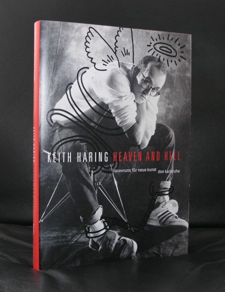
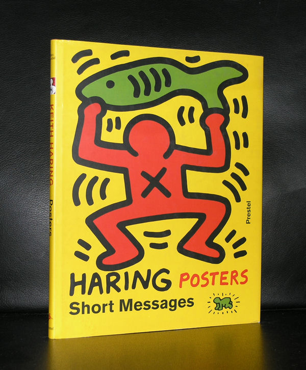
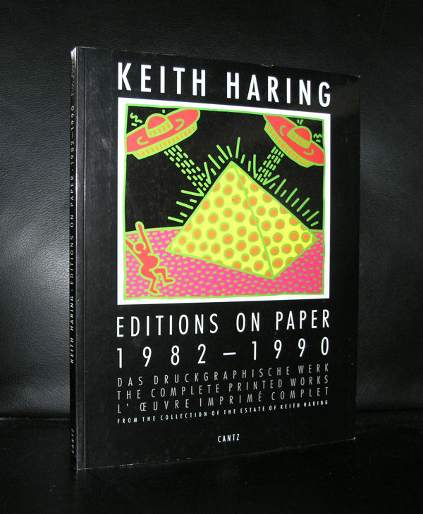
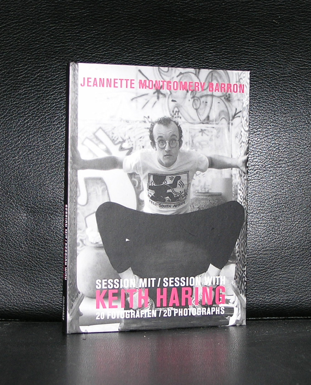
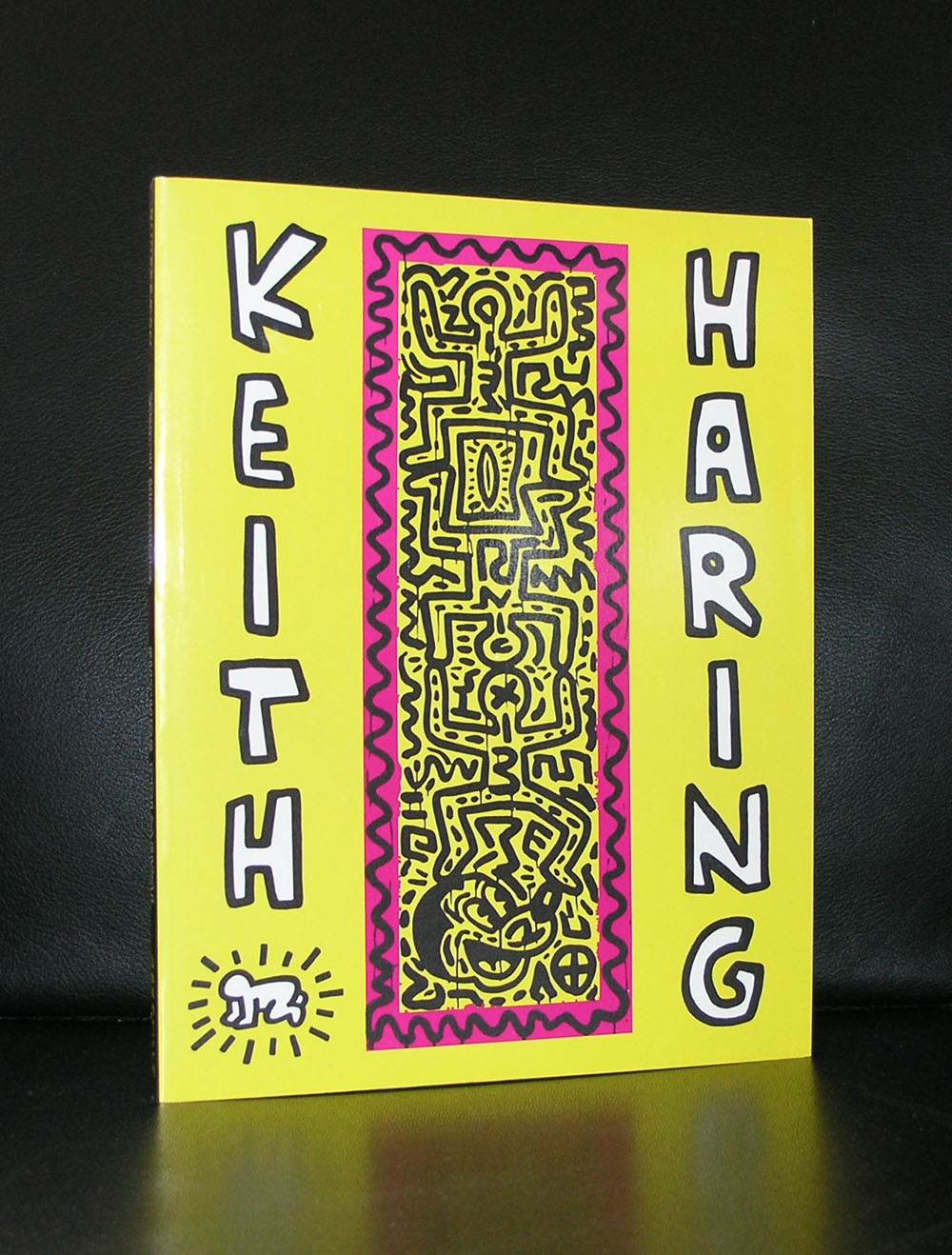
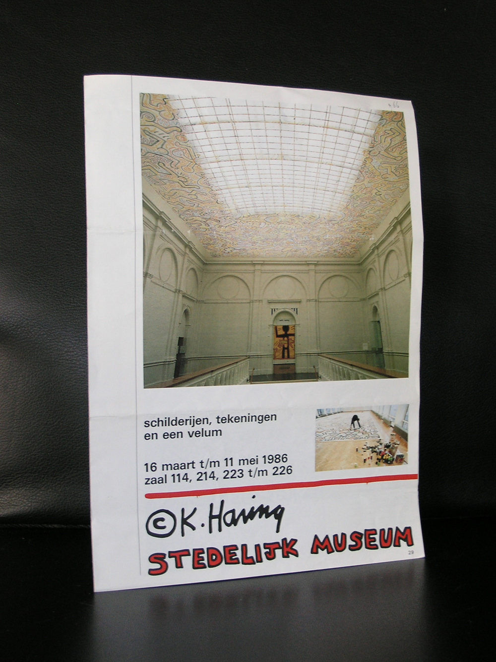
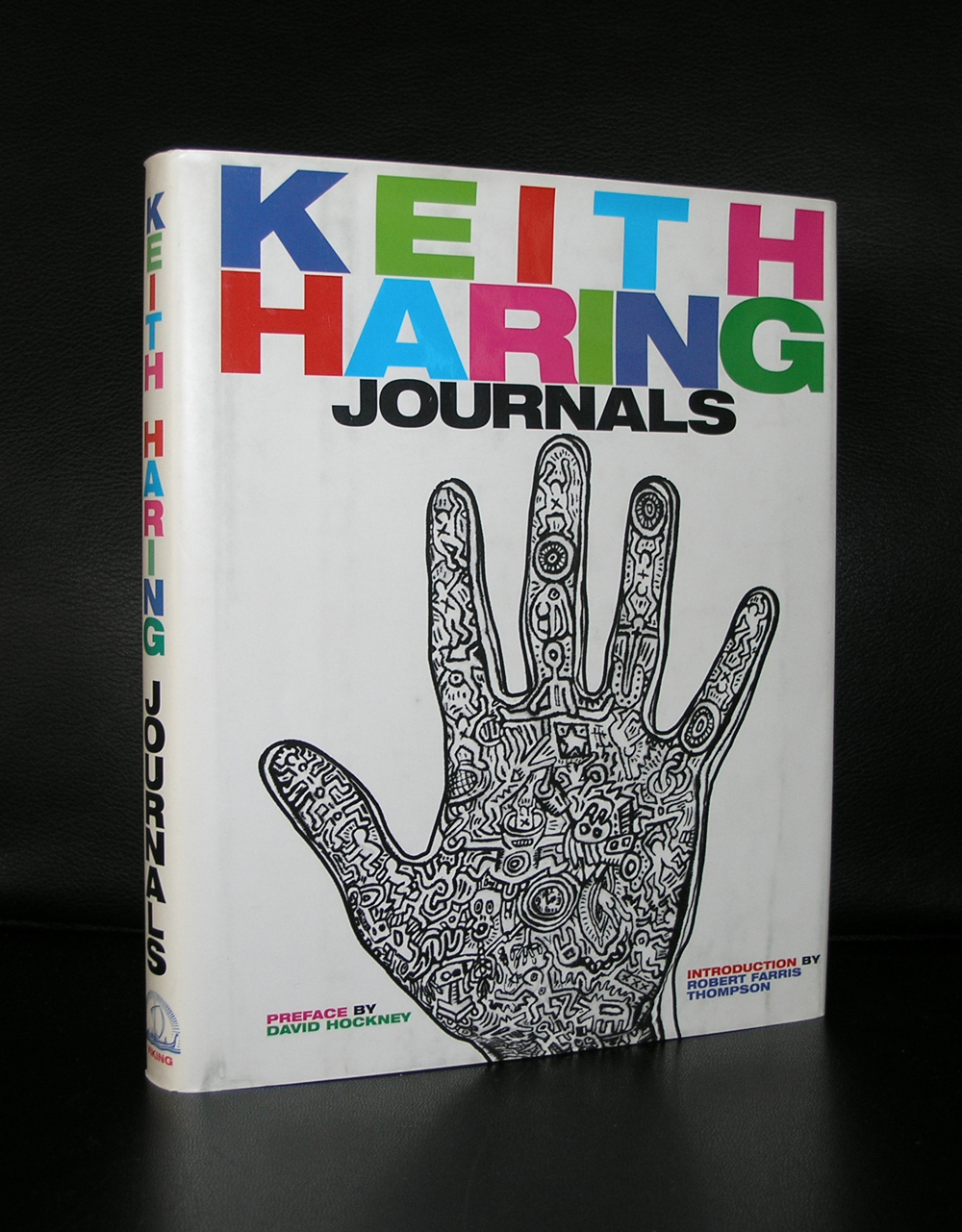
Keith Haring had one of his first European exhibitions within the Stedelijk Museum and for this occasion he made a very large ceiling piece/ the VELUM ( 1986), which was there during the exhibitions and for some time after, but….. since the exhibition i have never seen it again! Of course it is possible i have missed it, because i dit not visit the Stedelijk Museum each day i went to Amsterdam, but it is strange that in 30 years i never have seen it again. It was an extremely large piece by Haring and should be one of the key objects within any collection, because it represents everything the art of Keith Haring has become famous for. I checked the site of the Stedelijk Museum , but could not find it in the collection. Any readers who can help?
The site Widewalls has an excellent description why Keith Haring is important and was one of the key figures in the Grafiti art movement.
The 1990s were a time of change for many social and cultural aspects on a global scale. Art particularly saw many artists bring tremendous change in this period, and Keith Haring was one of them. Drawing and painting murals in public locations, Haring was often philosophical about his approach to creating artwork, and was amazed and inspired by the interaction and feedback he would get from people around him. Although he was young, he had developed a very specific concept of what art should represent, and the ideology carried over through his work would leave an everlasting effect on the street culture in New York City, as well as art as a whole. Along with Jean-Michel Basquiat, Kenny Scharf, Futura 2000 and Richard Hambleton, among others, he was part of the young, up-and-coming group of the American artists who challenged art’s old perceptions.
Fortunately the publications on Haring at www.ftn-books.com did not disappear ( but they can get sold out).
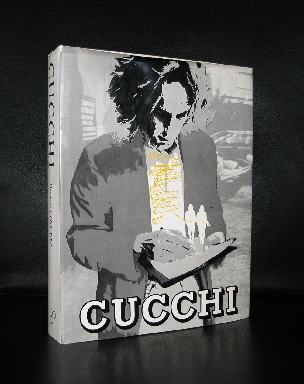
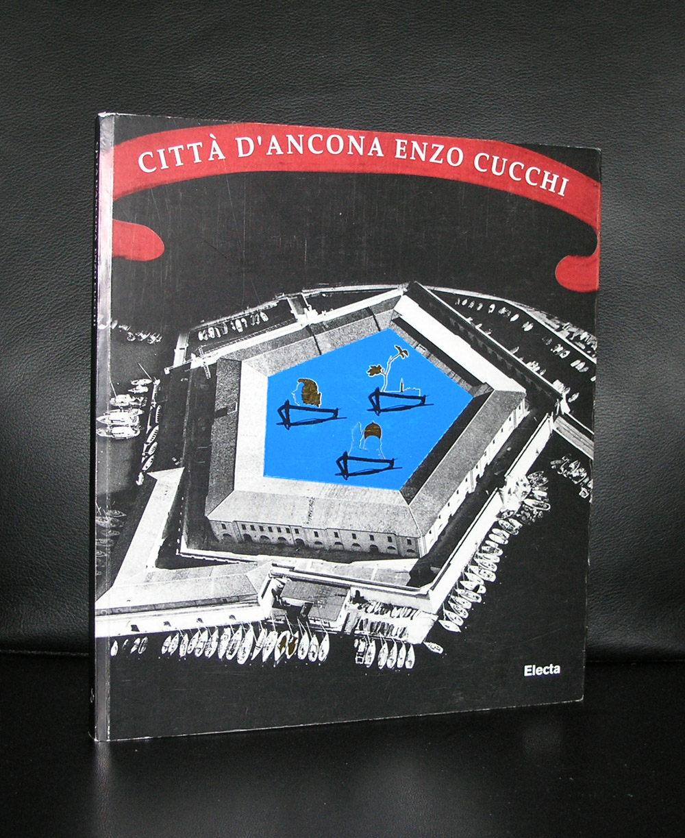
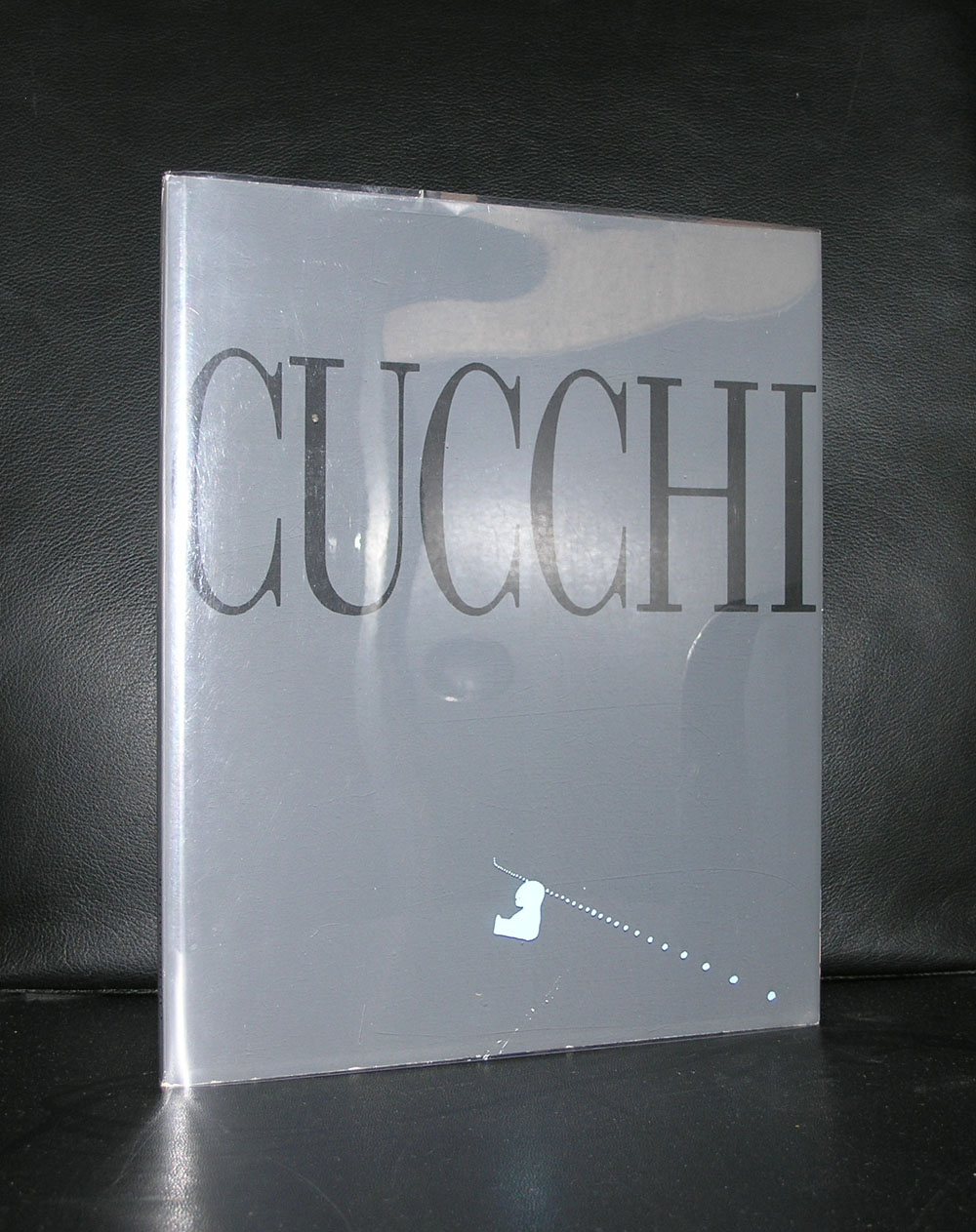
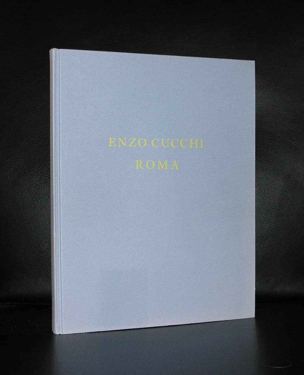
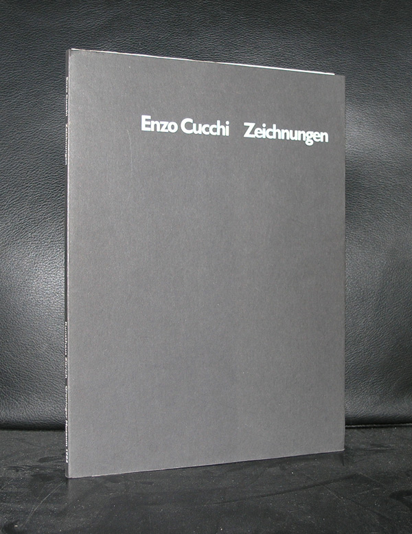
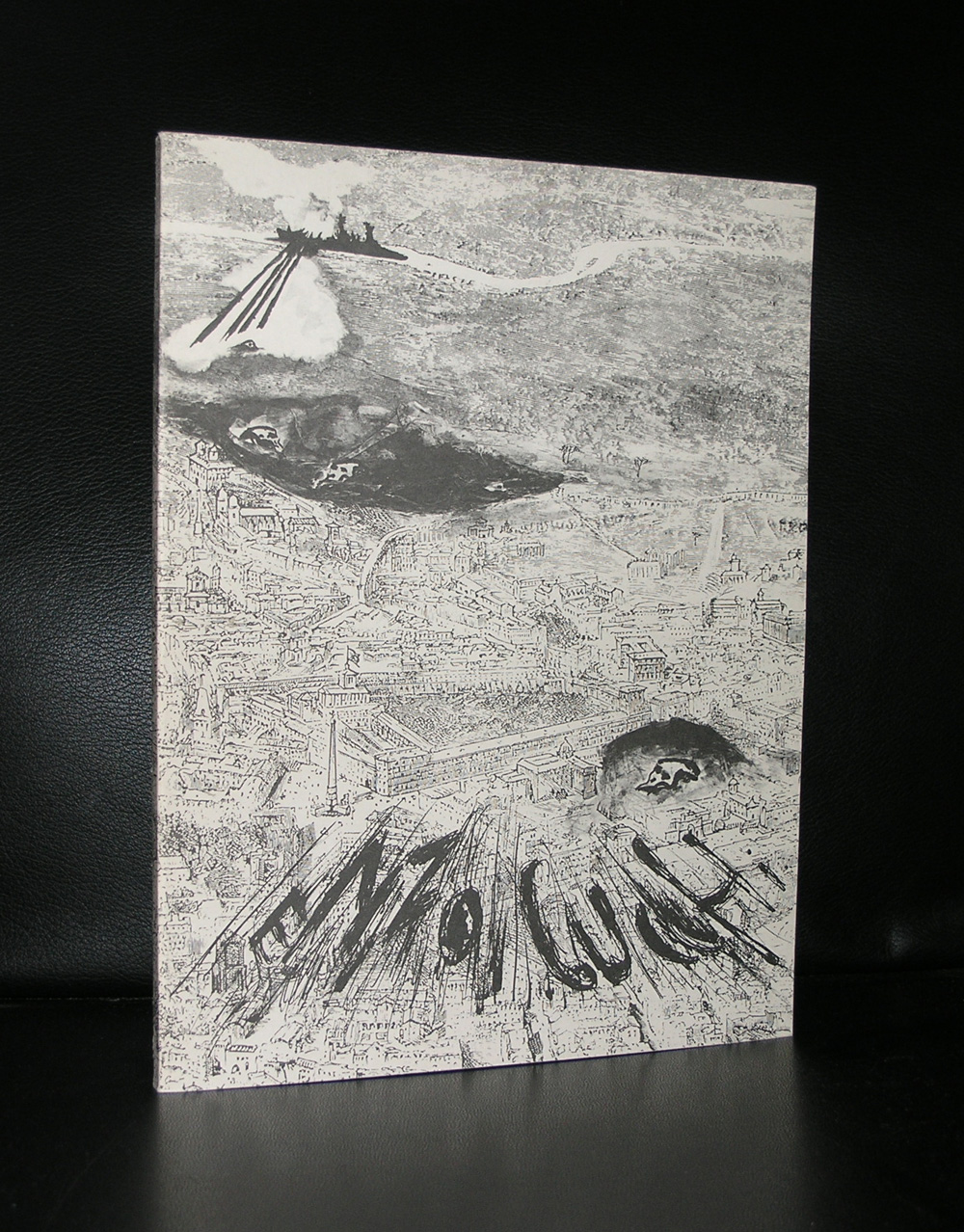
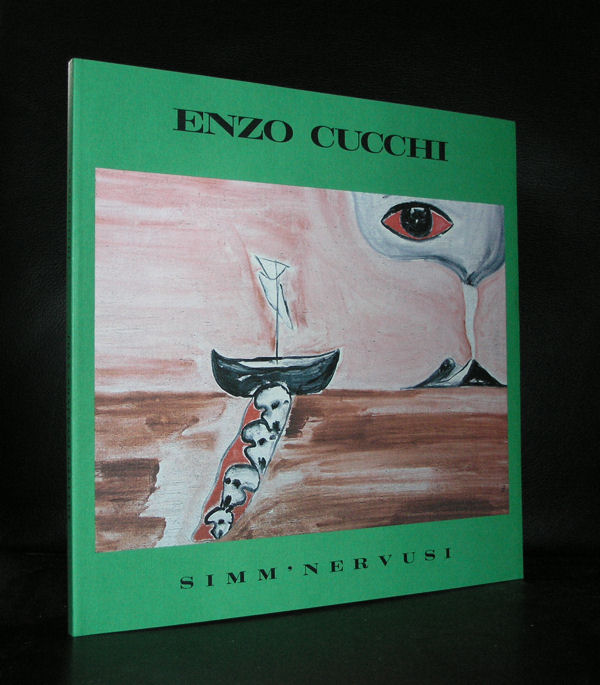
Enzo Cucchi was born in 1949 in Morro d‘Alba, a farming village in the province of Ancona in central Italy. As an autodidactic painter Cucchi won different prices already in his early years even though he was more interested in poetry at the time. He frequently visited poet Mino De Angelis, who was in charge of the magazine „Tau“. Through „La Nuova Foglio di Macerata“, a small publishing house, he met with art critic Achille Bonito Oliva, an important figure in the artist‘s prospective career. In its catalogues „La Nuova Foglio di Macerata“ published writings of artists such as Cucchi’s „Il veleno è stato sollevato e trasportato!“ in 1976. Frequent trips to Rome in the mid-seventies revived Cucchi’s interest in visual arts. He moved to Rome, temporarily abandoned poetry and dedicated himself exclusively to the visual arts. Here Cucchi met with different artists such as Sandro Chia, Francesco Clemente, Mimmo Paladino and Nicola de Maria with whom he began to work in close contact and to establish dialectical and intellectual dialogues.Achille Bonito Oliva was the first to see this young generation of Italian artists of the seventies as a group. Since this group of artists has frequently have ehibitions as a group or as an individual artists in the Netherlands. The Groninger Museum and the Stedelijk Museum had shows during the eighties and nineties and bought several works for their collections. Together with the exhibitions some excellent catalogues were published of which some are available at www.ftn-books.com
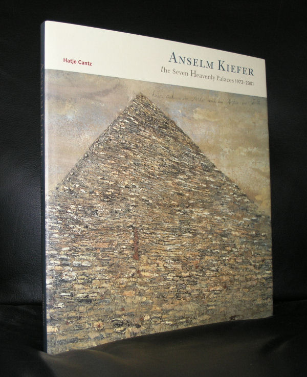
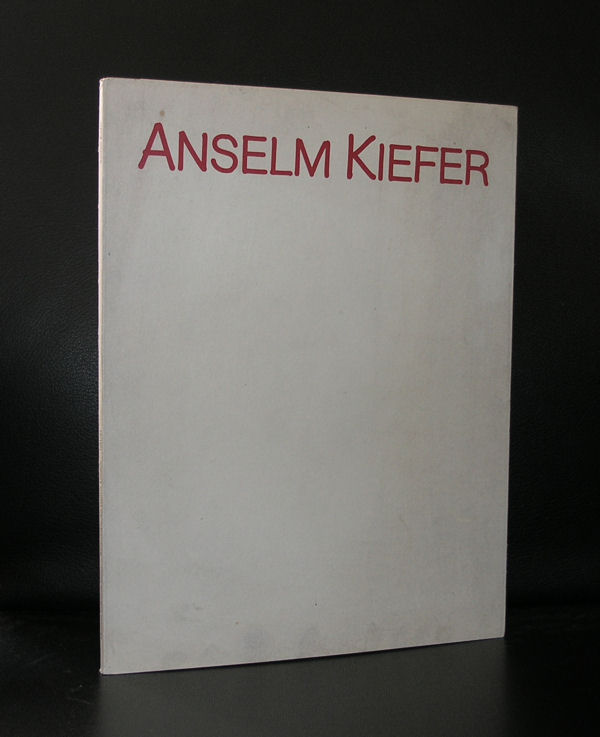
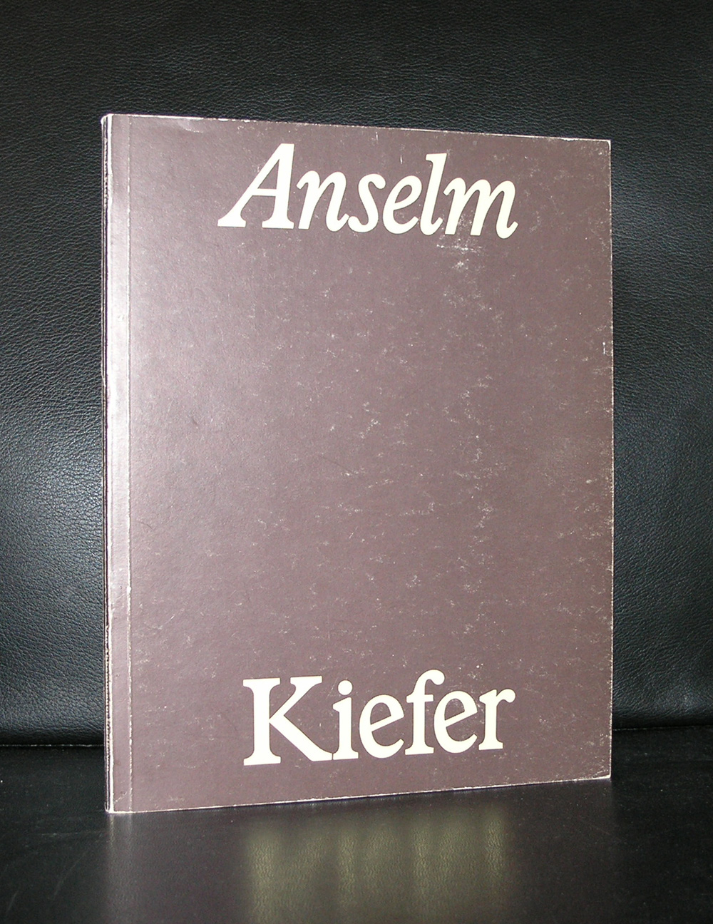
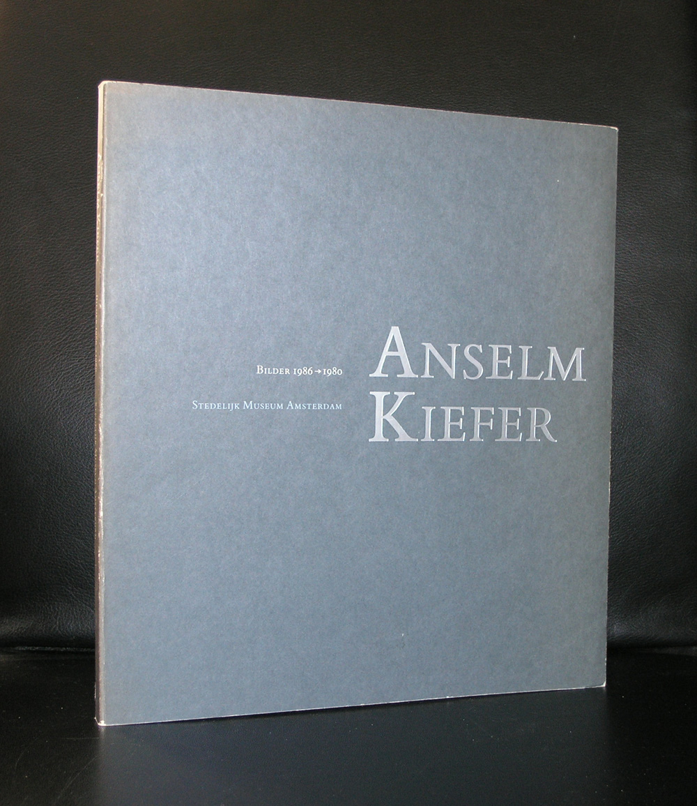
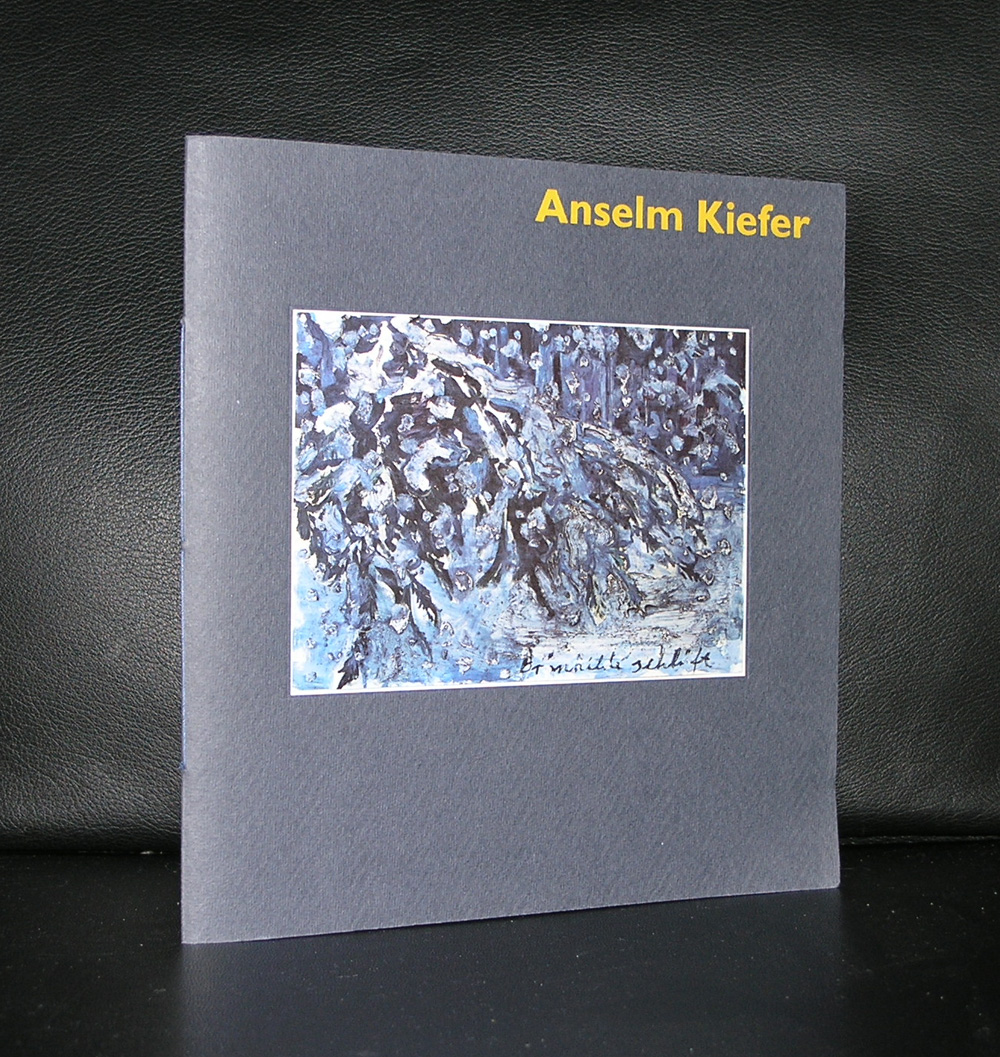
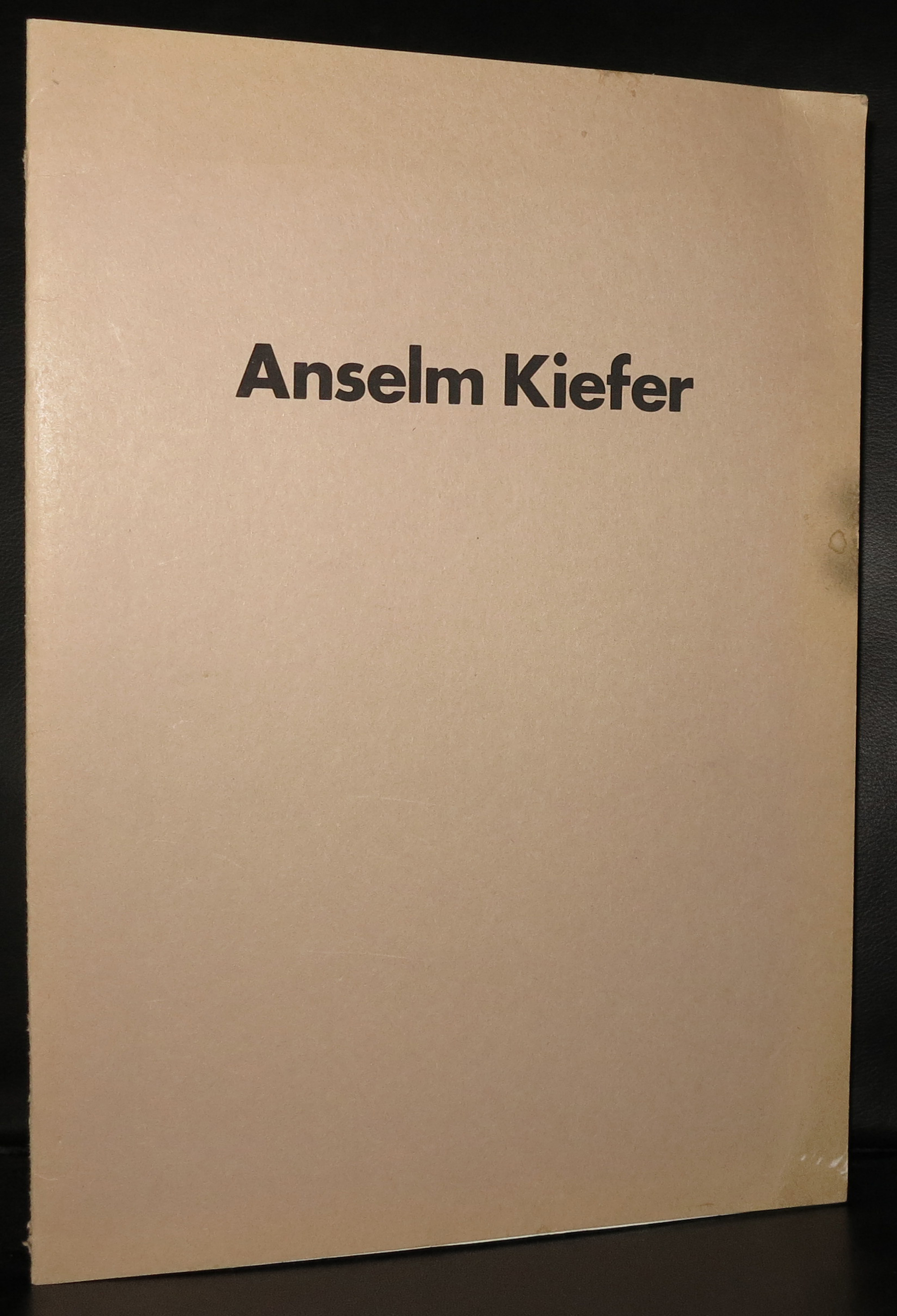
It is 31 years ago that i saw a work by Kiefer for the first time I and was really impressed . I remember the occasion….the occasion the Anselm Kiefer exhibition at the Stedelijk Museum Amsterdam. Grey, sombre , large paintings with scenes that reminded of war, devastation and ruins . Later i learned that the German history and the Holocaust were main themes Kiefer always used in his works. The history of Germany being one of the main subjects in his extremely large paintings. The Stedelijk Museum bought one of the paintings for its collection. “Innenraum” is a large painting ( 280 x 311 cm.) , but small compared to other Kiefer works.
The exhibition was a great succes and since i encountered several other Kiefers in museums. One stands out, impressive and it’s size is overwhelming. ( almost 10 meters in length) and is a must see whenever you visit the North of Spain.
Anselm Kiefer
Only with Wind, Time, and Sound (Nur mit Wind, mit Zeit und mit Klang), 1997
Acrylic and emulsion on canvas
473 x 944 x 22 cm
Guggenheim Bilbao Museoa
( the following text comes from the Art Story site)
It is the Anselm Kiefer’s monumental, often confrontational canvases were groundbreaking at a time when painting was considered all but dead as a medium. The artist is most known for his subject matter dealing with German history and myth, particularly as it relates to the Holocaust. These works forced his contemporaries to deal with Germany’s past in an era when acknowledgment of Nazism was taboo. Kiefer incorporates heavy impasto and uncommon materials into his pieces, such as lead, glass shards, dried flowers, and strands of hay, many of which reference various aspects of history and myth, German and otherwise. Influenced by his contemporaries Joseph Beuys and Georg Baselitz, as well as by postwar tendencies in Abstract Expressionism and Conceptual art, Kiefer is considered part of the Neo-Expressionist movement, which diverged from Minimalism and abstraction to develop new representational and symbolic languages.
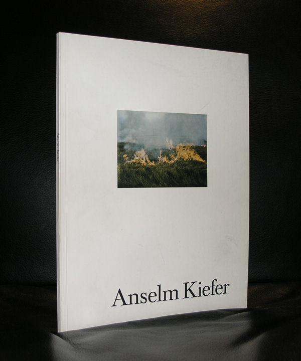
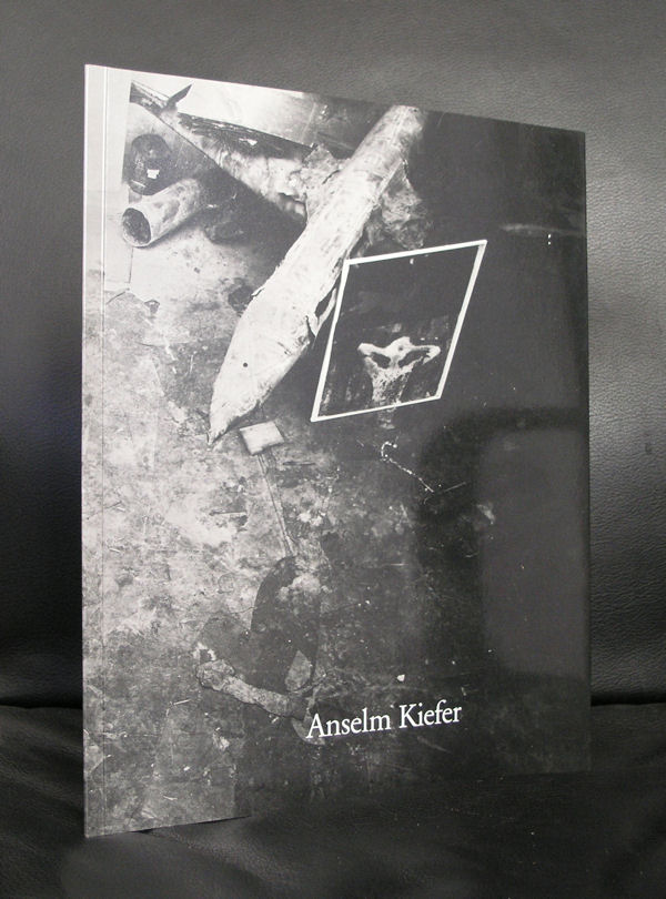
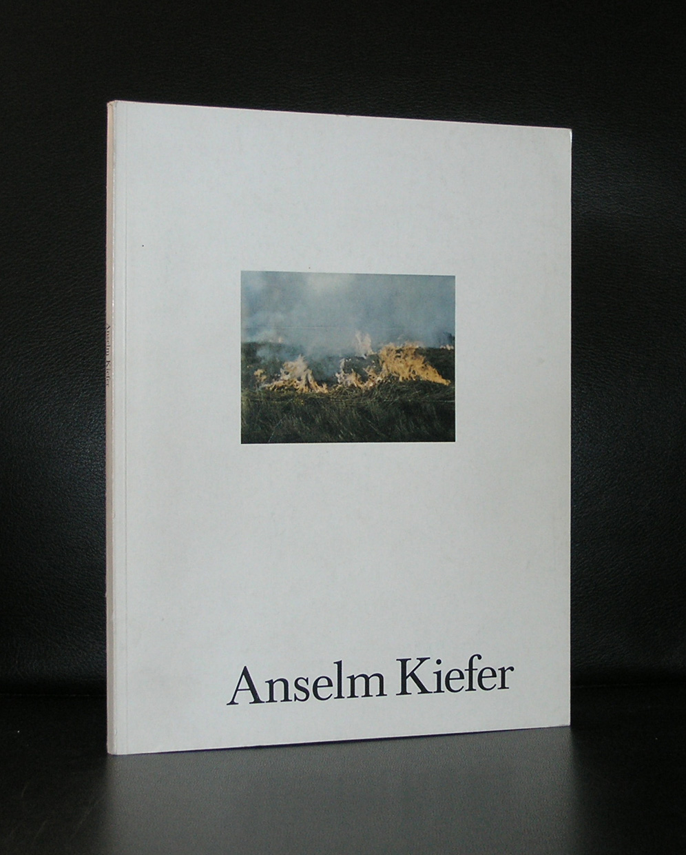
Of course there are some nice publications available at www.ftn-books.com including the Anselm Kiefer / Stedelijk Museum catalogue from 1986
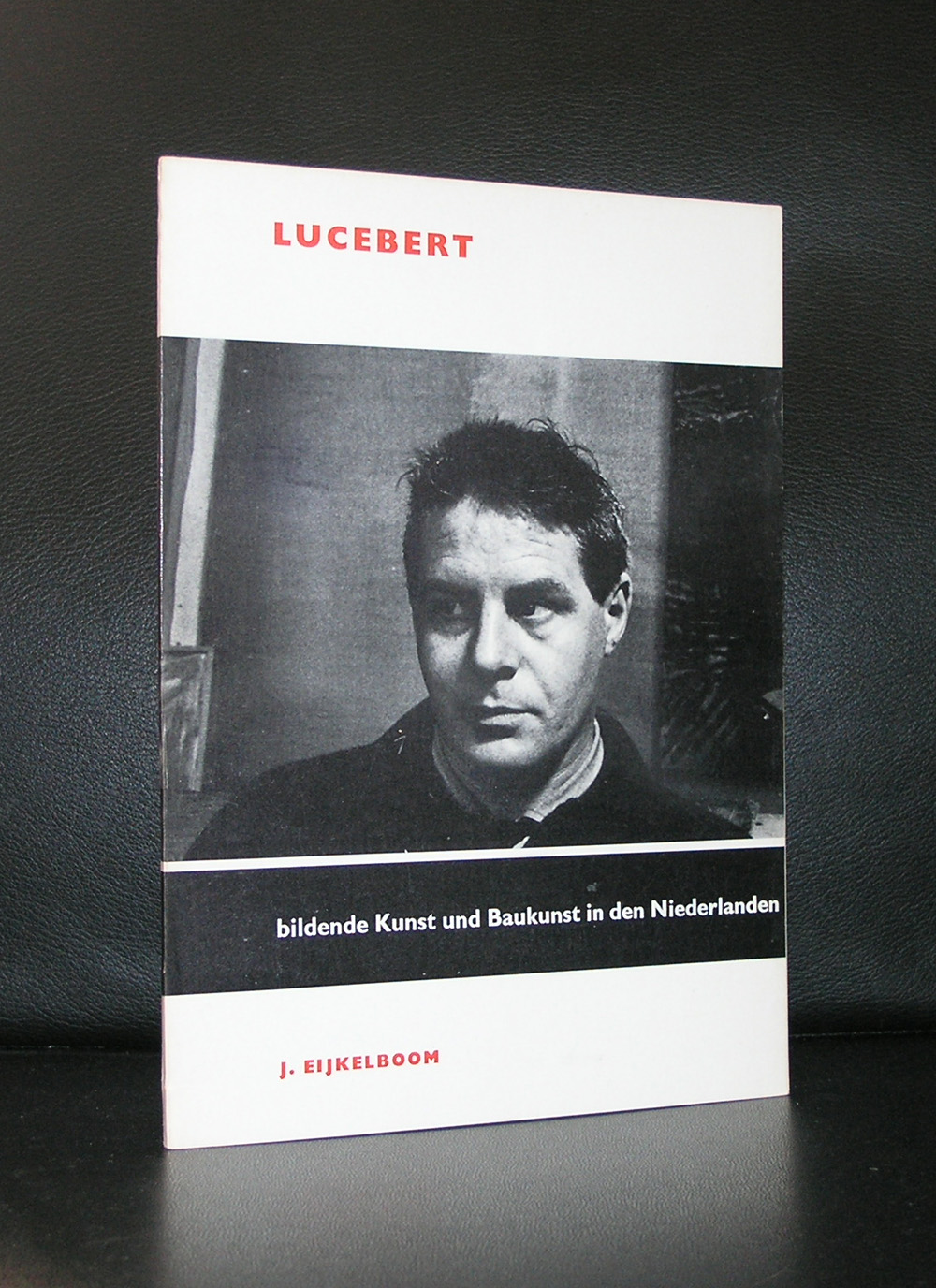
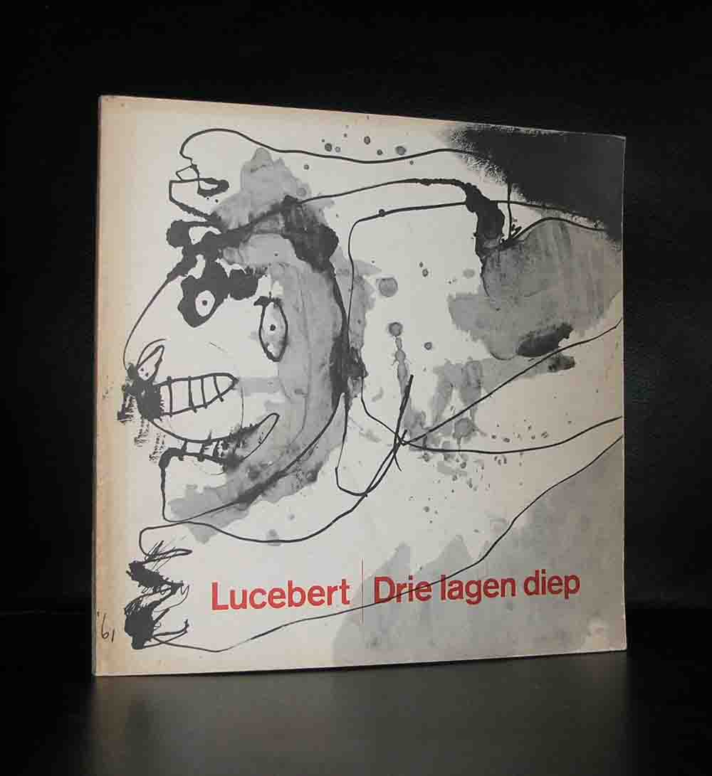
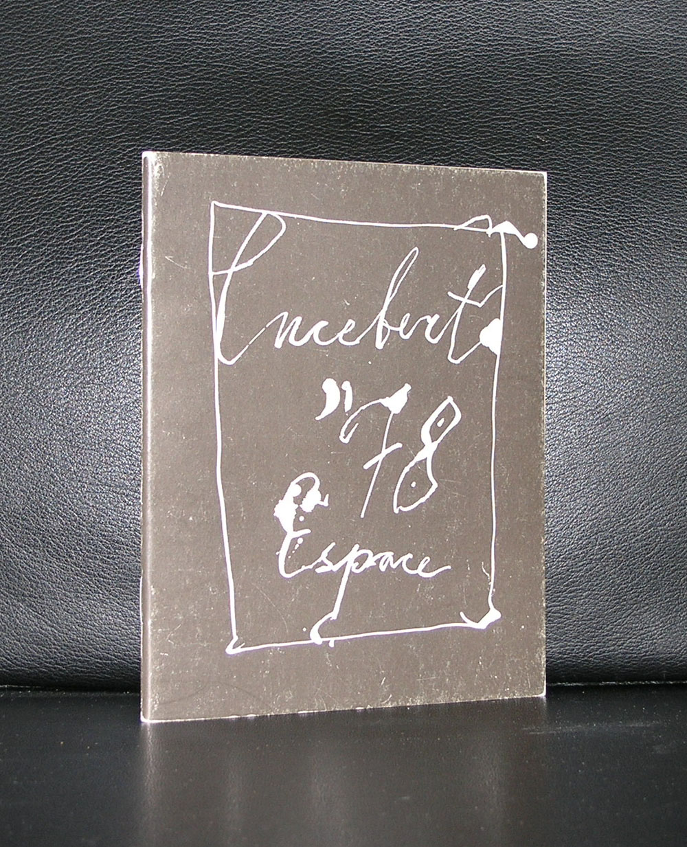
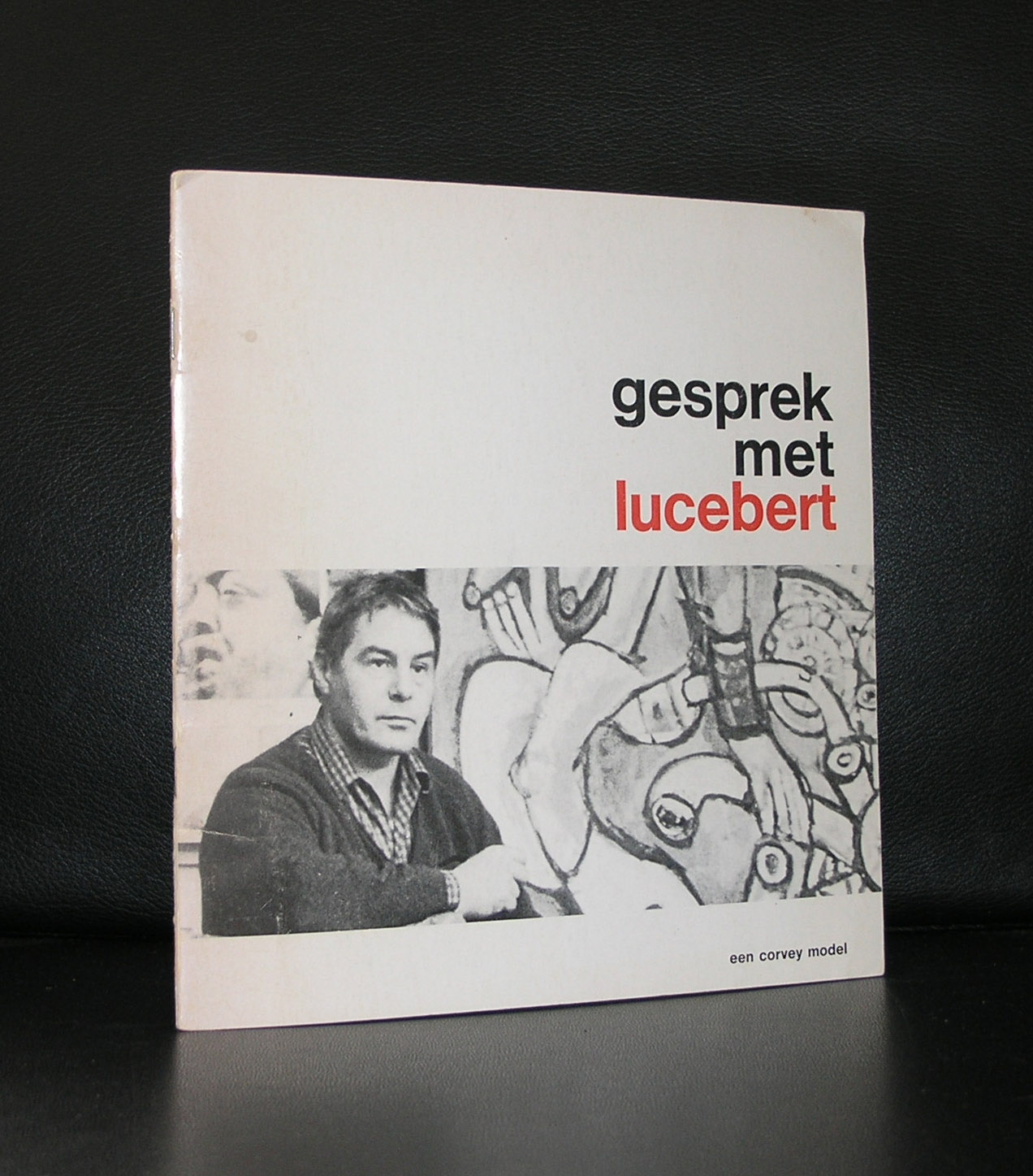
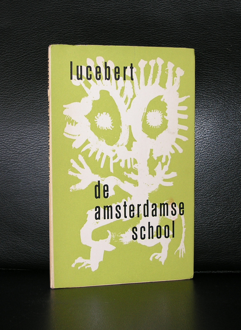
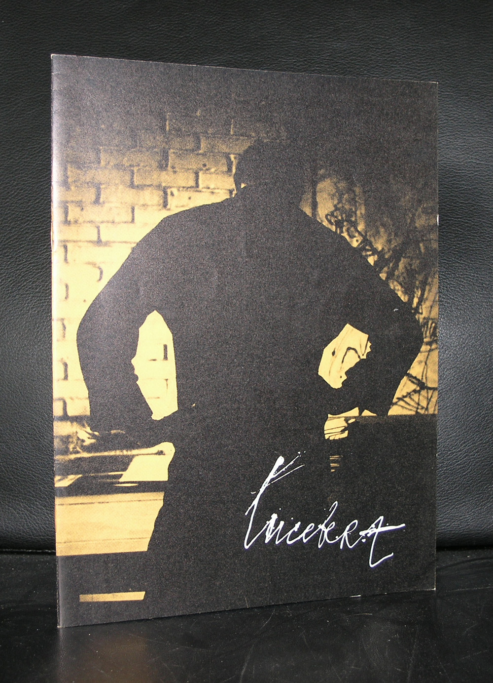
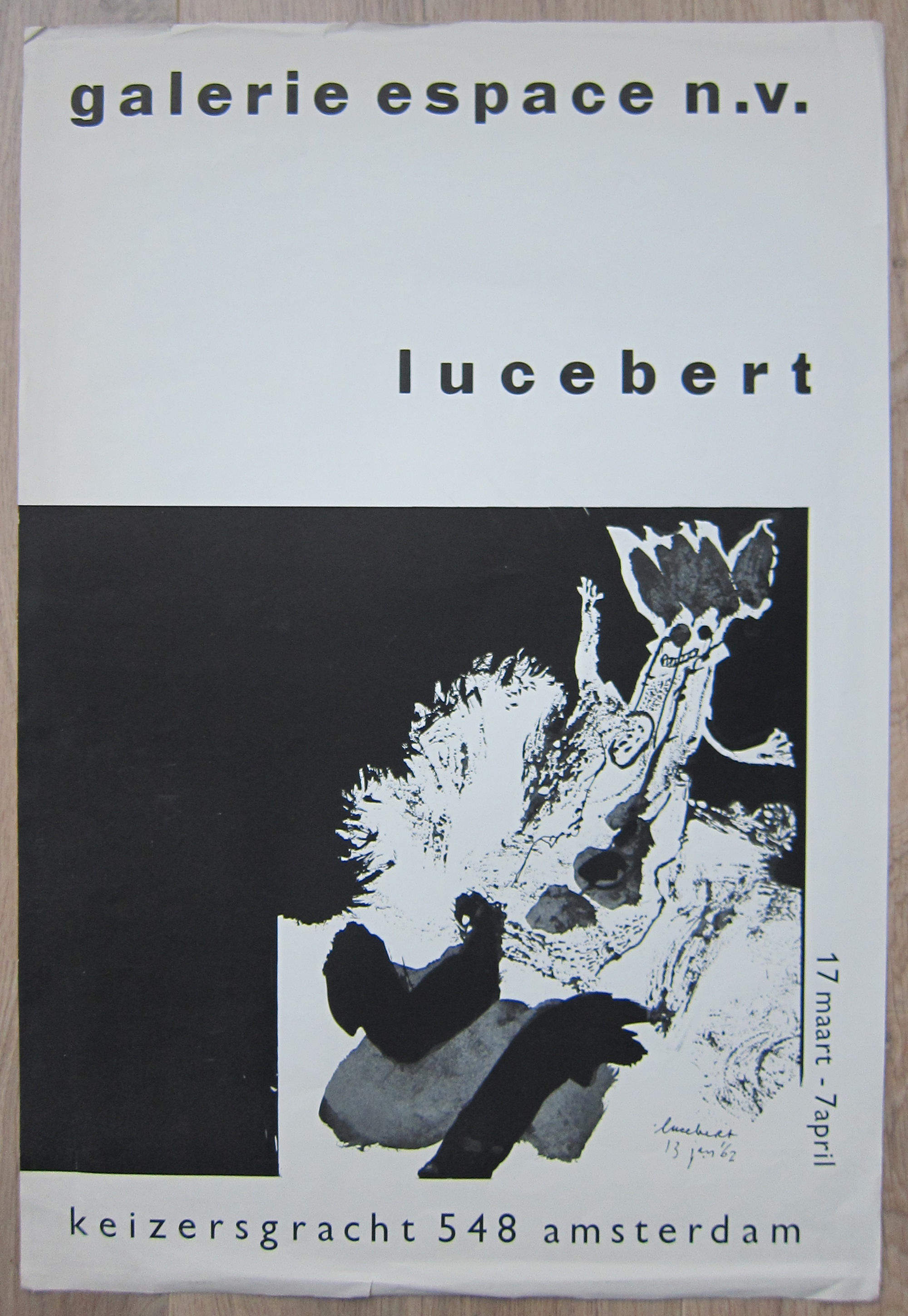
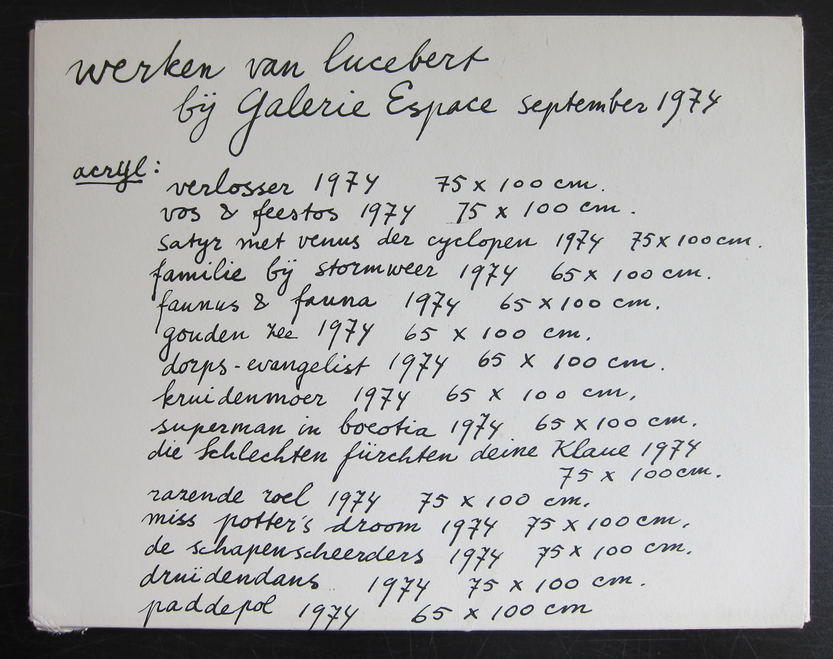
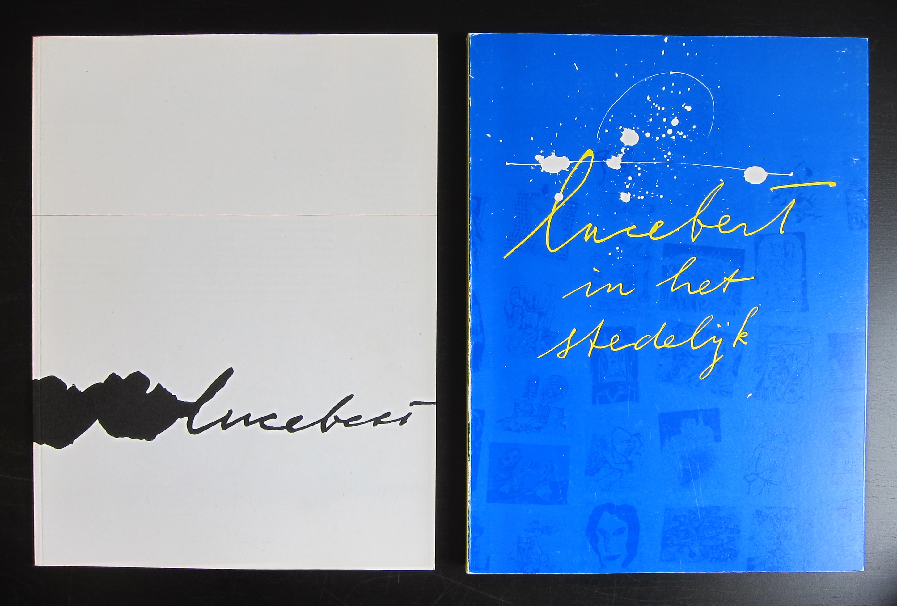
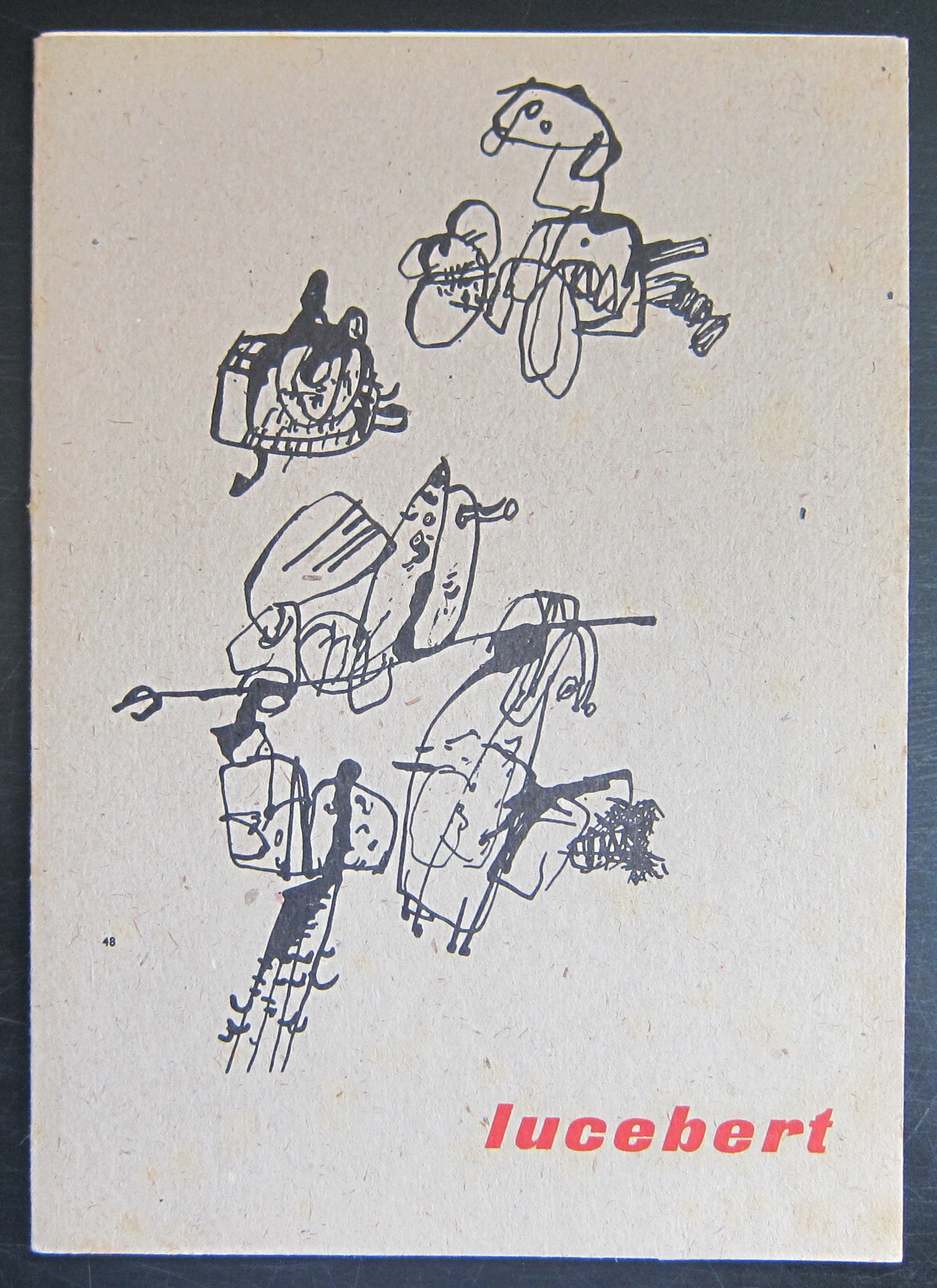
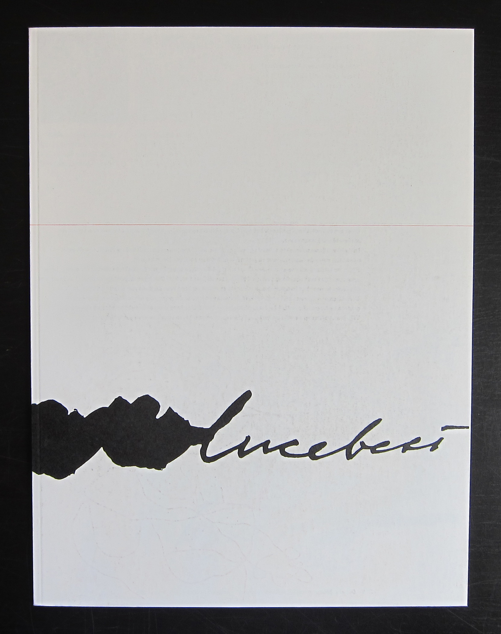
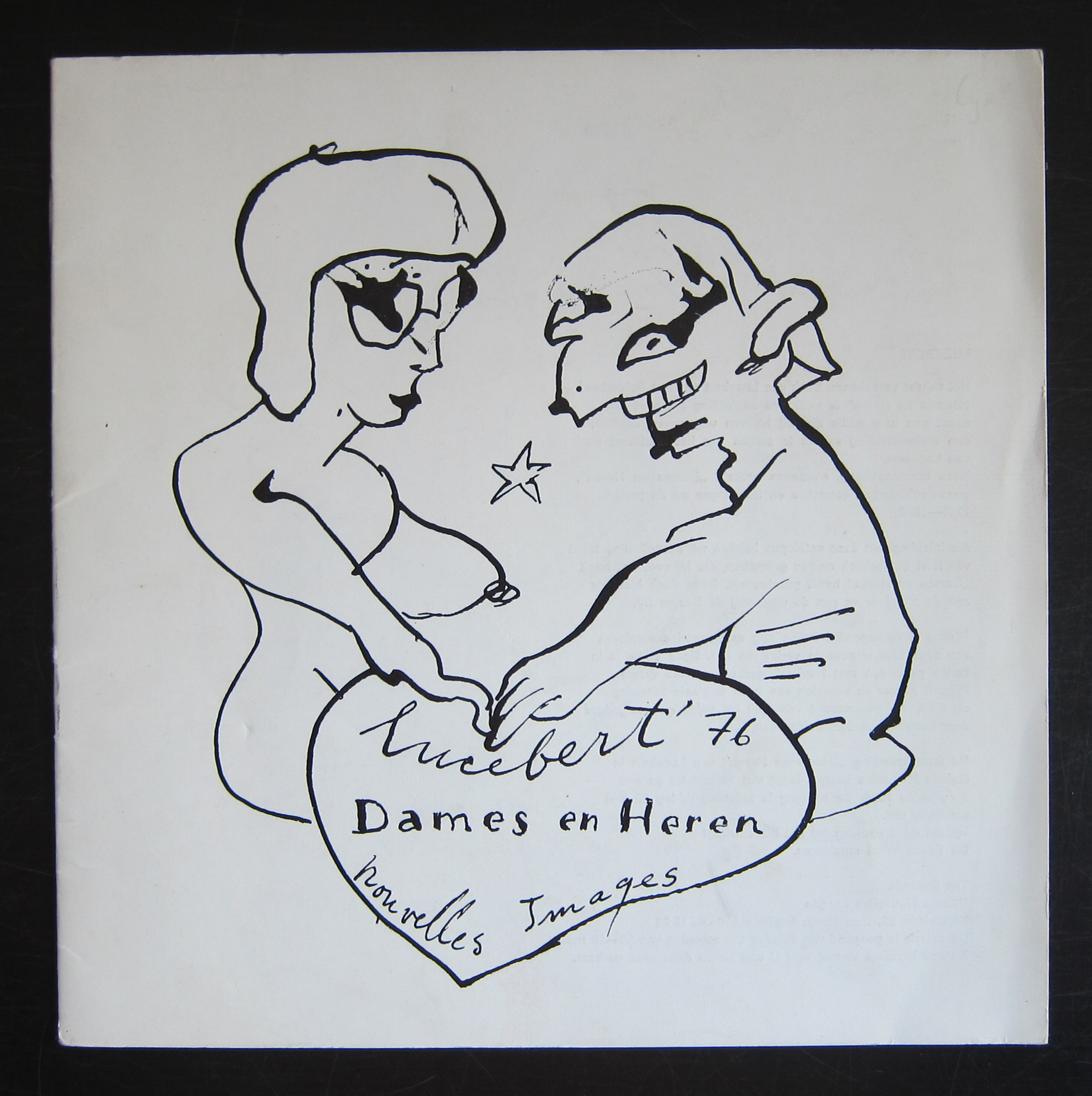
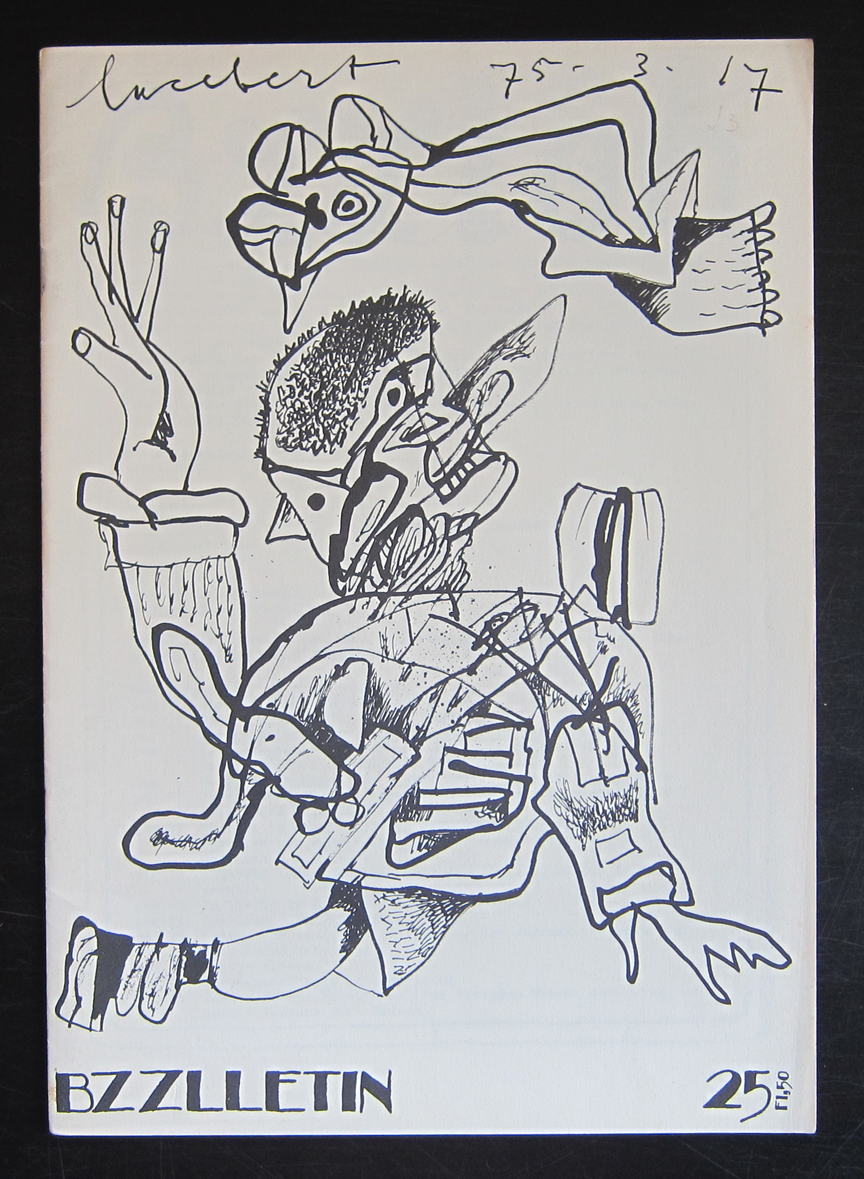
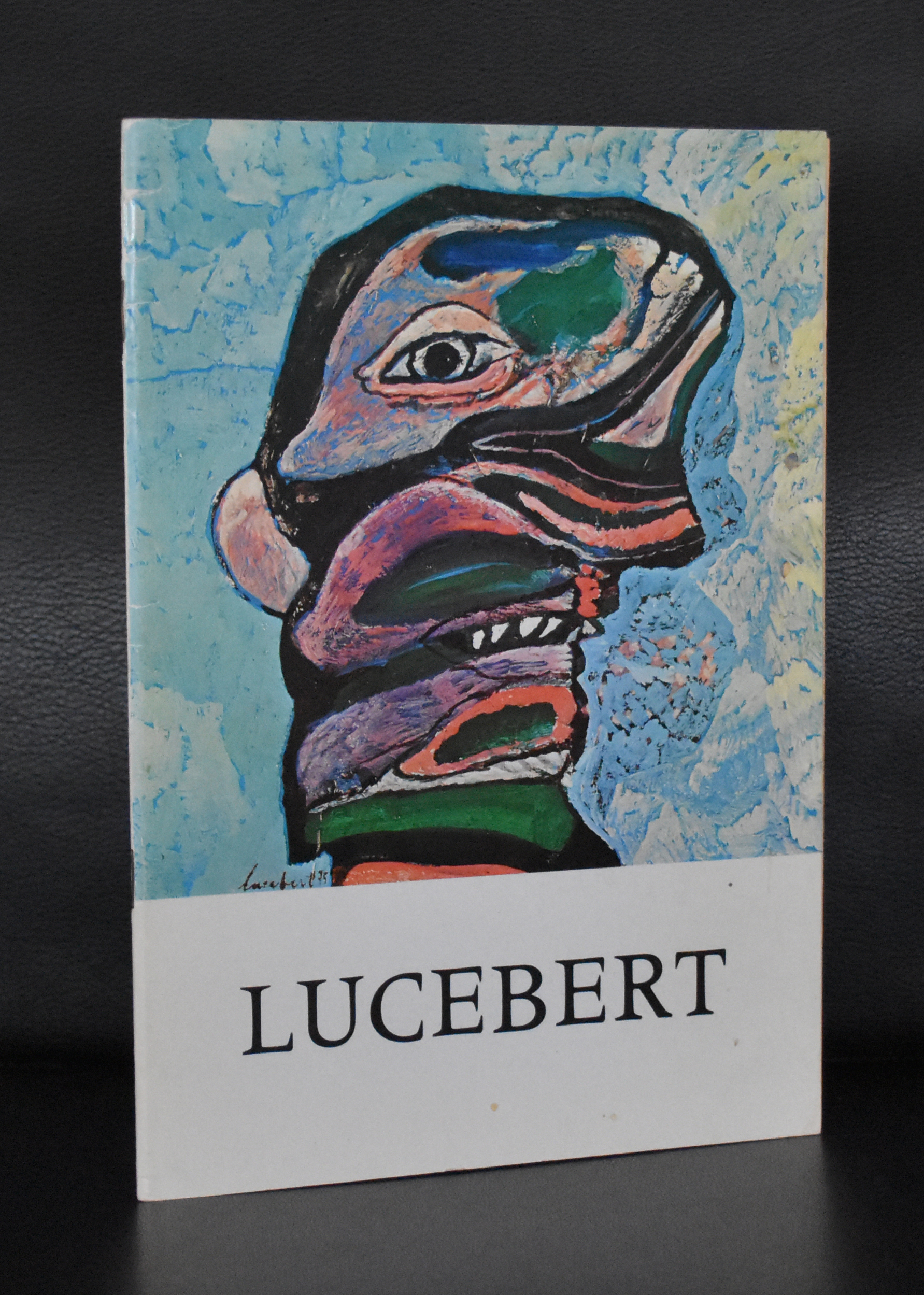
Everywhere i come across Lucebert (Lubertus Jacobus Swaanswijk) nowadays. Re-editions of his poems, paintings at auction and exhibitions in galleries and museums. There is a huge interest in his works since 20 years or so, but before that period he was hardly known as a painter , but nowadays he is considered as one of the leading dutch artists from the 20th century . In his early years he was very much influenced by Cobra , but soon he developed his personal style which for me is a crossing between Cobra and Art Brut. He became known for his poems, but when you ask about Lucebert nowadays, people think of him first and foremost as a painter and because of this interest it is harder and harder to find the early publications on his paintings and etchings. There are some by Nouvelles Images, but the most important ones come from the pubvlications series of the Stedelijk Museum Amsterdam. Publications in which original etchings were bound and therefore are highly collectable ( and expensive) publications. www.ftn-books.com has a nice selection of classic and collectable Lucebert publications.
OLYMPUS DIGITAL CAMERA
OLYMPUS DIGITAL CAMERA
OLYMPUS DIGITAL CAMERA
OLYMPUS DIGITAL CAMERA
OLYMPUS DIGITAL CAMERA
OLYMPUS DIGITAL CAMERA
OLYMPUS DIGITAL CAMERA
for more information on Lucebert visit http://lucebertstichting.nl
Artist/ Author: Oliver Boberg
Title : Memorial
Publisher: Oliver Boberg
Measurements: Frame measures 51 x 42 cm. original C print is 35 x 25 cm.
Condition: mint
signed by Oliver Boberg in pen and numbered 14/20 from an edition of 20