
Piet Dirkx cigarbox 505
Piet Dirkx cigarbox 505
Here is the link for the blog i wrote on this beautiful and impressive Sandberg designed special by Wessel Couzijn. It is now for sale at ftn-art
https://wordpressstrato-pacfwc5kp0.live-website.com/2017/11/08/wessel-couzijn-1912-1984-ii/
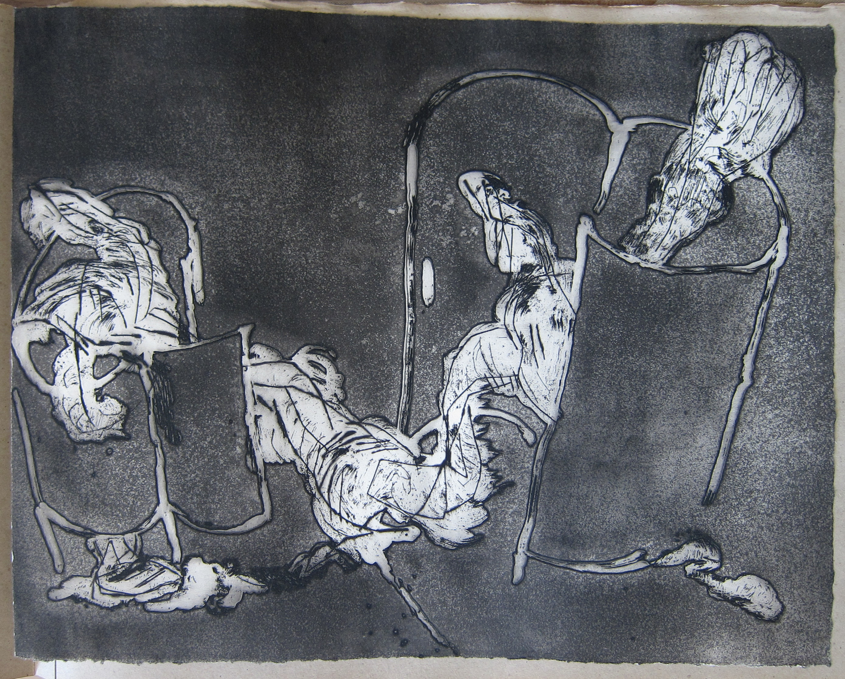
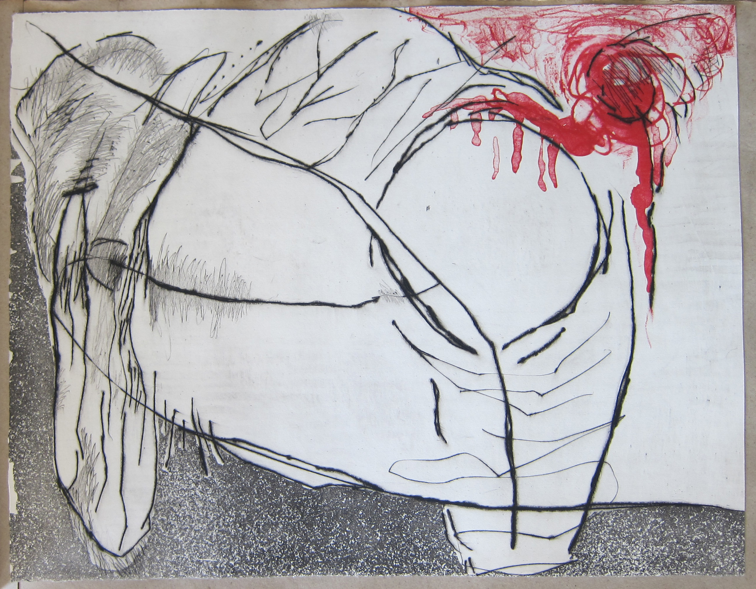
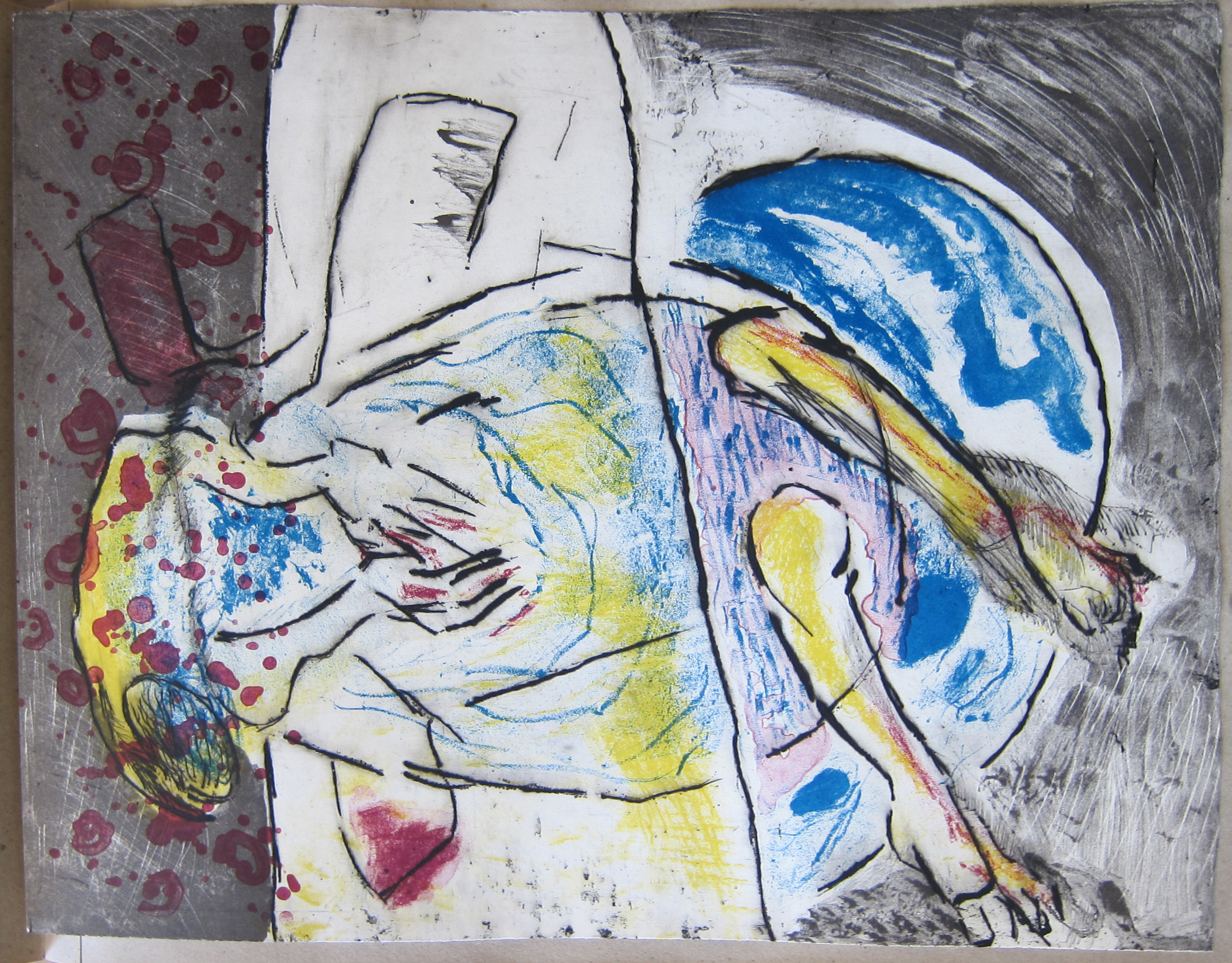
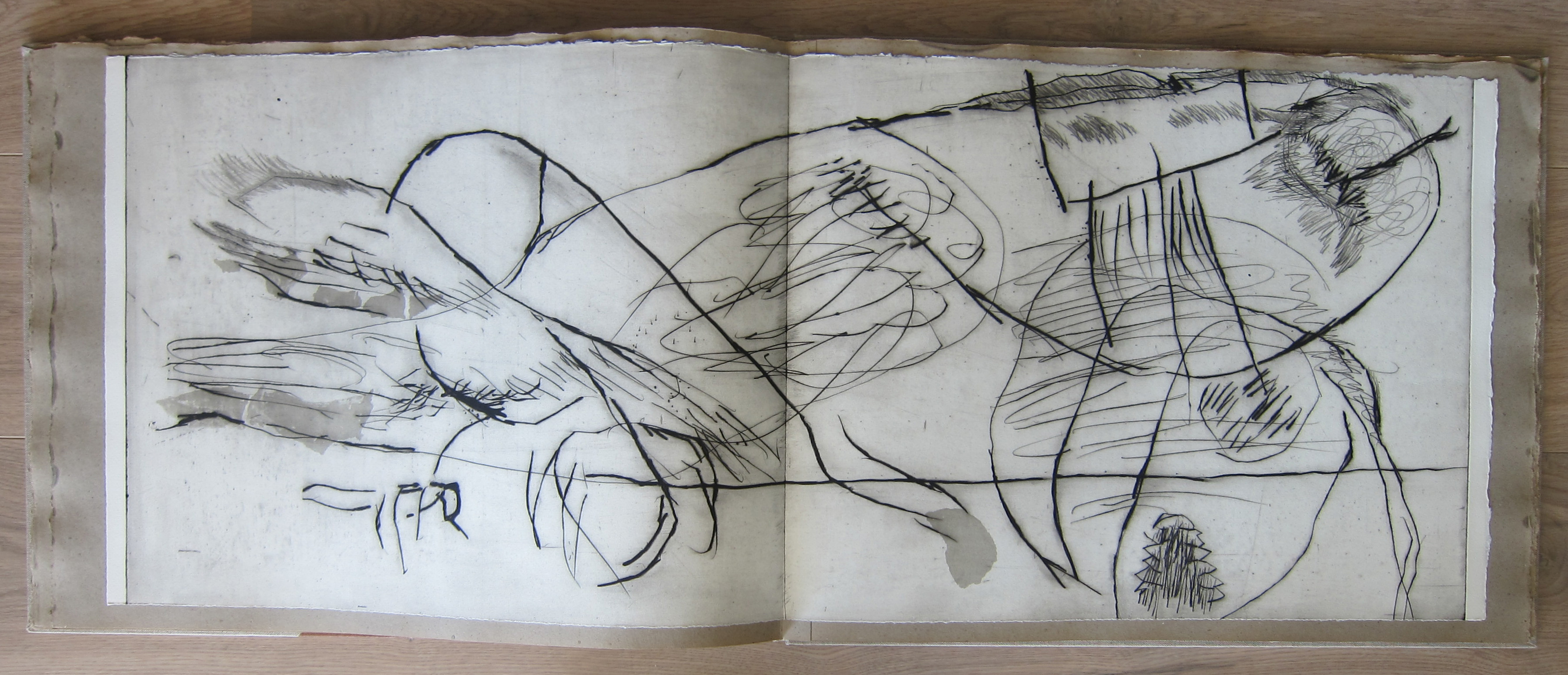
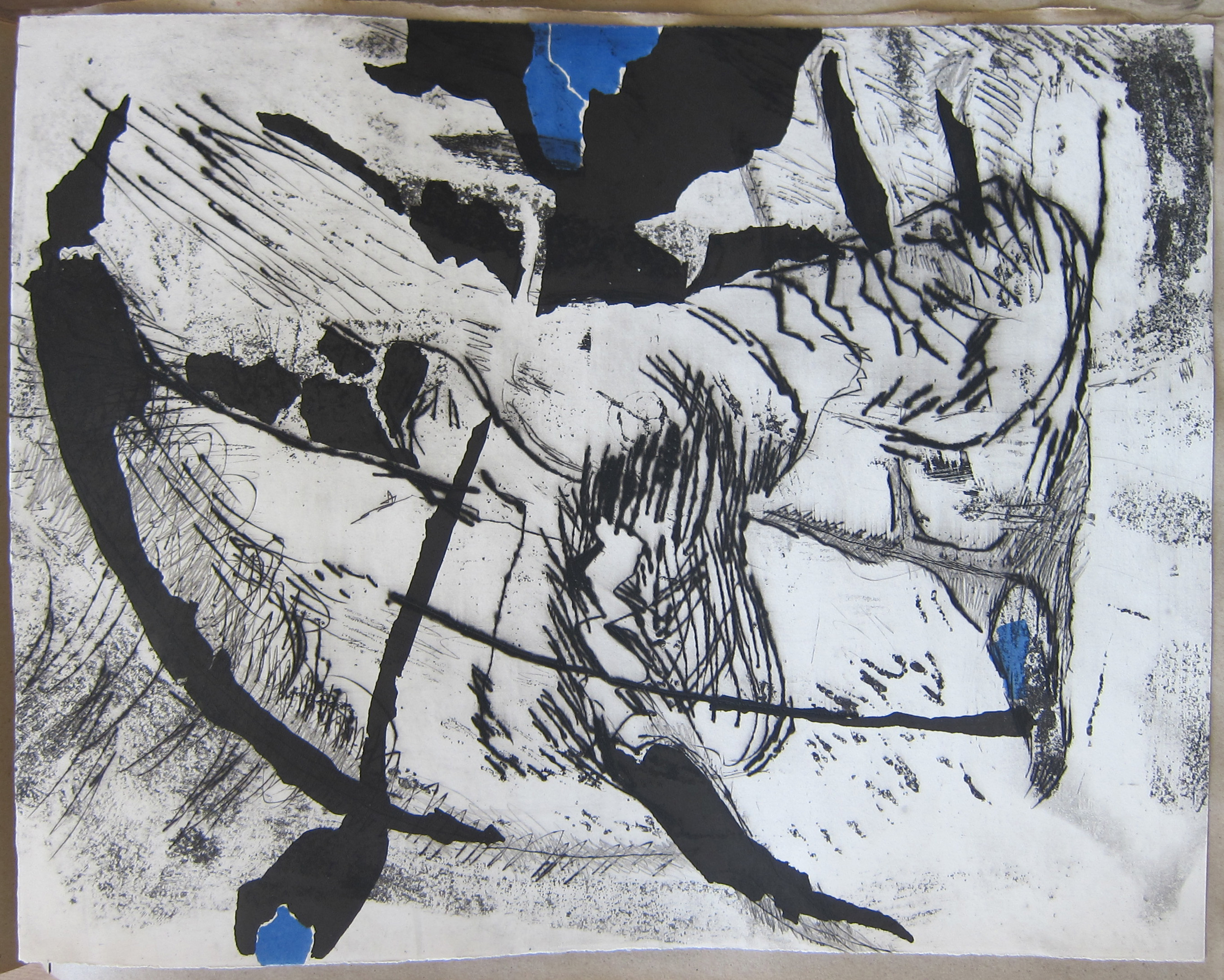

Artist/ Author: Wessel Couzijn
publisher W.A. Palm a La Haye
Text / Language: french
Measurements: 22 x 17.1 inches.
Condition: mint for the prints, nm++ for the book
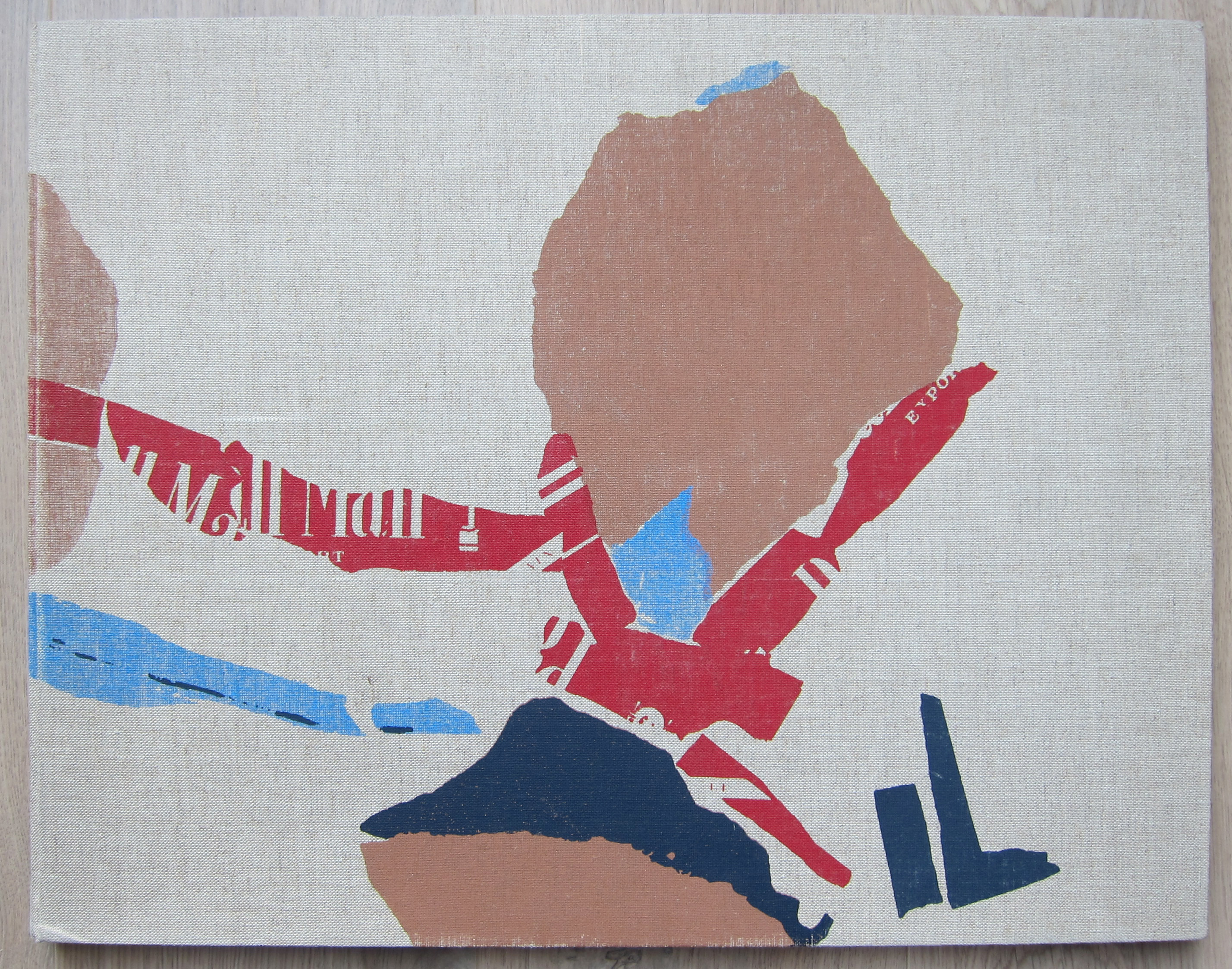
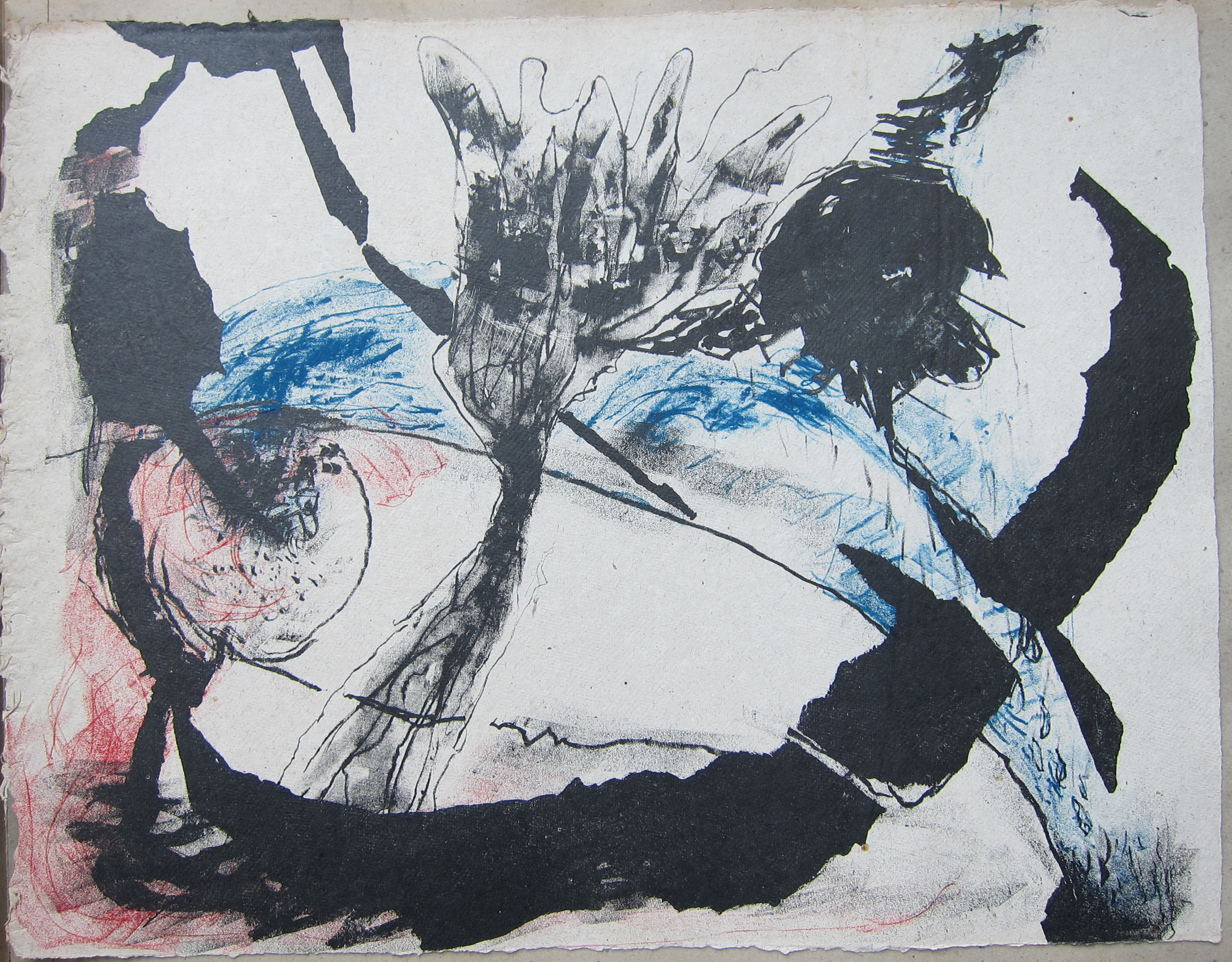
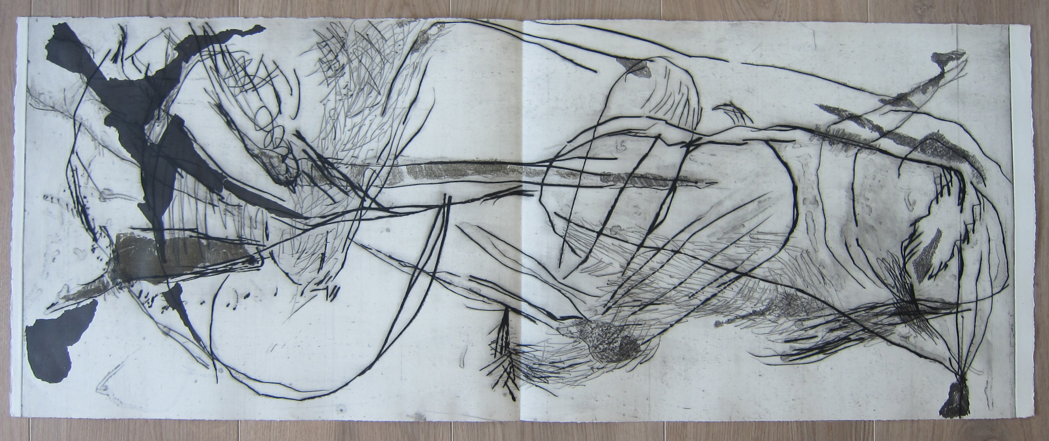
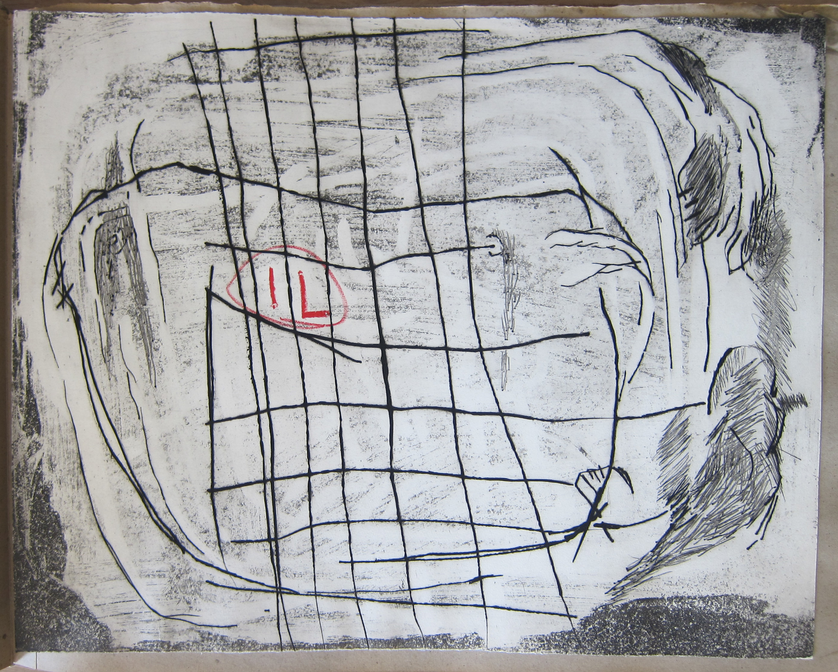
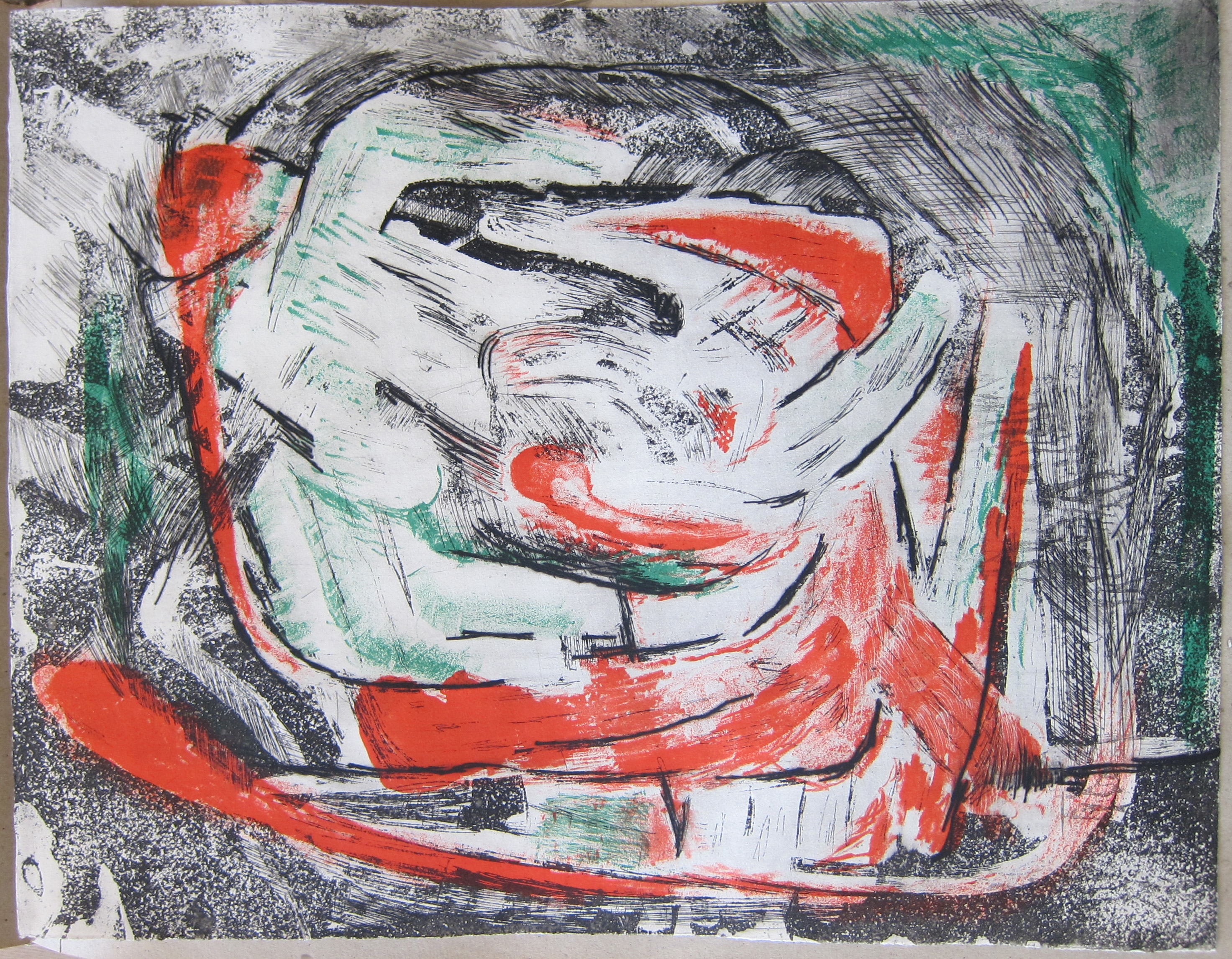
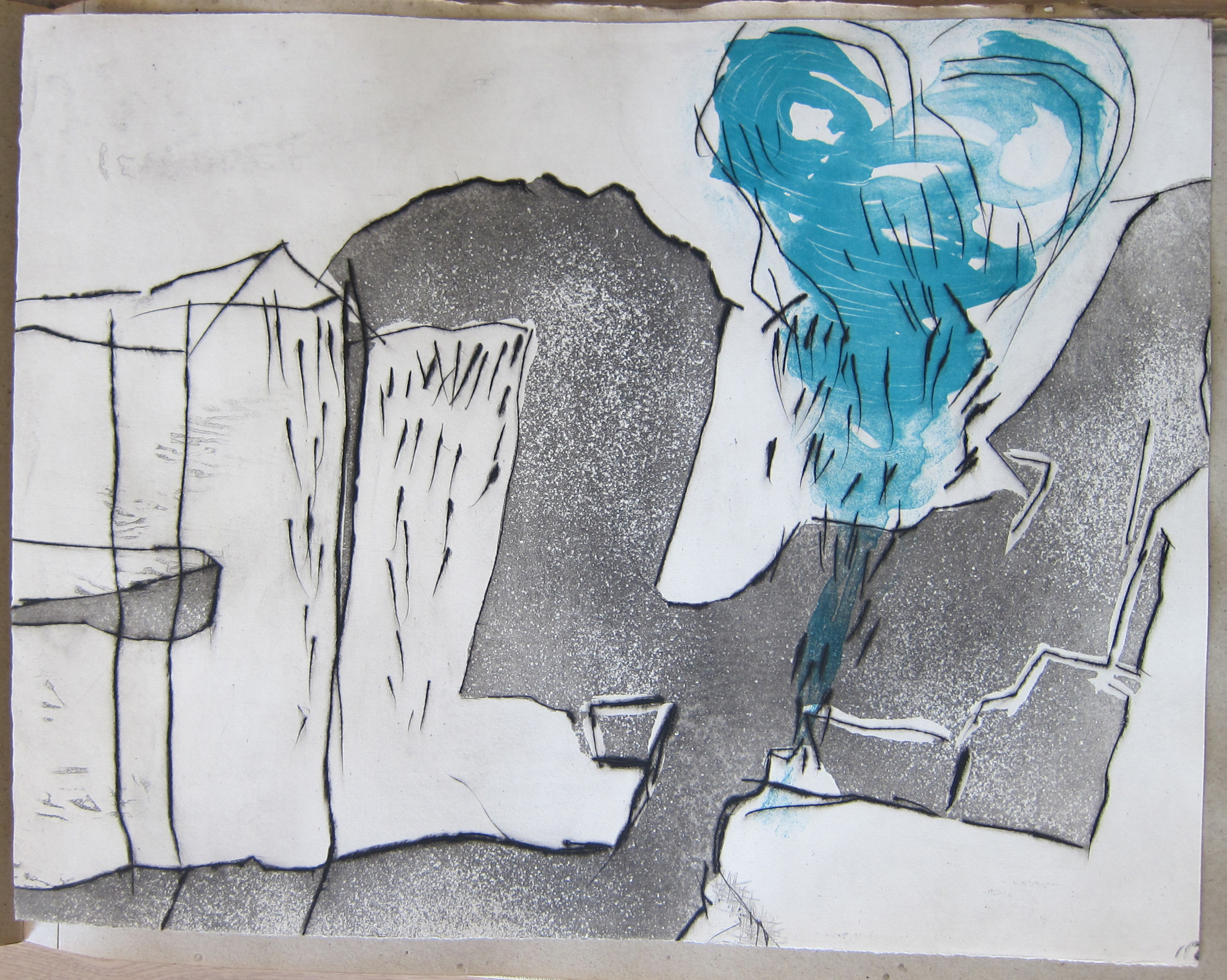
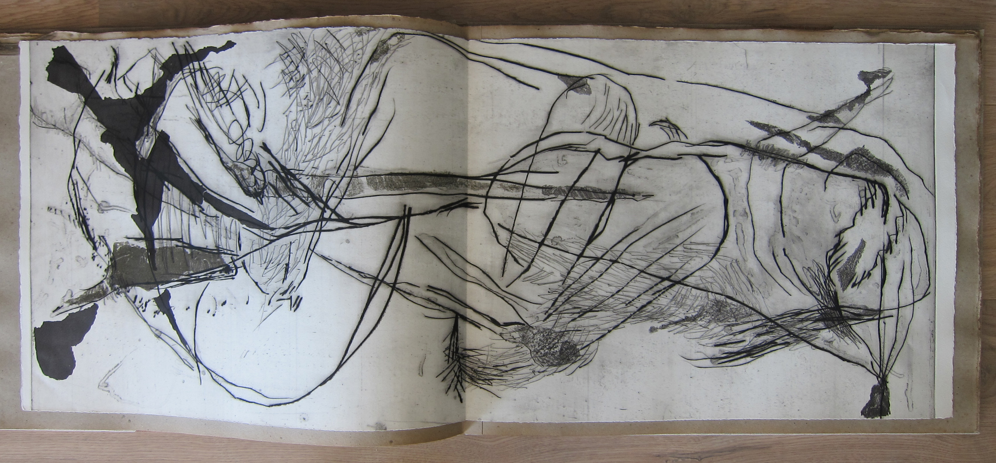
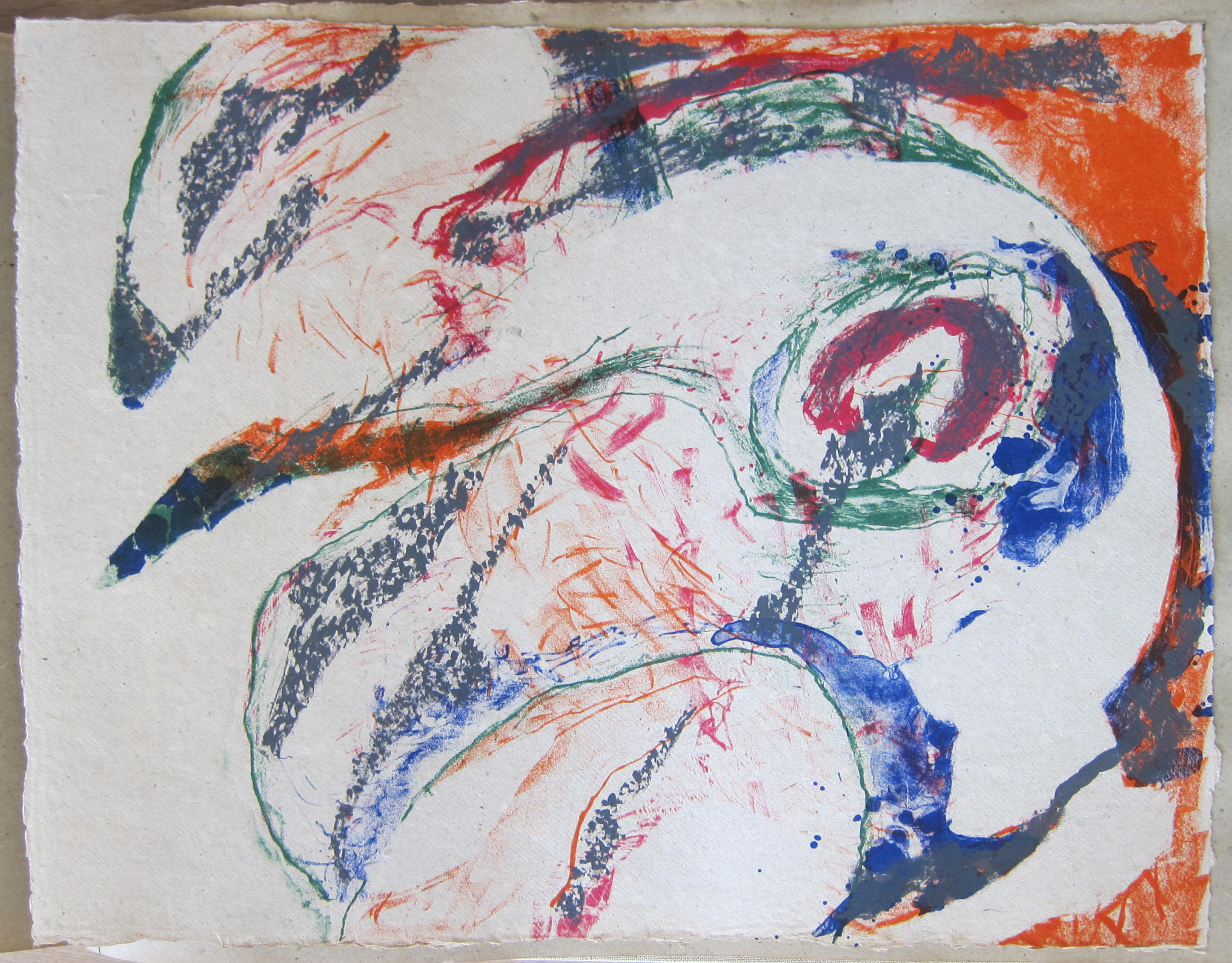
This is a rare publication from 1966. Published in a signed and numbered edition of 75 copies. . This no. 11
Book contains ( loose inserted ) 12 original prints at the inside and 1 on the cover by Wessel Couzijn.
10 prints measuring 20 x 15.7 inches
and 2 double prints measuring 40 x 15.7 inches
All prints are in MINT condition
price is : USD 2950,–
for more information pleas inquire

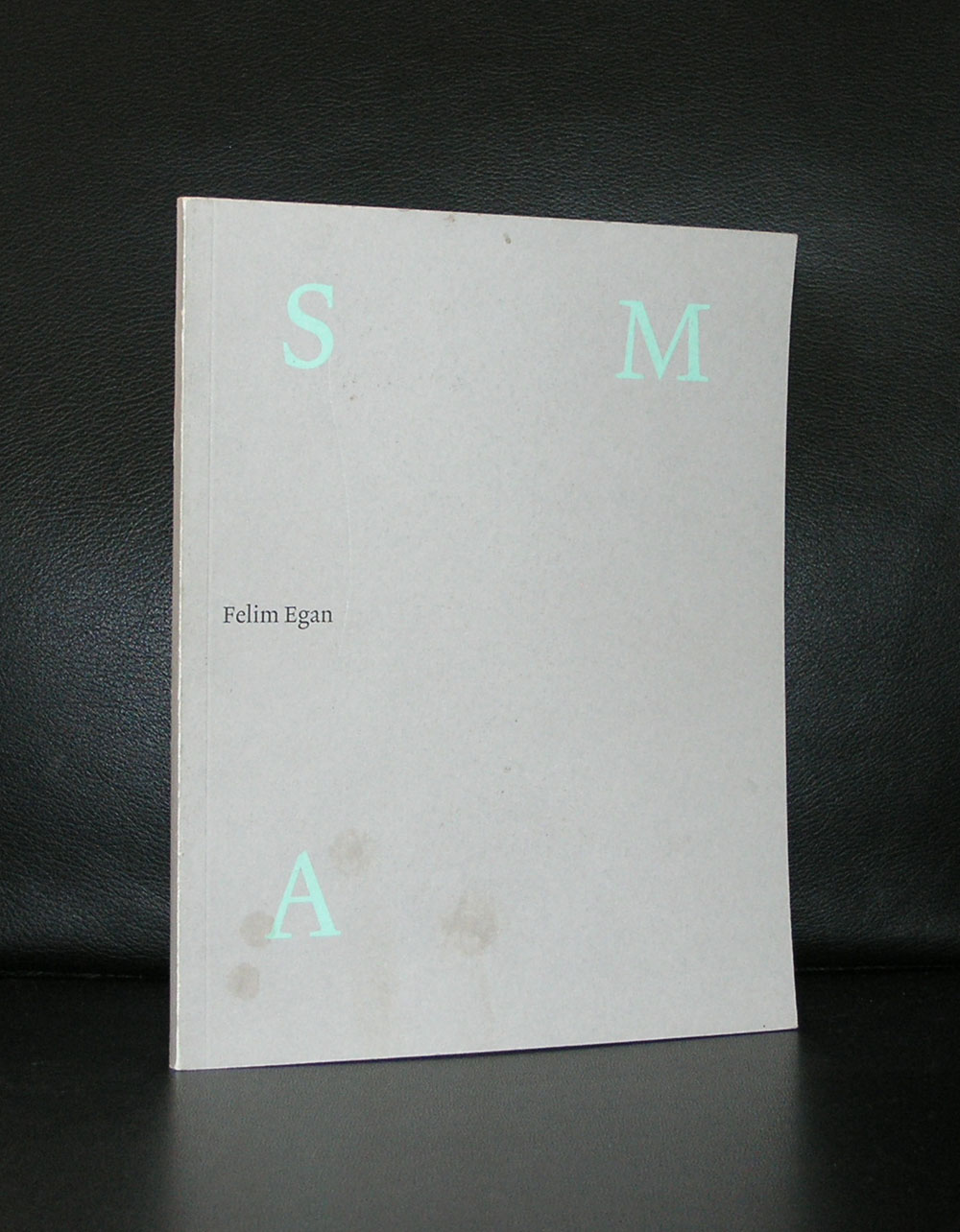
I had never heard of Felim Egan, but when i saw one of his paintings ( for the first time at Seasons gallery in Den Haag) i became an admirer. A free kind of constructivist abstraction in soft colors, which looks like Irish mist over a landscape. Later i found 2 publications on this artist which are now available at www.ftn-books.com so when i encountered these i decide to write a blog on an artist of whom i did not know very much except that he had exhibited in the Stedelijk Museum. I searched and found this article on his Felim Egan’s own website : www.felimegan.ie
FELlM EGAN was born in lreland in 1952 and studied at Belfast and Portsmouth, England before attending the Slade School of Art in London. He then spent a year at the British School at Rome in 1980 before returning to Dublin. Since then he has lived and worked at Sandymount Strand and the Docklands, on the edge of Dublin Bay.
He is known as a painter of restrained eloquence, who sparingly deploys a vocabulary of hieroglyphic motifs over monochromatic expanses of colour. His paintings are built up slowly with layers of thin colour applied to the surface and stone powder ground into the acrylic. The work is universal in spirit and at the same time emotionally intimate. His paintings are epiphanic, in that they convey to us the essential nature or meaning of something of which we were previously unaware. He is an abstract artist, a painter of quite formal abstract images, and yet his work is tied to the place he lives and works, to the long horizons, big skies and empty sands of the Strand and sea. In this way his abstract paintings are almost landscapes, with a magical quality that his neighbour, the poet Seamus Heaney, has aptly described “a balance of shifting brilliances”.
Egan has exhibited widely across Europe with 72 solo exhibitions since 1979 including major shows at the lrish Museum of Modern Art, Dublin,1996 and the Stedelijk Museum in Amsterdam, 1999. In 1981 he represented Ireland at the Xie Biennale de Paris and in 1985 at the San Paulo Bienal. In 1993 he won the prestigious UNESCO prize in Paris, and in 1995 the Premiere Prize at Cagnes-sur-Mer. His work hangs in numerous public collections including the Stedelijk Museum, Amsterdam; the Irish Museum of Modern Art, Dublin; the Ulster Museum, Belfast; the Metropolitan Museum of Art, New York, and the collection of the European Parliament. Major Commissions include; Dublin Castle; National Gallery of Ireland: O’Reilly Hall, UCD; Meeting House Square, Temple Bar; Pavilion Theatre, Dunlaoghaire; City Quay Building, Dublin; New Providence Wharf, London; the National Gallery of Ireland; Deutsche Bank, UK and Dublin and a large scale public ‘sculptural work’ at Cork Street, Dublin.
In 2005 he completed an installation of paintings at Deutsche Bank Headquarters, Dublin.
Felim Egan is a member of Aosdána.

Piet Dirkx cigarbox 504

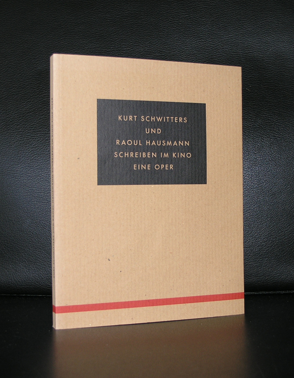
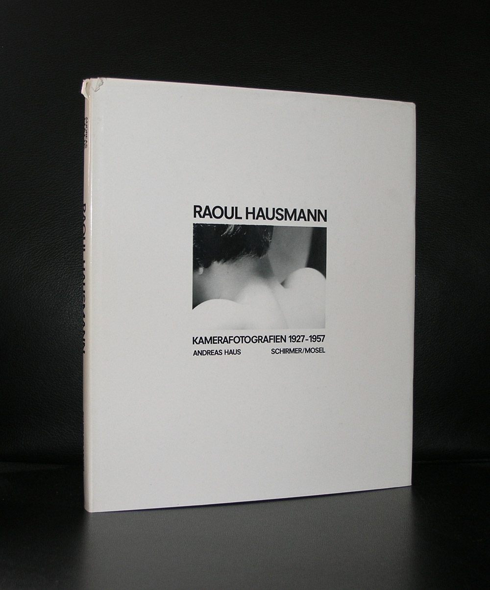
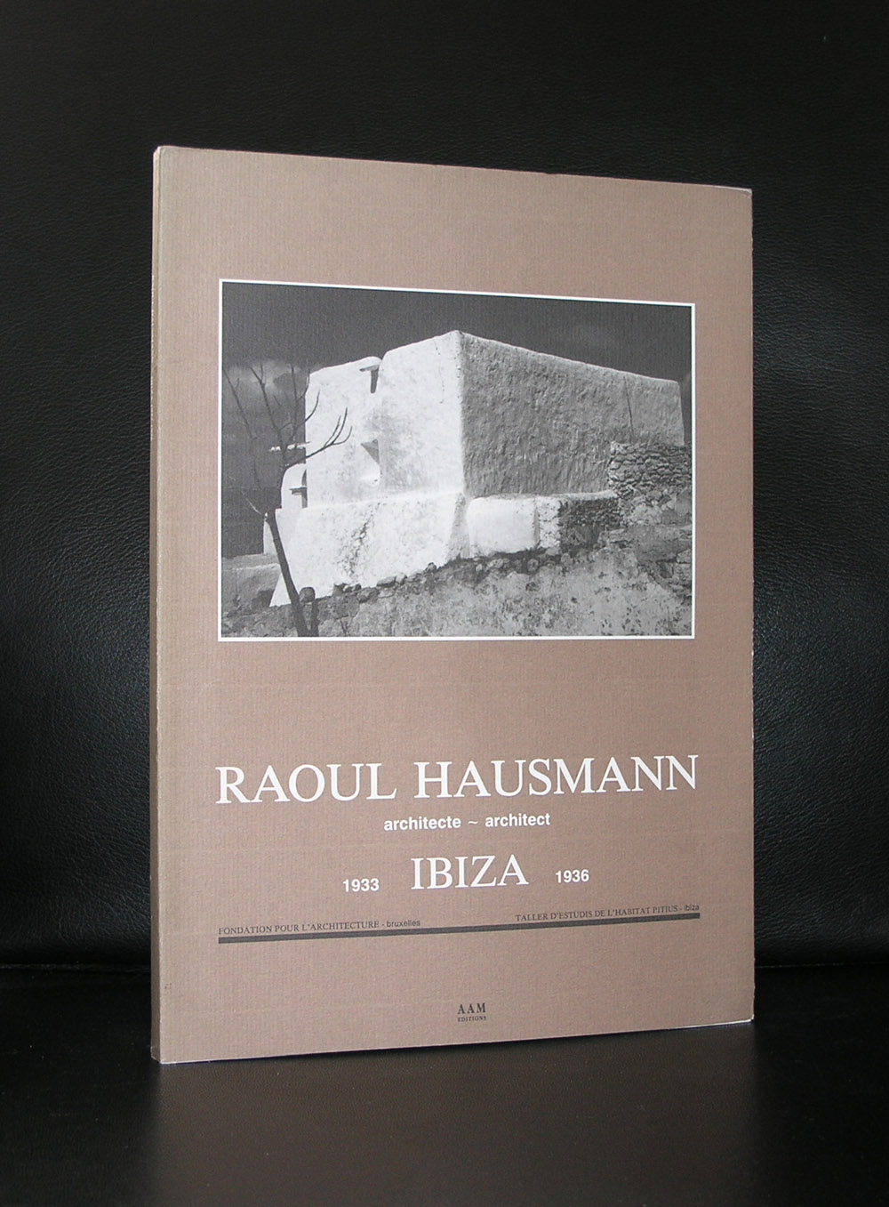
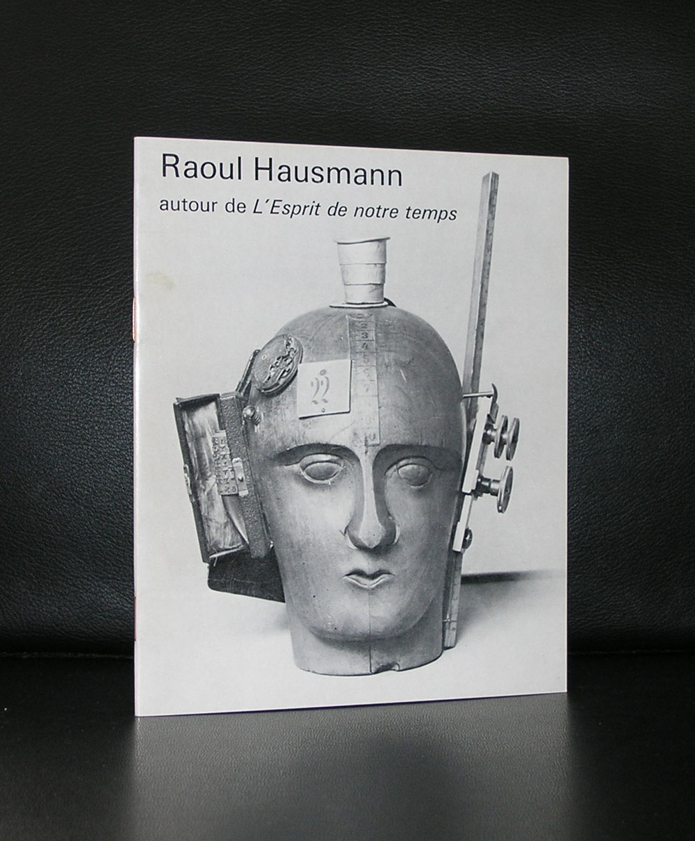
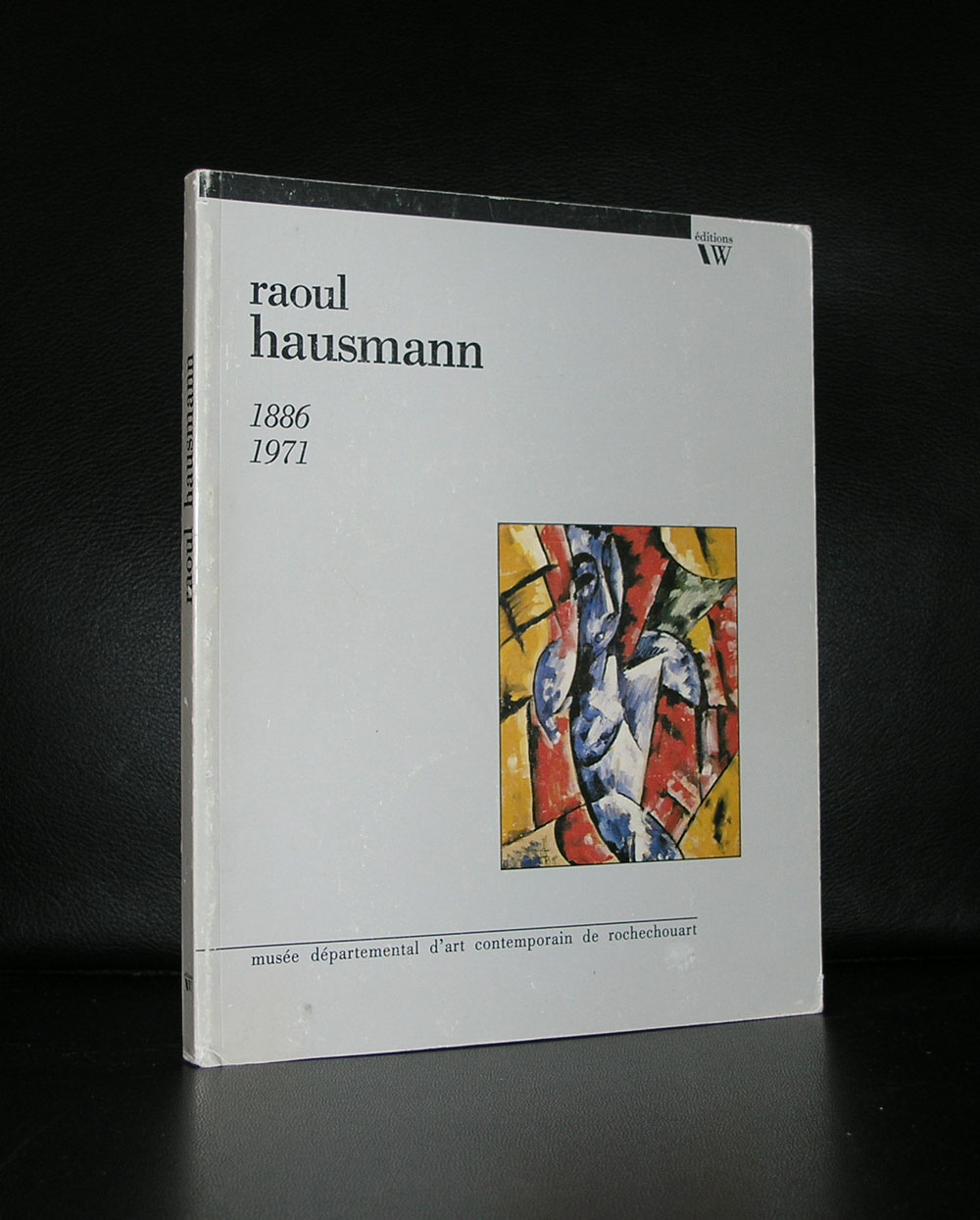
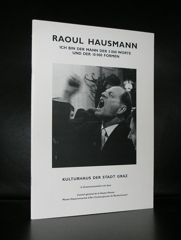
For me Hausmann stands for Dada and photomontages. He , together with Hannah Hoch ( his longtime lover) developed a style of photomontages typical for Dada. Combining classical elements together with industrial elements set on o a colorful background these photomontages are among the very best from that period.
The photomontage became the technique most associated with Berlin Dada, used extensively by Hausmann, Höch, Heartfield, Baader and Grosz, and would prove a crucial influence on Kurt Schwitters, El Lissitsky and Russian Constructivism. It should also be pointed out that Grosz, Heartfield and Baader all laid claim to having invented the technique in later memoirs, although no works have surfaced to justify these claims.
At the same time, Hausmann started to experiment with sound poems he called “phonemes”] and “poster poems”, originally created by the chance lining up of letters by a printer without Hausmann’s direct intervention. Later poems used words which were reversed, chopped up and strung out, then either typed out using a full range of typographical strategies, or performed with boisterous exuberance. Schwitters’ Ursonate was directly influenced by a performance of one of Hausmann’s poems, “fmsbwtazdu”, at an event in Prague in 1921.
Raoul Hausmann and Dada publications are both available at www.ftn-books.com

Piet Dirkx cigarbox 503

A 100% percent Cobra artist who has almost been forgotten by the public is Lotti van der Gaag. She began with sculpture on advise of Bram Bogart with who she was living in the late 40’s. In 1950 she moved to Paris where she met Karel Appel and Corneille with whom she stayed befriended during her entire life although Corneille had his objections of her joining the COBRA group. In 1974 she started with painting using the same fantasy figures she already had developed in her sculpture. When you look at these early paintings you can only draw one conclusion….Lotti van der Gaag is a Cobra artist!
What i did not know is that she was married to Kees van Bohemen , who has made a name for his abstract expressionist paintings in dutch art. www.ftn-books has a few Lotti van der Gaag publications.


Piet Dirkx cigarbox 502
Today is another milestone for me as a bookdealer in art books, because today i started on these pages ………FTN art
There will be irregular additions to this page, but all works depicted on these pages are for sale and guaranteed originals. The first original is a drawing/collage by Siep van den Berg who made this in 1979.
tekening/collage uit een serie constructivistische tekening/ Collage in blauw die Siep van den Berg heeft gemaakt op 16 augustus 1979 in Andelaroche ( Fr.) De tekening is eerst opgezet in balpen waarna er blauwe vlakken zijn bijgeplaatst ( of omgekeerd).
De tekening is gedateerd 16 9 79. Met notitie “Heleen Jarig Geweest” en signatuur in zwarte inkt …SvdB.
Kunstenaar : Siep van den Berg
titel: Heleen Jarig Geweest
techniek ; balpen en collage in blauw
afmetingen ; 27,7 x 20 cm.
gesigneerd : SvdB in zwarte inkt
gedateerd : 16 9 79
conditie : MINT-
price : euro 150,–
shipping Netherlands : euro 8,60
worldwide shipping costs: 11,95


Jan Maarten Voskuil was my personal discovery during the auction of the Klein Breteler collection last month. Immediately that i saw his monochrome “paintings” i got excited. These paintings have a quality which reminded me of a combination of both Donald Judd and Ellsworth Kelly. Two artist i admire very much and both artists are among the most important ones from last century. That standing is not for Jan Maarten Voskuil yet, but look as his approach to his paintings and the way he prepares the works to reach the ultimate result with the finished work and conclude that it is a question of time that he will be presented as one of the great contemporary minimal painters. These works shine with their simplicity and are in the meantime complex to execute. In every work he uses only one color to make a monochrome work, but put some together and the result is a multi colored wall with Voskuil works.

It was my luck that i could purchase one of the works at the Breteler auction. It was the lot. 152 titled “Wat een toeval” from 2009.

Originally this was made for the LADE PROJEKT of gallery Phoebus and because of the height of the drawers, the dimensions of the work itself were limited, but it still has all the qualities the works of Voskuil contain. A mochrome white surface and assembled from 3 different parts combine into a fascinating painting
www.ftn-books.com has no books on Voskuil , but i know that there is one book titled “Getting to a point” which is well worth reading and to have in your collection of Minimal art books ISBN. 978-90-811487-3-3


