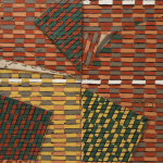
Here is the third contribution in the Dirkx publications. The one made for the Stadsgalerij Heerlen from 1992.

Here is the third contribution in the Dirkx publications. The one made for the Stadsgalerij Heerlen from 1992.

The books i am now very keen on and am selling at a much higher price level than the ordinary Eighties and Nineties books are those that i put up for “sale” a long time ago when i was working as the Museumshop manager at the Gemeentemuseum Den Haag. We had to make space in those days, because the very limited space available was not large enough to accomodate a large stock and in my wisdom, i decided to put up the Dieter Roth, Broken Music and Andre Thomkins publications up for sale because their sales were well below par.
In retrospect this is one of the bad decissions i have made, but at that time it was the only right one to take. The result …books were sold out over time……, but i now always try to make the pruchase when a Dieter Roth or Andre Thomkins book is encountered at the book markets or at auction. In the past 20 years i have collected in this way some very nice Dieter Roth and Andre Thomkins titles and what strikes me …in the last couple of years the interest in Andre Thomkins is rising. I conclude that he finally is appreciated fro the great artist he is and that the editions that have been made with Thomkins ( specially the Hansjorg Mayer ones) have become desirable and collectable books.
www.ftn-books.com has some Andre Thomkins titles still available

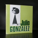
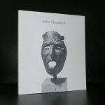
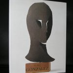
This blog was long due, because i personally think he is one of the all time greatest sculptors. The first time i noticed his works was some 30 years ago, ehren i first bought the Willem Sandberg designed publication that was publihed on the occasion of the 1955 Stedelijk Museum Amsterdam exhibition. This ia a classic by Willem Sandberg. A beautiful photo of Gonzalez in his studio on the cover and with the use of the typical 2 kinds of paper within the catalogue. A brown rough paper for the text and the white paper for the photographs. these catalogues by Willem Sandberg are becomong more scarce by the year, so pick these up while you can.

Back to Gonzalez who’s works can be characterized as a symbiosis between the surreal and abstract forms. These abstract sculptures or masks are fascinating to look at and with the use of scrap metal you always wonder what parts were used to make the composition. Is it something fabricated?….. or is it the original part which is used? Either way, the result is striking, their sizes not too small and not too large, these sculptures are to be admired by all.
www.ftn-books.com has some nice Julio Gonzalez titles available

I do not know this for certain, but because i could not find many pictures of Stephen Buckley, my guess is he is an introvert perhaps even a shy person and this picture of his character would fit the art that he makes. Large in size and very abstract, but filled with figures that are not very common and certainly not constructivist. There seems to be a mouvement in his paintings, realized by dividing the space , bending the canvas or shifting pannels from each other. This way of setting up the composition and expressing himself makes his paintings very authentic.
For more than forty years Buckley has concerned himself with addressing the major themes of the twentieth century through a personal style oscillating between the matiere of Schwitters, the dandyism of Picabia and the intellectual rigour of Duchamp by deconstruction and reconstruction. Eventually self-reference was inevitable and there is now a large portfolio of themes, references, motifs and symbols which are continually reworked and reinvented. Scale has always been significant from the 20 foot La Manche (1974) to a great number of ‘carry on’ sized works over a period of years.
www.ftn-books.com has a nice Buckley publication available

To my knowledge there are only 4 larger publications on Aline Thomassen
It looks as only every 3 or 4 years a larger publication by Aline Thomassen is published
Her subjects in most of her paintings is the female figure and the powers that drive the women in the paintings/watercolors. These woman are unpolished, beautiful and at the same time vulnarable, but also in practically all works they look extremely strong.
The woman depicted are Moroccan woman and perhaps this is why these works intrigue so much. You know the subject looks different, the figure is not familiar nor is their pose. This makes the composition not like the ones of many of Thomassen her contemporaries. In this way Aline Thomassen her works have a signature of their own. Highly recognizable because of the use of her subjects, underlined with arab text and practically in every painting the use of a blood red color which emphasizes, without exception, the dramatic compositions she realizes in her works.
Aline Thomassen is a great artist.
Look at the Golden age paintings and in many cases a roemer glass is depicted in the painting.

In later centuries the dutch have become known for their glass designs. Of course there are the glass objects and vases by Meidam and Copier, but i now want to direct your attention to the drinking glasses of Andries Copier . A glass artist/designer who has made one of the most functional and best wine glasses in the world. In the Netherlands this glass is called the Copier GILDE glass and it is stil made by the famous dutch Leerdam glass factory.  This glass has become a classic over the years and the series has white, red and water glasses. It has become an almost instant classic . From the first days it was made millions and millions of these were sold all over the world. So many of you have a piece of dutch design in their homes without knowing it. A book on HET DRINKGLAS is available at www.ftn-books.com

What is meant with HAAGSE STIJL? This question was answered with a beautifull exhibitionat the Gemeentemuseum Den Haag in 2004. The book which was published on that occasion was compiled and written by Timo de Rijk and ahs become the ultimate book on the subject. ( available at www.ftn-books.com)

Haagse Stijl is the period that a typical ART DECO style in Den Haag was developed. There were several furniture producers at that time in Den Haag and Pander was one of them. They made everything from consoles to bookcases and from desks to wast paper baskets.
During the years between the two world wars a luxurious and modern style of design emerged that was termed the ‘Hague School’. The style featured architectural forms, with the straight-sided, Cubist shapes of the furniture directly echoing those of contemporary buildings. Important influences included Berlage’s idealism, traditional arts and crafts, the interiors of Frank Lloyd Wright and the avant-garde ideas of De Stijl. The result was a modern, commercial style of design. Art Deco in The Hague – Interior design in The Hague during the interwar years occupies eleven rooms and shows some of the finest furniture and interiors of this period in The Hague
These golden years of DE HAAGSE STIJL was only a short period , because WWII made an end to most of the producing furniture makings in Den Haag and surroundings, but followthe auction houses closely and you certainly will find objects and furniture from this time slot….a tip the VENDUEHUIS has opened a special location from which their online auctions are directed. This is the spot to find DE HAAGSE STIJL.

In 1925, the same year André Kértész moved from Hungary, Jean Moral began photographing in Paris. Like Kértész, his photographs exemplified the inherent aesthetic of Modernism, which by the mid 1920s was in full swing. Moral’s photographs from 1925 to 1940 depict his eye for graphic abstraction and tight composition. His personal expression is most apparent in his images of Paris, his intimate portraits of his wife, his self-portraits and the more experimental images he made with photograms and double exposure.
It is hard to find good publications on Moral but there is one i can really recommend. The year of his deat MARVAL editions published a beautiful monograph on this classic french photographer . The book is available at www.ftn-books.com

I will follow up with the 1994 invitation card for the Jan Cunen exhibition in which Piet participated.


de Tilburgse School is the tile of a book with text by Geurt Imanse, former curator of the Stedelijk Museum Amsterdam. De Tilburgse School has proven to be one of the most important new groups of Modern Art painters in the Netherlands.
Who are members of the Tilburgse School?. ..The painters that form this group are :
Marc Mulders, Reinoud van Vught, Guido Geelen, Paul van Dongen, Ronald Zuurmond.
Personally i think Marc Mulders is one of the most gifted painters in the Netherlands and his works always fascinate me, but do not neglect the works from the others…. in many cases they are equally interesting.
What makes these painters stand out? …true craftmanship and the search for new ways in expressing themselves and it shows in the books i have on all these artists at www.ftn-books.com


