If i remember well , Marjan Boot was the curator who proposed to collect the works by Barbara Nanning fro the Haags Gemeentemuseum and Titus Eliens continued to follow her works closely and purchased some more important works for the collection of the Gemeentemuseum . At the time of the first purchase i immediately was a great admirer since her approach to ceramics was totally different from the ceramics i had seen before.
The circle has always been an important starting point for Barbara Nanning (b. 1957). Her forms and structures derive from a circular motion that she allows to solidify in glass or ceramics. She has been creating objects and installations in this way for precisely 40 years this year. Featuring twenty pieces by Nanning, the exhibition will illustrate her unique visual idiom that links the organic and the inorganic.
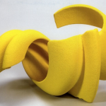
Nanning originally worked in ceramics before turning to glass. She graduated from the Gerrit Rietveld Academy in Amsterdam in 1979, at the same time as Geert Lap and Babs Haenen, who along with Nanning formed the core of a new generation of Dutch ceramicists who would become internationally renowned. In 1994 – at the invitation of the National Glass Museum and Royal Leerdam Crystal – Nanning experimented for the first time with what for her had been an unfamiliar and remote material. She shaped her first glass sculptures by sawing the blown glass objects and then grinding and polishing them.
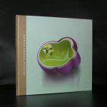
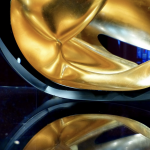
Over the past 25 years Nanning has built up an impressive body of work in glass that now features in museum and private collections in the Netherlands and abroad. Many of the objects and installations she creates suggest spontaneous growth, like crystals, jellyfish, flowers and microorganisms. They evoke tension and show that the contrast between ‘formed by nature’ and ‘handmade’ is not quite as rigid as we tend to think.
www.ftn-books.com has a few Nanning titles available