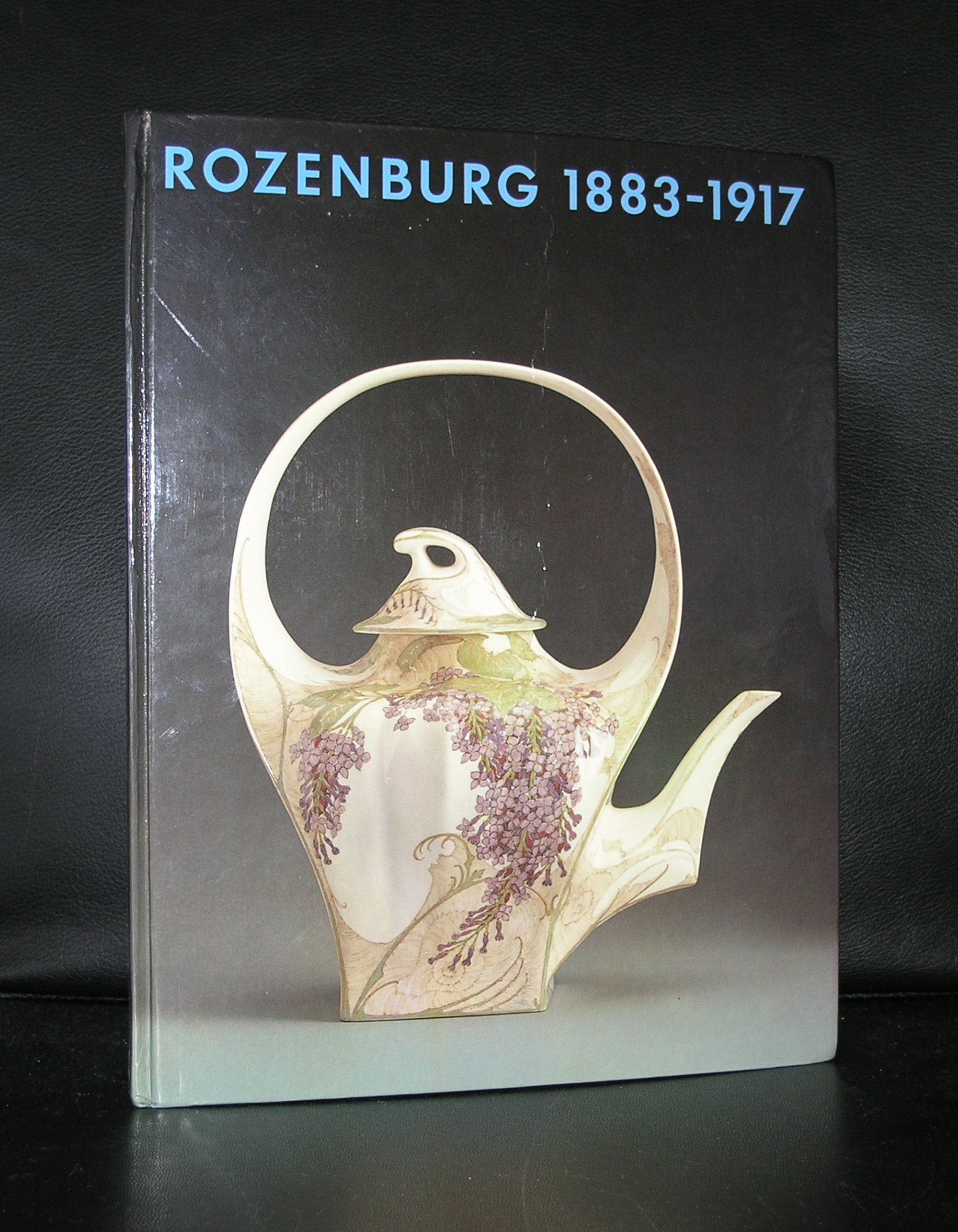
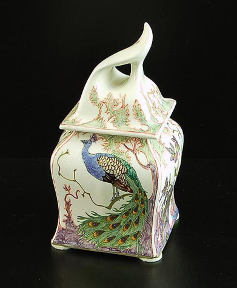
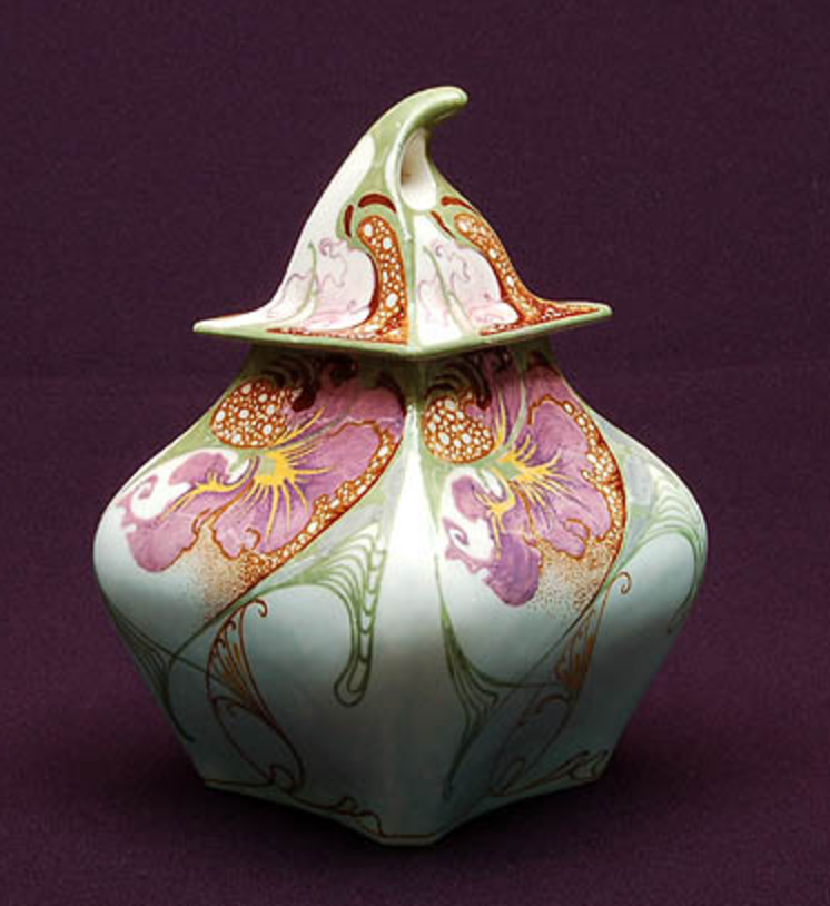
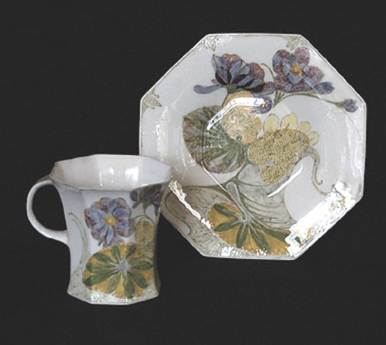
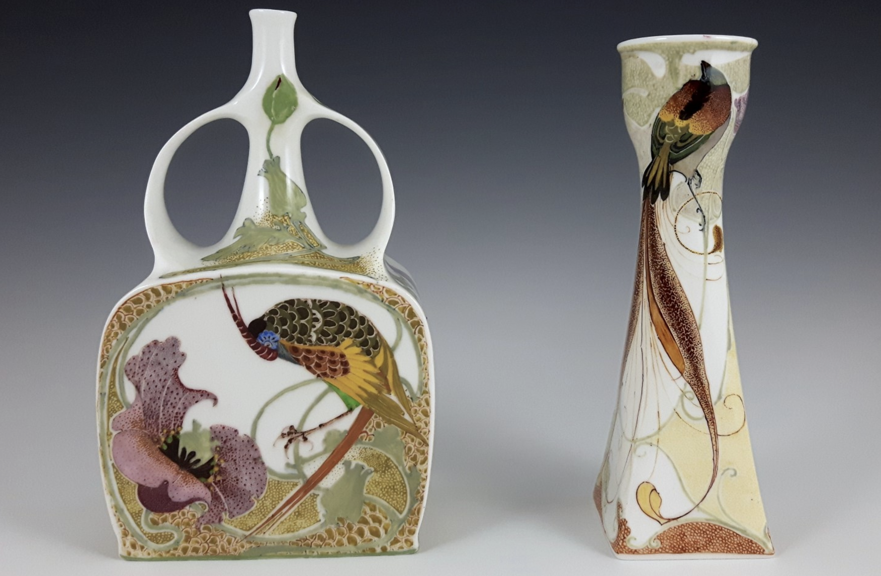
I consider the products by the Rozenburg porcelain factory from The Hague to be the best examples of Dutch Art nouveau ever. Of course many would consider the “Slaolie” poster by Jan Toorop to be the best example of Dutch Art Nouveau, but for me it is all bundled within the eggshell porcelain product by the Rozenburg factory. Hand painted with the most delicate patterns and illustrations these belong to the absolute top in Art Nouveau design, Take a look at these examples .
They are all of the utmost quality and show the best in design and painting. In the early 80’s the ultimate book on Rozenburg porcelain was published. Written and curated by Marjan Boot, who later would become head of the design department at the Stedelijk Museum AMsterdam. The reason whhy this book is still the best on the subject is because it contains a special chapter filled with stamps and autographs of the Rozenburg master painters. I am fortunate to have this title available at www.ftn-books.com
I knew that i was right when i noticed about a year ago that it was a real pitty that the Velum by Keith Haring was removed by the Stedelijk Museum, but now i got notified that it is back. From this day you can marvel at this extremely large Keith Haring and wonder why it has been away such a long time. The velum by Keith Haring…… it is back !
For some excellent Keith Haring publications visit www.ftn-books.com
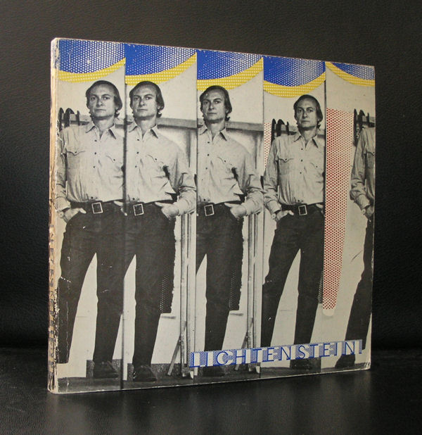
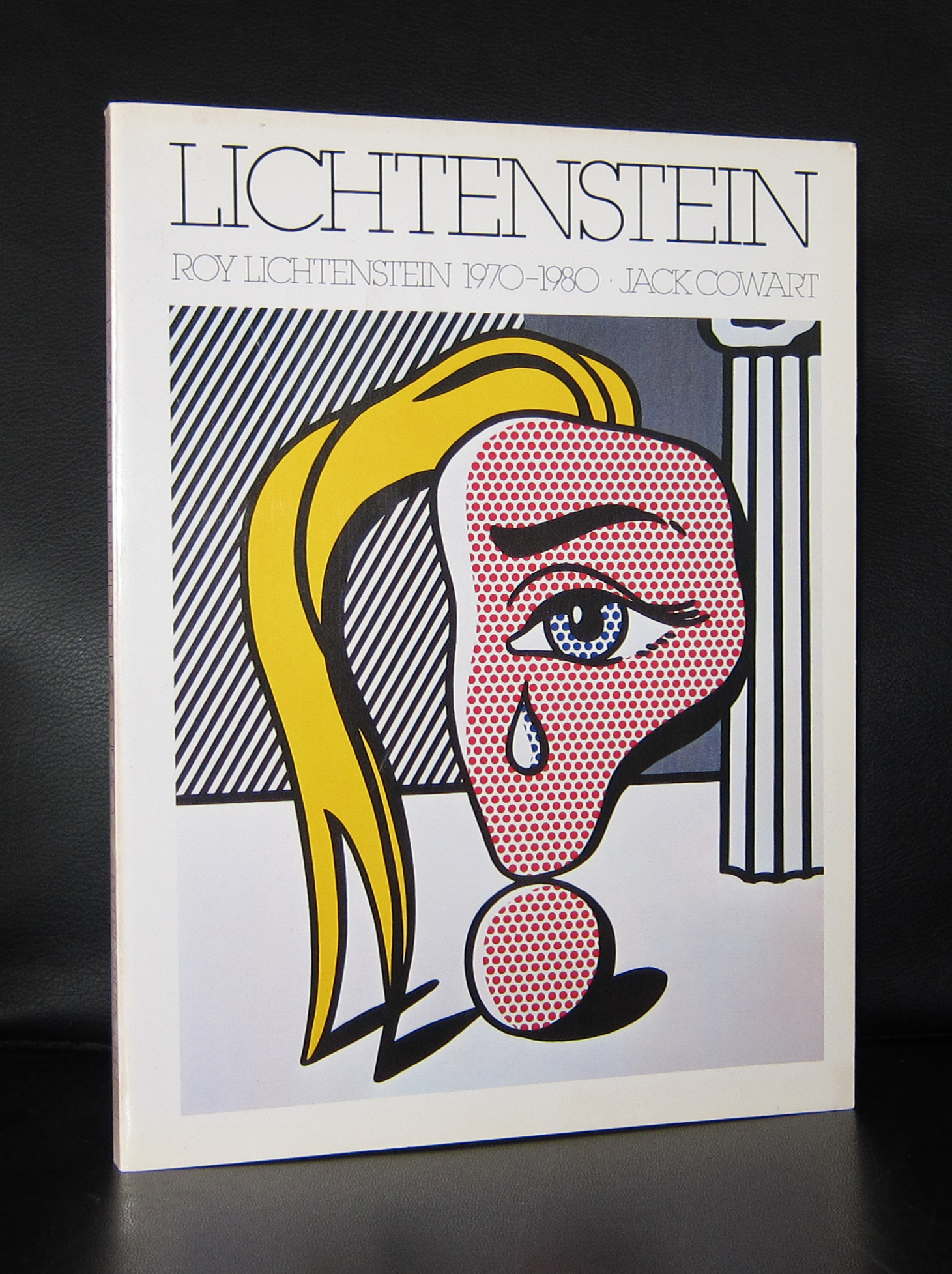
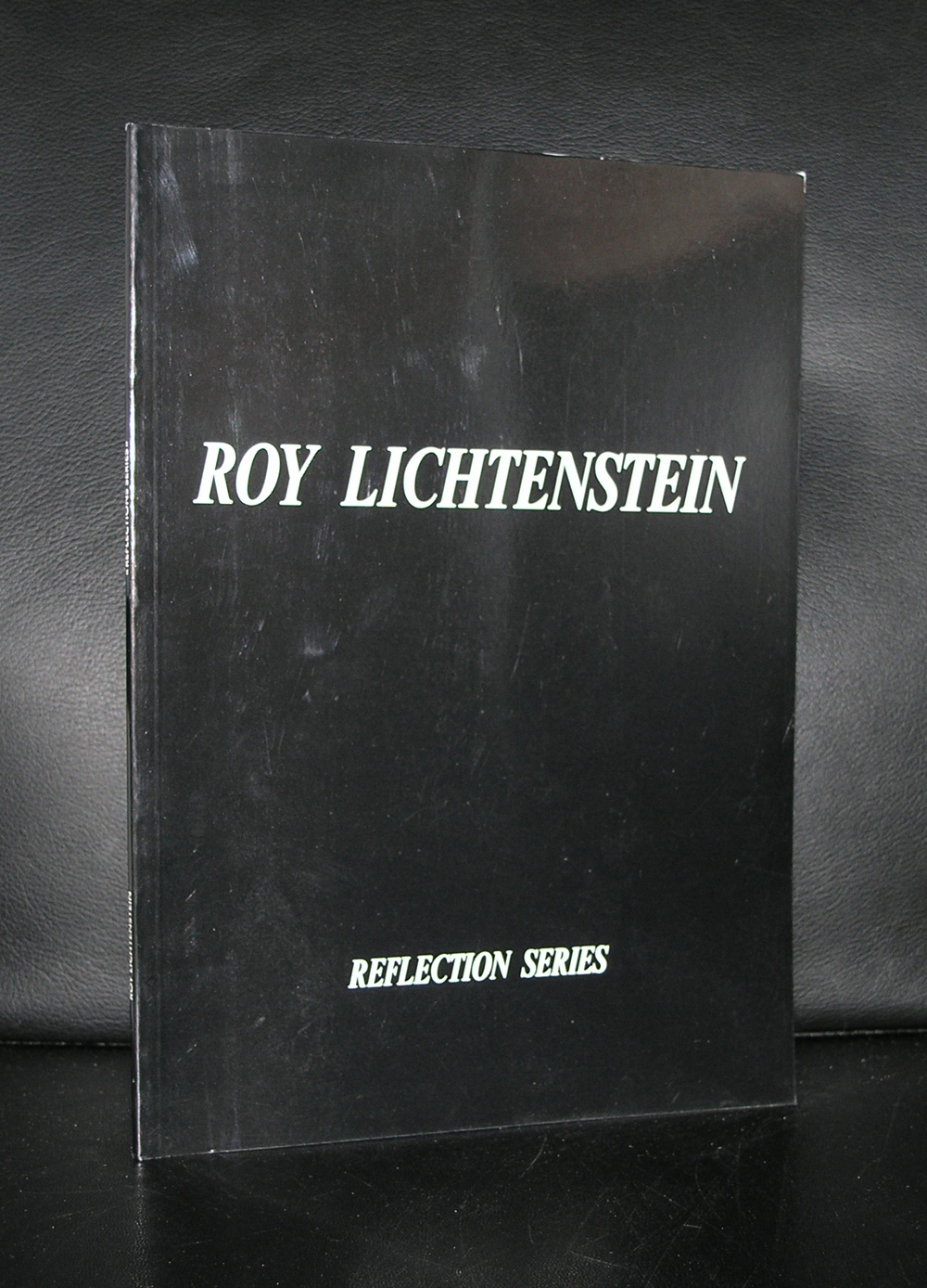
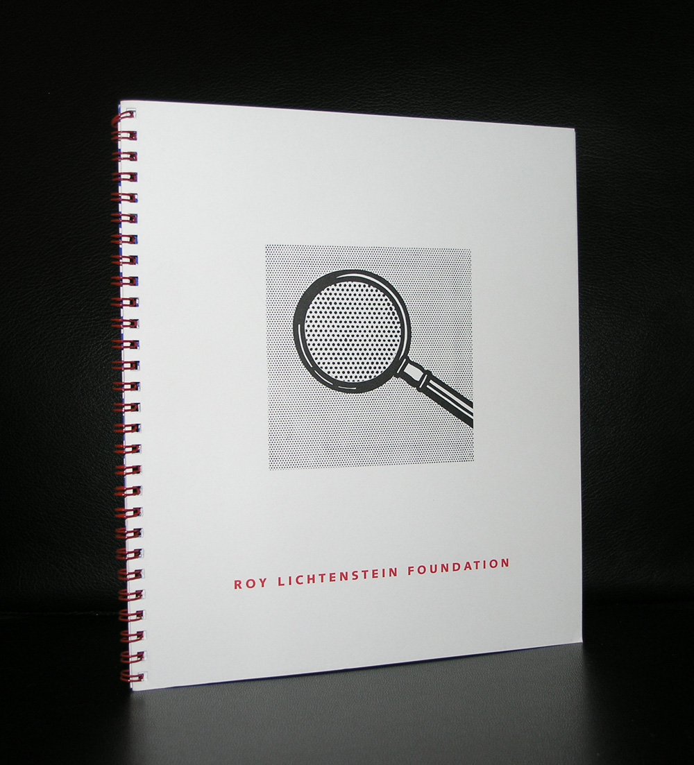
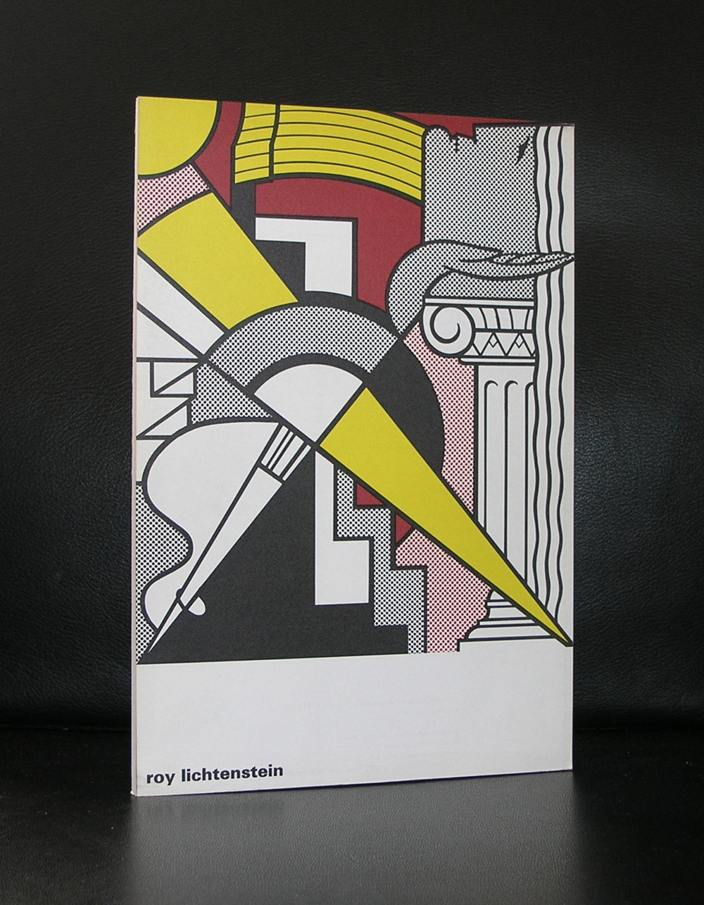
Arguably the most iconic Pop Art artist was Roy Lichtenstein. I know for certain that Andy Warhol is a much more household and famous name. But when you ask me , which artist i associate with Pop Art , …..it is definitely Roy Lichtenstein. I love comics and because of that, Lichtenstein was one of the first modern artists i began to follow and appreciate. His works with enlarged comic frames won me over for him and it happened that these frames , enlarged to an immense sized canvas, became the works for which Lichtenstein would become famous. There is one multi panelled work “As I opened Fire” which is in the collection of the Stedelijk Museum which i now must have seen dozens of times and it never stops impressing me.
Lichtenstein name is now one of the great names in Modern Art, but this has not always been the case. It took some years to become one of the greats , because Warhol was in the centre of the modern art world and Lichtenstein just a mere satellite. For me however, Lichtenstein is the artist that never disappoints and is the best Pop Art artist….period.
There are some greate Roy Lichtenstein publications available at www.ftn-books.com
Alex Vermeulen is a dutch multi-media rtist who has had several museum presentations in the Netherlands. In 1993 Vermeulen moved to Amsterdam and founded in 1995 “SOH-States of Humanity” and the Syndicaat foundation. A year later he presented his final film-book, as part of a large installation, Fuga Futuri,[4] at Amsterdam’s Stedelijk Museum (1996). The chief character introduced in this show for the first time, was the stylized humanoid “Eggy”, named after his egg-like shape. In the following fifteen years sculptures of various forms of the enigmatic Eggy would appear in a number of projects mounted in public places around the world including New York (1996) where Vermeulen asked those who passed to select their favorite Eggy and relate it to their personal life.
There is an excellent piece to be foumnd on Wikipedia, but to show something of his qualities as an artist here is the A SMILE FOR A SMILE video
there are some publications by Vermeulen availabel at www.ftn-books.com
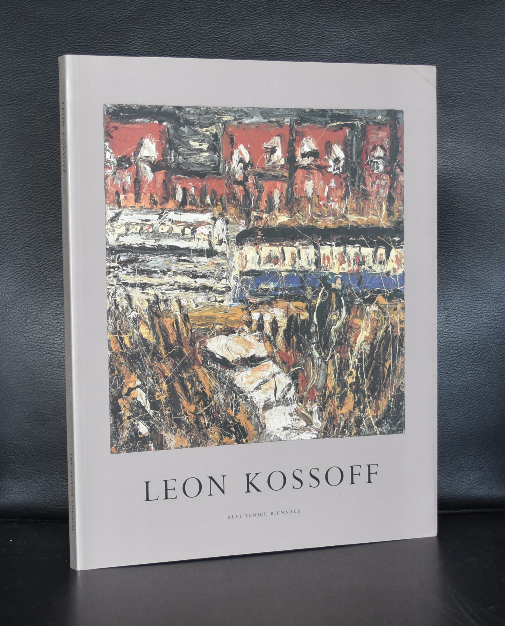
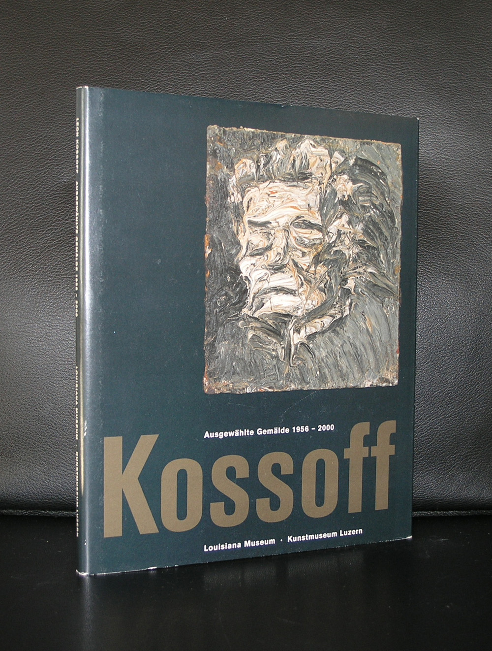
One of the grand old masters of British painting is Leon Kossoff. Kossoff is not very well known outside Great Britain , but had his exhibitions in one of the most prestigious museum for modern art, the Louisiana museum in Denmark. Beside that occasion he was presented on the Venice Biennale and in several group exhibitions in the Stedelijk Museum Amsterdam. In 1956, Kossoff joined Helen Lessore’s Beaux Arts Gallery, located on Bruton Place in London. In 1959, Kossoff began to teach at the Regent Street Polytechnic, the Chelsea School of Art, and the Saint Martin’s School of Art, all in London. While teaching, he continued his artistic career, and soon started featuring in galleries and shows, along with his friend Frank Auerbach and other artists such as Francis Bacon, Lucian Freud and Keith Critchlow a school friend from Saint Martin’s. During this time, Kossoff moved his studio to Willesden Junction, and in 1966, moved his studio to Willesden Green. It is not only his friendship with Auerbach, Bacon and Freud that his paintings deserve to be known better, but the quality of them stands out from many of the rest from his generation and he deserves a place next to his three famous friends and not behind them. Kossoff is a great painter. There are 2 publications available at www.ftn-books.com
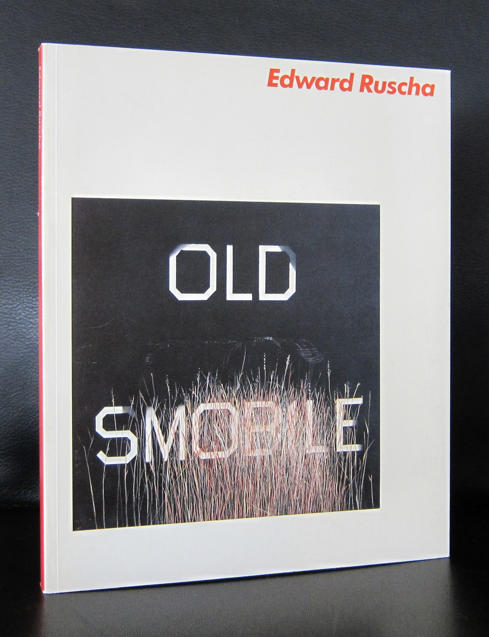
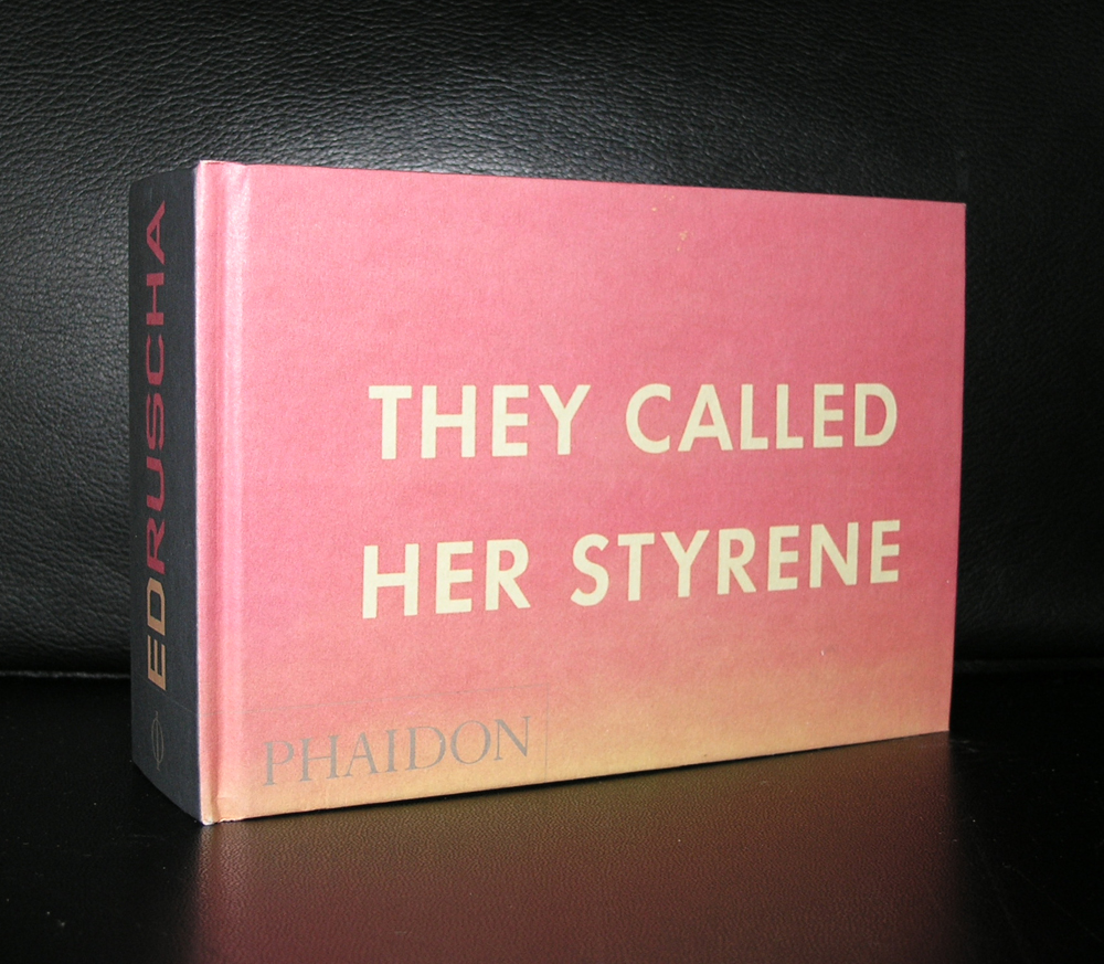
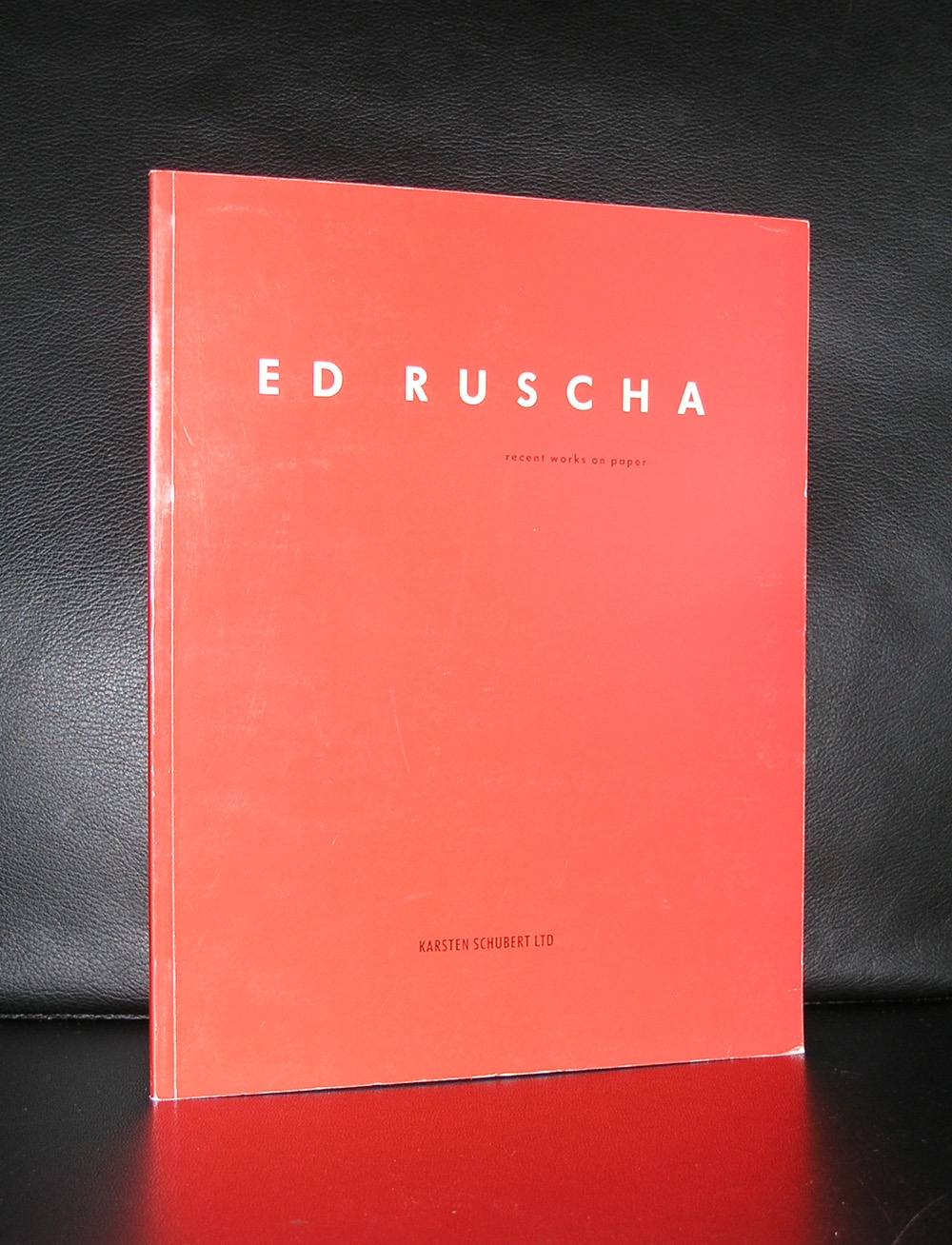
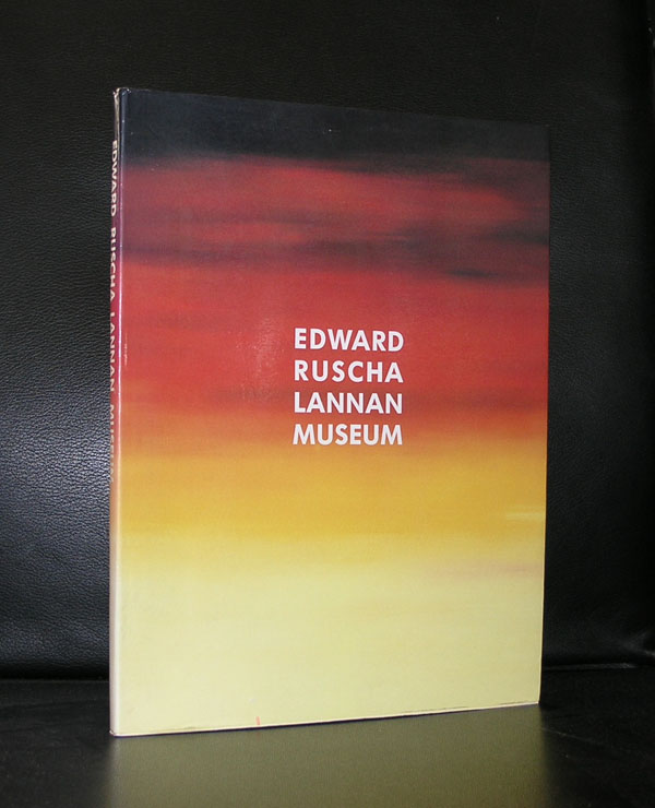
Influenced by Marcel Duchamp, Jasper Johns and H.C. Westermann, Ruscha developed an art form for himself. Ruscha achieved recognition for paintings incorporating words and phrases and for his many photographic books, all influenced by the deadpan irreverence of the Pop Art movement. His textual, flat paintings have been linked with both the Pop Art movement and the beat generation, but for me Edward Ruscha is foremost a Pop Art artist. Possibly this is because one of my favorite Stedelijk Museum catalogues from the Seventies is this 1976 Ruscha catalogue which was designed by Wim Crouwel and filled with typical Pop Art related Ruscha paintings.
Text and image blend into each other , catching your attention with a word or a phrase. Ruscha stayed true to this kind of painting and has since become one of the great names in the world of art. Checking my inventory i found that i have many interesting publications available at www.ftn-books.com. An excellent opportunity to find out why Ruscha is important in the world of contemporary art.
OLYMPUS DIGITAL CAMERA
OLYMPUS DIGITAL CAMERA
OLYMPUS DIGITAL CAMERA
Here is an interesting video on Ed Ruscha by the Tate
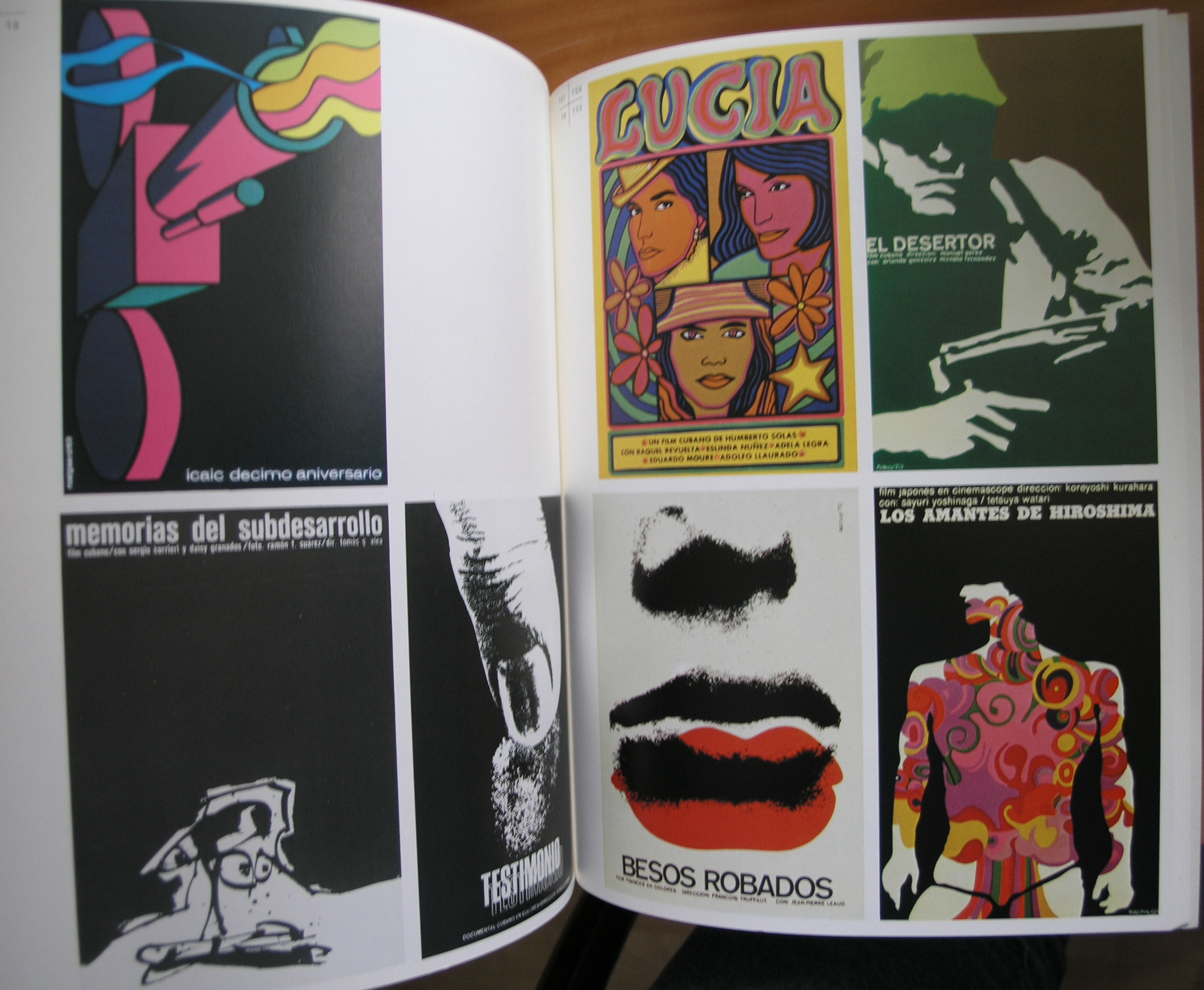
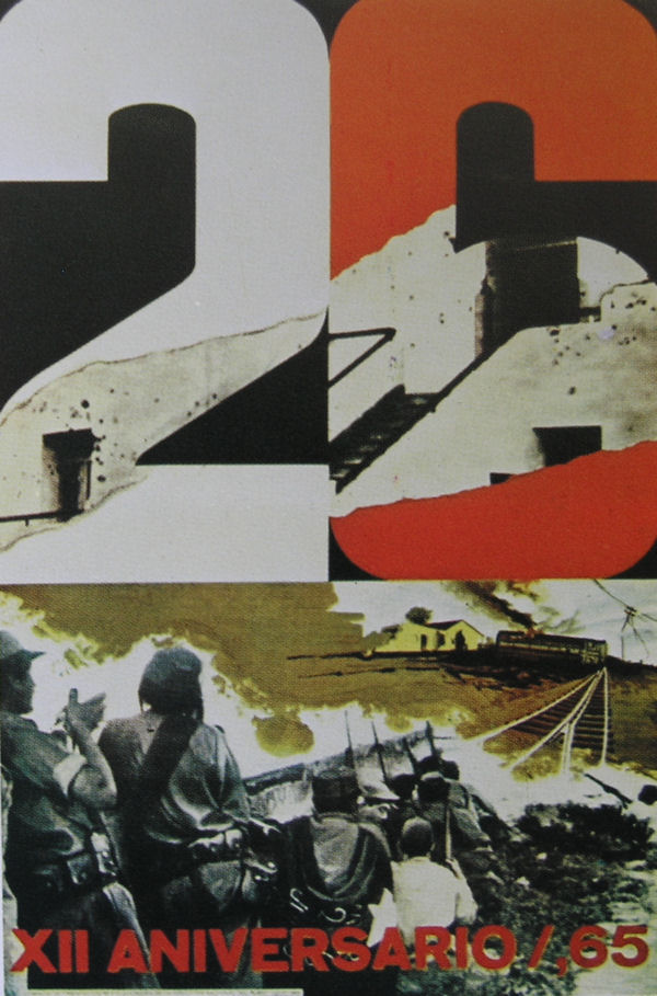
It is 1959 and the end of the Cuban Revolution is celebrated in the town of Havana. Since the beginning of the revolution many posters pro and contra have been published in Cuba and many of them have were great examples of political propaganda. These posters were recognized by the curators of the Stedelijk Museum as being important enough to present them in a special exhibition on Cuban posters. Wim Crouwel was asked to design the catalogue with this exhibition 1971, only 12 years after the end of the revolution .
Because of the power of these posters he decided to use one of the most iconic on the cover. Simplicity all the way. Just the power of the South America shaped fist with simple typography made this one of my favorite catalogues in the seventies of the Stedelijk Museum. Of course it is available at www.ftn-books.com together with many other Stedelijk Museum / Crouwel designed catalogues
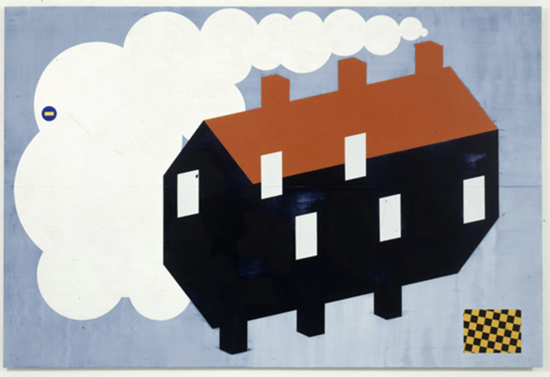
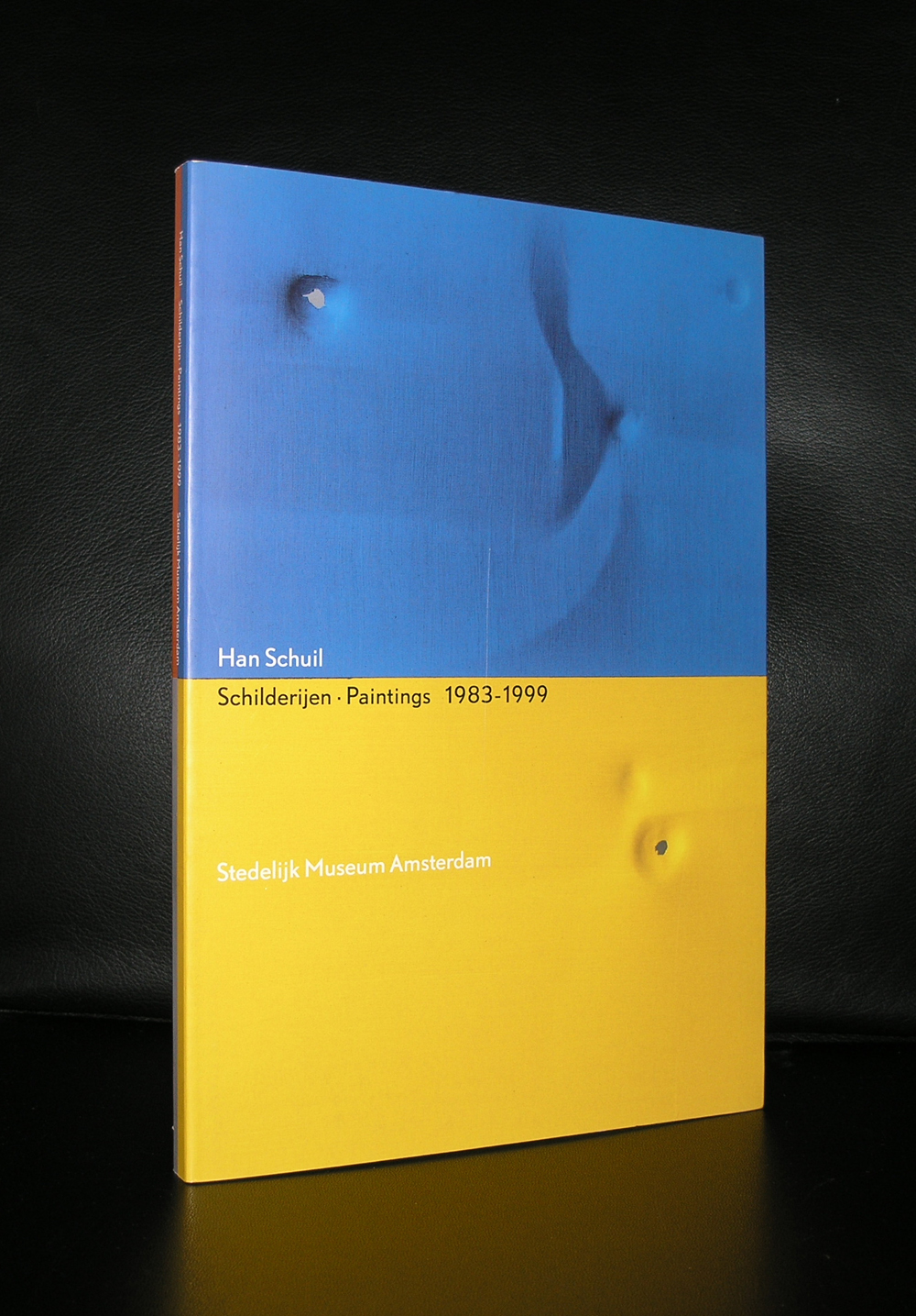
If you look at the Han Schuil paintings from recent years . Your first association is Pop Art. But look at them in retrospect and you must conclude that it is a natural development from his earlier works into these most recent ones.
Since the mid eighties he stayed true to his preferred material. An aluminium bearer, painted with alkyd and enamel. I still admire his works and because of the use of aluminium i think they stand out, giving the works both an abstract and an artificial industrial look. Schuil is for me one of the great dutch artists . www.ftn-books.com has some Han Schuil titles worth collecting.
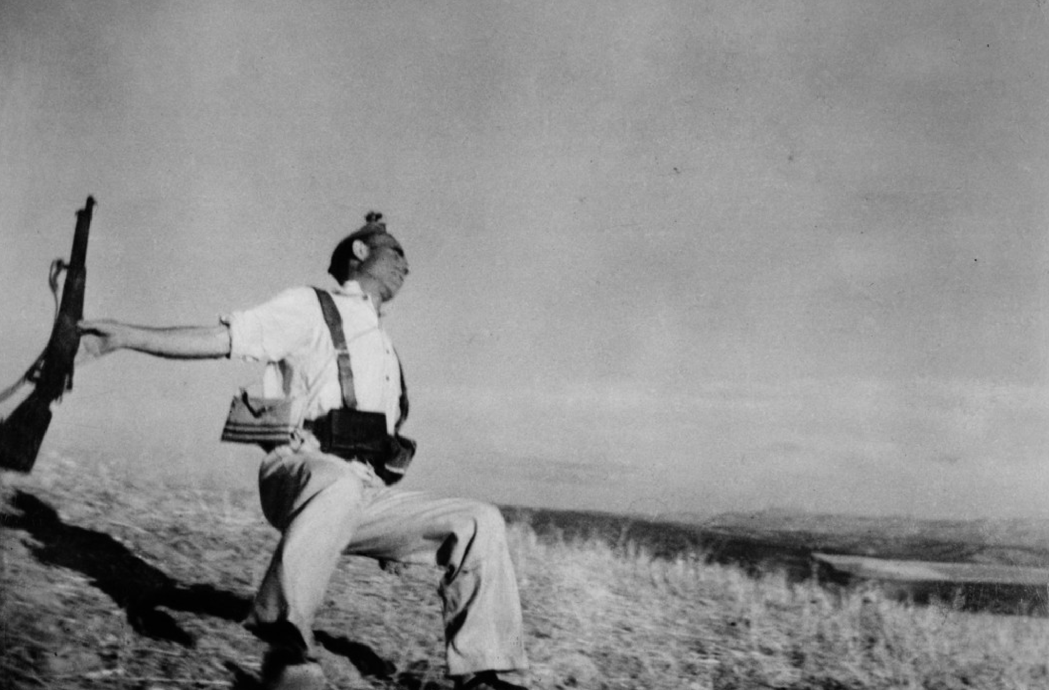
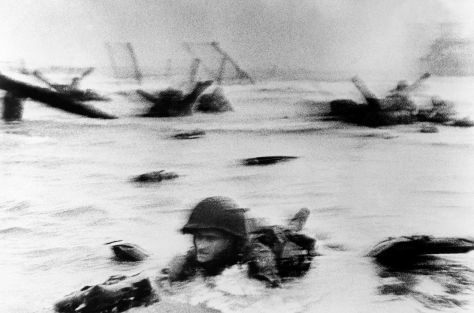
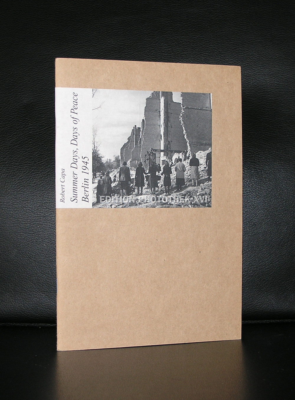
Only 41 years of age , but with an iconic oeuvre he left us.. Some examples of photographs we all have encountered for more than once in your lives. Foremost Capa was a war photographer and left us some iconic photographs. but when you study the Magmum site (https://pro.magnumphotos.com/C.aspx?VP3=CMS3&VF=MAGO31_10_VForm&ERID=24KL535353 ) you discover that beside his war photographs there are some tremendous other photographs to be found within the Magnum archives, but that his most important subject was WAR in all its aspects and cruelties. A true journalist photographer who showed us the cruelties of war . No polished photographs but a raw image of the reality.
What i stumbled upon when searching for material on Capa is that he had an affair with the famous Ingrid bergman. In 1945 after the fall of Nazi Germany, Capa was staying at the Hotel Ritz on Place Vendôme where he met Hollywood actress, Ingrid Bergman. Bergman was traveling around Europe to see the devastation caused by the war, and entertaining the troops. When they met, Bergman was still married to Petter Lindström who she had a baby with. Capa asked Bergman for dinner, and soon after they started to have an affair. In 1946, Bergman asked Capa to come to Hollywood with her, and he did. While Capa was in Hollywood, he visited her at a studio where she was filming, Alfred Hitchcock’s ‘Notorious’. Capa had shot some still photos for the film which he was given no credit for when they were published Hitchcock later made a film with James Stewart and Grace Kelly in 1954, called ‘Rear Window’, loosely based on Capa and Bergman. Bergman wanted to marry Capa and also tried to convince him to quit his job to work in Hollywood. Capa knew that he wouldn’t fit in, and told Bergman that he can’t have a wife and kids because of his duties of work. Their affair ended when Capa left Hollywood for an assignment in Turkey.
There is a great Capa and Magnum publication available at www.ftn-books.com
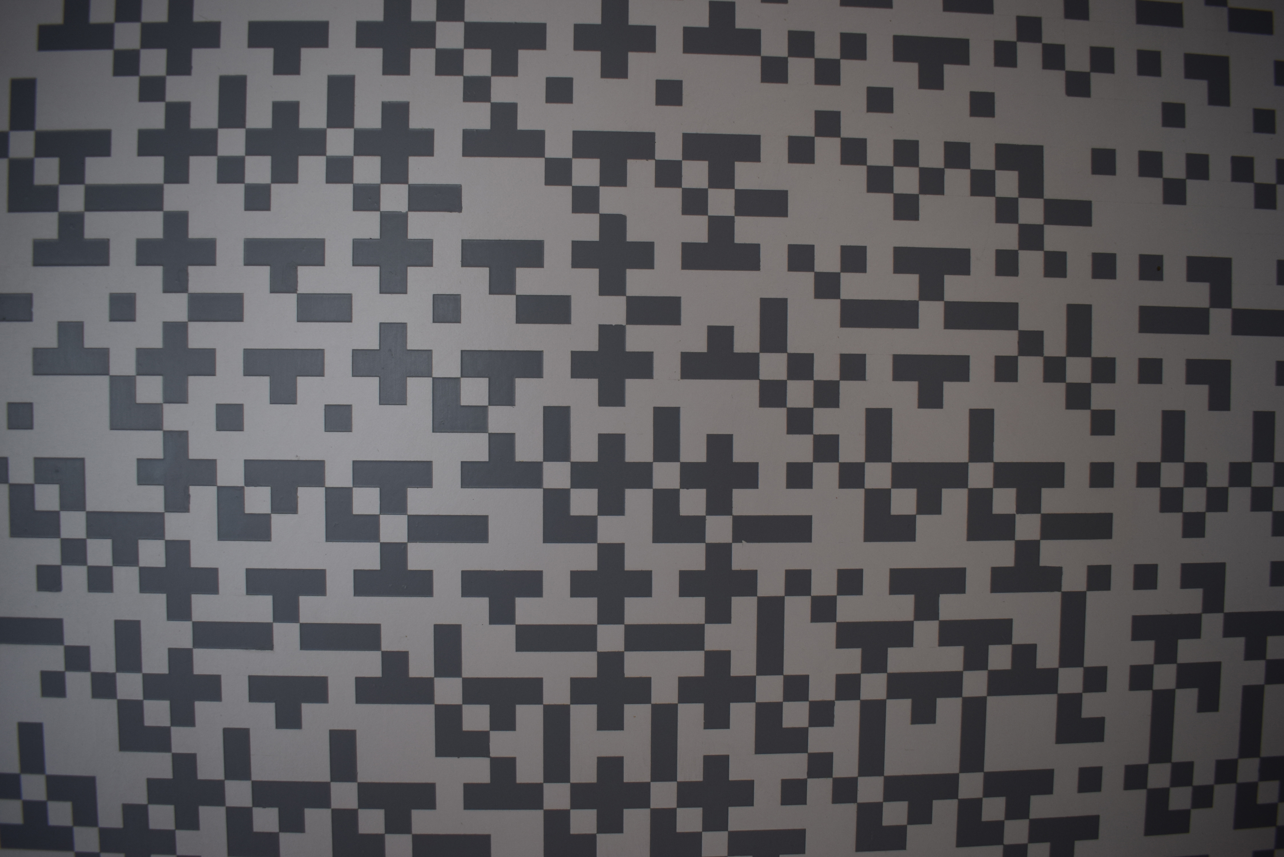
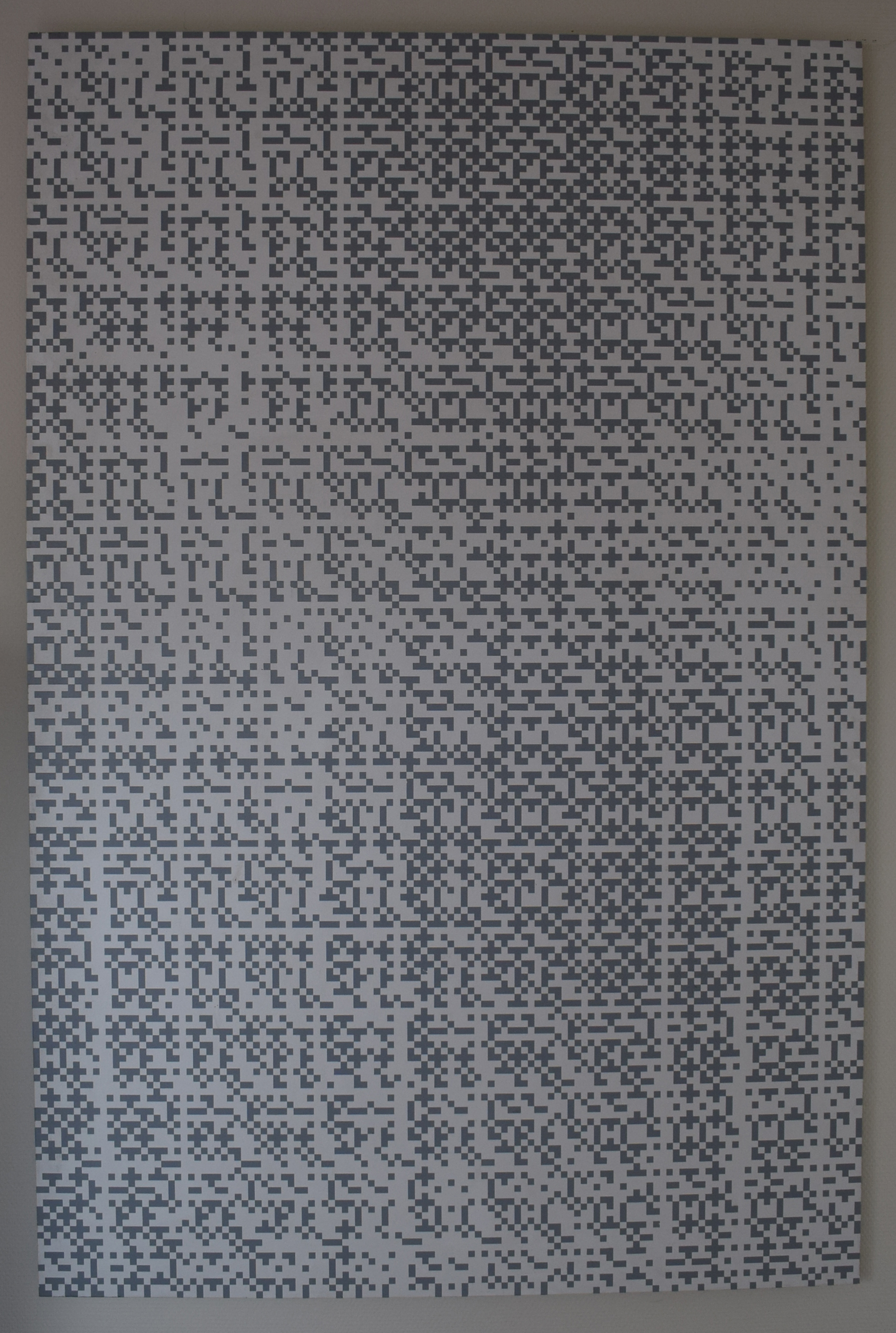
Personally i think that Jaap van den Ende is the only true successor of Jan Schoonhoven. Specially his early works have the similar qualities as the ones Schoonhoven made in the sixties and early seventies. The Stedelijk Museum has some excellent examples of these early works in which little cut out pieces of grey plastic foil are placed on a white surface according a well though over pattern. the System and pattern make the composition, but thus creating a fascinating , lively work of art.
A little like the way Struycken worked, but with a simplicity that resembles the great early Sol LeWitt works. I love this early works, Later he changed his style into more colorful compositions, but always along a line of well thought over abstract contructivist forms. Since 1997 his works become far more realistic. Seascapes, parks and landscapes are all painted with perfection . a fascinating artist which you can encounter in several dutch museum collections. There are some nice van den Ende publications available at www.ftn-books.com
Artist/ Author: Oliver Boberg
Title : Memorial
Publisher: Oliver Boberg
Measurements: Frame measures 51 x 42 cm. original C print is 35 x 25 cm.
Condition: mint
signed by Oliver Boberg in pen and numbered 14/20 from an edition of 20