Posted on Leave a comment

Experimental Jetset for SM

bulletin kramer rietveld

Here is a short  text on this design studio.

Experimental Jetset is very much rooted in the classic designs and must be influenced by Gerstner and Crouwel, but the result is totally original. Bright, youthful and different. The Stedelijk Museum used their designs for a short while when they were located at the CS location during the renovation of the museum at the Paulus Potterstraat. The result is breathtaking and personally i wished they would have been chosen to design the Stedelijk Museum publications after the reopening of the museum. As it is now the cooperation ended in 2008. But lets hope the future brings new chances for a renewed cooperation:

1. Stedelijk Museum Open …

Sheet of postage stamps Stedelijk Museum Amsterdam / Post NL (Dutch Mail) We were asked by Stedelijk Museum Amsterdam and PostNL (Dutch Mail) to design a sheet of stamps to celebrate the re-opening of …


2. About

… in New York, for inclusion in the MoMA’s permanent collection. Other institutes and archives that feature EJ material include MoMA’s Art Library, Stedelijk Museum (Amsterdam), SFMOMA (San Francisco), Art …


3. Whitney Graphic Identity

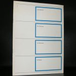
…  identity of the Stedelijk Museum CS (SMCS), back in 2004, we didn’t only design the sign system (a modular system of over 2000 plastic A4-sized document holders), but were also responsible for printin …


4. Interview / Confessions

… , a poster that Wim Crouwel designed in 1970 for the Stedelijk Museum, for an exhibition on concrete poetry – he also designed a really beautiful catalogue for that same exhibition, in collaboration wi …


5. Crouwel 80

Invitation card Stedelijk Museum Friday November 21, 2008, marked the 80th birthday of design legend Wim Crouwel. There were a couple of events scheduled in the weeks surrounding this date, and one …


6. D&AD Lecture

…  like the paradoxical quality of that. 5. What has been your favourite project to date and why? The graphic identity and sign system that we designed in 2004 for SMCS (Stedelijk Museum CS). We loved th …


7. Scale Models

… in production, but the stamps were. 10. 20/20 Vision title walls (2004) Models for 20/20 Vision, a group exhibition that took place at Stedelijk Museum CS (SMCS) in 2005. Basically two cardboard sta …


8. DTC / Gilgamesj

… straight out of the Stedelijk Museum CS (SMCS) assignment, which was quite a draining experience, we decided to develop the identity for De Theatercompagnie in a few successive steps, rather than to design …


9. Pop On Pop Off

… ns both have a diameter of 25 mm, and the shirt is a medium Fruit of the Loom shirt. While we were working on this project, we were also heavily occupied with the design of the graphic identity of Ste …


10. 3 Telephone Cards

… t present at this presentation; around the time of this launch party, we were working day and night on the graphic identity of the Stedelijk Museum CS (SMCS). Thanks to Daniela Petovic (KPN) for invitin …


11. SMCS / Introduction

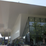
Introduction  Stedelijk Museum CS We were asked in the beginning of 2004 to create the graphic identity of the Stedelijk Museum CS, the temporary exhibition space of the Amsterdam museum of modern art. …


12. SMCS / Logotype

Logotype  Stedelijk Museum CS Note: this entry is part of a larger group of texts about the SMCS assignment. To read the full story about this project, start at SMCS / Introduction, and click through …


13. SMCS / Sign system 1

Sign System / part 1 Stedelijk Museum 2004 Note: this entry is part of a larger group of texts about the SMCS assignment. To read the full story about this project, start at SMCS / Introduction, and …


14. SMCS / Sign system 2

Stedelijk Museum CS Sign system / part 2 Note: this entry is part of a larger group of texts about the SMCS assignment. To read the full story about this project, start at SMCS / Introduction, and click …


15. SMCS / Title walls

Title walls Stedelijk Museum CS Note: this entry is part of a larger group of texts about the SMCS assignment. To read the full story about this project, start at SMCS / Introduction, and click through …


16. SMCS / Entrance

Entrance Stedelijk Museum CS Note: this entry is part of a larger group of texts about the SMCS assignment. To read the full story about this project, start at SMCS / Introduction, and click through …


17. SMCS / Banners

Banners  Stedelijk Museum CS Note: this entry is part of a larger group of texts about the SMCS assignment. To read the full story about this project, start at SMCS / Introduction, and click through all …


18. SMCS / Sandberg wing

Window display Stedelijk Museum 2004 Note: this entry is part of a larger group of texts about the SMCS assignment. To read the full story about this project, start at SMCS / Introduction, and click …


19. SMCS / Bulletin 1

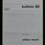
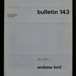
Stedelijk Museum Bulletin 1 Stedelijk Museum CS Note: this entry is part of a larger group of texts about the SMCS assignment. To read the full story about this project, start at SMCS / Introduction, …


20. SMCS / Bulletin 2

Stedelijk Museum Bulletin 2 Stedelijk Museum CS Note: this entry is part of a larger group of texts about the SMCS assignment. To read the full story about this project, start at SMCS / Introduction, …

An independent graphic design studio, Experimental Jetset is made up of only three people, Marieke Stolk, Danny van den Dungen and Erwin Brinkers. All three members are graduates of the Gerrit Rietveld Academy, located in Amsterdam, and have been collaborating since right after their graduation. While their influences are wide-ranging and varied, their aesthetic is closely related to that of the Modernist movement. The resemblance is reinforced by their use of Helvetica, implemented on nearly every one of their projects, as well as their often monochromatic color palette.  

Posted on Leave a comment

Art & Project final season 1998

Schermafbeelding 2019-06-16 om 11.29.58

People following this blog know that i have acquired a large collection with Bulletins and invitations of the Art & Project gallery. Geert van Beijeren and Adriaan van Ravesteijn have published in nearly 30 years numerous publications. Bulletins, Catalogues, invitations, multiples and letters. Here is the final announcement of all their activities. In dutch they announce the ending of their gallery activities by the end of August 1998. This final announcement is now for sale at www.ftn-books.com

Laatste seizoen inv


Posted on Leave a comment

Stedelijk Museum 2009 … a cotton bag


During the renovation of the Stedelijk Museum in 2009. There were only 5 special opening days of the museum. These days were on the occasion of the Amsterdam art fair to let the public see the progress and possibilities of the “new” building and get acqainted with it

The museum had a completely different approach in showing its colection since the rooms were filled for a period of only 5 days. The result a truly different museum filled with surprising and fantastic art and this bag is proof that there were these opening days in May 2009. There were 4 different versions and all versions are available. The bag is made of cotton and contained a newspaper on the museum and had a special button on the outside. These bags have now become highly collectable items and are now for sale at www.ftn-books.com. An important Stedelijk Museum collectible.

stedelijk bag a


Posted on Leave a comment

Fritz Wotruba (1907-1975)

Schermafbeelding 2019-07-22 om 11.59.45

A truly visionary artist Fritz Wotruba was. He is almost forgotten, but deserves to be recognized as one of the great European artists who shaped modern art and combined this with great architectural designs. Wotruba is like a cubist sculptor, but his shapes consist of parts put together and seen from nearby it seems as they have no relation with each other. But from further away figures emerge.

His sculptures are magnificent, but when you once have seen his architecture you are completely sold .

Schermafbeelding 2019-07-22 om 12.04.52

This is the discipline in which he excels and is a one of a kind artist. Fritz Wotruba has had several exhibitions in the Netherland in the 50’s and the 60’s, but is after these events almost forgotten. Instead in Austria he is still one of the greatest Modern Artists. Catalogues of these events are available at www.ftn-books.com

Posted on Leave a comment

Johan van Loon (1934)

Schermafbeelding 2019-07-03 om 14.56.19

Johan van Loon is without a doubt one of the most creative and important ceramic artists from the Netherlands. He is original in his approach to the material and his designs reflect his creative mind. His use of colors and the use of layers in his ceramic designs .

He bends, shapes and builds his creations in a very personal and original way, making these objects stand out from all their peers. Johan van Loon is an important ceramic artist and this is emphasized by the many exhibitions he has had in his career. One of the highlights was the 1991 Stedelijk Museum exhibition ( catalogue available at www.ftn-books.com) together with van der Vaart and Stockmans, but since many other s have followed. ao others the ones with the gallery Loes & Reinier ( https://loes-reinier.com/kunstenaar/johan-van-loon/).


Posted on Leave a comment

Kamagurka / Luc Zeebroek (1956)

Schermafbeelding 2019-06-30 om 11.07.27

Multi talented, performer, painter, cartoon maker and overall absudist genius is Luc Zeebroek better known as Kamagurka. It is one of those artist who’s works many of us have encountered at some time. He publishes his cartoons regularly and his drawings and paintings are presented frequently at galleries and art fairs. He even had his own Stedelijk Museum exhibition in 2002 which catalogue is available at www.ftn-books.com.

To characterize his work is impossible but there is always some humor in the work itself, but his style is something between graffiti and the paintings by Lucebert.

Schermafbeelding 2019-06-30 om 11.16.54

kamagurka


Posted on Leave a comment

Pop Art exhibitions in the Netherlands

A few years ago one of the most recent in a long line of Pop Art and Pop Art related exhibitions was being held at the Gemeentemuseum Den Haag. But since the mid Sixties numerous exhibitions have been held on Pop Art and Pop Art related artists. There were exhibitions at the Stedelijk Museum, Museum Boymans van Beuningen, Groninger Museum, Nijmeegs Museum, Kunsthal and the Gemeentemuseum and every time they were a huge success. My guess is that because the art is recognizable and because Pop Art established itself as a true mouvement in Art History, it has become popular to the masses.

Schermafbeelding 2019-06-24 om 14.10.08

Warhol, Lichtenstein and Wesselman are now household names and their works known by many. Perhaps it has even become to successful since images by these great artists are now part of Commercial activities and publicity campaigns which is a pity since these were not meant for being used this way. www.ftn-books.com has some nice duthc Pop Art publications available.

Posted on Leave a comment

Jaap Wagemaker (1906-1972)

Schermafbeelding 2019-06-24 om 13.15.55

Jaap Wagemaker, fascinated by Cobra, but never wanted to connect to the mouvement. Instead he searched for his won style. Influenced by and admiring Burri he discovered an interest in Oceanic art too. This influences he mixed into a style of his own. Building layers of paint and other materials into 3D paintings. Giving them a feel of assemblages, using materials that only few had used before. Bolts, paper, sand, wood everything could have a place in the paintings as long as it had an abstract function. This is how his painting became recognizable and in the last decade or so, his paintings are sought after and fetch prices higher than average.

Now that Zero is hardly affordable and kinetic goes the same way. It is time to focus on something different. I am sure that Minimal will fill this void, but this kind of material painting comes in a close second. Jaap Wagemaker publications are available at www.ftn-books.com including the impressive one Wim Crouwel designed for the Jaap Wagemaker exhibition at the Stedelijk Museum.

OLYMPUS DIGITAL CAMERA

Posted on Leave a comment

Wim Crouwel and DE VOLKSKRANT


Schermafbeelding-2019-09-22-om-09.28.00.png

Wim Crouwel passed away some days ago and since, a great number of articles have been published on his life and accomplishments as a designer. His works will prove to be highly important for designers all over the world in the future and DE VOLKSKRANT ( one of the most important newspapers in the Netherlands) recognized that fact and devoted  a 2 page article on Crouwel in their Saturday paper. It is only on rare occasions that such a long and detailed article is published on just one person. Wim Crouwel and his works prove to be that important. The article can be found on the internet here (dutch)

https://www.volkskrant.nl/mensen/wim-crouwel-hoeder-van-het-functionele-ontwerp-en-een-onverzettelijke-rechtlegger~bf53fa62/

Posted on Leave a comment

William Leavitt (1941)

Schermafbeelding 2019-06-19 om 15.48.55

William Leavitt was not known to me. I had seen his name in relation to the Art & Project bulletins, but never had seen works by him, so i had to turn to Wikipedia for some more information and this is what i found. Leavitt , a conceptual artist was not known like his contemporary friends like Baldessari and Kelly, but his work is well worth checking out, since some of his works are fascinating .

Schermafbeelding 2019-06-19 om 15.50.11

William Leavitt (born 1941) is a conceptual artist known for paintings, photographs, installations, and performance works that examine “the vernacular culture of L.A. through the filter of the entertainment industry…drawing on ‘stock environments’ and designs of films as well as the literature of the place.” A critical figure in the West Coast conceptual art movement of the late 60s, Leavitt himself has managed to maintain a low profile. “Over the last 40 years, William Leavitt has made a name for himself as an influential artist while staying so far out of fame’s spotlight that his hard-to-categorize works have been all but invisible to the public,” wrote the LA Times. While his work is collected by high-profile artists such as John Baldessari and Mike Kelley (who donated Leavitt works to the Museum of Contemporary Art, Los Angeles), Leavitt himself has eschewed celebrity.

Leavitt received a BFA from Boulder Unviversity and a MFA from Claremont Graduate School. Since moving to Los Angeles in 1965 his work evolved, increasingly referencing themes endemic to the city such as the line between reality and fantasy and the nature of illusion.

Three of the Leavitt bulletins he made for Art & Project are available at www.ftn-books.com