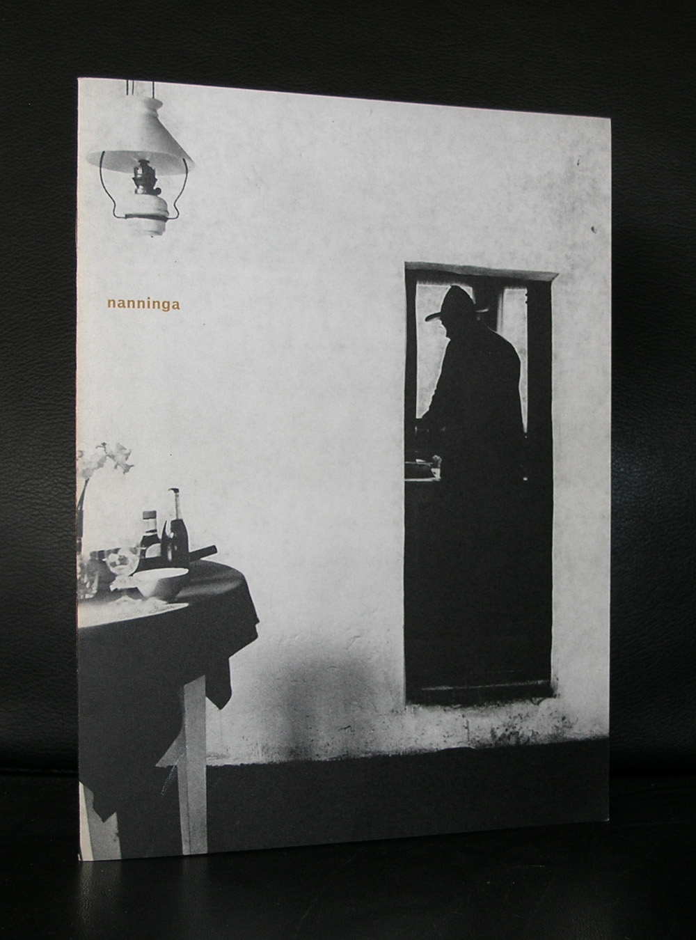
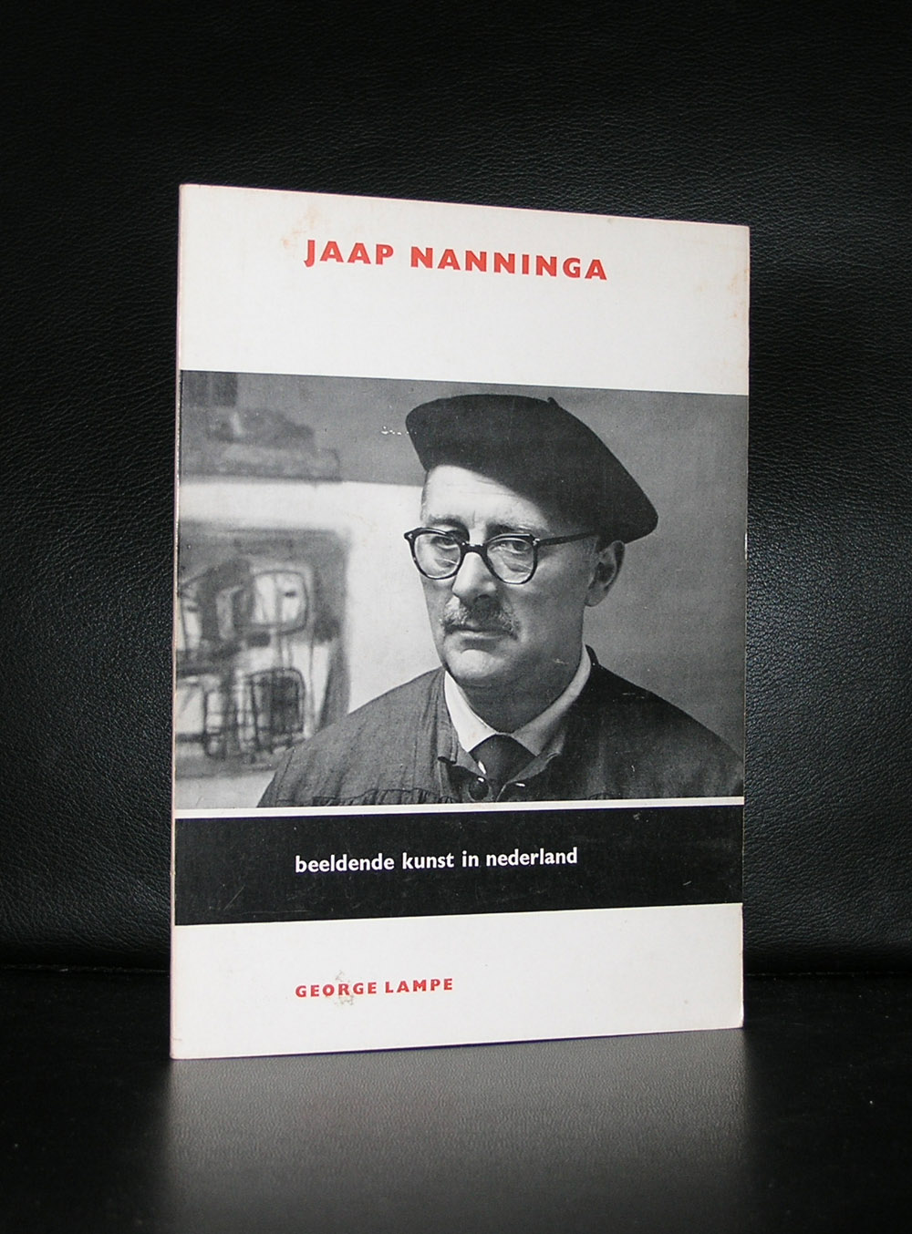
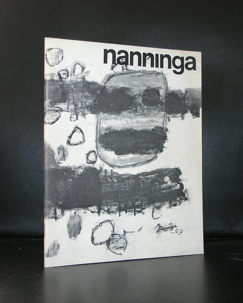
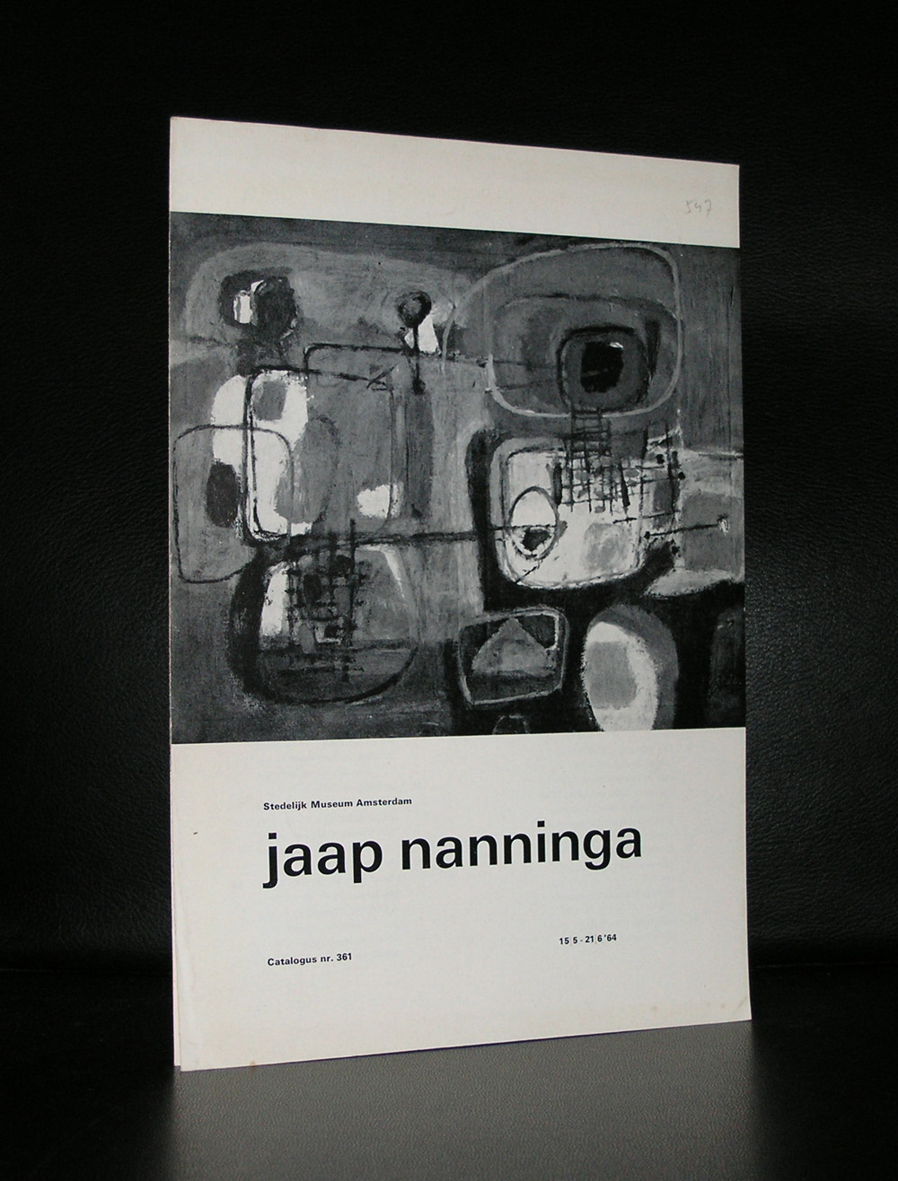
Jaap Nanninga was born in Winschoten in the north of the Netherlands but after travels to Germany and Poland he settled in Den Haag in 1936, where he stayed and worked his entire life. meber of the famous Posthoorn group het met his friends artist for drinks and dinners at the POSTHOORN cafe at the Voorhout in Den Haag ( and yes…it is still there and serves the finest “Bitterballen” in Den Haag. He received his artist eductaion from Werkman and Wiegers and stayed for a short moment with Geer van Velde in Paris. These 3 artists made Nanninga the artist which we know nowadays. Abstract compositions rooted in the Fifties . a little Cobra mixed with abstract expresionism. Many dutch museum have some great Nanninga’s, but one museum i would like to mention specially is the FIGURA painting in the van Abbemuseum collection. Powerful and typically Fifties abstraction.
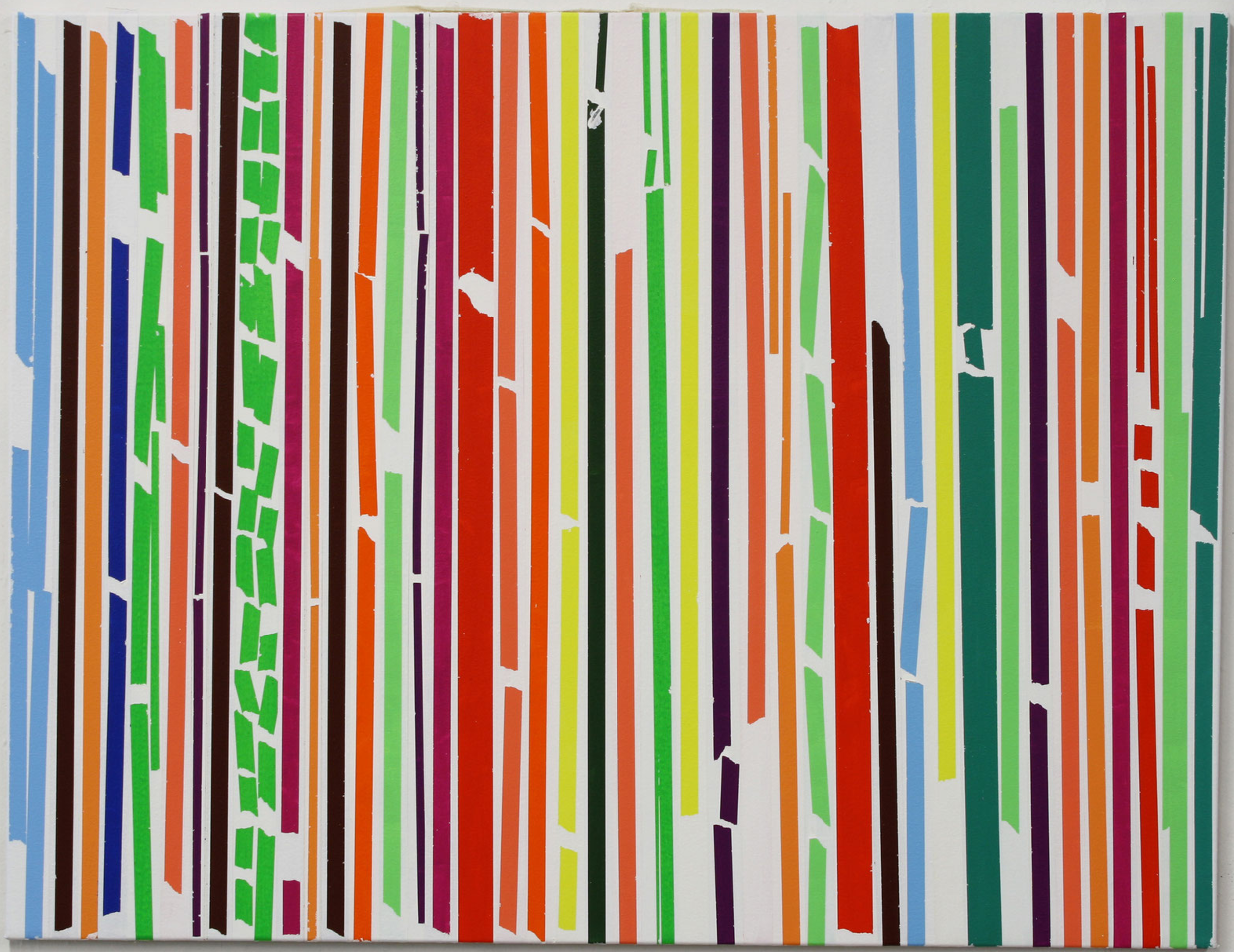
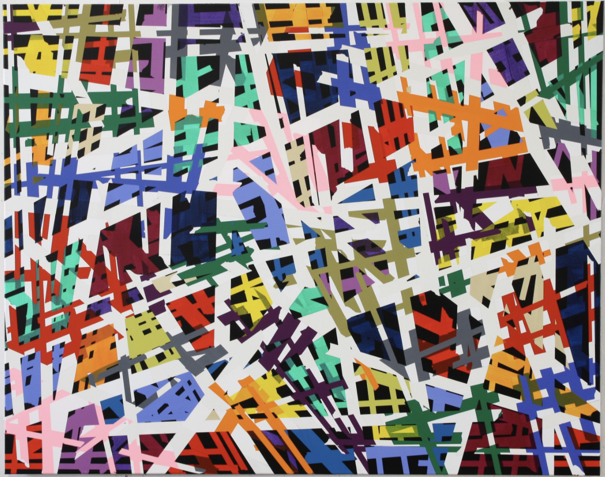
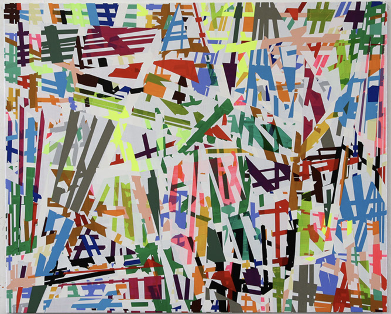
Sometimes you encounter works by an artist for which you have an instant liking and admiration. This is the case with Ruri Matsumoto. She was born in Tokyo and had her education in Japan and Germany. This is where she followed lessons with Helmut Federle and Markus Lupertz a.o.. She stayed after her education in Germany and now has her own studio in Dusseldorf, which she will leave for a temporary studio in Berlin until January 2018.
Her works are characterized by the use of very bright colors and are compositions of almost random like patterns formed with tape, but look more closely….. you will find layers of abstract constructivist forms making a spectacular work of art. Of course art is always something personal and subjective, but i like these paintings very much and because there is this rare chance to see her works at Livingstone Gallery i write this blog to let you know that until the 4th of November some of her works are on show in the PAINTING NOW exhibition, curated by Jan Wattjes.
To get an excellent impression of her works please visit:
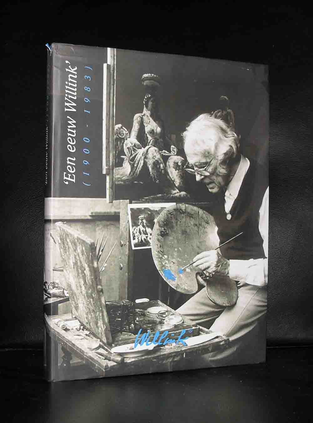
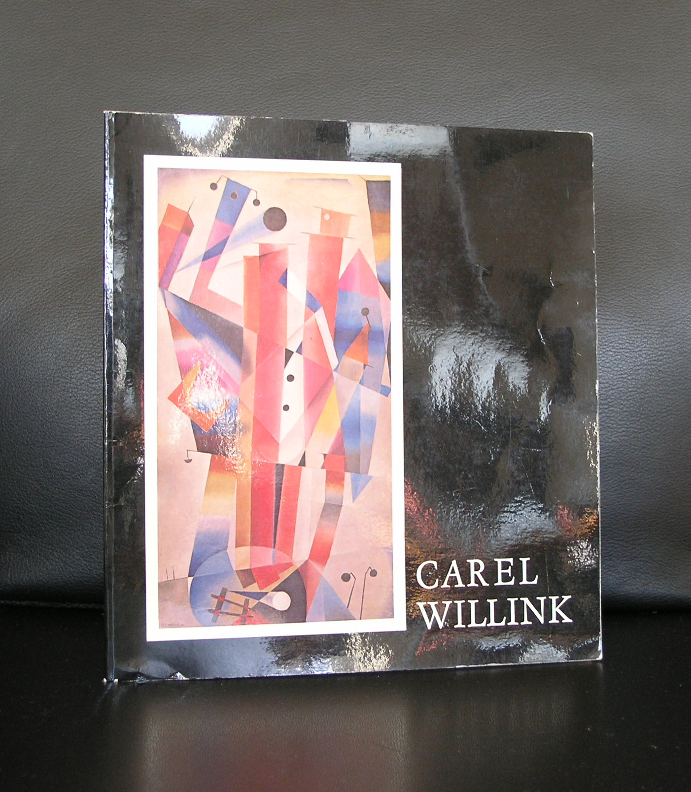
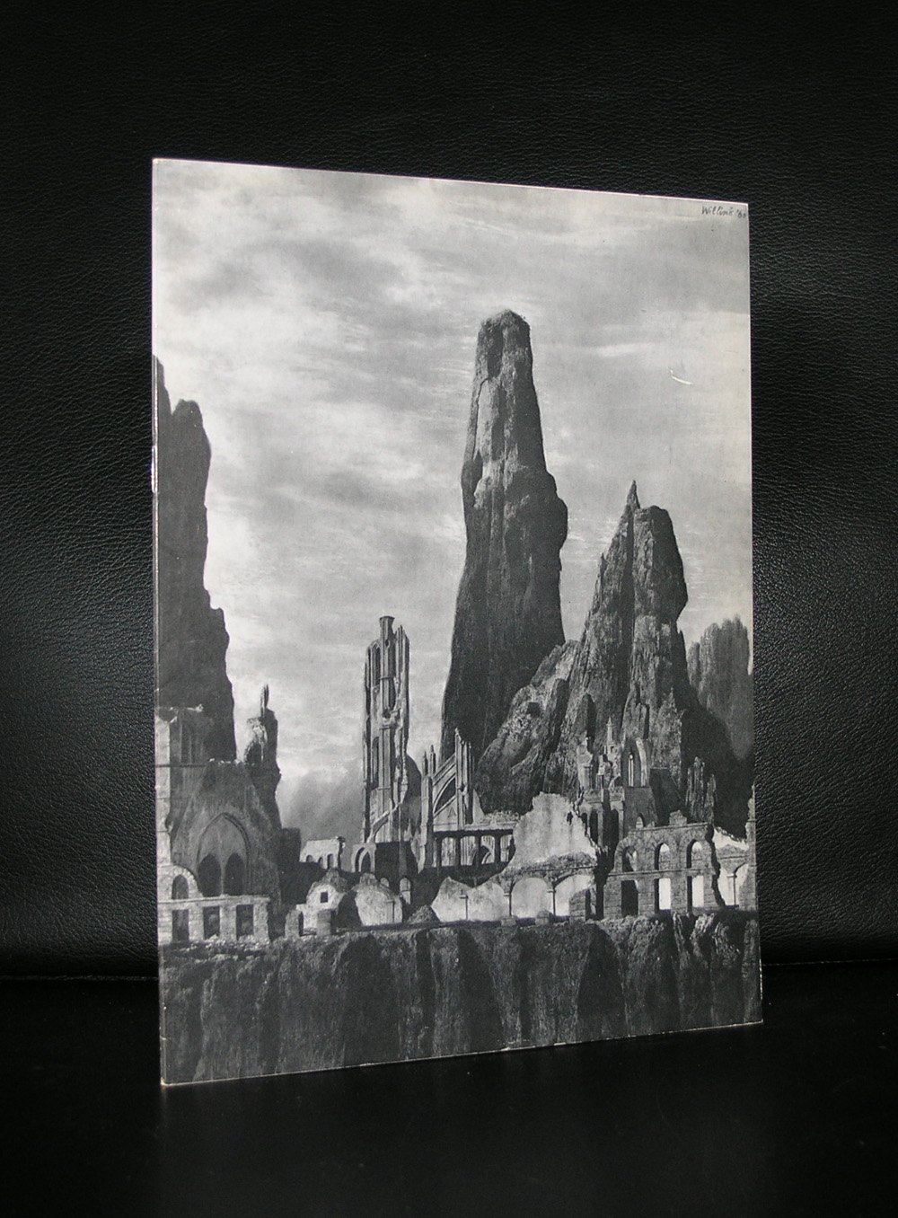
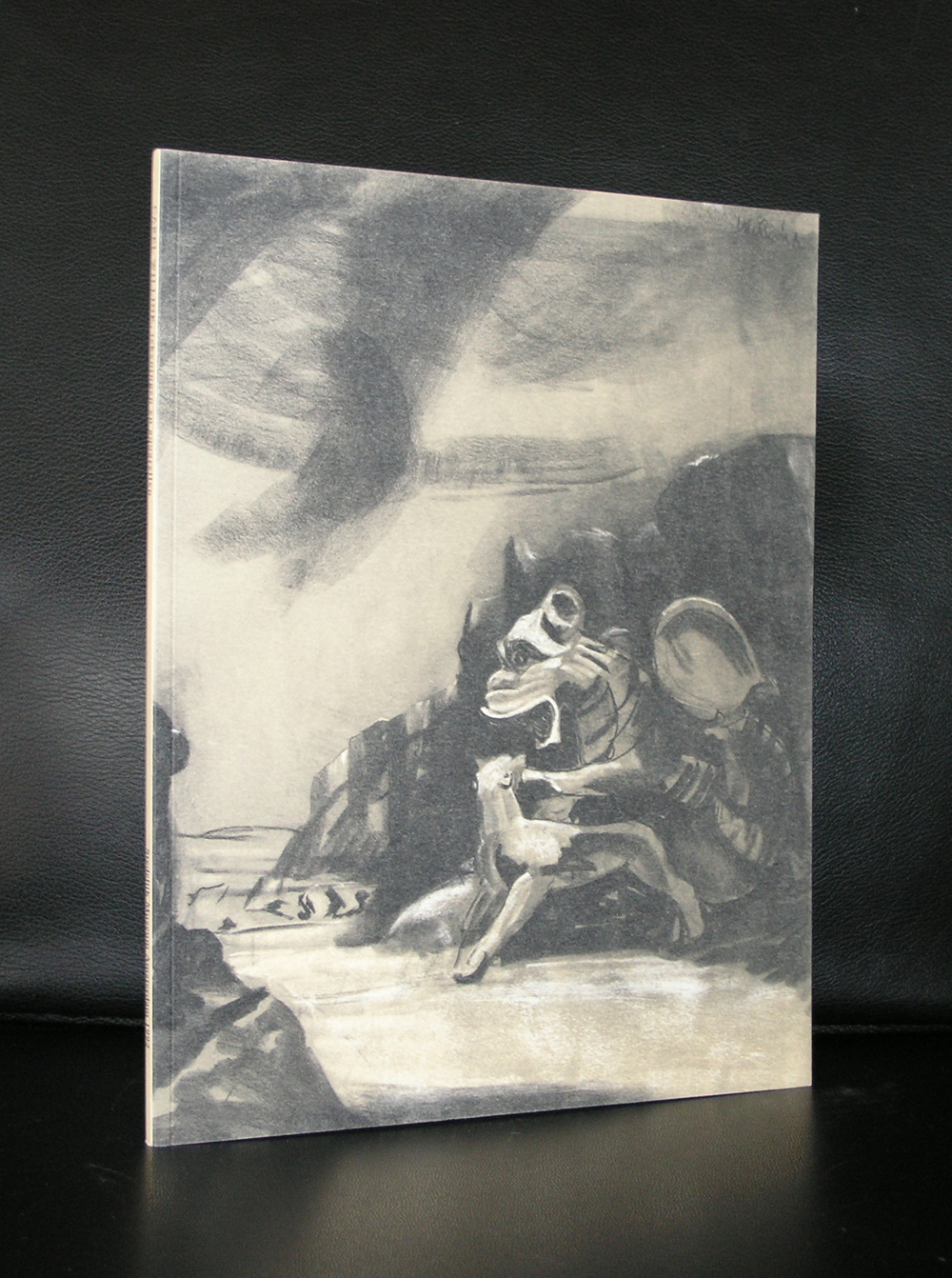
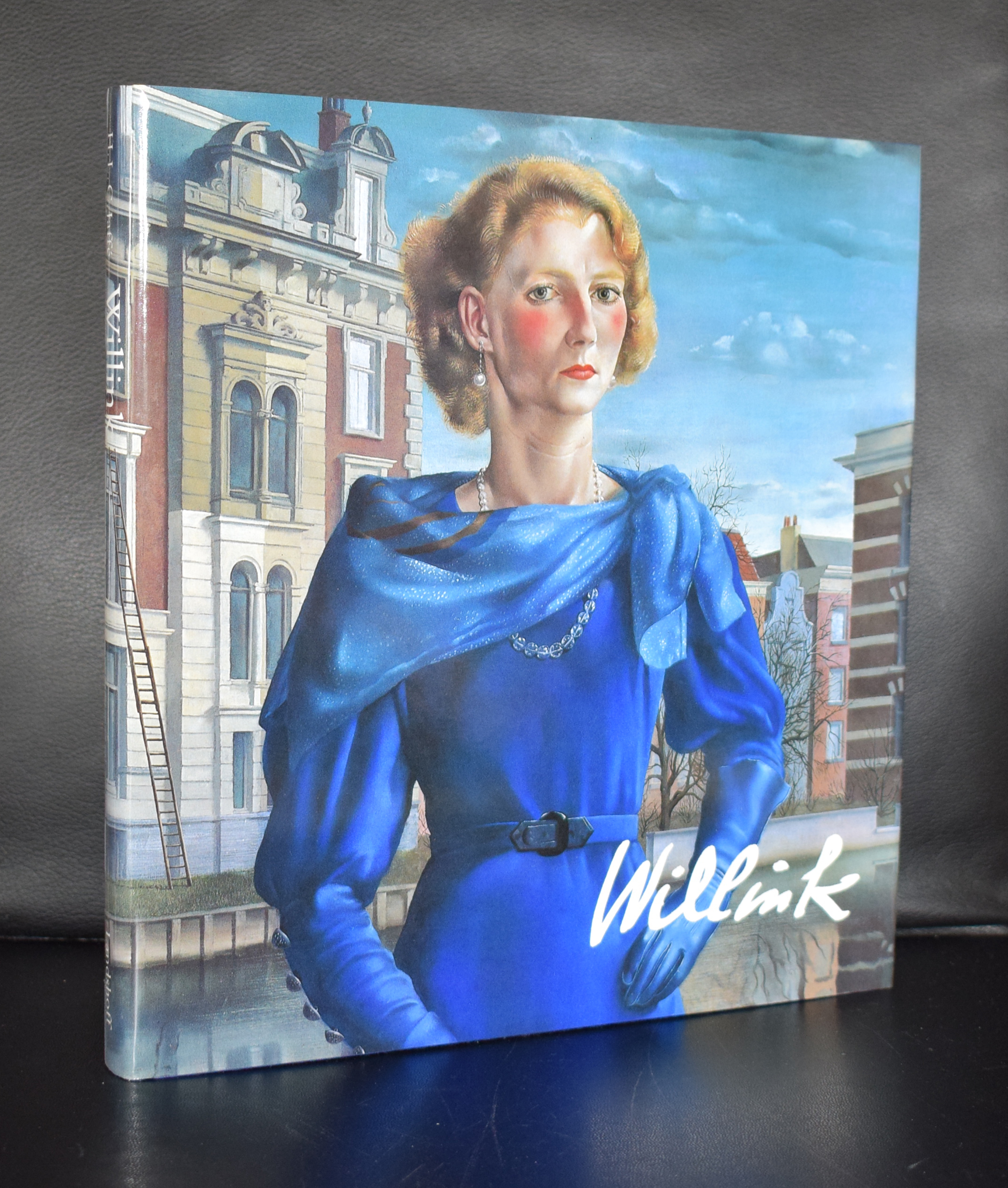
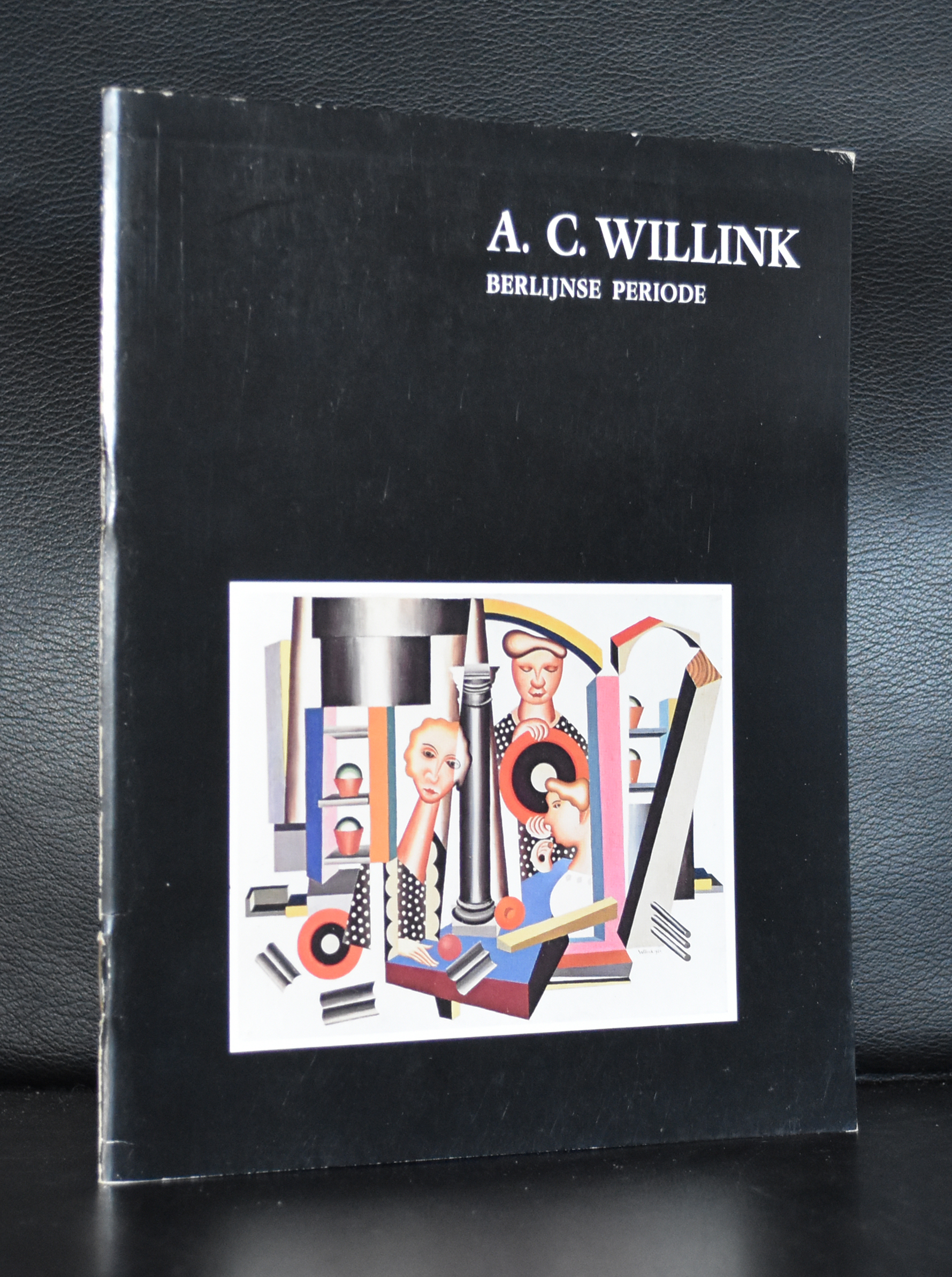
In the time the PC. Hooftstraat in Amsterdam was not a fashion street, but an ordinary city street with a butcher, a grocery, baker, vegetables shop and even a garage. In those days there were some galleries who held residence in the P.C. Hooftstraat,. Among them there was gallery IKON, which presented religious icons and yes, i was the shopkeeper …it was one of my first jobs in the art world. At one day Carel Willink passed by , returned and entered the gallery. Hat, walking stick, bow tie . He really looked like a bohemian. Now almost 35 years later i still remember the person, but as an artist i lost interest. His technique is phenomenal, but in the last years of his life he only took consignments and made portraits for famous dutch people. One exception… . The (nude) portrait he made of his wife Sylvia is exceptionally beautiful.
John Baldessari is a conceptual artist. Personally i am not the greatest fan of his work, but because of his approach to the the work of Sol LeWitt i have this one publication that is very special and of course typical Baldessari and available at www.ftn-books.com
Initially a painter, Baldessari began to incorporate texts and photography into his canvases in the mid-1960s. In 1970 he began working in printmaking, film, video, installation, sculpture and photography. He has created thousands of works that demonstrate—and, in many cases, combine—the narrative potential of images and the associative power of language within the boundaries of the work of art. His art has been featured in more than 200 solo exhibitions in the U.S. and Europe. His work influenced Cindy Sherman, David Salle, Annette Lemieux, and Barbara Kruger among others.
This is a special blog on Minimal art . This time i am offering my readers a real treat.
As you might know the Gemeentemuseum published in the late nineties a cd rom containing the PDF files of possibly the 3 most important and sought after Minimal Art exhibition catalogues which were held in Europe in the late sixties. A European first…..All three were curated by Enno Develing and all three were accompanied by a simple but important catalogue. All these catalogues ( LeWitt, Minimal Art, Carl Andre) sold out completely and because of the demand and art historical importance we decided to buy some antiquarian 2nd hand copies, strip them from their backbones and scan them as PDF files for future use and disclosure to students and publish them in a very limited number on cd rom.
At that time i bought the CD rom. The CD rom player on my Mac disappeared, but i kept the files on my hard drive including the Carl Andre, LeWitt and Minimal Art catalogues in pdf format . You can view the Minimal Art catalogue here: MINIMAL ART
For the complete CD ROM or separate files of the other catalogue please visit www.ftn-books.com
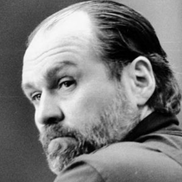
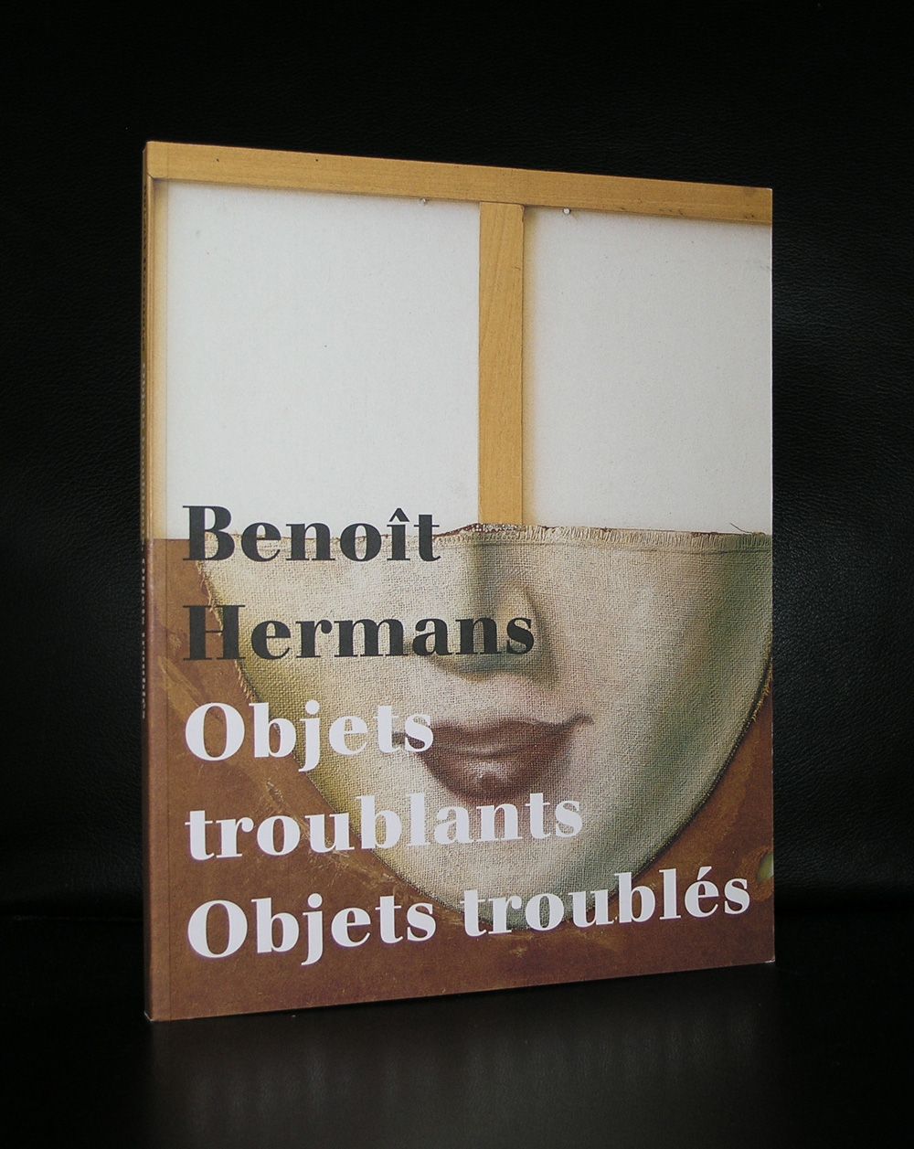
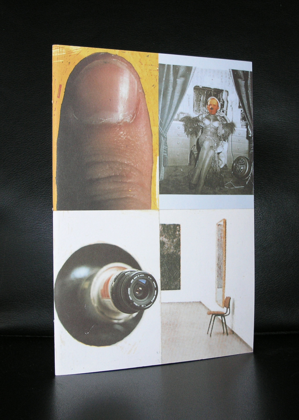
Starting this blog with the internet address of Benoit Hermans for those among you who do not know his work. Hermans exhibited on multiple occassions in the Bonnefanten museum , but it took some years and Rudi Fuchs to present his art in Amsterdam. It was in the late nineties that he first received an exhibition in Amsterdam at gallery van Dieten and participated in the Stedelijk exhibitions ON THIN ICE and UP TO NOW. Benoit’s his art is fascinating. He combines every day persons /objects into collages making them feel strange and surreal.
Een kopietje van Lichtenstein’s schilderij ¨I’VE HOOKED A BIG ONE¨ circuleerde al enige tijd in mijn atelier. Het fascineerde me vanwege de manier waarop Lichtenstein erin geslaagd was het typische Disney-idioom om te zetten in een goed lopend schilderij. Want in tegenstelling daarmee verzetten Disney’s tekeningen zich letterlijk nergens tegen de regels van het alledaagse zien. Ze sluiten zo direct mogelijk aan bij het meest voor de hand liggende, gaan altijd moeiteloos op in die allesverzengende brij van altijd geldende kijkgewoontes. Zo komt er in zijn tekeningen nooit een vorm voor die raadselachtig blijft. Altijd gaat het ene lusvormige onderdeel vloeiend over in het andere. De hele wereld is gereduceerd tot soepel in elkaar grijpende verzameling van krullen en cirkels – of het daarbij nu gaat om de snavel van Donald Duck, de kraag van zijn zeemansjasje of zijn veel te dikke eendenpoten. Zelfs de tekstballon wordt op die manier helemaal een met degene die hem uitspreekt. Dat maakt het nogal moeilijk om daar een goed schilderij van te maken. Ik vond het deste frappanter dat het Lichtenstein toch was gelukt.
Op een gegeven moment kwam dat fragment in de buurt van een reproductie van Caravaggio’s “Ongelovige Thomas” terecht en meteen viel me op hoe goed Donalds verwondering over zijn visvangst (dat is eigenlijk de vangst van zichzelf, want het haakje is in zijn eigen staart terecht gekomen) plotseling leek samen te vallen met de ontzetting waarmee Thomas Christus’ wond inspecteert. In de eerste plaats door het formaat van Donalds ogen, die daarom alleen al niet zozeer naar de wond als wel dwars door Jezus heen lijken te kijken. Het lijkt wel of ze zijn lichaam nog ’s extra doorboren met hun blik. Maar zeker ook doordat het krullende van Disney’s stijl de welving van de wond als het ware versterkt.
Bovendien realiseerde ik me tegelijkertijd hoe een drietal vormen van iconoclasme – twee oudere en een meer recente – op deze manier in één enkel beeld samenvielen. Die twee eerste vormen zaten al min of meer besloten in het schilderij van Caravaggio zelf. Die laatste werd door Donald Ducks aanwezigheid daaraan toegevoegd.
Wat ik bedoel is het volgende. Caravaggio’s versie van ´De ongelovige Thomas´ is op zichzelf een iconodulisch manifest in het kwadraat. Het drijft volgens mij namelijk hét centrale argument, dat de verdedigers van het beeld tegen zijn tegenstanders inbrachten, volledig op de spits. De tegenstanders van het beeld wezen er namelijk in eerste instantie op, dat het goddelijke als zodanig niet is af te beelden en dat dus elke poging het wel te doen uitloopt op blasfemie. Elke poging God in een beeld te vangen zou een daad van heiligschennis zijn.
Ter verdediging van het beeld wezen de iconodulen er vervolgens op dat het toch ook God zelf was, die besloten had zijn eigen zoon deel te laten nemen aan deze ‘goddeloze’ werkelijkheid van het ondermaanse. Waarom zou dan een andere verschijningsvorm, of liever: een andere vorm van incarnatie, daar dan geen getuigenis van mogen afleggen? De iconodulen wezen met andere woorden op de in hun ogen essentiële overeenkomst tussen de dubbele natuur van Christus en die van het beeld. Beiden namen gelijktijdig deel aan zowel de goddelijke als de wereldse dingen.
Nu speelde zich deze strijd tussen voor- en tegenstanders van het beeld af in de achtste en negende eeuw na Chr., dat wil zeggen meer dan achthonderd jaar, voordat Caravaggio zijn versie van de ongelovige Thomas schilderde. In de tussenliggende eeuwen was de houding van de kerk ten aanzien van het beeld totaal veranderd. Inmiddels was de schilderkunst al uitgegroeid tot een volkomen geaccepteerd propagandamiddel van de kerk en om die reden een belangrijk wapen geworden in de strijd tegen een geheel nieuw soort iconoclasme, dat van de protestanten.
Dat Caravaggio voor de kerk werkte ten tijde van de contra-reformatie, komt in zijn werk heel duidelijk tot uitdrukking. In de eerste plaats is daar de monumentaliteit en eenvoud van zijn composities. Hiermee kwam hij de voorstanders van de reformatie in zekere zin tegemoet. Want de eenvoud was uitdrukking van zijn verlangen terug te willen gaan naar de bron, dat wil zeggen te komen tot een zo direct mogelijk contact met datgene waar het in de bijbel om ging. Caravaggio deed er alles aan de toeschouwer ervan te doordringen, dat hij als het ware direct getuige was van datgene wat zich meer dan 1600 jaar geleden ooit had afgespeeld en dat hij zich daarop moest concentreren en niet op ingewikkelde, theologische toevoegingen van later datum. Ook een aantal andere, hele karakteristieke kenmerken van zijn werk zijn hierop terug te voeren. Zo gebruikte hij vaak als model hele volkse types, die in niets leken op de idealiserende kunst van de voorafgaande generaties. Een overdreven realistische weergave van handen of gezichten wijzen in die richting, maar vooral dus een uitgekiend gebruik van het door hem uitgevonden clair-obscur.
Gezien de achtergrond van het iconodulisch argument zou je kunnen zeggen dat Caravaggio op deze manier in zijn strijd tegen het tweede soort iconoclasme het inhoudelijke argument van het eerste radicaal versterkt. Want naarmate hij erin slaagde Jezus en zijn wond realistischer te schilderen, versterkt hij impliciet het iconodulische argument, dat uitgaat van de radicale overeenkomst tussen de goddelijke vlezigheid van Jezus én het materiële van het beeld.
In mijn eigen versie komt er dan nog een derde iconoclastisch gezichtspunt bij, dat te maken heeft met de reden waarom Lichtenstein in de jaren ’60 de hengelende Donald schilderde. Dat hing namelijk samen met een zoveelste beeldverbod, deze keer uitgevaardigd door een lid van de kunstgemeenschap zelf, namelijk de Amerikaanse kunstcriticus Clement Greenberg.
Voor de zoveelste keer is de houding ten aanzien van het beeld weer veranderd. Inmiddels heeft de zichzelf serieus nemende kunst de beschermende en beeldbepalende ruimte van de kerk al meer dan twee, drie eeuwen verlaten en is in staat gebleken geheel aan haarzelf gewijde ruimtes in het leven te roepen. En Greenberg wil nu dat de schilderkunst ook nog de laatste stap zet op weg naar de absolute autonomie; met het opgeven van de christelijke iconografie als leidraad heeft deze kunst volgens hem inmiddels ook de afbeeldende functie als zodanig verloren. Dus eist Greenberg de afschaffing van de figuratie als zodanig. Volgens hem heeft deze een optimale ontwikkeling van de kunst sinds eeuwen in de weg gestaan en kan de kunst alleen maar haar ware bestemming bereiken, als kunstenaars zich nog uitsluitend bezighouden met een onderzoek van het schilderij als plat vlak. En Lichtenstein’s schilderij van Donald Duck was op dat moment een bewuste stellingname tegen dit Greenbergiaanse (niet beeld- maar) afbeeldverbod. Lichtenstein heeft Donald Duck hier eigenlijk gebruikt om de schilderkunst te refigureren.
Tegen de achtergrond van deze derde laatste vorm van iconoclasme zou je nu kunnen zeggen dat de ongelovige Donald in dit schilderij namens Thomas en de ongelovige Clement een dubbel onderzoek verricht. Ten eerste naar de echtheid van Christus’wond en ten tweede naar de echtheid van het geschilderde. En in de visie van Greenberg betekent dat eigenlijk dan weer ten faveure van de afschaffing van de figuratie. En zo te zien vindt ie dat maar wat leuk. Want een en ander gaat gepaard met een enorme vondst: ´I’ve hooked a big one´. En die BIG ONE temidden van al dat iconoclastisch geweld, dat is hij natuurlijk zelf.
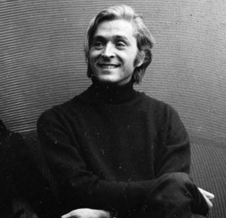
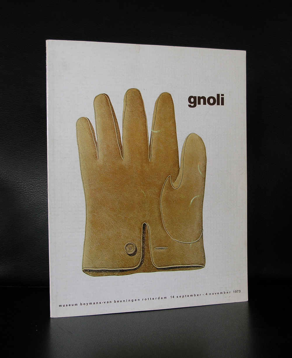
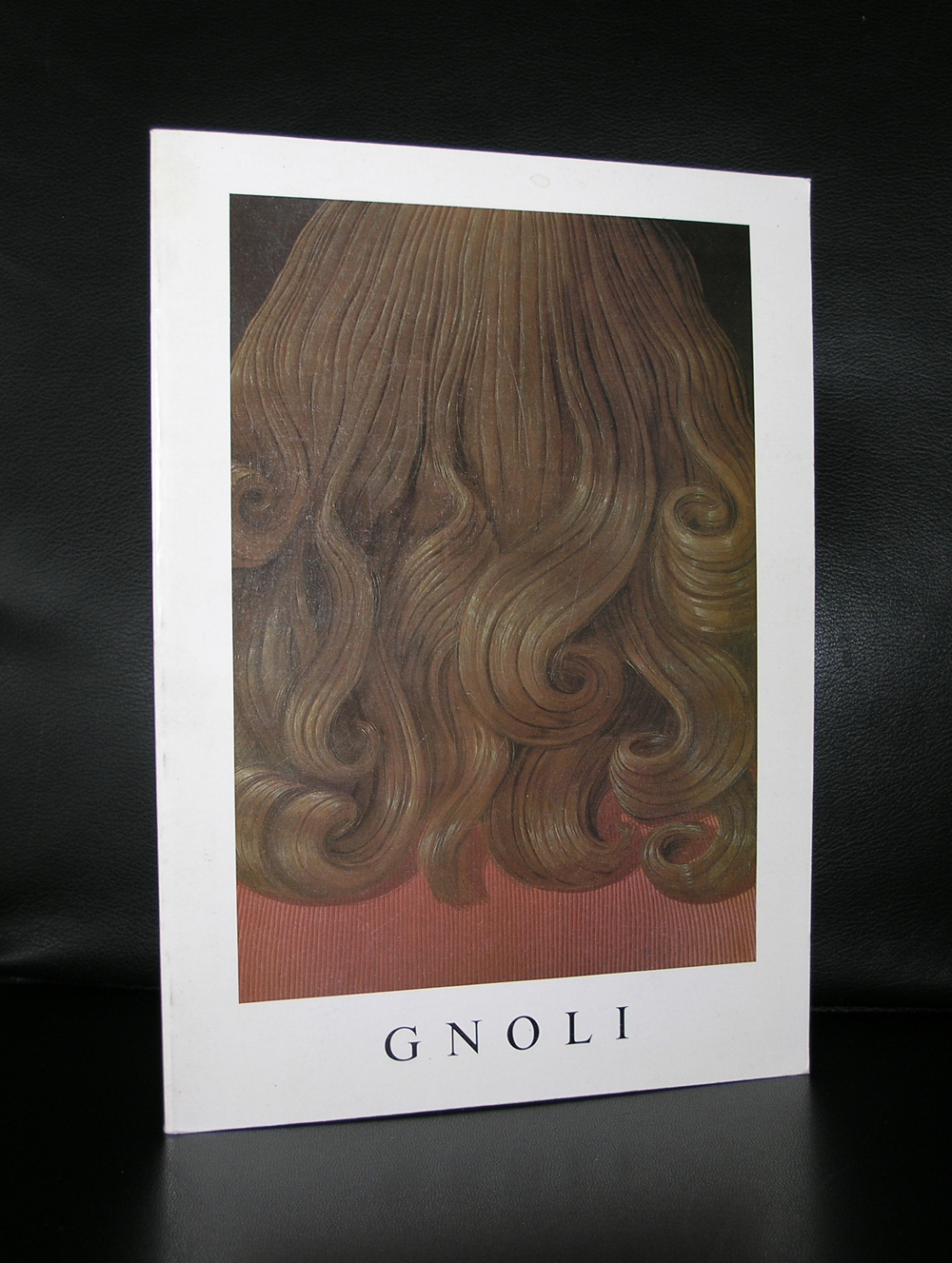
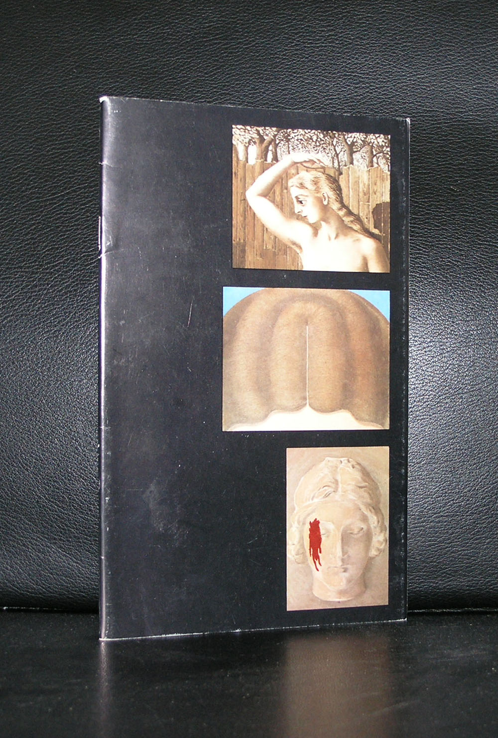
Died at the age of 37 , too young to die and leaving so much to admire. From his own perspective Gnoli enlarged daily objects and transformed them into large paintings, a little bit like Konrad Klapheck does, but with a much more gentle approach to the subject. Focussing on the extreme details , like stitchings and tissues he makes highly recognizable paintings.
Gnoli was born in Italy but moved at a very young age to the US where he stayed and worked in New York for the better part of his life. Painting and as a Stage designer to make a living, he got his first exhibitions in New York. Gnoli was presented in a large exhibition in the Netherland at the Boijmans van Beuningen museum, but it is of late that his name keep surfacing as one of the more important and influential Italian artists from the sixties and it is this raised interest in his works that it makes harder and harder to find good publications on Gnoli. www.ftn-books.com has two books available.
Joan Jonas was born in 1936 in New York. A pioneer of performance and video art, Jonas works in video, installation, sculpture, and drawing, often collaborating with musicians and dancers to realize improvisational works that are equally at home in the museum gallery and on the theatrical stage. Drawing on mythic stories from various cultures, Jonas invests texts from the past with the politics of the present.
Just a short biography which can be found everywhere on the internet, but a visual example of her work says more than a thousand words.
and the interview she has done with Art21
www.ftn-books.com has only one book available by Joan Jonas. It is the exhibition catalogue for her Stedelijk Museum exhibition in 1994.
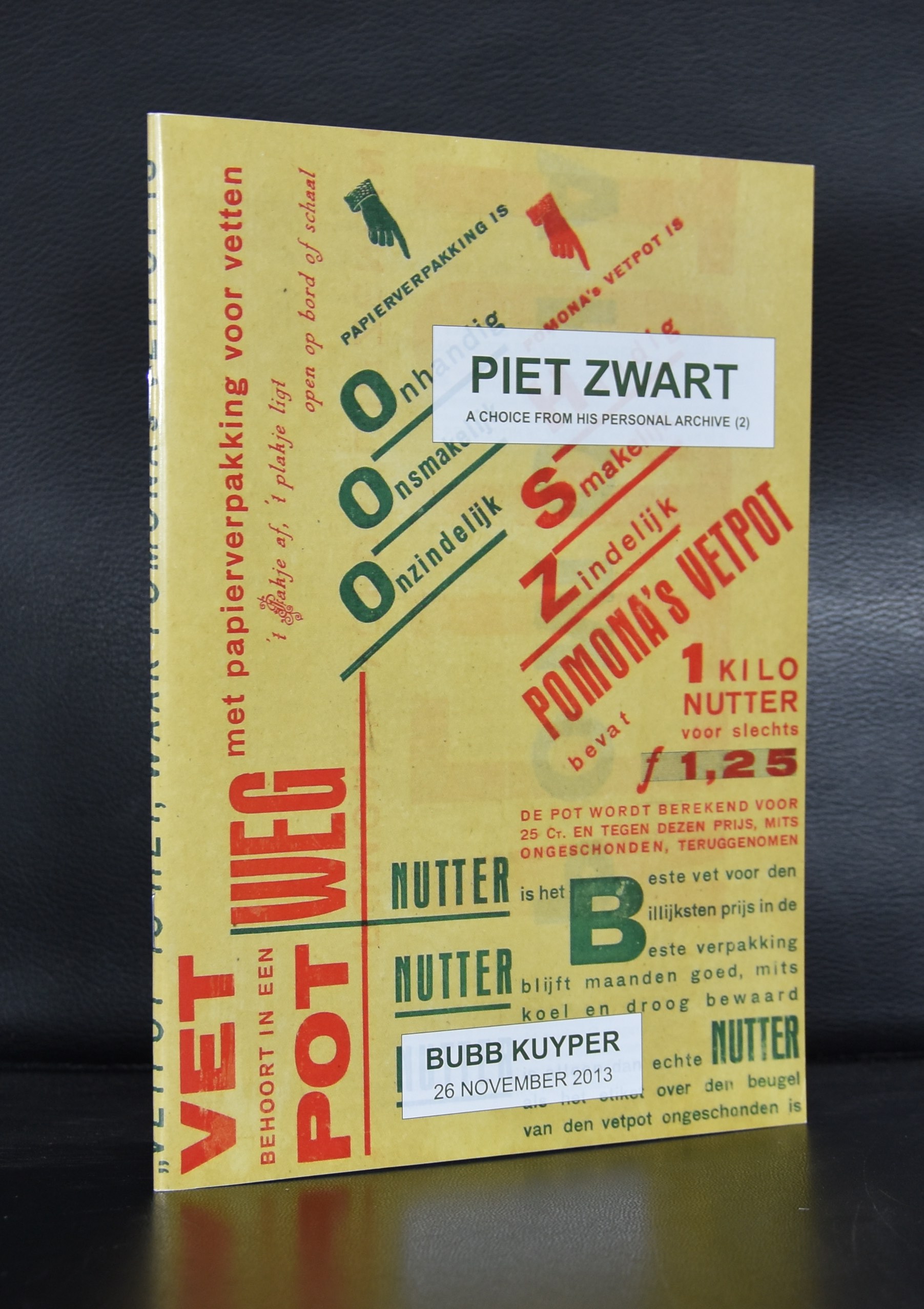
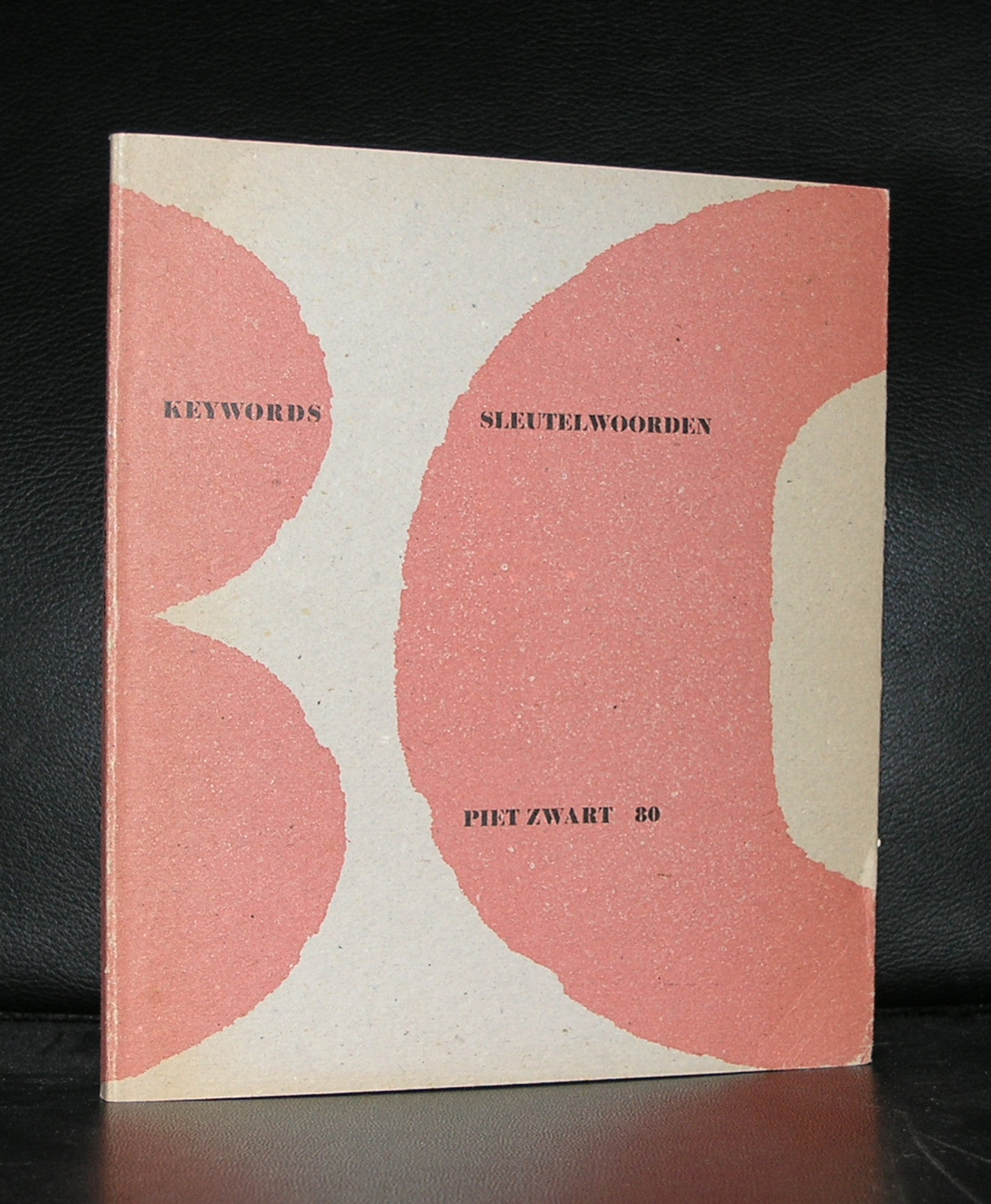
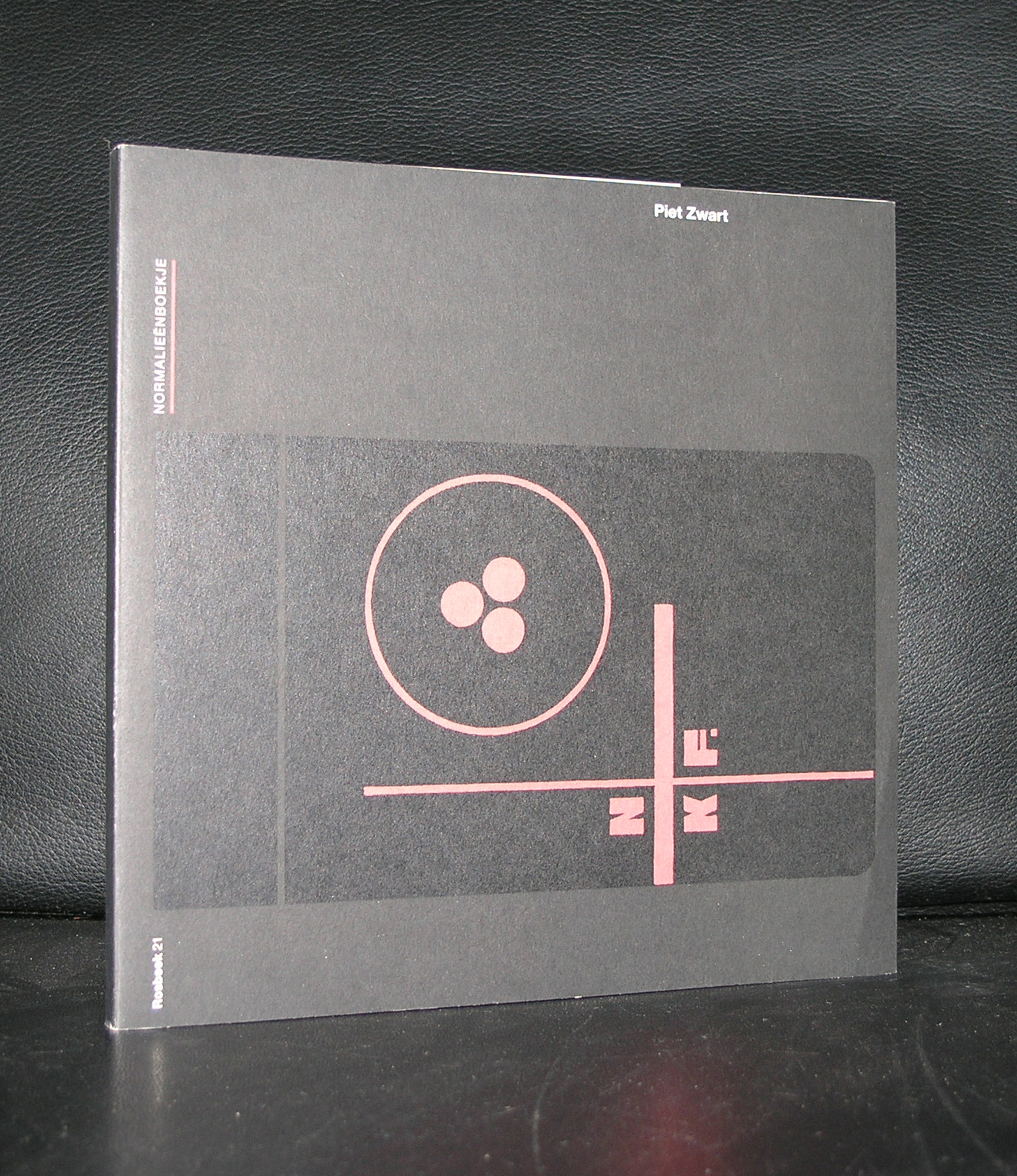
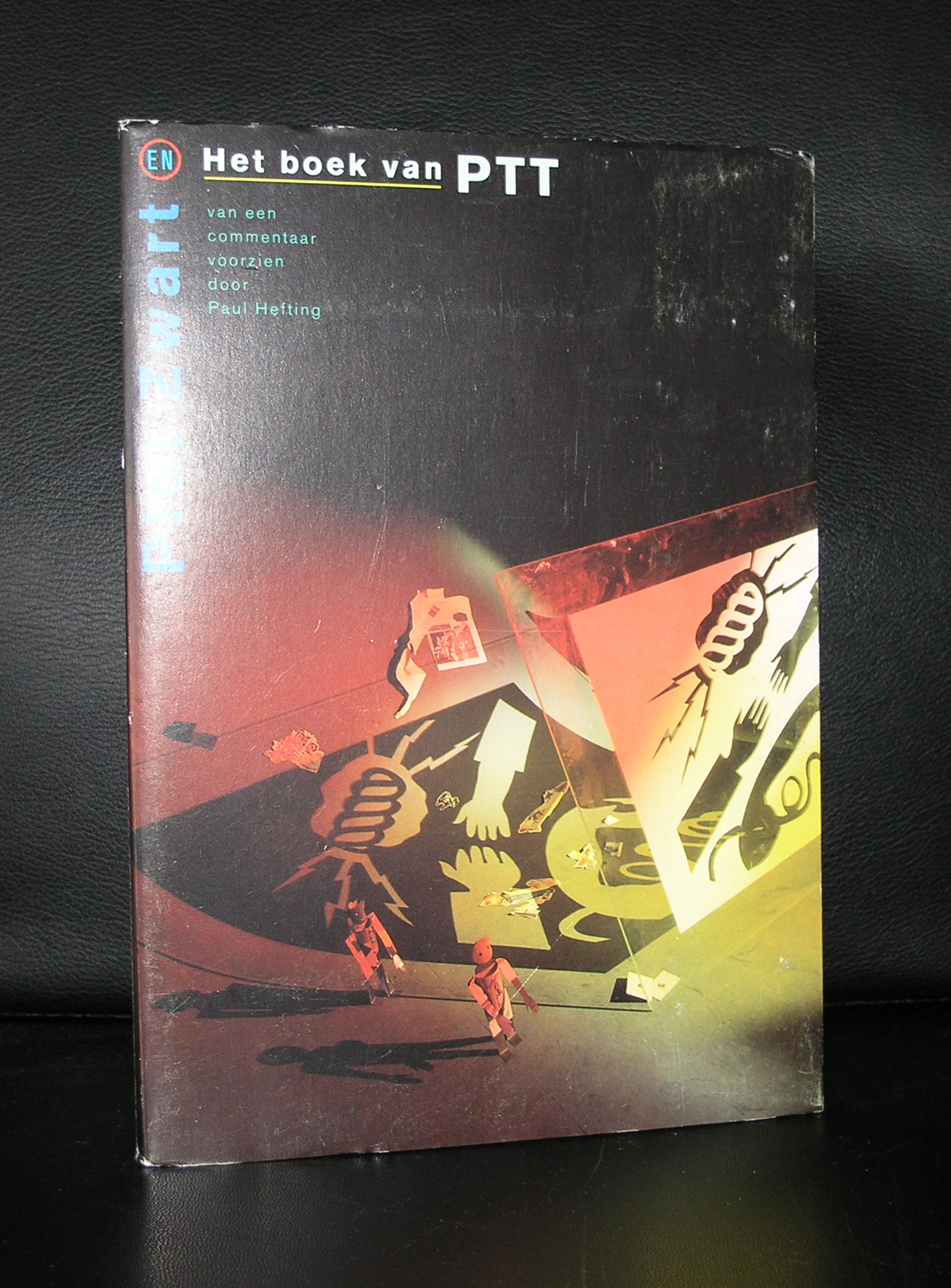
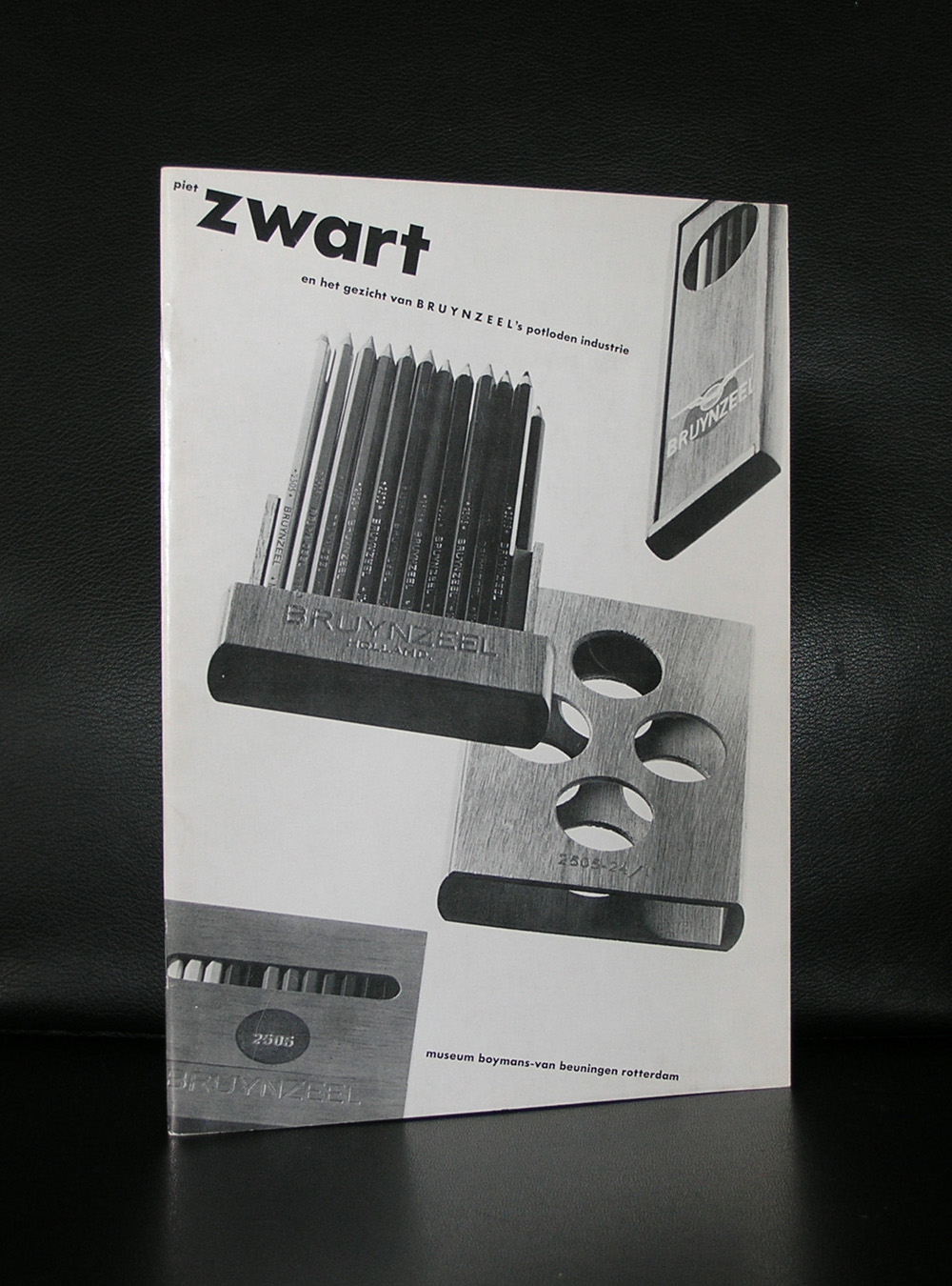
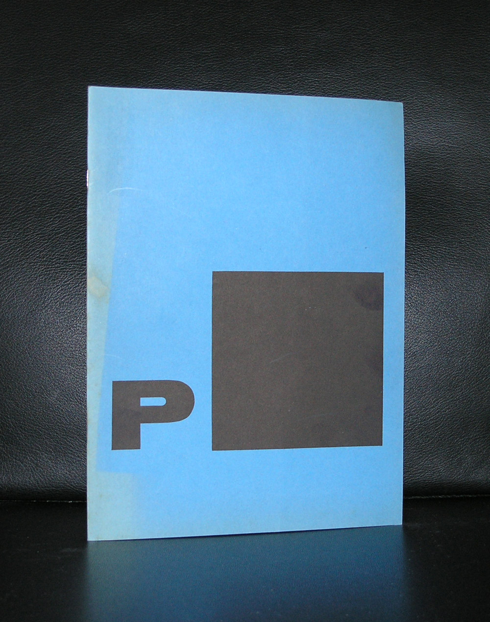
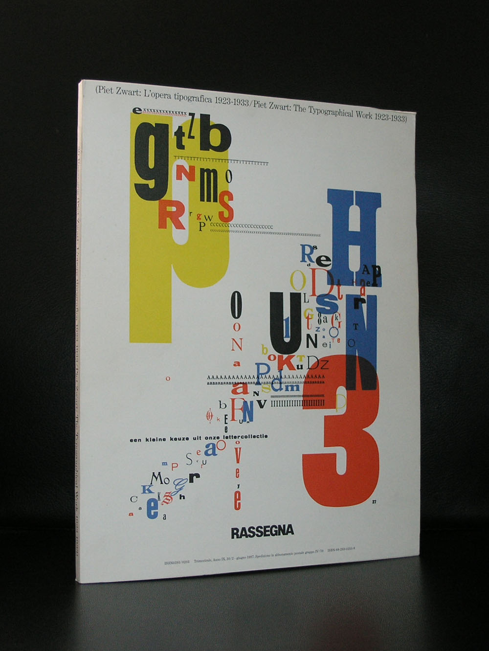
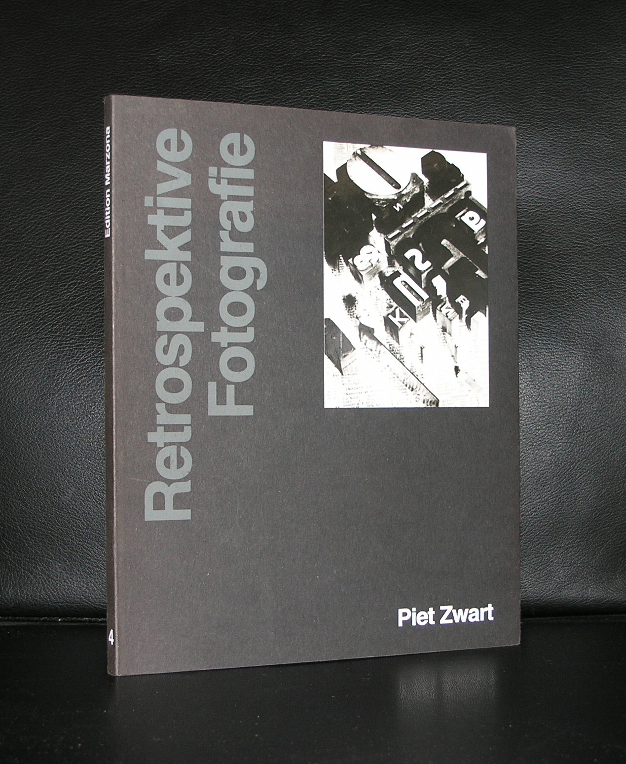
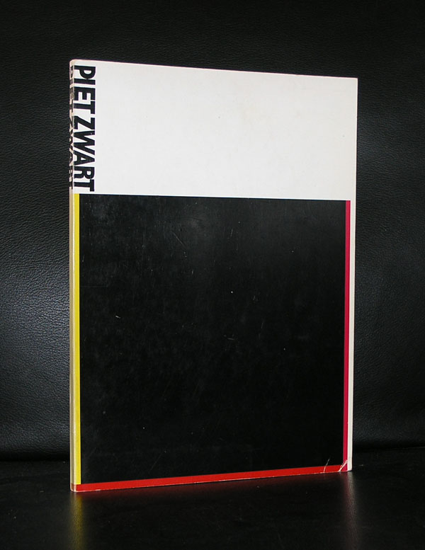
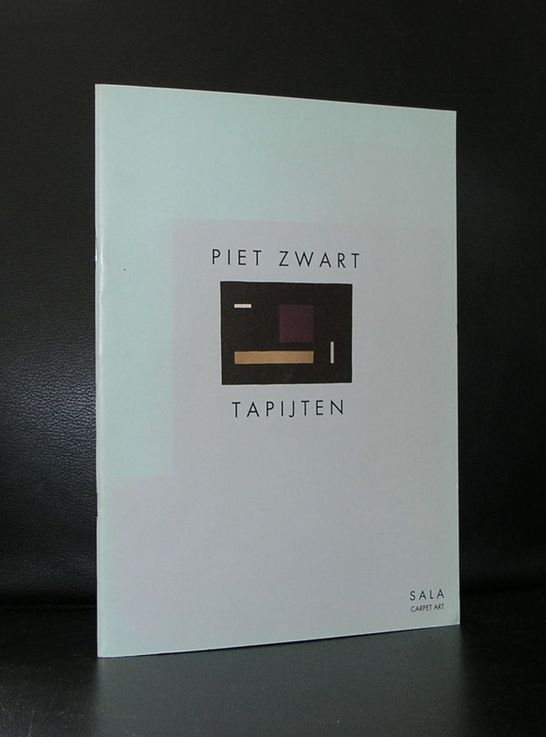
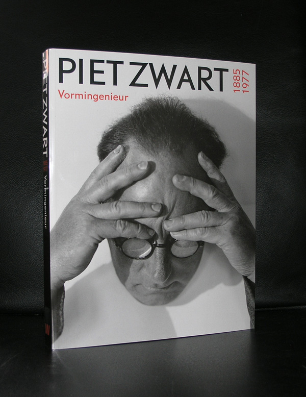
There is so much to be told about Piet Zwart, but a short blog on him can only indicate his importance to the world of design and typography. If ever there was a designer who’s influence is of worldwide importance, it is Piet Zwart. I wish my friend David took care of this blog, because he is far more knowledgable on Zwart than any other person i know of. About 40 years ago, shortly after Piet Zwart died, he received some major exhibitions in the Netherlands. Gemeentemuseum Den Haag, Stedelijk Museum Amsterdam and the Boijmans van Beuningen museum all had their Piet Zwart retrospectives of which the one curated by Flip Bool for the Gemeentemuseum was probably the most important one. There was a long relationship between the Gemeentemuseum and Piet Zwart, which resulted in an extensive gift from the Zwart family and several exhibitions on Piet Zwart and his designs in the Gemeentemuseum of which some publications are still available at www.ftn-books.com. For all collectors of Zwart… i want to inform you that there are some very nice catalogues of Piet Zwart items still available at Bubb Kuyper in Haarlem. Bubb Kuyper held special Piet Zwart auctions during the last 3 years in which they auctioned many rare Piet Zwart items.
One more things on Piet Zwart that you possibly did not know of. Because of the relationship with Piet Zwart , the Gemeentemuseum Den Haag placed a bench in its garden. design?….yes, Piet Zwart and to memorate his 80th Birthday , Willem Sandberg designed a special publication which is also available at ftn-books.
OLYMPUS DIGITAL CAMERA
OLYMPUS DIGITAL CAMERA
OLYMPUS DIGITAL CAMERA
OLYMPUS DIGITAL CAMERA
OLYMPUS DIGITAL CAMERA
OLYMPUS DIGITAL CAMERA
OLYMPUS DIGITAL CAMERA
OLYMPUS DIGITAL CAMERA
OLYMPUS DIGITAL CAMERA
OLYMPUS DIGITAL CAMERA
PS.
I almost forgot. The street lightning in some of the older parts of Den Haag…yes , also Piet Zwart’s design.
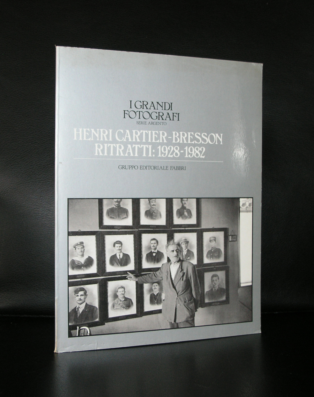
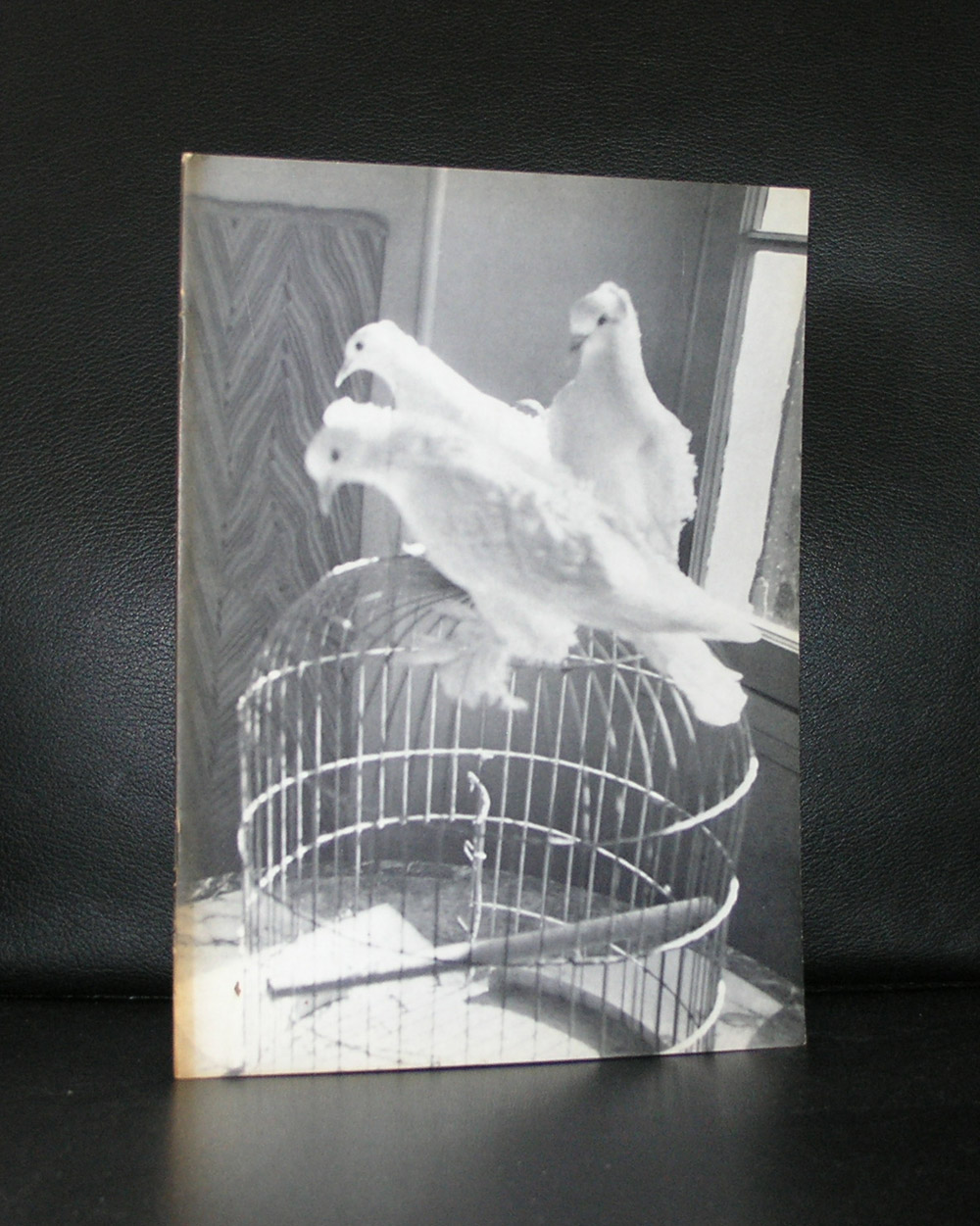
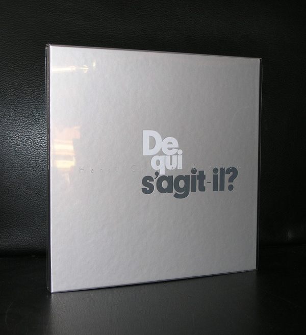
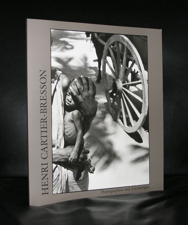
If ever there is a photographer who is recognized as one of the greatest ever, it is Henri Cartier Bresson. Being a Magnum photographer you can see and discover many known and unknown photographs by Henri Cartier Bresson on this site:
What it also shows is the power of black and white photography. It is in many cases far more authentic and beautiful than color photography and Heni Cartier Bresson proves that he is one of the most original and talented . Beautiful compositions and catching the very best important moments to make the perfect photograph.
www.ftn-books.com has some nice books on Henri Cartier Bresson , including the excellent Sandberg designed catalogue for his Stedelijk Museum exhibition in 1963.
Artist/ Author: Oliver Boberg
Title : Memorial
Publisher: Oliver Boberg
Measurements: Frame measures 51 x 42 cm. original C print is 35 x 25 cm.
Condition: mint
signed by Oliver Boberg in pen and numbered 14/20 from an edition of 20