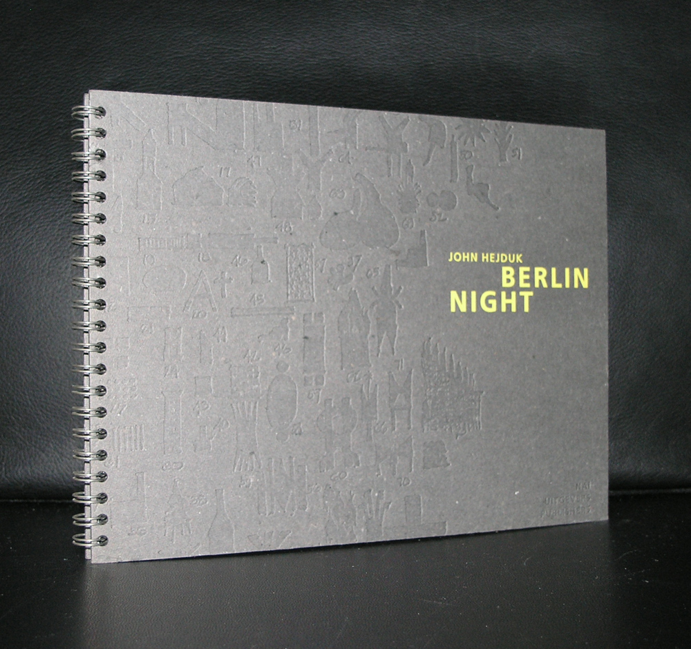
When i started with my internet site , there was one publication which was a remainder which i bought a large quantity of. Berlin Nights was on sale at Boekhandel de Slegte and sold there for euro 2.50. At that time i bought 10 copies, but because of a raised interest in Hejduk publications these were sold rapidly and i had to buy the copy i now have in stock for much more money that the 2.50 i paid for the other ones ;-(
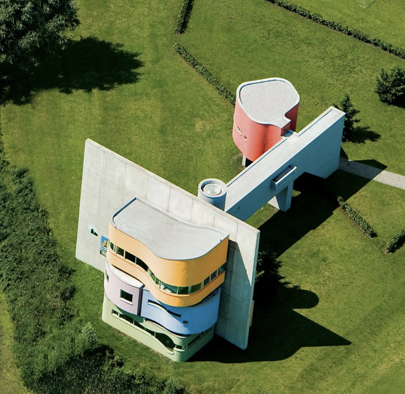
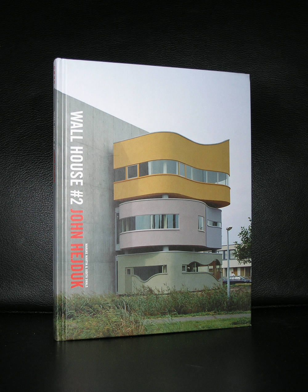
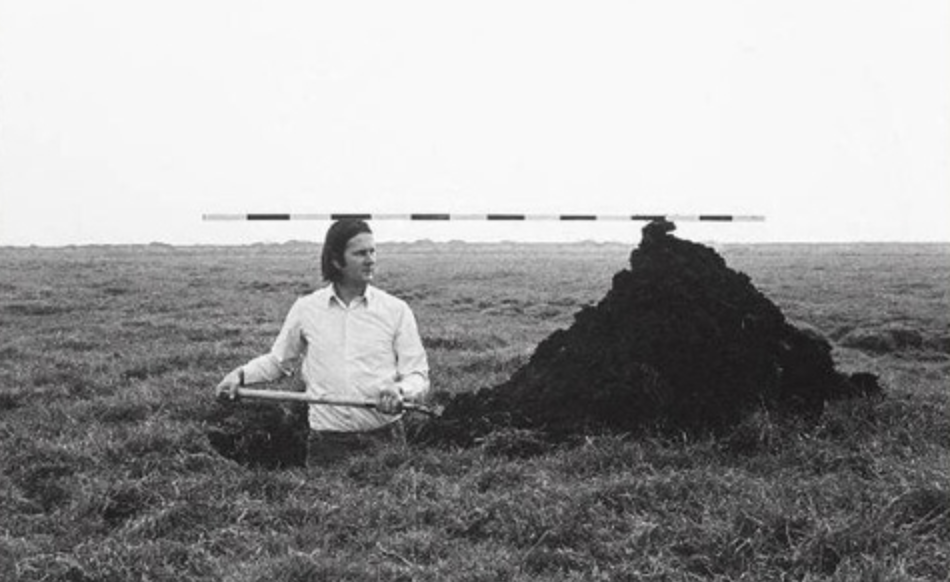
Still, i understand the importance of Hejduk. You only have to glance at his WALL HOUSE project in Groningen and you know why.
OLYMPUS DIGITAL CAMERA
Not only the architecture but also his drawings and the bookdesign itself make him very important and for me personally i think the books are outstanding. Because Hejduk is considered by many architecture students as one of the most influential and important architects in modern times and the demand for his publications is worldwide and i am proud that i can offer some nice and important ones at www.ftn-books.com
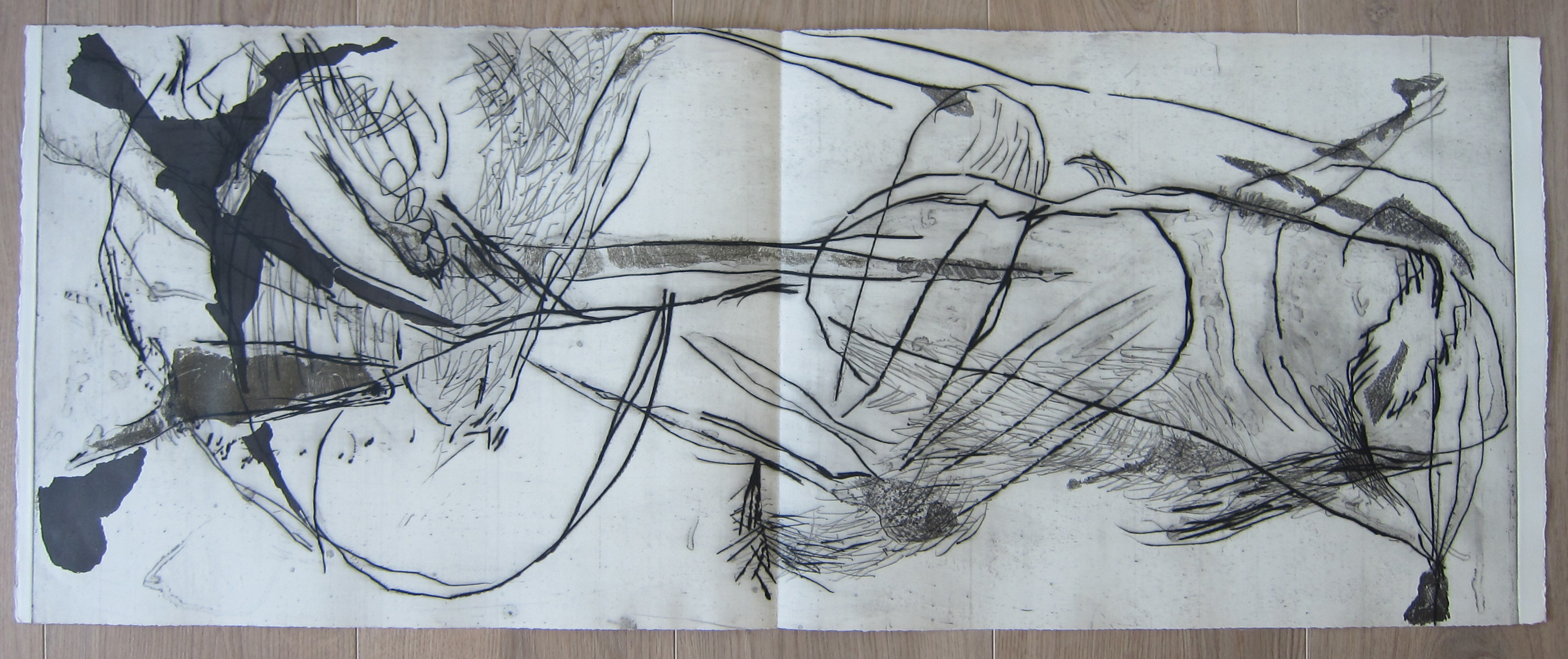
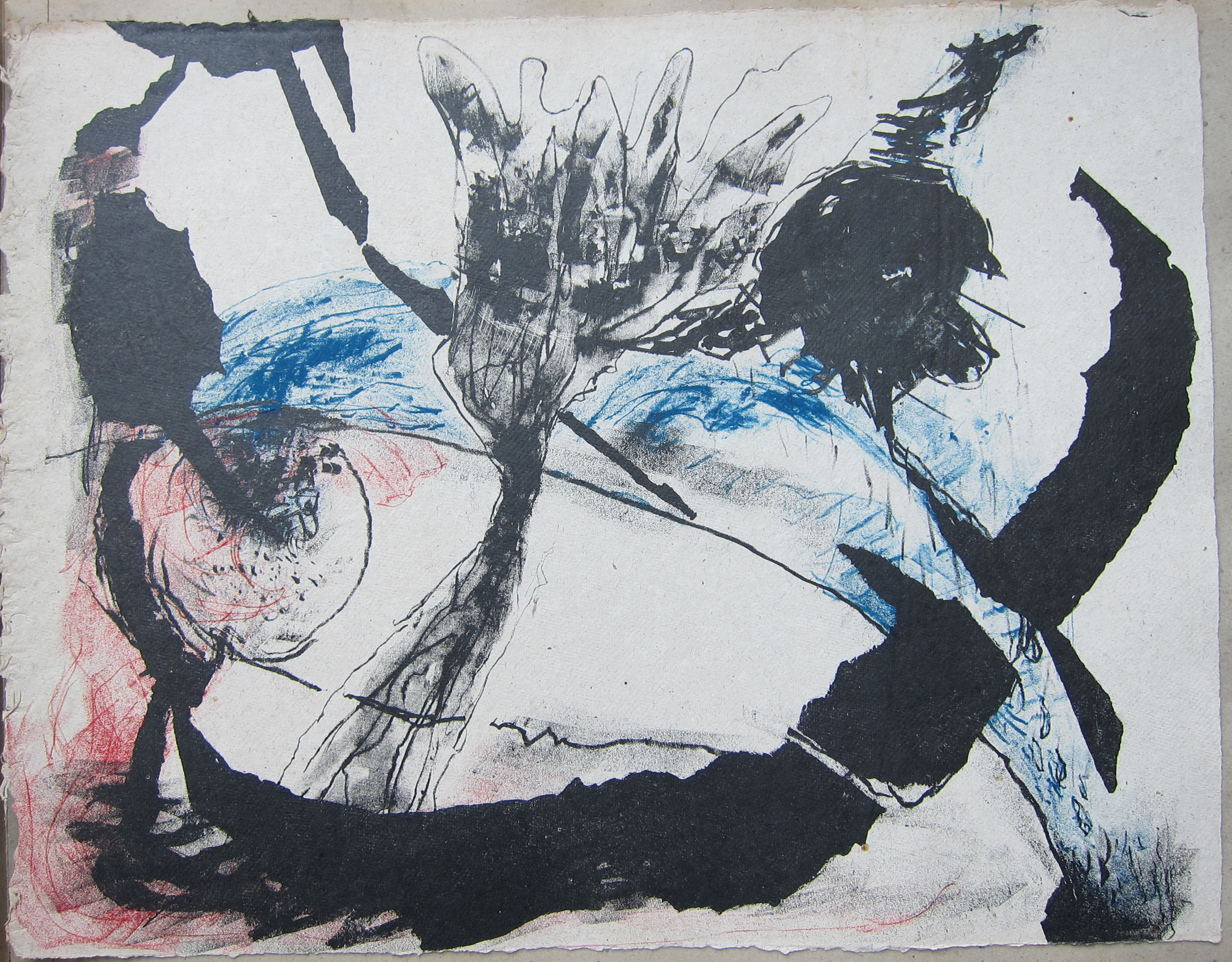
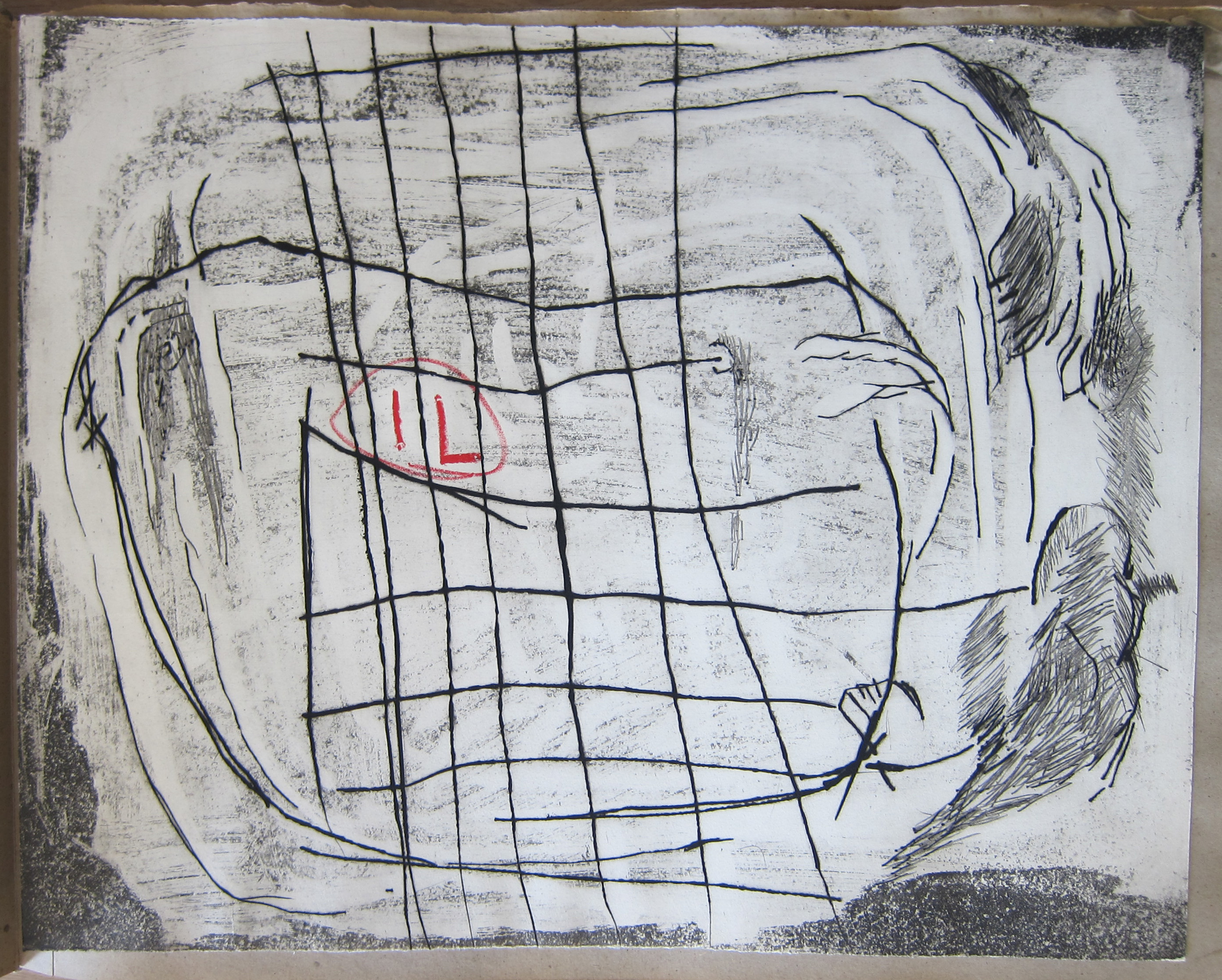
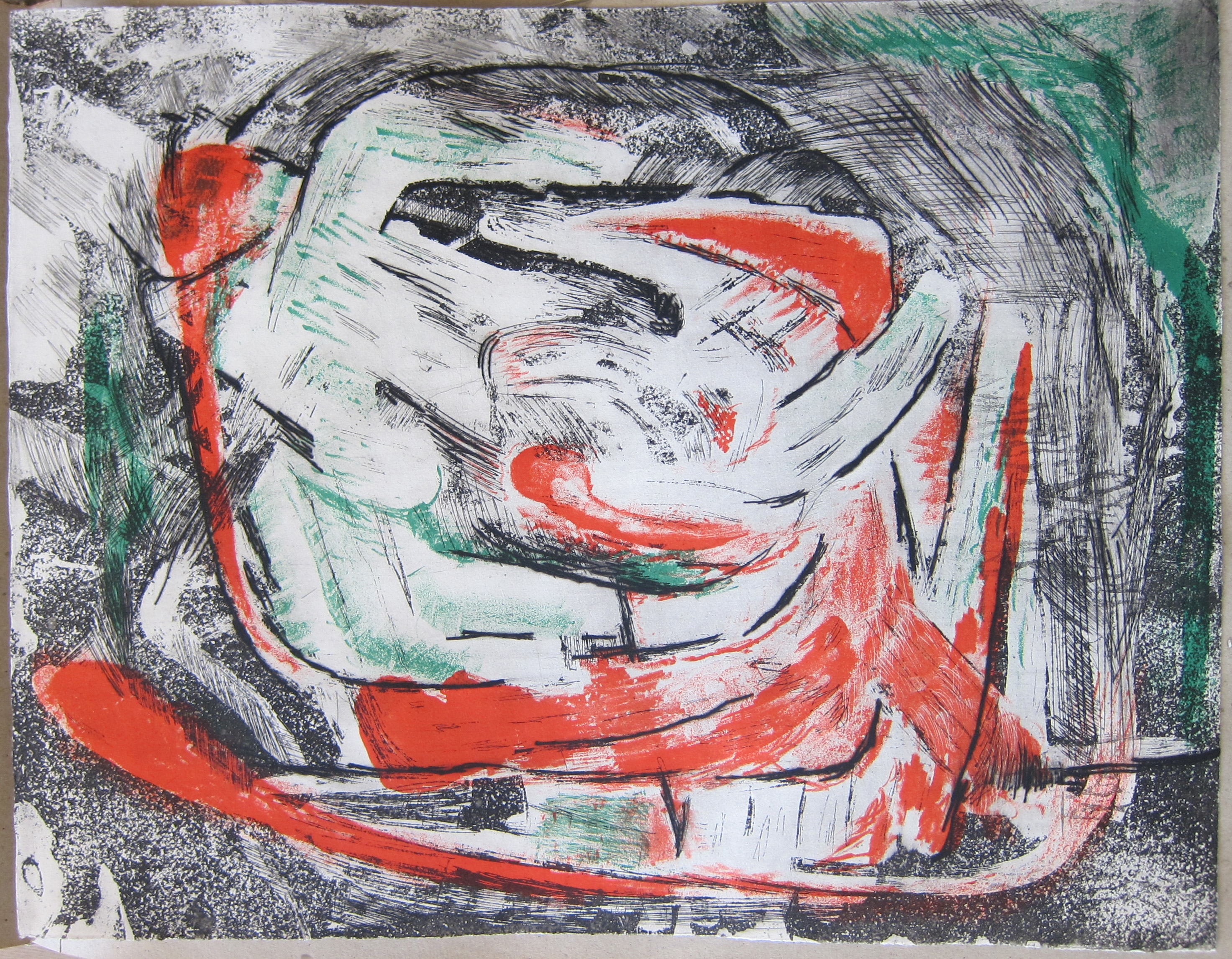
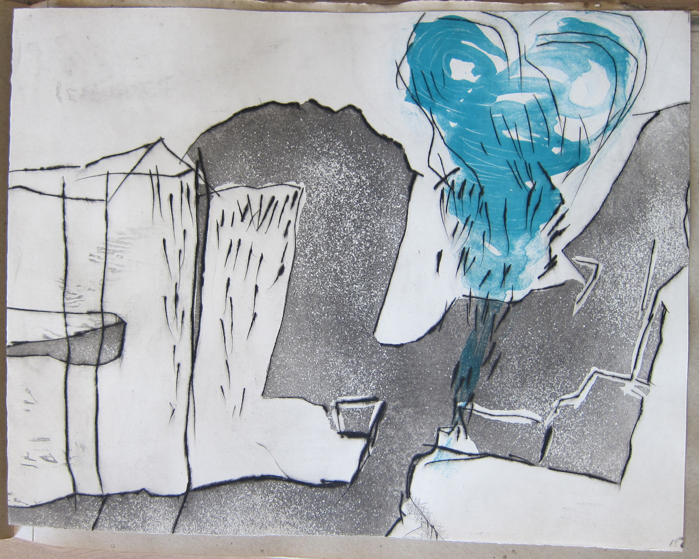
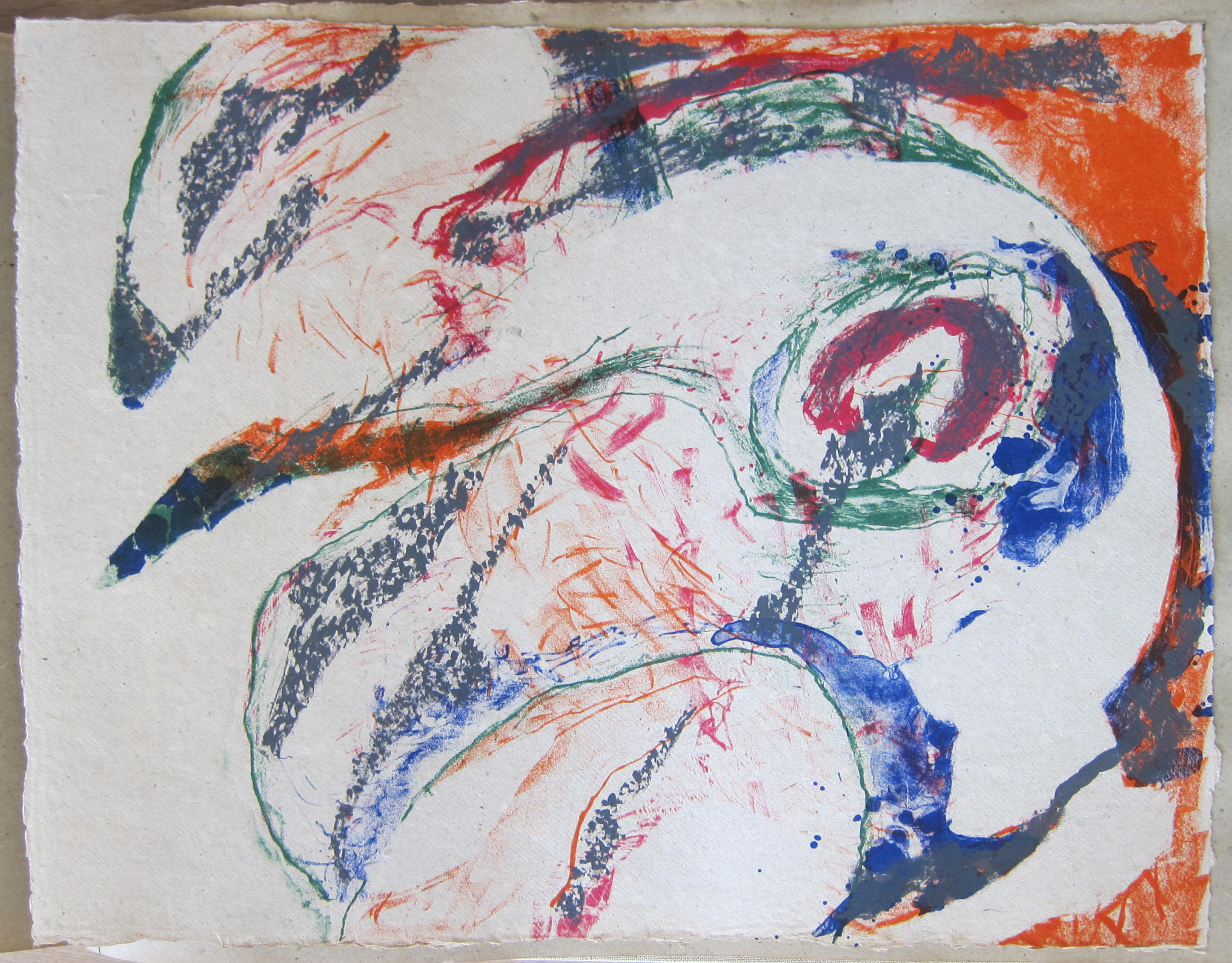
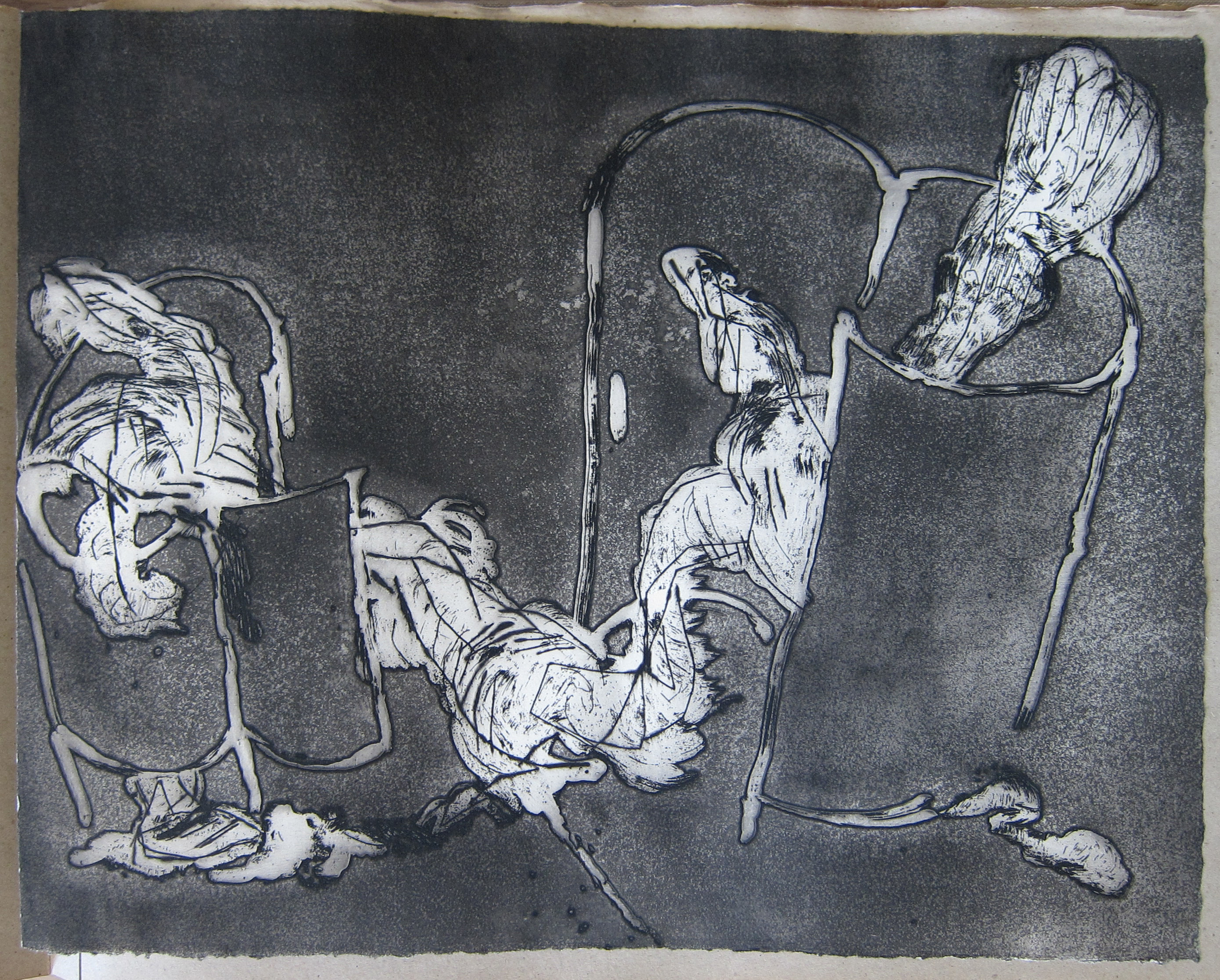
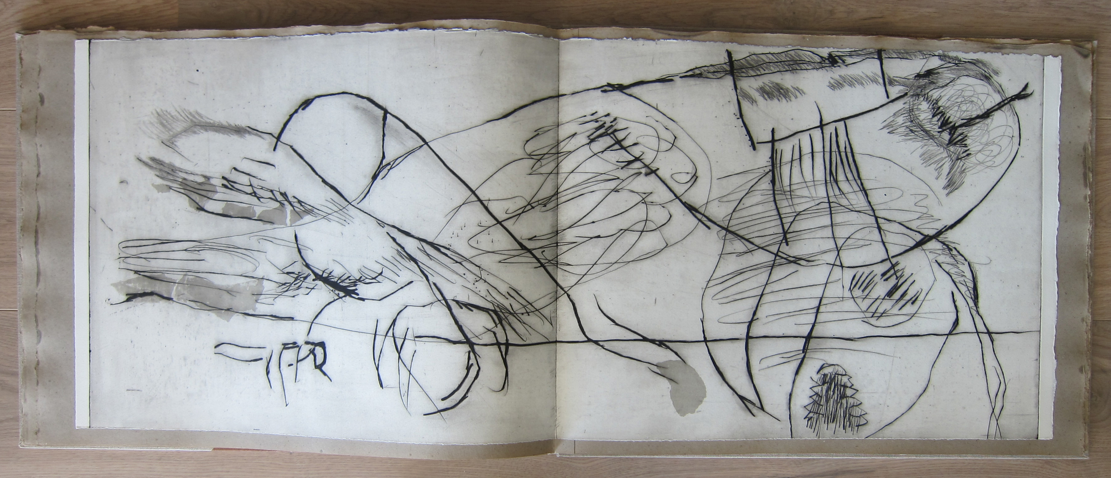
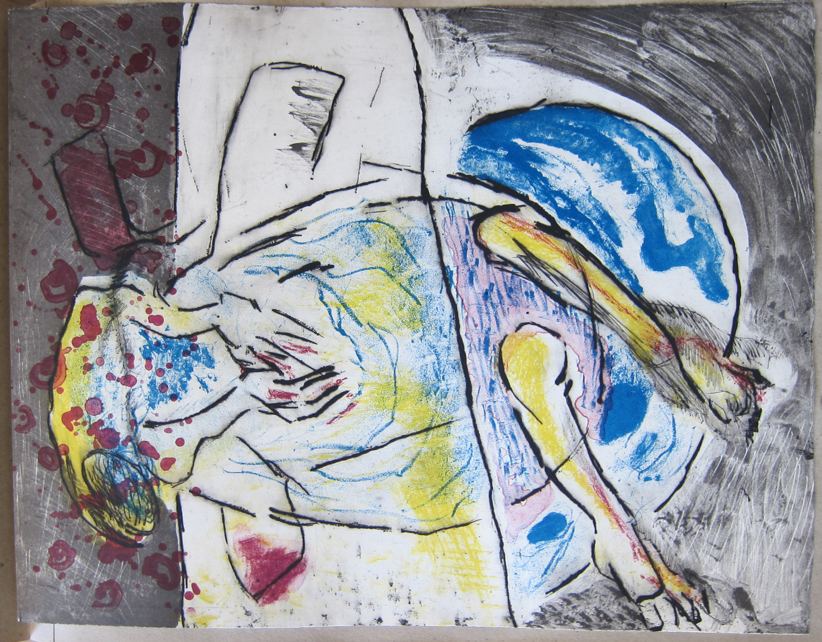
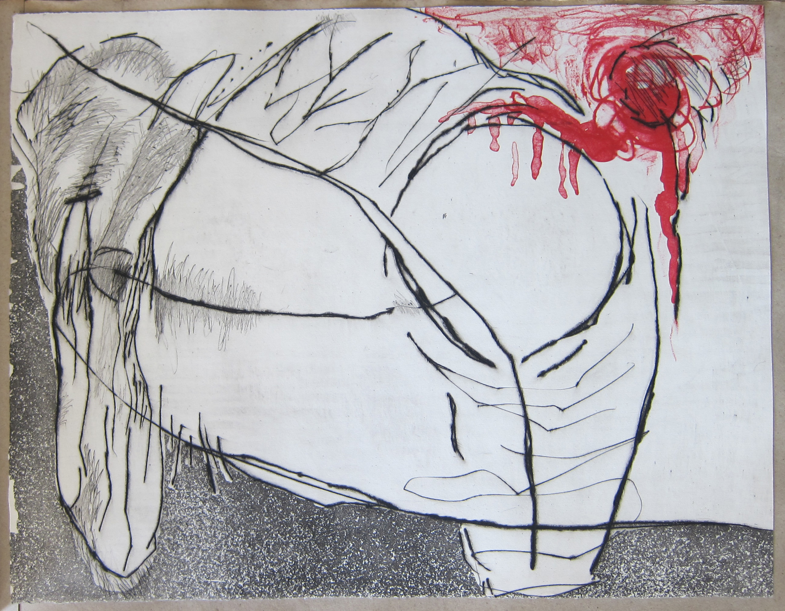
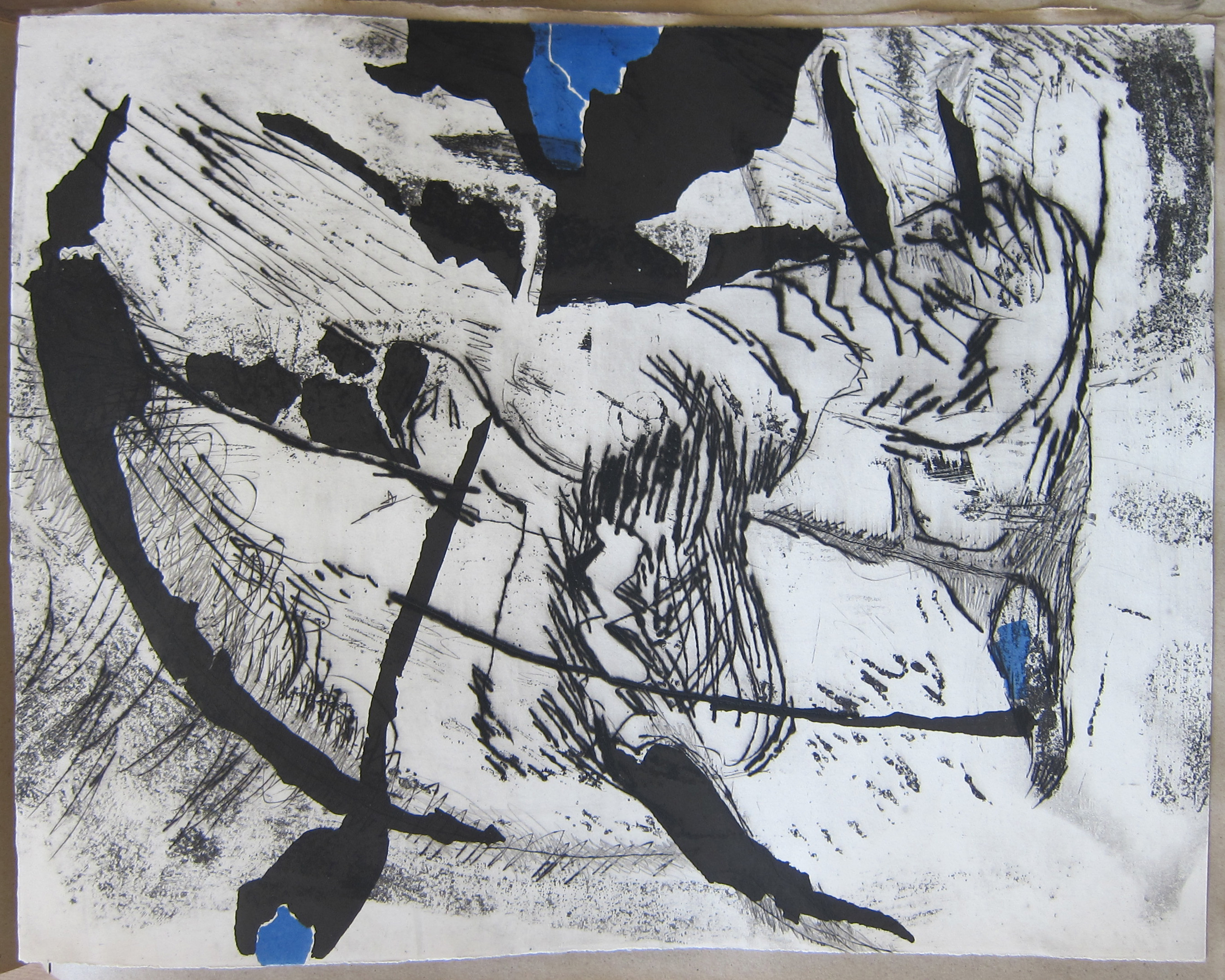
One of the most impressive publications i have in my inventory at www.ftn-books.com is a book in a limited edition of only 75 copies . Book design by Willem Sandberg and filled with 12 etchings ( signed/numbered ) by Wessel Couzijn.
The book was published in 1966, when abstract expressionism was at its height. Great quality etchings by Couzijn who beside a painter/ graphic artist was one of the most gifted sculptors from his generation. A multi talented artist which was recognized by Sandberg who admired him and gave him many times a platform to show his latest art in the Stedelijk Museum. This publication “iI” is rarely offered therefore i am proud to show in this blog the complete set of etchings from this rare and extremely important publication. Enjoy!
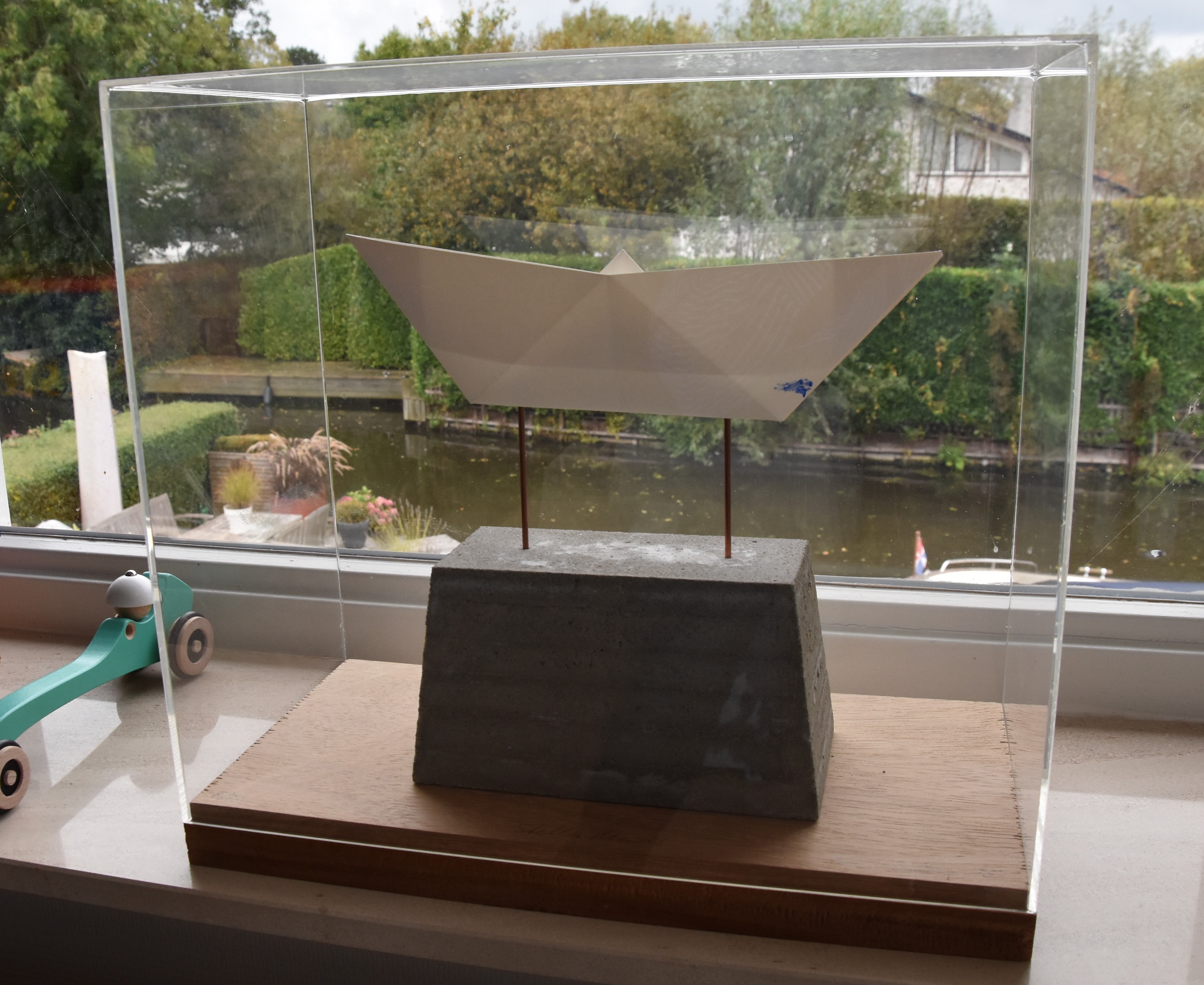
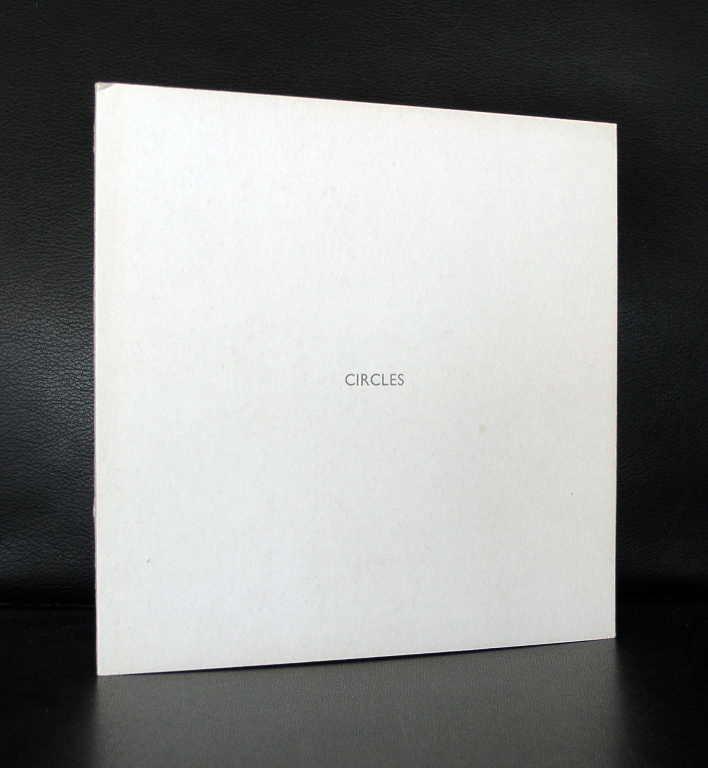
My admiration for Gudmundsson started when i first saw his “paper boat” in an edition of only 20 copies. The reason i was attracted to this work was because the same boat was depicted in a painting by Massimo Rao and for years both works were combined in my living room.
Now i have only the boat nearby and it has not lost its appeal in 20+ years. The edition was bought after i had traded in a Pieter Laurens Mol which was not the right piece of art in the right place and so the Gudmundsson was bought to make the Rao more complete and it stayed in my collection. It has pure humor and because of its presentation in a show case it still has a lot of style. This edition is only 20 copies and it was bought at DE EXPEDITIE in Amsterdam and is of course sold out now for decades , but i know of a special edition of a unique life size large paper boat which is/was in the collection of the AMC Amsterdam which is even more unique than the smaller i have on my windowsill.
For some nice Gudmundsson publications please visit www.ftn-books.com
Here is the second volume within the series Schaamstreken by Otto Egberts. At first glance this looks the least spectacular, but study it closely and you see that each page is worked over. Erased inks, sandpapered surfaces, folds and stamped “vervallen” (dilapidated). These were original maps too and i found some names which make it look like these come from the German Dutch Wadden region.
measures : 39,5 x 10,9 cm.
contains : 38 pages plus goat leather cover
contains : 32 “drawings” on old geographical maps
signed and dated, 2000 by Otto Egberts at the end page in pencil
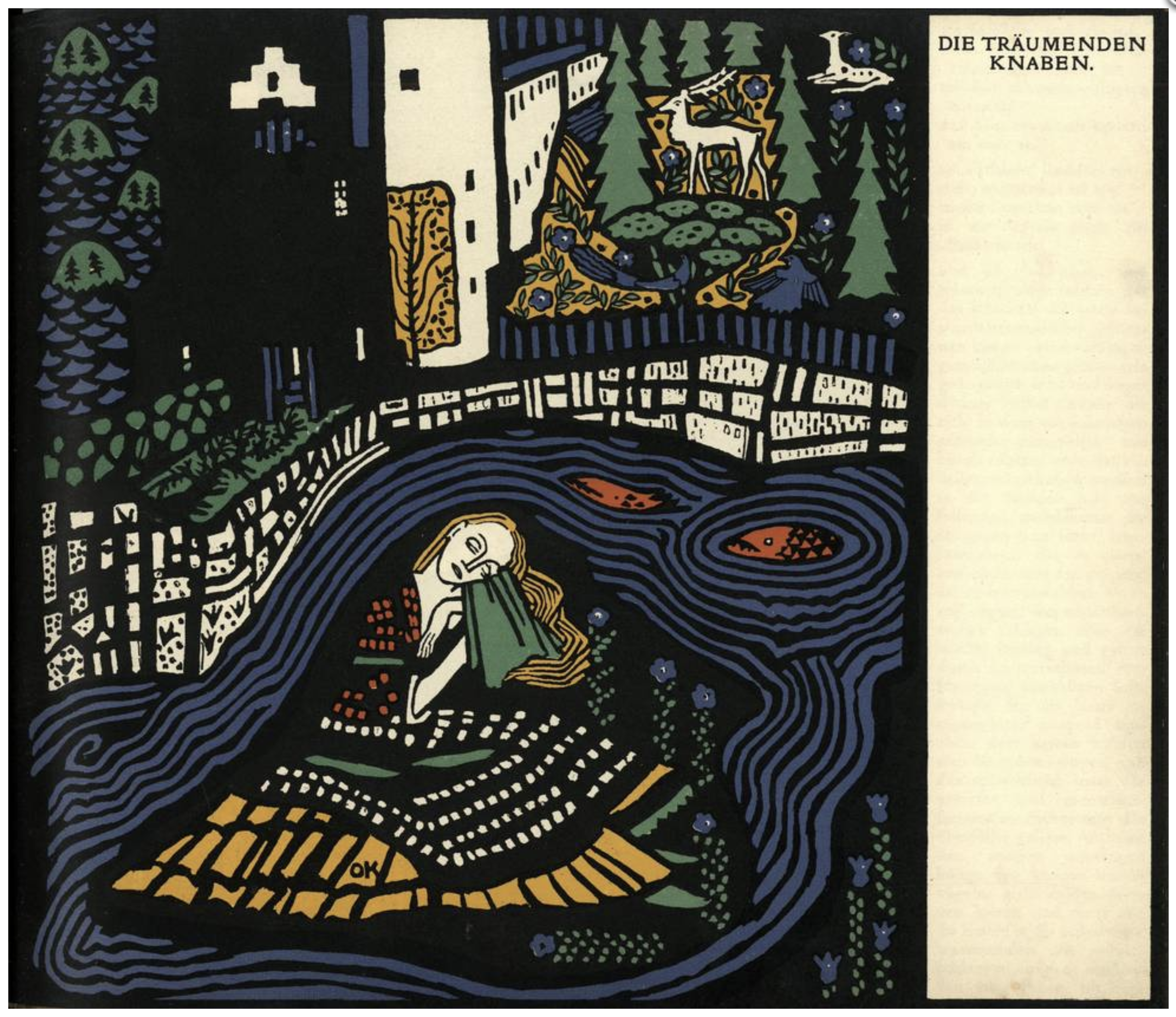
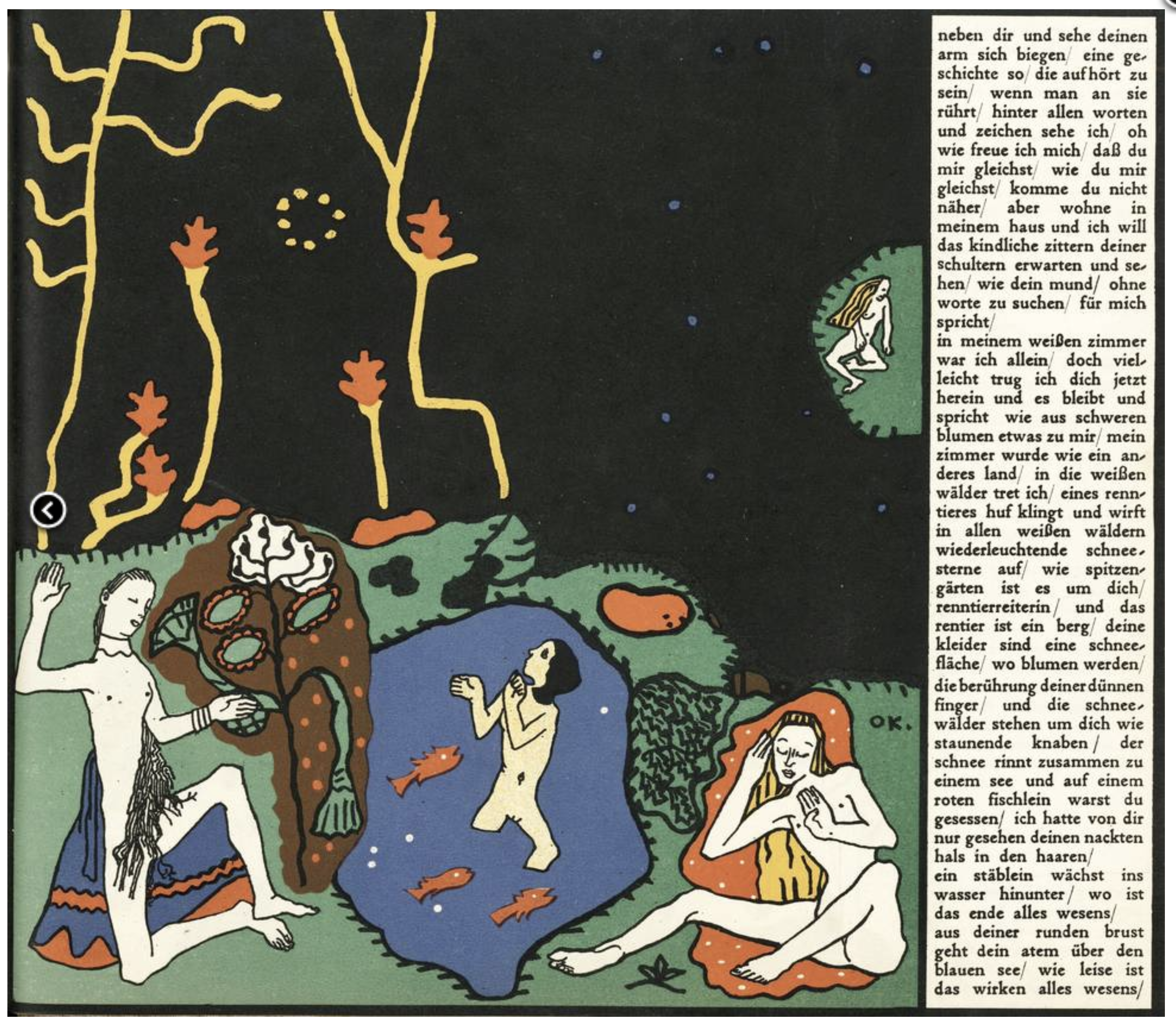
In the upcoming Bubb Kuyper auction is one of the most important Wiener Werkstatte books ever published. It is the book illustrated with 8 lithographs by Oskar Kokoschka …Die traeumenden Knaben
The financier of the Wiener Werkstätte, Franz Waerndorfer, commissioned Oskar Kokoschka to create a fairytale book for his children in 1907. It was published by the Wiener Werkstätte in 500 copies, and was presented at the Kunstschau exhibition of 1908. The number of copies ordered was disappointingly small and only a few copies were bound at the time. In 1917 Kurt Wolff reissued 275 copies of the remaining printrun in a lim. numb. edition and in a slightly different binding from the original binding (without use of the gilt thread). This copy up for auction is one of the UNNUMBERED copies of the first edition and as such is very rare, especially in this fine condition. At the time of commissioning (1907) Oskar Kokoschka was still a student at Vienna’s Kunstgewerbeschule. The fairytale that he wrote shows his strong Expressionist tendencies and is not a typical children’s book. As Waerndorfer wrote to Kokoschka’s former teacher C.O. Czeschka: “Eben bringt Kokoschka sein Märchenbuch, fertig und mit Text. Zum Beispiel: Musik, Musik, Gaukler, mein Leib, Schellenrassler, Beckenschläger. Weg der Popanz meines sündhaften Vorbehalts. Helle Feur liegen an den Zwergwäldern. Hinab springe ich mit wehenden Gewändern zur Erde und wie ein hoher einziger Ton steht hinter mir auf den Gärten die Sehnsucht. Na servus, und das ist der Lehrer meiner Kinder. Aber die Bilder sind glänzend.
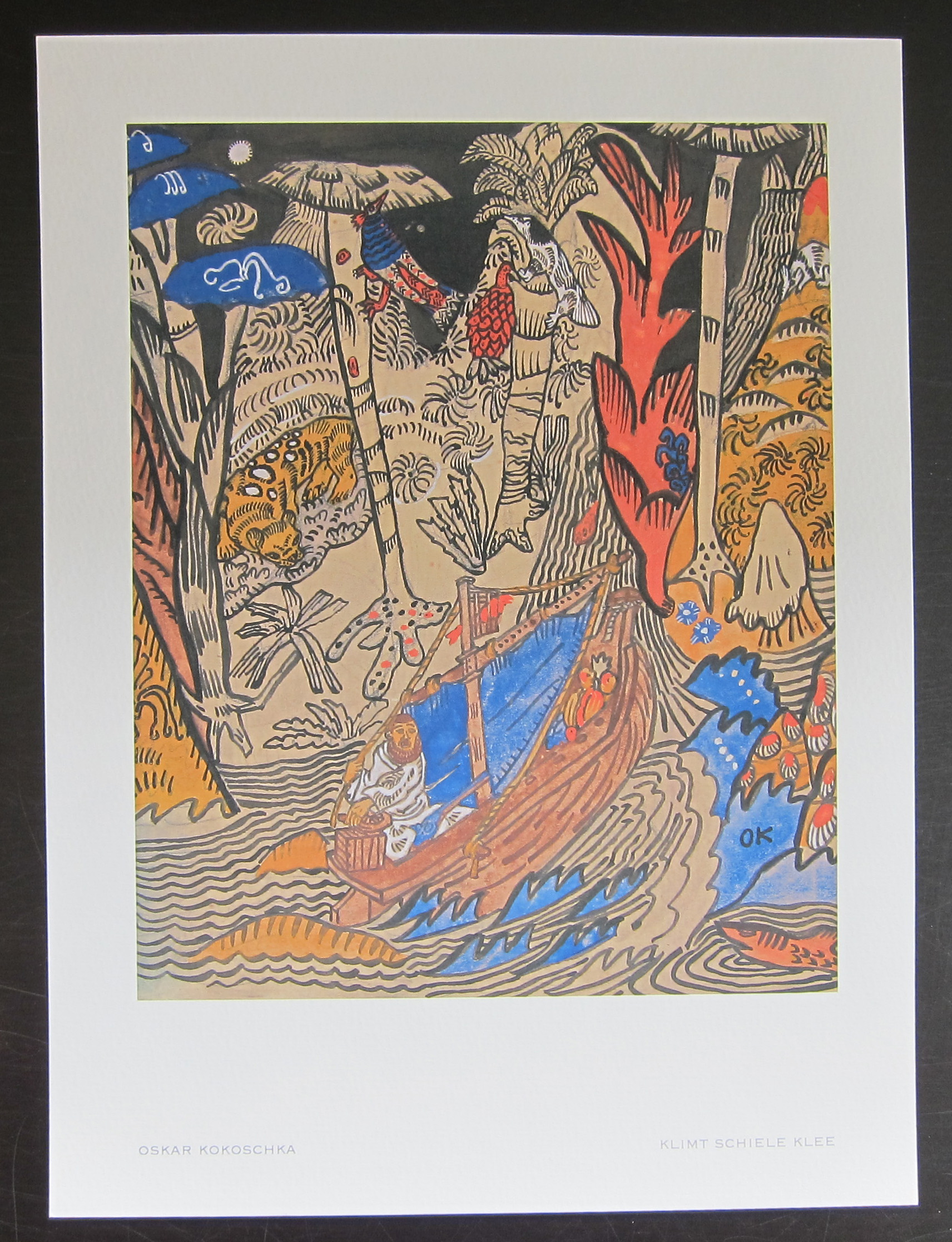
For less expensive books on Kokoschka please visit www.ftn-books.com
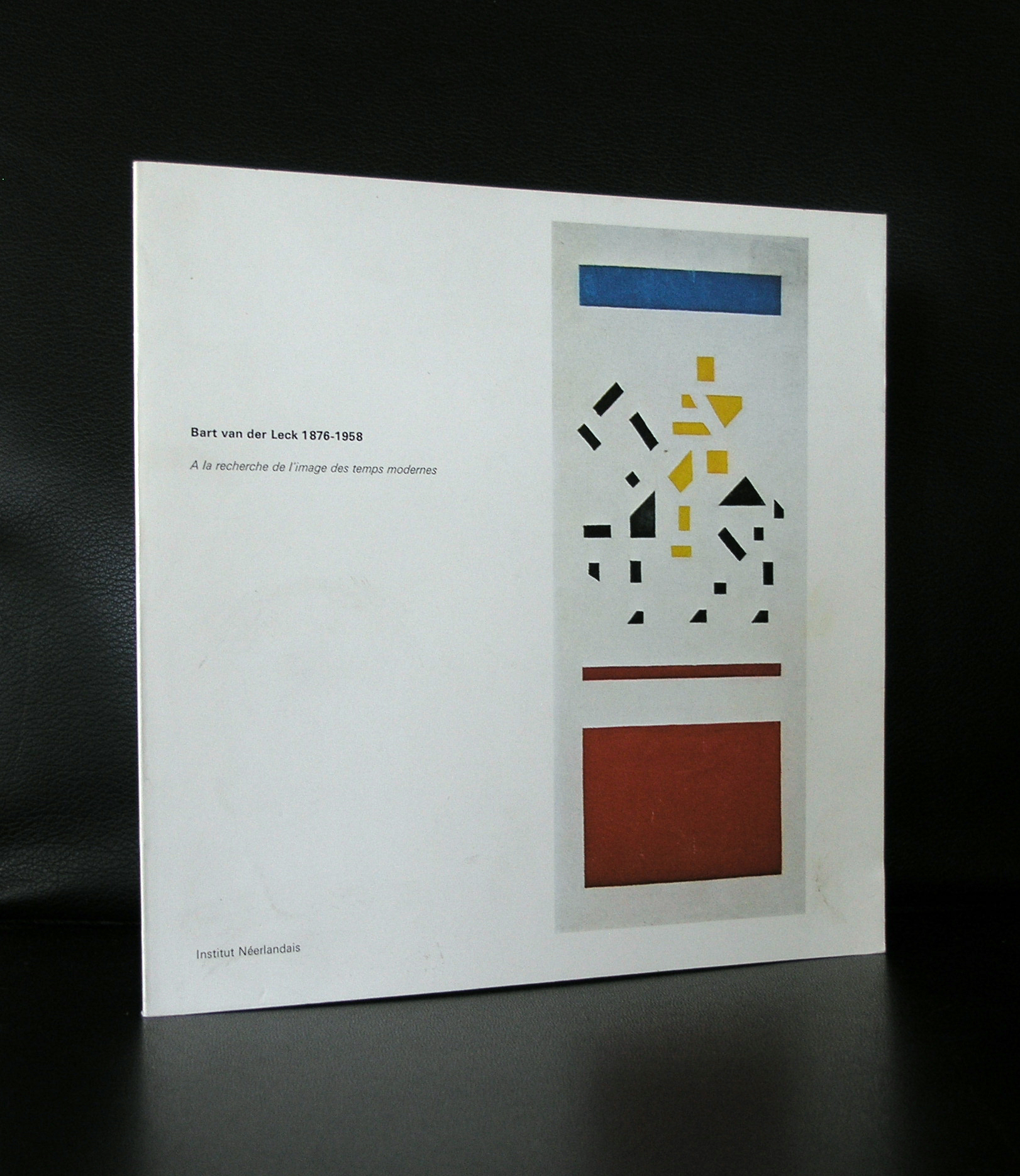
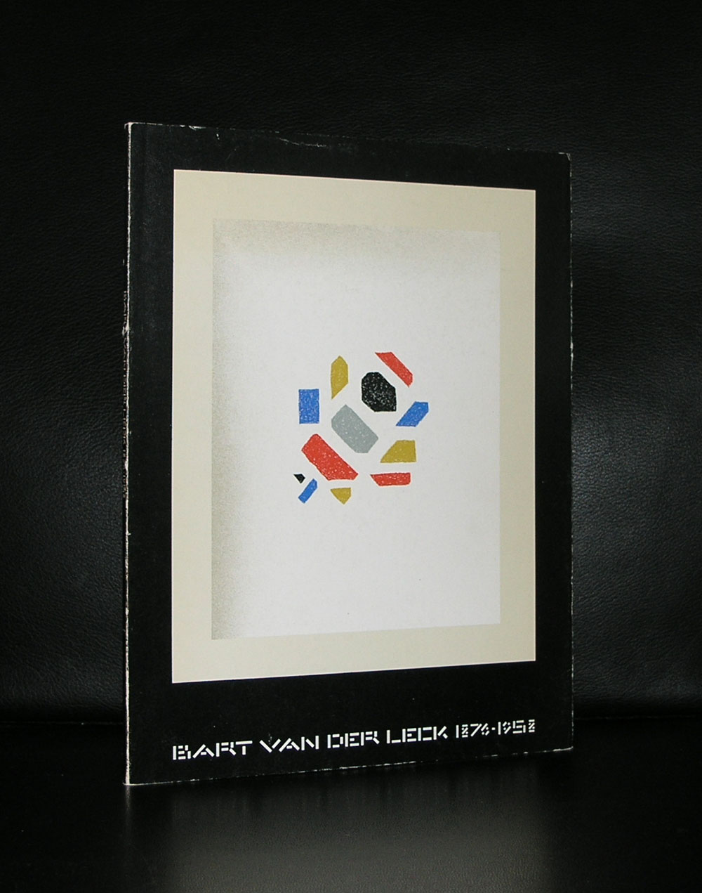
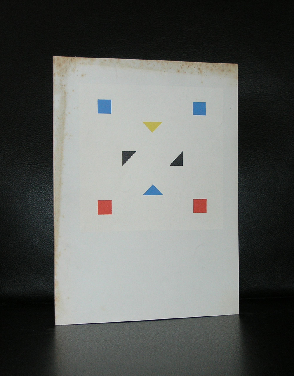
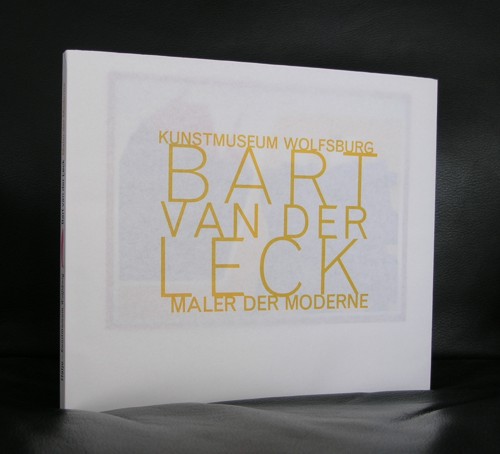
Without me knowing and realizing it I collected many van der Leck titles. Probably because subconsciously i must have realized that for me personally van der Leck is more important than Piet Mondriaan. Both are of course important members of DE STIJL group but where Mondrian is the artist who developed his art from realism into pure abstraction, van der Leck is the artist where realism was always present in his abstract works. When you look a little longer at his compositions you can distinguish the objects he depicted in his works. Take a look at these ducks…Yes it is a typical DE STIJL composition with primary colors, but you can clearly see the ducks in this painting.
Bart van der Leck was born in the Dutch city of Utrecht on November 26th, 1876. He started working as a glazier, but began focusing on his artistic career soon after. He started his studies at the Art Academy in Amsterdam soon after 1898. He was initially influenced by Isaac Israëls and mainly depicted scenes from everyday life. After he finished his education, his realistic working style became a more monumental and modern one.
In 1907 he rented a room in a farming establishment in Blaricum. His only possessions were a small painting chest and some clothing. He lived in complete isolation for a period of four months and thus many paintings depicting Blaricum and its surrounding area exist from his hand.
It is known Van Der Leck was a friend of fellow painter Mondriaan. They both possessed progressive working styles and their paintings were not appreciated by the painters of the Laren School.
Together with Mondriaan and a few other names, Van Der Leck can be held accountable for the establishment of ‘De Stijl'(1917). He passed away in Blaricum on November 13th, 1958.
Here are some of the van der Leck titles available at www.ftn-books.com
The coming blogs on Sunday are all devoted to SCHAAMSTREKEN . a series of artists books by Otto Egberts , all containing original drawings , executed on special papers and bound in goat leather
These Egberts books are very special and deserve to be known by a larger public and will be coming up for sale next year. It would be a pity that these great artist books are only known to a few persons. Therefore i decided to publish all pages of the 4 books in 4 separate blogs on consecutive Sundays starting from now and today is the first volume to be published within this blog series . The SCHAAMSTREKEN 1 book measures 39,3 x 10,9 cm. And contains 34 pages, 15 drawings spread over 2 pages and 2 one page drawings. The end paper has the signature and date on it in pencil. These original drawings were done in color on old Danish maps and nautical charts.
Here is the integral reproduction of volume 1
A truly magnificent artist book and one of the most spectacular books i have ever owned. For more information on Otto Egberts do not forget to visit his website www.ottoegberts.nl and other great artist books at www.ftn-books.com
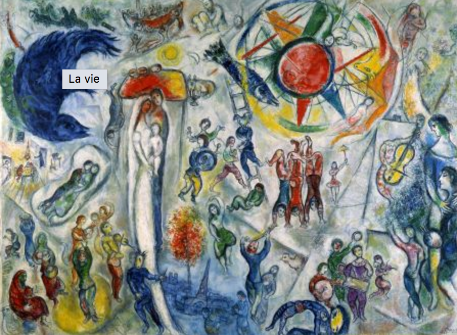
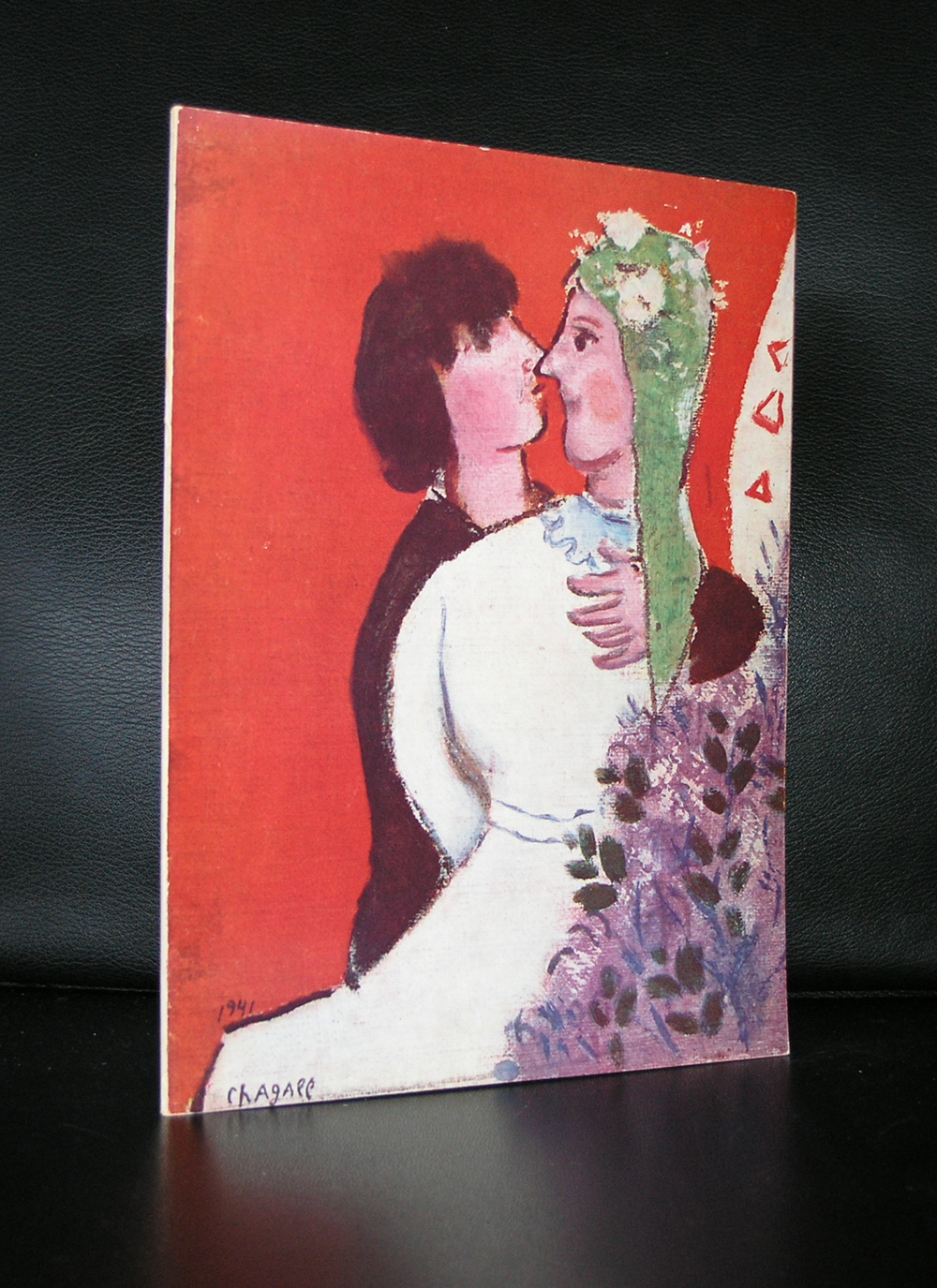
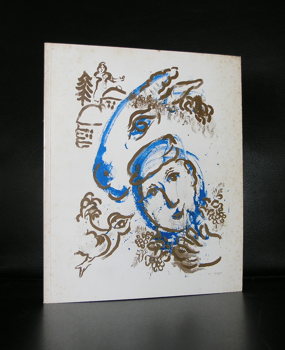
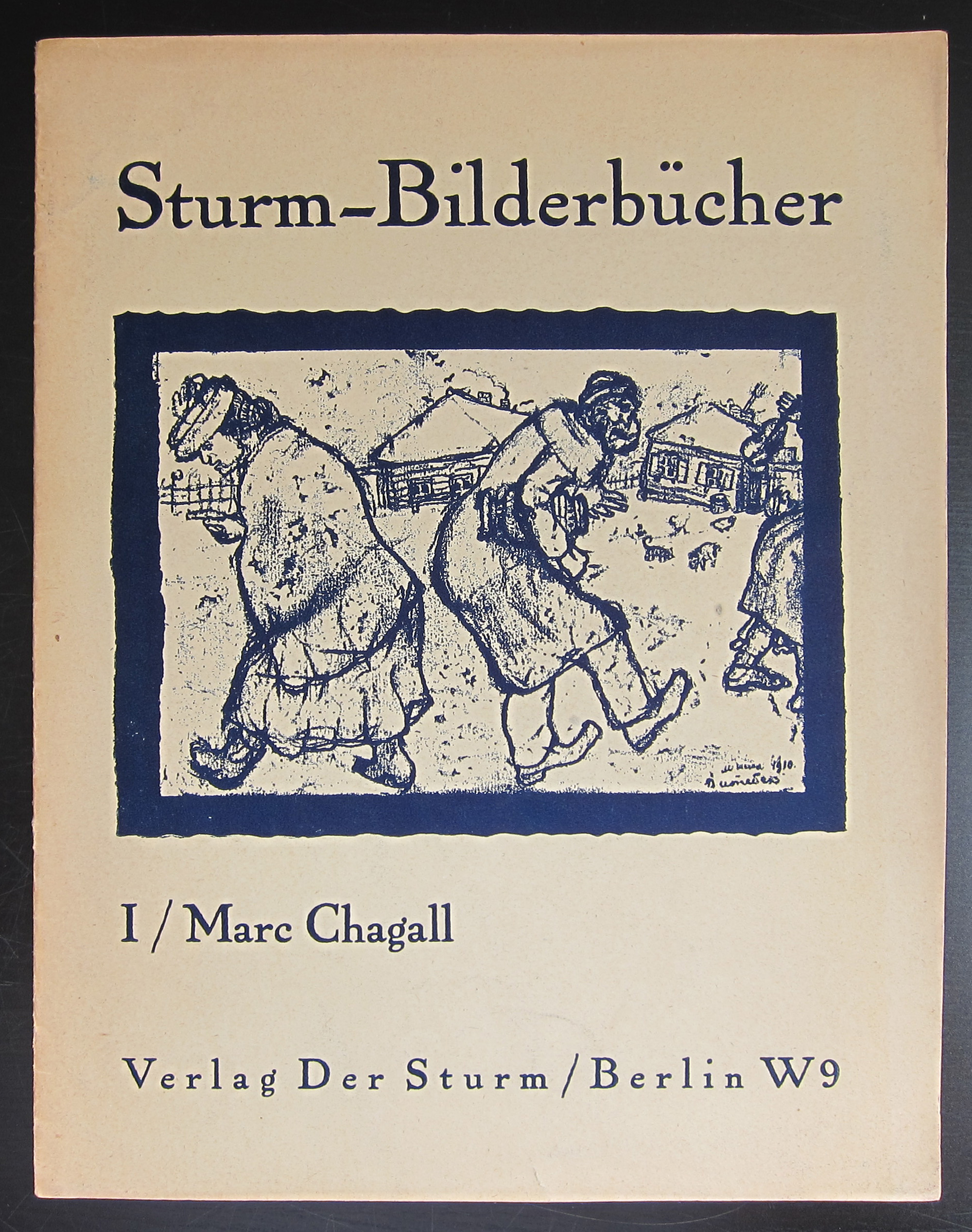
I am not an admirer of Marc Chagall. I am even one of those art lovers that does not like Chagall at all. Except there were 2 occasions i was impressed with Chagall. I remember the first time i went to the Fondation Maeght where ” La Vie ” was on display.
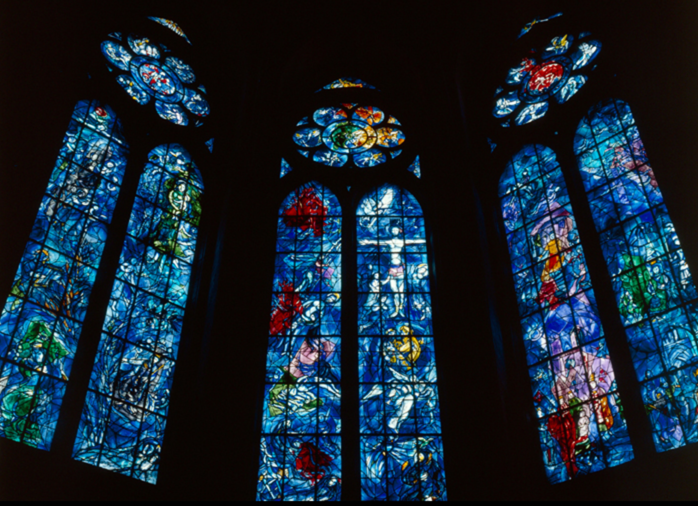
This painting had everything in it. Color, abstraction, symbolism and its size made it an overwhelming experience. The second time was in France too. I visited the Reims cathedral where the glass stained windows were designed by Chagall. In this religious setting everything came together again. Like the experience in Vence i had the same experience in Rheims…an overwhelming sence of piece and joy and realisation that life is great and beautiful. On the Maeght site i found this story on Chagall and for any publications on Chagall visit www.ftn-books.com
OLYMPUS DIGITAL CAMERA
OLYMPUS DIGITAL CAMERA
Painter born, Moïche Zakharovitch Chagalov, 7 July, 1887 near Vitebsk, in Belarus (then part of the Russian Empire), acquired French nationality in 1937 and died 28 March, 1985 in St. Paul de Vence.
Aimé Maeght met Marc Chagall for the first time in October 1947 at the opening of his retrospective at the Museum of Modern Art of the City of Paris organized by Jean Cassou to promote and celebrate the return of the painter after years of exile in the United States.
“Ida Chagall took me to her father’s house, and in the studio I was amazed when I discovered the gouaches painted in the United States and Mexico, sixty superb works that I had the chance to bring to rue de Téhéran. We all stopped the project for the first exhibition at the gallery. This meeting marked the beginning of our close and confident collaboration and a loyal friendship.” explained Aimé Maeght. This exhibition was held in March 1950. It was also the year that Chagall came to live in Vence near Saint-Paul.
When Marguerite and Aimé Maeght created the Foundation, they asked Chagall for a large painting for the room to be dedicated to him. The artist created La Vie(1964, oil on canvas, 296 x 406 cm), a large swirling composition where real-life events and dreams that had always lived within the painter come together : the rabbi grandfather,the marriage to Bella, the birth of Ida, the two exiles, the one from Russia by horse and the one to America by boat, musicians, acrobats and dancers, Paris all in blue and at the end of the path, the painter with the palette that appears to contemplate this epic that is larger than the adventure of one man. Above him, embracing him in her arms, is Vava his companion, the beneficial ally, who seems to be born of his painting to soothe the anxiety and torment of the creator.
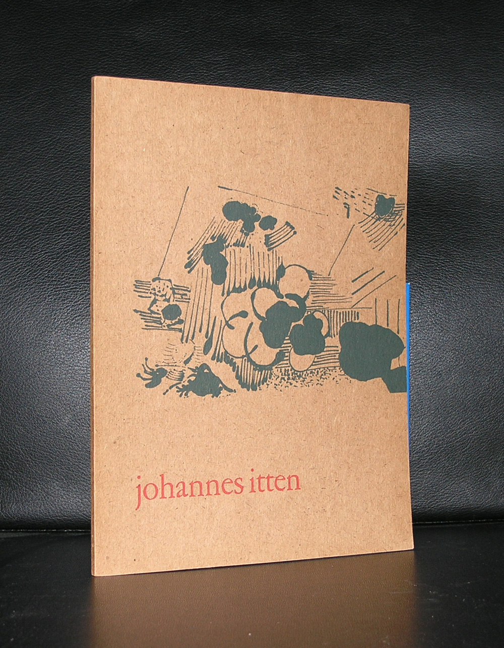
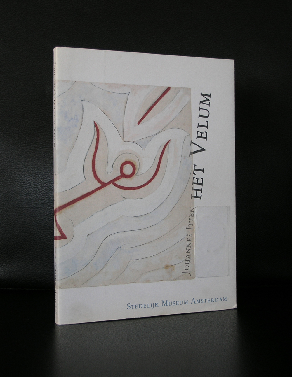
Johannes Itten. Not many know him, but through the years he has been acknowledged as being one of the teachers who developed the most important “color theory” in art.
Johannes Itten (11 November 1888 – 25 March 1967) was a Swiss expressionist painter, designer, teacher, writer and theorist associated with the Bauhaus (Staatliches Bauhaus) school. Together with German-American painter Lyonel Feininger and German sculptor Gerhard Marcks, under the direction of German architect Walter Gropius, Itten was part of the core of the Weimar Bauhaus.
But for me there is more about Itten. In 1957 the Stedelijk Museum devoted an exhibition to Itten. The catalogue of the exhibition was designed by Willem Sandberg , who made it one of the most iconic Stedelijk Museum catalogues from the 50’s. This catalogue is still available at www.ftn-books.com. But there si more on Itten and the Stedelijk Museum to be told, because Itten also designed one of the velums ( ceiling coverings) for the Stedelijk. It is rarely on show, but there is a nice publication on the project also available at www.ftn-books.com
The year 1958…. Philips company invited Le Corbusier to design the pavilion for their participation at the World exhibition in Brussels. Philips wanted to show their innovative products at this world exhibition because this was the best platform thinkable for them and Le Corbusier could give them the initial exposure with a spectacular pavilion.
With the presentation a Le Corbusier catalogue was published in several languages ( dutch, french, spanish and english) in 2 editions. The first edition has the color pages included and the 2nd edition only the black and white. This book is nowadays a highly collectable book. The cover by Jean Petit is iconic, the architectural photography spectacular and for the rest and the book itself . …..Philips has never made a better publication. This book is available at www.ftn-books.com
And for those who are into architectural models…yes, i have the model kit of the pavilion available too.
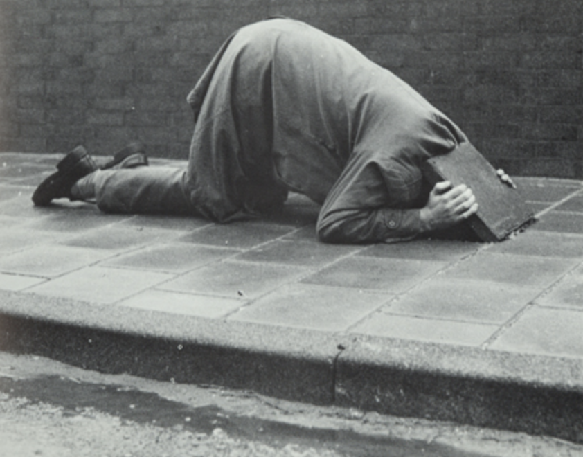
Artist/ Author: Oliver Boberg
Title : Memorial
Publisher: Oliver Boberg
Measurements: Frame measures 51 x 42 cm. original C print is 35 x 25 cm.
Condition: mint
signed by Oliver Boberg in pen and numbered 14/20 from an edition of 20