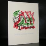
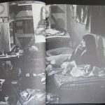
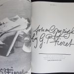
Increasingly important and one painter i discovered recently through a magnificent monograph/oeuvre catalogue on Carry Hauser which is available at www.ftn-books.com
I had to read some articles on this Austrian painter to know and discover myself how his art life developed through the years and it appears that the timeslot of the INTERBELLUM was artistically the most important one for him. For a quick biography…here is the entry on Wikipedia on the artist:
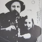
Carry Hauser was born in Vienna as Carl Maria Hauser into the family of a civil servant. He was educated at the Schottengymnasium and the Höhere Graphische Bundes-Lehr- und Versuchsanstalt, after which he studied at the Wiener Kunstgewerbeschule under, among others, Adolf Michael Boehm, Anton von Kenner, Alfred Roller and Oskar Strnad. He then began his career as a painter, illustrator, theatrical designer and author, which was interrupted by World War I, for military service in which he volunteered in 1914. His war experiences made him a pacifist.
After the war he returned to Vienna, where among others he met Franz Theodor Csokor, for whose play Die rote Straße (“THe Red Street”) he designed the set in 1918. In the same year the first comprehensive exhibition of his work was held, in the museum at Troppau, and another was arranged for him by Arthur Roessler, although his earlier works had been lost during the war and could not be exhibited. He became still better-known in 1919 through his portfolio Die Insel (“The Island”).
From 1919 to 1922 Hauser was a leading member of the artists’ group Freie Bewegung (“Free Movement”), and also belonged to the artists’ society Der Fels (“The Rock”) while he lived for a time in Passau. From 1925 to 1938 he was a member of another artists’ group, the Hagenbund, of which he was president in 1927/28. In the theatrical world he was vice-president of the Vienna Theatre Guild (Wiener Theatergilde). During the 1930s in the time of the Ständestaat he was active in the Patriotic Front (Vaterländische Front).
After the Anschluss of 1938, Hauser, because of his political stance, was banned by the National Socialists from working and exhibiting. In 1939 he was given an appointment in the art school of Melbourne but was prevented from taking it up by the outbreak of World War II. His wife, Gertrud Herzog-Hauser (1894–1953), to whom he had been married since 1922, was of Jewish origin and emigrated to the Netherlands, where she managed to survive the war. Hauser went into exile in Switzerland, where he wrote Eine Geschichte vom verlorenen Sohn (1941, privately published 1945), the novel Zwischen gestern und morgen (1945) and the fairytale Maler, Tod und Jungfrau (1946).
In 1947 Hauser and his wife returned to Vienna and took part in the reconstruction. In 1952 he became General Secretary of the Austrian PEN Club, and later its vice-president, which he remained until 1972. He was also a council member of the organisation Aktion gegen Antisemitismus (“Action Against Antisemitism”) and was involved in the revival of the Berufsvereinigung der bildenden Künstler Österreichs (“Professional Union of the Fine Artists of Austria”), of which he was later vice-president.
He died in 1985 in Rekawinkel. He is buried in a grave of honour in the cemetery at Hietzing.