Posted on 7 Comments

Erwin Olaf (continued)… April Fool 2020

olaf vk b

A follow up on the many blogs i have now written on Erwin Olaf. In the mid Nineties Olaf was diagnosed with COPD, a lung disease which makes him now one of the vulnerable people during this Covid-19 pandemic. He made a very personal series , making himself the subject and staging himself in some situations that can only occur during these pandemic times. The series is called ” APRIL FOOL 2020 ” and is now published for the very first time . The series which is now published in the magazine contains 8 photographs. Erwin Olaf makes himself the subject of these impressive, very personal photographs. The Volkskrant magazine had this honour to publish these for the first time.

olaf vk a

The magazine is a supplement to the Volkskrant newspaper which was published on Saturday the 16th of May. Maybe you can obtain a copy for your collection yourself, because this is an important , historical series and who knows, perhaps the only time it is published. ww.ftn-books.com has some very nice Erwin Olaf titles available.


Posted on Leave a comment

Robert Combas new additions

combas and pieters

The final blog on the “Figuration Libre” presents two important new additions to my inventory. Both are related to each other. The first is the Guy Pieters catalogue from 2003 in which he presented the latest paintings from 2002 and 2003 and the second is from 2005 from the Museum Jan van der Togt. The museum made a choice from these recent paintings and added, many paintings from the decades before to this great retrospective.

Both are now available at www.ftn-books.com and belong to the best publications on Robert Combas

combas pieters c

Posted on Leave a comment

Piet Dirkx weekly

For me personally one of the great publications of all time. Slipcase with artwork on the outside. Printed by Lecturis, edition of only 1000 copies , specially made for the Serpentine gallery exhibition in 1990. COLOUR ANONYMOUS is a classic.

dirkx anonymous

Posted on Leave a comment

Stephen Prina a Post Conceptual artist (1954)

Schermafbeelding 2020-01-24 om 15.45.38

Stephen Prina is an American artist whose work has been categorized as post-conceptualism. Prina is a professor at the Department of Visual and Environmental Studies at Harvard University.

He was born in 1954 in Galesburg, Illinois.

This is probably one of the shortest introductions i found on an artist on the internet. I like Prina’s art very much. Crates, monochrome paintings , ladders and the decoration of an entire space/ room are the elements that Piet Dirkx uses too. Both are from my generation and perhaps that is also one of the reasons i understand their art and like it so much. Where i have followed Dirkx for over 3 decades now, Prina is a discovery from the last 10 years. His exhibitions are true events but rare to be found in Europe. Still there was one held at the Boymans van Beuningen Museum in 1992 and to accompany that exhibition an artist book was published . The only color used for all pages is a bright yellow. A scarce book and now available at www.ftn-books.com

prina a


Posted on Leave a comment

Wally Elenbaas (Continued)

Schermafbeelding 2020-01-22 om 11.40.29

On the 8th of May 2018 i published a blog on the very impressive photography by Wally Elenbaas. These were photographs not lightly to be forgotten. Specially because Elenbaas was sentenced to prison for these beautiful photographs.

https://wordpressstrato-pacfwc5kp0.live-website.com/?s=elenbaas

Schermafbeelding 2020-01-22 om 11.47.37

Now it is time to shine some light on another aspect of this great dutch artist. Elenbaas was also a gifted designer and used his typography to create images and illustrations consisting of letters transforming these and their meaning into illustrations. Images tell a far better story than words so here are some illustrations….and….the LETTERBOEK is available at www.ftn-books.com

elenbaas letterboek a

Posted on 3 Comments

Aat Veldhoen (1934-2018)

Schermafbeelding 2020-05-12 om 16.51.50

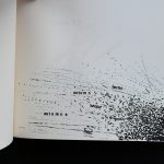
Art collecting is full of surprises. I started collecting books and art some 50 years ago and in this time I encountered some amazing works of art. I bought only a few and “forgot” to buy many, but I always had an open mind for great techniques. Aat Veldhoen was such an artist. He was arguably the first dutch artist who made his art available for the common people. Selling rotaprints by Jasper Grootveld these “erotic” prints were not appreciated and thought to be pornographic.

Schermafbeelding 2020-05-12 om 16.05.55

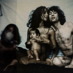
These erotic prints can be considered the same as the Japanese Shunga prints, but with less colour and possible more realistic. Still the technique is stupendous. Lifelike figures making love, not hiding themselves and enjoying each other. Veldhoen became famous for these prints and drawings and during his life eventually was admired for them. Now culminating in a great solo exhibition at Museum Kranenburgh ( https://www.kranenburgh.nl/english/exhibitions-and-activities/aat-veldhoen-art-of-life). Unfortunately coles at this moment because of the Covid-19 virus, but hopefully open again later in June. Seeing these great drawings I have a feeling to compare these with Lucian Freud his works. the human figure in all its glory, not hiding anything.

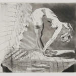
Why this blog on Veldhoen now. …….Yesterday I met with a client who wanted very much to by the Jan Cremer i had in my collection for over 30 years. We made a deal and I sold him the Cremer. Today he came to fetch it and brought a beautiful drawing by Veldhoen of his former wife KABUL. I was very much impressed with this drawing and I could buy it from the Cremer buyer. So now this drawing is mine and I am still impressed by it. There are not many drawings by Veldhoen. A great many of them were destroyed and cut, but this remains and was in its former private collection for over 30 years. It was bought directly from Veldhoen and his a fitting ” Heijdenrijk” frame which enhance s the drawing. A classic ‘nude pose” of by Kabul makes this a typical Aat Veldhoen drawing.

veldhoen kabul a

Aat Veldhoen (1934 – 2018) lived for and surrounded himself with his art. He worked in his teeming house and studio on Amsterdam’s Wittenburgergracht. The creative urge that underscored his versatile oeuvre, including drawings, etchings, paintings, photos, ceramics and sculptures, remained unwavering to the end.

Desire, love, sex, illness, old age, death

After studying drawing, Veldhoen set about documenting desire, love, sex, illness, old age and death, all with uncompromising zeal and compassion. This exhibition includes work Veldhoen made after suffering a partial paralysis at the age of 69, as well as Polaroids from the Rijksmuseum collection which have never been shown before.

Veldhoen’s exceptional and enduring curiosity for everything human resulted in an intimate, lifelong study of those around him. We see this in Veldhoen’s countless portraits of himself and his family, friends and artists.

Life and art

The works in Aat Veldhoen – Art of Life show remarkable connections with the work of those he knew and encountered. His life and art were inextricably intertwined. The result is a personal and tender view of human existence. Since Veldhoen often portrayed himself, the viewer is no longer the only voyeur.

for more information on the drawing please inquire at ftnbooksandart@gmail.com


Posted on Leave a comment

13 sculptors from Paris…cat no 50

Schermafbeelding 2020-01-20 om 14.41.24

Published within the Stedelijk Museum series with no. 50, designed by Willem Sandberg and with the “creme de la creme” of sculptors from France / Paris, this has arguably become one of the most important exhibitions and catalogues for the Stedelijk Museum from the Fifties. Within the catalogue you will encounter only the most famous of names. Here they are: Brancusi, Gonzales, Gargallo, Laurens, Arp, Chauvin, Zadkine, Lipchitz, Giacometti, Richier, Couturier and Auricoste. Another important aspect to this exhibition is the catalogue. It uses multiple kinds of brown and glossy papers, making this one of the first for a series of catalogues which were designed by Willem Sandberg in such a way for the Stedelijk Museum. This design was typical for Sandberg in the Fifties and he continued to use these papers throughout his career as a designer. Wim Crouwel broke with this tradition and presented a much cleaner, more contemporary design, but i admire these Sandberg catalogues and this is probably one of the very best and most important.

OLYMPUS DIGITAL CAMERA

Posted on Leave a comment

Josep Vallribera (1937)

Schermafbeelding 2020-01-20 om 13.55.52

Vallribera in his art, books and of course his personal history has its roots strongly planted in the Spanish soil. Influences of Miro, Chilida and Tapies one can recognize in his works , but his abstract art is also personal and original . Vallribera is known in his own country, but throughout his career he mainly was presented in Germany where he had multiple gallery and museum presentations. The book that is now for sale at www.ftn-books.com was published by the gallery Carinthia and gives an almost perfect overview of Vallribera and his art.

vallribera

Posted on Leave a comment

Günter Wintgens (1951)

Schermafbeelding 2020-01-20 om 10.05.41

Not much information to be found on Günter Wintgens, but still he has had quite a few exhibitions all over Europe according to his biography and now is selling on Saatchi art.

Picture planes in Günter Wintgens’s work Pictorial motifs with diaphanous planes form a central aspect of Günter Wintgens’s work. Their optical transparency, intuiting or understanding the partially concealed planes, plays with visitors’ curiosity. It allows them to recognize several pictorial planes at once. Hence, they perceive the amount of time that has passed from one stage of the creative process to the next, and are able to guess, to a certain extent, the history behind the creation of this picture. For the fragmented motifs, made up of countless, particle-like brushstrokes across a mono- or polychromatic ground, the passage of time is also an important aspect. Although it also applies to the process of creating the painting, it is mainly true of the element of instability—the apparent motion evoked by the painting’s shimmering texture, and often reinforced by its format, the tondo. Also important is the aspect of communicating information. Each bit is legible by itself, but because the individual planes of information are assembled and layered on top of each other, visitors are offered a new, conceptual projection surface. Yet another aspect is clearly of a spiritual nature: the constantly recurring question about the real essence of things. Behind a veil both delicate and tear-resistant, the answer to this question stoutly resists comprehension.

www.ftn-books.com has an early Wintgens catalogue available

wintgens

Posted on Leave a comment

Ah Xian (1960)

Schermafbeelding 2020-01-20 om 09.39.22

I am not the greatest fan of Chinese art, althought i have learned to appreciate some of the artists and their works. One of the last to admire was the artist Ah Xian whose works were exhibited in the “stijl zalen” of the Gemeentemuseum Den Haag. They blended like they were meant to have been made for this location. Specially the “GOUDLEER” and Chinese rooms were a feast to the eye. Now i have acquired the exhibition catalogue for this exhibition. It is the one that sold out almost instantly. available at www.ftn-books.com

Schermafbeelding 2020-01-20 om 09.31.30

Chinese artist Ah Xian lives and works in Sydney where for nearly two decades he has explored aspects of the human form using ancient Chinese craft methods including porcelain, lacquer, jase, bronze, and even concrete. The artist often uses busts of his own family members including his wife, brother, and father onto which he imprints traditional designs with a vivid cobalt blue glaze. via Colossal.

ah xian