I have made it myself easy this time. The following text was found on the internet. I searched but this painter is rather obscure and not much information can be found on him. I thought Peter Lanyon interesting enough to look for some more information, because his works in his GIMPEL FILS looks promissing ( available at www.ftn-books.com). I found some info, but many pictures ( Tate collection ao)
(8 February 1918 – 31 August 1964) was a Cornish painterof landscapes leaning heavily towards abstraction. Lanyon was one of the most important artists to emerge in post-war Britain. Despite his early death at the age of forty-six he achieved a body of work that is amongst the most original and important reappraisals of modernism in painting to be found anywhere. Combining abstract values with radical ideas about landscape and the figure, Lanyon navigated a course from Constructivism through Abstract Expressionism to a style close to Pop. He also made constructions, pottery and collage.
Lanyon took up gliding as a pastime and used the resulting experience extensively in his paintings. He died in Taunton, Somerset, as the result of injuries received in a gliding accident and is buried in St. Uny’s Church, Lelant.
In September 2010 Peter Lanyon’s work was honoured with a large-scale retrospective exhibition: Peter Lanyon 9 October 2010 – 23 January 2011 at Tate St Ives. Curated by Chris Stephens, Head of Displays and Curator of Modern British Art at Tate Britain, it was the first thorough museum retrospective for almost forty years. In 2015 Lanyon’s Gliding Paintings were shown as a set in the Soaring Flight exhibition at the Courtauld Gallery, London.
In 2018 the catalogue raisonné of Peter’s oil paintings and three-dimensional works was published by Modern Art Press, after a decades work by Toby Treves.
In November I presented a little chapter from Nico Dijkshoorn his book KIJKT KUNST” here is another personal view by Dijkshoorn on one of the Kroller Muller Museum highlights. This time Hr looks at “Farmyard with girl ” By Henry van de Velde.
This video says it all. One of the most powerful art performances ever.
Passionate, pioneering and powerful, these are the three most apt words to sum up the work of Ulay and Marina Abramovic. Proof that they were destined for romance, the couple even share the same birthday. Referring to one another as “the other” and “parts of a two-headed body”, their synchronised creativity resulted in over a decade of collaborations that explored themes of ego and artistic identity. Not all love lasts forever, though, and the two parted ways with one last collaboration. Entitled “The Great Wall Walk”, this final partnership saw Abramovic and Ulay separated by China’s Great Wall, where they went to meet in the middle for one last goodbye.
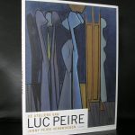
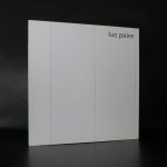
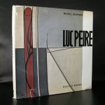
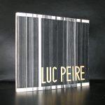
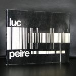
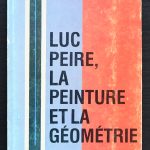
Geometric abstract painting. This is the speciality of Peire. I was late to discover this great Belgian painter who was a contemporary of Walter Leblanc, but since i took an interest in Leblanc, soon afterwards i discovered Luc Peire. If i must describe his art …. mix Geometric Abstract painting with a little Pop Art and the works of Luc Peire emerge. The one painter that reminds me of his work in the Netherlands is Willy Boers who experimented in the final years of his life with “hard edge” painting and made some wonderful paintings. I was fortunate to see the Luc Peire exhibition from 1995 which was held at the Josef Albers Museum in Bottrop, ( poster available at www.ftn-books.com)
but since, i only have seen the occasional painting by Peire which was collected some 40 years ago for the public collections in the Netherlands and Belgium. Peires works are not that well known, but every time i see work of his, I find them intriguing and timeless. Peire is one of the greats of Geometric Abstraction and will soon be recognized as one of the greatest Belgian artist from last century.
This publication is one of the starting points for my collection.
I had been working for 8 years at the Haags Gemeentemuseum when this exhibition was held at the Rijksmuseum Twenthe. First there was the catalogue which we sold in the museum shop and then there was the exhibition itself which opened my eyes for the quality of Abstract Geometric art in the Netherlands.
It has been 32 years now since that exhibition was held , but it has proven to be a very important one. Of all the names presented at that time, artists which were hardly known and could be picked up at auction at extreme low prices, many have had their reevaluation, resulting in a steep rise of prices fetched at auction.
Among them names as Constant, Domela, Hussem, Huszar, van der Leck, Peeters and Vordemberge Gildewart. But among them were so many other great artists. These are now the artist who are on the verge of their breaktrough. I predict that these names will be the future stars in private and public collections. The names?…….. Siep van den Berg, Piet de Haard, Frieda Hunziker, Wim Sinemus, Andre Volten and Nicolaas Warb.
I have the exhibition publication now available at www.ftn-books.com and you can check these names and all others within the exhibition out in the “DE NIEUWE SYNTHESE”
It took me some years to realize that the dutch gallery owner Milco Onrust was one of the driving forces in the gallery and art world. NOt only in the Netherlands his gallery became famous, but abroad his gallery became famous because of the independent choices his owner made during its existence.
Starting at a young age, during his art studies he already collected Modern art, he soon would become one of the most important young gallery owners in the Netherlands, presenting artists like LeWitt, Partenheimer, Gunn , Knobel and Swarte.
OLYMPUS DIGITAL CAMERA
OLYMPUS DIGITAL CAMERA
I did not visit his small gallery many times, but i remember it to be nearby Wim van Krimpen his gallery in Amsterdam.. What strikes me most now, after so many years follwing his gallery and buying his publications, is that the Onrust pubications are all from a small edition and in most cases look and feel like true artists books. They are little gems among the other gallery publications. This i realized when i dove into my own art book collection and found some precious ones on Partenheimer which have some original drawings inside.
Until 2012 there was an organisation and Modern Art museum in Almere which was responsible for the maintenance and exploitation of the Land art projects in Flevoland ( in the middel of the Netherlands).
The museum was called “de Paviljoens” and presented some breathtaking projects during its existence. But because of financial problems they had to close their doors in 2012.
However the good thing is the world famous land art projects are still there. Projects by Robert Morris and Richard Serra are world famous and the “green cathedral” by Marinus Boezem deserves to be known by many more than the few who know of its existence.
So we are still fortunate that these great land art projects are still there and hopefully funding will be there to preserve these for future generations. Here is the site which presents these great works of art on the internet:
If i would make a top 10 of my favorit Stedelijk Museum publications this Jan van Munster publication from 1970 would be ceertainly somewhere in my top 10.
Published in 1970. It is typical Wim Crouwel design, but some details make it exceptional. First there is the use of a viny cover which has a silkscreened print in bright red on cover and backside. The vinyl cover is used as a portfolio for just one 2 page publication. Printed recto/verso and protected by a blank sheet of white paper. This publication is very special and instead of being a full catalogue with the exhibition , this is a true artist publication making this much more valuable for all Stedelijk Museum collectors and Jan van Munster admirers. The Jan van Munster 1970 / Stedelijk Museum by Wim Crouwel publication is now available at www.ftn-books.com
A few years ago i wrote a blog on David Hamilton. It gavce some information on Hamilton as an artist, but now there is an absolute must read on Hamilton which ws recently published by Mutual Art magazine. Here it is :
The controversial work of the British photographer has long been part of the “art or pornography?” debate, a question to which there are no apparent answers.
Dreamscapes of nubile girls in French fields and farmhouses, an age of innocence teetering on that of womanhood; flowers and the thin fabric of dresses, all seen through the gentle distortion of a soft-focus lens. David Hamilton’s filmmaking and photography are quintessentially 1970s, a product of a time in which society was granted more freedom to explore avenues which may have been previously unchartered. But in today’s period of political correctness, collective guilt and finger pointing, where does it leave the viewer and lover of art? Does the rapidly changing world around us force us to now think and feel differently in terms of aesthetical enjoyment? And do purported wrongdoings on the artist’s part come into play?
There is a warmth emanating within a lot of Hamilton’s photography; washed out light seeping into pastel colors, diffused and surreal. There is also a great gentleness to his work; the images are delicate, as if they exist only amid a slow-fading memory. Hamilton is a master in this sense, possessing the capability to create a world of fragile dream or recollection. It is the same feeling one gets when they conjure up the almost-ancient reminiscences of childhood summers; a time brimming with the possibilities of life, of warm, languid days, when time seems to stand still.
David Hamilton was born in London in 1933. During World War II he became an evacuee and spent time in the Dorset countryside, which would go on to influence his future work. At the age of twenty he moved to Paris where he worked as a graphic designer for Swiss fashion photographer Peter Knapp of Elle magazine. It was during this period that he began to make a name for himself. He returned to London to work as the art director for Queen magazine, but he soon returned to Paris. Back in the city he truly loved, he found work as art director for the city’s biggest department store, Printemps. Here, he started doing commercial photography on the side, and quickly gained success through his trademark grainy, dream-like style. But with success the photographer also found defame. The public was either attracted or repulsed by the nudity and the subtle-not-so-subtle eroticism found in his images, and some critics summed up his work as trite. In the mid-90s, Hamilton stated that people “have made contradiction of nudity and purity, sensuality and innocence, grace and spontaneity. I try to harmonize them, and that’s my secret and the reason for my success. While some have labelled David Hamilton’s work as pornographic, and some photographs are certainly erotic, numerous prints of his are almost completely devoid of sexuality. They are often platonic pieces, which aren’t intended to sexually arouse at all, similar to a nude cherub or statue. But his subjects are very real, which for the viewer can elicit a plethora of moralistic questions. Why was he posing young, semi-clothed girls in front of the camera? What exactly am I looking at here? Photography is a very poignant medium in this regard. With a painting, or a statue, there is some degree of removal between model and masterpiece — in capturing images on film there isn’t. The nude model is there before one’s eyes, the same as the artist looked upon amidst the throes of creation.Hamilton was an active photographer for most of his life, but after decades of shooting film and photography, sexual allegations began to surface, which he denied vehemently. Soon thereafter, he was found dead in his southern Paris apartment. An apparent suicide. In light of these allegations, is it our moral duty to have nothing more to do with Hamilton’s photography? Or is it acceptable to still appreciate the art? Do they even come into account at all? Afterall, the art hasn’t changed, only our perception of the artist, and what may have gone on behind the scenes. It is a difficult question, and one that only the individual can answer for him- or herself.
www.ftn-books.com has some David hamilton tiltles available
Around 1972 , Wim Crouwel started to use a computer design inspired layout for the Museum Fodor publications. A bright orange/red color with in the background a pattern of fine white dot. Just below the middle a tin white line. Fodor in Pink. On the left half the exhibition in info and in Most cases above the white line the artist name. Over 40 publications have appreared within these series and nearly all belong to the very best of Crouwel designs from the Seventies. www.ftn-books.com has many of these publications available. This is a typical connoiseurs choice, not expensive and with all the qualities of a Seventies Crouwel designed publication.
Artist/ Author: Oliver Boberg
Title : Memorial
Publisher: Oliver Boberg
Measurements: Frame measures 51 x 42 cm. original C print is 35 x 25 cm.
Condition: mint
signed by Oliver Boberg in pen and numbered 14/20 from an edition of 20


 This publication is one of the starting points for my collection.


