The German sculptor Thomas Schütte is constructing a museum to house his artwork in the town of Hombroich, located about 16 km (10 miles) southeast of Düsseldorf.
The new structure—which will offer 700 square meters (1,300 sq. ft.) of floor space when completed—was designed by Schütte, and is being built close to the grounds of the Museumsinsel Hombroich, a multi-building complex that also houses the collection of the German collector Karl-Heinrich Müller……
I just encountered this old news on the internet and was reminded about the sculptures i had seen by Schuette, when Rudi Fuchs was director of the Gemeentemuseum. Since i have seen his works on multiple occasions and whenever there was a catalogue published on the exhibitions i was full of admiration, because his catalogues are among the best published in the last 3 decades. There are several available at www.ftn-books.com. So in the near future when you visit the Dusseldorf area you can include Hombroich together with Bottrop to visit 2 exquisite museums.
Because i get notified by Pinterest which items are shared and saved, i found out that this is one of the most appreciated photographs of all publications on www.ftn-books.com
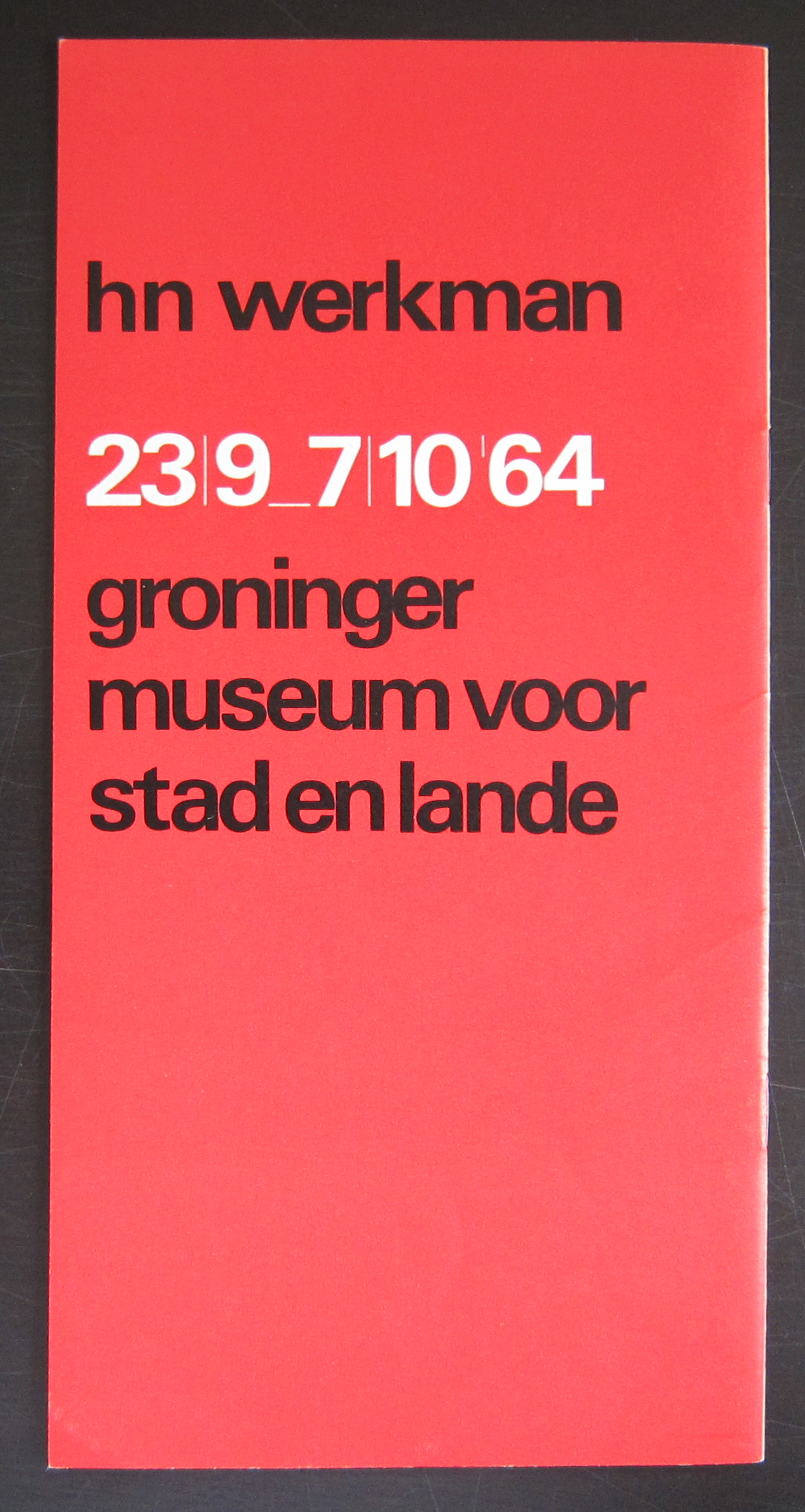
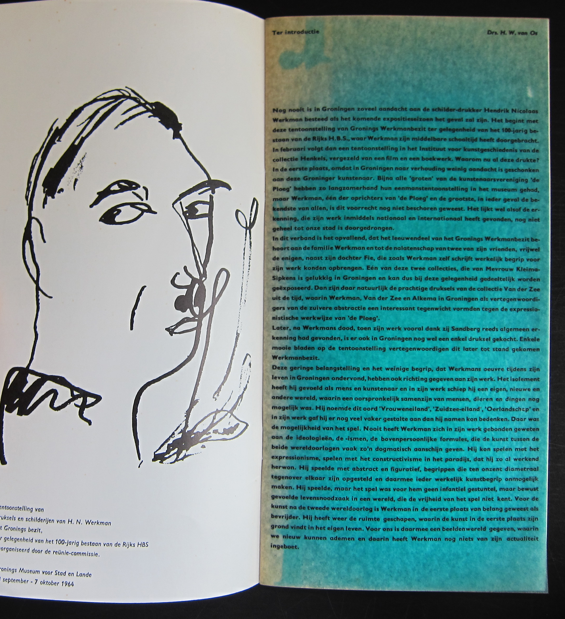
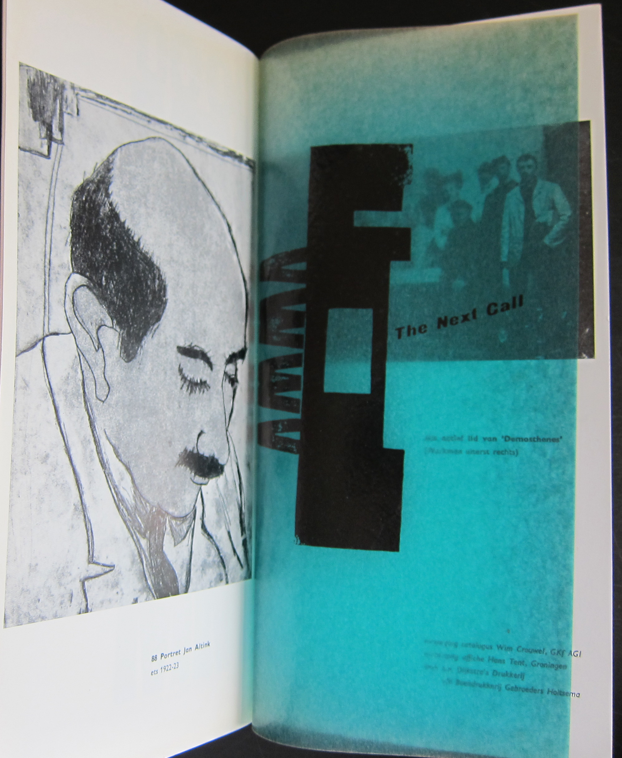
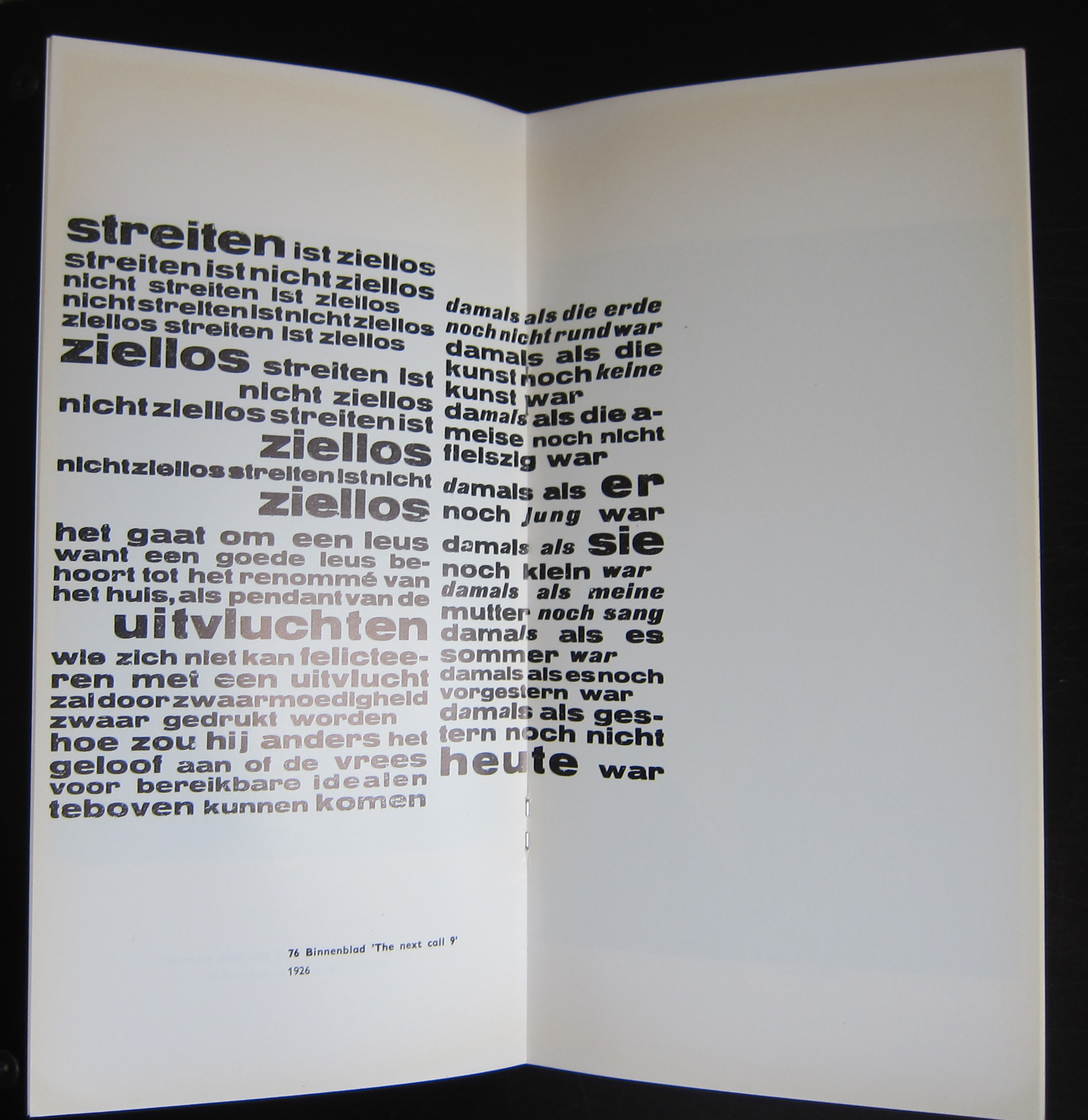
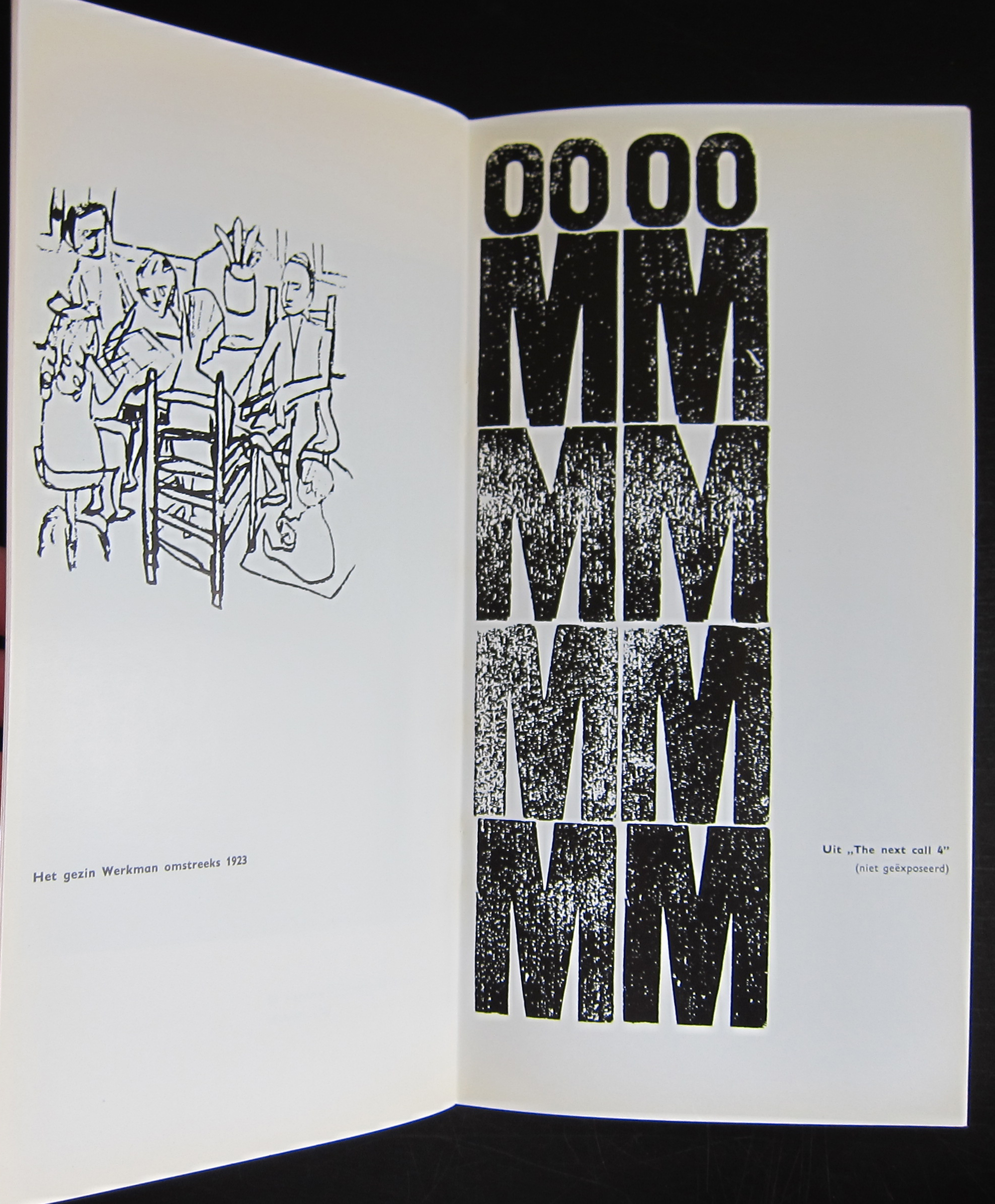
This publication was published on the occasion of the Werkman exhibition in Groningen in 1964 and one of the first designs that Wim Crouwel made for a dutch museum. In this same period he designed the publications for the van Abbemuseum which were followed from the early sixties on by the publications of the Stedelijk Museum. What makes this one special is the condition it is in and the highly unusual appearance. The use of multi colored papers, its odd size and a cover chosen in relation with the Werkman print which is used as a cover. This publication is the top in dutch lay-out and design and must be considered as one of the very best publications of the sixties. Curious?………take a look at
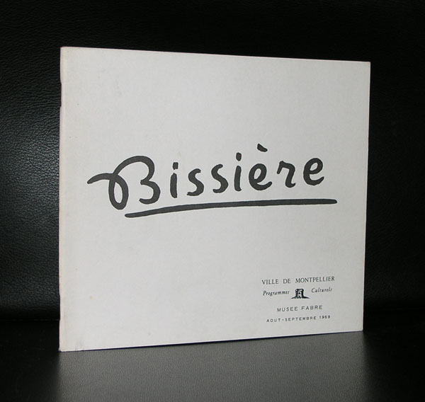
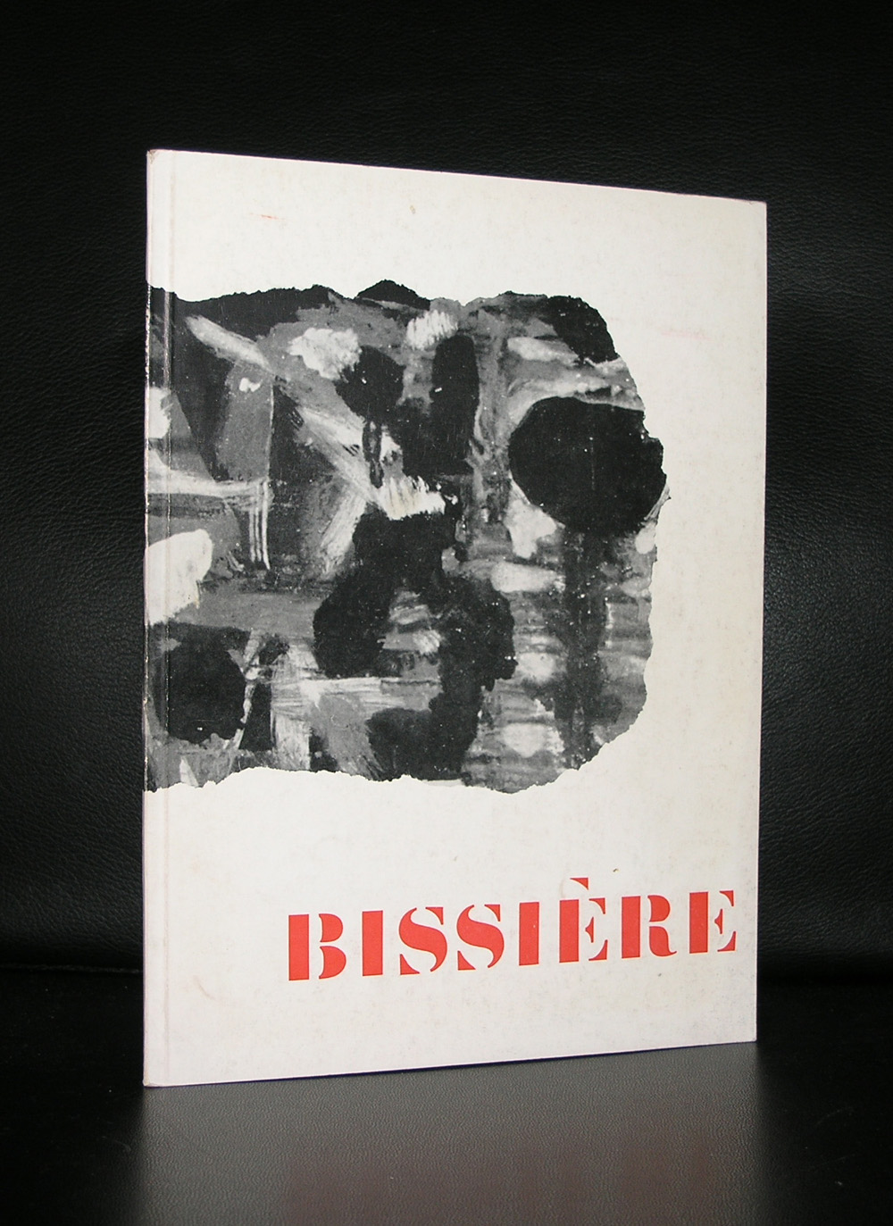
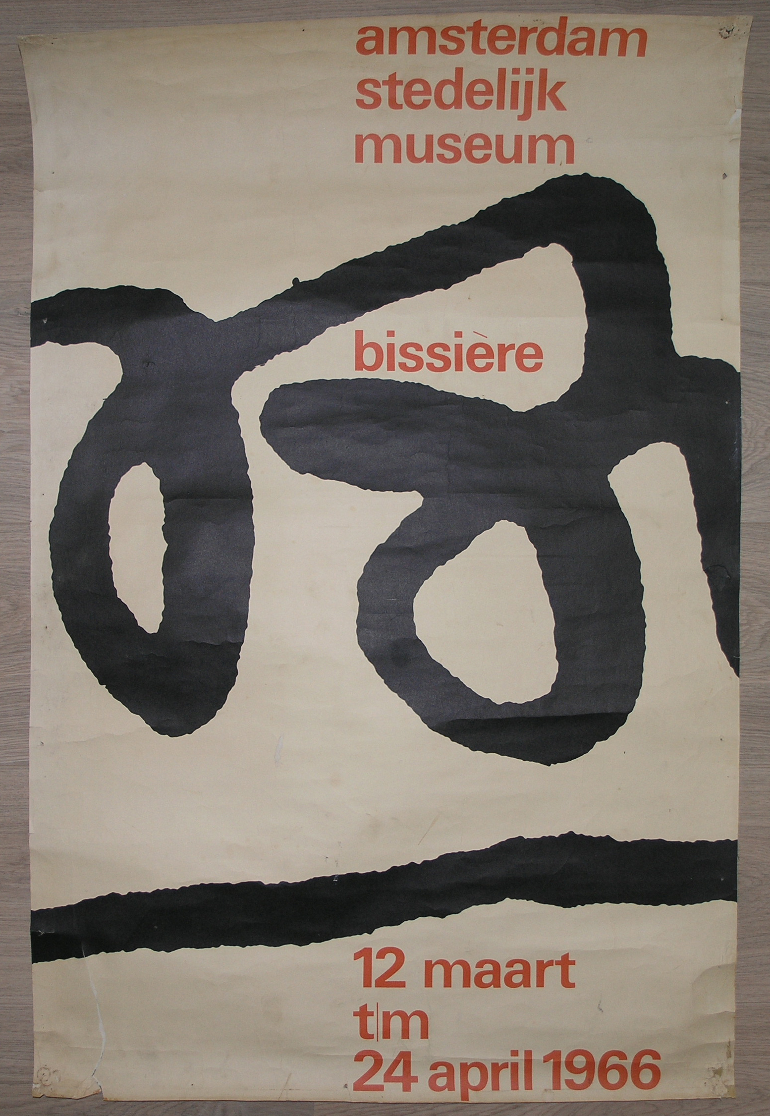
A lyrical abstract artist and related to other abstract French painters like Manessier and Bazaine, Admired by Willem Sandberg , Bissiere received his first Stedelijk Museum exhibition in 1958 and in the early sixties another followed , this time with a spectacular catalogue designed by Wim Crouwel and for me this catalogue is the reason to write this blog, because i find this catalogie one of the very best Wim Crouwel ever made.
Clean, bright with some highly original details, the early smaller size and great typography makes this a Crouwel classic and the art…..well not bad either!
This text was taken from the site ” MEMORY OF THE NETHERLANDS ” and gives an excellent idea what TD was.
The corporation Associatie voor Total Design NV, Total Design for short, was established in 1963. Until then, practically all major design commissions from Dutch clients had been contracted out to foreign agencies. There were no large design agencies in the Netherlands at the time. Total Design was established with a view to filling this unsatisfactory gap.
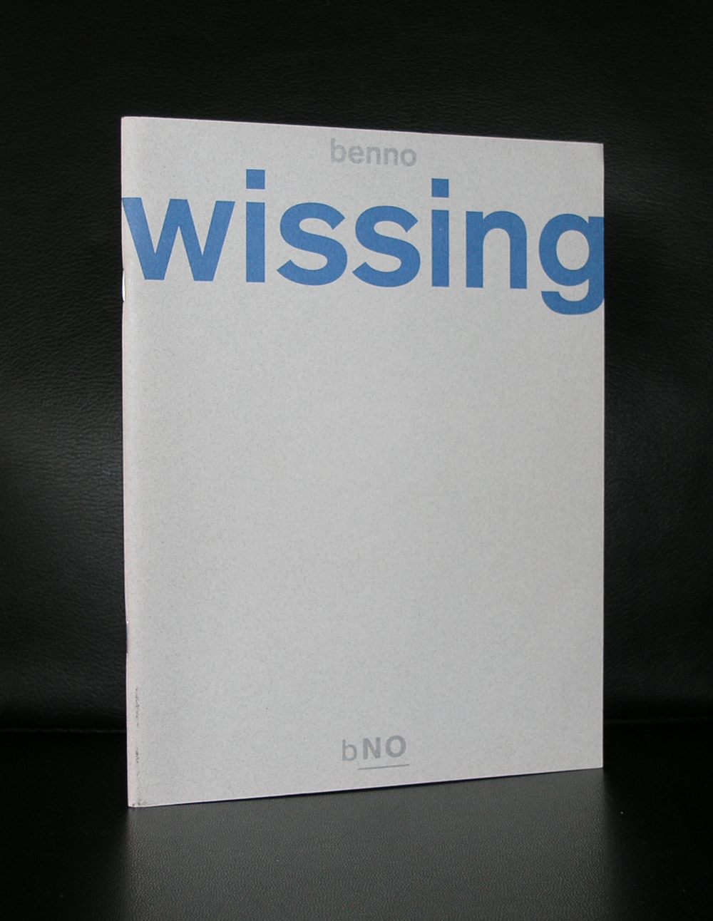
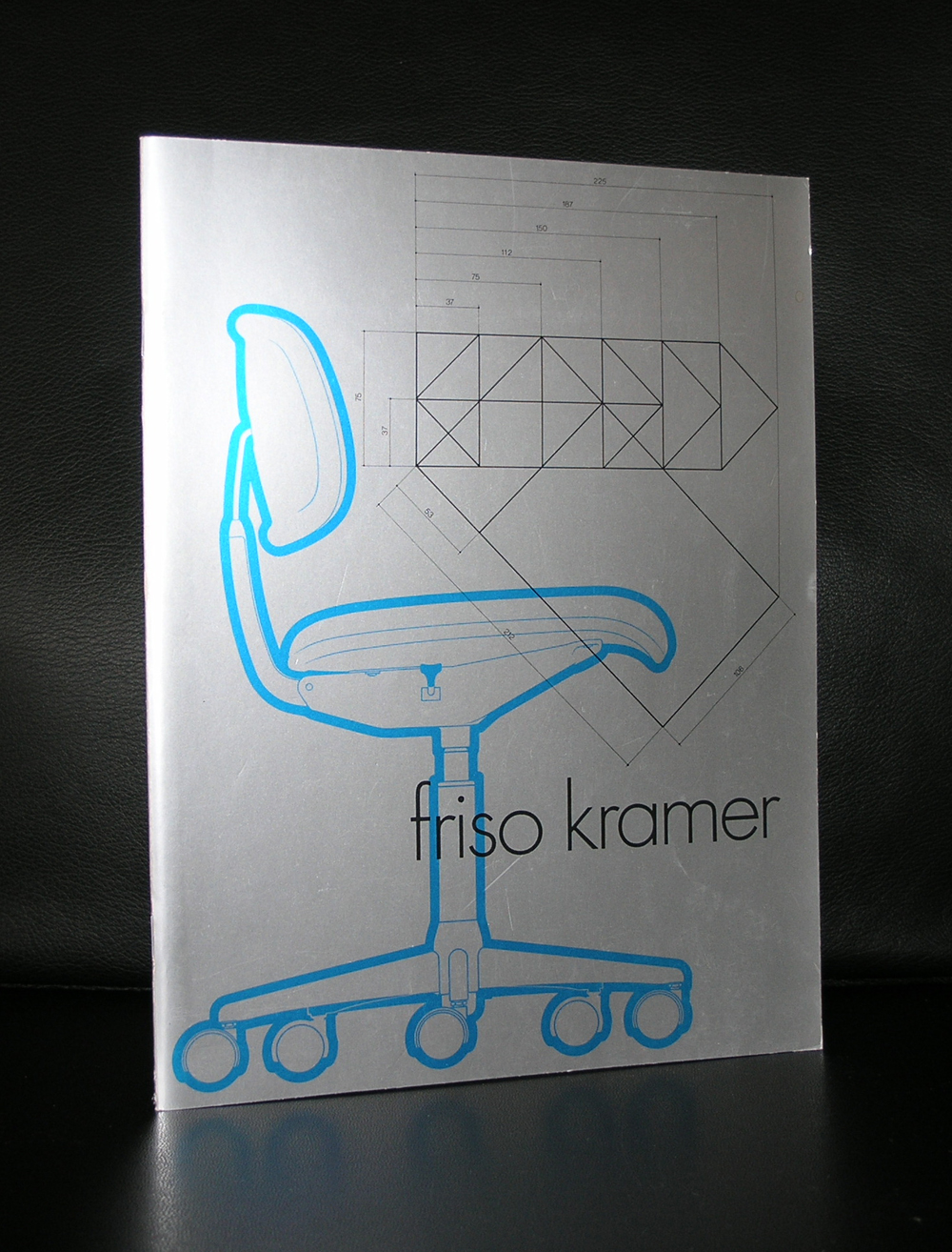
The founders were Wim Crouwel (graphic design), Friso Kramer (industrial design), Benno Wissing (graphic and spatial design) and Paul and Dick Schwarz (organization and finance). Before long, Ben Bos, an experienced copywriter and designer, joined the team.
This mixed group had such wide ranging experience that it was able to execute complex ‘total’ commissions from a variety of clients in industry, trade and transport, and the government and cultural sectors.
Years of success The 1960s were the most successful period for Total Design: its staff size increased enormously and the agency managed to hold on to various clients for a long time. Some of them, like Randstad and the Amsterdam Stedelijk Museum, ( of which many books are available at www.ftn-books.com) were extremely loyal to Total Design.
In those years, other important clients were Schiphol airport, De Bijenkorf, Steenkolen Handelsvereeniging (SHV), including its oil division PAM, Stichting Kunst en Handel (Arts And Business Foundation) and the Peter Stuyvesant Collection of paintings; a major commission dating back to that period was the design of the Dutch pavilion for the 1970 Osaka World’s Fair.
Changes In the 1970s, Total Design underwent great changes. The agency received mainly graphic commissions and created many house styles.
The composition of the staff changed as well. Some important designers from the very beginning decided to leave the agency. Friso Kramer had left already in 1967; in 1972, Benno Wissing, Anne Stienstra, Hartmut Kowalke and the Schwarz brothers followed. Wim Crouwel, Ben Bos and Hans Wierda became the managers.
The agency’s intricate and obscure management structure was replaced by semi-independent design teams. As a result, a new generation of designers, trained by the agency itself, got a chance to prove themselves.
A period of less cohesive views on design and style dawned. Designers like Jurriaan Schrofer, Anthon Beeke, Paul Mijksenaar and Andrew Fallon introduced a lively and fresh approach to design commissions. Loek van der Sande was taken on as office manager. Work for the Dutch Post Office PTT, the Amsterdam city transport company, the Holland Festival, the Globe Theatre as well as for other clients began in the 1970s.
Total Design experienced many further changes in the 1980s and 1990s. Jelle van der Toorn Vrijthoff joined the management team in 1982. He championed young talent and in particular new techniques. Sometimes his views were diametrically opposed to those of the old guard. Wim Crouwel left Total Design in 1985, Ben Bos followed in 1990. They were the last two designers who had been involved with Total Design from the very beginning.
New orientation Much had changed, also in the field of design. Total Design no longer had the renown of the early years. Many more design agencies had sprung up in the Netherlands through the years.
In 1988, Hans Brandt began to develop the design agency into a strategic communication agency. In de 1990s, Total Designed shifted from being a classic design agency to becoming an organization that put the emphasis on identity development, corporate branding and reputation management. In 2000, the name Total Design was changed into Total Identity.
An excellent story in the history of Total Design, but to see the true meaning of the TD office you have to experience and see their designs. Beside the Stedelijk Museum publications there are some special Total Design books available at www.ftn-books.com
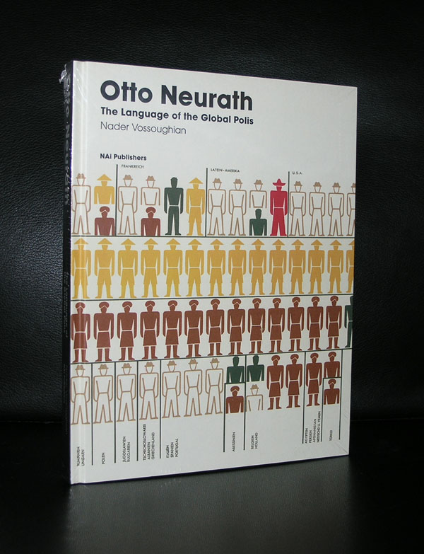
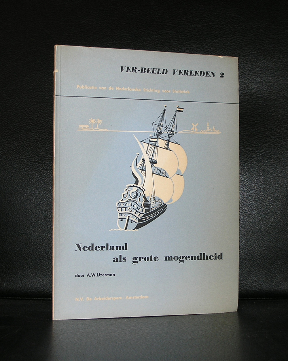
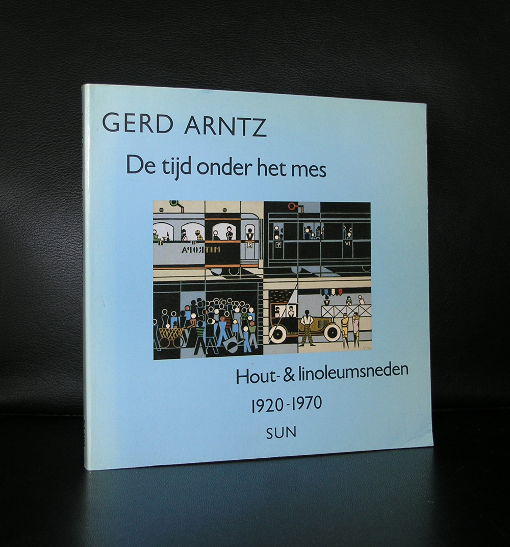
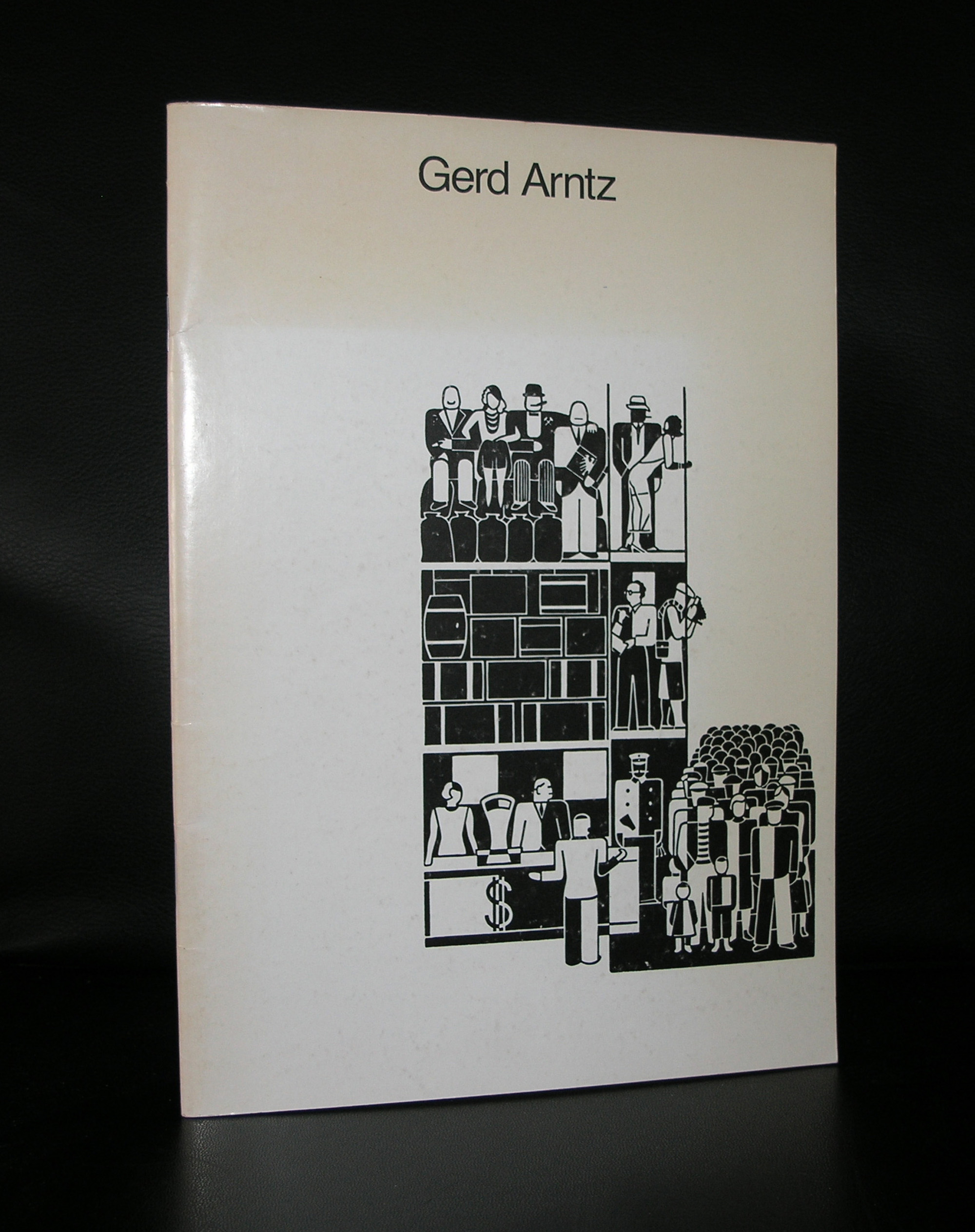
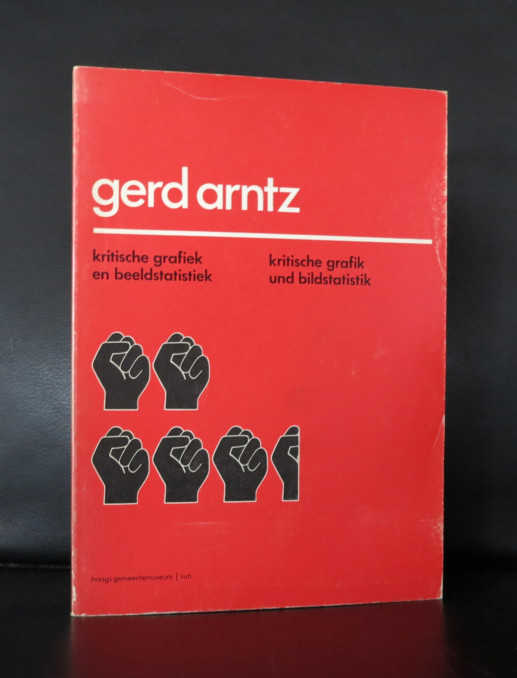
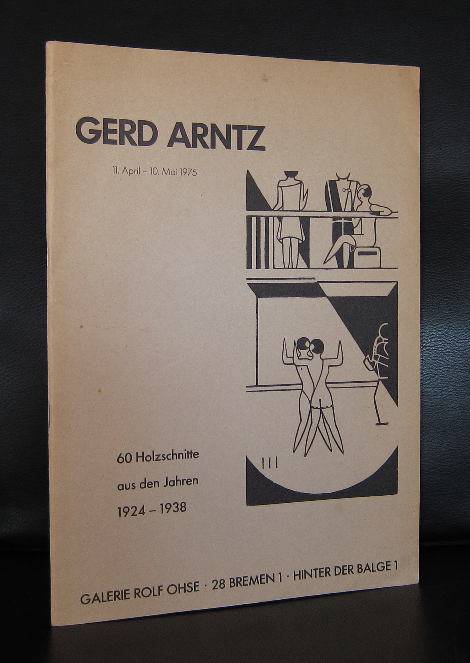
Otto Neurath was the first, but together with Neurath, Arntz is considered to be one of the founders of Isotype. A simple word for ISOTYPE is pictogram and he made over 4000 of them. Gerd Arnyz is even in our days considered to be one of the great inventors of the pictogram. The strength is that one can immediately see the meaning of the picture/pictogram and in relation to numbers and other pictograms.
Picture from www.gerdarntz.org
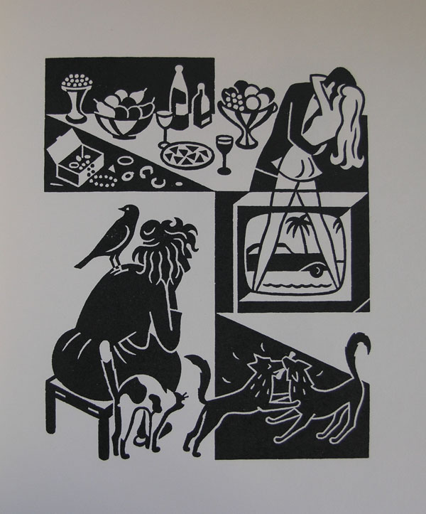
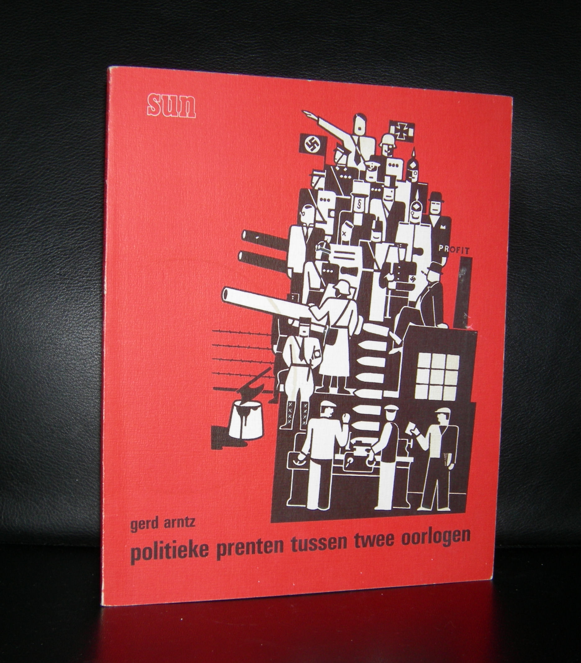
Because he opposed to the Nazi party in Germany and made some political drawings and statements against them, he fled to Den Haag in 1934, where he joined Neurath and Reidemeister. The three of them became extremely productive and it is in the Netherlands that most of his books, pictorial statistics and pictograms were published. Living and working in Den Haag, Arntz was familiar with its museum and for this reason the Haags Gemeentemuseum could acquire a large collection of his works and still on the book markets, when looking thoroughly, you can even find some nice publications, but this is getting harder and harder each year. www.ftn-books.com has some nice publications and the book ZEVEN HOOFDZONDEN in which an original woodcut by Arntz is published together with 6 other originals.
OLYMPUS DIGITAL CAMERA
OLYMPUS DIGITAL CAMERA
OLYMPUS DIGITAL CAMERA
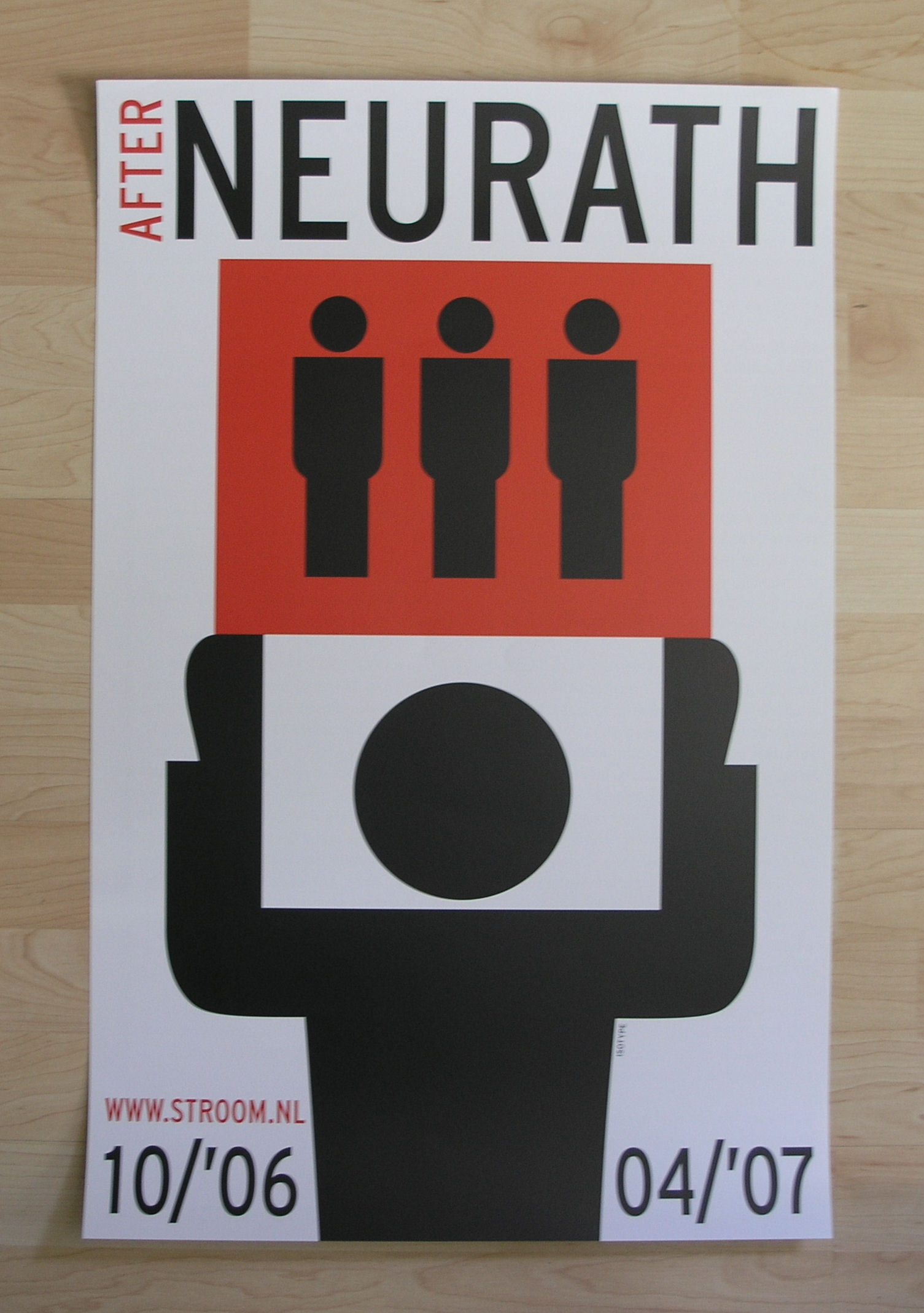
It was about 10 years ago that STROOM had a nice exhibition on Arntz and Neurath and they made a spectacular poster for the exhibition which is also available at www.ftn-books.com
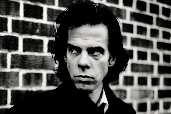
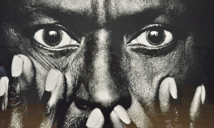
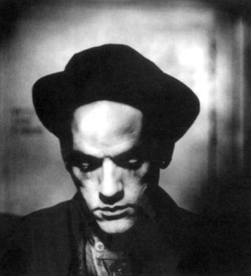
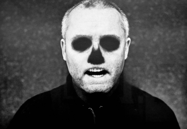
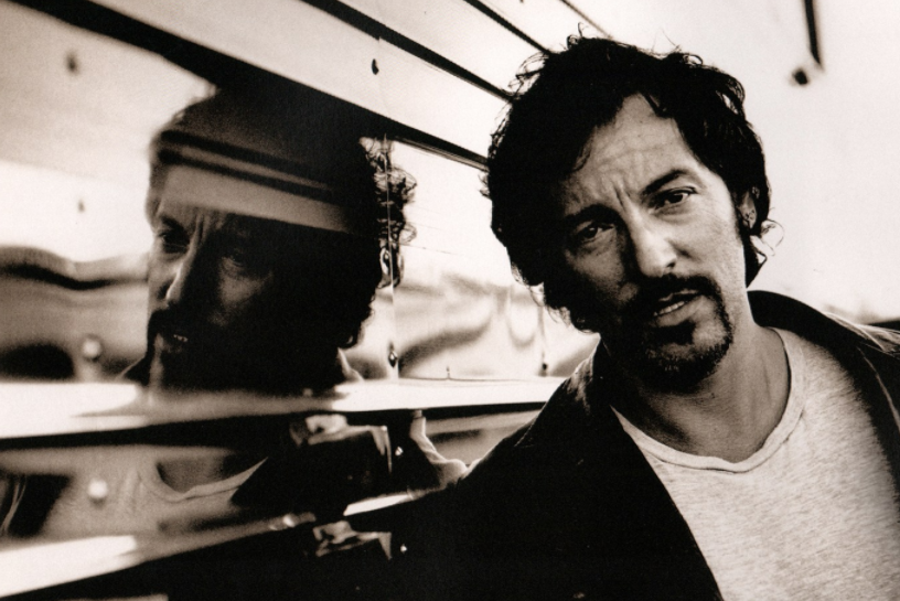
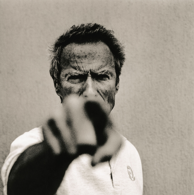
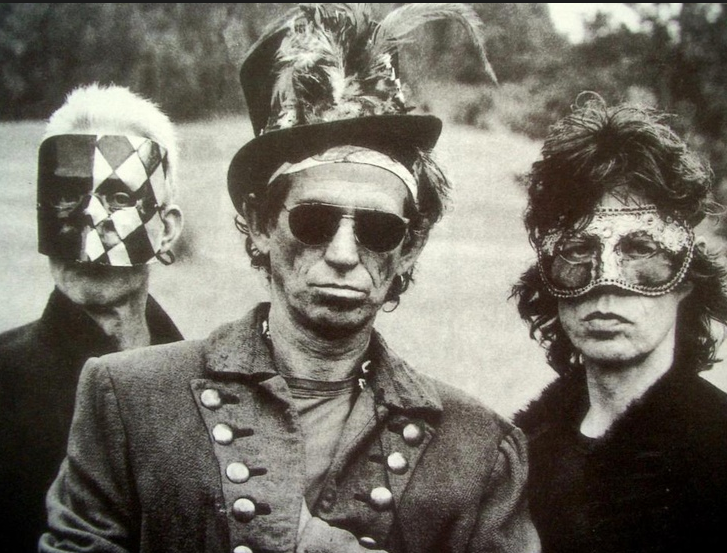
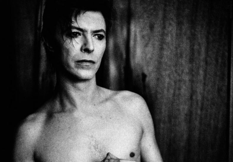
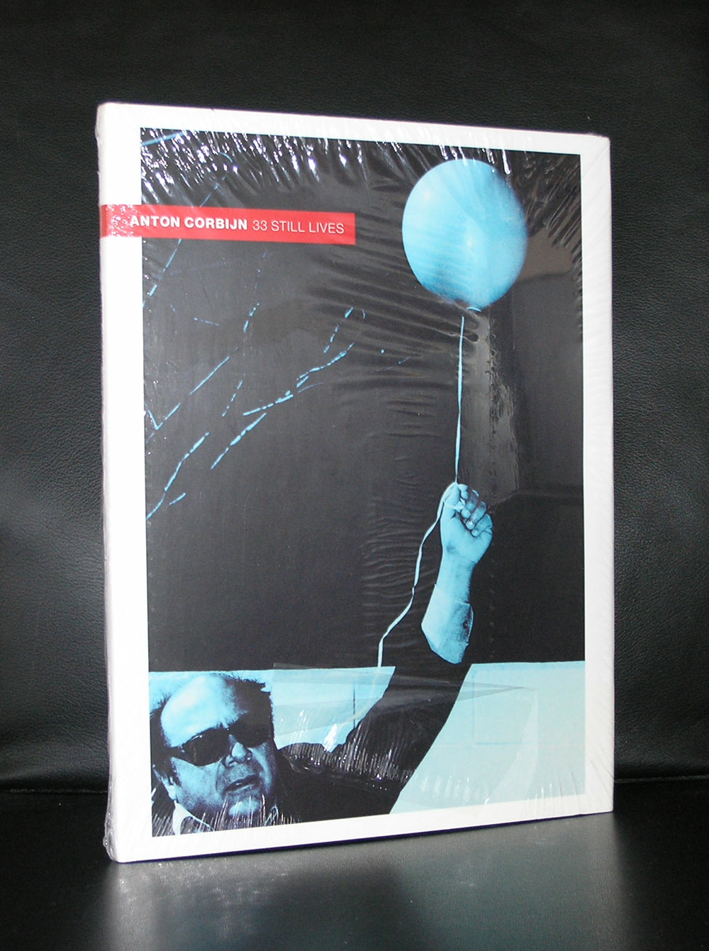
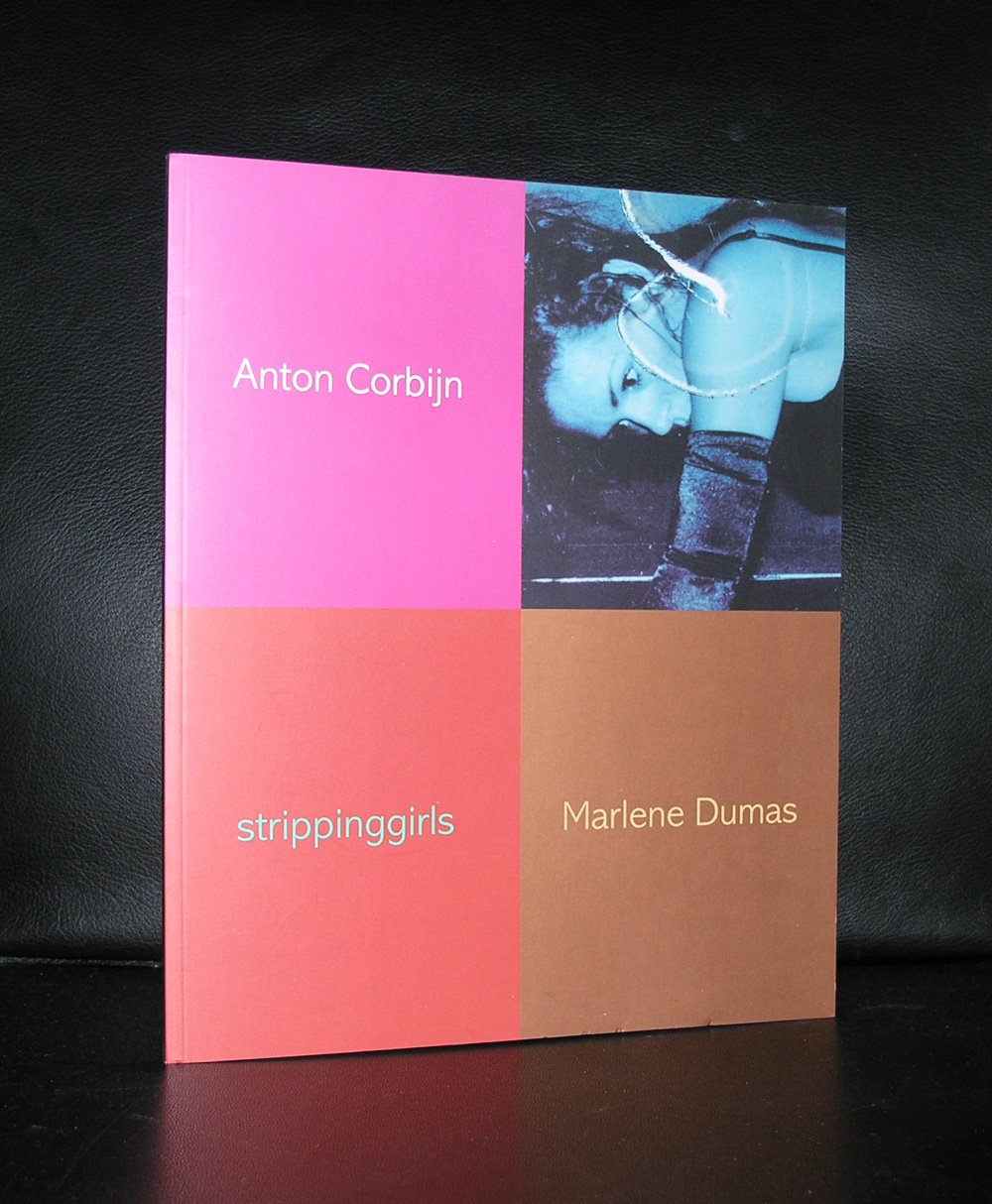
Rightfully world famous now. An excellent photographer and film maker. I am less enthusiastic about his abilities as a designer, but stil his photographs deserve some extra attention by this blog on art. Because these are not only great photographs, but they also reflect music and their performers through the last 4 decades. Bowie, Jagger, Cobain, Davis and of course U2, name them all and all of them have been before the lens of Anton Corbijn.
( all photographs by Anton Corbijn )
Black and white being his favorite way to portray these great artists. As of late he made some movies during the last decade ( the American and A Most wanted man) However, he made his feature film debut with Control, a film about the life of Joy Division frontman Ian Curtis. It premiered to rave reviews at the Cannes Film Festival on 17 May 2007. Curtis was a personal friend and it shows in the respectful way he portrayed the singer of Joy Divisison. Because his acquired celebrity status as a photographer, Corbijn has had retrospective exhibitions all over the world and 2 years ago there was a large retrospective on Corbijn in the Gemeentemuseum Den Haag. Since a few years Corbijn took up the art of design. Personally i do not think he is a strong designer, but this is my personal opinion on his designs. There is a new logo by the Municipality of DEN HAAG which was designed by Corbijn and judge for your self.
Better focus on his photographs….they are very personal, intriguing portraits and they are great!
for some Corbijn titles visit www.ftn-books.com ( stripping girls is made together with Marlene Dumas)
Yesterday, AntonMartineau died. He proclaimed himself the last of a great generation , together with Appel and Lucebert ( personal friends) he became known as an abstract painter, but never belonged to the Cobra movement. Born in the middle of the Red Light district in Amsterdam a fortuneteller told him in his early youth that he would become a painter and a writer. He studied with one of the great designers in these days Paul Schuitema and was successful both as a painter and a writer. www.ftn-books.com has only one title of this fascinating artist available , but it is an important one. It contains both poetry and drawings by this great dutch artist.
The little documentary on Youtube is in dutch , but shows what a wonderful and colorful Martineau was
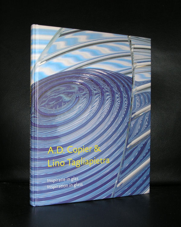
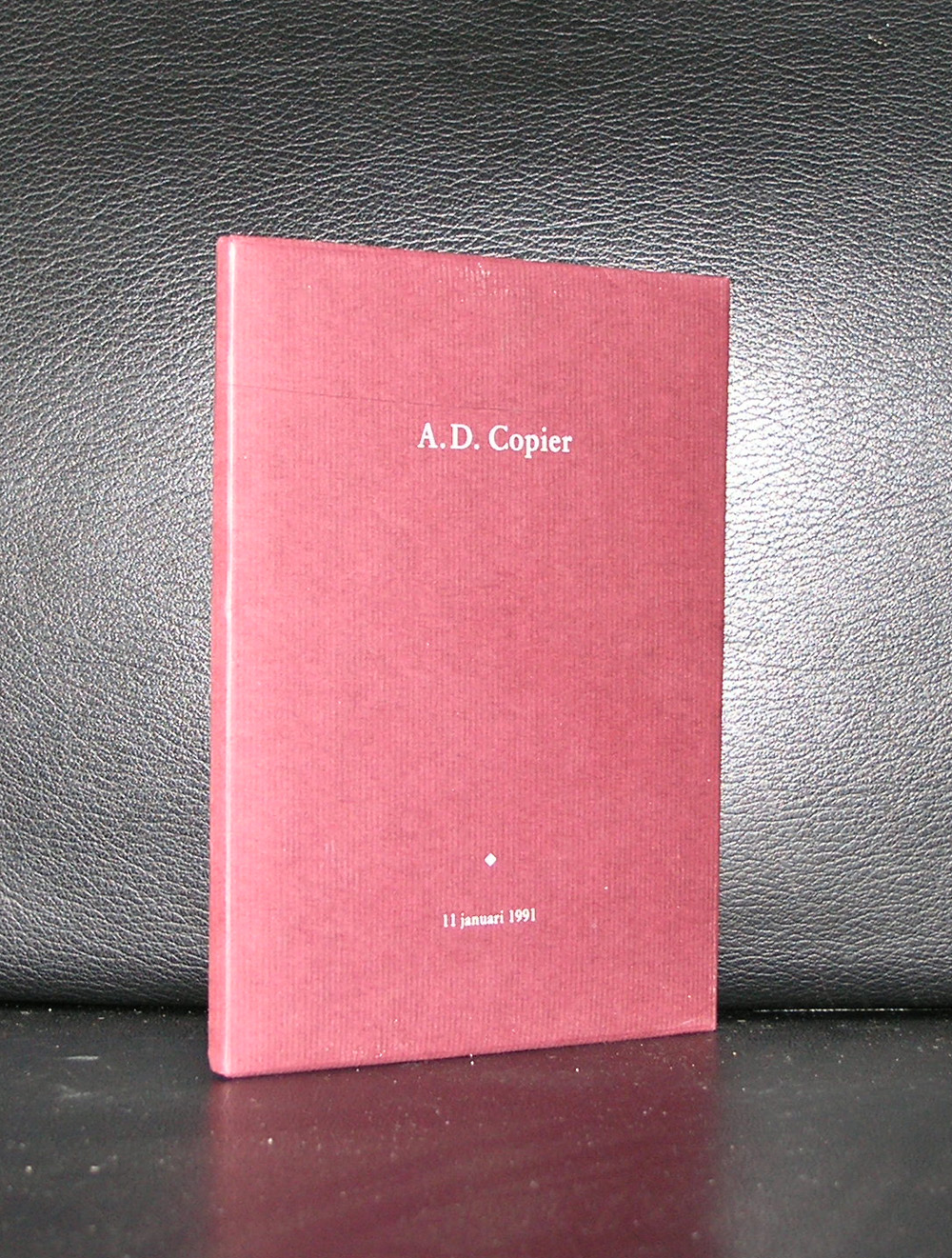
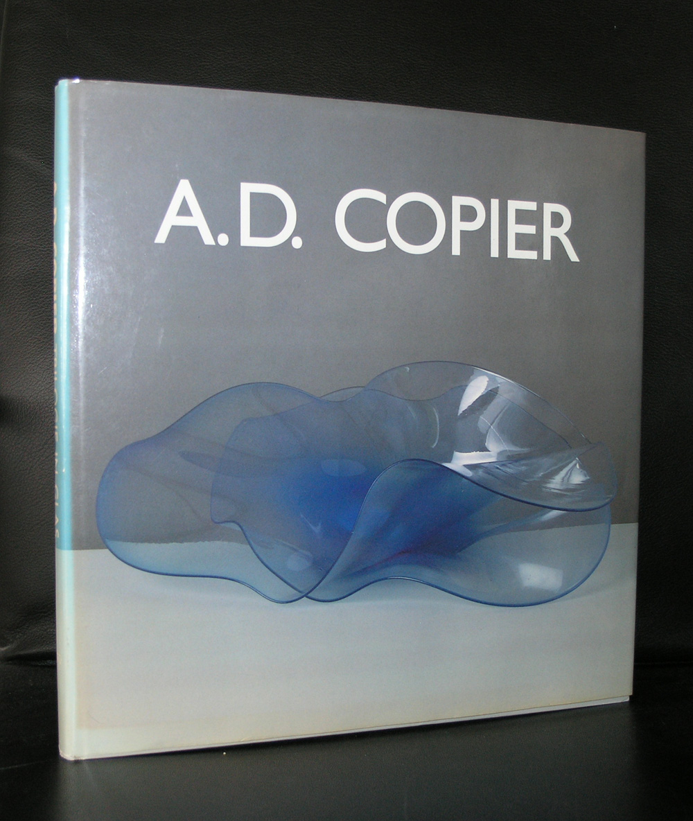
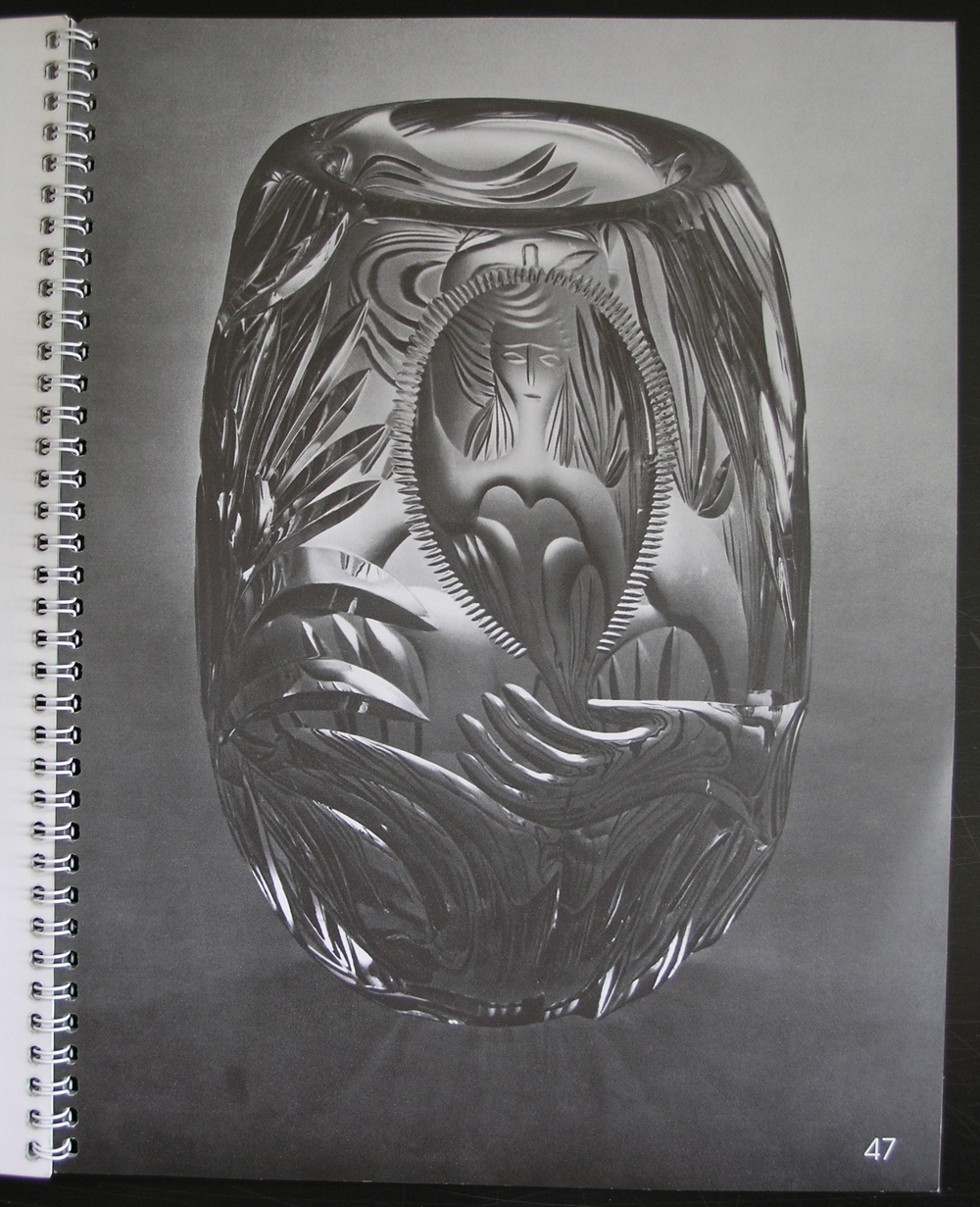
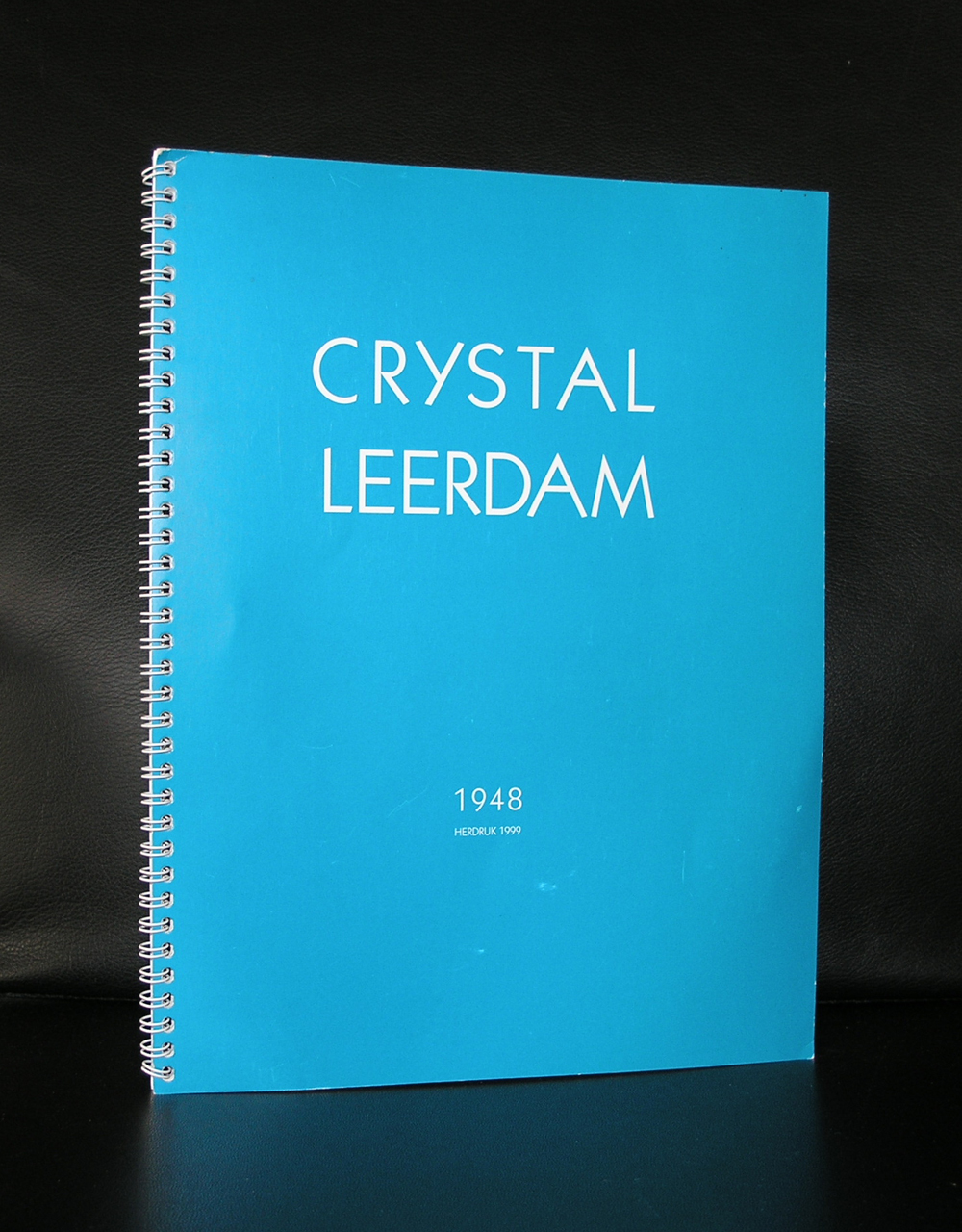
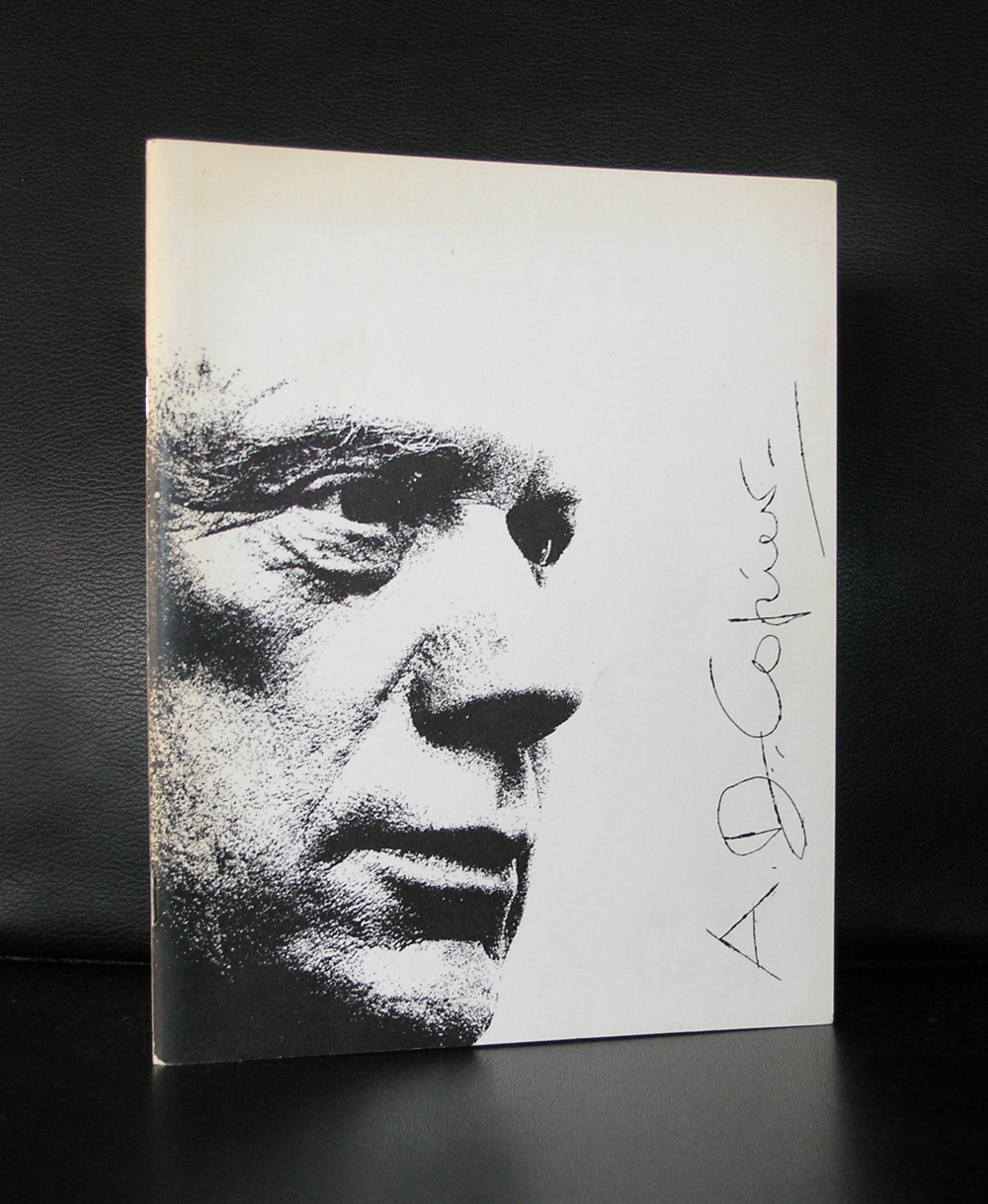
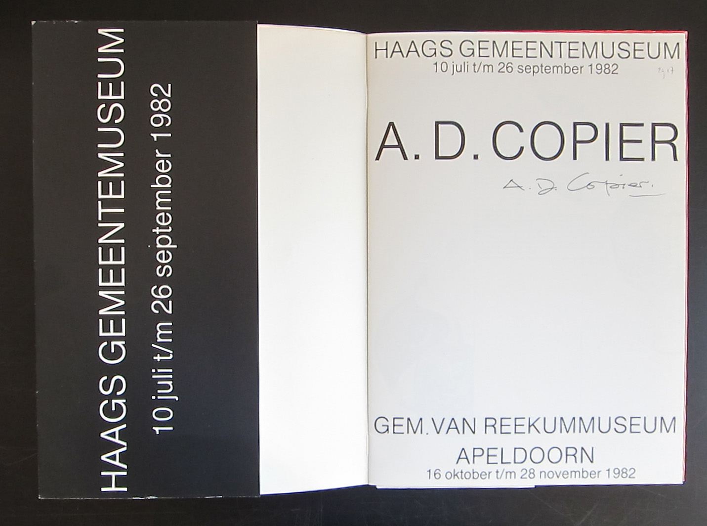
If there is one glas artist you will probably know the name of, or at least who’s work you encountered once in your life time, it must be A.D. Copier. After studying as an apprentice at the workshops of his father at the Leerdam Glas factory and the vakschool voor Typografie in Utrecht, he became practically the sole designer for the factory for a period of almost 40 years. In these years he made many glas related designs, but one stands out…it is the Gilde glas series which is still being made and copied all over the world.
The glas has excellent drinking and tasting qualities holds extremely well in you hand and is one of the icons in dutch design. Since he left the Leerdam factory in 1971 he made unica and glas objects after his own designs .
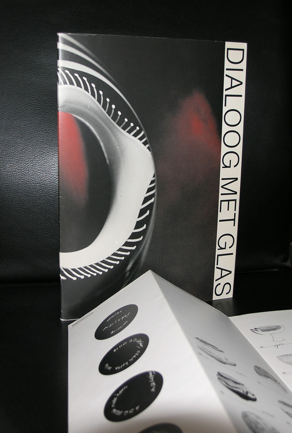
Andries Dirk Copier is considered as one of the great true talented artists in the world of glas, the difference between him and for example Lino Tagliapietra is that Copier always has the usability and the aesthetics of the object in mind, where as others loose themselves in experiments. www.ftn-books.com has some nice books on Copier in its inventory.
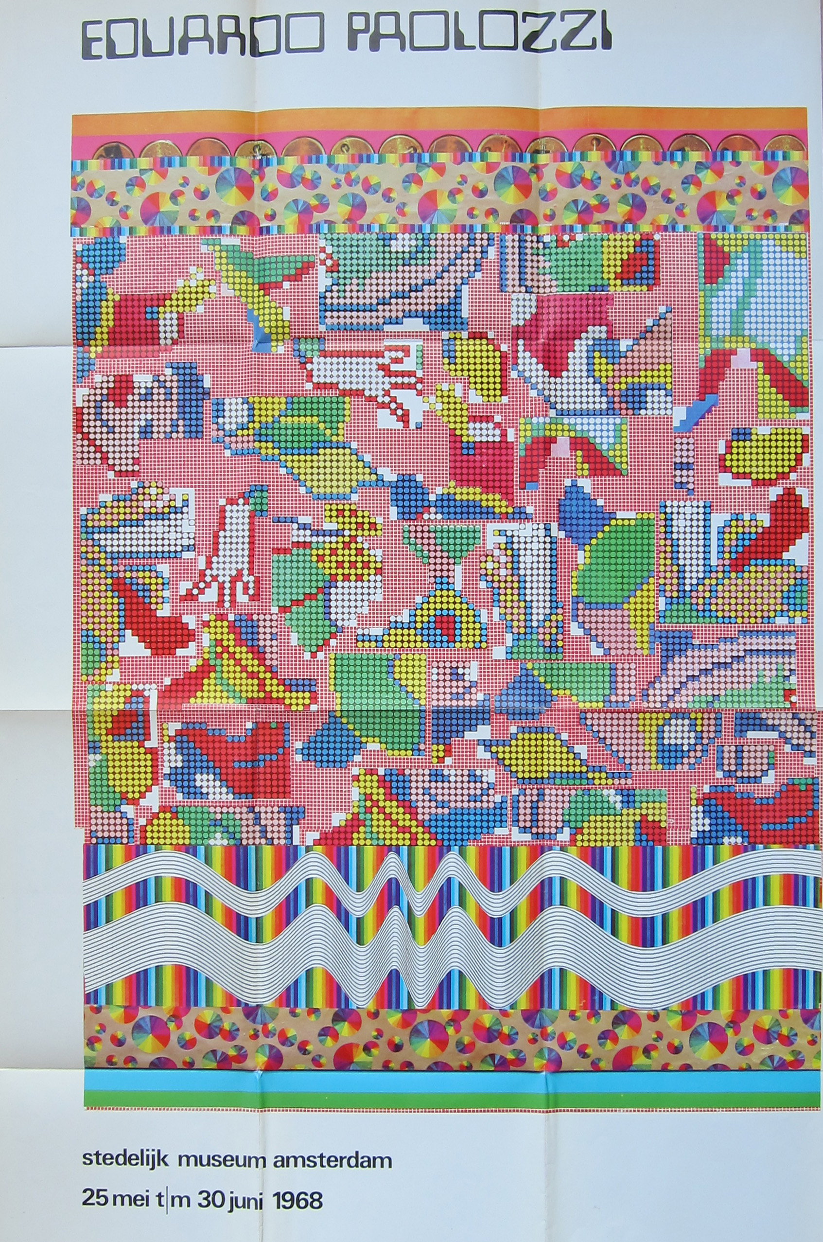
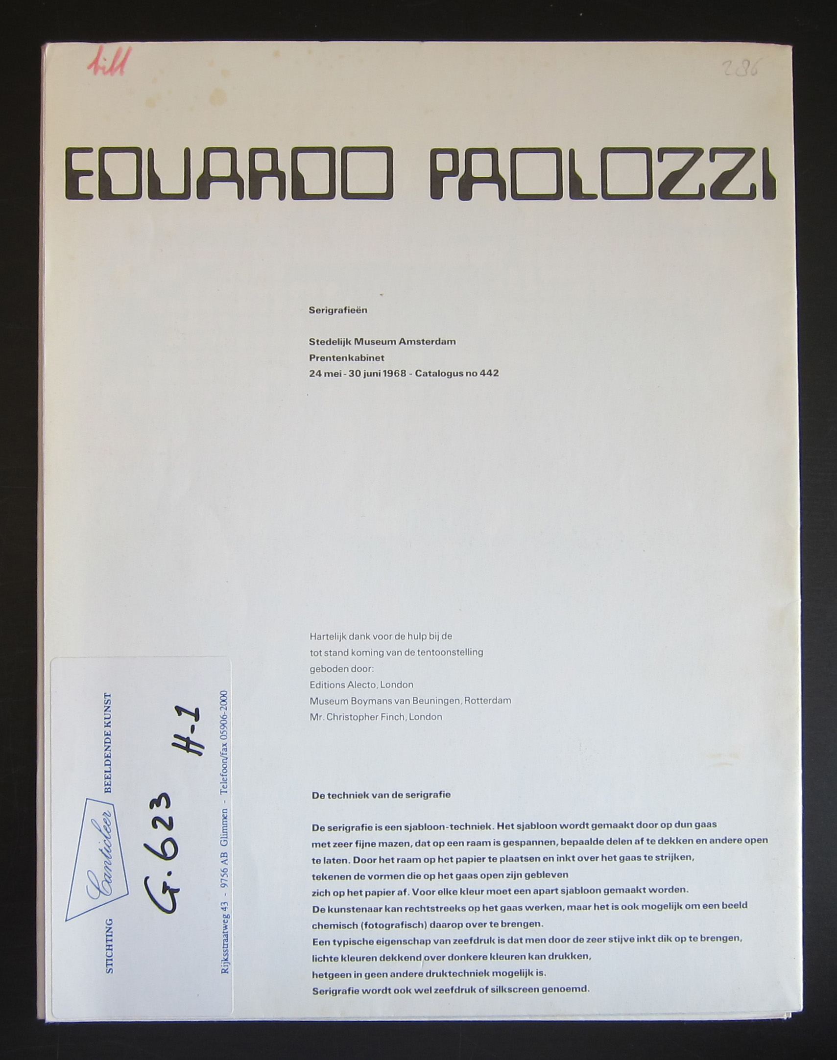
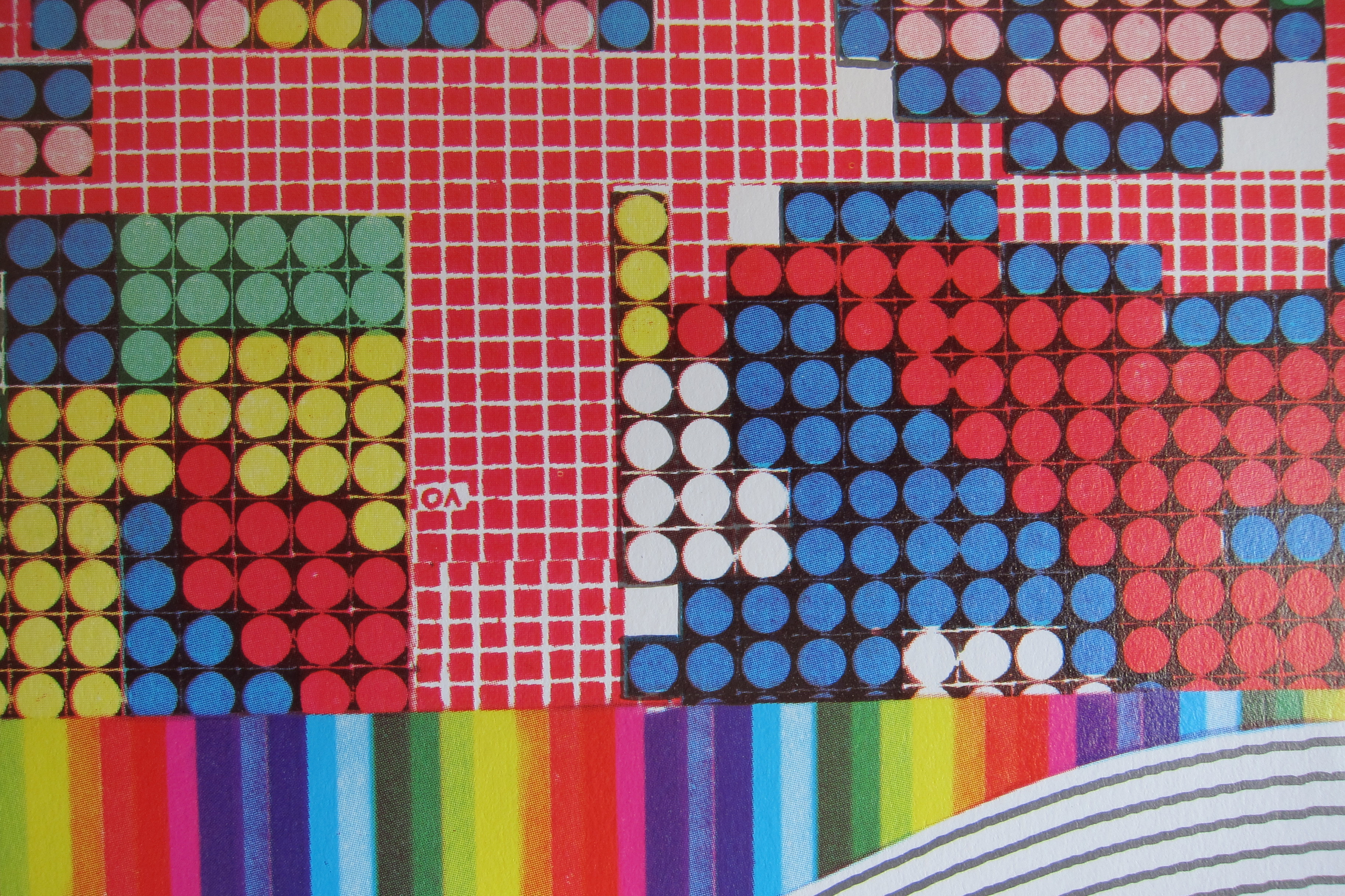
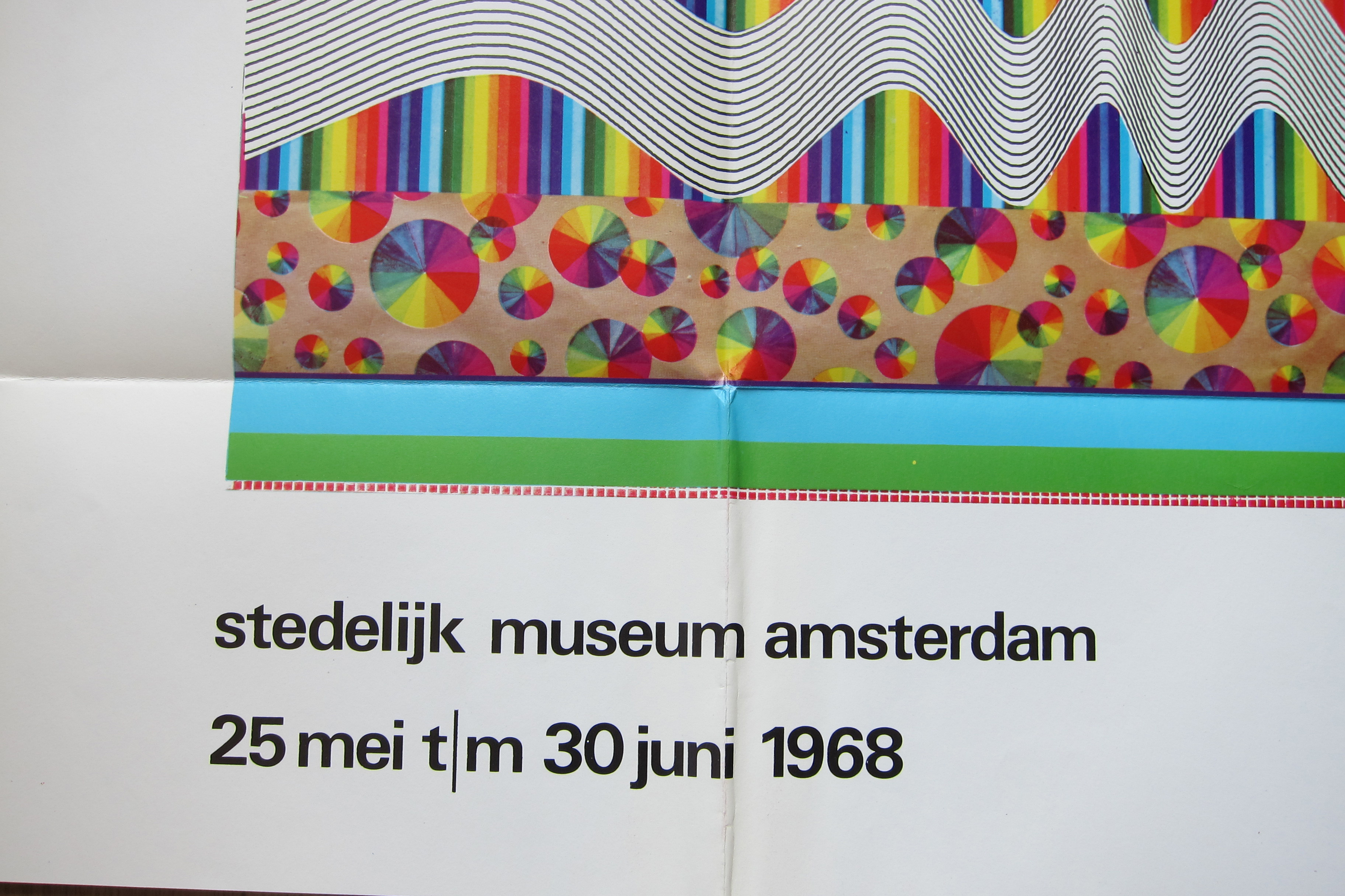
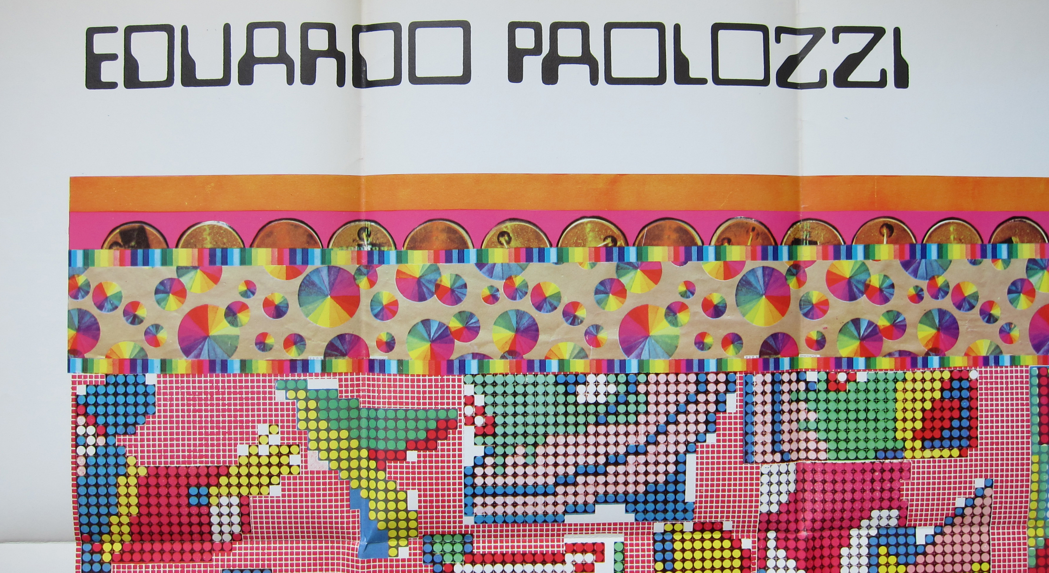
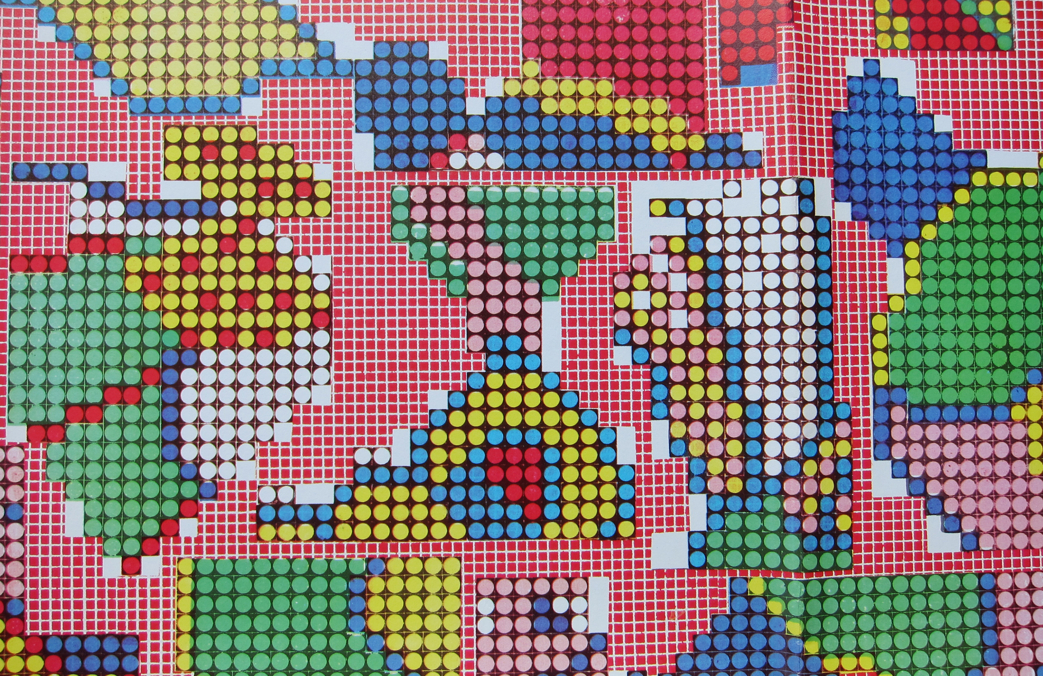
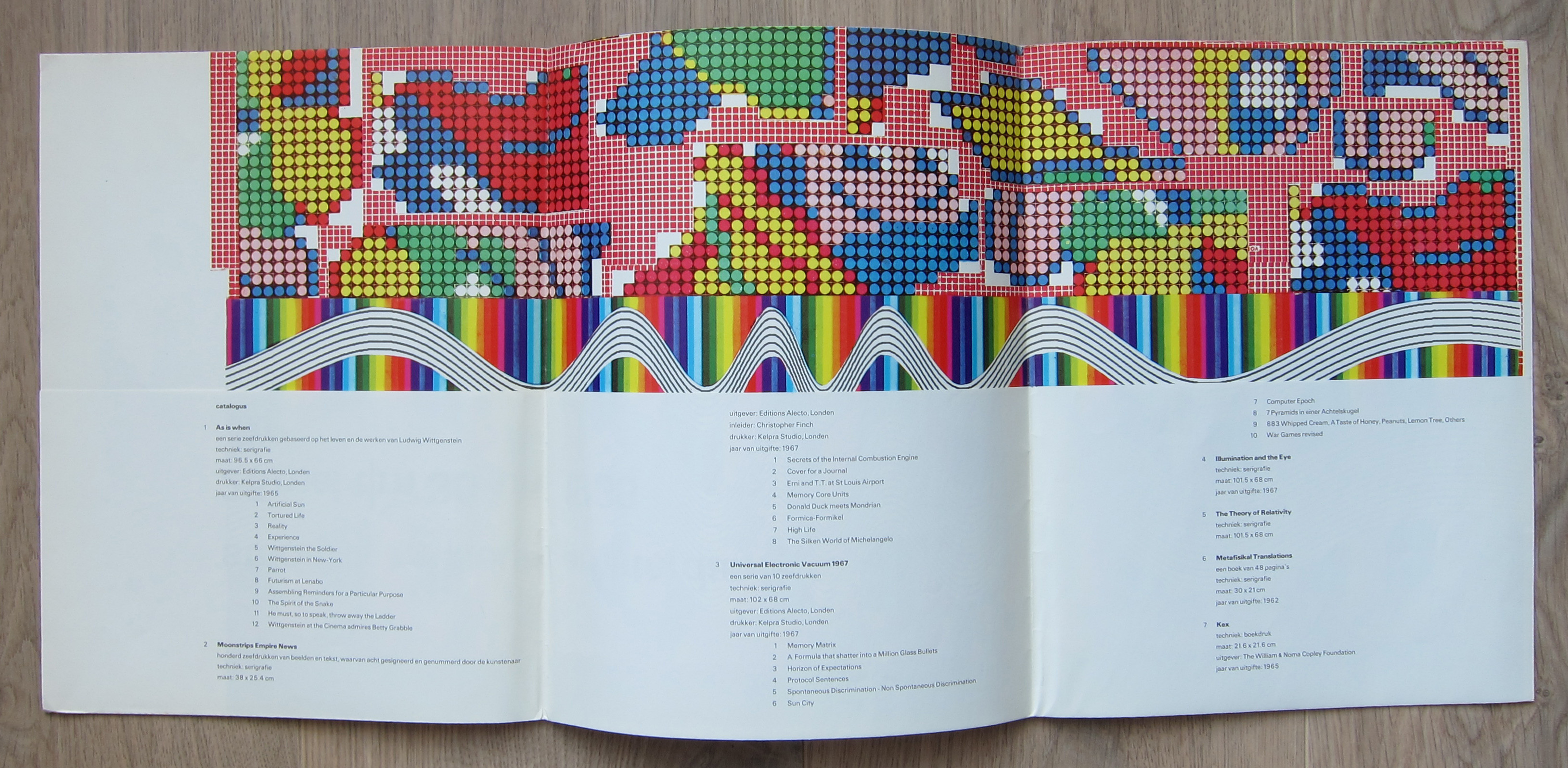
There are multiple reasons to like the publication no 442. of the Stedelijk Museum Amsterdam. Published in 1968 on the occasion of the Eduardo Paolozzi exhibition this is a 100% original work of art . A serigraphie by Paolozzi in his typical Pop Art style. Folded as issued and when folded out an impressive large work of art. Design?….by Wim Crouwel who used the backside of the serigraphie for all the information on Paolozzi. A great Pop Art work of art and available at www.ftn-books.com
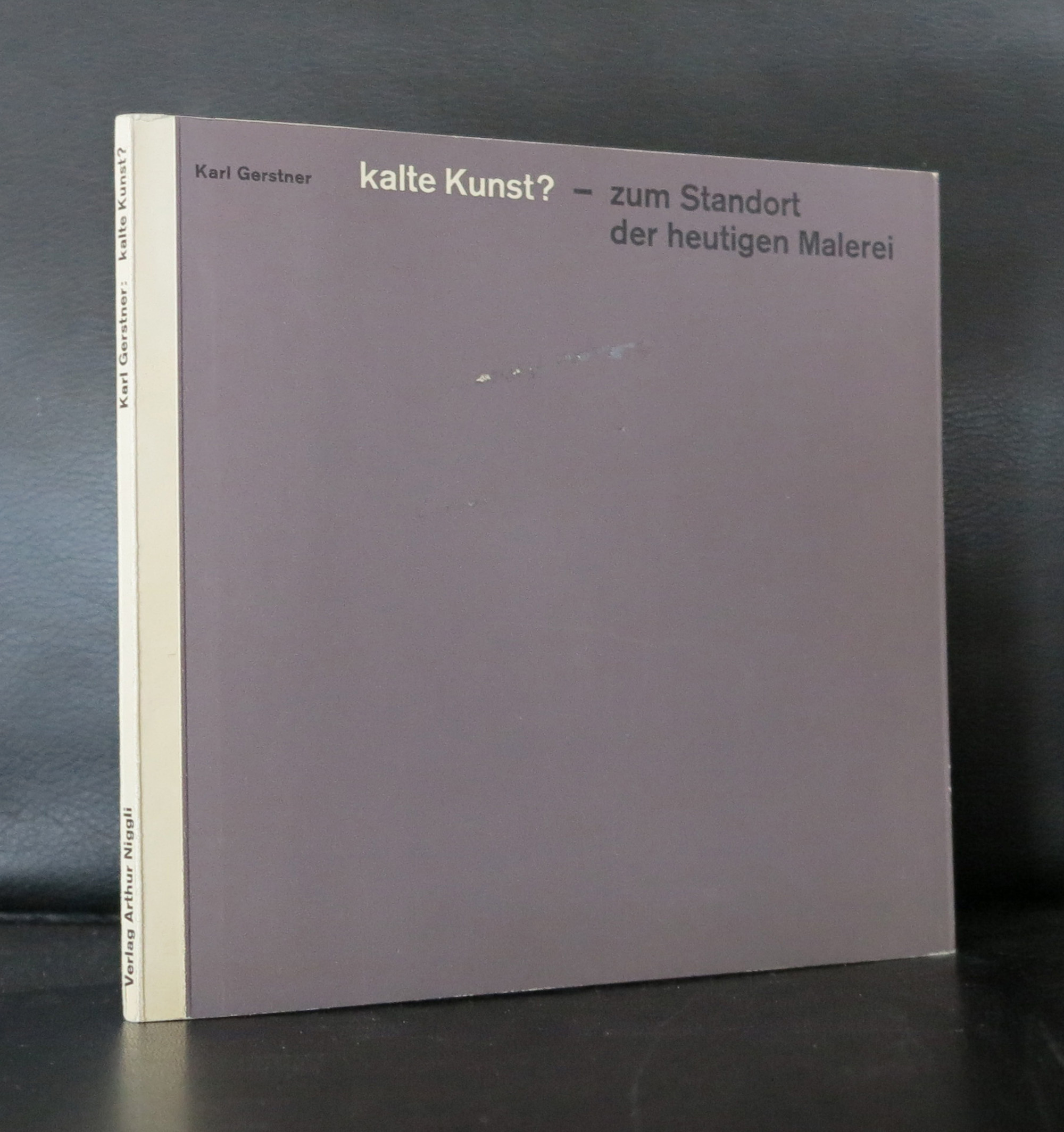
One of the greatest book designers recently died. Karl Gerstner died on the 1st day of this New Year.
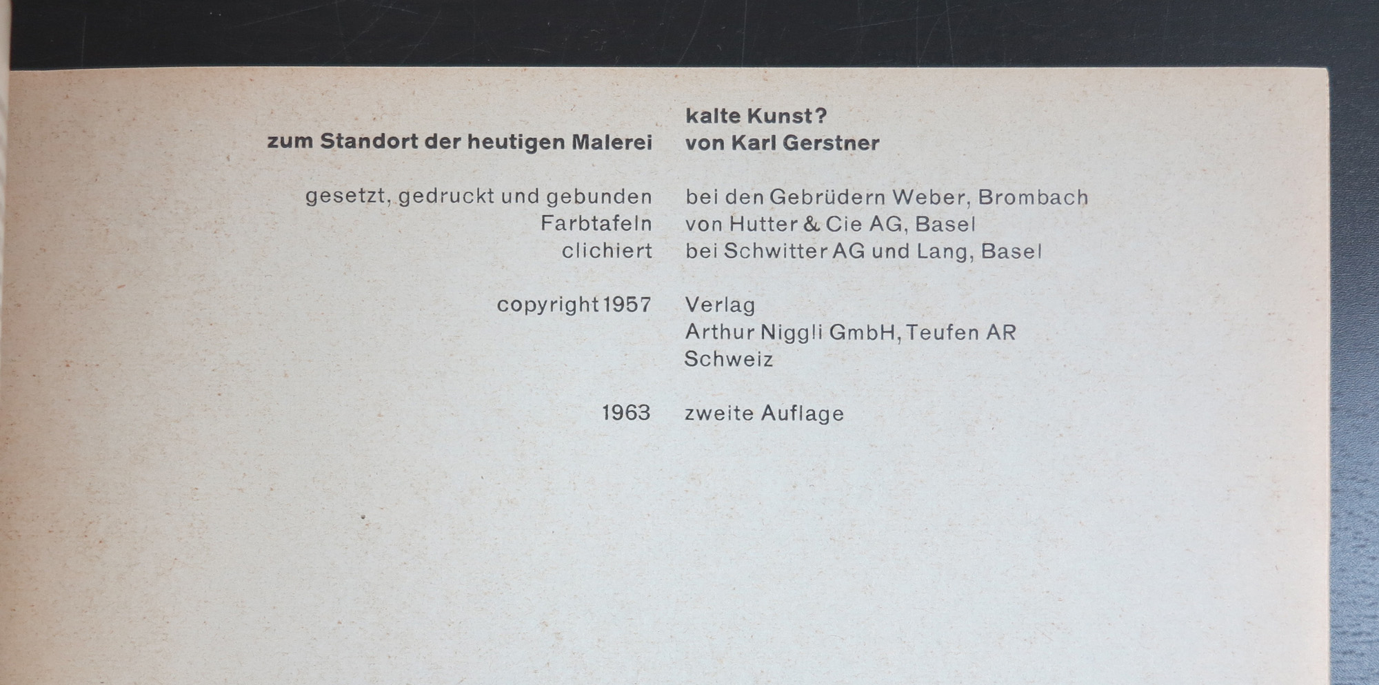
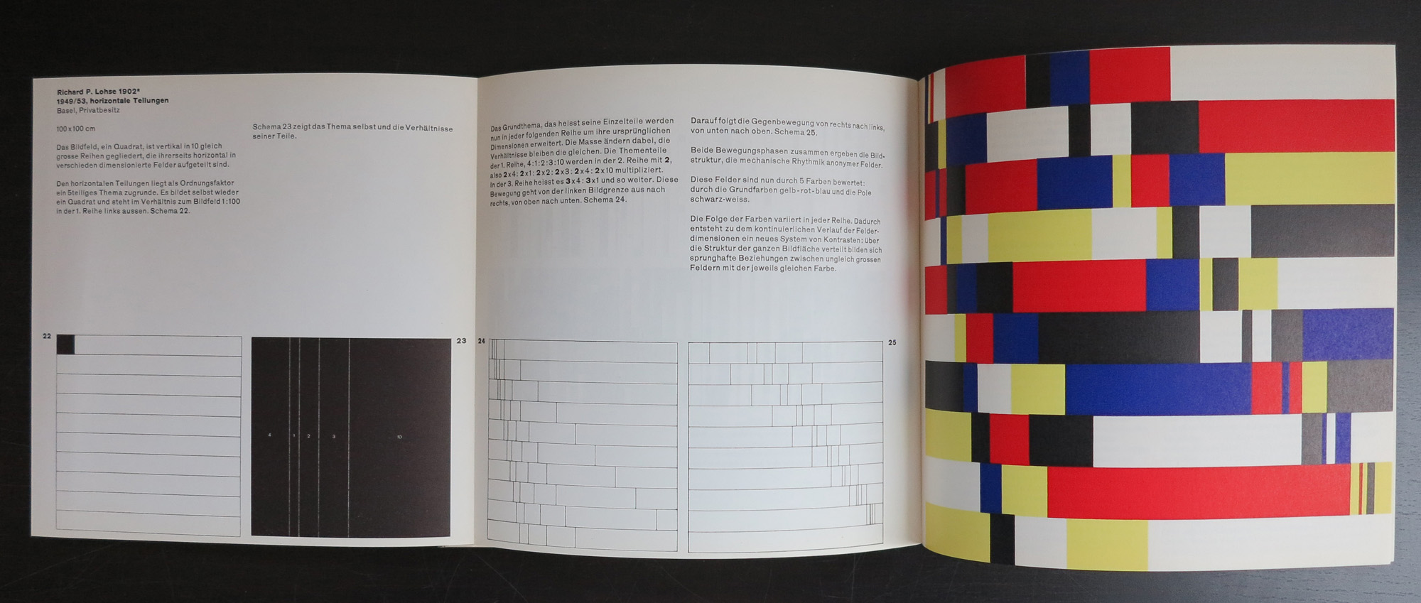
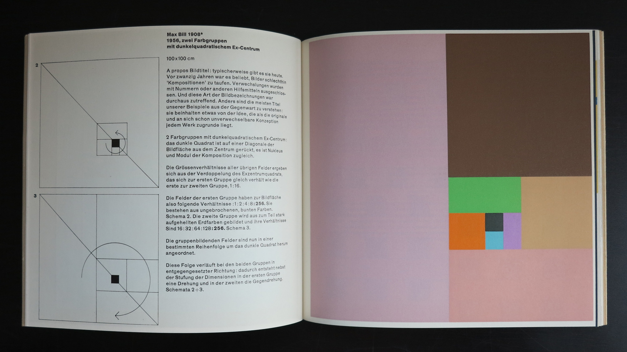
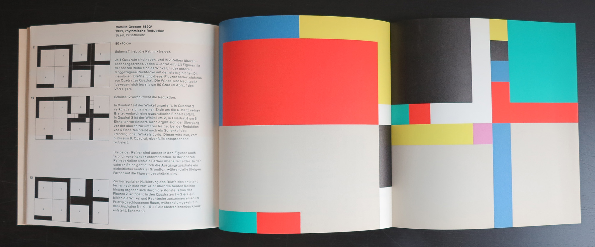
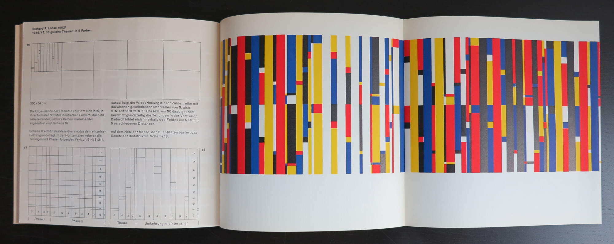
If there was one iconic Swiss book from the late Fifties it is probably Kalte Kunst?
Designed by Karl Gerstner, this book has become an example to many. Look at the early Wim Crouwel designs….influence Gerstner. Benno Wissing…influence Gerstner.
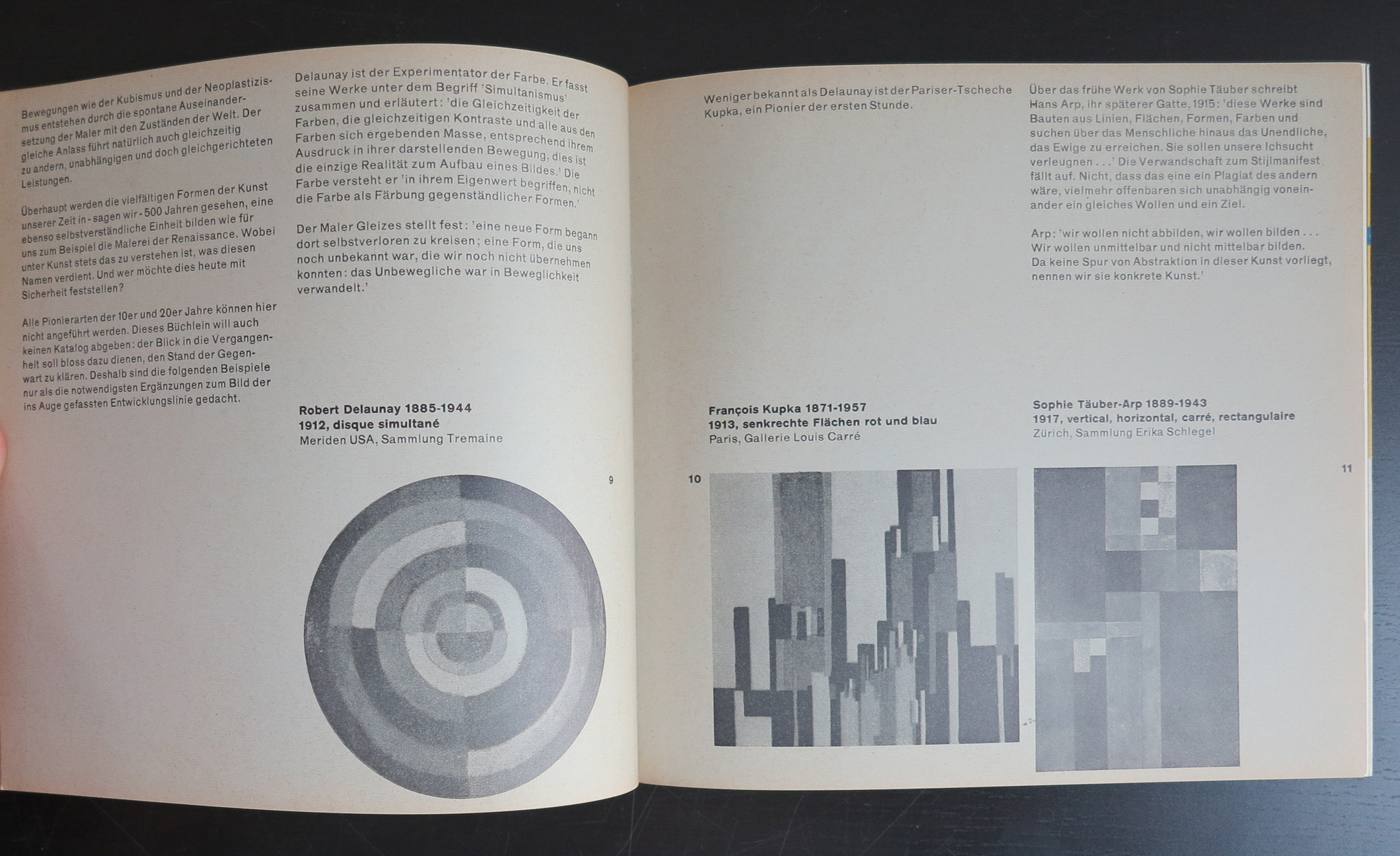
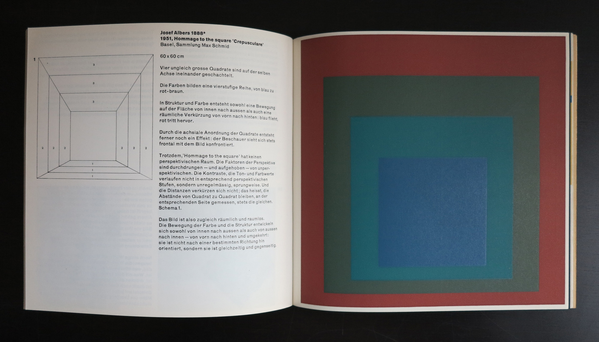
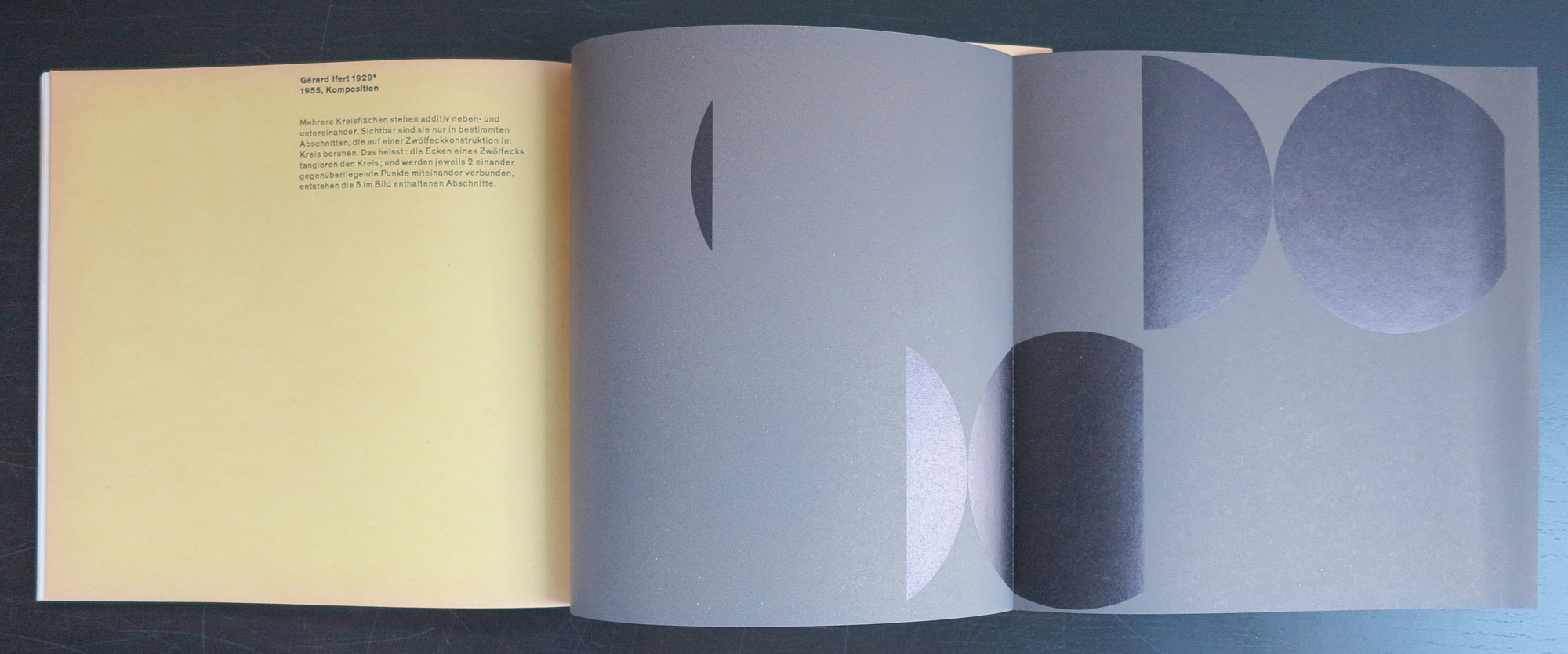
Karl Gerstner is a contemporary designer who’s work is strong and clean, but full of details. Typography and design melt together into a publication which is modern and classic. One of the first of these publications was Kalte Kunst? in which the most modern artist from the fifties were invited to make a contribution, which was placed within the publication. Special prints, silkscreens and litho’s were bound in Kalte Kunst?
“Kalte Kunst?” (1957, 2 editions, both 1000 copies) was Gerstner’s first authored book where he advocates for a specific form of rational, geometric and mathematical art with examples from Josef Albers, Max Bill, Camille Graeser, Richard P. Lohse, Gerard Ifert, Mary Vieira and Marcel Wyss.
Artist/ Author: Oliver Boberg
Title : Memorial
Publisher: Oliver Boberg
Measurements: Frame measures 51 x 42 cm. original C print is 35 x 25 cm.
Condition: mint
signed by Oliver Boberg in pen and numbered 14/20 from an edition of 20


")