Posted on Leave a comment

William Klein (1928) a master of abstract photography

Schermafbeelding 2018-02-07 om 13.49.11

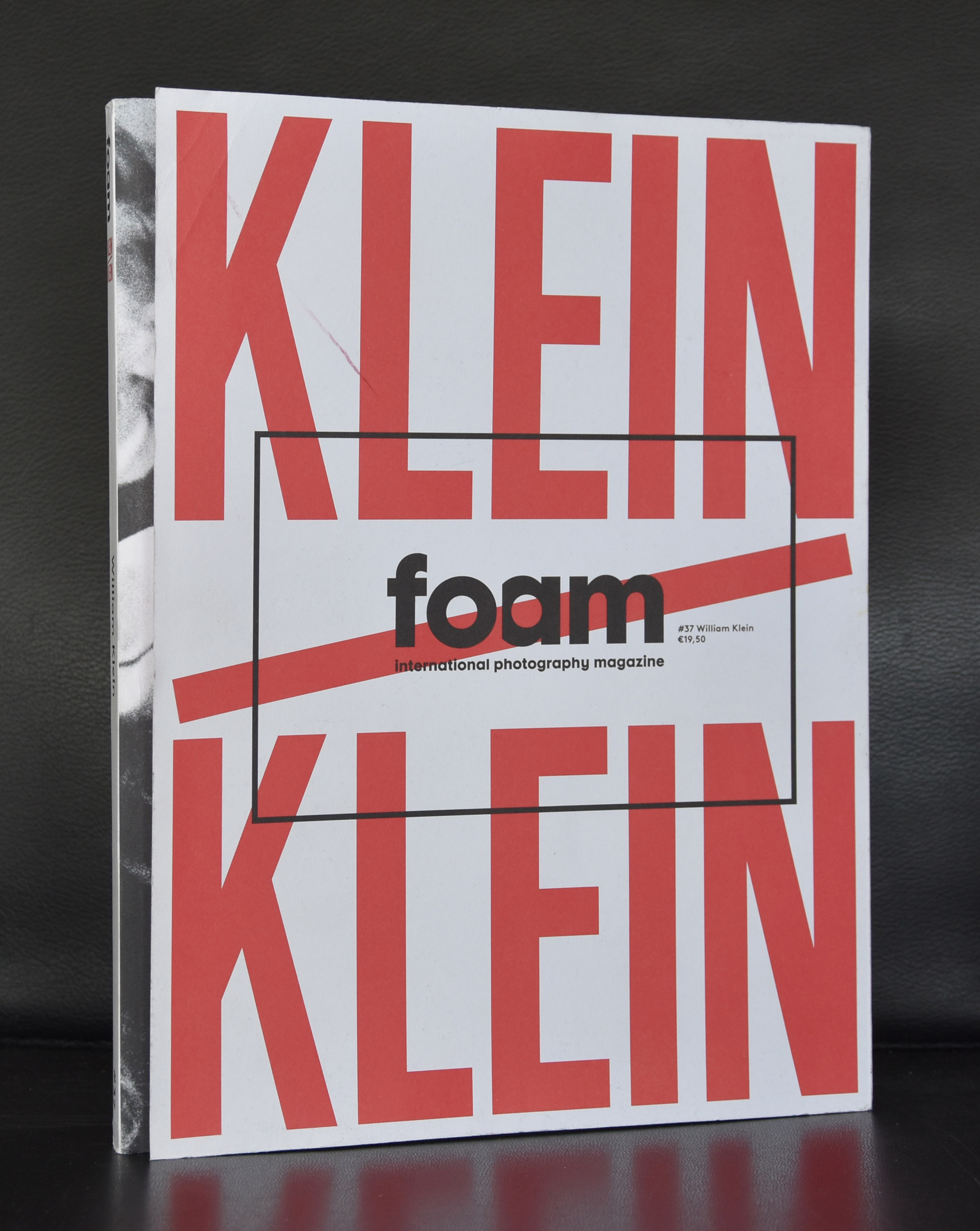
I found an excellent biography on Artnet on William Klein, but for me the importance of Klein is the fact that William Klein made a stunning catalogue together with Wim Crouwel for his 1967 exhibition in the Stedelijk Museum Amsterdam. The catalogue has some very bold typography and the use of the bright yellow in contrast with the black and white photograph in the back makes it for me a classic. Here is the Artnet bio.

OLYMPUS DIGITAL CAMERA

William Klein is an American artist known for his unconventional style of abstract photography depicting city scenes. Although similar in subject matter to other street photographers such as Diane Arbus and Saul Leiter, as well as fashion photographers Irving Penn and Richard Avedon, Klein’s images break from established modes. “I came from the outside, the rules of photography didn’t interest me. There were things you could do with a camera that you couldn’t do with any other medium—grain, contrast, blur, cock-eyed framing, eliminating or exaggerating grey tones and so on,” he reflected. “I thought it would be good to show what’s possible, to say that this is as valid of a way of using the camera as conventional approaches.” Born on April 19, 1928 in New York, NY, Klein studied painting and worked briefly as Fernand Léger’s assistant in Paris, but never received formal training in photography. His fashion work has been featured prominently in Vogue magazine, and has also been the subject of several iconic photo books, including Life is Good and Good for You In New York (1957) and Tokyo (1964). In the 1980s, he turned to film projects and has produced many memorable documentary and feature films, such as Muhammed Ali, The Greatest (1969). Klein currently lives and works in Paris, France. His works are held in the collections of The Museum of Modern Art in New York, the National Gallery of Art in Washington, D.C., and the Art Institute of Chicago, among others.

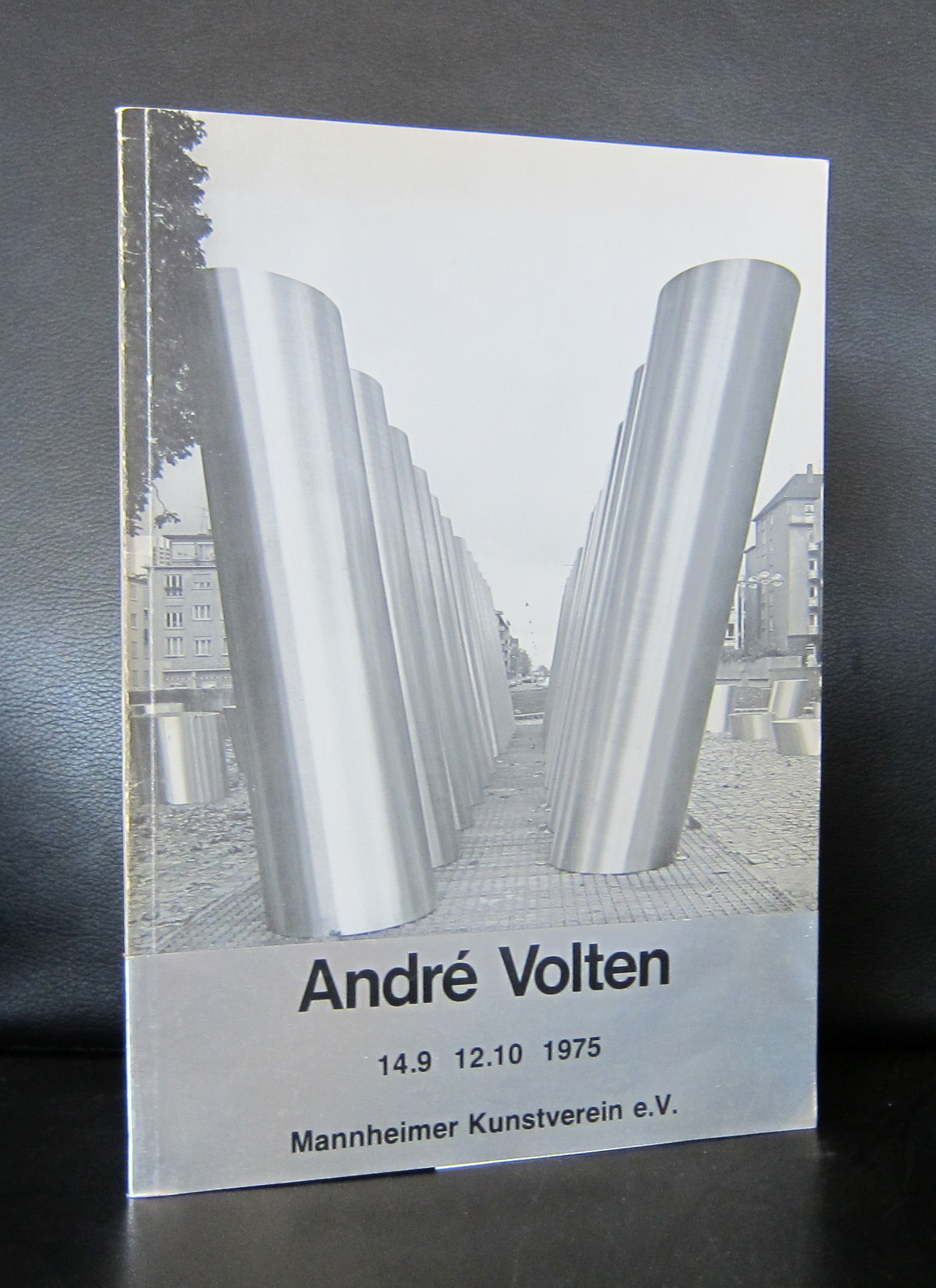
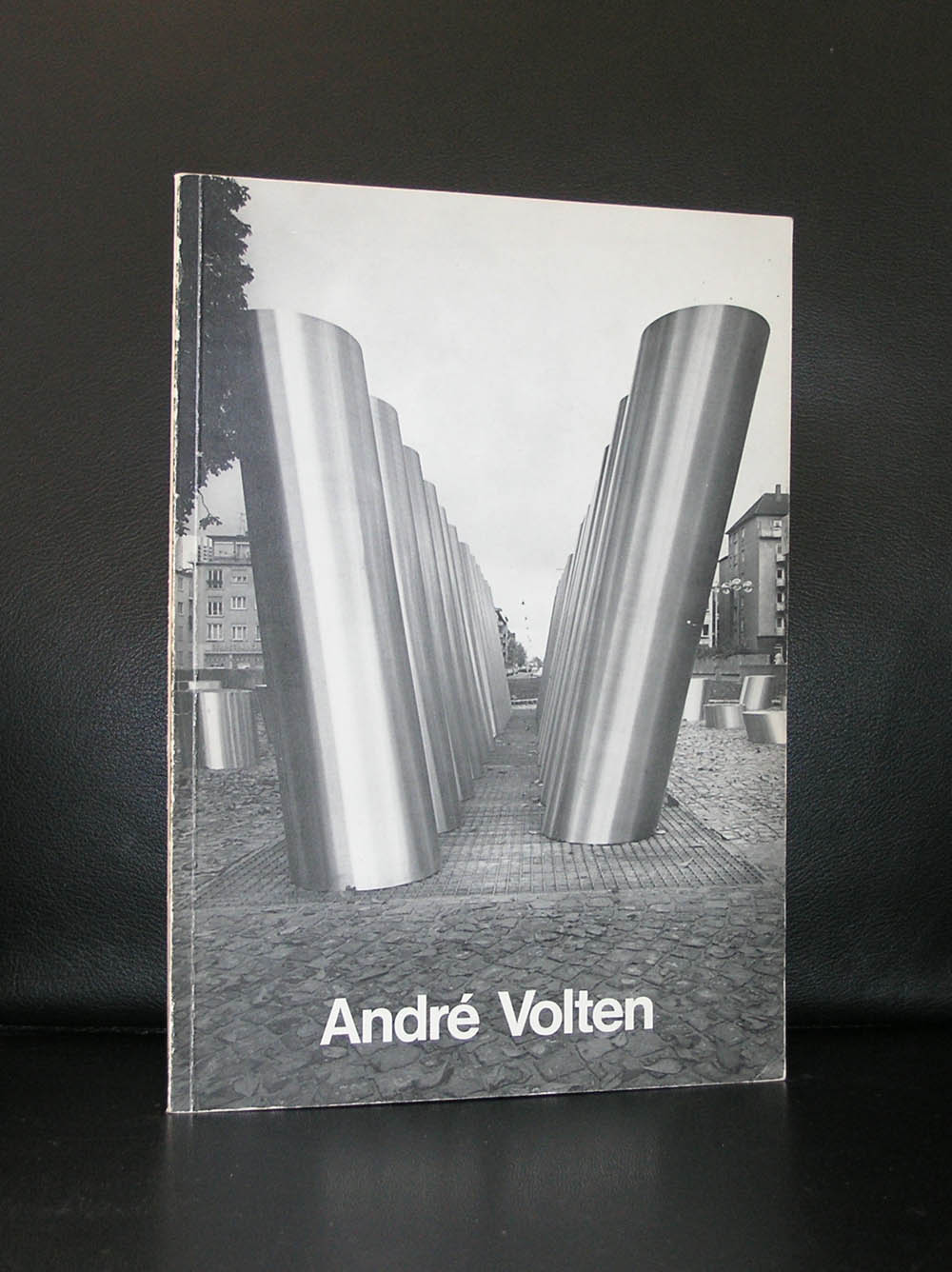
There are more titles on or with contributions by William Klein available at www.ftn-books.com

Posted on Leave a comment

Richard Long (1945)

Schermafbeelding 2017-11-04 om 14.45.16

Hamish Fulton and Richard Long…. Two artist who i learned to appreciate in the time that Rudi Fuchs was director at the Gemeentemuseum. Long was nominated 4 times for the prestigious Turner price , but only won it once in 1989 for White Water Line.

Schermafbeelding 2017-11-04 om 14.50.29

Since i first saw works and publications i have seen Richard Long his works on many occasions and one of the most recent ones was at the Guggenheim Bilbao museum. Each time the lines, circles and labyrinths look random, but this is not true. The placement of the stones and paint is strict and makes it free whitin the object , but it has very strict boundaries making it perfectly shaped. The way each work is created is described and laid down in drawings i a way that each work can be re-cretaed at any other place than it was first was created. It is somewhat the saem as with the walldrawings by Sol LeWitt who uses the same method . The art work is the sketch/drawing and materials and can be re-created anywhere as long as you have the original drawing belonging to the work.

What makes Richard Long stand out from other contemporary artists is that many of his publications are also artist books which hold beside the works, photography and word “sculptures” by Long and www.ftn-books.com has some of these titles available.

Posted on Leave a comment

Henry van de Velde ( 1863-1957)

Schermafbeelding 2018-02-05 om 10.37.51

What is possibly not known to many is that they have visited one of the masterpieces by Henry van de Velde in the past. The architecture of the Museum Kroller Muller was done by van de Velde after the family Kroller Muller turned down the sketches and plans by both Mies van der Rohe and Berlage. The new building was necessary for them to present their extremely large collection of van Gogh paintings. Later this collection has become the fundament of their collection which included highlights by many other contemporary artist, but the van Gogh’s are in most cases the reason why visitors from all over the world visit this museum in the forests of Park de Hoge Veluwe.

Schermafbeelding 2018-02-05 om 10.40.49

van de Velde designed a beautiful building with spectacular views on the surrounding forests and sculpture park. Later Wim Quist designed the necessary annex building , because the collection had grown too large for the old building alone and the museum was in need of an extra exhibition space for large objects.

Beside architecture van de Velde was a multi talent who designed everything. From wall papers to kitchen were all was executed with an exquisite taste.

www.ftn-books.com has some books available on Henry van de Velde

velde henry


Posted on Leave a comment

Then I ducked my Head and the lights went out, and two guns blazed in the Dark……

Schermafbeelding 2018-02-04 om 09.45.35

This brilliant title is given by William N. Copley to a painting he made in 1966. Copley must be one of the wittiest artists.

copley title

He had no trouble at all in finding or coming up with original titles. ( a little like Piet Dirkx/ follow the Piet Dirkx daily at this blog). I love Copley and artists who can come up with original and fun titles for their works. Compare the above and for example” Mount Venus and the Hula-Hula Graces in the Glade” to titles like composition I and composition II. This does not mean that “composition” is a worse painting, but when there is a story in a title it says something about the artist himself. Looking for some more great titles for paintings? visit www.ftn-books.com for other Copley publications.

( and search within my blog to find another blog on Copley)

Posted on Leave a comment

Peter Blake (1932) … a British Pop-Art artist

Schermafbeelding 2018-01-28 om 10.13.16

Peter Blake is known by the dutch art lovers as one of the first Pop Art artist who had the opportunity to exhibit at the Stedelijk Museum, Together with this exhibition an excellent catalogue designed by Wim Crouwel was published , bu apart from that his work is becoming more and more important every year. The same with Paolozzi works , this Pop Art is original and authentic and where it was almost forgotten 30 years ago it is now considered among the best art from the 60’s.

Without knowing, many people have admired Peter Blake’s works and are familiar with it . This, because he was the painter and designer of the Beatles Sgt Pepper  album. He even made a second version for Liverpool being cultural capital of Europe in 2008.

In the original 1967 work, the Beatles form the centrepiece wearing colourful military-style outfits while their wax models also feature. However, in the 2012 piece, the faces of Ringo Starr and the late John Lennon and George Harrison have all been omitted.

And even Sir Paul McCartney has been relegated to the third row – one behind his daughters Stella, the fashion designer, and Mary, the photographer. Blake, known as the Godfather of Pop Art, has put his own face and images of his family where the Fab Four once stood.

Blake painted several album sleeves. He designed the sleeve for Sgt. Pepper’s Lonely Hearts Club Band with his wife Jann Haworth, the American-born artist whom he married in 1963 and divorced in 1979. The Sgt. Pepper’s sleeve has become an iconic work of pop art, much imitated and Blake’s best-known work. Producing the collage necessitated the construction of a set with cut-out photographs and objects, such as flowers, centred on a drum (sold in auction in 2008) with the title of the album. Blake has subsequently complained about the one-off fee he received for the design (£200[5][6]), with no subsequent royalties. Blake made sleeves for the Band Aid single, “Do They Know It’s Christmas?” (1984), Paul Weller’s Stanley Road (1995) and the Ian Dury tribute album Brand New Boots and Panties (2001; Blake was Dury’s tutor at the Royal College of Art in the mid-60s). He designed the sleeves for Pentangle’s Sweet Child and The Who’s Face Dances (1981), which features portraits of the band by a number of artists.

There are some excellent publications on Blake available at www.ftn-books.com

Posted on Leave a comment

Ernst van Leyden (1892-1962) … a forgotten painter

Schermafbeelding 2018-01-27 om 15.23.33

Undeservedly forgotten by most and rarely presented nowadays in exhibitions and gallery presentations. The story of van Leyden is that he fortunately had a loyal group of admirers and collectors, but after trying to give him back his popularity with an exhibition around 2008, it is again complete silence.

Schermafbeelding 2018-01-27 om 15.31.48

Van Leyden was an extremely productive and versatile artist, hugely inspired by his numerous travels: his use of warm colors, striking compositions, and strong rendition – whether figurative or abstract – of people, animals, objects and landscapes made him a thoroughly appreciated artist within a circle of peers and friends to which Picasso, Salvador Dali and Willem de Kooning belonged as well.

It just took a look at a recently acquired catalogue on van Leyden from 1964 and it oozes with quality.  Rotella, Villegle and others using the art of collage must have been inspired by van Leyden. Who dares …who presents this great artist again and gives him the stage in Modern Art he deserves to have?

www.ftn-books.com has the Stedelijk Museum and galerie Anderson -Meyer catalogues available for sale.

Posted on Leave a comment

Andre Volten (1925-2002)

Schermafbeelding 2018-01-19 om 14.44.57

Andre Volten is arguably the greatest sculptor form the second half of last century in the Netherlands. Educated in Amsterdam he soon became friends with contemporary artists like Ongenae. AAfter his arrival in Amsterdam he founded the LIGA NIEUWE BEELDEN and developed his art into a very personal form of abstract expressionism. Because he was at one time employed as a welder, steel and other metals were like wax in his hands and he could bend and transform them into the sculptures he wanted to make from the available materials. The result …. some magnificent large sculptures in public places. Sometimes they are hidden , but in many cases they are in the open. Just look at these 2 examples and find many more in classic publications on this artist at www.ftn-books.com. Among them iconic Wim Crouwel designed in brown and black cover . One of my personal favorites.

For more information on Volten please look at the www.andrevolten.nl site for information on the Volten foundation

Posted on Leave a comment

Tapio Wirkkala (1915-1985) an Iittala visionary.

Like Andries Copier in Netherlands, you probably have seen and perhaps are even using the designs by Tapio Wirkkala. Born in Finland his designs are certainly influenced by Scandinavia design. They are without any unnecessary details , clean and clear. Most of them have been published by Iittala and among them there are such iconic designs like the Thule and Tapio glass series .

Schermafbeelding 2018-01-16 om 13.43.44

But he also had his free projects in which he developed beautiful ceramics. Wirkkala had a solo exhibition in the Stedelijk Museum in 1976 for which Wim Crouwel designed the exquisite catalogue. The catalogue itself has become rare since there have been a worldwide recognition of Wirkkala as a truly original designer and artist, but www.ftn-books.com has this catalogue available together with other catalogues on Finnish designs and art.

Posted on Leave a comment

Joost Baljeu ( 1925-1991 )

Schermafbeelding 2018-01-15 om 12.20.14

Here is a short text that you can find on Wikipedia on Baljeu:

Joost Baljeu was born in Middelburg on 1 November 1925. During World War II (1939–45) he began painting in an expressionist, realistic and semi-abstract idiom. After Cubism he evolved to constructivism. He made his first reliefs in 1954-55. From 1957 to 1972 he was a professor at the Royal Academy of Art, The Hague in the Hague.[1] The Canadian artist Eli Bornstein began to make three-dimensional “structurist” reliefs during a sabbatical in Italy and the Netherlands in 1957.[ He met and was influenced by artists such as Jean Gorin, Joost Baljeu, Anthony Hill, Kenneth Martin, Mary Martin, Victor Pasmore and Georges Vantongerloo.

I truly began to appreciate his works just some 10 years ago at the time i first visited a gallery on dutch Modern Art. The art dealer had at that time 2 large wall sculptures by Baljeu, which were not only very impressive, but unfortunately much too expensive to acquire.

Schermafbeelding 2018-01-15 om 12.14.28

Because i had seen these, i was spoiled and never wanted to focus at something much smaller. The admiration remained , but no additions were made to our collection of Modern Art. Still www.ftn-books.com has some excellent and highly collectable Baljeu publications for sale.

Posted on Leave a comment

Benno Wissing (1923-2008)

Schermafbeelding 2018-01-11 om 14.42.10

In the dutch museum and art scene there are some classical partnerships regarding the design of museumpublications. There are Willem Sandberg and Wim Crouwel who bot worked in different decades for the Stedelijk Museum. There is again Wim Crouwel and Walter Nikkels who worked for the van Abbemuseum. There are Donald Janssen and Gracia Lebbink who had their designs published by the Gemeentemuseum Den Haag and there is Benno Wissing ( one of the founders of Total Designs) who worked almost exclusively for the Boymans Van Beuningen Museum Rotterdam during 3 decades.

Bernard (Benno) Wissing was a Dutch designer, painter, graphic artist and architect. He trained as a painter at the Art Academy in Rotterdam.

Schermafbeelding 2018-01-11 om 14.51.56

He began his career in 1949 as a designer for the Museum Boijmans in Rotterdam under VP Ebbinge Wubbe. He designed catalogs and posters and established exhibitions. He was one of the founders of Total Design which he worked from 1964 to 1972.

Benno Wissing is for me one of the greatest names in dutch design, but still stands in the shadow of Crouwel and Sandberg. Undeservedly, because his designs are true ” classics”. Just search for Wissing at www.ftn-books.com and find some excellent examples of his truly great designs.