Posted on Leave a comment

Pieter Brattinga (1931-2004)

Schermafbeelding 2019-09-11 om 15.55.26

In an earlier blog I wrote something on the relation between Henry Miller and Pieter Brattinga, but there is much more importance found in the fact that Brattinga was a designer /publisher all by himself, who made some very prestigious publications in the late Fifties and early Sixties. Being the son of the director of Steendrukkerij de Jong he held exhibitions within the printing rooms of Steendrukkerij de Jong and even started his own publication KWADRAAT Blad making it an example of the qualities that the Steendrukkerij de Jong was possible of. In later years he organized numerous exhibitions and designed many other books and stamps for PTT ao.. Pieter Brattinga was important for the development of dutch graphic design from the last century. Many of the Kwadraat publications are available at www.ftn-books.com

Posted on Leave a comment

Ko Oosterkerk ( 1928-2012)

Schermafbeelding 2019-09-10 om 14.58.54

Jacobus Willem (Ko) Oosterkerk. It has not been recently that Ko Oosterkerk was admired for his black and white , highly abstract etchings. Almost in a contstructivist way he builds his compositions, but always was free, where the constructivist set their limitations.

Schermafbeelding 2019-09-10 om 15.07.22

A few years ago (2016) there was an exhibition at the Kampen Museum, which showed all the qualities of his work through the years. Just have a look at all these wonderful works by searching with Google and you will be amazed how timeless these works are. I leafed through the van Abbemuseum catalogue from 1975 and noticed the quality of all his works. I can highly recommend this artist who is on the verge of becoming much more popular, but now still is very affordable.

Posted on Leave a comment

Willem Sandberg a 1961 publication

Schermafbeelding 2019-09-09 om 10.45.14

Willem Sandberg has designed many publication for the Stedelijk Museum. Starting as early as 1939 until in the early 60’s he finished designing publications for the Stedelijk and Wim Crouwel took over this task. In those 25 years he rarely made a large sized publication. This book is the exception. In collaboration with Meulenhoff publishers the Stedelijk Museum published its highlights and asked Sandberg to be the designer. A Large sized book of 12.1 x 10.6 inches  containing over 200 pages, linnen bound with dustcover. Sandberg took the typical elements ( use of multiple sorts of paper) of his Stedelijk designs and incorporated these in his own way into this much larger publication. The extra size makes the art even more impressive.

stedelijk kunst heden c

This book is now for sale at www.ftn-books.com and has been included in the ever expanding inventory of Stedelijk Museum catalogues. I know that sometimes these emerge and come to the market, but i rarely have seen one at a reasonable price. This one, includes the dustcover, which is almost every time missing ans it is now for sale. A Willem Sandberg masterpiece which has been under valued for far too long.

Posted on Leave a comment

Stedelijk Museum 2009 … a cotton bag


During the renovation of the Stedelijk Museum in 2009. There were only 5 special opening days of the museum. These days were on the occasion of the Amsterdam art fair to let the public see the progress and possibilities of the “new” building and get acqainted with it

The museum had a completely different approach in showing its colection since the rooms were filled for a period of only 5 days. The result a truly different museum filled with surprising and fantastic art and this bag is proof that there were these opening days in May 2009. There were 4 different versions and all versions are available. The bag is made of cotton and contained a newspaper on the museum and had a special button on the outside. These bags have now become highly collectable items and are now for sale at www.ftn-books.com. An important Stedelijk Museum collectible.

stedelijk bag a


Posted on Leave a comment

Fritz Wotruba (1907-1975)

Schermafbeelding 2019-07-22 om 11.59.45

A truly visionary artist Fritz Wotruba was. He is almost forgotten, but deserves to be recognized as one of the great European artists who shaped modern art and combined this with great architectural designs. Wotruba is like a cubist sculptor, but his shapes consist of parts put together and seen from nearby it seems as they have no relation with each other. But from further away figures emerge.

His sculptures are magnificent, but when you once have seen his architecture you are completely sold .

Schermafbeelding 2019-07-22 om 12.04.52

This is the discipline in which he excels and is a one of a kind artist. Fritz Wotruba has had several exhibitions in the Netherland in the 50’s and the 60’s, but is after these events almost forgotten. Instead in Austria he is still one of the greatest Modern Artists. Catalogues of these events are available at www.ftn-books.com

Posted on Leave a comment

A tribute to Cor Rosbeek ( 1944-2019 )

Schermafbeelding 2019-07-16 om 14.29.57

Recently one of the driving forces in the dutch museum publications world died. I remember Cor Rosbeek as one of the most gifted of all printers in Europe. On those occasions that we met professionally he came up with practical solutions and had always in mind the quality of the finished product.

Schermafbeelding 2019-07-16 om 14.30.15

He made the impossible possible with a printing press and found solutions for the product that were thought to be impossible to realize. One of his best publications was the Diary of Anne Frank for which he made the facsimile reprint. Cor Rosbeek was a printing genius and realized many beautiful publications with the greatest of practically all (dutch) designers. His series of Rosbeek publications is known all over the world. In these publications everything comes together….great design, typography, layout, choice of papers and subject make these publications a monument for Cor Rosbeek. Some of these highly collectable publications are available at www.ftn-books.com


Posted on Leave a comment

Johan van Loon (1934)

Schermafbeelding 2019-07-03 om 14.56.19

Johan van Loon is without a doubt one of the most creative and important ceramic artists from the Netherlands. He is original in his approach to the material and his designs reflect his creative mind. His use of colors and the use of layers in his ceramic designs .

He bends, shapes and builds his creations in a very personal and original way, making these objects stand out from all their peers. Johan van Loon is an important ceramic artist and this is emphasized by the many exhibitions he has had in his career. One of the highlights was the 1991 Stedelijk Museum exhibition ( catalogue available at www.ftn-books.com) together with van der Vaart and Stockmans, but since many other s have followed. ao others the ones with the gallery Loes & Reinier ( https://loes-reinier.com/kunstenaar/johan-van-loon/).


Posted on Leave a comment

James Brown (1951)

Schermafbeelding 2019-07-01 om 12.26.27

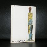
Of course James Brown deserves a blog. It is one of those artists who has become important for us Europeans since he has had exhibitions in the Netherlands ( Livingstone gallery ao) and Belgium in the last few decades in which we could see his paintings . Some of these catalogues are available at www.ftn-books.com. What follows now is the information you can find on Brown on Wikipedia.

Born in Los Angeles, California, he received at BFA from Immaculate Heart College, Hollywood. He then spent years in Paris, and attended the Ecole Superieure des Beaux Arts, Paris, France. He rebelled against the classical training there, which he considered irrelevant, but stayed as he wanted to stay in Paris. Tours of Europe seeing renaissance and especially medieval painting of Italy influenced his work. During the 1980s, his paintings, mixing the modernist tradition of painterly application and adherence to the picture surface with clear influences from tribal art. In the early 1980s he began exhibiting in New York, and in this decade this work became a hit in the galleries and art press, sharing a look with the Bad Painting and young neo-expressionism of the East Village painters of the time. On 12 September 1987 he married Alexandra Condon, who was studying History of Art at NYU at the time. They had known each other for little more than ten years. Despite some time on the East and West coast of New York, he continued to live in Paris. With the fading of the East Village art scene he had increasingly shown in European galleries, where his work was now seen in the context of a post-war European modernism in the tradition of Jean Dubuffet. James and Alexandra had their first child, Degenhart Maria Grey Brown, on 24 September 1989 in New York. In 1991 their second boy, Cosmas And Damian Maria Todosantos Brown, was born on 6 June in Paris. On 16 April 1993, their daughter was born, Dagmar Maria Jane Brown, in New York. In 1995 he moved out to the valley of Oaxaca (Mexico) with his family, where they lived in a hacienda for nine years. During that time, James Brown continued exhibiting in Europe, the United States and Mexico. He and his wife collaborated with various artists, making rugs in a village in the mountains of Oaxaca. The rugs were made in the traditional Mexican fashion, weaved by hand on large wooden frames. Jamaes and Alexandra then decided to start making books with artists, so they started Cape Diem Press. Like the rugs, these books are printed in Oaxaca using old-fashioned and traditional methods. The books are printed in limited editions, and Carpe Diem Press continues to collaborate with artists. In 2004, they moved to the city of Mérida, in the Yucatán. Since then James Brown has been spending much time in Europe, exhibiting his work in France, Germany, Italy and Holland. He has been working mostly in Paris.

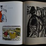
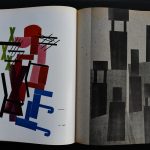
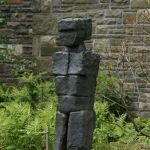
His work has taken on several styles over the years, but maintains a hand-made look combining concerns of the modernist tradition with motifs and spiritual interests from tribal art. Much of his work is a non-realistic but contains depictions or signs of recognizable faces or objects. More recently he has done more in an abstract mode. However, the line between representation and abstraction is often a difficult one in his work, such as his more recent “Firmament Series” – abstract canvases that can also be read as referring to constellations or stars, or groups of rocks. Besides paintings Brown has also produced sculptures and series of prints at various points in his career, and in the 1990s started to heavily utilize collage. Drawing and other unique works on paper have been important to his artistic development and production. In an Artforum review of a 25-year retrospective, Martha Schwendener noted “The works range from abstract gouaches to biomorphic and figurative watercolors to collages that update the synthetic Cubist experiments of Picasso and Braque.

Posted on Leave a comment

Kamagurka / Luc Zeebroek (1956)

Schermafbeelding 2019-06-30 om 11.07.27

Multi talented, performer, painter, cartoon maker and overall absudist genius is Luc Zeebroek better known as Kamagurka. It is one of those artist who’s works many of us have encountered at some time. He publishes his cartoons regularly and his drawings and paintings are presented frequently at galleries and art fairs. He even had his own Stedelijk Museum exhibition in 2002 which catalogue is available at www.ftn-books.com.

To characterize his work is impossible but there is always some humor in the work itself, but his style is something between graffiti and the paintings by Lucebert.

Schermafbeelding 2019-06-30 om 11.16.54

kamagurka


Posted on Leave a comment

Pop Art exhibitions in the Netherlands

A few years ago one of the most recent in a long line of Pop Art and Pop Art related exhibitions was being held at the Gemeentemuseum Den Haag. But since the mid Sixties numerous exhibitions have been held on Pop Art and Pop Art related artists. There were exhibitions at the Stedelijk Museum, Museum Boymans van Beuningen, Groninger Museum, Nijmeegs Museum, Kunsthal and the Gemeentemuseum and every time they were a huge success. My guess is that because the art is recognizable and because Pop Art established itself as a true mouvement in Art History, it has become popular to the masses.

Schermafbeelding 2019-06-24 om 14.10.08

Warhol, Lichtenstein and Wesselman are now household names and their works known by many. Perhaps it has even become to successful since images by these great artists are now part of Commercial activities and publicity campaigns which is a pity since these were not meant for being used this way. www.ftn-books.com has some nice duthc Pop Art publications available.