Posted on Leave a comment

Hap Grieshaber (1909-1981)

Schermafbeelding 2019-04-09 om 14.03.03

Hap Grieshaber is one of the great graphik artist from the 20th Century.

Personally i consider Hap Grieshaber, H.N.Werkman and Josua Reichert to be the top in graphic artists from the 20th century. Reichert is the best, but Grieshaber and Werkman are close in second spot.

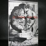
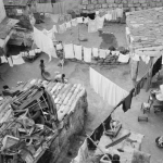
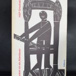
Grieshaber is a typical 50’s /60’s artist. The first time i encountered his works i had a strong asscociation with the Catholic bid prints, inserted and collected in bibles by young people in the early 60’s.

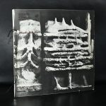
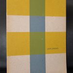
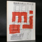
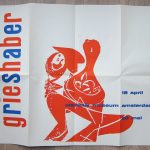
But there is so much more to be discovered in his works than simple figures. The combination of abstract patterns in the background of slhouetted figures are typical Greishaber and make the composition to appear totally abstract. Willem Sandberg was a Grieshaber admirer and together they made one of the most iconic of all Sandberg / Stedelijk Museum catalogues

grieshaber cata a

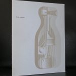
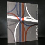
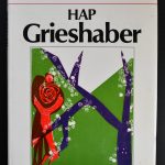
This and other Grieshaber publications are available at www.ftn-books.com

Grieshaber was honoured with numerous prizes and retrospective exhibitions. He exhibited works at the documenta in 1959 and 1964. In honor of his 70th birthday in 1979, large retrospectives were shown in various museums in both parts of Germany. The last prize that Grieshaber was awarded in 1980 was the art prize of the town of Konstanz. Grieshaber died in 1981 in Eningen unter Achalm aged 72 years.

Posted on Leave a comment

Julio Gonzalez (1876-1942)

Schermafbeelding 2019-04-03 om 14.25.18

This blog was long due, because i personally think he is one of the all time greatest sculptors. The first time i noticed his works was some 30 years ago, ehren i first bought the Willem Sandberg designed publication that was publihed on the occasion of the 1955 Stedelijk Museum Amsterdam exhibition. This ia a classic by Willem Sandberg. A beautiful photo of Gonzalez in his studio on the cover  and with the use of the typical 2 kinds of paper within the catalogue. A brown rough paper for the text and the white paper for the photographs. these catalogues by Willem Sandberg are becomong more scarce by the year, so pick these up while you can.

OLYMPUS DIGITAL CAMERA

Back to Gonzalez who’s works can be characterized as a symbiosis between the surreal and abstract forms. These abstract sculptures or masks are fascinating to look at  and with the use of scrap metal you always wonder what parts were used to make the composition. Is it something fabricated?….. or is it the original part which is used? Either way, the result is striking, their sizes not too small and not too large, these sculptures are to be admired by all.

www.ftn-books.com has some nice Julio Gonzalez titles available

Posted on Leave a comment

BNO & GKf and Proost Prikkels 251

ontwerpers gkf

The Beroepsorganistaie Nederlandse ontwerpers and the Beroepsvereniging van Fotografen GKF joint forces in a premium edition by the manufacturer of paper for printing purposes….Proost. Proost was known for its quality papers they delivered for printers in the Netherlands and abroad and every few month they published a Proost Prikkels edition to show in which way their papers could be used. The no. 251 is a very prestigious project since it contains fiches ( cards) on all the designers and  photgraphers that used their papers. There are 80 fiches in this cassette which itseld is a beautifully typically designed 60’s project . On the front of the card , names address and short biography of the designer and the back holds a picture of one of his most iconic designs.

On the cards famous names like Piet Zwart, Wim Crouwel, Willem Sandberg, Jurriaan Schrofer and Otto Treumann ao. This is the history of dutch design in a smalll box and available at www.ftn-books.com

Posted on Leave a comment

Etienne Martin (1913-1995)

Schermafbeelding 2018-12-17 om 17.33.16

Etienne Martin was one of the most colorful sculptors from France from the last 100 years. Ofcourse France has brought us great sculptors like Rodin and Camile Claudel, but in this long tradition, Martin must have a place in history too. His sculptures are a combinbation of abstract art and recognizable human body parts. The result …. a typical Etienne Martin sculpture of which his LE MANTEAU from 1962 is probably his most well known and famous sculpture.

Schermafbeelding 2018-12-17 om 17.38.39

A large work which is intended to be worn by the artist.

What made me realize that Etienne AMrtin is important is the catalogue i recently acquired. The catalogie was published by galerie Breteau and is from 1960. It has a classic kind of cahier stitching and in between the black and white pages foils with Etienne Martin sculpture designs are inserted. A typical and highly collectible Etienne Martin catalogue which is, beside the Sandberg designed Stedelijk Museum catalogue available at www.ftn-books.com

Posted on Leave a comment

de Stijl catalogue ( 1951 ) by Willem Sandberg

Schermafbeelding 2018-09-04 om 15.21.26.png

I have copies of this 1951 catalogue for sale at www.ftn-books.com for a very long time now and whenever i have a copy available it is rapidly sold, but the one i have at this moment is very special ( please inquire). It is the same book/catalogue from 1951 as the other ones i had, but it has some extra’s that none of the copies i had before had. It contains the original folder ( it is possibly designed by Willem Sandberg) in which the separate rooms in the Stedelijk are described and 2 pages of stencilled texts on de Stijl. I have never seen the folder before and it must be one of the extremely rare Stedelijk Museum collectibles. To my knowledge this makes this package the only complete publication package on the very Special de STIJL 1951 exhibition at the Stedelijk Museum Amsterdam.

stijl package a

stijl package b

stijl package c

Posted on Leave a comment

Gisela Andersch (1913-1987)

Schermafbeelding 2018-05-14 om 12.32.22

Another rather obscure artist for us in the Netherlands was Gisela Andersch. An artsits presented by Willem Sandberg with a special exhibition in the Stedelijk Museum in 1961.

The catalogue for the exhibition was in one word….”SPECTACULAR”. It was not a catalogue but more a piece of art. The art being the cover and within  the stapled pages with the exhibition works. Cover was silkscreened upon the typical raw carton like paper Willem Sandberg was so fond of. Many people did not recognize the quality of this catalogue. But now that more and more collectors all over the world of Typography and catalogue design are appreciating the Stedelijk Museum catalogues, its importance is growing. This one is not collected for the artist, but for the combination of Sandberg excellent design together with the Andersch original art.

www.ftn-boooks.com has this Gisela Andersch catalogue available together with the van Abbemuseum one.

Posted on Leave a comment

Carel Blazer (1911-1980)

Schermafbeelding 2018-09-07 om 14.44.51

A great dutch photographer who is known for his Fifties and Sixties photography , but also for his active part in the resistance during WWII.

Some interesting periods during the life of Blazer made him a true international photographer.

After been educated at the Kunstgewerbeschule in Zurich, he soon after travelled Spain to photograph the Civil war. After that period he travelled Italy and visited Rome to photograph this city which photographs were published in a book by Contact. Later there were travels to Asia and Sicily. On both occasions series of photographs were taken and published.

Willem Sandberg took an interest in these photographs and presented a selection at an exhibition at the Stedelijk Museum which catalogue is available at www.ftnbooks.com

There are many titles which have these breathtaking Blazer photographs in them, so beside the ones that i have in my shop please locate 50’s and 60’s books at bookmarkets and look into the colofon to discover if photographs by Blazer are included.

 
Posted on Leave a comment

Henri Laurens (1885-1954)

Schermafbeelding 2018-08-27 om 13.42.52

A long time i thought Laurens was not that important for Modern Art, but since i have seen his exhibition at the Museum Beelden aan Zee  ( catalogue available at www.ftn-books.com), I changed my ideas about his work. At first i thought him to be heavily inspired by Picasso, but in this show i discovered he really has a personal approach to art and a “signature” of his own.

left Picasso and right Laurens

He was a French sculptor best known for his Cubist collages, sculptures of nudes, and busts. The curving forms and simplified features of his oeuvre are reminiscent of ancient greek sculptures, though he also drew influence from his friendships with contemporary artists Georges Braque, Amedeo Modigiliani, Juan Gris, and Pablo Picasso. Born on February 18, 1885 in Paris, France, Laurens first worked as a stonemason before taking drawings classes and developing a strong interest in the works of Auguste Rodin. From 1914–1915 and extending until after the First World War, Laurens experimented with still lives and various new media, using wood and iron and eventually graduating to terracotta and bronze. He then went on to participate in the Venice Biennales of 1948 and 1950, and had a retrospective at the Musée National d’Art Moderne in Paris in 1951.

Posted on Leave a comment

Ben Shahn (1898-1969)

Schermafbeelding 2018-08-20 om 13.37.50

Ben Shahn  is one of the older Modern Painters emerging in the 40’s and 50’s from the American art scene. Jewish background and born in Russia. After his marriage to mrs Goldstein he travelled North Africa and the great museums in Europe and this shows, because from that date the influence of Klee and Picasso can be recognized in his works. Later he developed a style of his own in which color was an important aspect in his paintings.

Shahn mixed different genres of art. His body of art is distinctive for its lack of traditional landscapes, still lifes, and portraits. Shahn used both expressive and precise visual languages, which he united through the consistency of his authoritative line. His background in lithography contributed to his devotion to detail Shahn is also noted for his use of unique symbolism, which is often compared to the imagery in Paul Klee’s drawings. While Shahn’s “love for exactitude” is apparent in his graphics, so too is his creativity. In fact, many of his paintings are inventive adaptations of his photography and that is an aspect i did not know before. The Ben Shahn catalogue designed by Willem Sandberg for the Stedelijk Museum and available at www.ftn-books.com shows exactly why i think Shahn is one of the more important painters from last century.

OLYMPUS DIGITAL CAMERA

Posted on Leave a comment

Ivan Puni / Jean Pougny (1892-1956)

Schermafbeelding 2018-08-09 om 13.54.27

I had never known this before, but now that i searched for Ivan Puni i found out that Jean Pougny and Puni are one and the same person. I knew that he stayed for most of his life in France and was succesful in France  and that must have been the reason that Puni became Pougny. the catalogue i have in my inventory is one of the best ones Willem Sandberg designed in the Fifties . It is a typical Sandberg designed catalogue and one of the first with tipped in color plates.

Puni received his formal training in Paris in 1910-11 at the Académie Julien and other schools, where he painted in a derivative fauvistestyle. Upon his return to Russia in 1912, he met, and exhibited with, members of the St Petersburg avant-garde, including Kazimir Malevich and Vladimir Tatlin. He made a second trip to Paris in 1914, returning to St. Petersburg in 1915. At this point, he began painting in a Cubist style reminiscent of Juan Gris. In 1915, Puni, (Aleksandra Ekster, Liubov Popova, Ivan Kliun, Ksenia Boguslavskaya, Olga Rozanova, Nadezhda Udaltsova, Nina Genke and others) formed Supremus, a group of artists dedicated to the promulgation of Suprematism, the abstract art movement founded by Malevich. Malevich and Puni co-authored the Suprematist Manifesto, published in 1916, which proclaimed a new, abstract art for a new historical era. Puni also organized the exhibitions Tramway 5 and 0.10, both held in St Petersburg in 1915, in which Malevich, Tatlin, Popova and others participated, and to which Puni contributed constructions and paintings. In 1915-1916 Puni, together with other Suprematist artists, worked at Verbovka Village Folk Centre. In 1919, he taught at the Vitebsk Art School under Marc Chagall.

Puni and his wife, Kseniya Boguslavskaya, emigrated from Russia in 1919, first to Finland, then in 1920 to Berlin, where the first exhibition consisting entirely of his work was held at the Galerie der Sturm. While in Berlin, Puni also designed costumes and sets for theatrical productions. Puni and Boguslavskaya relocated to Paris in 1924, where his style changed once again to a variant of Impressionism. In France, he signed his work Jean Pougny in an effort to distance his new art practice from his previous one in Russia. In 1946, Puni/Pougny became a French citizen. He died in Paris in 1956.

www.ftn-books.com has Puni/Pougny titles available.