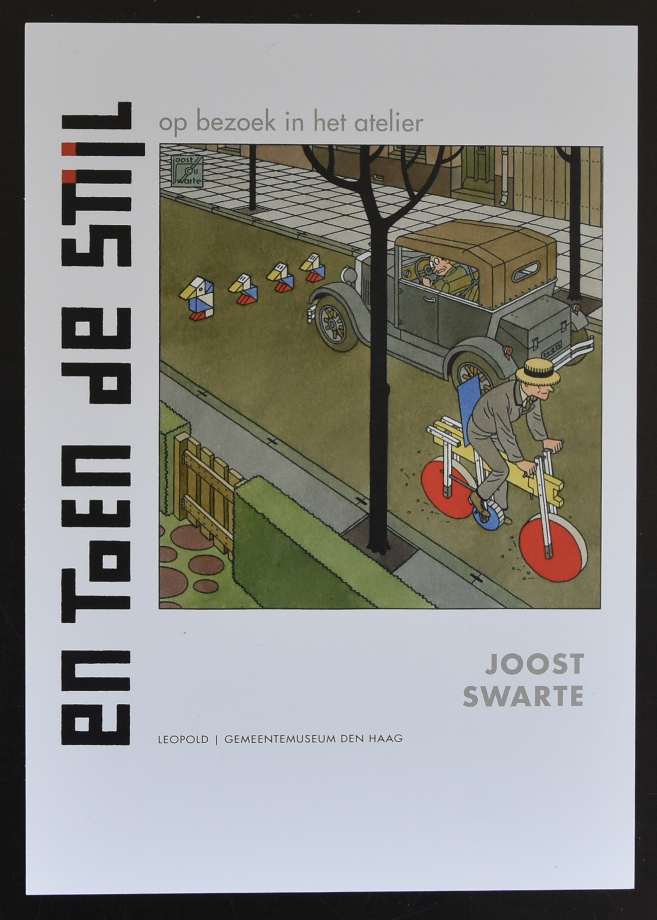
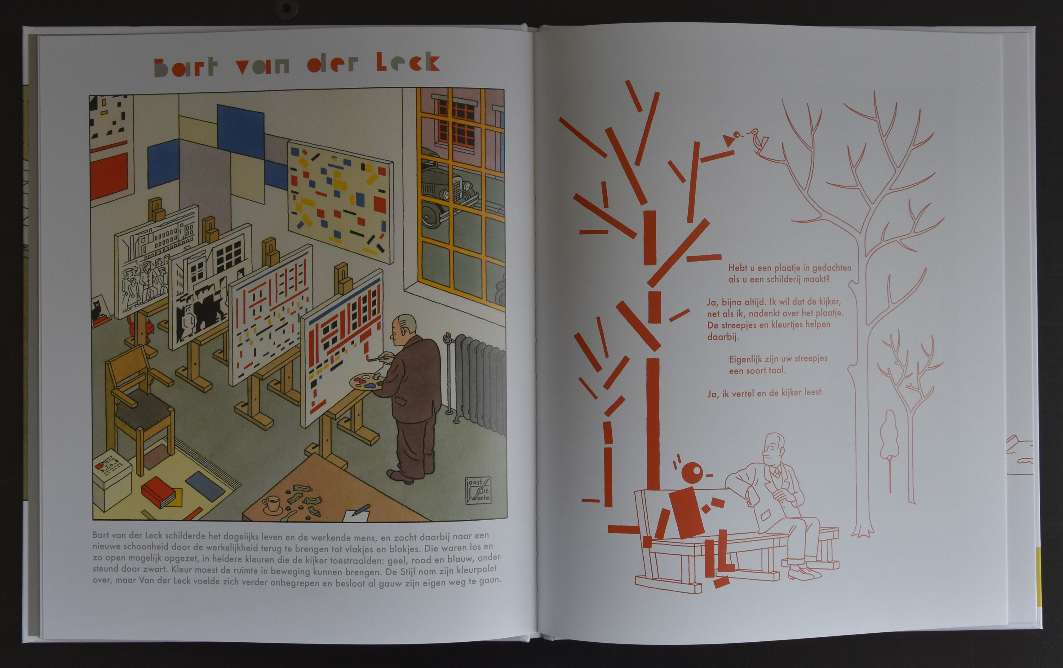
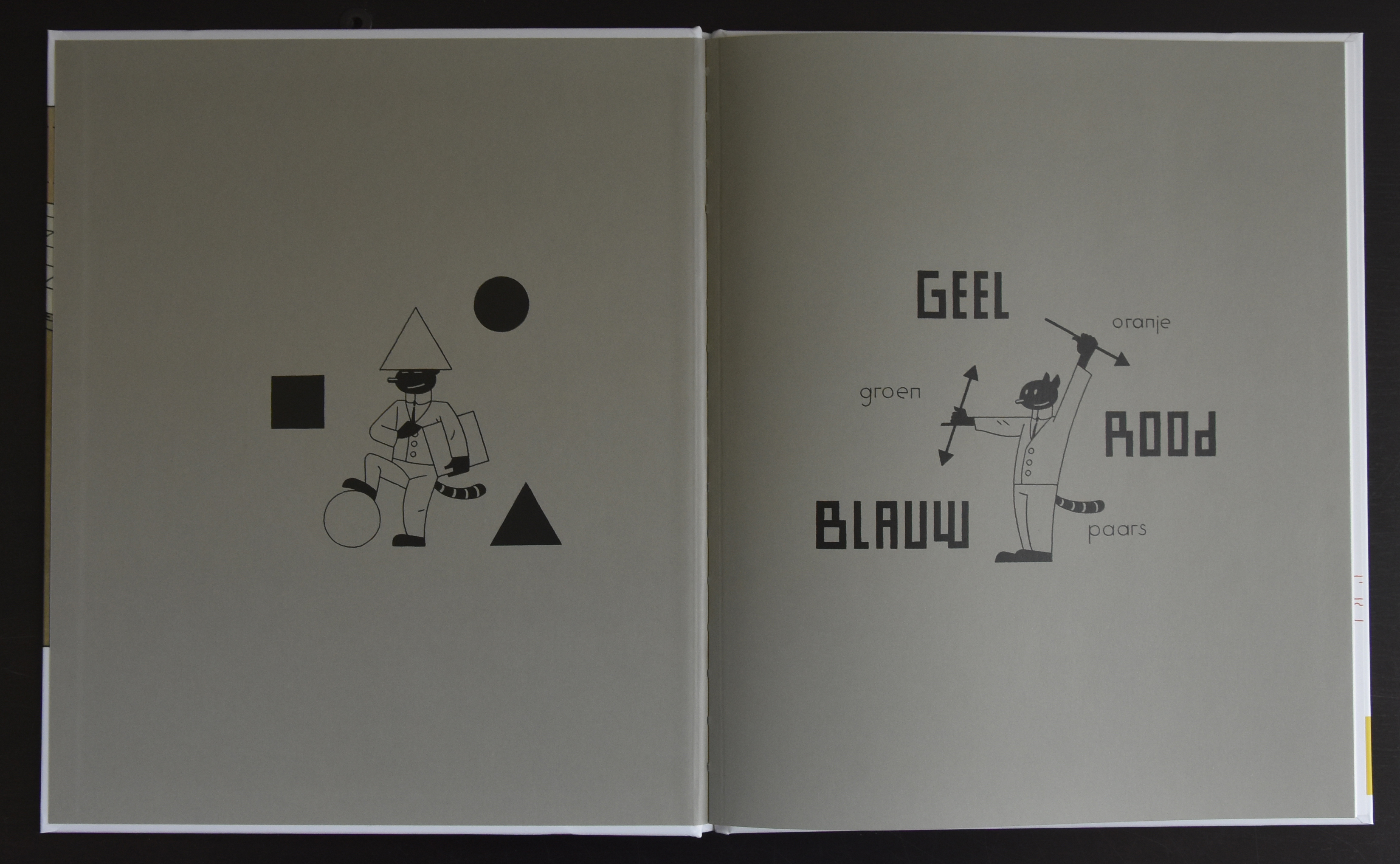
“En toen de stijl” is the new publication by Joost Swarte . Book is published in cooperation between the publisher LEOPOLD and the Gemeentemuseum Den Haag. Personally i think this is the best publication by Swarte from the last 10 years. It brings the story of de STIJL mouvement in illustrations of the famous members of the DE STIJL group. Illustrations on Mondrian, van Doesburg, Huszar, Zwart, Oud, Torres Garcia, Verzuu, Bauhaus, van der Leck and Rietveld tell the story on de STIJL. Perfect publication and published with isbn.9789025872380
and the invitation to the launch of the book is available at www.ftn-books.comand when you look closely at the illustration on Ko Verzuu, you see the manufacture of the ADO/ BESTELDIENST which is also available at www.ftn-books.com
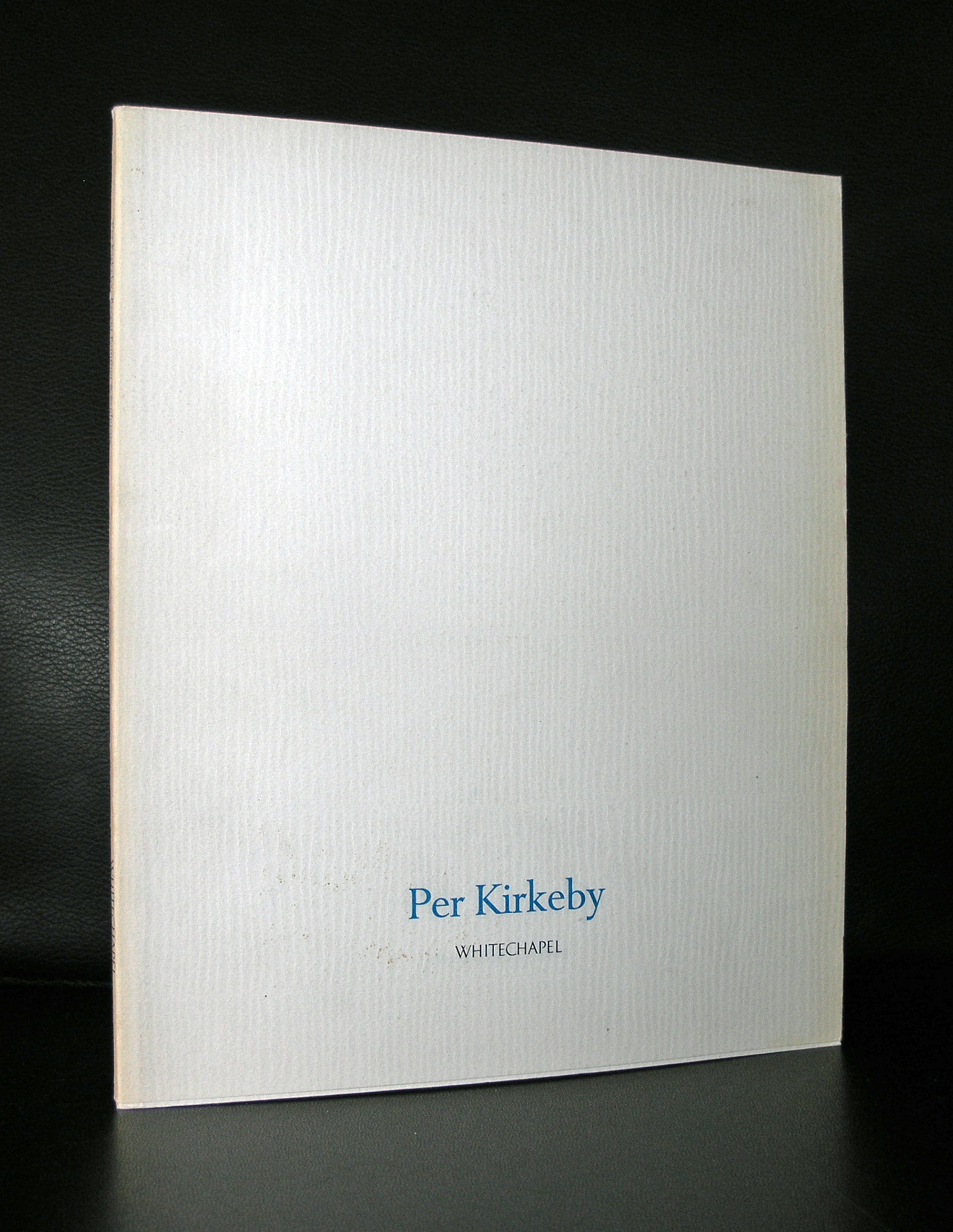
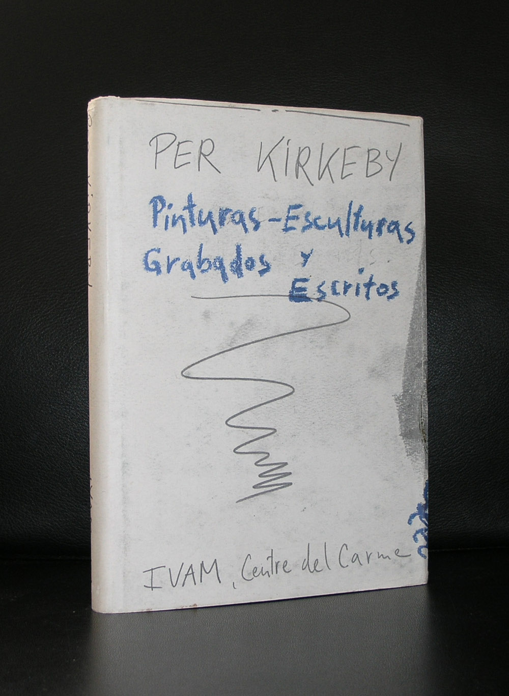
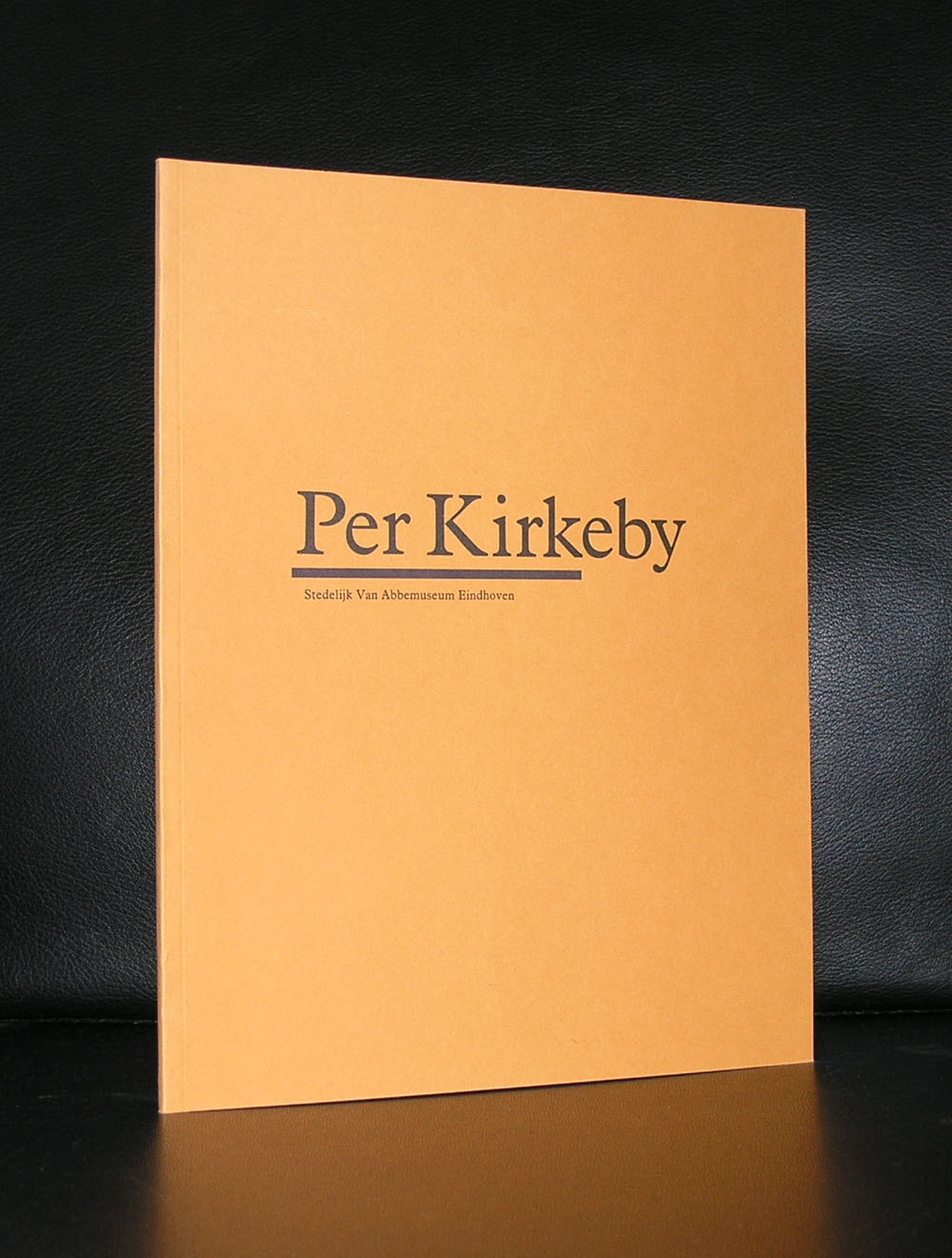
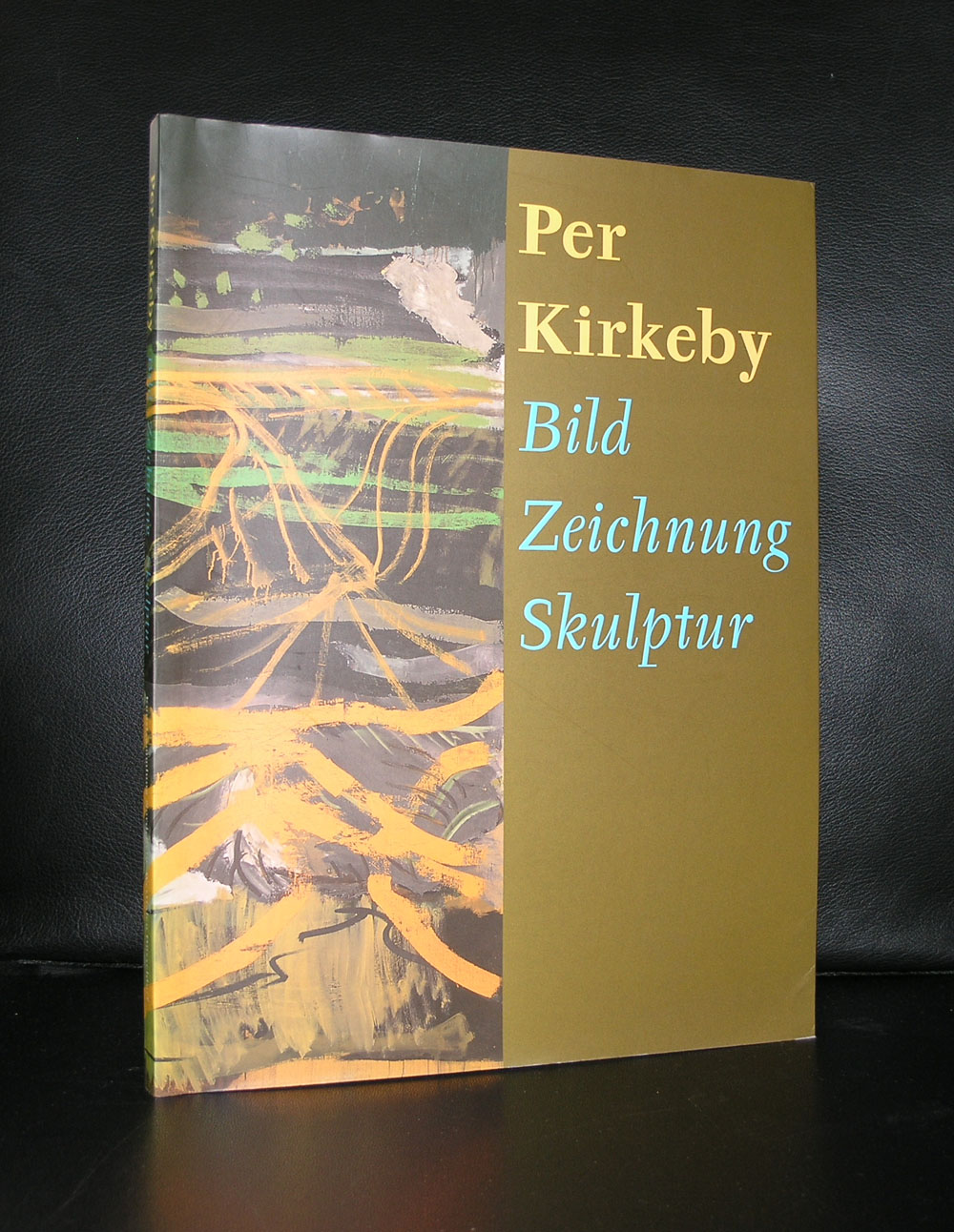
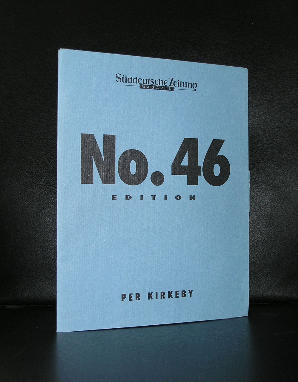
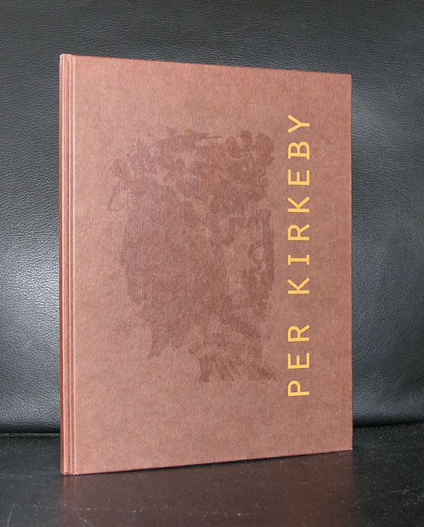
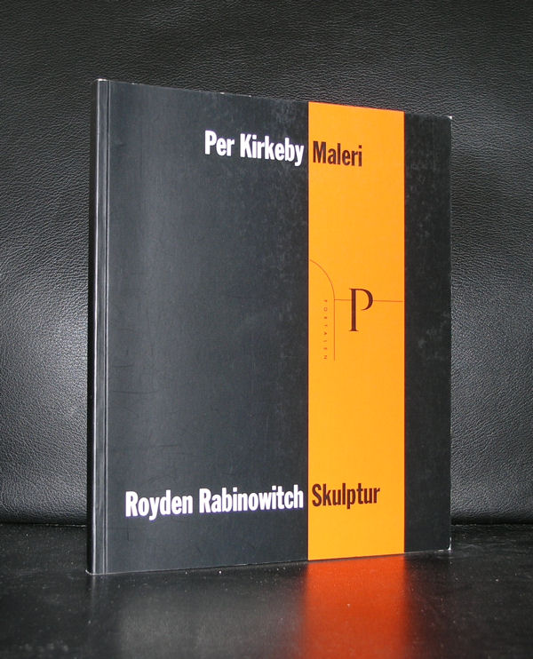
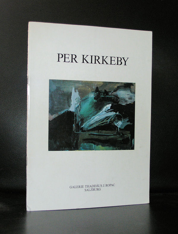
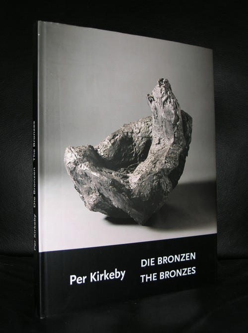
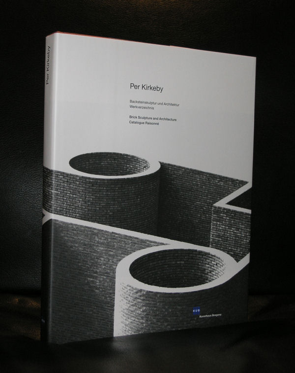
Ever since Rudi Fuchs for the first time presented his friend and artist Per Kirkeby in the Gemeentemuseum , i have been an admirer. First and foremost an admirer of his paintings. But when in the early nineties a brick sculpture was realized in the inner garden of the Gemeentemuseum i became an instant fan of his sculptures too. His brick sculptures are typical Kirkeby and the use of bricks make these sculptures stand out from the others of his time. There is another sculpture specially made for the Caldic collection which i admire too.
The trick is …it looks closed…but it is open…A must see when you visit Wassenaar. To prepare your visit look at the books on Kirkeby at www.ftn-books.com
The German sculptor Thomas Schütte is constructing a museum to house his artwork in the town of Hombroich, located about 16 km (10 miles) southeast of Düsseldorf.
The new structure—which will offer 700 square meters (1,300 sq. ft.) of floor space when completed—was designed by Schütte, and is being built close to the grounds of the Museumsinsel Hombroich, a multi-building complex that also houses the collection of the German collector Karl-Heinrich Müller……
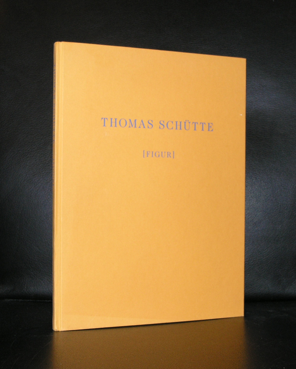
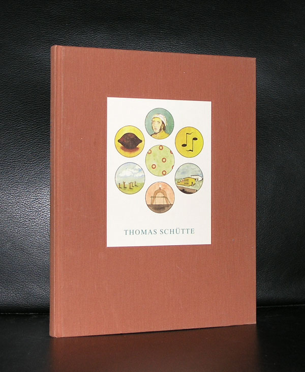
I just encountered this old news on the internet and was reminded about the sculptures i had seen by Schuette, when Rudi Fuchs was director of the Gemeentemuseum. Since i have seen his works on multiple occasions and whenever there was a catalogue published on the exhibitions i was full of admiration, because his catalogues are among the best published in the last 3 decades. There are several available at www.ftn-books.com. So in the near future when you visit the Dusseldorf area you can include Hombroich together with Bottrop to visit 2 exquisite museums.
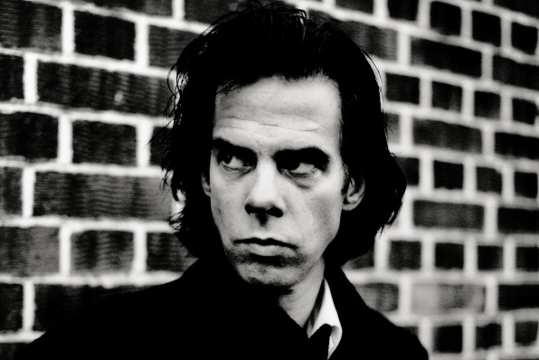
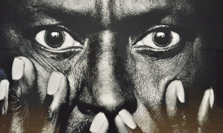
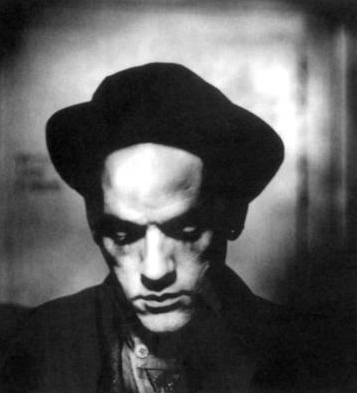
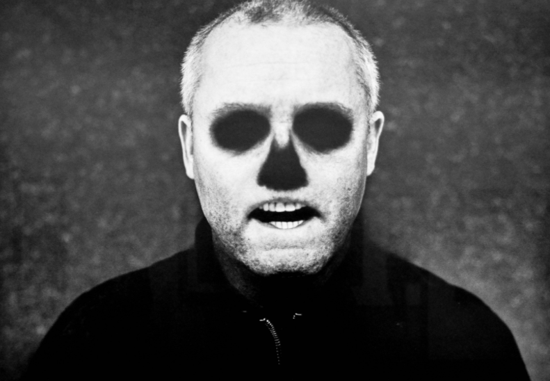
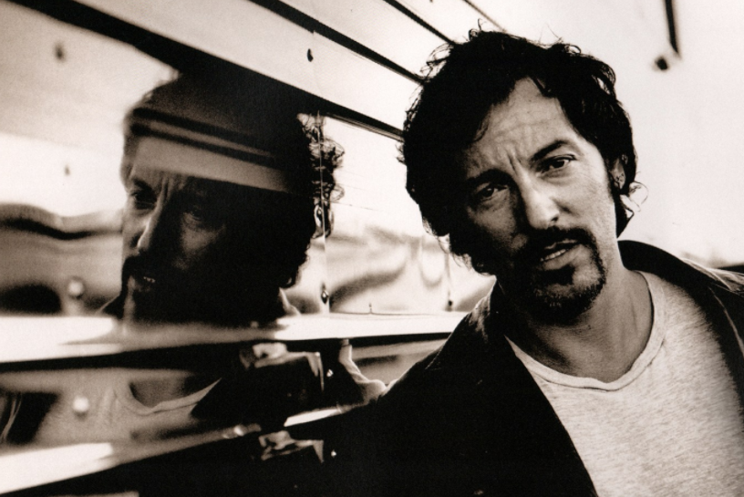
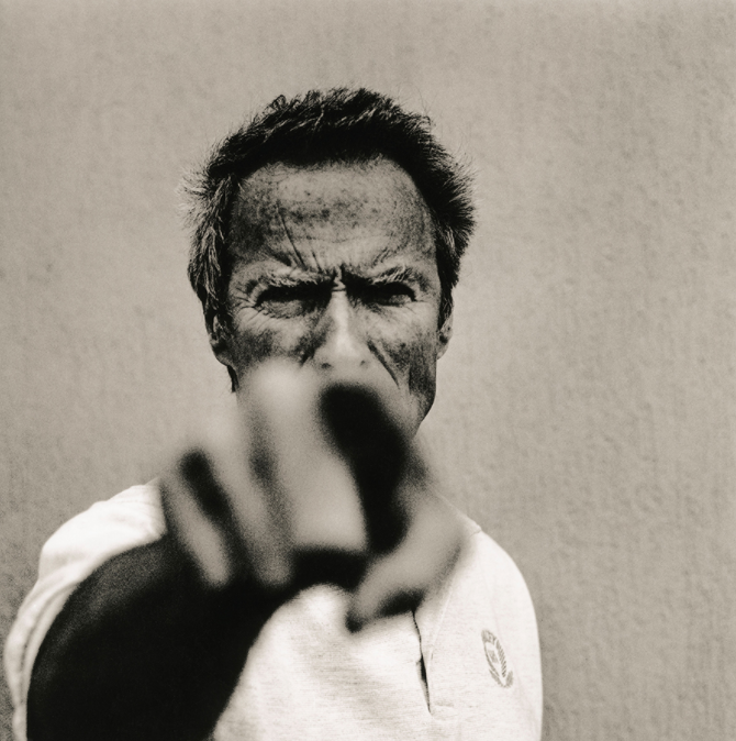
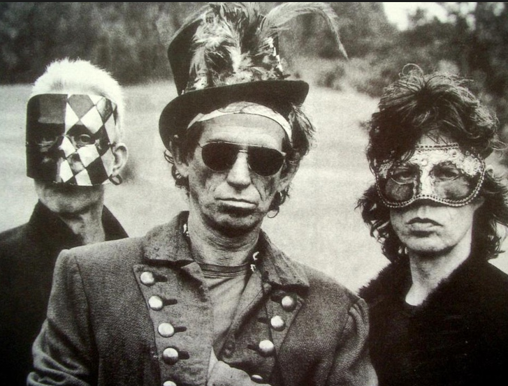
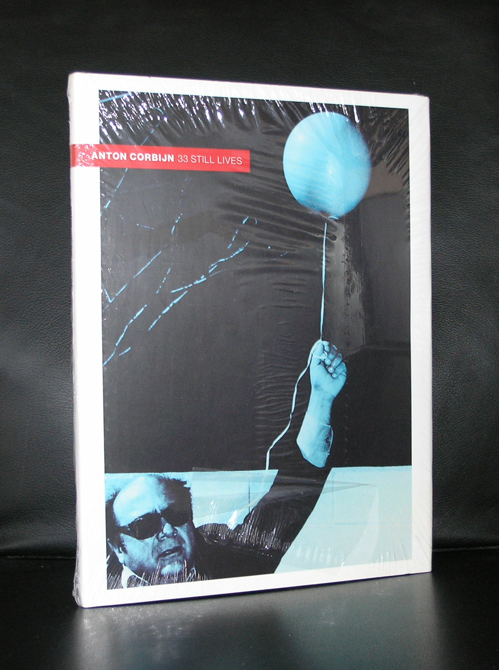
Rightfully world famous now. An excellent photographer and film maker. I am less enthusiastic about his abilities as a designer, but stil his photographs deserve some extra attention by this blog on art. Because these are not only great photographs, but they also reflect music and their performers through the last 4 decades. Bowie, Jagger, Cobain, Davis and of course U2, name them all and all of them have been before the lens of Anton Corbijn.
( all photographs by Anton Corbijn )
Black and white being his favorite way to portray these great artists. As of late he made some movies during the last decade ( the American and A Most wanted man) However, he made his feature film debut with Control, a film about the life of Joy Division frontman Ian Curtis. It premiered to rave reviews at the Cannes Film Festival on 17 May 2007. Curtis was a personal friend and it shows in the respectful way he portrayed the singer of Joy Divisison. Because his acquired celebrity status as a photographer, Corbijn has had retrospective exhibitions all over the world and 2 years ago there was a large retrospective on Corbijn in the Gemeentemuseum Den Haag. Since a few years Corbijn took up the art of design. Personally i do not think he is a strong designer, but this is my personal opinion on his designs. There is a new logo by the Municipality of DEN HAAG which was designed by Corbijn and judge for your self.
Better focus on his photographs….they are very personal, intriguing portraits and they are great!
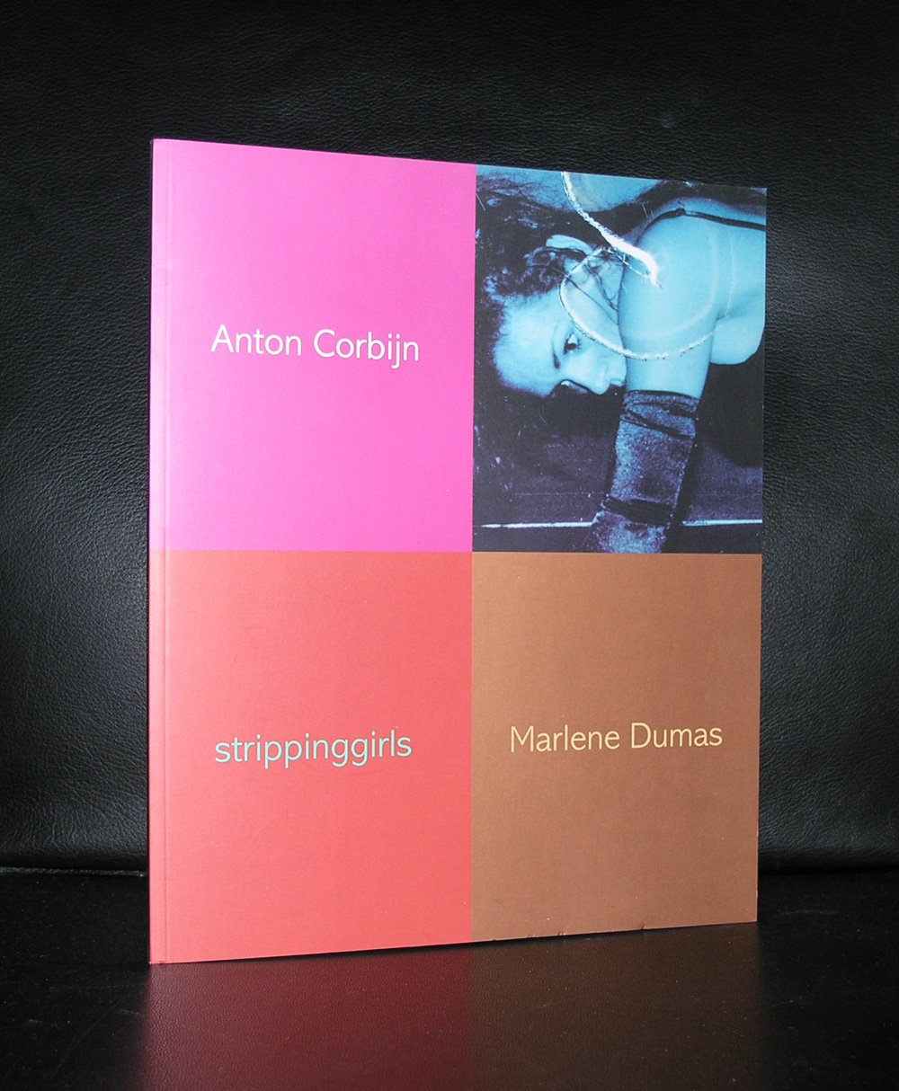
for some Corbijn titles visit www.ftn-books.com ( stripping girls is made together with Marlene Dumas)
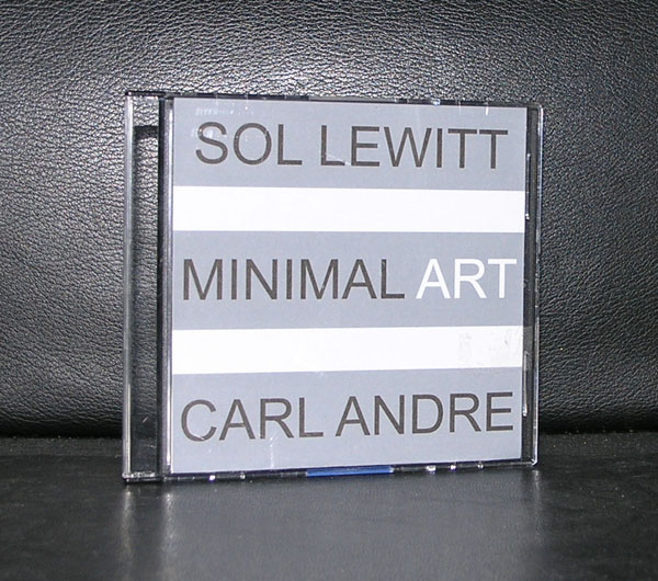
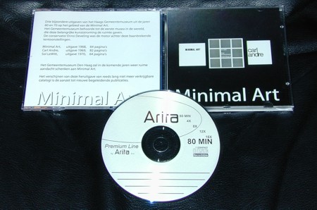
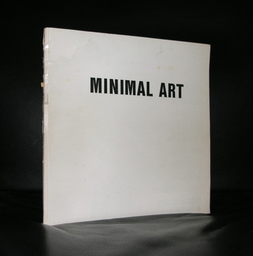
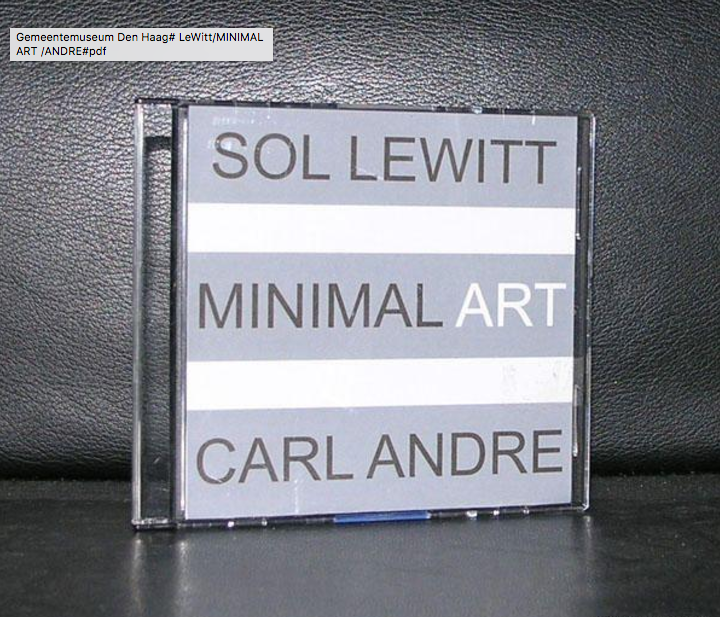
I chose these 3 artists to tell you something on Minimal Art in the Netherlands. These 3 artists were the first to be invited to have an exhibition on Minimal Art in 1968,. The exhibition was curated by Enno Develing and the catalogue published with this exhibition has become one of the rarest of dutch museum catalogues from the last half century. I am fortunate to still have it available in PDF, because this one was so rare i decided, at the time i was working as a bookseller/publsher for the Haags Gemeentemuseum to buy one to turn it into PDF files and so making it available for collectors and visitors. Thanks to Ap Gewald, who had the original copy and lent it to me for this purpose, this project became possible. A good decision, because it has become a very hard to find catalogue and because of its importance it is still available for students and collectors alike in PDF.
OLYMPUS DIGITAL CAMERA
OLYMPUS DIGITAL CAMERA
For all customers ordering in the next week, i make this catalogue available on request and sent it by Wetransfer. But because of this long time relation of these 3 artists, all three of them have made special editions with the museum shop. Sol LeWitt made painted tiles, Carl Andre small copper plates in editions of 1/1 and Donald Judd, made brightly colored furniture for the bookshop in the early nineties. Of course these products are all completely sold out, but what is still available, but is increasingly becoming more scarce every day, is the Museum publications and artist books by these artists. Specially Sol LeWitt works are harder to find each
month, but i am proud to have one of the 1972 editions by Sol LeWitt in my inventory. It is the Macerata edition of 8 original /signed silkscreens by Sol LeWiit in its original white plastic container.
And because we have to celebrate a milestone on Facebook there is of course a discount code (valid for only 2 days) , which gives a 10% discount : FBminimal10
Please take a look at the many beautiful Minimal Art books that are available at:
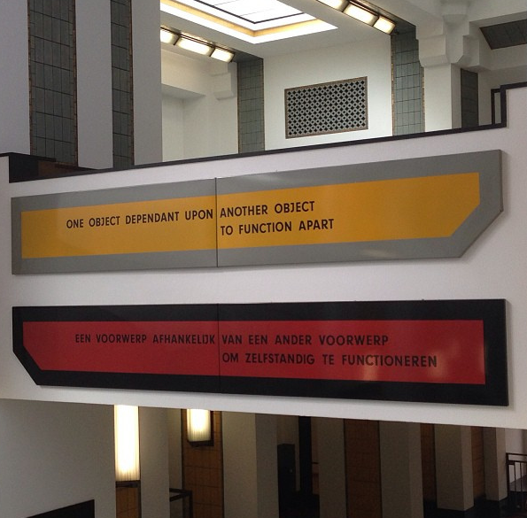
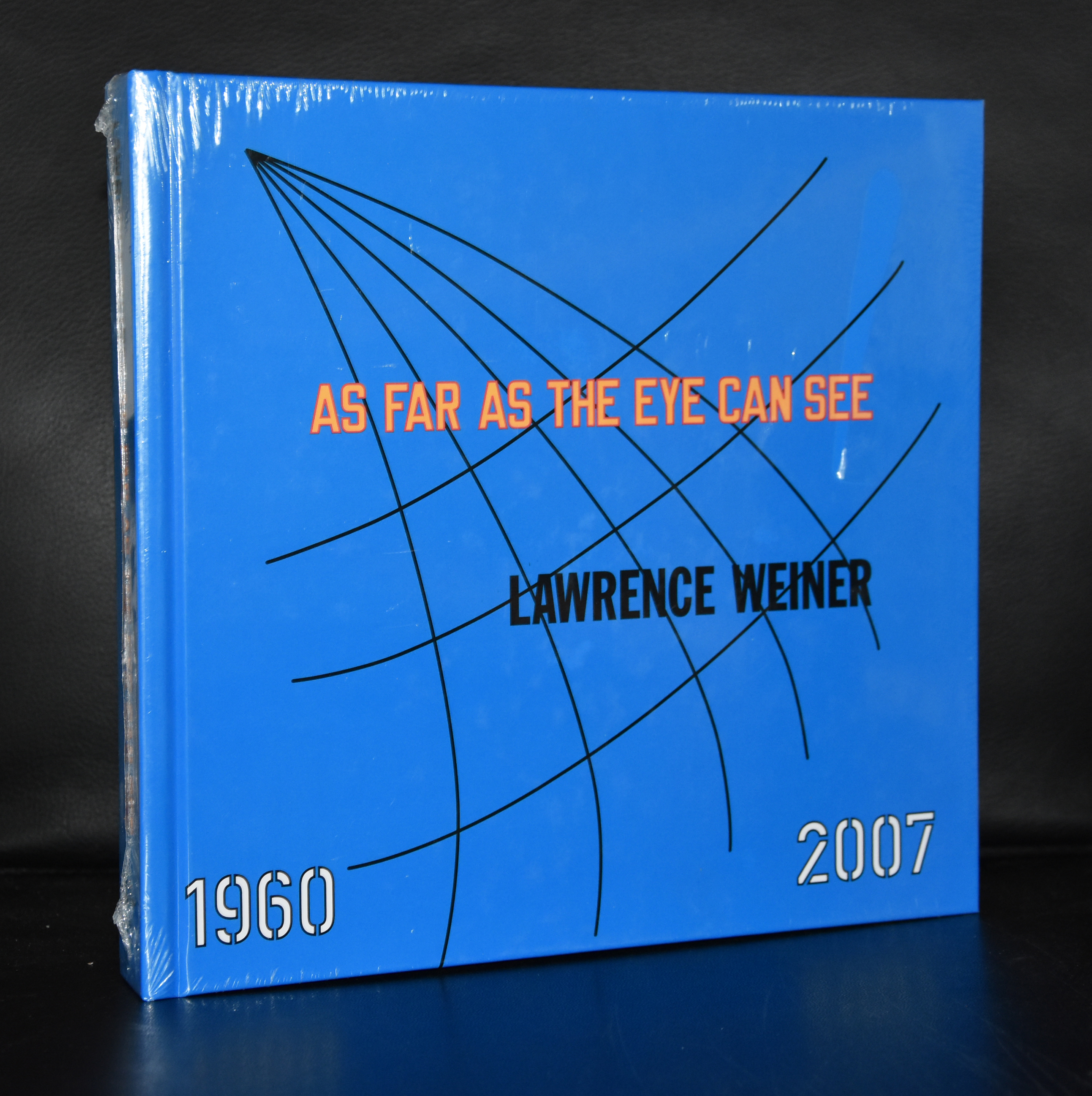
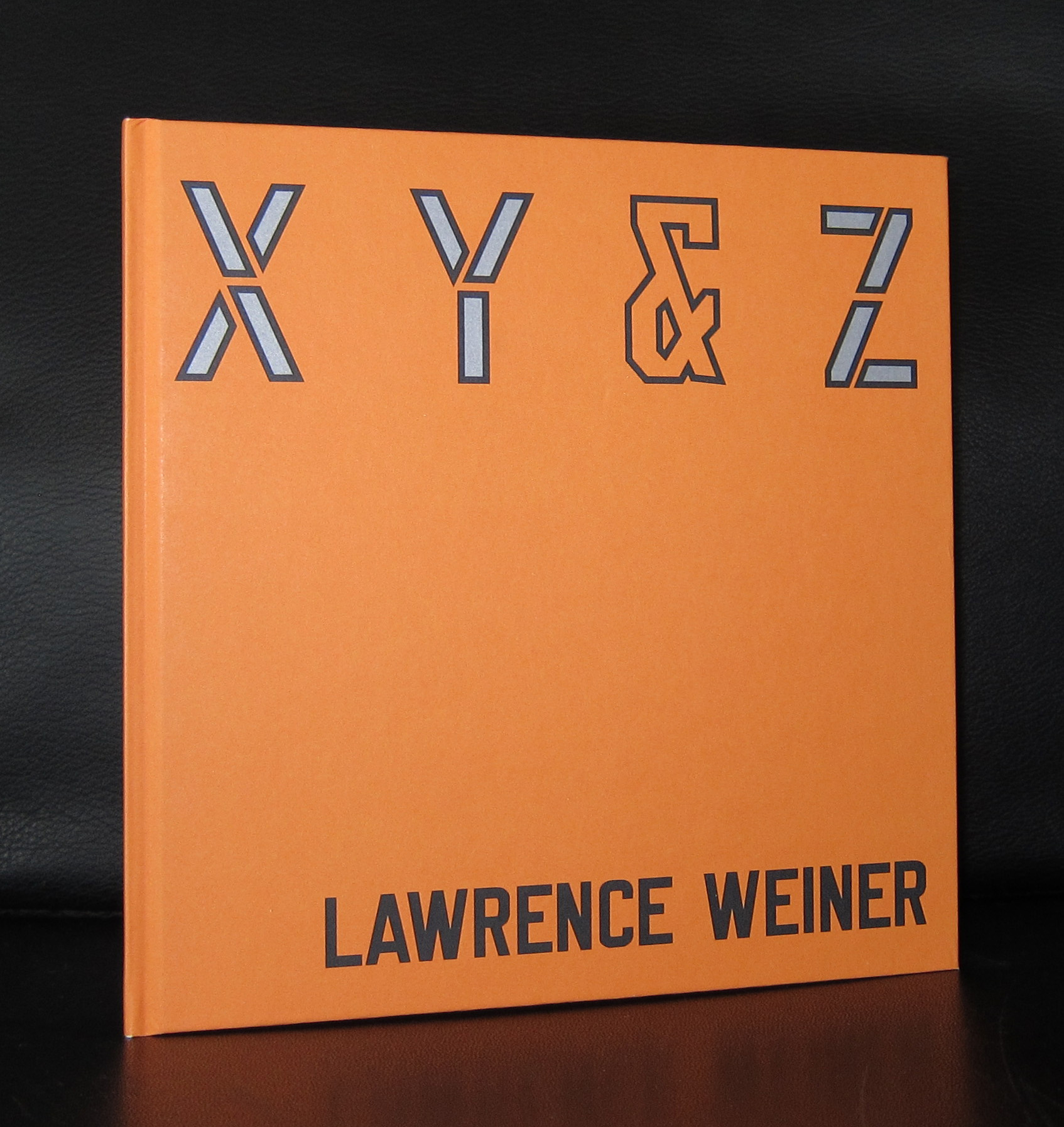
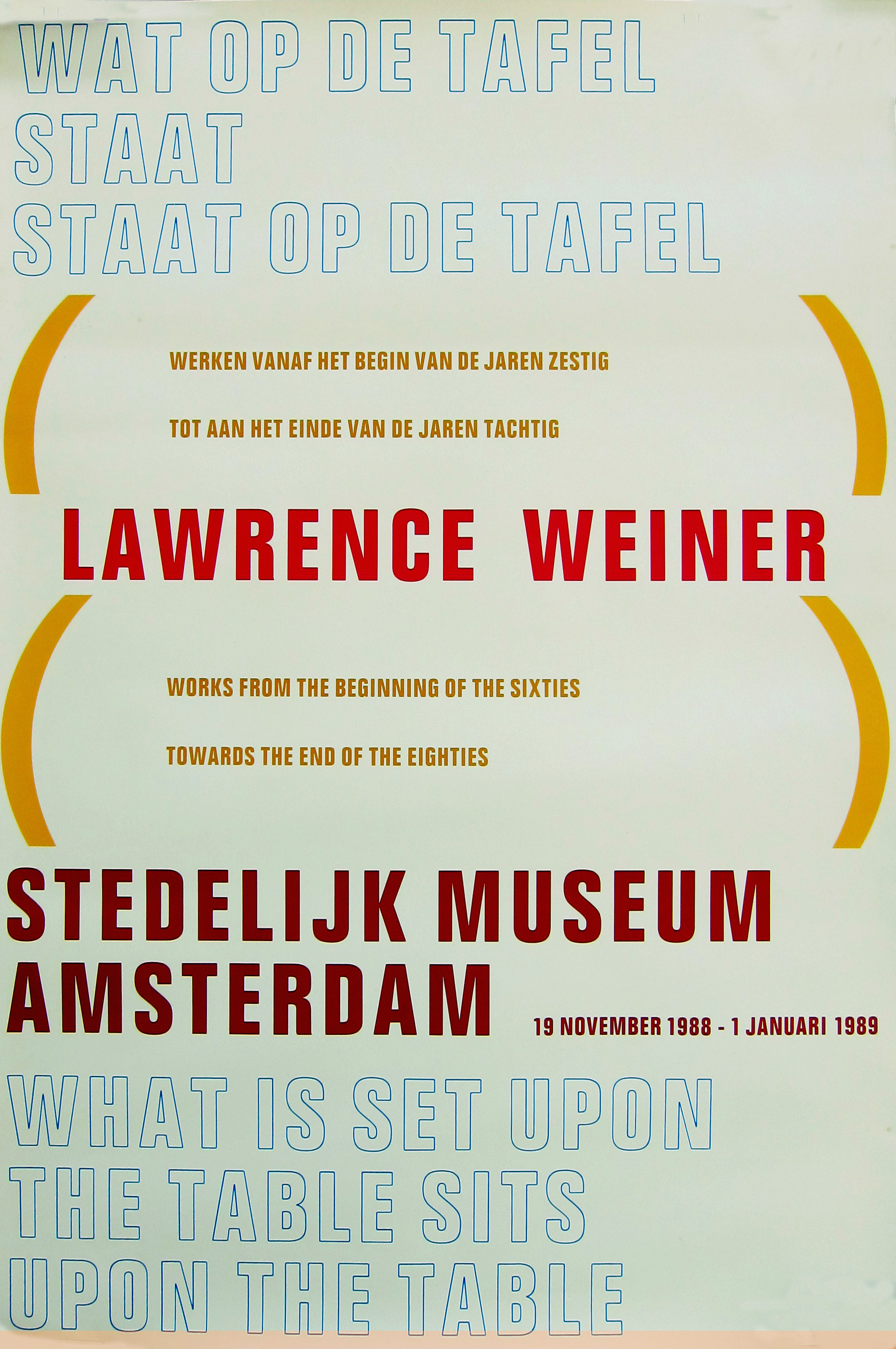
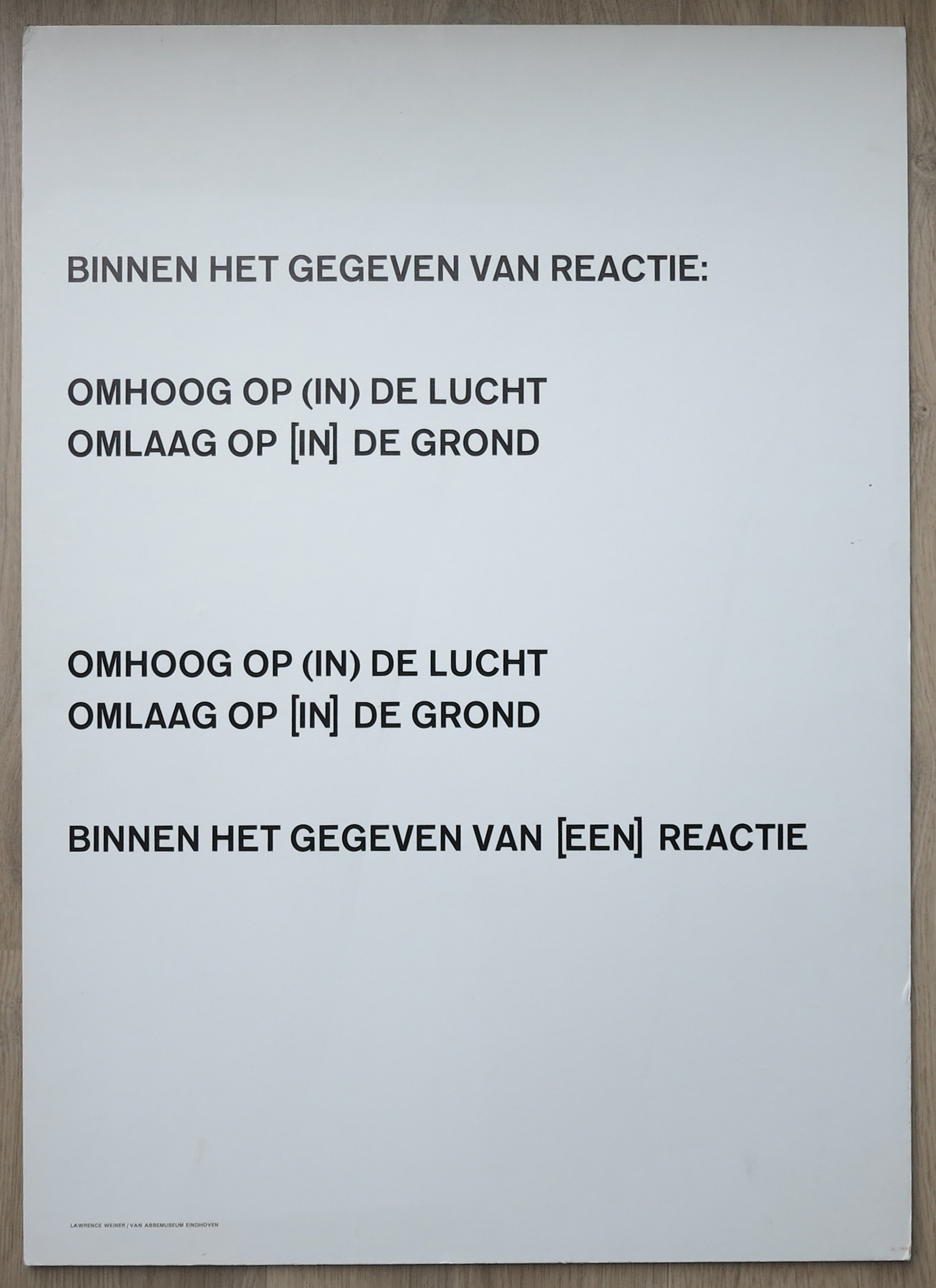
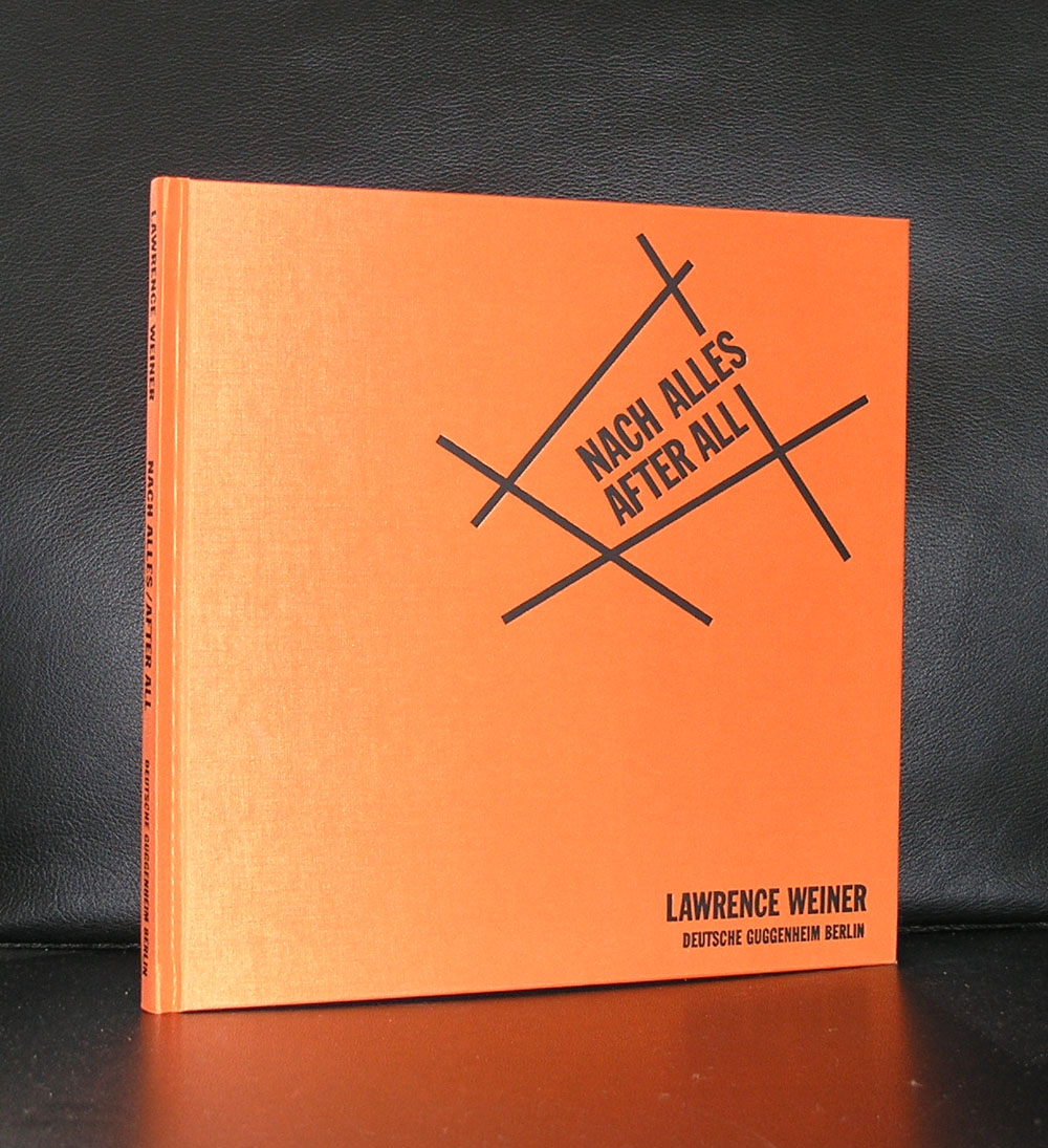
Lawrence Weiner is one the the leading artists within Conceptual Art .
The first time i daily encountered a work by Lawrence Weiner was when curator Flip Bool of the Gemeentemuseum had bought a magnificent large one for the entrance hall. I noticed the forms and strong meaning of the sentences used and learned to appreciate it.
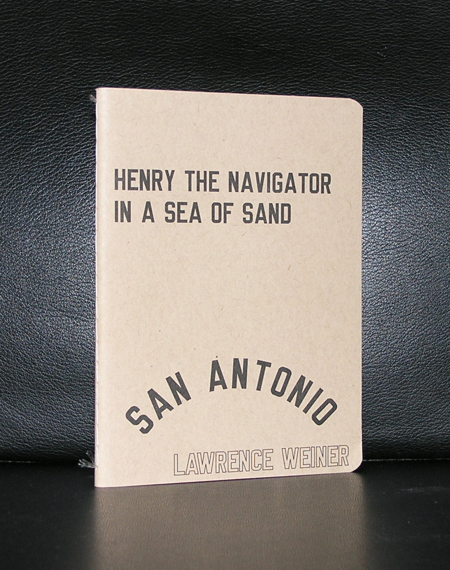
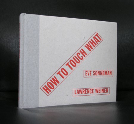
Since, i have been collecting books on Weiner in every possible way . Other museum publications, abroad art locations, galleries and auctions all had some in them, so over the years a small collection was formed and some are available at www.ftn-books.com
Later i realized that so many publications were published in the Netherlands, because he frequently stayed over here and made contributions to many other museums in the Netherlands. Notably tothe van Abbemuseum and the Stedelijk Museum have. Both have several works by Weiner in their collections.
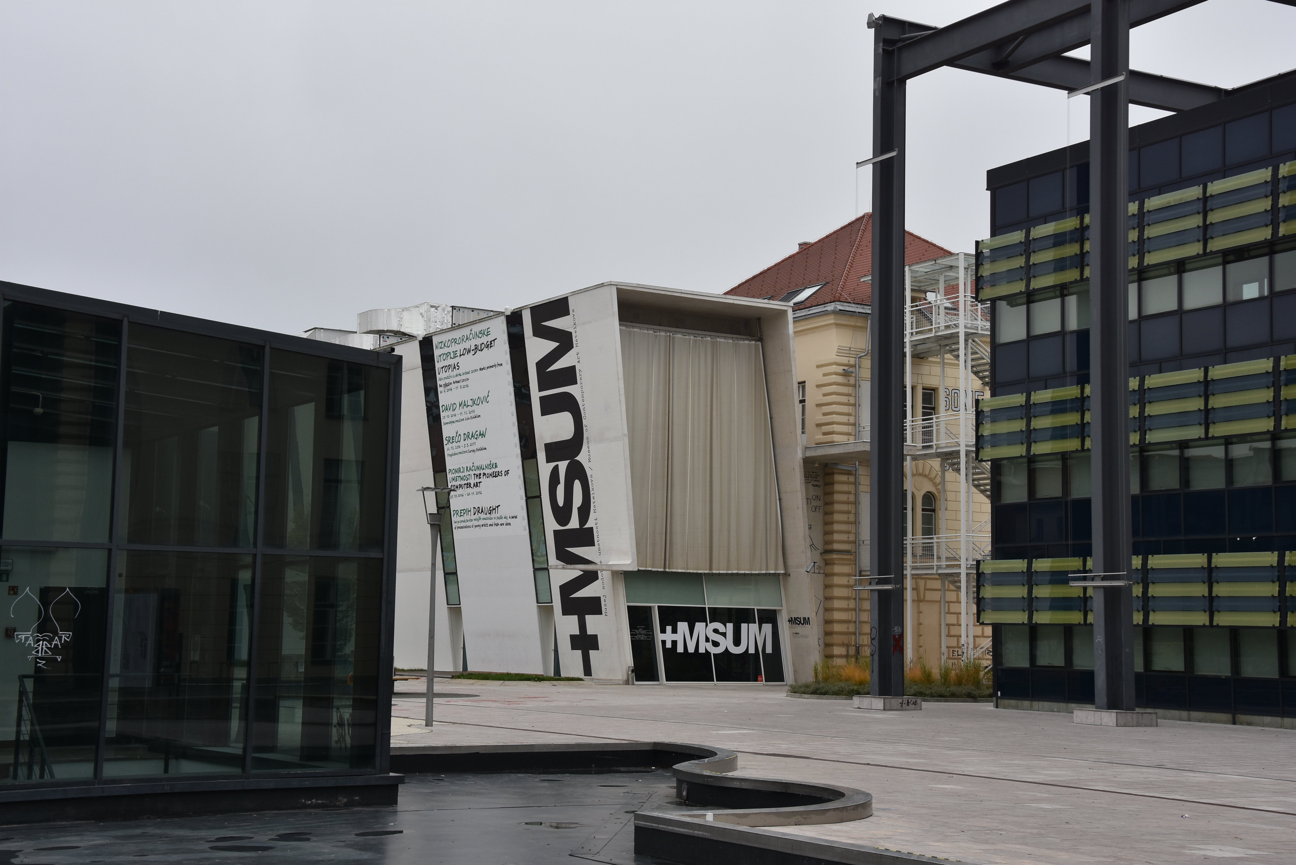
The last time i encountered a work by Weiner (unexpectedly) was in Ljubljana, where at the facade of the Modern Art Museum a large Weiner was fixed. It gave me the same feeling as the one in the Gemeentemuseum. It changes the way you look at something and makes you think about its text…..it is great art.
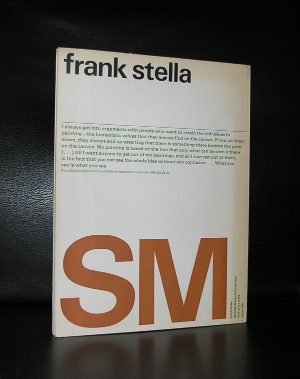
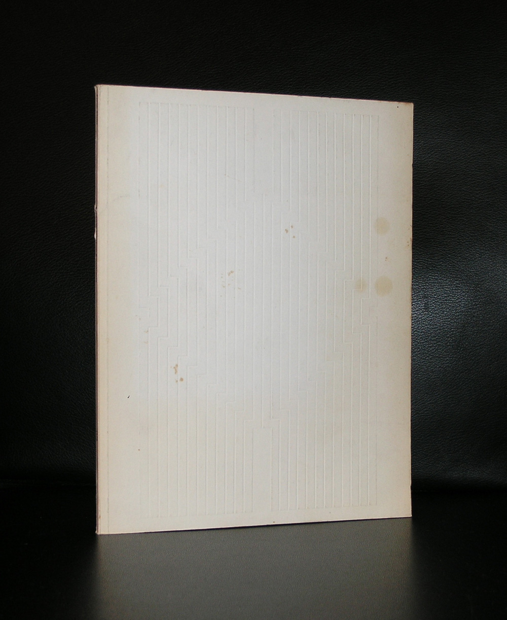
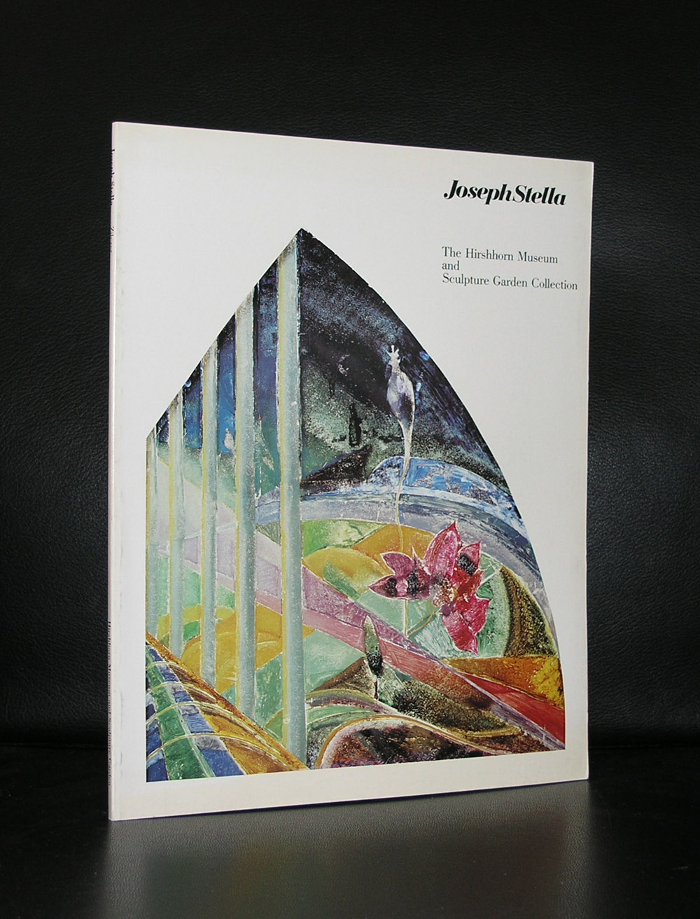
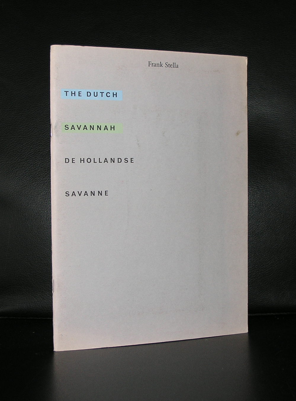
Two reasons to devote a blog to Frank Stella. First there is an acquisition by the Gemeentemuseum Den Haag which i do not understand. For me it is a “stand alone” work of art with no relation with other works within the collection and at the time i saw it , i recognized it as a Stella, but was not very impressed by it. I would have thought the Stedelijk Museum Amsterdam would have bought a work by Stella, because it fits in….but at the Gemeentemuseum it looks to be “a stranger at our midst”. Still Frank Stella is a great print maker and one of the reasons for this blog is to point out a very fine publication the Stedelijk Museum has published in 1970. The design was done by Wim Crouwel, but the best is there is a highly original “blind print” used as cover for this great catalogue.
It is one of the most spectacular catalogues from the 70’s with its embossed cover. A special artist cover which relates to one of the first “shaped canvases” use of multiple papers and ink colors. Typical Crouwel design. Book measures 10.8 x 8.2 inches, contains 78 pages plus cover. text in dutch and english.
Frank Stella is an important artist, has made some great works of art, but especially his minimal early works are for me among his best, including this great 1970 catalogue.
The Wim Crouwel / Stella catalogue from 1970 and other Frank Stella publications are available at www.ftn-books.com
I first discovered Raquel Maulwurf, after she had her solo exhibition at the Stedelijk Museum Schiedam and the Livingstone gallery in Den Haag. Large and small canvasses with charcoal drawings depicting scenes from war and destruction. ( one the book titles of her is DRAWN TO DESTRUCTION).Inspired by war (action) photographs she transforms these black and white pictures into large paintings and drawings and because of their size and intensity ( these are all executed in black and white) they impress you immediately. Now the Gemeentemuseum has made a project with her ….titled :
RAQUEL MAULWURF – THE CARBON WAR ROOM
PROJECTS GALLERY GEMEENTEMUSEUM DEN HAAG
Raquel Maulwurf (Madrid, 1975) developed the installation ‘The Carbon War Room’ especially for the Gemeentemuseum. It arose from the desire to physically create the depth that is evoked in her charcoal drawings in three-dimensions. By working with a very large format and creating wall drawings that cover several walls, she previously captured the feeling of ‘walking into a drawing’. This third dimension was also added literally from the moment she began scratching the museum board she uses for her drawings with a box cutter. The installation in the museum’s Projects Gallery enables Maulwurf to take the final step.
Impressive project and a must see for her admirers and for all interested in great modern art. What i do not understand is that almost the same scene is used for the invitation as the one on page 21 of her book “Drawn to destruction”.The one in the book is turned 90 degrees if compared to the one depicted on the invitation….different title /different year, but almost 100% identical …..which one is the right one?…who can help?
Because of my personal interest in her works i have some nice titles available at www.ftn-books.com
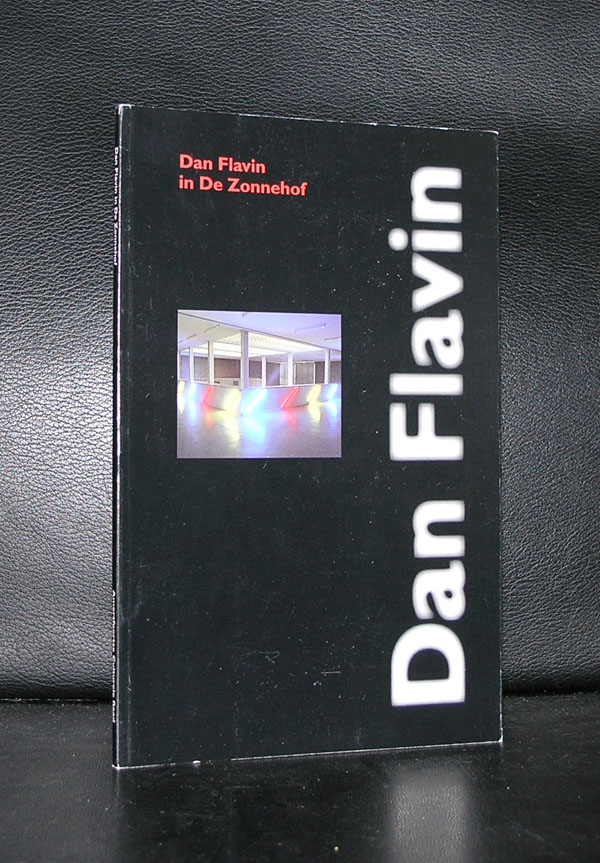
Minimal Art, but for me completely different because of the great change his art makes to its direct environment. Colors, size and composition of the lights change the room where the light sculptures are exhibited completely.
There must be a wealth of unfinished projects, because Flavin generally conceived his sculptures in editions of three or five, but would wait to create individual works until they had been sold to avoid unnecessary production and storage costs. Until the point of sale, his sculptures existed as drawings or exhibition copies. As a result, the artist left behind more than 1,000 unrealized sculptures when he died in 1996.
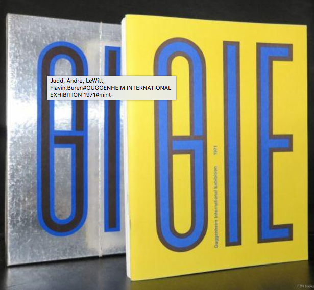
His earliest works were exhibited in the van Abbemuseum in 1966. The Netherlands were at that time one of the earliest countries to adopt the Minimal Artists. Major exhibitions by LeWitt, Andre and Judd in the late 60’s were held in Den Haag and Amsterdam.
Flavin realized his first full installation piece, greens crossing greens (to Piet Mondrian who lacked green), for an exhibition at the Van Abbemuseum, Eindhoven, Netherlands, in 1966. Flavin’s “corridors”, for example, control and impede the movement of the viewer through gallery space. They take various forms: some are bisected by two back-to-back rows of abutted fixtures, a divider that may be approached from either side but not penetrated (the color of the lamps differs from one side to the other). The first such corridor, untitled (to Jan and Ron Greenberg), was constructed for a 1973 solo exhibition at the St. Louis Art Museum, and is dedicated to a local gallerist and his wife. It is green and yellow; a gap (the width of a single “missing” fixture) reveals the cast glow of the color from beyond the divide. In subsequent barred corridors, Flavin would introduce regular spacing between the individual fixtures, thereby increasing the visibility of the light and allowing the colors to mix.[24]
By 1968, Flavin had developed his sculptures into room-size environments of light. That year, he outlined an entire gallery in ultraviolet light at documenta 4 in Kassel, Germany. In 1992, Flavin’s original conception for a 1971 piece was fully realized in a site-specific installation that filled the Solomon R. Guggenheim Museum’s entire rotunda on the occasion of the museum’s reopening.
www.ftn-books.com has many titles on Minimal Art and some on Dan Flavin
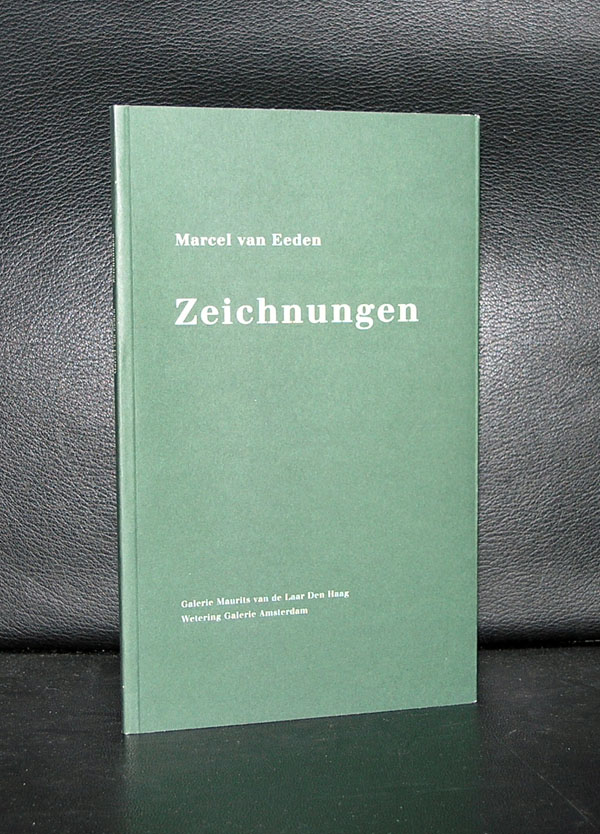
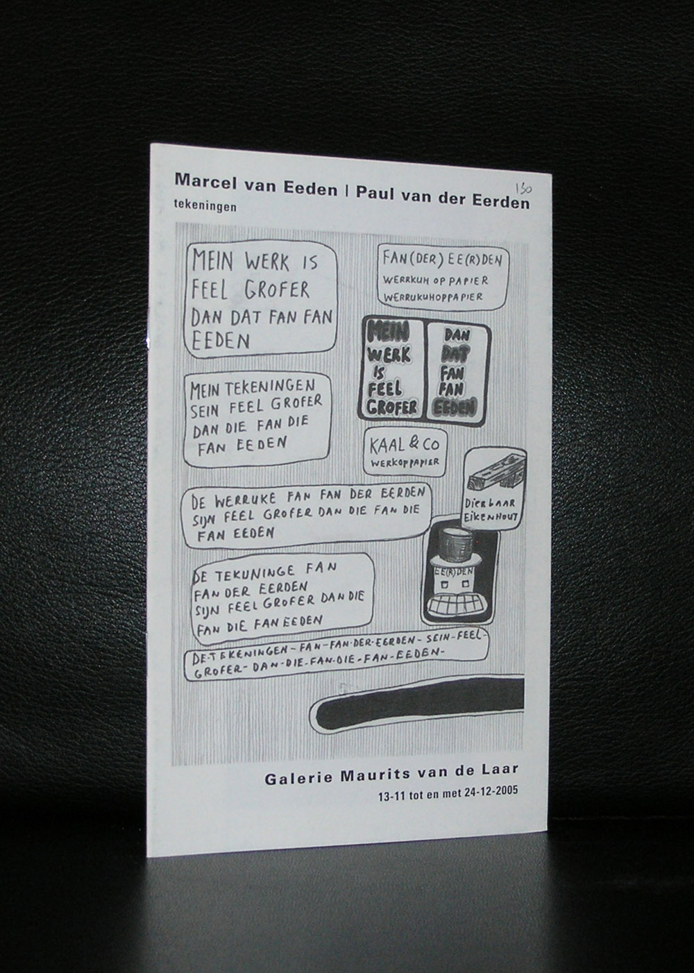
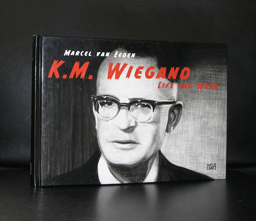
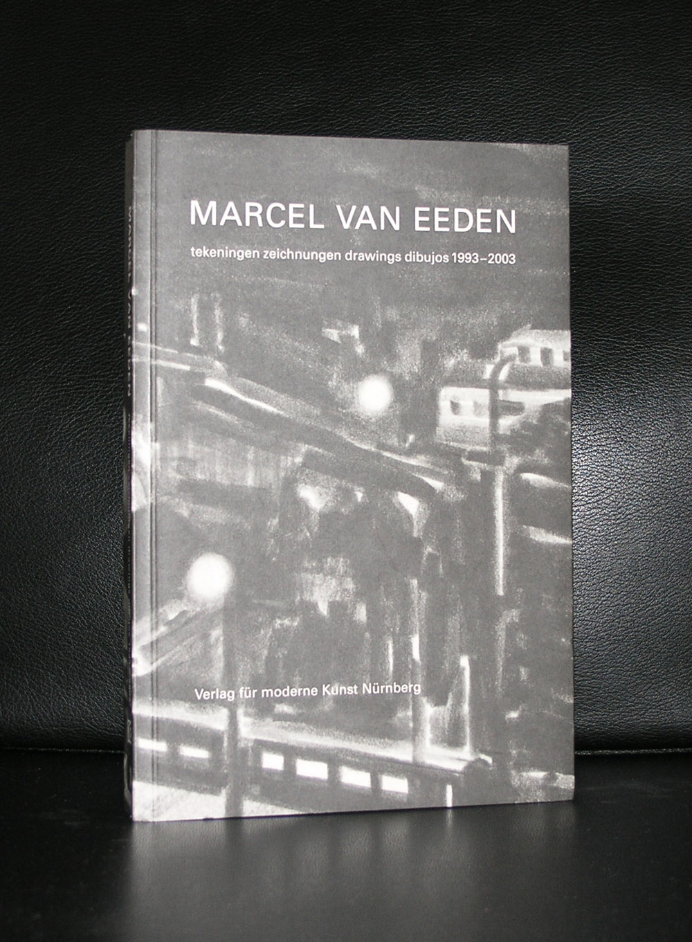
I picked Marcel van Eeeden for todays blog because of two reasons. First of all ….arguably van Eeden is the greatest drawing artist in the Netherlands today. He publishes frequently on the internet and has exhibitions all over the world. Transforming every day scenes and news paper clippings into authentic van Eeden drawings he has made after 30 years a tremendous oeuvre. Born in Den Haag and living nowadays in Zurich, van Eeden is the latest addition to the video series of famous dutch artists. The series started some years ago and contains now over 100 contributions. Fascinating 15 minute portraits/movies on the best of dutch artists.
http://hollandsemeesters.info
De Gemeentemuseum was one of the first museums in which the drawings by van Eeden have been presented and since this opportunity to see his intimate drawings, i became interested in his publications. The books he published feel like graphic novels , but are instantly recognizable as van Eeden publications. Some of these highly collectable books are available at www.ftn-books.com
OLYMPUS DIGITAL CAMERA
OLYMPUS DIGITAL CAMERA
OLYMPUS DIGITAL CAMERA
OLYMPUS DIGITAL CAMERA
To show the quality of the series of HOLLANDSE MEESTERS i put the van Eeden video with this blog, but do not forget to look at the complete lists of dutch artists and look for more at the site of http://hollandsemeesters.info
Artist/ Author: Oliver Boberg
Title : Memorial
Publisher: Oliver Boberg
Measurements: Frame measures 51 x 42 cm. original C print is 35 x 25 cm.
Condition: mint
signed by Oliver Boberg in pen and numbered 14/20 from an edition of 20