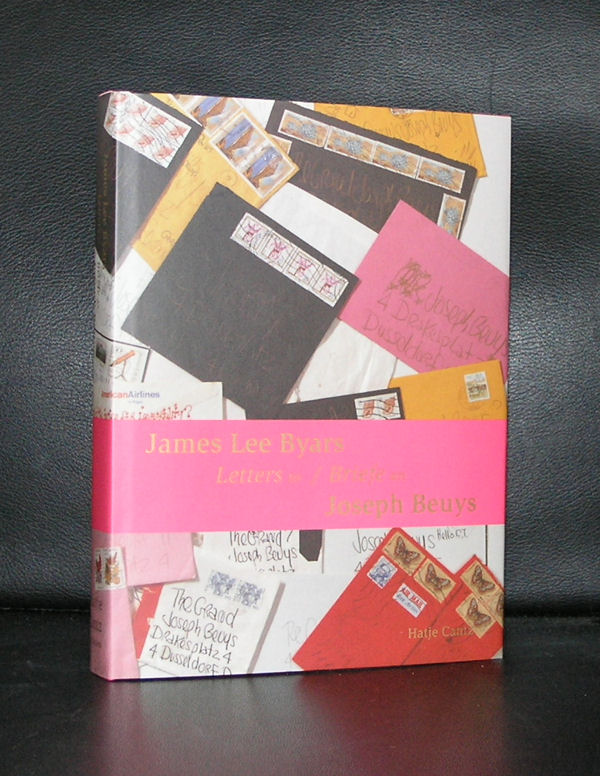
James Lee Byars was both. An excellent sculptor and a performance artist in the US, much like Joseph Beuys was in Germany. They knew eachother very well and became friends in the late Seventies, resulting in a fascination correspondence between them of which part was published.
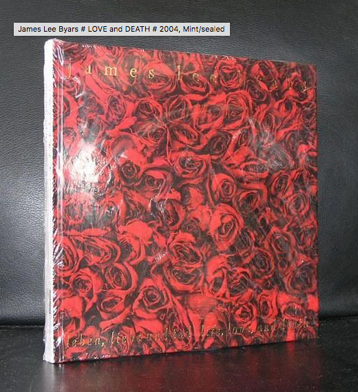
Obsessed by the idea of perfection, Byars produced a remarkable body of work that strove to give form to his search for beauty and truth. Pursuing what he called “the first totally interrogative philosophy,” he made and proposed art at scales ranging from the vastness of outer space to the microscopic level of subatomic particles, in an attempt to delineate the limits of our knowledge while enacting a desire for something more.
Here is the performance of THE PERFECT LOVE LETTER in Stockholm.
Byars was one of a kind and his art stands out from that of his contemporary artists. www.ftn-books.com is lucky to have some excellent publications on James Lee Byars.
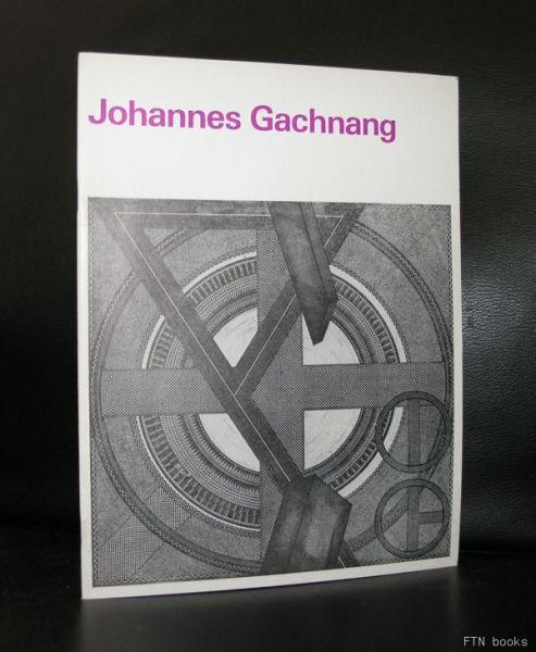
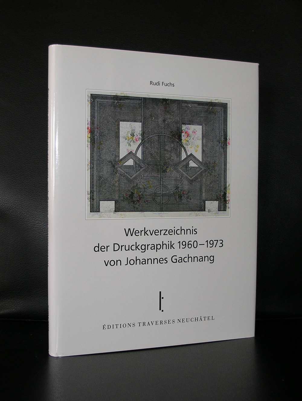
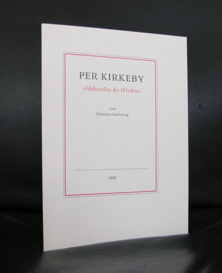
The first time i met Gachnang was during an exibition at the Haags Gemeentemuseum when he visited his friend Rudi Fuchs , who was at that time the director of the Gemeentemuseum. I remembered an unpleasant person, but Rudi wanted the publications by Gachnang to be sold at the shop of the Gemeentemuseum and i was critical about them. It was not that i was not convinced of the art within these publications, but the art by Gachnang was so personal and i thought “strange” that i did not see any selling possibilities for them. Years later, i started to encounter his works in museums and found them far more accessible than i first had thought they were. ALL Gachnang publication have a certain quality and belong to the best publications on art in the last 3 decades of the 20th century and some of them are available at www.ftn-books.com
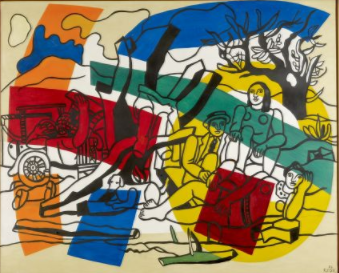
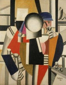
I am still in doubt for myself if i must consider Leger as one of the great artists from last century…or does he uses a ‘Trick” to compose and impress with his paintings. If one sees an extremely large sized work …it is almost in every case impressive, but as soon as it is a smaller one, the attraction is gone. I will show this with to examples. The first painting is roughly 3 x 4 meters and in the collection of the Fondation Maeght. The send is Trois Camarades in the collection of the Stedelijk Museum Amsterdam. The first has typical figures by Leger with an abstract pattern painred over them….. a beautiful and impressive Leger. The second one, is for me far less appealing and a “flat” painting.
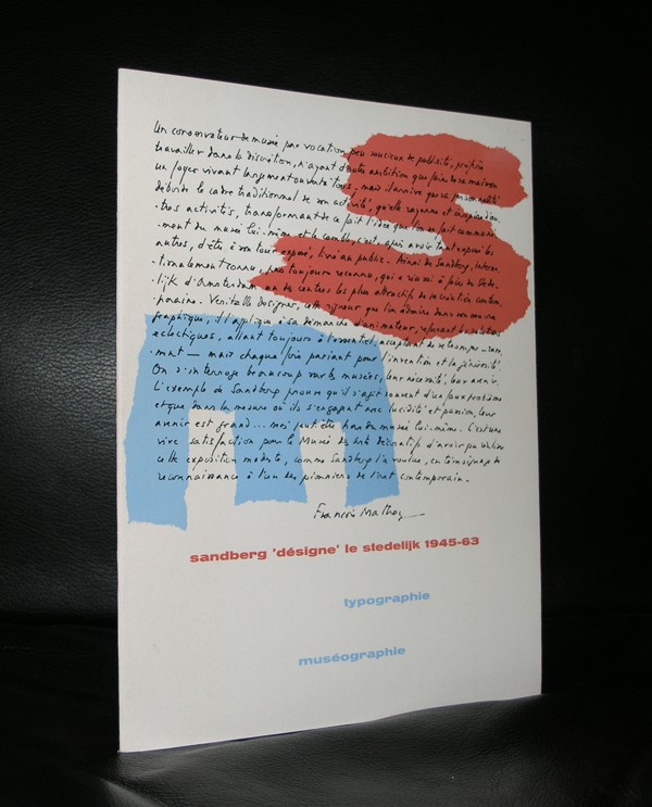
Make up your mind yourself on Leger , but know that there are some excellent publications available at www.ftn-books.com including a famous Sandberg designed catalogue
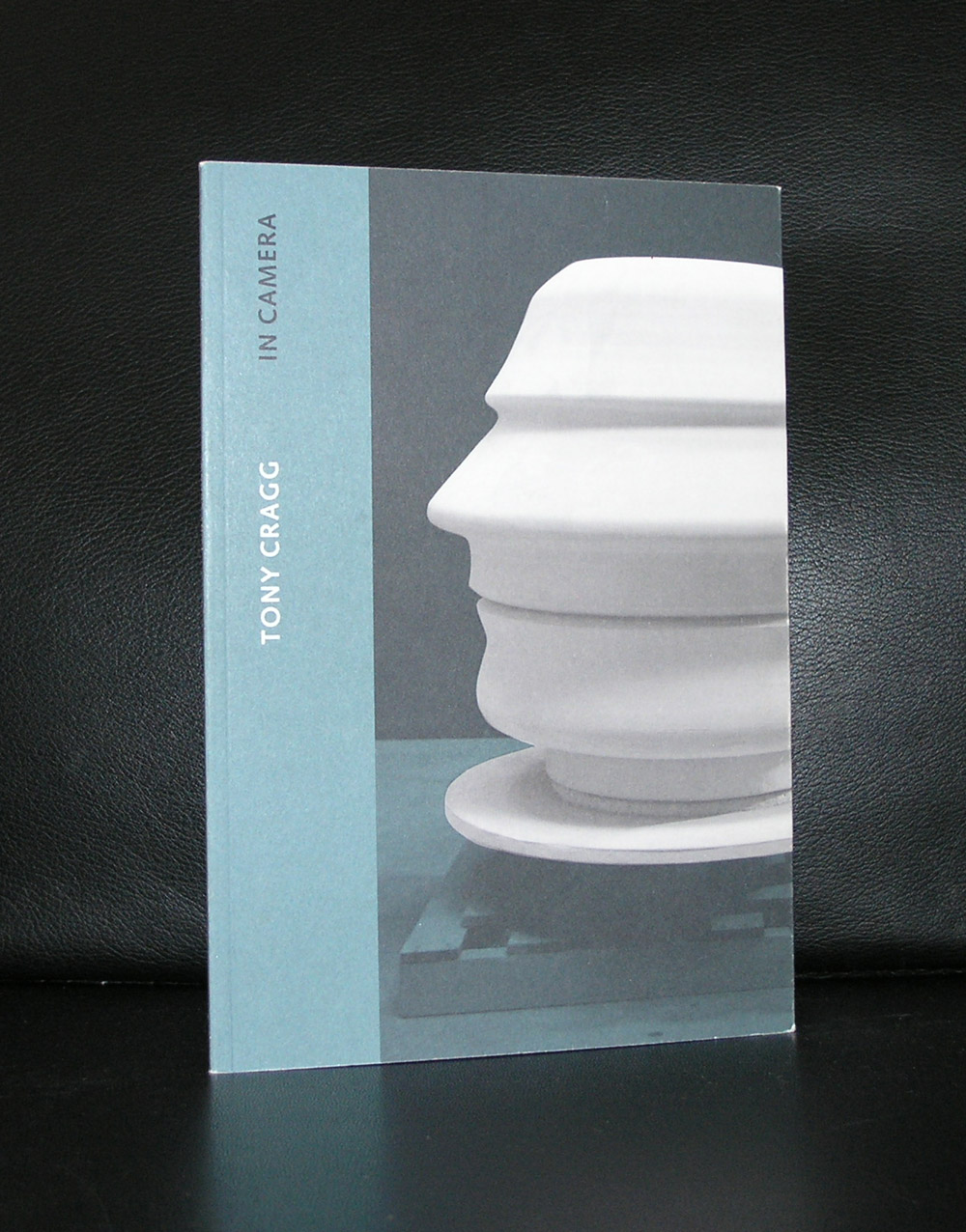
Tony Cragg, british and famous in the Nineties, but nowadays he almost looks forgotten. No more great shows , nor great assignments…..but his works are still there. Present in great collections like the Boymans van Beuningen, Tate and Caldic collection. Maybe it is time to rediscover Cragg, because his works are highly original and well worth seeing. In many cases the scale is large and because these large sculptures can not be dismissed they often impress. Take a look at the books available at www.ftn-books.com and if interested visit the Caldic collection for this and other great sculptures by contemporary artists.
Because i get notified by Pinterest which items are shared and saved, i found out that this is one of the most appreciated photographs of all publications on www.ftn-books.com
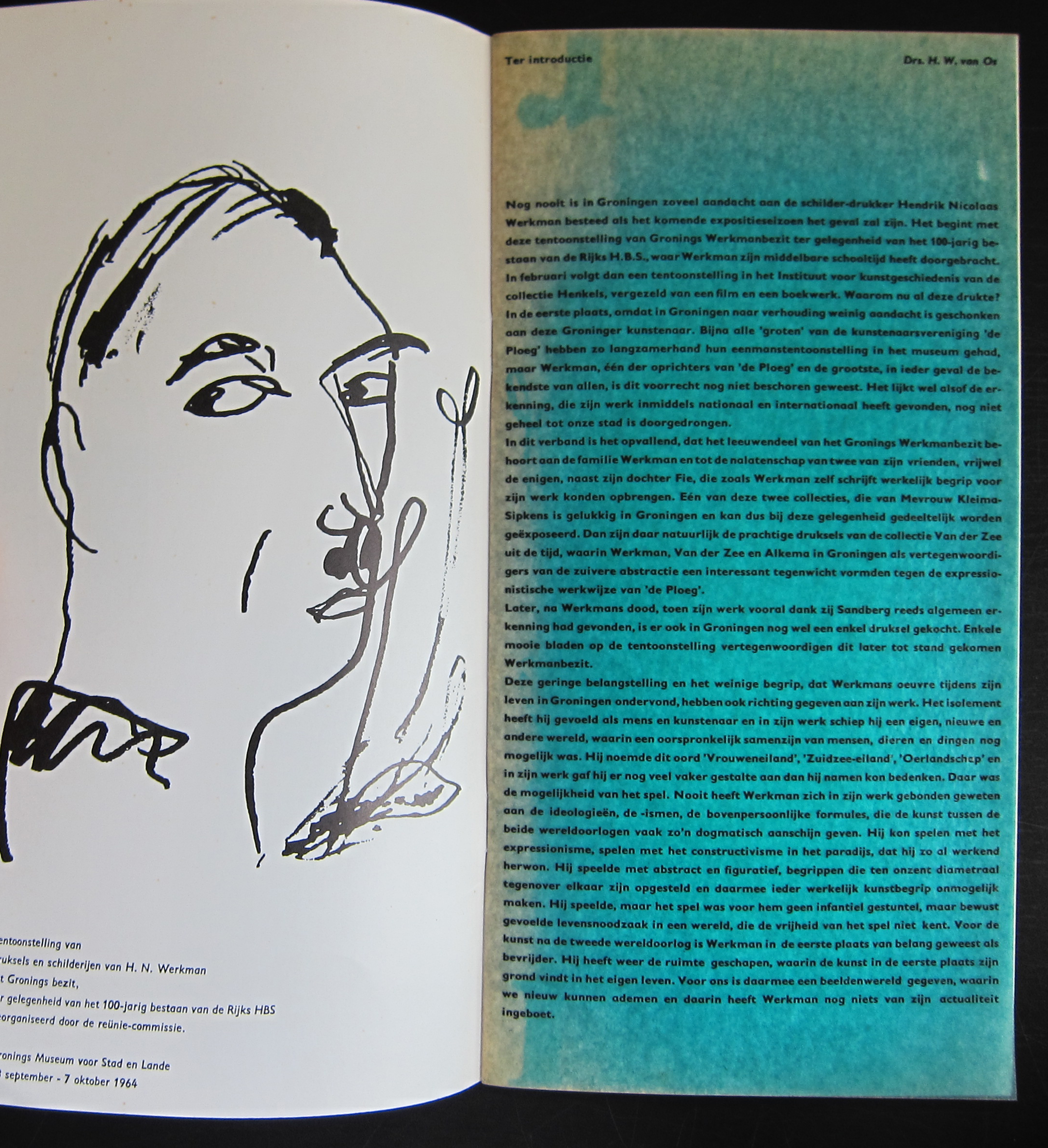
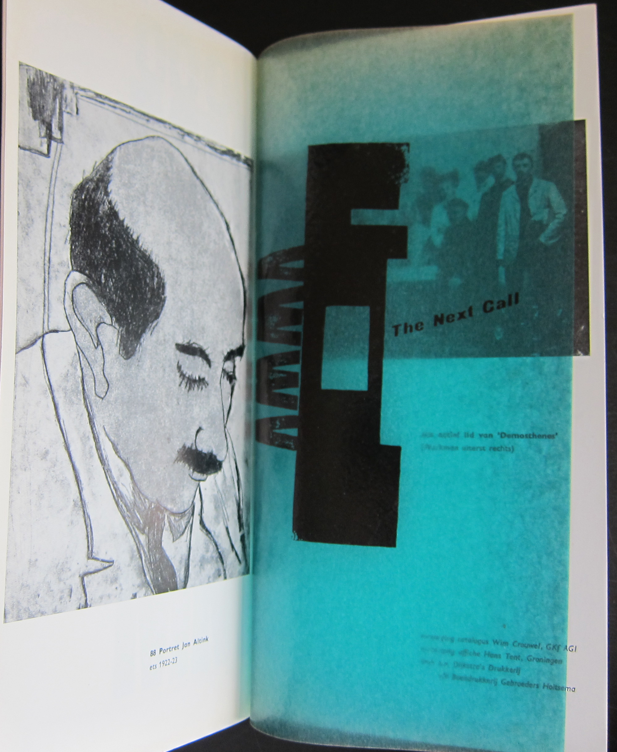
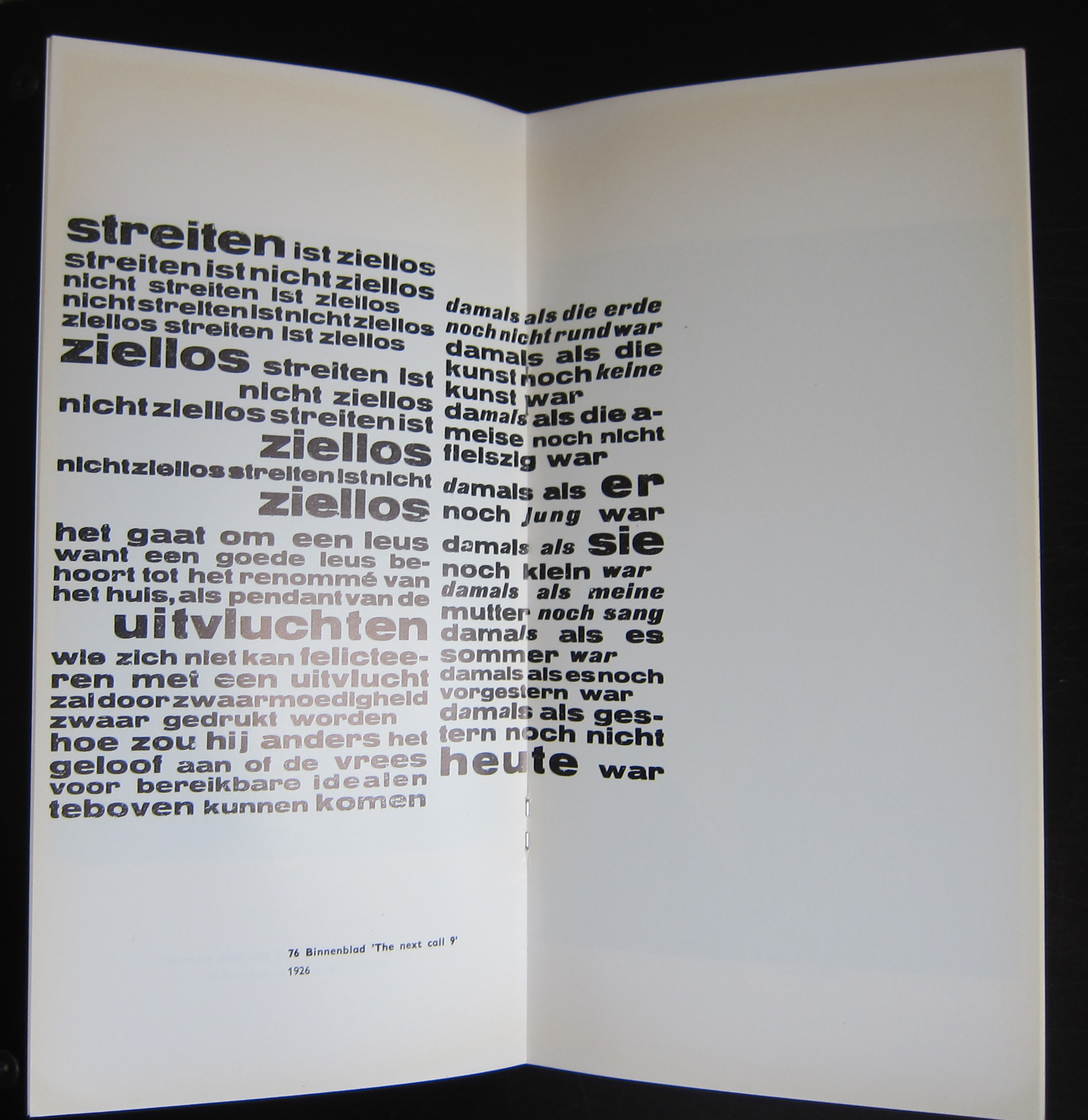
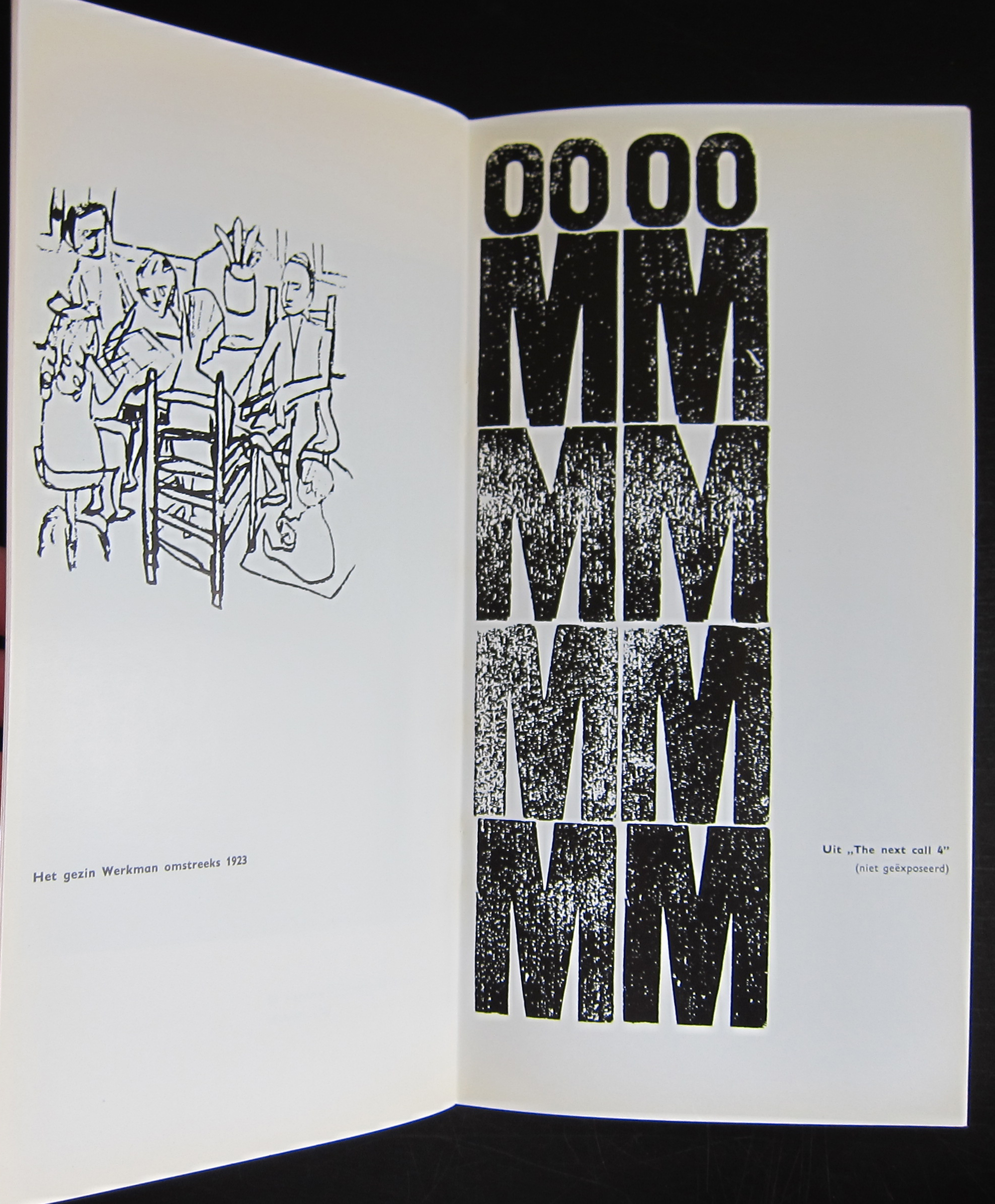
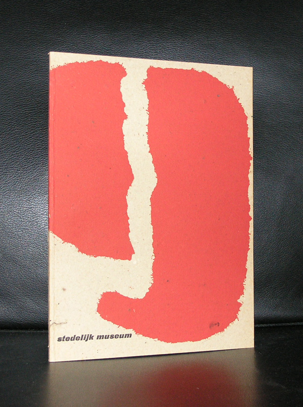
This publication was published on the occasion of the Werkman exhibition in Groningen in 1964 and one of the first designs that Wim Crouwel made for a dutch museum. In this same period he designed the publications for the van Abbemuseum which were followed from the early sixties on by the publications of the Stedelijk Museum. What makes this one special is the condition it is in and the highly unusual appearance. The use of multi colored papers, its odd size and a cover chosen in relation with the Werkman print which is used as a cover. This publication is the top in dutch lay-out and design and must be considered as one of the very best publications of the sixties. Curious?………take a look at
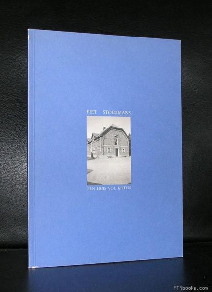
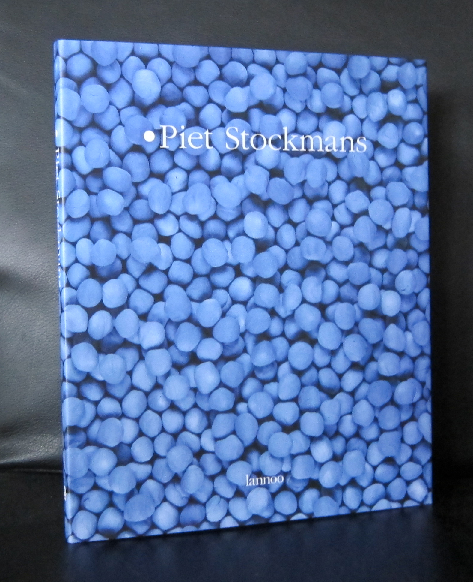
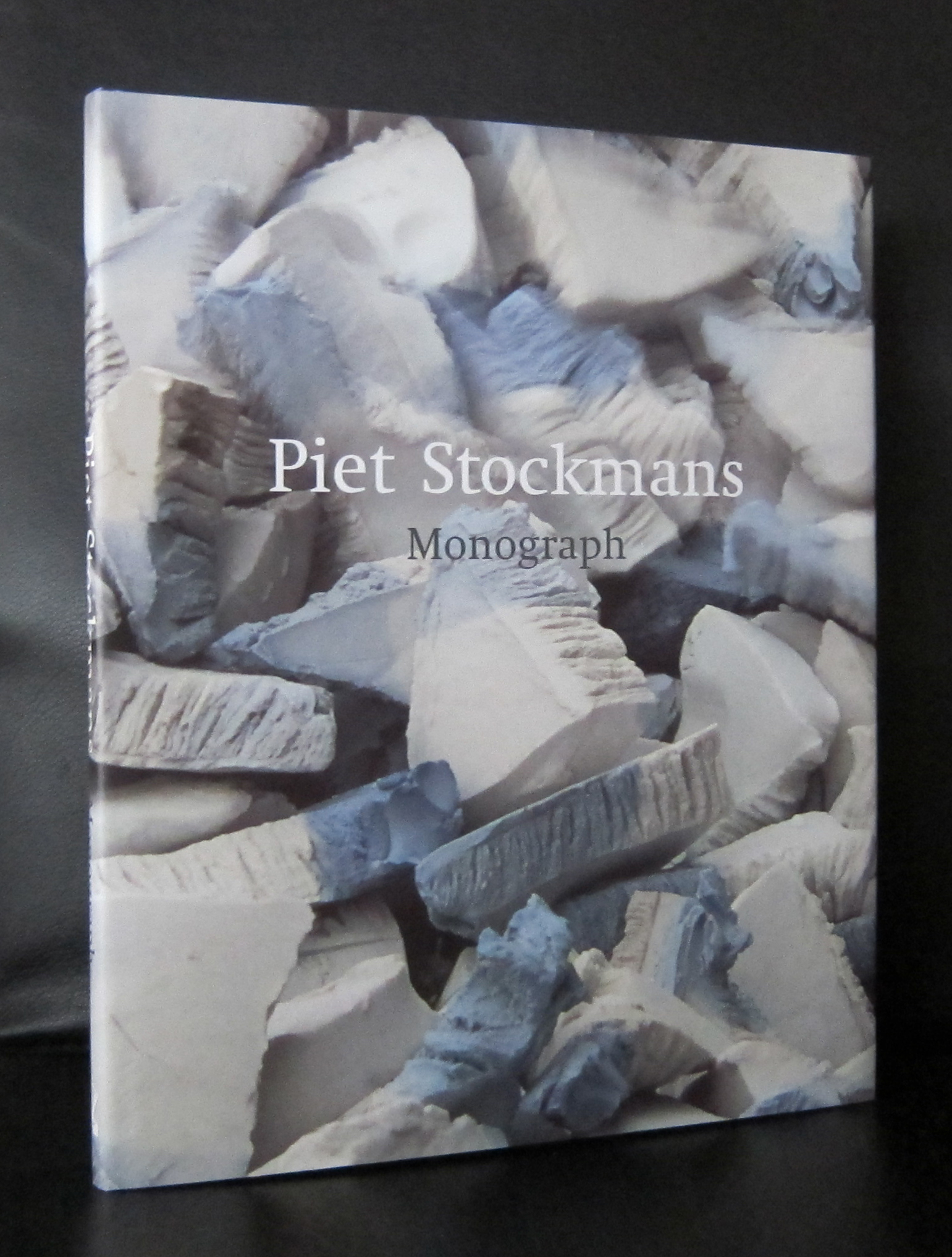
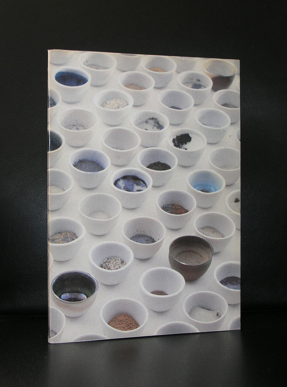
We were only 3 in Den Haag who offered the small studio ceramics by Piet Stockmans and now only one is left ( Toegepaste Kunst/ Valkenbosplein, Den Haag). The shop in the Gemeentemuseum Den Haag, Toegepaste Kunst and Studio 40 sold these little ceramic art objects. White or pale blue they made an everlasting impression when you first see them. Stockmans started his career at Koninklijke Mosa in Maastricht where he worked from 1966 until 1989. After that period he worked for himself and his studio became world famous among ceramic art collectors all over the world and many of them visited his studio in Genk. Stockmans has become a very successful ceramic artist who’s works are sold all over the world, which makes him not only as an artist successful, but also commercially his products are a huge success. One aspect of his designs deserve special attention. He has designed and made porcelain for many of the great chefs in Europe.
Of course www.ftn-books.com has some nice examples of his publications . Browse through them and you will notice that beside his commercial porcelain there are some very nice and breath taken ceramic unique works.
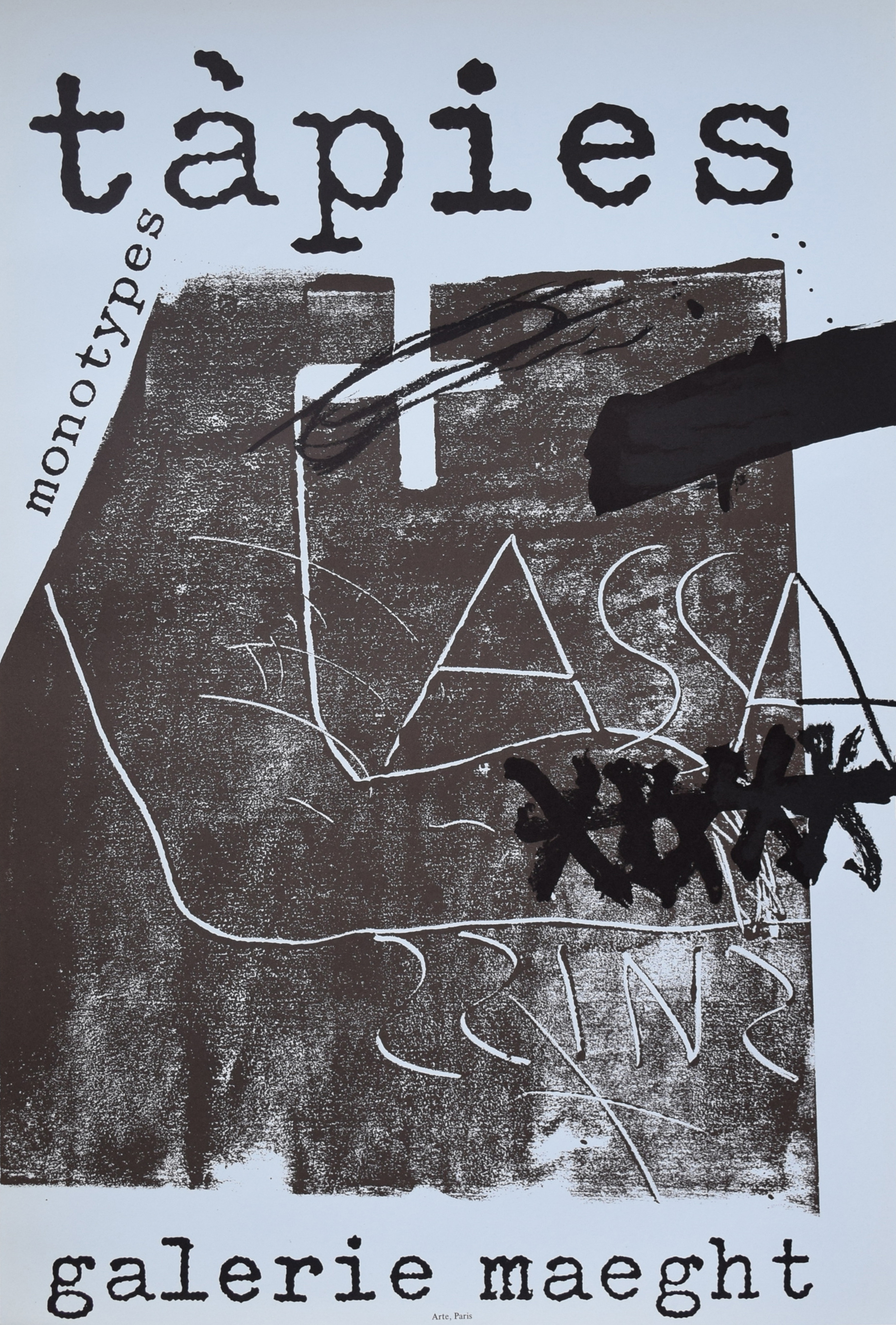
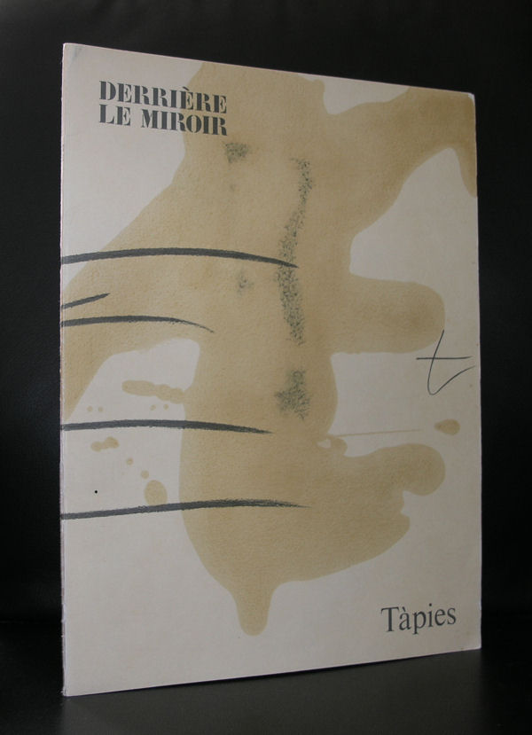
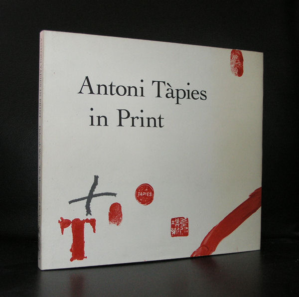
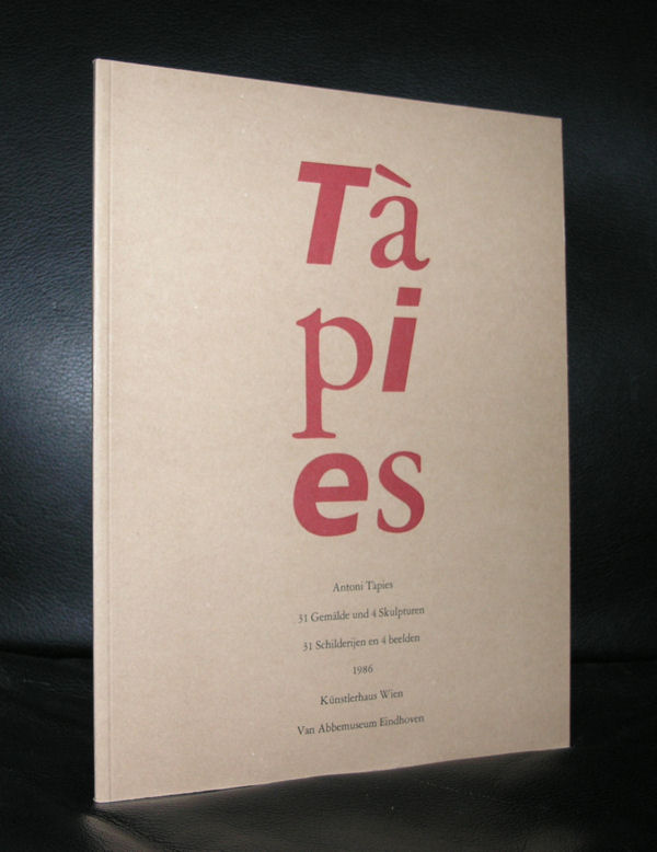
It must have been some 12 years ago that i first visited Barcelona and found myself amazed and surprised by this city full of Gaudi and other modernista marvels, but the best find for me was the discovery and first visit of the Fundacio Antoni Tapies.
The building itself is already worth visiting and the inside is even more spectacular. An old facade houses a very modern museum inside which houses the works donated by Antoni and Theresa Tapies. I loved its collection and it proved to me that Tapies his art is timeless, very spanish and cosmopolitan at the same time. Tapies is possibly , next to Picasso and Dali , the most important spanish name in Modern Art. He often uses large canvasses and on them paints with “earth” colors impressive abstract compositions and uses matter in them.
In these matter paintings , the materials used are no longer simple media used to express an idea; they are the idea itself. That process produces a complete identification between material and form, between concept and language. Those works become opaque surfaces, walls on which the artist writes his graffiti and attaches the forms of objects or people. His identification with the work through his surname (in Catalan Tàpies means “walls”) expresses a more profound desire to break with Western dualism and blend with the material in a continuous formlessness.
Over the post-war years there was a general interest among artists on both sides of the Atlantic in material. Awareness of the atomic bomb and the new scientific discoveries aroused a strong curiosity in science, the new ideas about space-time and substance, while inventions such as the electronic microscope provided a new view of nature.
At the same time, Tàpies had developed an interest in Eastern philosophy, because of its emphasis on material, the identity between man and nature and its denial of the dualism of our society.
There are some excellent Tapies publications available at www.ftn-books.com
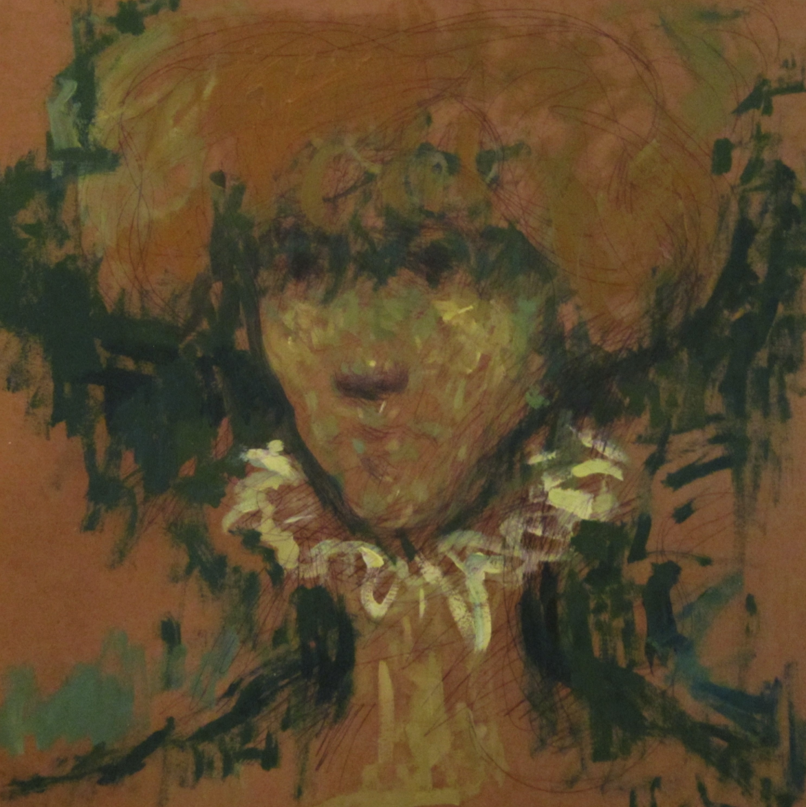
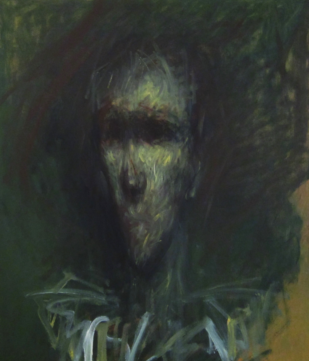
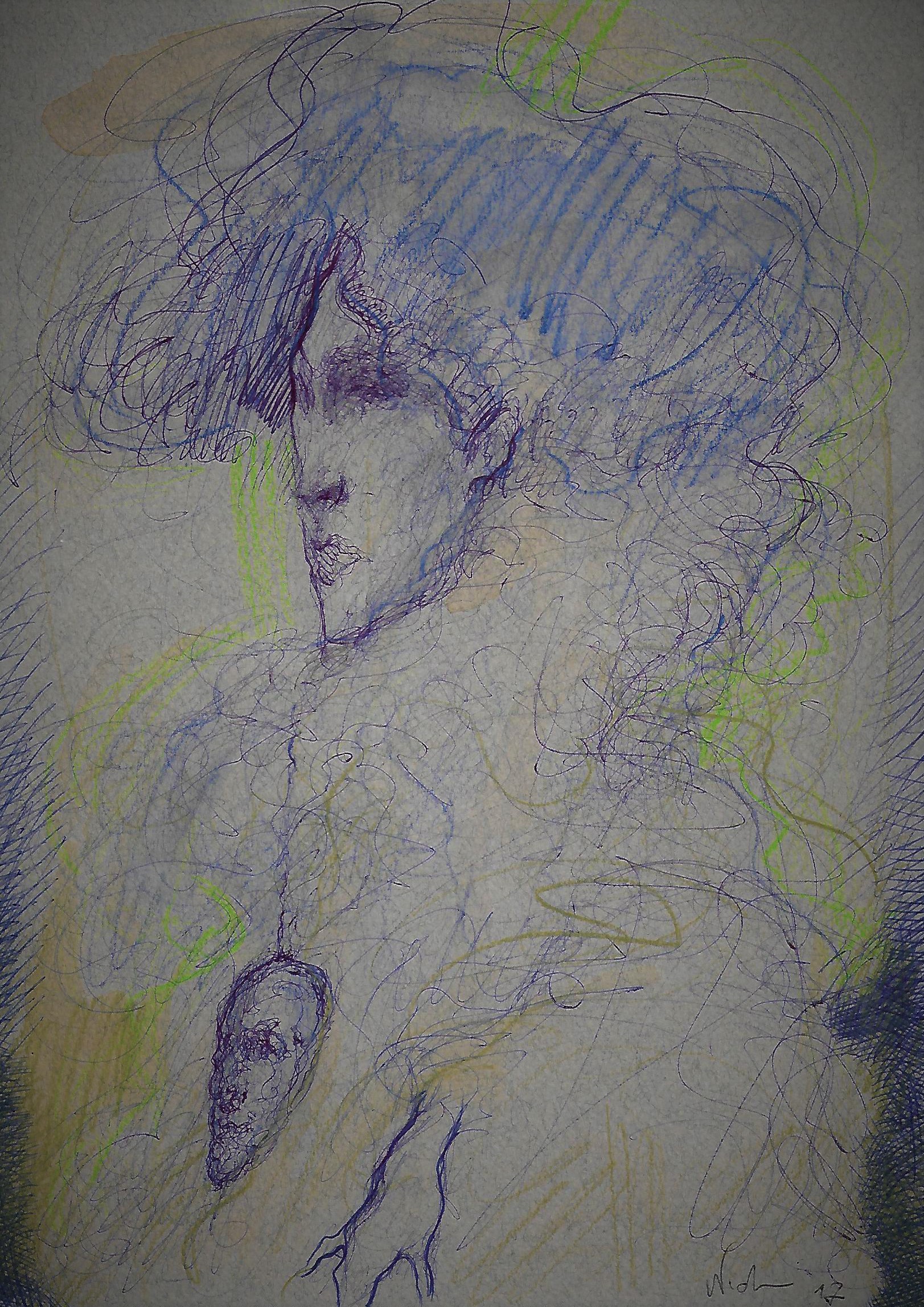
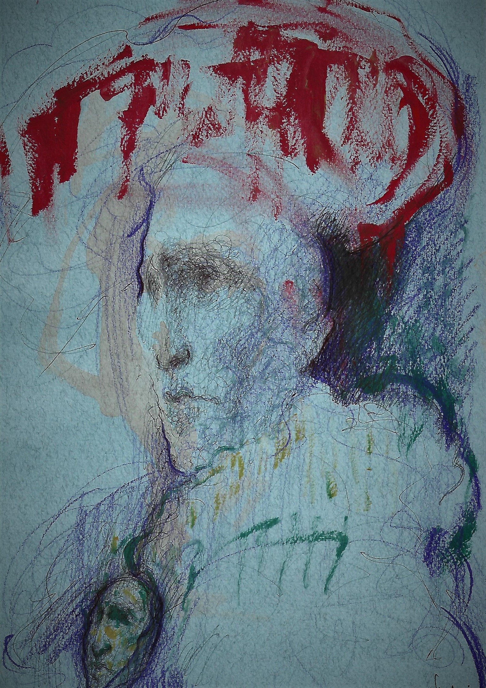
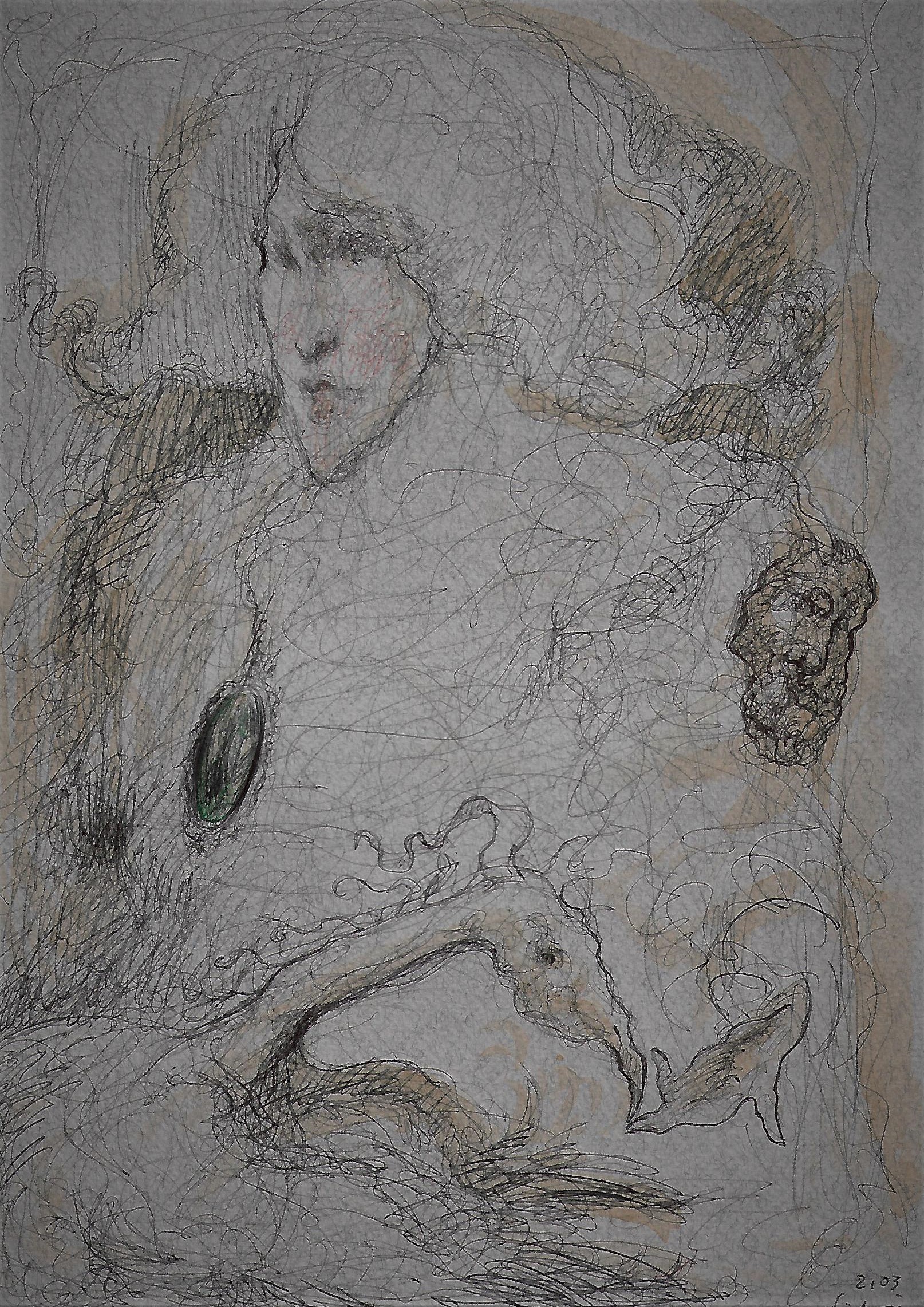
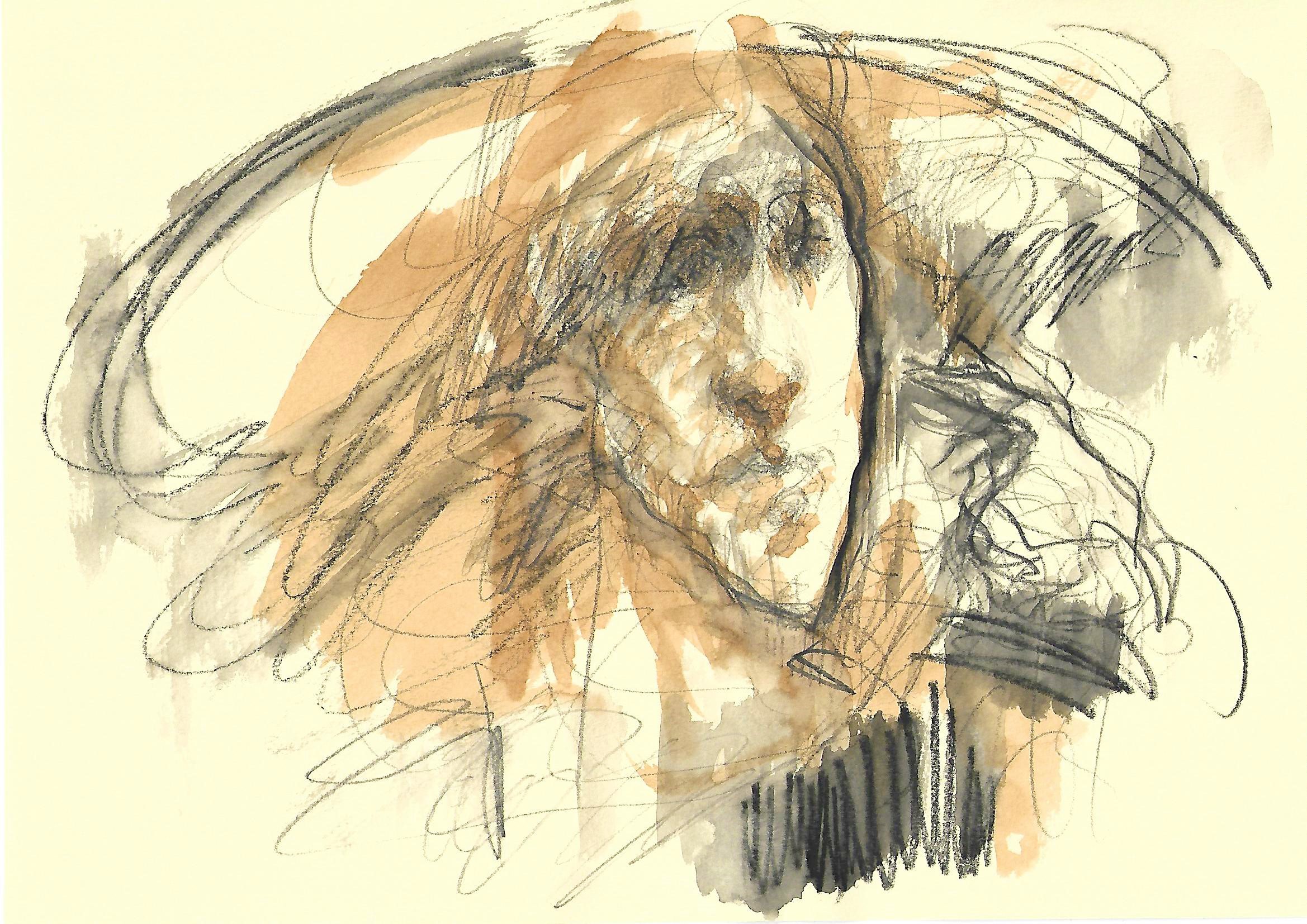
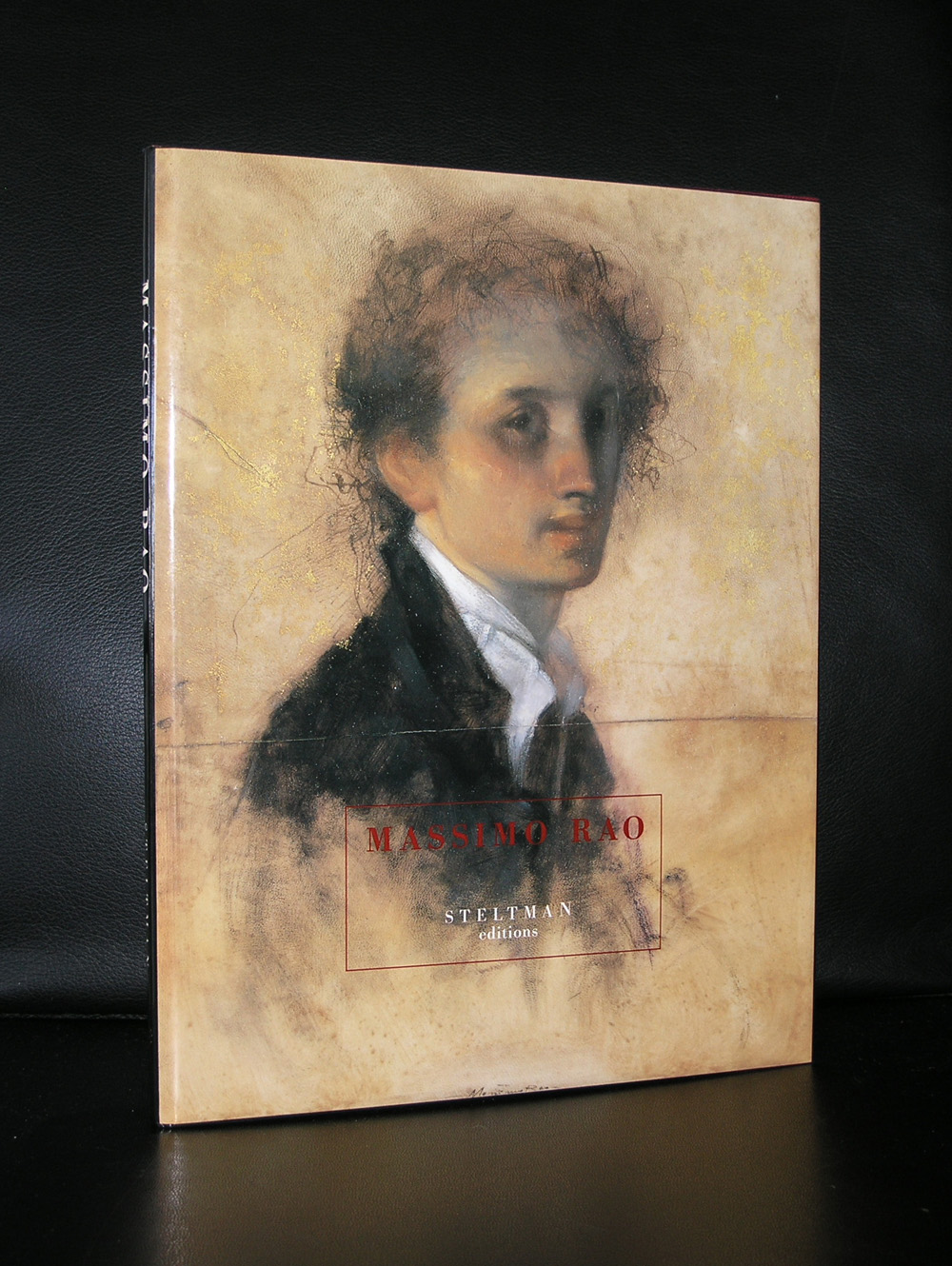
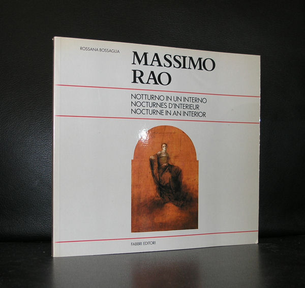
Down under in Italy, in the region of Bari works a young artist by the name of Giovanni Nicolai. I did not know him, never met him, but we recently contacted each other about a purchase. He mailed me that he was a fan of Massimo Rao and because of this fascination was inspired by him which resulted in very personal and somehow typical italian classical portraits. He sent me some examples and i was very much convinced that these works deserve to be known outside Italy too. Therefore this blog with some examples of his works. It is Modern art with some abstraction but also a very classical touch within them.
The small faces of the portraits resemble a little bit the lean figures by Alberto Giacometti, but the atmosphere breathes Massimo Rao.
Not the surrealist setting of Massimo Rao, but recognizable poetic portraits. Very nice to look at and subtil in their execution. If you want more information on Giovanni Nicolai do not hesitate to contact me and i will gladly supply you with his email address. The publications on Massimo Rao are available at www.ftn-books.com
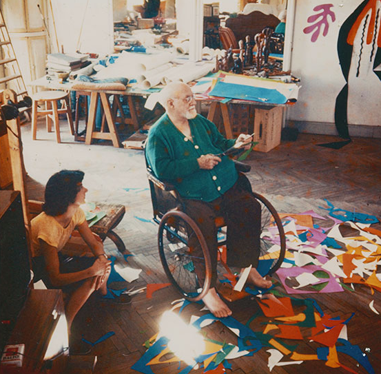
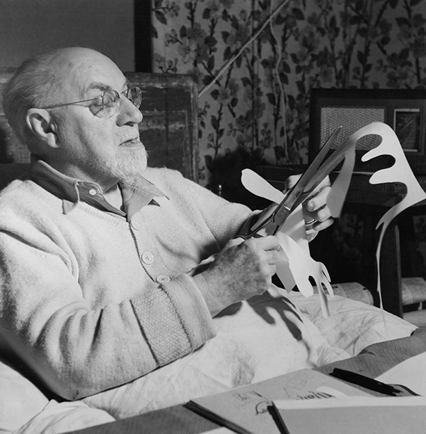
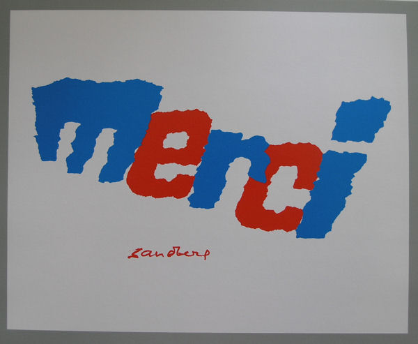
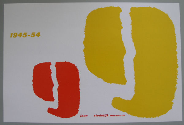
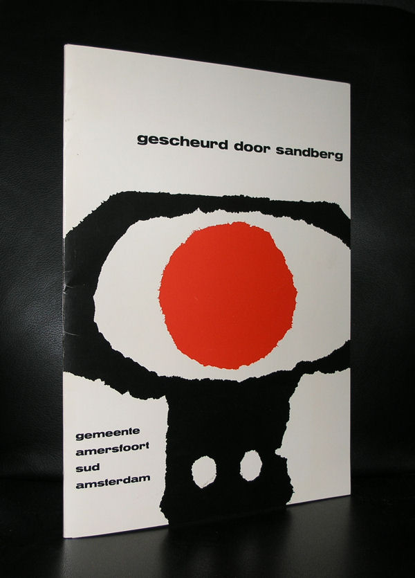
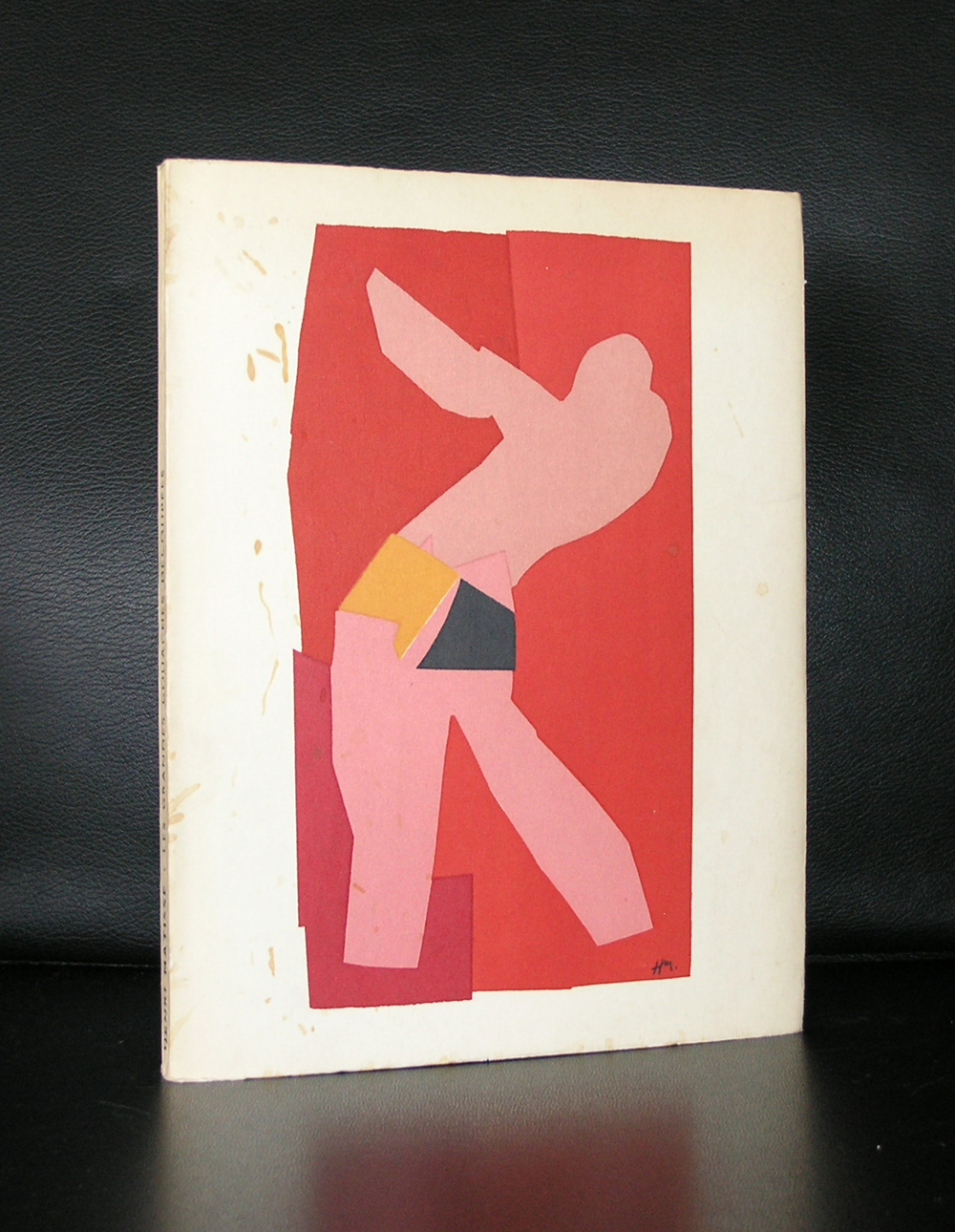
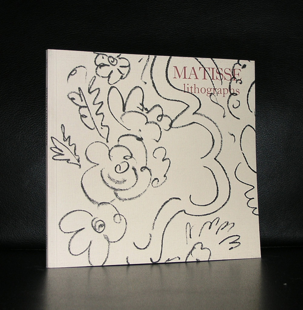
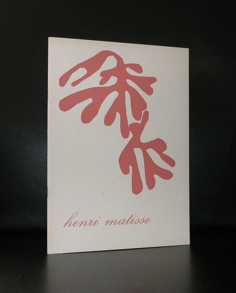
Sandberg as a curator admired Matisse as an artist and Sandberg as an artist must have been inspired by Matisse, when he made his famous paper cuttings because of his illness. Matisse himself called it “painting with scissors”. Could this have been the inspiration for Sandberg to use modelled torn papers for his book designs? Because these torn pieces of paper together with the lay-outs made the Sandberg publications highly personal and iconic. There is of course a difference, but the period in which these works of art existed is the same so it is not unlikely that his paper torn pieces were inspired by Matisse. The designs by Sandberg are now in, what are considered, classic publications and now used worldwide as examples of great design .
OLYMPUS DIGITAL CAMERA
OLYMPUS DIGITAL CAMERA
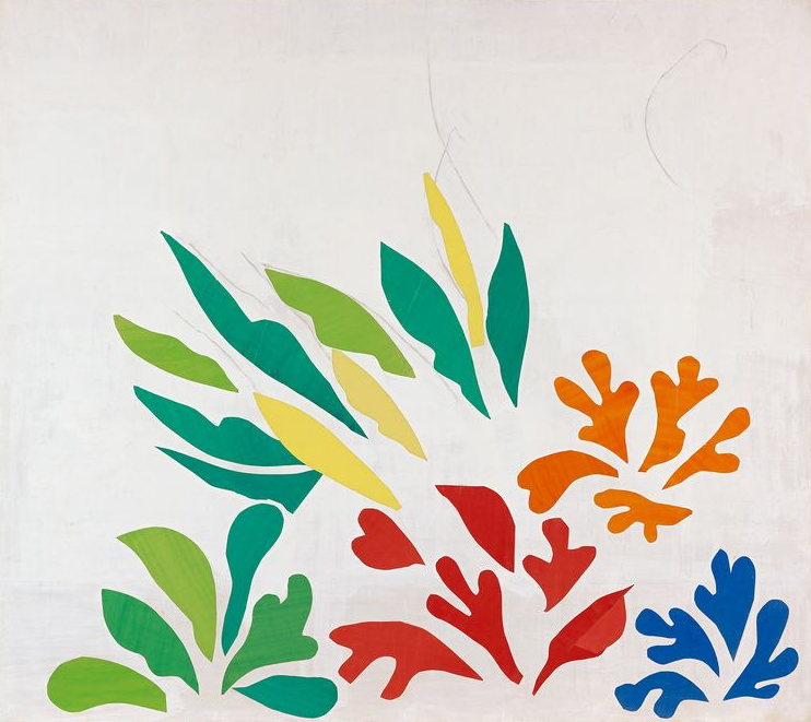
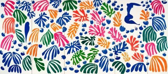
Printed on paper, they easily survived 50 years or longer, however it is totally different with the Matisse cut-outs. These have to be restored now to conserve them for future generations and i know of two projects which have taken place in the last 10 years. There is of course the large cut out composition LA PERRUCHE ET LA SIRENE 1952/53 from the Stedelijk Museum Amsterdam collection which was totally restored and made future proof for the decades to come and there was a project in the Beyeler in which one could follow the progress of the restoration /conservation of a large canvas titled ACANTHES, 1953.
Both works are on show again in all their splendor and show exactly why Matisse is possibly the greatest artist from last century. Great art in great museums and for those that want to read on both artists…visit www.ftn-books.com for some nice publications.
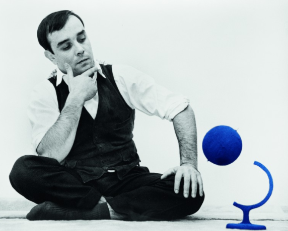
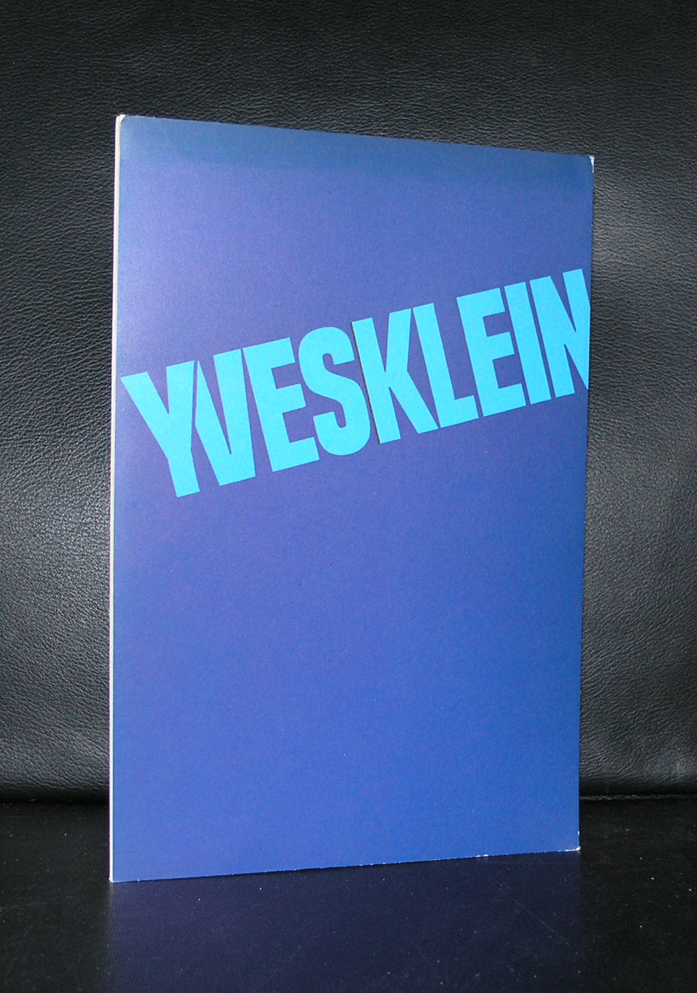
Yesterday i learned from a dutch TV program (DWDD / De Wereld Draait Door) that there is a large Yves Klein retrospective in the BOZAR museum Brussels.
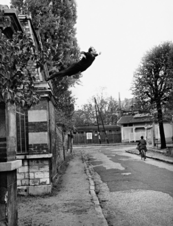
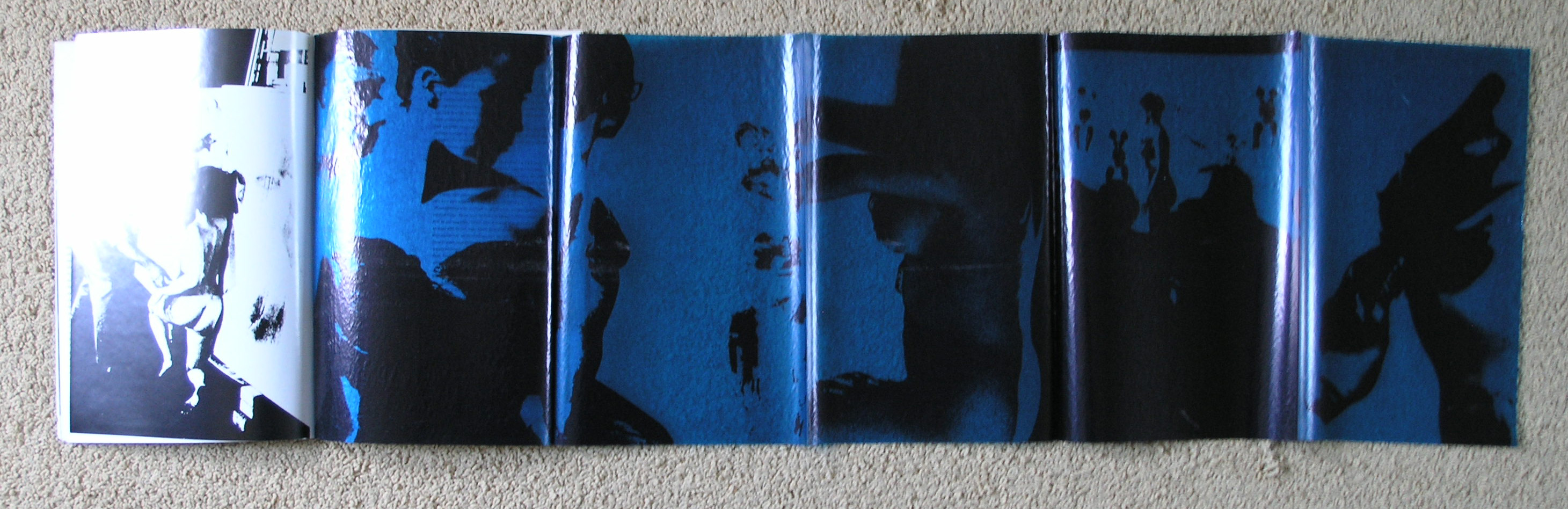
Yves Klein , touched many currents in Modern Art, even was one of the participants in ZERO, but eventually developed a style of his own using in many of his works the iconic BLUE color he developed. Was it zero, action painting or performance art? Today art lovers around the world can not answer these questions , but one can see for one self what fits most, because there is a great retrospective on his art in BOZAR/ Bruxelles until the 20th of August. His monochrome blue paintings are on show together with his action paintings of blue prints of female bodies. A great show and possibly a once in a lifetime chance to see many important Yves Klein works together.
Nowadays Klein paintings fetch record prices at auctions all over the world, but in one of his first shows In Krefeld in 1961 nothing was sold. This was followed by an unsuccessful opening at Leo Castelli’s Gallery, New York, in which Klein failed to sell a single painting. He stayed with Rotraut Uecker at the Chelsea Hotel for the duration of the exhibition; and, while there, he wrote the “Chelsea Hotel Manifesto”, a proclamation of the “multiplicity of new possibilities.” In part, the manifesto declared:
At present, I am particularly excited by “bad taste.” I have the deep feeling that there exists in the very essence of bad taste a power capable of creating those things situated far beyond what is traditionally termed “The Work of Art.” I wish to play with human feeling, with its “morbidity” in a cold and ferocious manner. Only very recently I have become a sort of gravedigger of art (oddly enough, I am using the very terms of my enemies). Some of my latest works have been coffins and tombs. During the same time I succeeded in painting with fire, using particularly powerful and searing gas flames, some of them measuring three to four meters high. I use these to bathe the surface of the painting in such a way that it registered the spontaneous trace of fire.
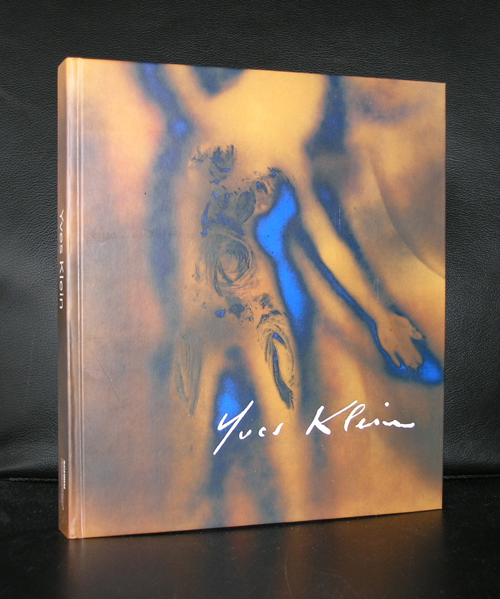
To prepare your self for the exhibition, know that over the decades excellent books on Klein were published. There are some available at www.ftn-books.com
Artist/ Author: Oliver Boberg
Title : Memorial
Publisher: Oliver Boberg
Measurements: Frame measures 51 x 42 cm. original C print is 35 x 25 cm.
Condition: mint
signed by Oliver Boberg in pen and numbered 14/20 from an edition of 20