Posted on 1 Comment

Woody van Amen (1936)… dutch Pop Art

Schermafbeelding 2018-03-01 om 14.41.58

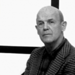
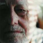
Ask me … who is the greatest Pop Art artist in the Netherlands….my answer would be Woody van Amen.

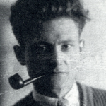
Woody van Amen (Eindhoven, 1936)* studied at the Willem de Kooning Academy in Rotterdam. His fascination for contemporary culture stemmed from the 2 year period he spent in New York from 1961 to 1963, where he met pioneers of the Pop Art movement such as Andy Warhol and Robert Rauschenberg. Woody van Amen states himself on what he encountered there: ‘Pop Art is a purely American phenomenon, based on American advertising. I am concerned with figurativism and new realism. I make things about subjects that intrigue me… everything is usable because everything can become symbolic when taken out of its usual surroundings’.

His contact with artists and his discovery of artist’s cafes, jazz music, junk art and neon light gave him inspiration and informed the themes and methodology of his work. He started to incorporate the logo’s of big Dutch brands and used techniques such as assemblage, in this way developing his own new style.

Foreign countries and cultures have remained an important point of inspiration for Woody van Amen. In the Seventies a trip to South-East Asia lead to many new oriental influences in his work. In 2007 he produced a film, put together with footage he shot during his travels in Vietnam, Burma and Indonesia. Man, religion and the beauty of nature are important themes in this video piece and they recur once again in the exhibition SHAN 2013.

van Amen has won numerous prizes during his art career and his works are important parts of the permanent collection in many museum around the world. Since Pop Art has become important and main stream, the works by van Amen reappeared in presentations and i predict that in a few years his works will be on show permanently.

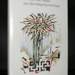
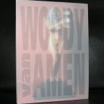
www. ftn-books.com has some important van Amen publications available.

Posted on Leave a comment

Martin Visser ( 1922-2009 )

Famous for his dutch designs. Especially his Martin Visser couch is a design classic, but Visser was so much more than a designer. Martin Visser build one of the most important private art collections in the world. Specializing in die Neue Wilden and Minimal art, his collection was after his death on the wish list of all the major and  important museums in the Netherlands. He was one of the first to collect Cobra, He recognized the importance of Keith Haring and was one of the first to collect Kiefer at a large scale. Visser’s life was art and the House Visser was designed by Gerrit Rietveld and the adjustments to the house done by Aldo van Eyck.

What is more to say about him.., He worked together with the greats in dutch design like Kho Liang Ie and Wim Crouwel. He knew all the great german painters from the eighties and conceptual art and land art had no mysteries to him. Visser was a force in the dutch art world and the Kroller Muller MUseum can show why he was such an important collector because they received the gift of 400 works from the Martin Visser collection. www.ftn-books.com has some nice publications on the Martin Visser collection.

OLYMPUS DIGITAL CAMERA

Posted on Leave a comment

Nicolaas Wijnberg (1918-2006)

Schermafbeelding 2018-02-26 om 16.33.06

Here is one of my regrets as a collector. Nicolaas Wijnberg was one of the first artists i purchased a lithjograph of. At Arta a small lithograph was sold at a very low members price and i could buy it from my saved pocket money. Perhaps 40 years later, it must be about 10 years ago, a painting was offered at Bubb Kuyper. This painting “glowed” and looked at me. It was not signed , but definitely by Wijnberg and from the mid seventies /early eighties.

OLYMPUS DIGITAL CAMERA

I loved this painting, made a written bid. ( I never buy at the live auction , to avoid that i am carried away and spent too much) and ….. i was successful . This beautiful painting was mine. I took it home and within 48 hours i was called by the auction house that they had a new “after sale” bid for the painting i just had bought and I could make a large profit on it. A collector had missed the auction and wanted to buy it with a premium for me as a buyer. I always had told myself that what i had bought for www.ftn-books.com was not for my personal collection….and i decided to sell it. Now years later , i am not so sure that i made the right decision. The painting still looks beautiful and impressive and i recently saw it published in the book on Wijnberg .

But as Martin Bril used to say . “You miss more than you experience”

For other Nicolaas Wijnberg Books please visit www.ftn-books.com

Posted on Leave a comment

Dick Cassee (1931)

Schermafbeelding 2018-02-25 om 15.17.05

Try to find a biography on Dick Cassee and you will not find it. I found some information through the documentation site of art in Overijssel, but no biography, no site, no museum information, no exhibitions …..nothing! But Cassee is an important dutch artist from the sixties and seventies and his art was really avant-garde at that time. It was recognized as important for many dutch museum too, because they started to follow this artist and made some purchases. Among them, the van Abbemuseum, Stedelijk Museum and the Haags Gemeentemuseum. What makes his work characteristic . is the continuous bend line in his compositions. Making abstract city scapes and skylines.


Schermafbeelding 2018-02-25 om 15.33.06

Others form landscapes and again later works are a combination off al these together. His works fascinate me and because i recently encountered a work at auction and could buy it for ftn art, i started to search for information on Cassee…..none to be found… his artistic life is now still a mystery to me, but i have decided to put the work i bought up for sale at FTN art. Here it is .

title : VENASCLE, from 1975 in an edition of 60 numbered and signed copies.

Cassee
Cassee
Posted on Leave a comment

Sixties magazines TIQ versus PLEXUS

The sixties were the years of my teens. And with these years belong some dutch fan music magazines . There was Muziek Express and Tuney Tunes for the young fans, For the somewhat older teens there was HITWEEK( Which later became Aloha)

and then there was finally TIQ…. a a magazine focussing on art, music, fashion, photography and ….”sex”  making this a true Dutch Pop Art magazine .It was a groundbreaking magazine , years ahead of its time. Published as a glossy magazine , but with a contents that was solely focussing on the teens and twens from the sixties.

Unfortunately it was not popular and only 14 of these magazines were published in 1966 and 1967. It disappeared much to soon from the market ,leaving the youth only Hitweek, but in France it was totally different. Of course there were BD’s ( Bandes Dessinees/ Comics) with Pilote as the leading magazine. But is focusses on the very youthful , this was recognized by L.D. publisher who wanted something different and then there suddenly was PLEXUS. No glamour photography but artful photographs by renowned photographers. Paintings by Labisse and Leonor Fini . Painters and artists who did not look away from nudity. Nudity, erotic art, erotic cartoons and short stories were the main ingredienst. Focussing with this contents on a youthful audience. In France this was the equivalent for the TIQ magazine in the Netherlands. A pop Art magazine with only 40 volumes in its publication years. Both nostalgic collectables of which there are now 3 volumes available at www.ftn-books.com

plexus z

Posted on Leave a comment

Aurélie Nemours (1910-2005)

Schermafbeelding 2018-01-19 om 12.09.07

Finally i get the right signals that Aurélie Nemours is appreciated for her beautiful works of art. The last time i visited the Strasbourg Museum of Modern Art, her works were prominently on show, the same as i encountered them in Metz. It did me great pleasure, because these constructivis tcompositions shine in their simplicity and fascinated me from the first time i discovered them. For me there are 2 female artists that i would like to have in my collection. First there is Marthe Wery and secondly there is Aurélie Nemours.

From Aurélie Nemours i only have a beautiful print available, it is not ideal, but still it is better than nothing to have such a nice print in my inventory at www.ftn-books.com


nemours bb


Posted on 2 Comments

Wilhelm Wagenfeld (1900-1900)

If only one object from the Bauhaus has reached an iconic standing in world design it is the Bauhaus lamp by Wilhelm Wagenfeld. It is still produced in its original dimension and materials and is one of the design classics from last century. It was such a success in interior design in the last 3 decades that many copies were produced and sold.

Schermafbeelding 2018-02-16 om 10.57.02

The only original one is done by Tecnolumen, but for much less you can buy an excellent copy. But beside the lamp Wagenfeld designed many more items. teapots, cutlery, candle sticks, door knobs but all with one specific design element. The design had to be “clean”. No curls and no ornaments…just functional design. Wagenfeld was  a true master of this clean design and influence with his designs many of the 20th century designers, including some dutch designers like Kho Liang Ie and Martin Visser , who’s designs were simple and functional .

the Bauhaus Lamp is probably the most iconic piece of lighting to come out of the Bauhaus, William Wagenfeld’s lamp, constructed of precisely cut glass and metal, is among the first objects to emerge under the Bauhaus’ technology-focused regime.

This a description as it is found on the internet, but i would like to add something else…William Wagenfeld is probably the first designer who respected the material and functionality of an object and taught this to his students. It is not the lamp that is iconic, but for me it is the designer, who is the grand master and who designed/invented the iconic Bauhaus lamp. www.ftn-books.com has some nice publications on Wagenfeld ( also one by Sandberg).

Posted on 16 Comments

Wally Elenbaas (1912-2008) & Esther Hartog.

An artist couple that survived WWII but of whom Wally was put in prison, because of Nude photography which was still forbidden in the sixties. Wally spent 9 months in jail because of these beautiful photographs, taking all the blame and preventing that his wife would be punished too for making the same kind of photographs. Now in these modern times it is almost unthinkable that an artist would be put in prison, but in the early sixties it was done. Why took Wally all the blame on him?…… because he feared that esther would become insane since her family lost their lives in prison and concentration camps and by all means he wanted to prevent this to happen. A sad, but also beautiful love story which was the fundament of all their great photographs they made together and of each other.

It is now almost 10 years after Elenbaas died, but since his death a growing appreciation is there for the photography of both these artists which resulted in a beautiful impressive book published by nai010 which is also available at www.ftn-books.com

ellenbaas


Posted on Leave a comment

Sandberg design of GKF de Hand en machine

After WWII the 5th of May became a day of remembrance and celebration of the Liberation of the Netherlands. Every year on the 5th of May in those days a special exhibition was held which was accompanied by a special catalogue. Key elements in the cover were always the colours red , white and blue. The colors of the dutch national flag. Personally i think the HND EN MACHINE from 1957 is the very best of these publications. It has everything.  A typical Sandberg design. the use of multiple sorts of paper , great printing quality and a spectacular cover, making this for me personally the best in the series.