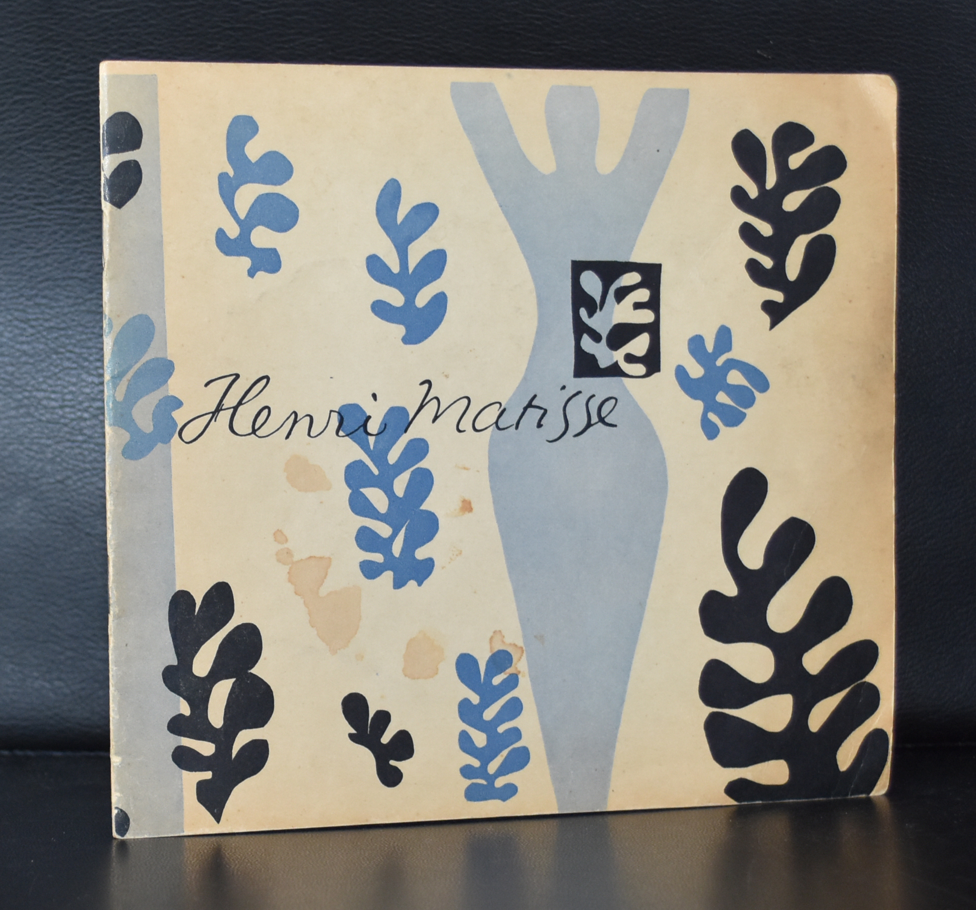
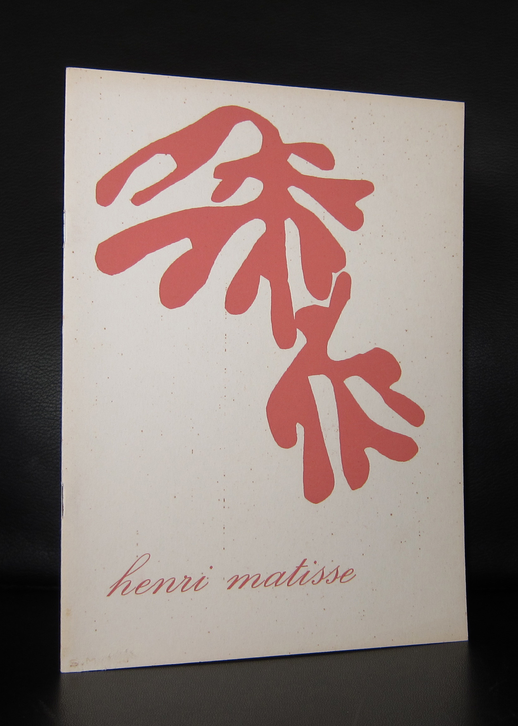
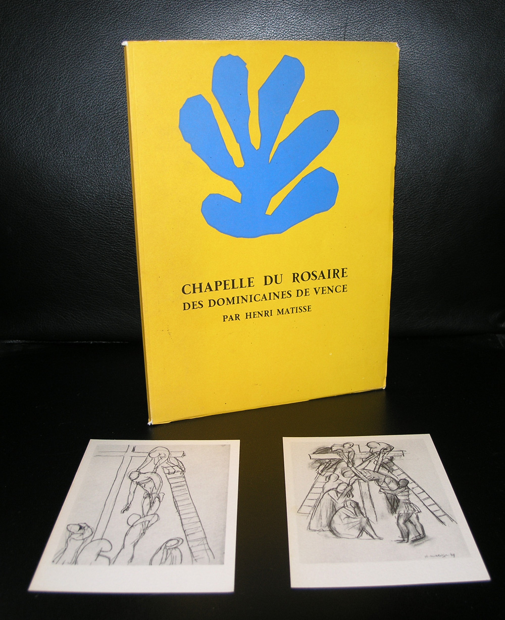
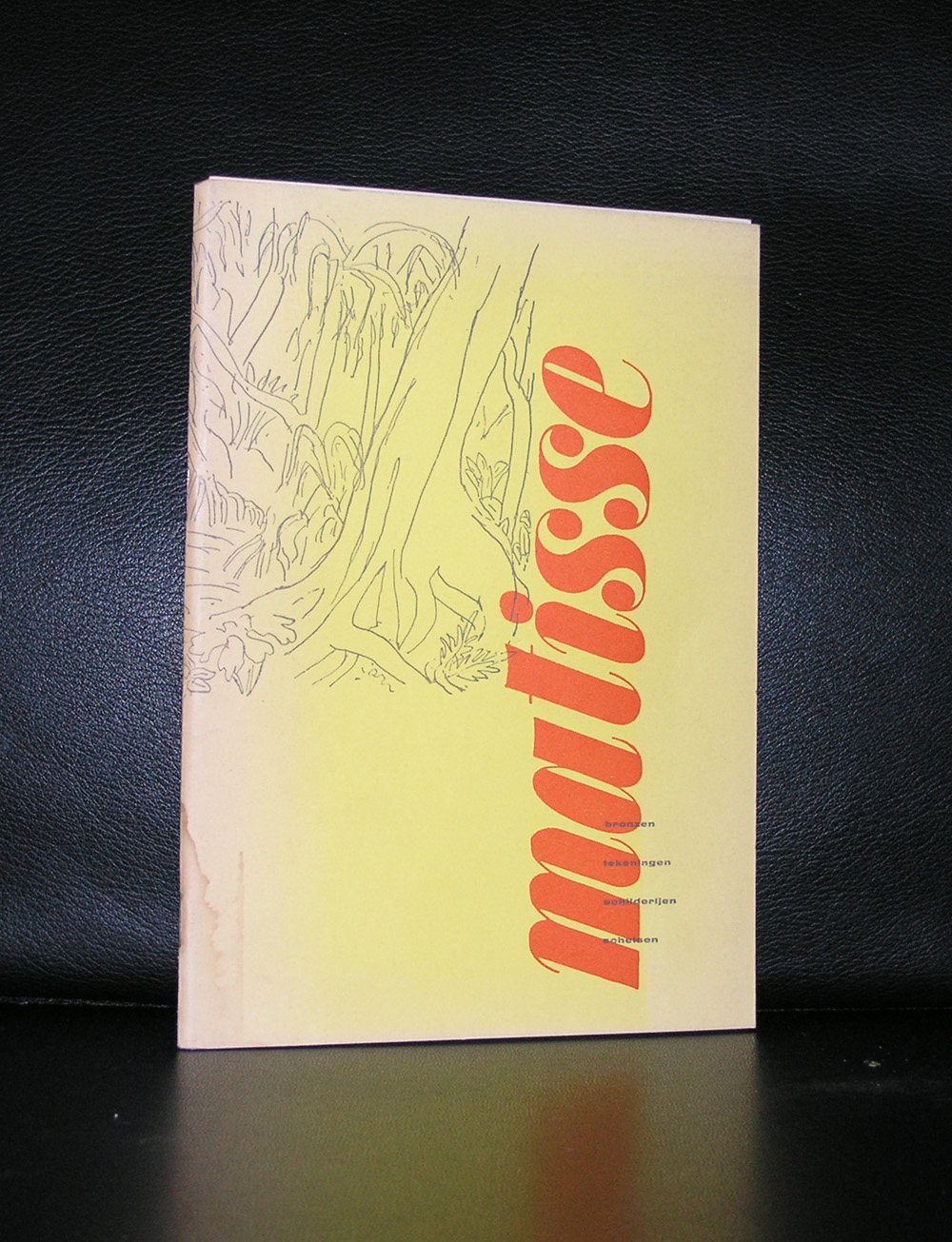
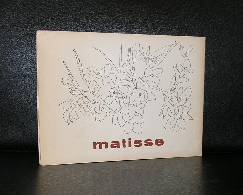
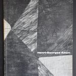
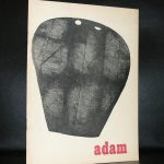
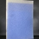
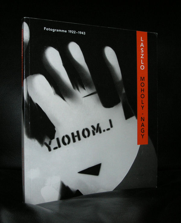
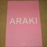
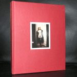
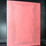
One of the most striking catalogues from the Fifties by Willem Sandberg was done for the Adam exhibition in 1955. The use of simple brown colored paper and the special print by Henri-Georges Adam on the frontcover made this one very special and an example for many catalogues which were published since. The use of brown colored paper. the special print on the outside , the typography and lay out made this an outstanding catalogue by Sandberg . Willem Sandberg must have admired Adam, because you can feel the love that went into this catalogue.

Adam a typical Fifties artist was groundbreaking in his etchings and because of the forms he used is typical for the abstract art which appeared in that decade. In the Netherland there were Ouborg, Hussem and Nanninga in France there was Henri -Georges Adam.
Here is an excellent biography on Henri-Georges Adam i found at gallery MC.
Henri-Georges Adam was born in Paris in 1904. In 1918, after his studies at the school of clock industry, he started working in his father’s workshop, jeweler. He followed (1925) evening classes to the art school Germain-Pilon in Montparnasse, then to the Beaux-Arts. Henri-Georges Adam became a drawing professor of the city of Paris. Then, he made satirical drawings and political caricatures.
In 1934, he got injured after an accident and while his resting time he approached the etching. During all his life he wanted the etching to be black and white. In 1934 was organized his first exhibition. He met regularly Surrealists: Breton, Aragon and Eluard. In 1936, he created a series of etchings violently expressionists around the war of Spain. Adam adhered in 1936 to “the Association of the writers and revolutionary artists” where he met Estève, Manessier, Pignon or Arpad Szenes. He took part in the exhibition “July 14th” with Romain Rolland (and Picasso, Matisse, Dufy, Chagall, etc).
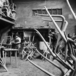
Mobilized in 1939, he was taken prisoner; drafted the hospital of Besançon as a medical orderly, he carried out many drawings of soldiers and casualties. Released in 1940, Henri-Georges Adam discovered the sculpture two years later. His etched work, initially figurative, stuck more and more to the purity of the lines, the plans and their articulation together. In 1943, he was one of the fifteen clandestine founders of the Salon de Mai. This same year, he created decorations and costumes for “Les mouches”, the first play of Jean-Paul Sartre, put in scene by Charles Dullin. The artist made friend with Pablo Picasso who lent him his atelier in the Grand Augustin-street until 1950 and his property of Boisgeloup (1948-1949).
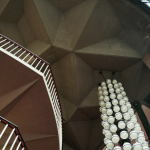
From 1947, Adam made paperboards for the tapestry. An exhibition of his whole work was devoted to him in 1949 to the Maeght Gallery. In 1952, the Bookshop-Gallery La Hune presented his copperplate etchings cut. During 5 years, he was professor of drawing in Anthony (1950-1955). In 1955 a first retrospective of his work was organized in Stedelijk Museum of Amsterdam. Adam created in 1956 and 1957 one of his most famous series of etchings, “Dales, Sable et Eau”, around the plays of the sea, sand and the granite, and the series of sculptures “Mutations marines”. He carried out new tapestries (French Embassy in Washington, UNESCO, etc). “The Signal”, set up on the square of the House of the Culture in Le Havre in 1961, was the first of his monumental sculptures. Adam multiplied from 1962 the architectural sculptures. Henri-Georges Adam was named in 1959 etching professor then chief-professor-atelier of monumental sculpture at the École Nationale Supérieure des Beaux Arts in Paris. He set up his own atelier and his printing press in La Ville du Bois, close to Montlhéry, while many exhibitions of his work were presented in the French and European museums. The artist carried out in 1961 an important series of sculptures, “Cryptograms”.
A retrospective of his work was presented in 1966 at the national Museum of modern art of Paris.
The following year, in full creative activity, Henri-Georges Adam had a heart attack at the 63 years age. Many retrospectives of his work will be organized after the death of the artist.
Some of the Henri-Georges Adam publication are at this moment available at www.ftn-books.com