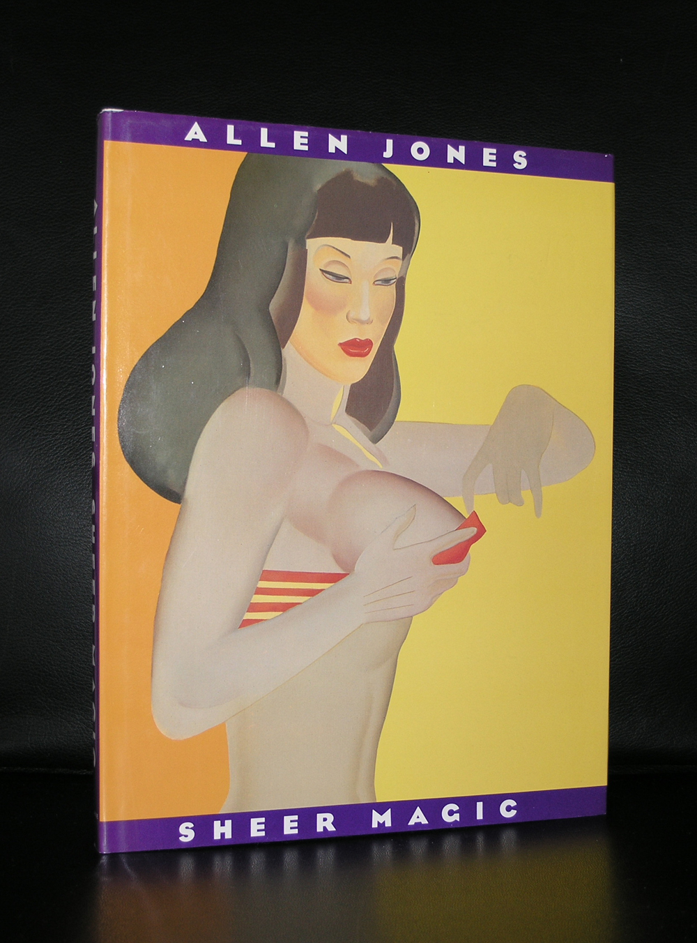
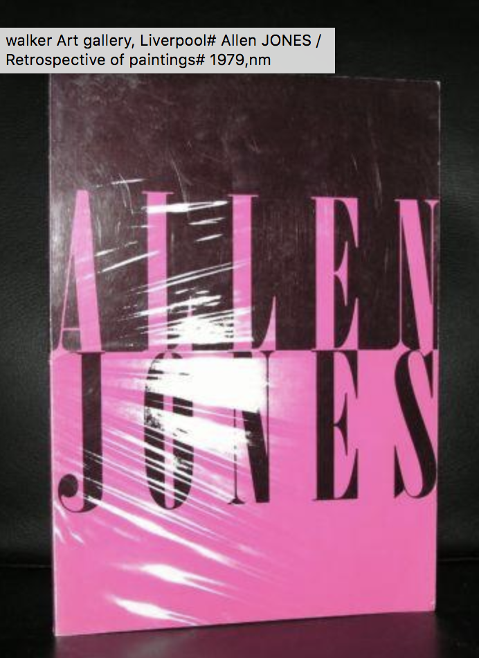
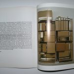
Followers of this blog know of my special interest in the publications of the Stedelijk Museum. I have many titles avaialable and ftn-books.com is one of the first sources that is consulted when it comes to publications of and on the Stedelijk Museum Amsterdam. Yet…. one learns every day, even when you have so many catalogues by the Stedelijk Museum available as i do. It has been years ago that i last saw this catalogue which was published by the Stedelijk in 1984 which gives the best and complete overview of their collecting in the period 1963-1984.
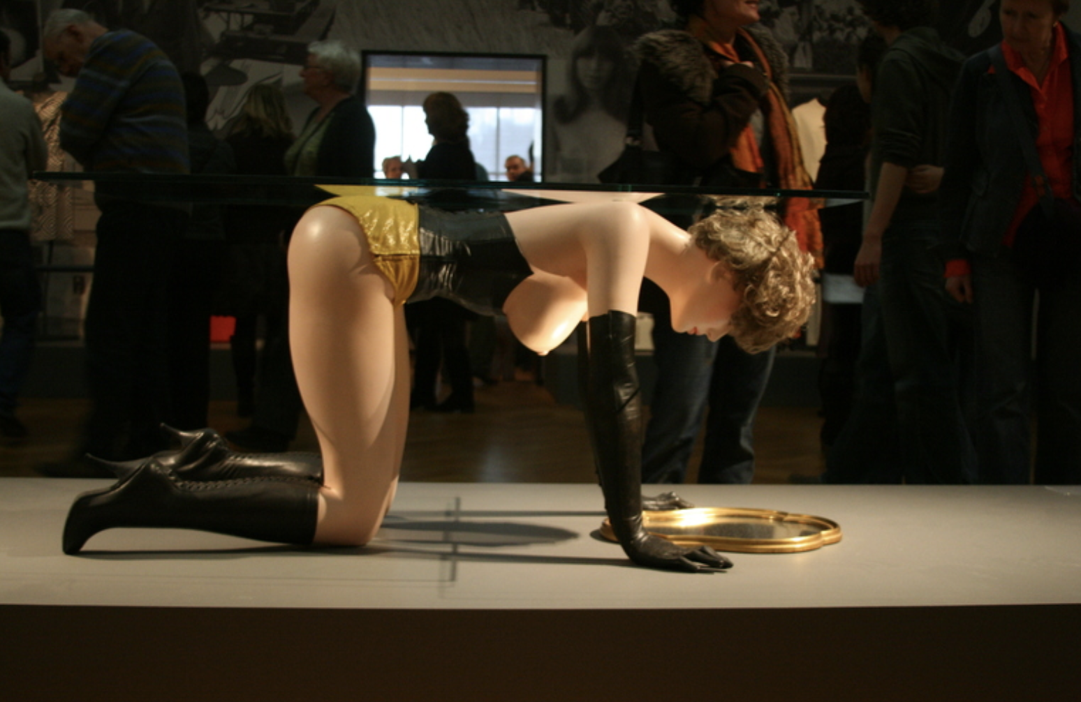
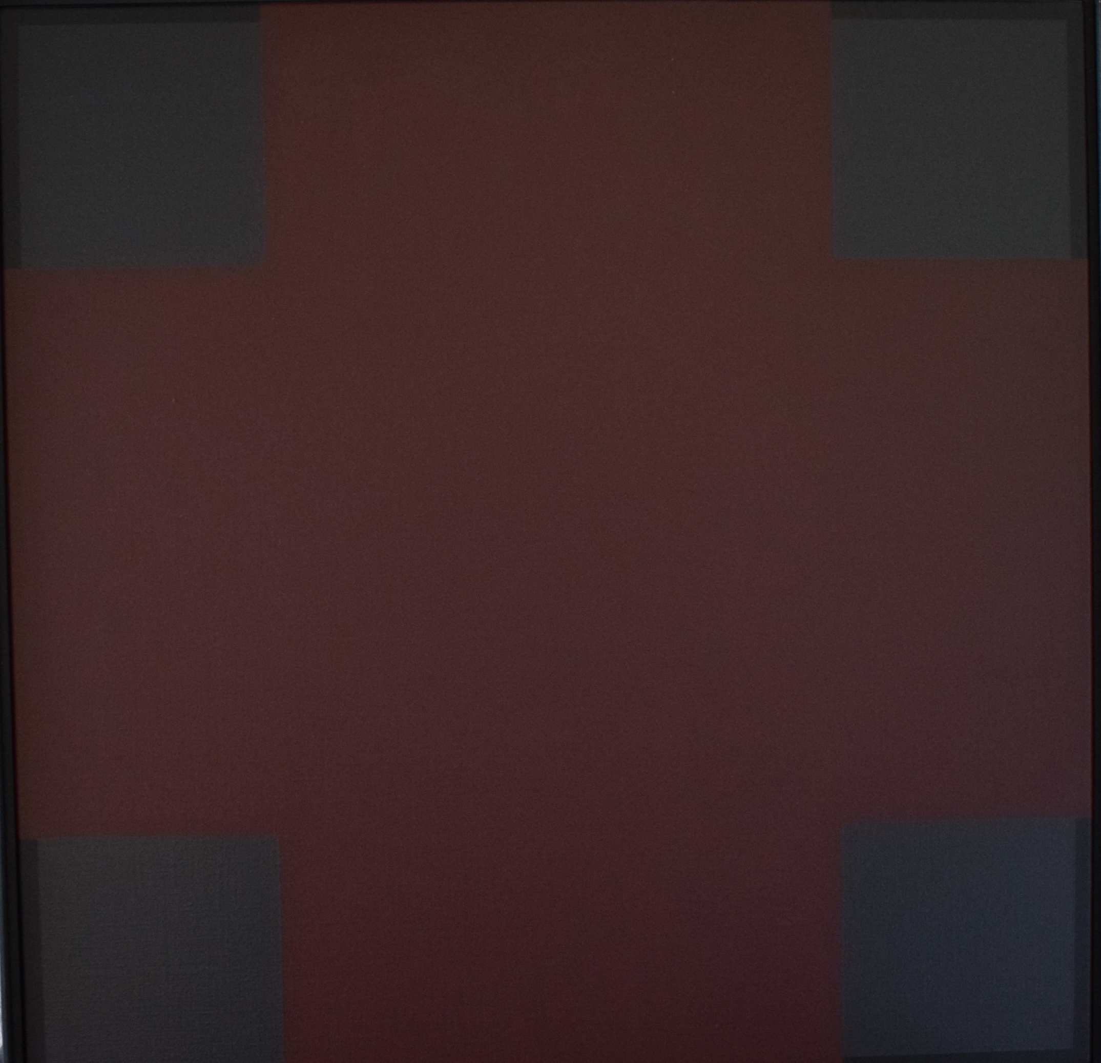
Why is this important? Personally i think that this is the period in which the SM made their best and most important purchases. How about important acquisitions like the ones by Kelly, Dubuffet, LeWitt, de Kooning , Mangold , Lichtenstein and Warhol. Just a few names that belong to the most famous ones, but among the hundreds of these acquisitions there is so much quality art acquired that only with these acquisitions one can fill an entire collection and become with this collection one of the most important Modern Art Museums in the world. The book was compiled by Joosten and designed by Total Design/ Wim Crouwel, which makes it even more worthwhile collecting . It is now available at www.ftn-book.com