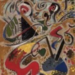
I remember a magnificent Masson exhibition at the old venue of the Musee de l’art Moderne / avenue Wilson in Paris. It was at the time i was living for 9 months in Paris and visited that museum frequently. They had the Brancusi Studio , which is now opposite the Centre Pompidou. I remember the Masson exhibition being different . I expected a kind of surrealism like the paintings by Dali and Magritte, instead i found paintings which were far more abstract and reminded me more like the ones i had seen by Miro. Here follows a short biography i copied from Wikipedia.
His early works display an interest in cubism. He later became associated with surrealism, and he was one of the most enthusiastic employers of automatic drawing, making a number of automatic works in pen and ink. Masson experimented with altered states of consciousness with artists such as Antonin Artaud, Michel Leiris, Joan Miró, Georges Bataille, Jean Dubuffet and Georges Malkine, who were neighbors of his studio in Paris.
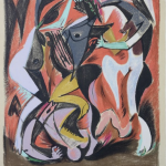
From around 1926 he experimented by throwing sand and glue onto canvas and making oil paintings based around the shapes that formed. By the end of the 1920s, however, he was finding automatic drawing rather restricting, and he left the surrealist movement and turned instead to a more structured style, often producing works with a violent or erotic theme, and making a number of paintings in reaction to the Spanish Civil War (he associated once more with the surrealists at the end of the 1930s).
Under the German occupation of France during World War II, his work was condemned by the Nazis as degenerate. With the assistance of Varian Fry in Marseille, Masson escaped the Nazi regime on a ship to the French island of Martinique from where he went on to the United States. Upon arrival in New York City customs officials inspecting Masson’s luggage found a cache of his erotic drawings. Living in New Preston, Connecticut his work became an important influence on American abstract expressionists, such as Jackson Pollock. Following the war, he returned to France and settled in Aix-en-Provence where he painted a number of landscapes.
Masson drew the cover of the first issue of Georges Bataille’s review, Acéphale, in 1936, and participated in all its issues until 1939. His brother-in-law, the psychoanalyst Jacques Lacan, was the last private owner of Gustave Courbet’s provocative painting L’Origine du monde (The Origin of the World); Lacan asked Masson to paint a surrealist variant.
www.ftn-books.comhas a few important Masson titles available


 .
.