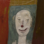
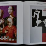
There was a time that i travelled all over the Netherlands and Germany to get inspiration for the perfect museumshop. Rudi Fuchs wanted a Walter König like bookstore within the walls of the Gemeentemuseum and i personally wanted to see and experience what the best solution could be. I was impressed with the Cologne/ Museum Ludwig and we made an interpretation of that store within the Gemeentemuseum. Many ideas that are now applied to the store were developed within those days and some have even disappeared already. One of the best ideas was to make the store visible from within the museum rooms which was realized now some 14 years ago and the result i think is that it is one of the best ideas for this particular store . On one of these travels i found myself in the middle of nowhere at the Jopies Huisman museum in Workum/Friesland. It felt like i travelled to South Africa. No easy connections , but the result was a visit to a highly original museum , totally devoted to Jopie Huisman, a self taught painter . beautiful realistic works of ordinay daily life objects which he found in his direct surroundings.

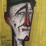
Jopie gave the people honour he felt they deserved. His paintings, whether they are about people or about their belongings, are a homage to the simple Frisian rural farm life, the landscape and the culture. The portraits are monuments to simple things.
Jopie’s artwork does not only possess the recognition and acknowledgement of poverty but also a lot of humour. The humour between people who, driven by circumstance, have to rely on one another. For Jopie, humour was the grease and glue of his life. In the stories he wrote, humour is also clearly present. When you read them, you are actually reading behind the scenes of his paintings.
Jopie’s eye for the absurd, for human proportions and relationships can be found in many of his written or painted caricatures. Recognition was and is above all, a comfort to many visitors as we can see by their reactions.
Jopie was fascinated by daily life which he drank in with great gusto and, as he remarked himself, ‘threw down on canvas’. He poured his soul into his art with great doggedness, perseverance and tenacity. He understood the art of rubbing shoulders with people from all different walks of life like no other.What makes Jopie Huisman so unique is the fact that he was able to illustrate his philosophy of life with so much vigour and with so much feeling and energy. His works are a combination of philosophy, aesthetics and phenomenal art. His message of compassion is universal and timeless.

This book is now available at www.ftn-books.com