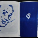
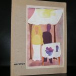
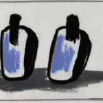
Another rare itemis this special publication by galerie van esch. Piet Dirkx has the largest contribution with some color photo’s and 2 special booklets. numbered edition of only 200 copies . Published 0n the occasion of the KUNSTRAI 1990


Another rare itemis this special publication by galerie van esch. Piet Dirkx has the largest contribution with some color photo’s and 2 special booklets. numbered edition of only 200 copies . Published 0n the occasion of the KUNSTRAI 1990

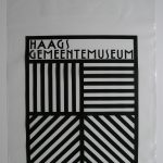
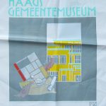
People almost forget that every publication and every outing by a larger company has been designed by a designer. In the tine that i worked at the Gemeentemuseum Den Haag, i have witnessed that every director wanted a change in company style. It was a bit like the french presidents always want to erect a building to show the people in the country that he once was their president ( Pompidou, Mitterrand, Chirac they all had their building projects and are now remembered in the name of the building.

It was the same with the directors i worked with at the Gemeentemuseum. First there was Theo van Velzen who was very fond of Donald Janssen, followed by Henk Overduin who continued with Donald. After Henk Overduin the museum had Rudi Fuchs as a director. Fuchs trusted Walter Nikkels , but after a few month he decided for Gracia Lebbink as a designer and young and saspiring designers who had the “style’ he desired for the publications of the museum and i must admit, personally i think this period produced the best and most beautiful publications. Gracia continued to design some 8 years for the museum. In the time of some 20 years i had witnessed and worked with 4 designers and as many of 4 times every printed outing of the museum was redesigned. Posters, books, printing paper , entrance tickets, shopping bags every aspect of printing was designed agin with the coming of the new company style. It the meantinme i had also witnessed 3 name changes of the museum itself. To show some of the bags that were published over the time i show you the most famous plastic bags of the museum , which are both available at www.ftn-books.com

A blog on a contemporary artist who must have been inspired by her fellow countryman Boris Mikhailov and stirred the art world with het book on two Russian drug addicts “ANOTHER LIFE” But this is not the reason for this blog. I recently added a wonderful artistbook by Popova from 2013 to my inventory. An edition of only 80 , signed and numbered copies. This book is an absolute must for her admirers.

Irina Popova is Russian / Dutch photographer, writer and curator with special interest in the subjects of privacy, sincerity and marginality. She works with a combination of the mediums; non-linear multi-focal storytelling, internet & new media, books and installations.
Born in 1986 in Tver, Russia, Popova started to work as a journalist at the age of 16 in the local newspapers and magazines, and made photos for her articles. Since then, she has gained a remarkable reputation for her intimate collections of photo-stories.
Popova became scandalously famous for her project “Another Family”, where she told a personal story of a drug-addicted couple with a little daughter. The viewers questioned if the story was staged and also the future of the girl in these circumstances. Someone wrote to the police and the investigation started. The artist refused to give away the address of the family, so the family couldn’t be reached. Once more, this story raised questions about the professional ethics of photojournalism.
“If You Have a Secret” tells the stories of her native land, edited from thousands of images, and seven years of photographic life.
the artist book is available at www.ftn-books.com

Treumann is certainly one of the greatest designers from last century and has designed some of the most iconic images in the Netherlands from the last 50 years, but he has been specially important for the designs of the Joods Historisch Museum and the Jewish community.

Born in Bavaria in a German Jewish Liberal family in 1935 he came as an immigrant to Amsterdam fleeding Nazi Germany. He followed his education at the “NIEUWE KUNSTSCHOOL” in Amsterdam he educated their students according to the Bauhaus principles. During the occupation in WWII, Treumann became part of the resistance and forged ID’s and food stamps. After the war his posters for the Jaarbeurs in Utrecht became very famous . He also made some striking designs for AKU, which are now sought after and collected. In 1948 he received the H.N. Werkman price.
Treumann made designs for the Stedelijk Museum, the Anne Frank foundation and the Gasunie. His designs can still be found at reasonable prices and some of these pubications are available at www.ftn-books.com

A local celebrity in Friesland, but still not known outside this province of the Netherlands is Rienold Postma. Thom Mercuur who initiated the Museum Belvedere was an admirer and he organized several exhibitions with this painter , who is a master in smaller paintings. With a minimal composition he transforms his small works into a work with maximum exposure and effect. Just look at these two examples
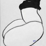
left : “a girl struggling with her sweater” and on the Right “Two girlfriend walking on the dyke”. These are examples of his art and i think they are impressive. When you leaf trough the book on Postma ( available at www.ftn-books.com) you will soon experience the power of these small paintings. These are realistic paintings that are on the border of being completely abstract.
The works by Rienold Postma can be seen at the Museum Belvedere near Heerenveen.
https://www.museumbelvedere.nl


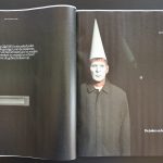
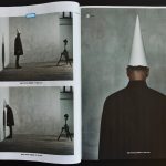
A follow up on the many blogs i have now written on Erwin Olaf. In the mid Nineties Olaf was diagnosed with COPD, a lung disease which makes him now one of the vulnerable people during this Covid-19 pandemic. He made a very personal series , making himself the subject and staging himself in some situations that can only occur during these pandemic times. The series is called ” APRIL FOOL 2020 ” and is now published for the very first time . The series which is now published in the magazine contains 8 photographs. Erwin Olaf makes himself the subject of these impressive, very personal photographs. The Volkskrant magazine had this honour to publish these for the first time.

The magazine is a supplement to the Volkskrant newspaper which was published on Saturday the 16th of May. Maybe you can obtain a copy for your collection yourself, because this is an important , historical series and who knows, perhaps the only time it is published. ww.ftn-books.com has some very nice Erwin Olaf titles available.

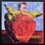
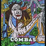
The final blog on the “Figuration Libre” presents two important new additions to my inventory. Both are related to each other. The first is the Guy Pieters catalogue from 2003 in which he presented the latest paintings from 2002 and 2003 and the second is from 2005 from the Museum Jan van der Togt. The museum made a choice from these recent paintings and added, many paintings from the decades before to this great retrospective.
Both are now available at www.ftn-books.com and belong to the best publications on Robert Combas

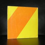
For me personally one of the great publications of all time. Slipcase with artwork on the outside. Printed by Lecturis, edition of only 1000 copies , specially made for the Serpentine gallery exhibition in 1990. COLOUR ANONYMOUS is a classic.


Stephen Prina is an American artist whose work has been categorized as post-conceptualism. Prina is a professor at the Department of Visual and Environmental Studies at Harvard University.
He was born in 1954 in Galesburg, Illinois.
This is probably one of the shortest introductions i found on an artist on the internet. I like Prina’s art very much. Crates, monochrome paintings , ladders and the decoration of an entire space/ room are the elements that Piet Dirkx uses too. Both are from my generation and perhaps that is also one of the reasons i understand their art and like it so much. Where i have followed Dirkx for over 3 decades now, Prina is a discovery from the last 10 years. His exhibitions are true events but rare to be found in Europe. Still there was one held at the Boymans van Beuningen Museum in 1992 and to accompany that exhibition an artist book was published . The only color used for all pages is a bright yellow. A scarce book and now available at www.ftn-books.com


On the 8th of May 2018 i published a blog on the very impressive photography by Wally Elenbaas. These were photographs not lightly to be forgotten. Specially because Elenbaas was sentenced to prison for these beautiful photographs.
https://wordpressstrato-pacfwc5kp0.live-website.com/?s=elenbaas

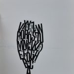
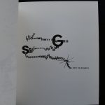
Now it is time to shine some light on another aspect of this great dutch artist. Elenbaas was also a gifted designer and used his typography to create images and illustrations consisting of letters transforming these and their meaning into illustrations. Images tell a far better story than words so here are some illustrations….and….the LETTERBOEK is available at www.ftn-books.com