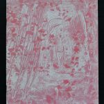
Personally this is one of my all time favorite publications by the van Abbemuseum. Designed by Arlette Brouwers, this publication has everything.
Great cover. In all its simplicity it makes in one glance clear that these are the important acquisitions of the van Abbemuseum. In the background one of the main exhibition rooms of the museum and inside, a very transparent lay out, in which the acquisitions are described. This is a true connaisseurs publication and deserves to be collected.
for this and other Arlette Brouwers designed publications please visit my store at www.ftn-books.com
Last Thursday i encountered finally one of the list I was hoping to find for a long time. The list is made in the beginning of the Eighties when interest rose in acquiring and collecting the Stedelijk Museum publications. Since the start in the Mid ’30s from last century, over 1100 publications have been published by the Stedelijk Museum Amsterdam and this list contains the numbers and titles of the first 500 numbered publications. Willem Sandberg, Piet Zwart and Wim Crouwel, 3 of the greatest of Dutch designers all can be found on this list and i noticed of the 500 titles on it I have over 400 currently available at www.ftn-books.com
Beside the one on the list, there are of course many others published by the Stedelijk Museum FTN books has available. Take a look, save and share this very important document. the list is in PDF format and can be downloaded with the link below:
Yesterday I acquired a small collections from the former library of the Rabo art collection. All books in excellent condition and some are quite scarce. Here is a preview of this 30 books collection. If you see something for your personal collection do not hesitate to contact me at ftnbooksandart@gmail.com and inquire after the price.
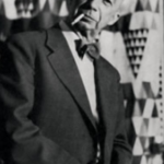
One of the reasons i decided to write this almost daily blog was to expand my knowledge on art and artists from lats century and that is why i stumbled upon Hans Werdehausen., An artis which i did not know of , but who painters touch is typical for the decades hew was producing his art within. Abstraction, Constructivism and cubism mix together and belnd into a personal style.
I recently bought the Recklinghausen catalogue from 1958, which is now available at www.ftn-books.com and i must say that i like his work. If i had a house with 50’s and 60’s furniture there is no doubt in my mind and i would heartely recommend his art for decoration . These compositions are so typical for the Fifties and Sixties and certwainly have a quality of their own. Maybe in the future i must look for his works at auction 😉
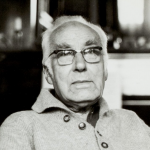
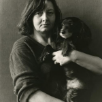
A few days ago i learned that Helena van der Kraan had died at the age of 80.
I have encountered Helena a number of times at the Gemeentemuseum Den Haag where she had become friends with many of its staff. At many occasions these friendships grew into series of portraits and i remember at one time she made photographs of all the staff to be published in a little book which was presented to Theo van Velzen at his leaving the museum. A very kind woman she was and she will be surely remembered for her great photographs she made during her entire career.
OLYMPUS DIGITAL CAMERA
On June 14th, on her 80th birthday, former participant and photographer Helena van der Kraan passed away. Born in Prague in 1940, she came to the Netherlands shortly after the uprising in former Czechoslovakya in 1968, for a two year residency at what was then known as ‘ateliers ’63’. There she met sculptor Axel van der Kraan, with whom she collaborated for many years on large-scale, wooden sculptures, until Helena’s artistic practice focussed more and more on photography. She is known for her restrained and tender portraits of artist friends. Her work is represented in the collections of the Rijksmuseum, the Stedelijk Museum and Museum Boijmans-Van Beuningen. In Fotomuseum The Hague, her series of teddybear photographs is on view until November 1st, 2020.
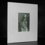
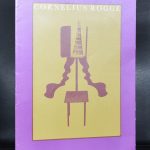
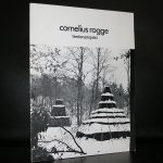
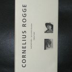
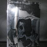
The reason i started to read about Cornelius Rogge and his art is because some 12 years ago i encountered two publications by Rogge. The first and most important one was his TENTENPROJEKT (1976) and the second Battlefield (1997) . 21 years apart from each other but both of a rare quality. Here is what the Kroller Muller writes on his tent project:
These six, mysterious, brown tents are no ordinary tents. Some have the shape of a truncated pyramid or cone. Others are reminiscent of a wigwam, a dolmen or a ziggurat; a pyramidal temple building with terraces. But what contributes most to their unusual appearance is that none of the tents has an entrance.
Secret
What lies in the darkness of these tents? What secrets do they hold? Cornelius Rogge offers no concrete solutions or answers to these questions. With the inherently mundane object of the tent, he calls attention to the mysterious, the inexplicable. ‘Every culture always has mysteries that are inaccessible to people. And that mystery has disappeared in modern culture. Perhaps today’s art has the task of bringing back mystery’.
Vanitas symbol
Over the years, the tents deteriorate and perish under the influence of the wind and weather. Rogge is also aware of this aspect of decay and impermanence. ‘Despite its concrete materialization, the subject of “the tent” is an image of decay, a vanitas symbol’, according to the artist.
These outdoor sculptures are among the largest sculptures collected in the Netherlands and because of their size you can not encounter time as much as i would like to see them, but here is a short film on Rogge in which you can see him at work in his studio.
Here are some titles available at www.ftn-books.com
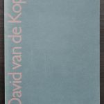
I would have liked to have known David van de Kop, since i have seen practically all his exhibitions in the Netherlands from the mid Eighties until his death in 1994. For me van de Kop is foremost a sculptor and less a painter. Most if his sculptures a fairly large and compositions with different kinds of materials . Steel, stone, ceramics. Every material is suitable for a sculpture. David van de Kop was educated by Carel Visser and in his turn he taught Arjanne van der Spek. Two artists i admire very much.
So for me personally it is a natural admiration, but his works are not only admired by me. His works are present in numerous dutch Museums of Modern art, but because of their size are hardly present within the collections of the well known dutch private collectors. This should be different, but time will show the importance of van de Kop and it will not take long before his works receive the recognition they deserve. David van de Kop publications are now available at www.ftn-books.com
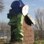
( and yes it still is possible to not find a portrait photo of the artist, so i have put his sculpture DE WACHTERS, on top of the blog)
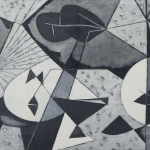
The first dutch artist that springs to mind when you look at the works by Oskar Tröndle. I Julie de Graag. She woorked in roughly the same time bracket as Tröndle and there are similarities in both their works.
But where de Graag stayeed near her home for her subjects, Tröndle has a much broader point of view. I was not very familiar with his works but they have the same quality is the de Graag’s i know. Strong graphic representation of the subject. It is the kind of art i like most.
The scarce “OT” book from the Solothurn museum is now available at www.ftn-books.com
This is the last of the “Piet Dirkx weekly” . After i had finished the cigarboxes 2 years ago and now the series publishing almost 80 Piet Dirkx weekly’s . This series has now come to an end.
Small, important, rare kinds of Piet Dirkx publications and collectibles have come along. Does this mean that there will no longer be any Piet Dirkx publications/ blogs anymore? Certainly not….. i will be preparing in the next months the material for another 60+ works by Piet Dirkx and will publish these in a “PIET DIRKX MONTHLY”.
For now i have decided this beautiful and cherished 2009 New Years wish by Piet Dirkx to conclude this series. It is a pencil and watercolor drawing. Signed and colored by Piet.
Franz Radziwill had some fame in the early Seventies from last century. His Magic Realism paintings were alike with the works by Willink and Berserik but had a style of thier own because of the objects found within the compositions. After the Seventies his name was almost forgotten, but lately i noticed that his paintings started to appear at auction and among them some nice paintings and what struck me is that they were not out of fashion.
Not too big and easy on the eye these are great paintings to start collecting. You can find many more in the catalogue from 1971 for his Reekum galerij exhibition, which is now available at www.ftn-books.com
Artist/ Author: Oliver Boberg
Title : Memorial
Publisher: Oliver Boberg
Measurements: Frame measures 51 x 42 cm. original C print is 35 x 25 cm.
Condition: mint
signed by Oliver Boberg in pen and numbered 14/20 from an edition of 20