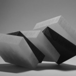
Posted on Leave a comment

Carel Kneulman (1915-2008)

Schermafbeelding 2020-05-15 om 12.18.18

A few days ago I wrote a blog on Aat Veldhoen and illustrated it with a photograph of Jasper Grootveld selling Rotaprints by Veldhoen. In the photograph, the dutch will recognize the “classic” Philips logo on the wall of Atheneum bookstore and “HET LIEVERDJE” the iconic statue.

Schermafbeelding 2020-05-15 om 12.18.34

The Provo movement gathered at this place and the statue is still a symbol of the roaring PROVO Sixties in Amsterdam. The statue was made by Carel Kneulman, one of the leading Amsterdam artists who made a name for himself with sculptures. Forget HET LEIVERDJE and look at his other works you can see a sculptor influenced by Moore and Brancusi and making far better sculptures than the one at the Spui square. It took until his 80th birthday until he received full recognition for his art. At that time he finally received a retrospective at the Stedelijk Museum, but a few years earlier a nice exhibition was being held at the Museum Fodor ( 1990) which exquisite catalogue is now available at www.ftn-books.com

Posted on Leave a comment

Gerard Verdijk (continued)

Schermafbeelding 2020-05-13 om 15.35.39

There was a time that Den Haag had multiple important art galeries, but it now looks like practically all have disappeared. I do not why , but many have stopped their business. One of them must have been Roger Verstraten , since it was about 8 years ago that I encountered at the local book market a box containing all kinds of small publications on Gerard Verdijk. Being a collector of his works I bought the box and many have since become part of my personal library, but one publication was present with multiple copies in the box and 2 of these were signed by Gerard. I did not discover this until recently I leafed through them and noticed that, besides my own personal copy, another one was signed and dedicated to Roger Verstraten. The little book ” VERGETEN DAT JE HET VERGAT ” was published on the occasion of the Artoteek exhibition in 2000.

The second signed copy of this book, which was published in an edition of only 750 copies, is now available at www.ftn-books.com

Posted on Leave a comment

Edward Sheriff Curtis (1868-1952)

Schermafbeelding 2020-05-14 om 14.06.17

I did not realize that Curtis is almost a contemporary photographer. When you look at his photographs you get an impression that these were made in the earliest days of photography, but studying his works you discover that many were made well after 1930.

His most important contribution is however, the series he made around 1915 on the history of the North American Indian people. He photographed the Indian peoples in a way that his works were not only important as a photography document but also they reflected the way the Indian peoples in North America, lived, dressed and were present in US society.

In 1906, J. P. Morgan provided Curtis with $75,000 to produce a series on Native Americans This work was to be in 20 volumes with 1,500 photographs. Morgan’s funds were to be disbursed over five years and were earmarked to support only fieldwork for the books, not for writing, editing, or production of the volumes. Curtis received no salary for the project, which was to last more than 20 years. Under the terms of the arrangement, Morgan was to receive 25 sets and 500 original prints as repayment.

Once Curtis had secured funding for the project, he was able to hire several employees to help him. For writing and for recording Native American languages, he hired a former journalist, William E. Myers. For general assistance with logistics and fieldwork, he hired Bill Phillips, a graduate of the University of Washington. Perhaps the most important hire for the success of the project was Frederick Webb Hodge, an anthropologist employed by the Smithsonian Institution, who had researched Native American peoples of the southwestern United States.[ Hodge was hired to edit the entire series.

Eventually 222 complete sets were published. Curtis’s goal was not just to photograph but also to document as much of Native American traditional life as possible before that way of life disappeared. He wrote in the introduction to his first volume in 1907, “The information that is to be gathered … respecting the mode of life of one of the great races of mankind, must be collected at once or the opportunity will be lost.” Curtis made over 10,000 wax cylinder recordings of Native American language and music. He took over 40,000 photographic images of members of over 80 tribes. He recorded tribal lore and history, and he described traditional foods, housing, garments, recreation, ceremonies, and funeral customs. He wrote biographical sketches of tribal leaders. His material, in most cases, is the only written recorded history, although there is still a rich oral tradition that preserves history.[His work was exhibited at the Rencontres d’Arles festival in France in 1973.

The book by Curtis on the North American Indians is available at www.ftn-books.com

curtis legacy

Posted on Leave a comment

Christopher Knowles (1959)

Schermafbeelding 2020-05-13 om 15.06.41

Christopher Knowles (born 1959) is an American poet and painter. He was born in New York City on May 4, 1959, and has received a diagnosis of possible brain damage. He is often referred to as autistic. In 1976, his poetry was used by Robert Wilson for the avant-garde minimalist Philip Glass opera, Einstein on the Beach. Wilson describes his discovery of the then 13-year-old Knowles in the extended notes to the Tomato Records release of Einstein on the Beach

In early 1973 a man … gave me an audio tape … I was fascinated. The tape was entitled “Emily Likes the TV”. On it a young man’s voice spoke continuously creating repetitions and variations on phrases about Emily watching the TV. I began to realize that the words flowed to a patterned rhythm whose logic was self-supporting. It was a piece coded much like music. Like a cantata or fugue it worked with conjugations of thoughts repeated in variations…

The first time I heard about Knowles was when the Boymans van Beuningen museum presented an exhibition on the artists and the BEBERT publishers published one of the best books from the Eighties on this hardly known artist.

For this occasion Jannes Linders, a Rotterdam photographer made the press material. Knowles name did not grow , but the book and his great art remain and are available at www.ftn-books.com and so are the press ( original)  photographs .

knowles foto c

Posted on Leave a comment

Josef Felix Müller (1955)

Schermafbeelding 2020-05-13 om 14.35.34

A typical Swiss artist who is rooted in the German and Swiss sculpture and graphic arts scenes. Looking at his graphic art you can go back decades and decades and see what kind of art he must have seen in his youth. These influences are evident and are translated into a kind of personal art I like very much.

Schermafbeelding 2020-05-13 om 14.46.26

Bold, rough and poetic all combined at the same time. An interesting interview with Josef Felix Müller can be found with this link:

https://www.jfmueller.ch/cms/images/Interviews/mueller_butter-milk-soap_1990.pdf

Of course www.ftn-books.com has some nice Josef Felix Müller publications available

Posted on Leave a comment

Henk van Vessem (1939)

Schermafbeelding 2020-01-21 om 15.56.10

For me van Vessem is a typical dutch abstract painter. Bright colors and a kind of abstraction that is common among dutch painters and perhaps the way these paintings feel familiar makes me less of a fan. It is a kind of art which is much appreciated by those who seek a decoration on the wall and decide for a brightly colored abstract painting. Perhaps this is a too negative approach to his painting, but since this is a personal blog  i am allowed to express my opinion on an artist and his works. I read somewhere that there are works by van Vessem to be found in the collection of the Royal House of Orange, but this does not automatically mean that one have to admire his art.

Still www.ftn-books.com has a nice publication available which included an original lithograph and i can understand why others like the colorful paintings by van Vessem.


Posted on Leave a comment

Pieter Holstein (1934)


Schermafbeelding 2020-05-05 om 13.44.57

Holstein works are on the border of comics and illustrations. They have a message to be told and within the picture one can discover a complete story even fantasize about the figures and what they are doing. It is a kind of art which is timeless and easy to admire. Figures and drawings are detailed without being realistic. As said a bit like comics are drawn and made.

The Stedelijk Museum recognized the qualities of these drawings in an early stage and made a beautiful catalogue together with the exhibition in 1970. The SIPKE & PIET boek is a typical Holstein production. Drawings and design ( WIm Crouwel), make this a highly collectable item.OLYMPUS DIGITAL CAMERA

Posted on Leave a comment

Ossip ( 1952 )….continued

Schermafbeelding 2020-05-03 om 13.16.25

Readers of this blog know of my admiration for Ossip. It started when i first saw one of his small figures at the Artoteek and wanted to own it for my collection. Far too expensive it was, but when i left the Gemeentemuseum and started FTN books. The museum and my colleagues presented me with the same sculpture i had seen at the Artoteek. It sparked the interest in Ossip and his art and since i have visited numerous times his studio and made frequent purchases.

ossip prive

Ossip name was becoming more and more familiar among collectors and it meant that prices for his works were on the rise.

But in a period of over 15 years i have bought frequently and managed to collect some very nice works through galleries and auctions. It is time to contact him once again and see for myself what kind of works he is making this time, because every time i visit his studio he amazes me with the progress and inventions he makes with his figures and mobiles. Some very nice Ossip publications are available at www.ftn-books.com

Posted on Leave a comment

Riki Mijling (1954)

Schermafbeelding 2020-01-17 om 12.20.39

Two reasons for writring a blog on Riki Mijling. First reason is i admire her works since i first saw them at the ART AMSTERDAM fair in 2005(?). I . am fond of Concrete and minimal art and in her art i find a twist that fascinates me. Yesterday at the local bookmarket i bought a small artist book by Riki Mijling. Published ia a very small signed and numbered edition of only 20 copies. The reason i noticed it was a ribbed card board cover which was etched by the artist rM ’00. So her innitals and signatue are appearing twice in this very limited edition which is now for sale at www.ftn-books.com

Here follows the biography which can be found on the Riki Mijling site:

Dutch sculptor Riki Mijling (1954, Nijmegen, the Netherlands) works in a rich tradition of non-objective, post-minimalist sculpture. The twentieth century art genealogy shows a forceful line of abstract-geometry, with pioneers such as Kasimir Malevitjs, Vladimir Tatlin, Piet Mondrian and Theo van Doesburg. 

Developments in art since the mid-1960s show how artists expanded on this legacy, on both sides of the Atlantic Ocean. In the United States artists like Carl Andre, Donald Judd and Robert Morris burst onto the scene, causing a landslide with their minimalist approaches, a radical simplification of forms and dissolving ‘meaning’ in the traditional sense. 

And in the Netherlands too, artists sought for new forms of expressiveness, for a formal and linguistic reduction, no-longer connected to representation and story-telling.  With her sculpture––and her works on paper too––Mijling expands on this rich tradition of essentialism, developing a characteristic and unique visual language. 

Mijling pairs a reductionist approach with a warm, ‘charged’ character of her sculptures in waxed steel, Cor-Ten steel, glass and stone. It distinguishes Mijling from so many contemporaries and admired forerunners, and raises the question whether the concept of ‘minimalism’ is, in Mijling’s case, still applicable.

​The non-referential, archetypical forms of Riki Mijling’s sculptures lead back to basic elements, to universal significance of timeless forms. Unmistakably ‘Mijling’ is a quest for an ideal line, for pure form and a new experience of space, of the balance between matter and non-matter.