Posted on Leave a comment

Early Promotional designs

denmark travel a

I have been interested in promotional and commercial designs from the Twenties until the Eighties from Last century. Willem Sandberg, Wim Crouwel , Piet Zwart and Paul Schuitema all are personal heroes . Not only known by me, but by many more admirers all over the world. But there is another field of interest. …..

The small commmercial colourful brochures which were published from the early Thirties until the mid Sixties. These are almost forgootten, but have a quality of their own and show life in those decades . Bright colours hardly any descent typography and filled with info and photomontages these brochures are collectibles too. They do not have the quality and historic value of the ones which are designed by the greatest designers from last century, but beside their quality they have “appeal” and that is perhaps even is as important as quality. I have decided to sell some of my doubles on the Scandinavian countries and some of the ones i have on German trains

These are now available at www.ftn-books.com

Posted on Leave a comment

Joost Swarte and HUMO (continued)

Schermafbeelding 2021-02-07 om 13.54.51

Joost Swarte has been drawinh and designing covers for well repected magazines for over four decades now. Drawing covers for Vrij Nederland, The New Yorker, Raw magazine and many more, but one contribution which has been continuing for over 30 years now,stands out and is for the Flemish magazine HUMO.

Schermafbeelding 2021-02-07 om 13.56.09

He made dozens and dozens of covers over the years and many of these were published in small portfolio’s. A collection well worth starting now. www.ftn-books.com has the portfolio “TWEE POLEN” now available. A beautiful start or addition for your Joost Swarte collection.

swarte polen a

Posted on Leave a comment

Cor van Dijk (1952)

Schermafbeelding 2021-02-07 om 13.37.39

I recently acquired a drawing by Cor van Dijk from 1993. I am very happy with my purchase, since i consider Cor van Dijk as one of the true dutch minimal artists.

cor van dijk a

I have encountered many sculptures by van Dijk at gallery exhibitions and auctions, but never had the funds to buy  a larger work. This was a chance i had to take and bought the drawing.  A graphie filled in shape of two rectangles intertwined and very much a drawing which is typically van Dijk. The drawing is now available at www.ftn-books.com

To explain the attractions of van Dijk i found this text on his site. It gives a rather accurate description of the way Cor van Dijk constructs his sculptures, which is also applicable on his drawings

The steel sculptures of Cor van Dijk (Pernis, 1952) are characterised by clear lines and geometric shapes. From first stages of their design, the material used for these works – steel – and their realisation are inextricably linked. To create his work, the artist uses separate sheets of solid steel, which he joins together with extreme precision. Van Dijk bases the dimensions of his sculptures on the standard gauge of the sheet metal. As a result, the mill scale found on the rolled steel is left intact in the finished works.

Viewing Van Dijk’s sculptures, one’s eyes constantly move across their surface and one’s attention keeps shifting from areas of open space to sections that take up space. The seams between the different segments play a key role in the works, since they lend a sense of scale to the mass of steel and define its different volumes. The artist strives to show interior space – its layout, possible compartments, the spaces between the segments and the massive quality of the steel itself. The different dimensions all interact with one another. Ultimately, this is also what gives the sculptures their specific presence: the precise handling of volumes and the perfect connection of individual sections in space.
Each newly-realised concept is intended to bring even greater clarity to the context of the preceding work – while also pointing ahead, suggesting new concepts that are still waiting to be developed.

Viewed head-on, Van Dijk’s sculptures seem quite unambiguous. But when you observe them from a variety of angles, this clear-cut quality makes way for a new complexity that takes more time to fathom. The seams created by the careful positioning of the individual metal sheets form a two- and three-dimensional drawing – both across the sculpture’s surface and within it.

Over time, the artist’s explorations and realised projects have yielded a unique generative system in which each evolution, each addition and each realisation charts its own course, fulfils its objectives and ensures that the whole ‘makes sense’ – for the moment, at least.

A sculpture’s realisation is the final stage of a long process. The artist needs to wait until the entire design process has been rounded off and the concept is fully developed. The different dimensions all need to be determined with millimetre accuracy. In this method of working, any further interference during or after the sculpture’s production is out of the question. This puts considerable pressure on Van Dijk’s work process – which he sees as a good thing, incidentally.

Van Dijk’s most recent sculptures comprise a single segment. The location of the open space and its dimensions determine the scale of the work as a whole. The result is an object in which mass (matter) and open space interact more intensively than ever before. In technical terms, the steel used for the sculptures shows no traces of machining or processing. Thanks to their mass, the open space and the interaction of these two elements, these tranquil objects seem to speak directly to the viewer.

Posted on Leave a comment

Sandro Chia (1946)

Schermafbeelding 2020-10-02 om 15.27.12

The very first time when i saw work by the Italian CHia was when he was presented together with contemporary artist from Italy presented at the Stedelijk Museum and i decided at that moment that fro me personally i liked the works by Chia the best. Not cucchi, not Clemente and not Palladino i liked most but the semi bombastic paintings by Chia  i liked most. They have a classical quality, but look very contemporary. Bright colors and filled with action his paintings still fascinate me.

chia sm a

Sandro Chia is an Italian painter and sculptor. A native of Florence, he was a key member of the Italian Transavanguardia movement, along with fellow countrymen Francesco Clemente, Mimmo Paladino, Nicola De Maria, and Enzo Cucchi. The movement was at its peak during the 1980s and was part of a wider movement of Neo-Expressionist painters around the world.

www.ftn-books.com has some nice Chia titles available.

Posted on Leave a comment

Gerard Unger (1942-2018)

Schermafbeelding 2021-02-01 om 14.54.43

Longtime overdue…this short piece on Gerard Unger does not do justice to the importance of Unger for dutch graphic design.

Unger was a Dutch graphic and type designer. He studied at the Gerrit Rietveld Academie in Amsterdam from 1963–67. A pioneer of digital type and an eyewitness to the important technological shifts of the past five decades, prolific writer and researcher. Unger has taught at the Gerrit Rietveld Academie for over 30 years, and since 1994, he is a visiting professor at the University of Reading at the Department of Typography and Graphic Communication. From 2006 to 2012, he has been lecturer in typography at the Department of Fine Arts of the University of Leiden.


The following text comes from EYEmagazine

Gerard Unger was a quietly ambitious typeface designer whose fonts have achieved a popularity and ubiquity that few superstar designers can equal. Born in The Netherlands in 1942, he has been involved in digital type design since 1974: for print (Dr-Ing Rudolf Hell GmbH, now Linotype Library); for office use (OcZ Nederland, Venlo); and for the screen (Philips Data Systems). Unger studied at the Gerrit Rietveld Academy in Amsterdam from 1963-67 and he has taught there for more than 30 years. Since 1994 he has been a visiting professor of typography and graphic communication at the University of Reading in the UK.

The many typefaces he has designed include Hollander (1983), Flora (1984), Swift (1984-86), Swift 2.0 (1996), Amerigo (1986), Oranda (1986), Argo (1991), Gulliver (1993), Paradox (1998), Coranto (1999) and Vesta (2001), a new sans serif. Many of these are used internationally in newspapers and magazines: for example Coranto for The Scotsman and the Brazilian newspaper Valor, launched in 2000; Gulliver for USA Today and Stuttgarter Zeitung. Swift (see Eye no. 3 vol. 1) has acquired the status of a late twentieth-century classic.

He has also designed several typefaces for signage, including the one used for the Amsterdam Underground and in 1996, in conjunction with the Leiden-based company n|p|k industrial design, a new face for Dutch road signs, commissioned by the Dutch tourist organisation ANWB. He made a personal contribution to the tradition of public lettering in Rome when he was commissioned to developing an orientation and information system for the City of Rome’s Jubilee year 2000. He headed a team of six designers, working again in conjunction with n|p|k. Part of this project was a new type family, Capitolium (1998), to be used in seven languages and in different technologies, including public touch screens.

Unger also designs corporate identities, magazines, newspapers and books, writes regularly about graphic design and typography and lectures abroad. He claims he is proud to remain an ‘old-fashioned designer, satisfying clients, solving problems,’ continuing a Dutch tradition of text face design for reading. ‘Over the past decade,’ he says, ‘while many designers were producing post-structuralist, post-industrial, Deconstructivist designs and … more interested in how things look than in what they have to say, I remained interested in content first.’

Posted on Leave a comment

Robert Mapplethorpe… an assignment

Schermafbeelding 2021-01-29 om 15.42.46

Before Robert Mapplethorpe became worldfamous for his photographs he made a living as a portrait photographer and in 1986 he brought in an assigment for  a book which is now sought after because of his brilliant photography. The book? ….. 50 NEW YORK ARTISTS … edited and written by Richard Marshall and all portrait photography done by Robert Mapplethorpe. Among the artists depiceted some famous names like Isamu Noguchi, Kenny Scharff, Donald Judd, Roy Lichtenstein, Keith Haring, Eric Fischl and many many more. It reads like a WHO IS WHO from the art scene in New York in the mid Eighties. A great collectable book and now available at www.ftn-books.com

mapplethorpe artists a

mapplethorpe artists c

mapplethorpe artists b

Posted on Leave a comment

the ZERO FOUNDATION

Schermafbeelding 2021-01-28 om 16.56.34

Looking for more infor on ZERO/NUL i stumbled upon this nice site . Site is in German and English and one can open and enlarge some very nice ZERO publications. For some real authentic ZERO publications please find what is available at www.ftn-books.com, but for those only wanting a short “fix” this is perfect.

http://zerofoundation.de/en/

Posted on Leave a comment

Pierre Poiret ….King of Fashion

Schermafbeelding 2020-09-28 om 14.34.00

The following text was originally published in the New York Times.
Poiret’s achievement is not as visible today as that of Coco Chanel, who built on some of his ideas and discarded others. His fashion house closed in 1929, and he spent his remaining years impoverished. But Poiret was for a while a revolutionary in revolutionary times and also a canny impresario. His radically streamlined, unstructured, often stridently colored clothes freed women from corsets while evoking exotic, non-Western cultures and a fierce disregard for social convention.

He introduced these corset-free garments in 1906, the year before Picasso committed his decidedly uninhibited (and unstaid) “Demoiselles d’Avignon” to canvas. But with his love of the exotic, his brilliant use of color and pattern, and his penchant for simplified, almost rudimentary form, Poiret most resembles Matisse.

Poiret functioned as a kind of one-man cultural scene. He collected art, gave lavish costume parties and made astute use of the press while laying the groundwork for fashion design as a modern art and a modern business. His clients included Sarah Bernhardt, Nancy Cunard, Isadora Duncan, Colette and Helena Rubinstein. Man Ray photographed Peggy Guggenheim in a Poiret gown and turban. Edward Steichen’s first fashion photographs were taken of models in Poiret’s atelier.

He was the first designer to understand the value of designing for well-known actresses both onstage and off. He was also the first to create his own line of perfume, named Rosine, for his eldest daughter, and the first to open an interior design store, Atelier Martine, named for his second daughter but inspired by the Weiner Werkstätte. His innovations included the chemise, harem pants and pantaloons and the popular lampshade skirt. When he visited the United States in 1913, he found himself called the king of fashion and discovered the underside of modern fashion success: His lampshade skirt was being copied far and wide.

Organized by Harold Koda and Andrew Bolton, who are curator in charge and curator of the Met’s Costume Institute, “Poiret: King of Fashion” conveys quite a bit of his complex genius and his contradictory relationship with modernity. It displays 50 garments on mannequins (by Beyond Design) whose ovoid faces and cryptic features evoke Brancusi and Modigliani. The silk backdrops, which are the work of Jean-Hugues de Chatillon, a French set designer who served as the exhibition’s creative consultant, accent the show’s spaciousness with indelibly Parisian vistas of leafy parks, chic theaters and luxurious drawing rooms. All told you may have the sensation of drifting through a series of extraordinarily beautiful fashion illustrations, an art that Poiret cultivated to his advantage.


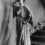
Poiret’s liberation of the female body was in part inspired by the gamine build and independent spirit of his wife and muse, Denise, whom he married in 1905. In other ways it was born of necessity. Although he was initiated into the couturier business between 1898 and 1903, working as a designer for Jacques Doucet and then the House of Worth, Poiret never trained in the exacting crafts of couture tailoring or dressmaking.

His design ideas began with the flat, rectangle of the fabric itself, as did the Japanese kimonos and North African caftans he admired. They then evolved through draping, not tailoring, into garments with a minimum of seams that pretty much hung from the shoulders.

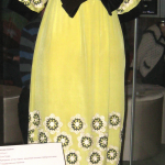
Poiret drew from a broad range of sources. Early in the show there is a trio of nightgowns, based on the Classical Greek gown known as the chiton, that are precursors to the 1950s negligee and the early 21st-century socialite party dress. To one side of these are two white high-waisted dresses that hark back to the severe yet demure gowns of post-Revolution France, displayed with an Atelier Martine chair that has bubbly hand-painted fabric.

Nearby is evidence of Poiret’s attraction to a more ornate form of non-Western dress: a gauzy harem outfit studded with enormous beads of turquoise celluloid that Denise might have worn to their most famous fete, “The Thousand and Second Night” costume party on June 24, 1911.

But turn around and you will see a stark simplicity that may take you aback: a gown that resembles nothing so much as a 1960s abstract painting. Wrapped gracefully around a mannequin, it has no sleeves or collar to speak of, just four broad, alternating bands of stylishly darkened red and blue.

Poiret’s best clothes were abstract in a very real sense, with a kind of self-evident structure that is a precursor of Minimalism, as well as of clothing designs as different as those of Rei Kawakubo, Hussein Chalayan and Andrea Zittel. His basic form was a cylinder, with or without sleeves attached. It appeared in his work as early as 1905 in his Révérend Coat embellished with Chinese roundels. The first garment in the show, it is worn over a white, lacy, high-necked, pinch-waisted Edwardian gown, like those Poiret designed at the beginning of his career. The sartorial conflict accents the shock of the newness of his sense of form, structure and color.

His best known and most audacious designs are a series of full-length columnar opera coats that begin in 1911 and culminate in the 1919 Paris Evening Coat, merely a swath of uncut fabric with a single seam. In a wonderful bit of exhibition magic this Möbius-like feat is demonstrated in a brief digital animation projected on a scrim that then turns transparent, revealing the actual coat behind it.

But even without digital aids you can see how his garments are built, step by step. A day coat began as a black satin jacket based on a Chinese robe. To this he added four strips of cream-colored wool jacquard striped horizontally with thin lines of brown for two cuffs, a simple folded-over collar and a slightly gathered skirt that reaches almost to the floor.

The contrast of fabrics joined in this single form is elegantly harsh, like a combination of Hudson Bay blanket and black tie. A similar contrast is drawn more closely in a jumperlike dress made of gold-lamé twill.

Poiret followed modernity only so far. By the mid 1920s Chanel was designing convenient, understated clothes for women enjoying an increased sense of physical and social freedom in the wake of World War I. But Poiret ignored the shorter skirts and trimmer lines and continued enveloping women in luxurious garments that began to look cumbersome.

the following books on Poiret are available at www.ftn-books.com

Posted on Leave a comment

Lei Molin (1927-1990)

Schermafbeelding 2020-09-28 om 13.36.49

Lei Molin followed in his very own way “the road to abstraction”.

Making black and white landscapes in the early years of his career, painting portraits to make a living, he moved in the mid Sixties to Amsterdam where he made a connection with Pieter Defesche, Jef Diederen en Ger Latster, they were called the ” Amsterdamse Limburgers”, because they all moved from Limburg to Amsterdam. In Amsterdam he was influenced by Cobra and Minimalism, resulting in a style of his own losing the bright colors and presenting his works in a sober black an white. In the early Eighties color returned into his works and the us e of plastic foils made his paintings stand out from the ones of his colleagues.

Schermafbeelding 2020-09-28 om 13.37.33

After Amsterdam he movend to Ijmuiden, where he became a member of the Ijmuider kring and got inspired by the harbors of Ijmuiden.

In 1986 he told the interrviewer for a nespaper that he considered his latest works to be the ones of his 40 year career. I have known i could make it, but now i finally i am confident enough to make it. It will not become better, also not worse…this is the result of a lifelong career.

Thr above titles are available at www.ftn-books.com


Posted on Leave a comment

Raymond Pettibon and THE BLASTING CONCEPT.

Schermafbeelding 2021-01-15 om 16.32.28

This album cover was done by Raymond Pettibon and the album contains punk and post punk. A true sampler which shows the best artist from the SST label. None is importnt for me personally, but what i do like is that the over art is done by Raymond Pettibon. For those interested in the contents of the album read this.

pettibon blasting a

pettibon blasting b

When punk had its second boom in the early `80s, the emerging art form of the compilation album was given birth and has remained with the genre to today. The east coast beat its chest with the faster-than-light Flex Your Head comp released by Dischord, while the west coast celebrated its fierceness with the mostly Californian Let Them Eat Jellybeans! out on Alternative Tentacles. Boston responded with the soundtrack to circle pits, This Is Boston, Not L.A.. Unfortunately, with these three pillars casting their influence on almost the entire punk and indie scene, some label-specific comps tend to get overlooked. This is a shame as SST’s The Blasting Concept (Vol. 1), released in 1983, features a great selection of early-to-mid-SST jams which feature the label at its most lean and angriest.

The album opens with a selection of early Minutemen tunes. This handful of tracks shows that while many labels were heading in a generic three-chord, minute-thirty direction, SST was signing artists that were unique and completely inimitable. In usual Minutemen style, the trio rips through tunes which are more sketches than full-fledged opuses, jumping and skittering around chords and across song structures with more ideas in two minutes than many bands have in an entire album. In contrast to the Minutemen, Black Flag dominates the flip side with a song headed by each of the three pre-Rollins singers. While the Watt/Boon/Hurley combination delighted in its delicate intricacies, the Greg Ginn-headed Black Flag explodes with skillful rage, wasting not a millisecond of time.

Complimenting Black Flag are Saccharine Trust and Stains, two other bands on the early LA punk scene. While time hasn’t been as kind to these two groups as Black Flag, the two singles included in the comp show that while Black Flag, the Germs and a few others might have been the most dangerous, the west coast had plenty of other groups who could not only hold their weight, but also were capable of adding a little bit of east coast flavor to the west coast sound.

While SST started out as a punk label, it would later incorporate other non-commercial music including heavy metal and even free-form jazz. Chuck Dukowski’s Wurm, featured in its second incarnation on this comp, shows SST recording, Sabbath-influenced metal that allowed The Duke to show off his bass mastery/savagery. While Wurm wore its influences in the open, Overkill would be one of the first groups to head in the newly emerging thrash direction. While later on the group became much more well-known in metalhead circles, on The Blasting Concept the band carefully balances the challenging weights of punk and metal, making one hell of a fist pounder.

Although post-punk began to develop almost as soon as punk itself developed, most of these late `80s heros began as straight-up punk outfits. Luckily for us, the comp features early versions of Hüsker Dü and the Meat Puppets. Both bands are caught amidst their transitions, when unusual song structure and thick riffs dominated their sound.

Creative arguments and financial difficulties would plague SST in its later years. These troubles make this document all that much more valuable. There once was a time when SST was a dysfunctional yet happy family united not by a common sound but by a common aesthetic. The 14 cuts on this platter feature SST at its prime when it made a bold statement wrapped in a provocative cover by the awesome Raymond Pettibon. Of course, it’s a waste of time to live in the past, but every once in a while it’s nice to remember a time when all our heroes were pals (even though they kinda hated each other then, too). text by John gentile, 2007