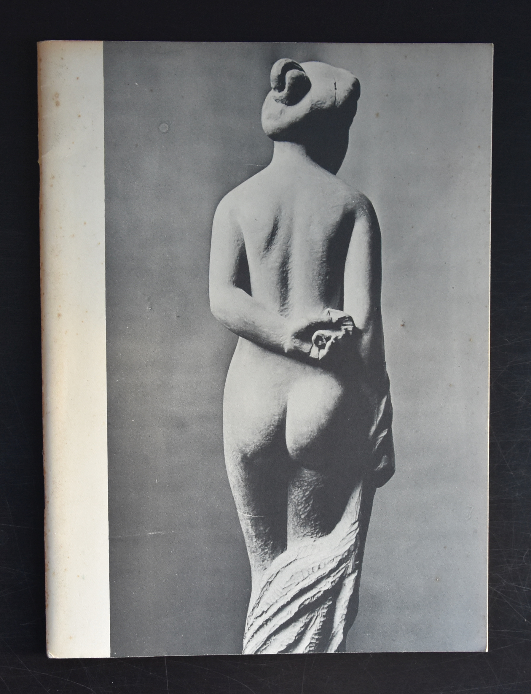
If ever i had to chose two great sculptors from France , for me personally it would be Camille Claudel and Aristide Maillol. Rodin is a great sculptor , but i find his sculptures/statues to classic. He is a craftsman but for me he lacks the personal touch that i encounter with Maillol and Claudel. I have been admiring daily for 25 years a great statue by Maillol which is in the collection of the Gemeentemuseum Den Haag and i found it never boring.
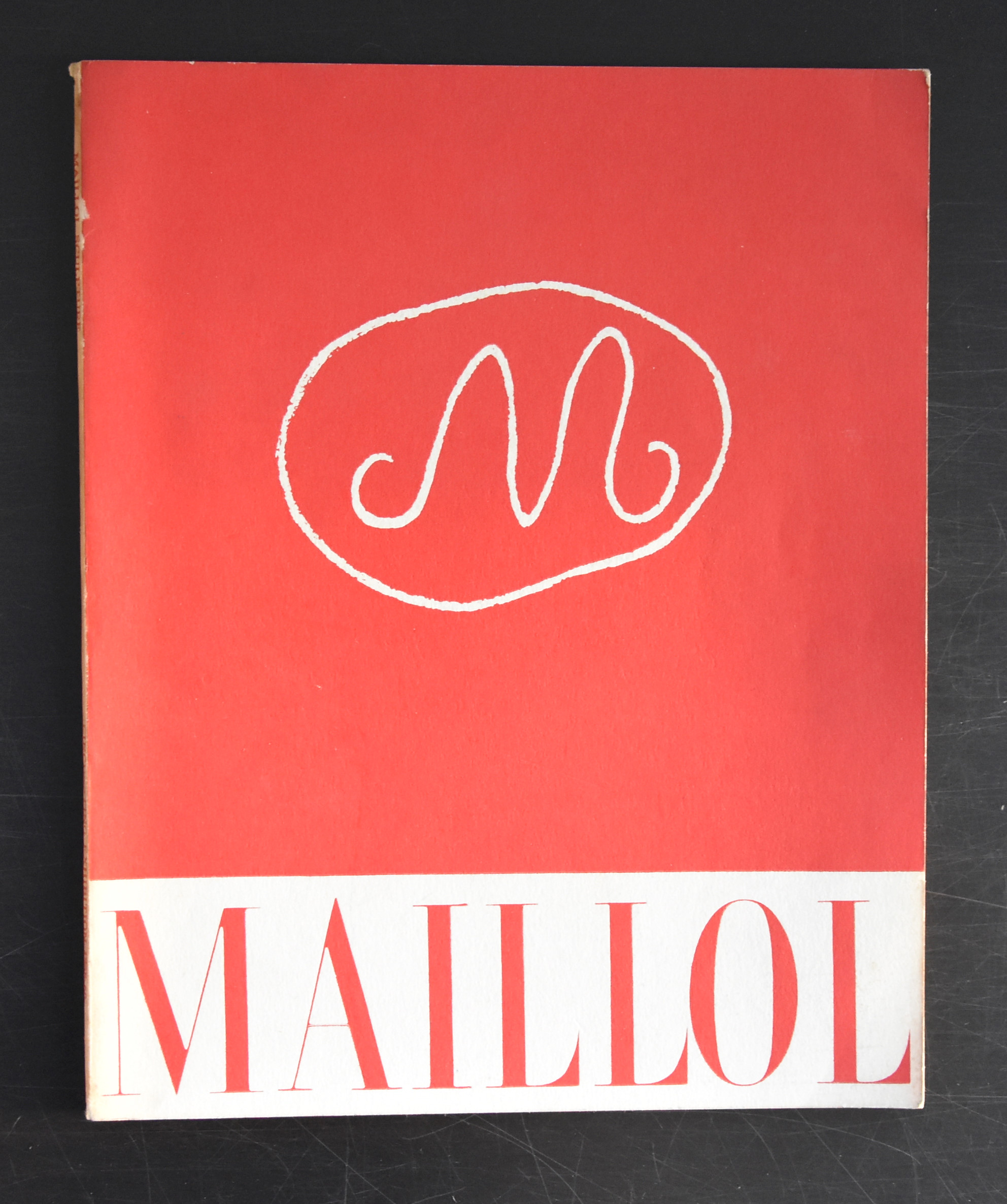
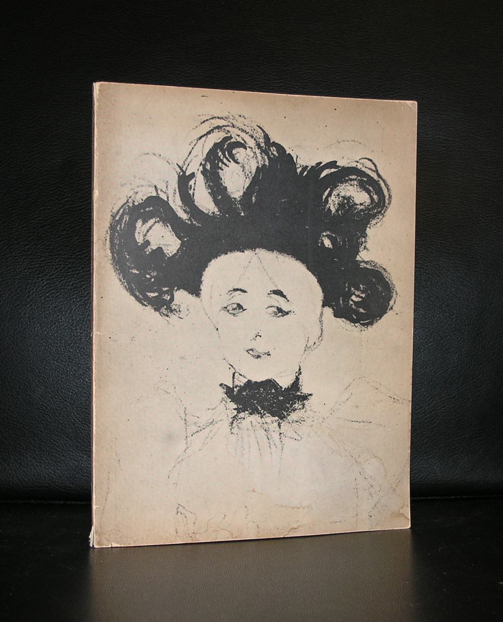
This is the reason that i am always on the look out for publications on Maillol and finally i found another great one at our local bookmarket . It is the spectacular Paul Rosenberg catalogue for his sales exhibition of sculptures by Maillol from 1958. It is now available at www.ftn-books.com together with excellent Sandberg designed catalogue from the 1962 exhibition which was held at the Stedelijk Museum.
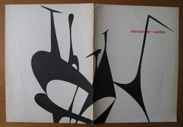
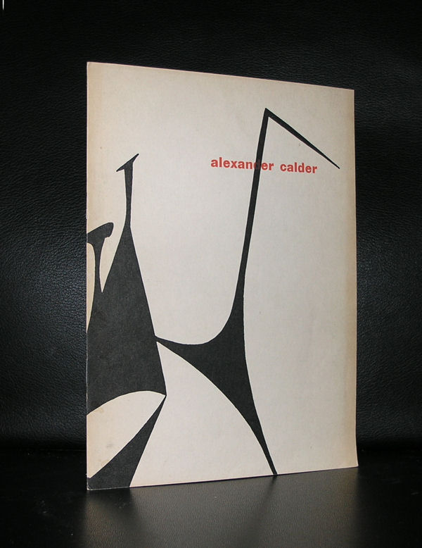
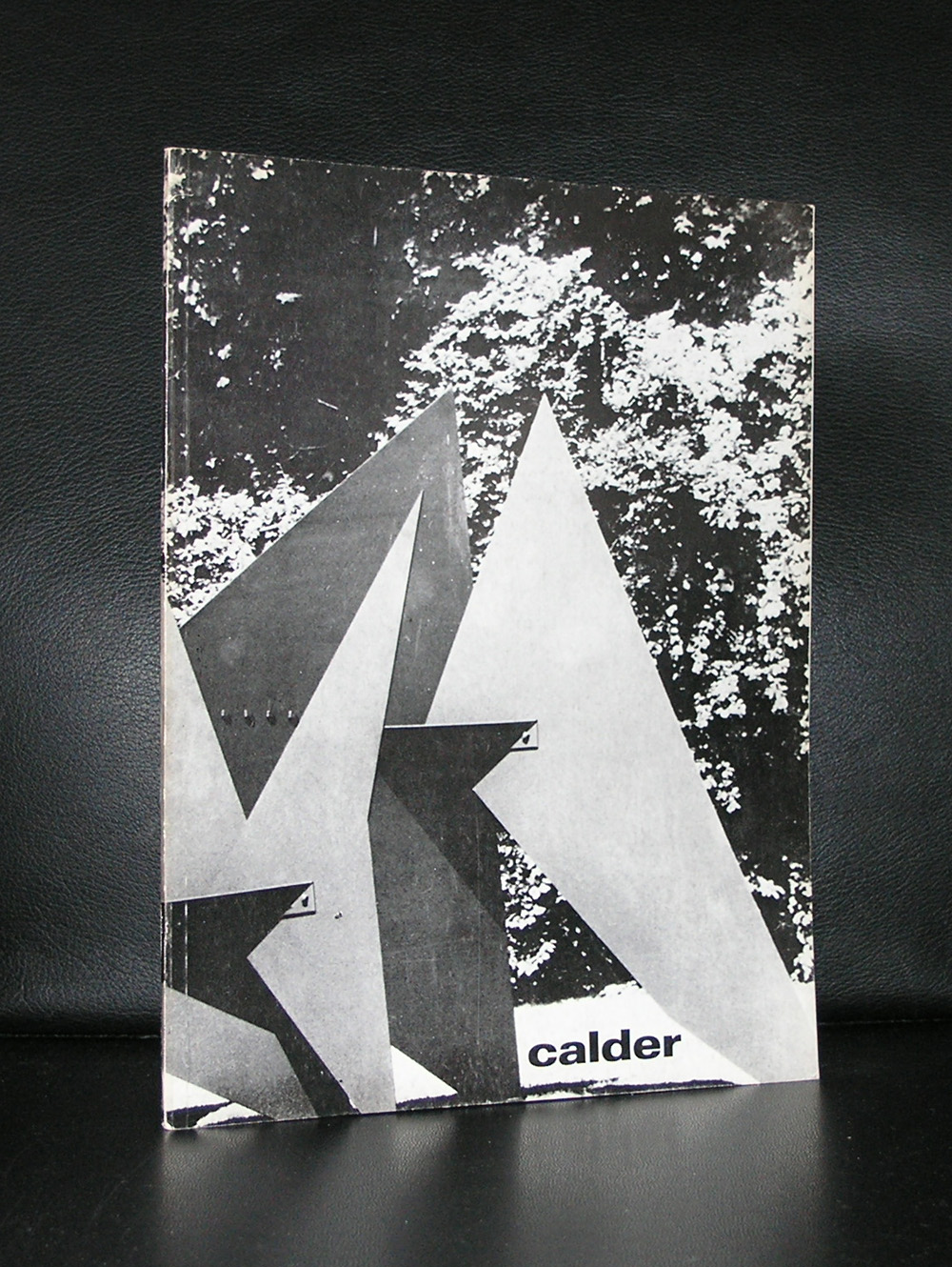
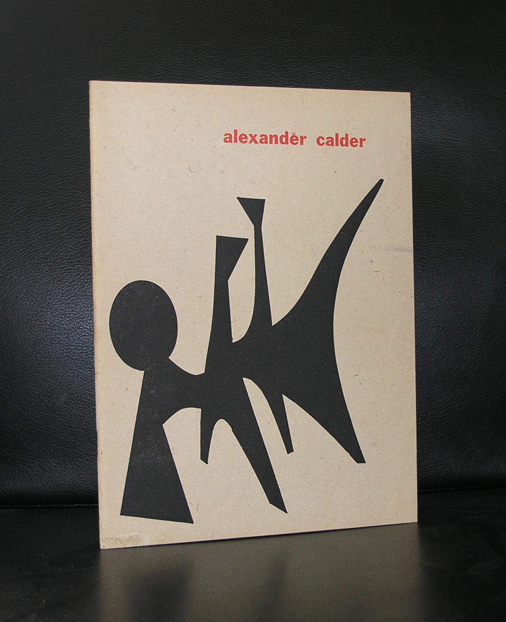
There are 3 Calder catalogues published by the Stedelijk Museum ( 1947,1959 and 1969). 2 of them are available through www.ftn-books.com. The first 2 were designed by Willem Sandberg and the last one by Wim Crouwel. Many colelctors like the 1959 catalogue , this because of the bald design and great prints on the cover, but for me the 1949 is the best, much more subtle and a catalogue that shows the design path Sandberg is going to take. Choice of paper, typography and illustrations make this the perfect early Sandberg publication.
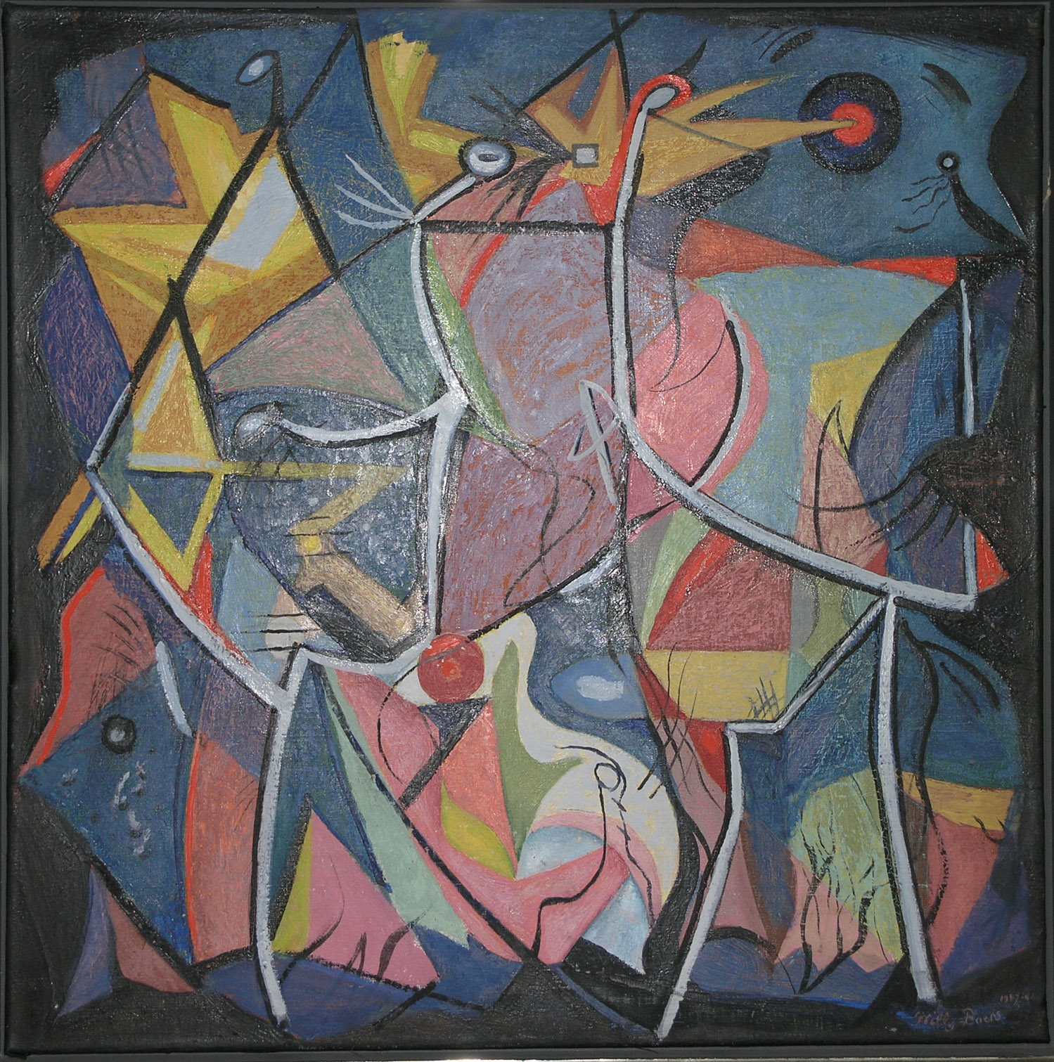
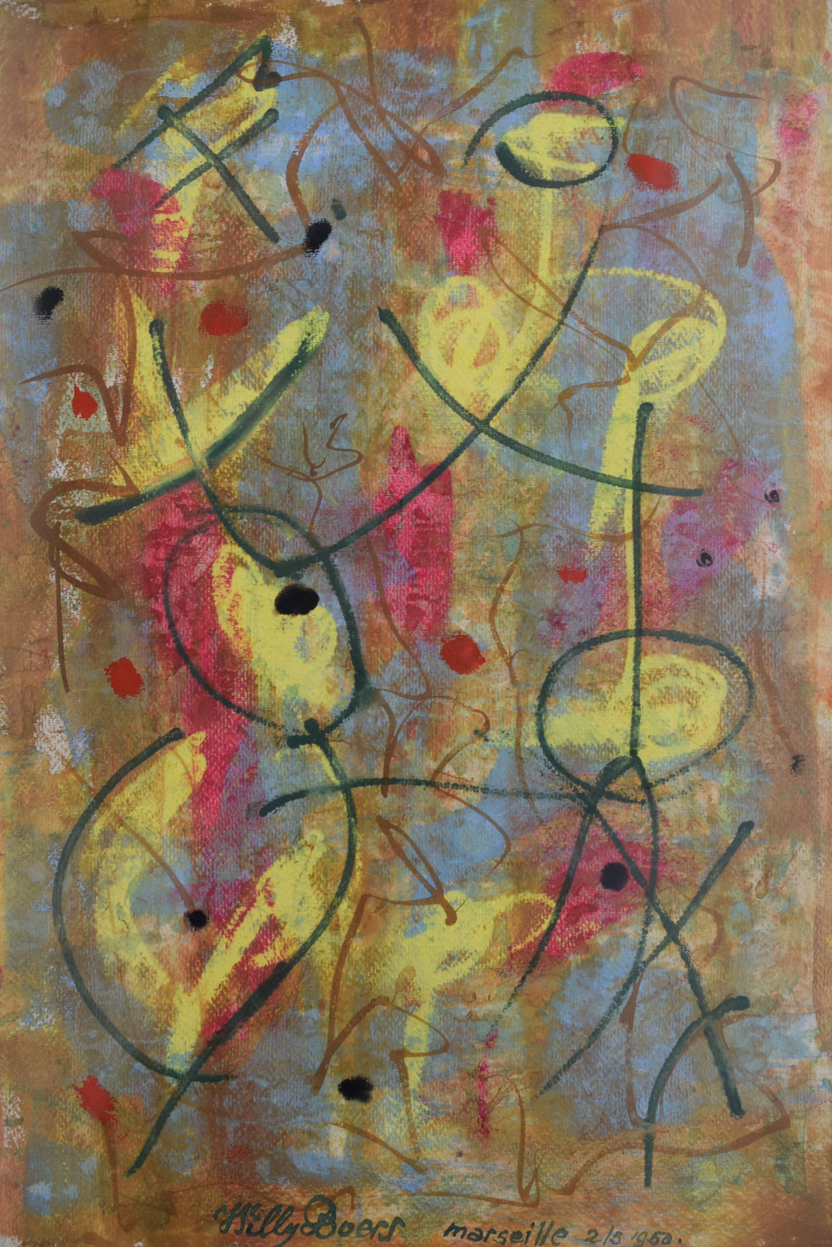
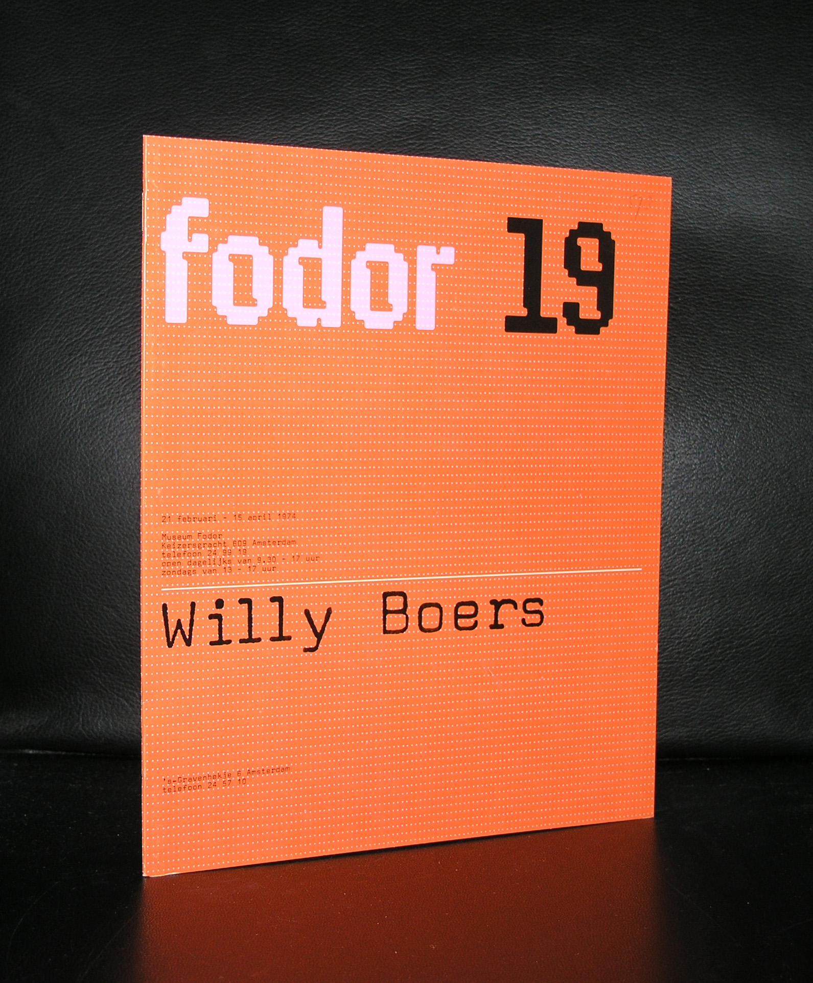
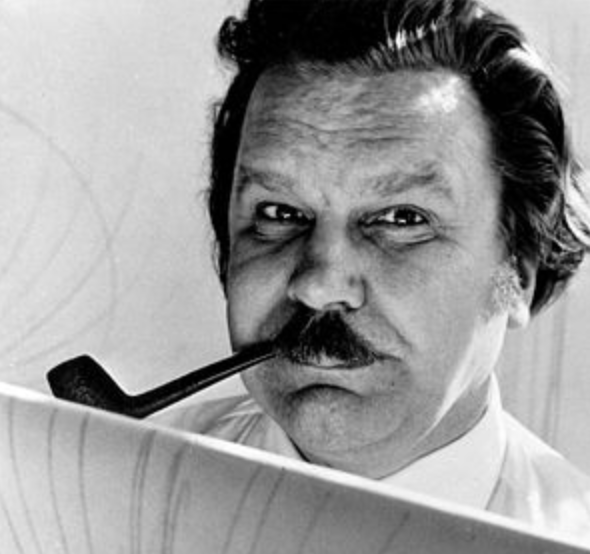
Willy Boers, Dutch art ” insiders ” will know the name and the works he stands for. But for those less familiar with the artist Willy Boers here is a short biography. Willy Boers developed his art from realistic scenes into abstract, even hard edge art over a period of some 40 years. He stood at the cradle of the first dutch modern abstract expressionist paintings. Probably influenced by Miro and Picasso he developed his art into something very typical and recognizable as a Willy Boers painting.
OLYMPUS DIGITAL CAMERA
When i first read the catalogue EEN NIEUWE SYNTHESE ( available at www.ftn-books.com) , there were 2 artist which immediately caught my eye. There was of course Willem Hussem and ….Willy Boers.
Boers was far less familiar, because i already had seen some Hussem paintings at gallery Nouvelles Images, but it was not until 10 years ago that i finally had a chance to admire some paintings by Boers “live” . It was at the gallery of Henk Klasema who had bought the remainder of the Boers studio and was selling these Willy Boers paintings. Because he had all periods available i could discover his development into hard edge abstract art, but was mostly convinced of the art he made in the period between 1949 and 1955.
Now is finally the time that Willy Boers is being recognized for the great dutch artist he was . A true pioneer in dutch Modern Art and sometimes his works come now available at auction. Keep this in mind… Boers is still affordable, but it will not last 10 years before his art will be picked up by many more art dealers and collectors, making it far less affordable than these works are right now.
There are some nice Boers publications available at www.ftn-books.com including the which was made for his Stedelijk Museum exhibition.
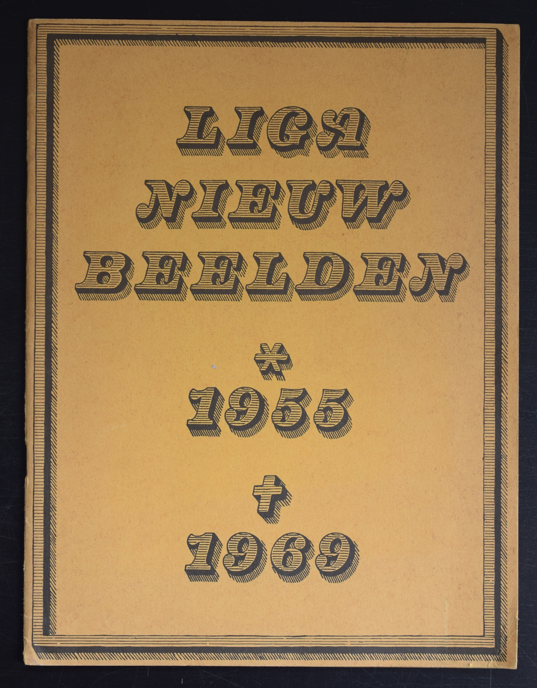
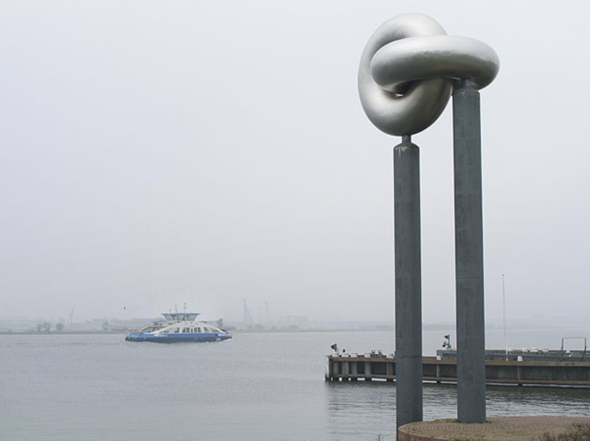
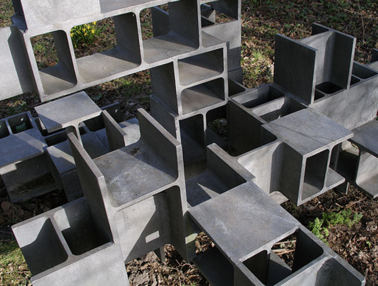
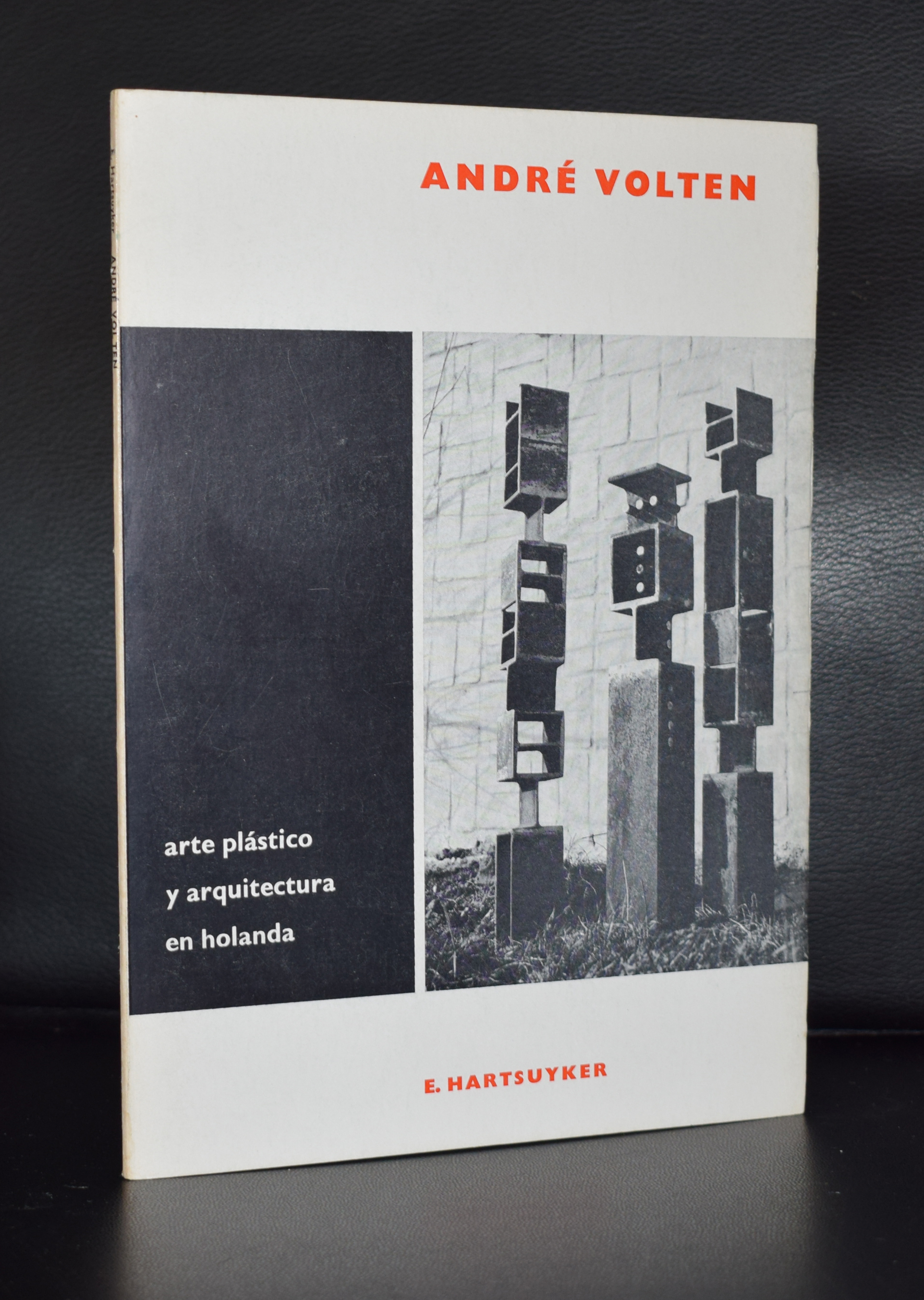
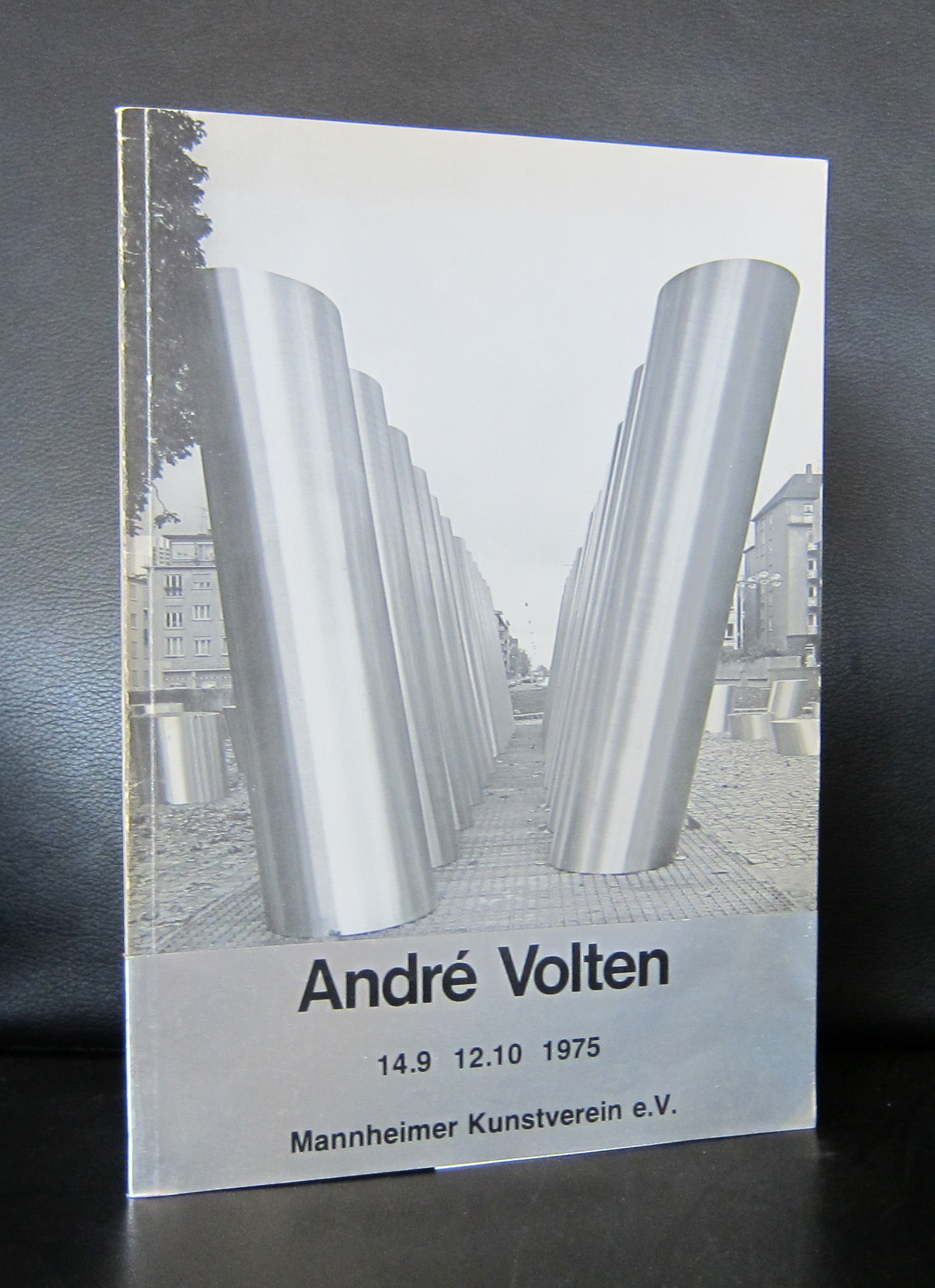
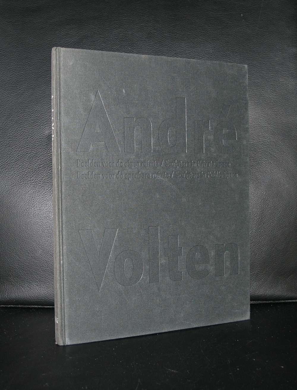
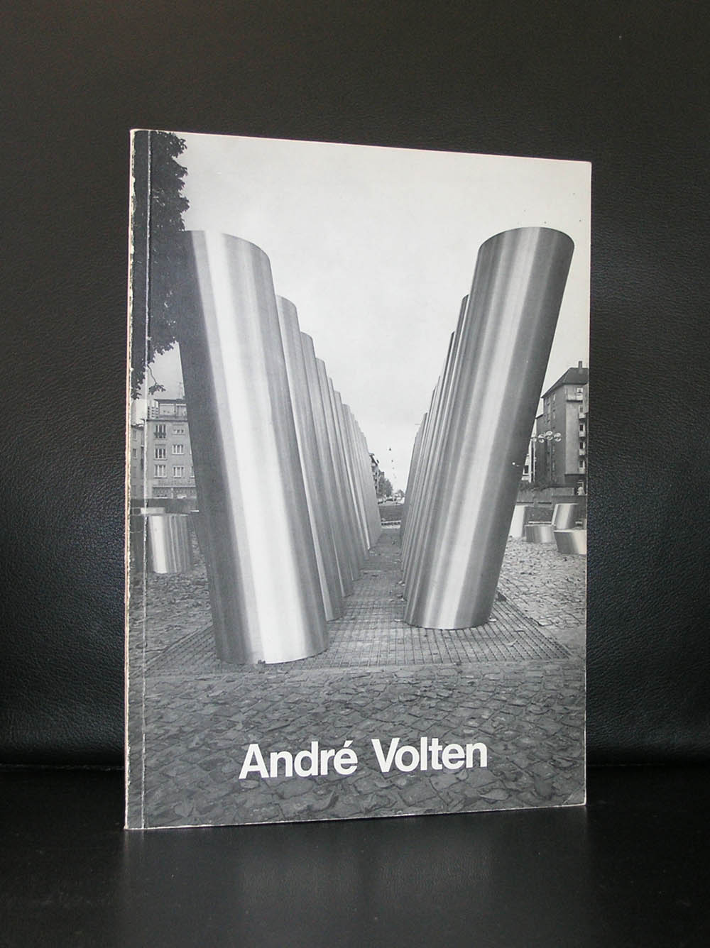
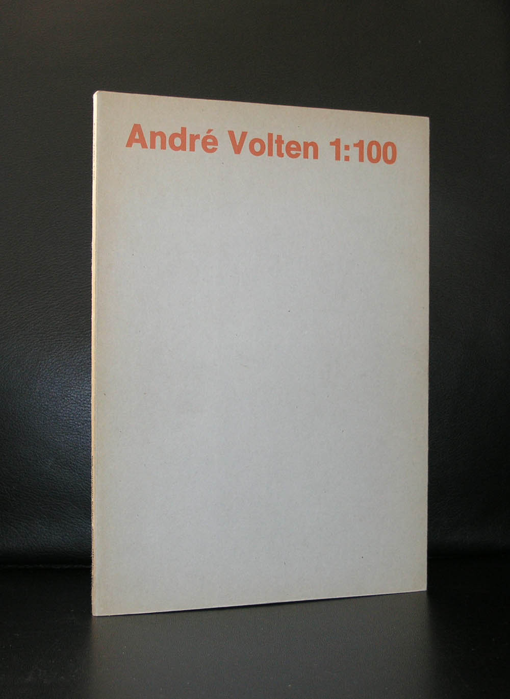
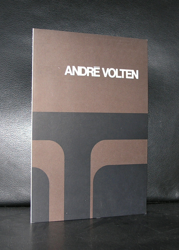
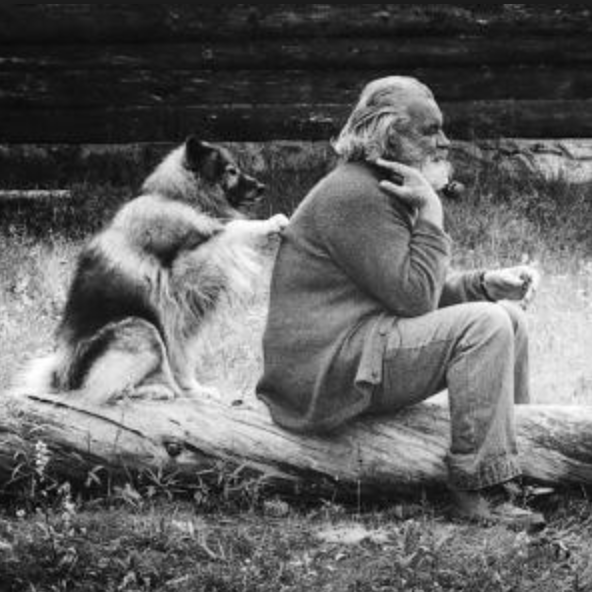
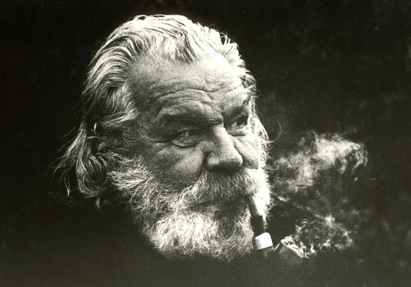
Andre Volten is arguably the greatest sculptor form the second half of last century in the Netherlands. Educated in Amsterdam he soon became friends with contemporary artists like Ongenae. AAfter his arrival in Amsterdam he founded the LIGA NIEUWE BEELDEN and developed his art into a very personal form of abstract expressionism. Because he was at one time employed as a welder, steel and other metals were like wax in his hands and he could bend and transform them into the sculptures he wanted to make from the available materials. The result …. some magnificent large sculptures in public places. Sometimes they are hidden , but in many cases they are in the open. Just look at these 2 examples and find many more in classic publications on this artist at www.ftn-books.com. Among them iconic Wim Crouwel designed in brown and black cover . One of my personal favorites.
For more information on Volten please look at the www.andrevolten.nl site for information on the Volten foundation
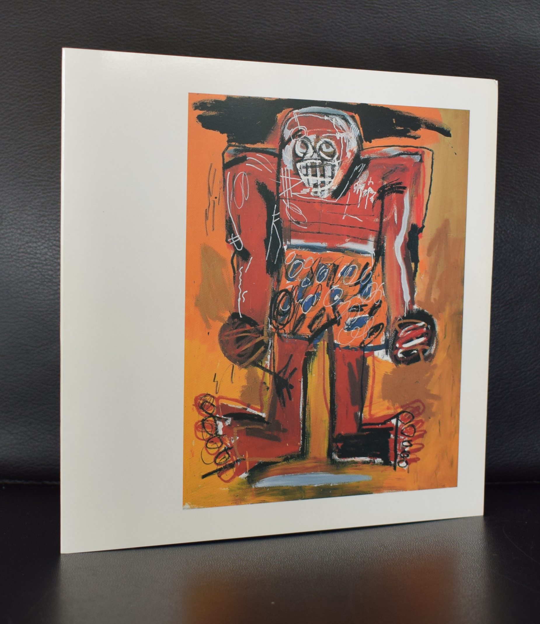
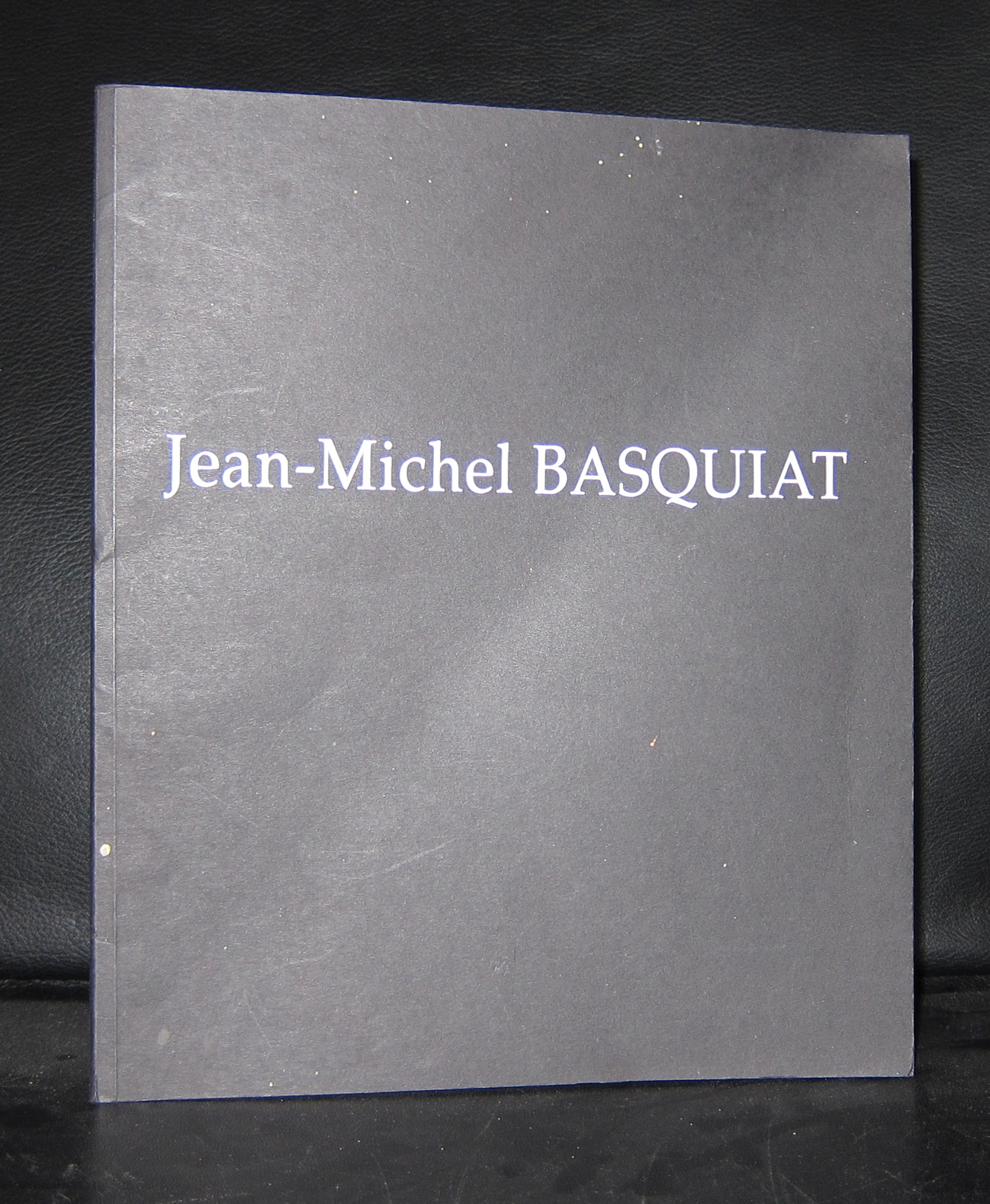
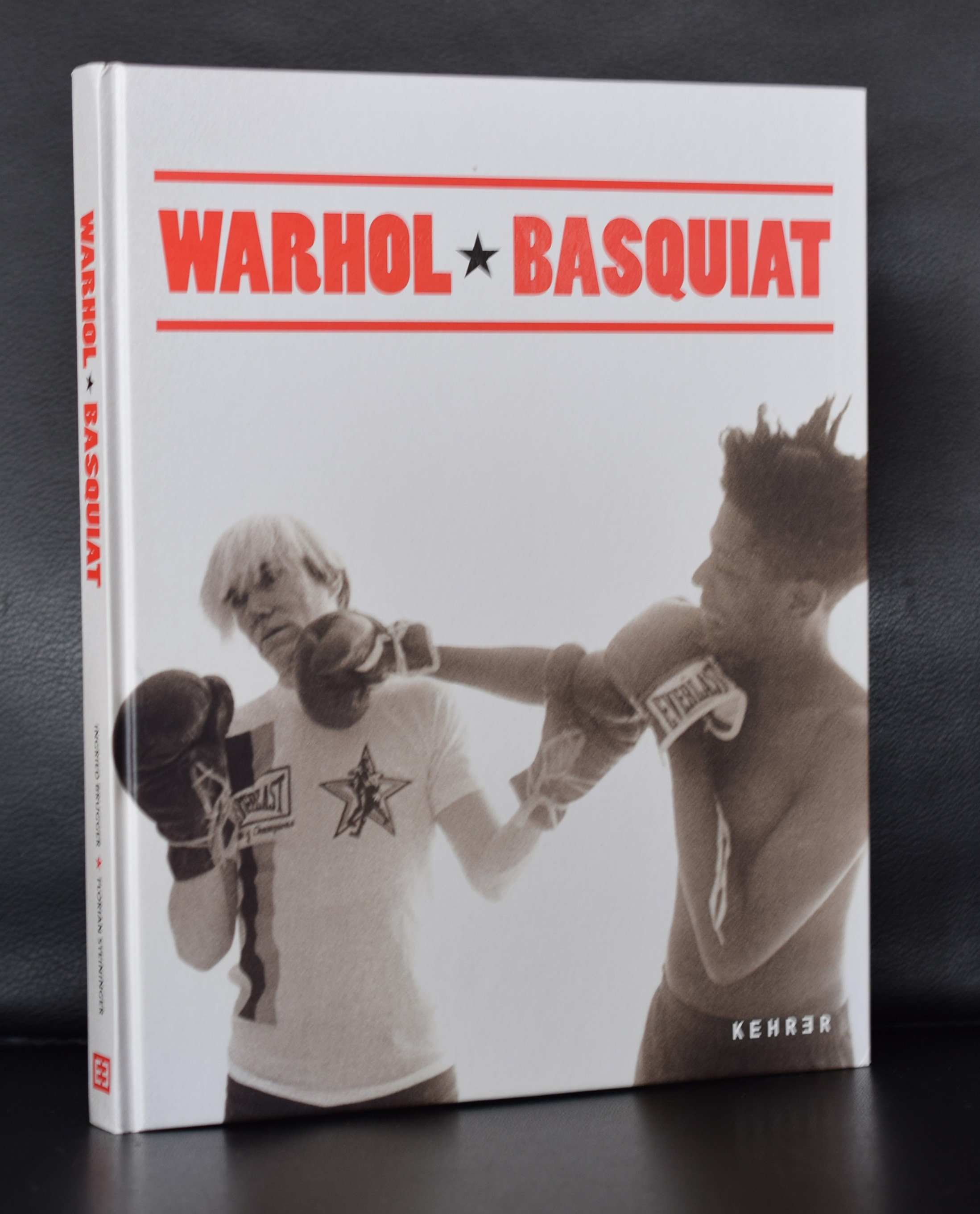
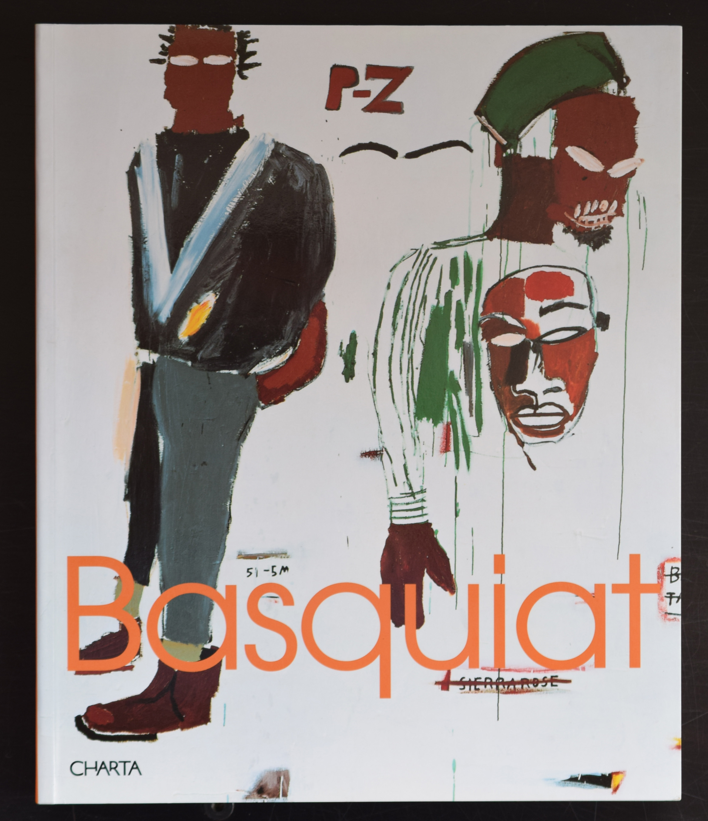
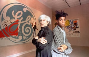
This blog is how i experience books and art and what i read about them and this is certainly an article i want to share with you. The guardian did an excellent article on Basquiat and his Fahion style/ A style which looks random , but was a well thought out way of dressing… Hooray for the Guardian. Here is the article and do not forget that www.ftn-books.com has some nice titles on Jean-Michel Basquiat.
There’s an image of Jean-Michel Basquiat on the cover of the New York Times magazine from 1985. The photo is by Lizzie Himmel; the headline New Art, New Money. The artist, wearing a dark Giorgio Armani suit, white shirt and tie, leans back in a chair, one bare foot on the floor, the other up on a chair. The combination of the suit and the bare feet is typical of the way Basquiat defined his own image; always with an unconventional bent.
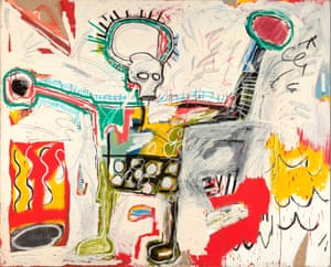
I’ve obsessed over his style when standing in front of Hollywood Africans, a 1983 work from a series where the images relate to stereotypes of African Americans in the entertainment business. It is a banger of a painting and will form part of Basquiat: Boom for Real, a retrospective opening at the Barbican in London this month.
I have a longstanding interest in the way artists dress, from Picasso to Hockney, Georgia O’Keeffe to Robert Rauschenberg, and I think their wardrobes exert as powerful an influence on mainstream fashion as those of any rock or Hollywood stars. These artists carved out instantly recognisable uniforms: clothes that symbolise the same singular point of view as their greatest works, usually with the sense of complete ease that is the holy grail of true style.
FacebookTwitterPinterest
Jean-Michel Basquiat, Untitled 1982, Museum Boijmans Van Beuningen, Rotterdam. On show at the Barbican in London in 2017. Photograph: Jean-Michel Basquiat/Barbican
Basquiat’s wardrobe was distinctive, whether he was in mismatched blazer and trousers with striped shirt and clashing tie, or patterned shirt with a leather jacket pushed off his shoulders. He was perhaps most recognisable in his paint-splattered Armani suits. “I loved the fact that he chose to wear Armani. And loved even more that he painted in my suits,” Giorgio Armani says. “I design clothes to be worn, for people to live in, and he certainly did!”
In many ways, this bricolage approach to clothing is akin to the way he created his art. “His work was a mysterious combination of elements – text and colour, historical reference, abstraction and figurative techniques,” Armani says. “In his life, he also mashed up creative activities – he was a graffiti artist, a musician, an actor, a maker of great artworks. This eclecticism made him a mysterious and unconventional man. That mix made him stand out.”
“He was an incredibly stylish artist,” says Barbican curator Eleanor Nairne. “He was very playful about the performative aspects of identity.” He was also aware of the “renewed fixation on celebrity” that coincided with the art boom of the 80s, particularly in New York. He famously appeared in Blondie’s Rapture video, dated Madonna and befriended Andy Warhol.
Andy Warhol and Jean-Michel Basquiat, September 1985. Photograph: Richard Drew/AP
Cathleen McGuigan, who wrote that 1985 New York Times feature, recounts Basquiat at the hip Manhattan hangout Mr Chow’s, drinking kir royal and chatting to Keith Haring while Warhol dined with Nick Rhodes of Duran Duran nearby. “He attracted the attention of Warhol and Bowie, so was endorsed by those who had already achieved that rare style-icon status,” Armani says. “And he had a very unique look – he had hair as distinctive as Warhol’s and wore suits in a way as stylish and relaxed as Bowie.”
Basquiat went on to model in a 1987 Comme des Garçons show wearing a pale blue suit, black buckle sandals, white shirt and white bow tie. Robert Johnston, style director at British GQ, describes Basquiat’s style as “a work of art in itself” and adds: “While meaning no disrespect to his talent, it is hard to imagine he would have taken New York so much by storm if he’d looked more like Francis Bacon.”
Basquiat’s influence on menswear is still felt today. While other icons have referenced his style – Kanye West sported a T-shirt bearing his portrait, Frank Ocean namechecked him in lyrics by Jay-Z, who dressed as him for a Halloween party – there is a more direct effect on fashion. There have been collaborations, via his estate, with the likes of Reebok and Supreme. There’s a photo of Basquiat wearing an Adidas T-shirt with a pinstripe suit which is a template for how the younger generation approach the idea of tailoring. At the S/S 18 shows in Milan, wonky ties with suiting at Marni made me jot down “Basquiat” in my notebook. And with the Barbican show his influence will spread. “The way Basquiat mixed classic tailoring with a downtown nonchalance fits the mood in menswear,” says Jason Hughes, fashion editor of Wallpaper*. “A refined suit worn with an unironed shirt, skewwhiff tie and beaten-up sneakers. The fact that he painted in those suits feels slightly anarchic and nonconformist. I want to wear a suit like that.”
This article appears in the autumn/winter 2017 edition of The Fashion, the Guardian and the Observer’s biannual fashion supplement
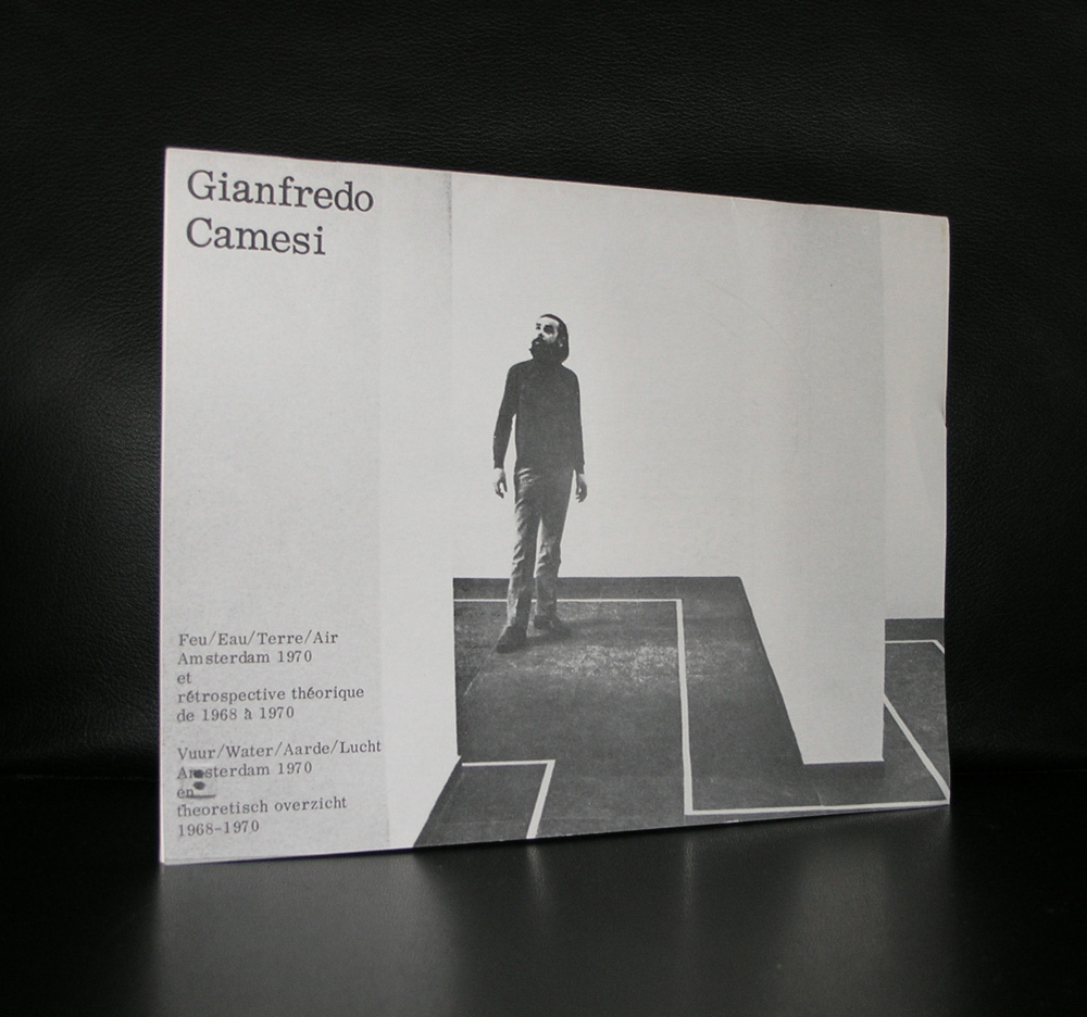
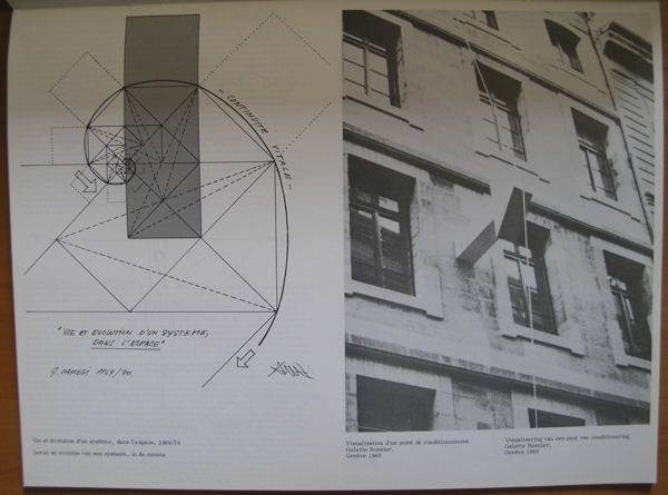
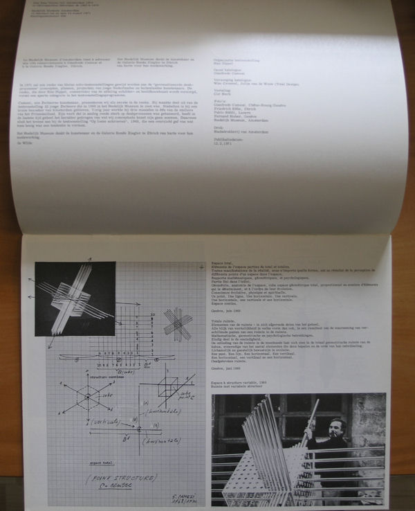
A Swiss born artist who had at the age of 30 a solo exhibition in 1970 in the Stedelijk Museum Amsterdam. Catalogue and poster were designed by Wim Crouwel.
Camesi painter/sculptor who operates as an avant garde artist pur sang deserved at that time a presentation in the Stedelijk Museum. His works intrigue and it is a pity that he has not become as famous as some of the others from his generation. Still the catalogue published with the exhibition in the Stedelijk Museum is one of the very best designed one from the early Seventies and the art by Camesi within it is still fresh and contemporary and of course available at www.ftn-books.com
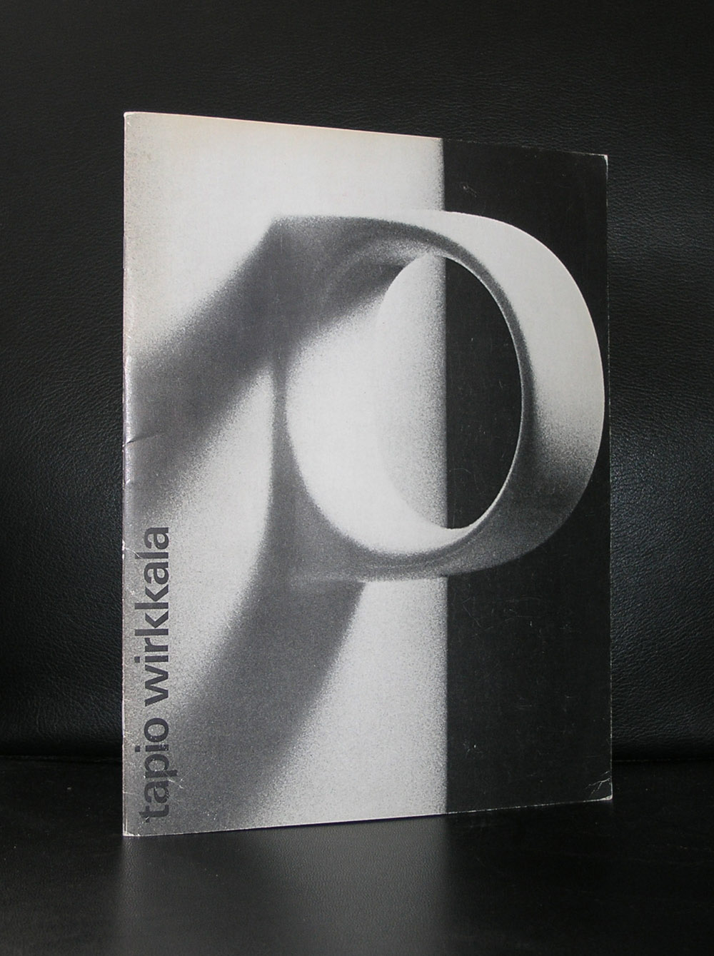
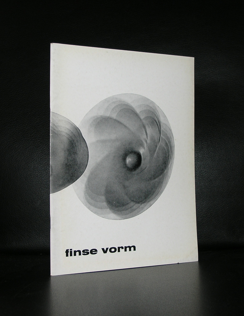
Like Andries Copier in Netherlands, you probably have seen and perhaps are even using the designs by Tapio Wirkkala. Born in Finland his designs are certainly influenced by Scandinavia design. They are without any unnecessary details , clean and clear. Most of them have been published by Iittala and among them there are such iconic designs like the Thule and Tapio glass series .
But he also had his free projects in which he developed beautiful ceramics. Wirkkala had a solo exhibition in the Stedelijk Museum in 1976 for which Wim Crouwel designed the exquisite catalogue. The catalogue itself has become rare since there have been a worldwide recognition of Wirkkala as a truly original designer and artist, but www.ftn-books.com has this catalogue available together with other catalogues on Finnish designs and art.
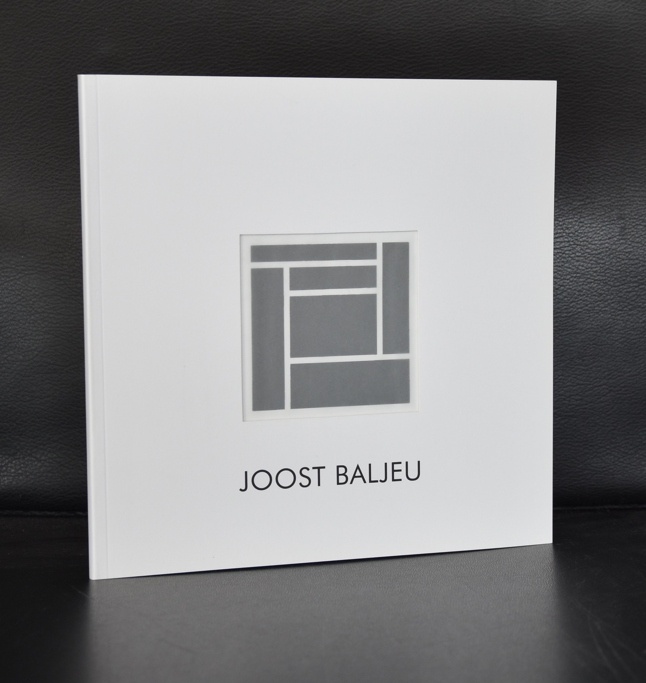
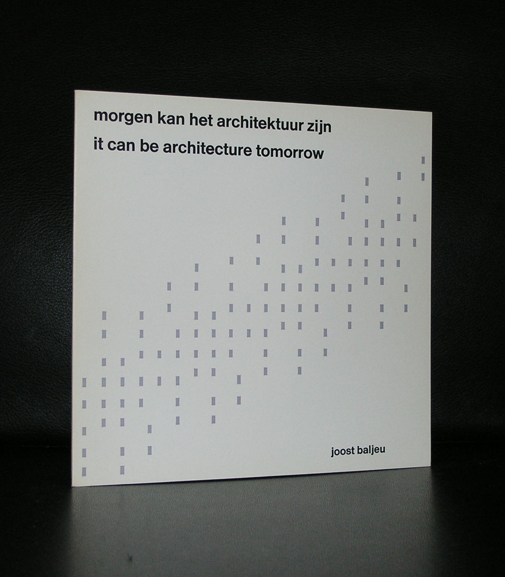
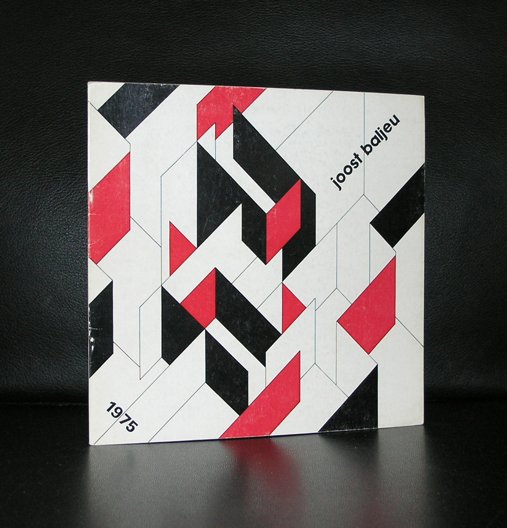
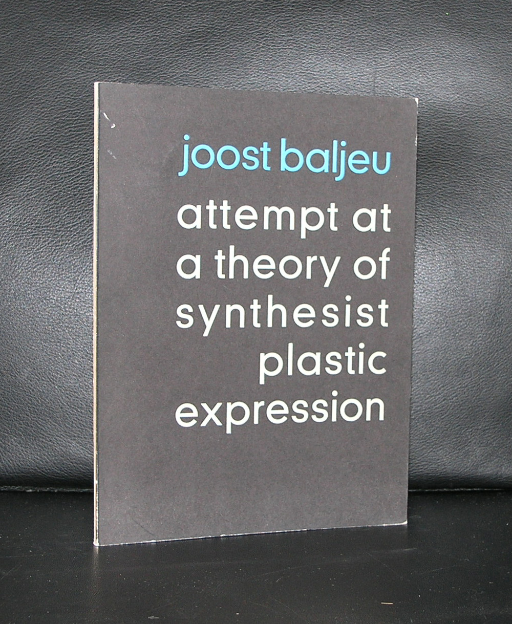
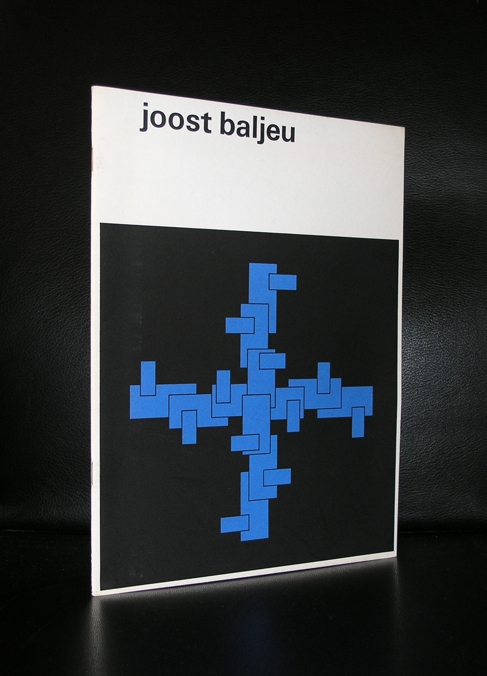
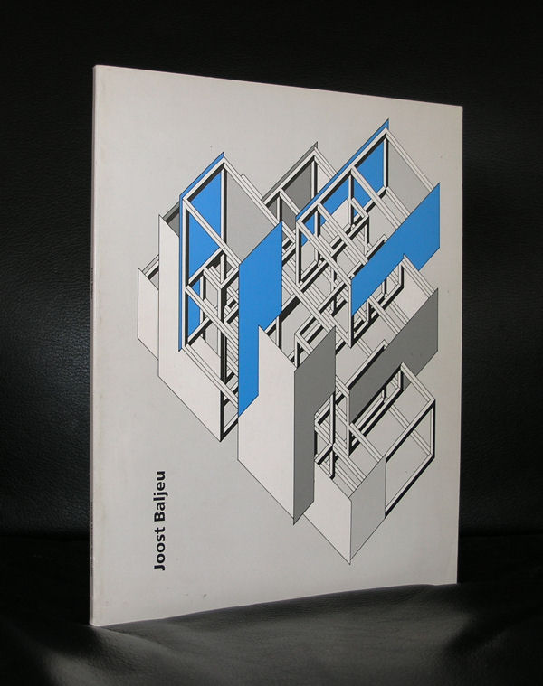
Here is a short text that you can find on Wikipedia on Baljeu:
Joost Baljeu was born in Middelburg on 1 November 1925. During World War II (1939–45) he began painting in an expressionist, realistic and semi-abstract idiom. After Cubism he evolved to constructivism. He made his first reliefs in 1954-55. From 1957 to 1972 he was a professor at the Royal Academy of Art, The Hague in the Hague.[1] The Canadian artist Eli Bornstein began to make three-dimensional “structurist” reliefs during a sabbatical in Italy and the Netherlands in 1957.[ He met and was influenced by artists such as Jean Gorin, Joost Baljeu, Anthony Hill, Kenneth Martin, Mary Martin, Victor Pasmore and Georges Vantongerloo.
I truly began to appreciate his works just some 10 years ago at the time i first visited a gallery on dutch Modern Art. The art dealer had at that time 2 large wall sculptures by Baljeu, which were not only very impressive, but unfortunately much too expensive to acquire.
Because i had seen these, i was spoiled and never wanted to focus at something much smaller. The admiration remained , but no additions were made to our collection of Modern Art. Still www.ftn-books.com has some excellent and highly collectable Baljeu publications for sale.
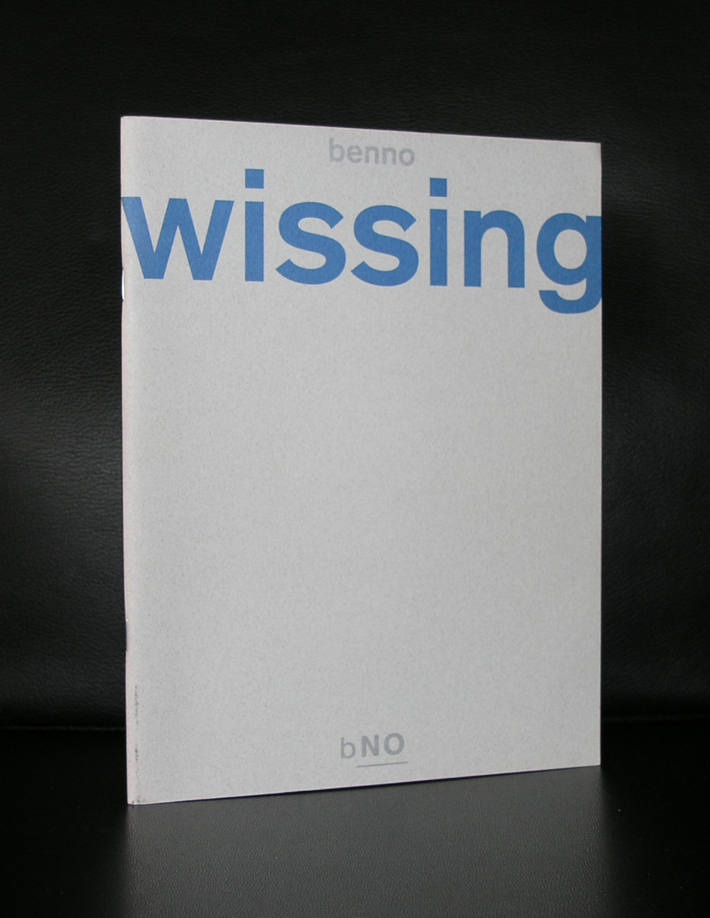
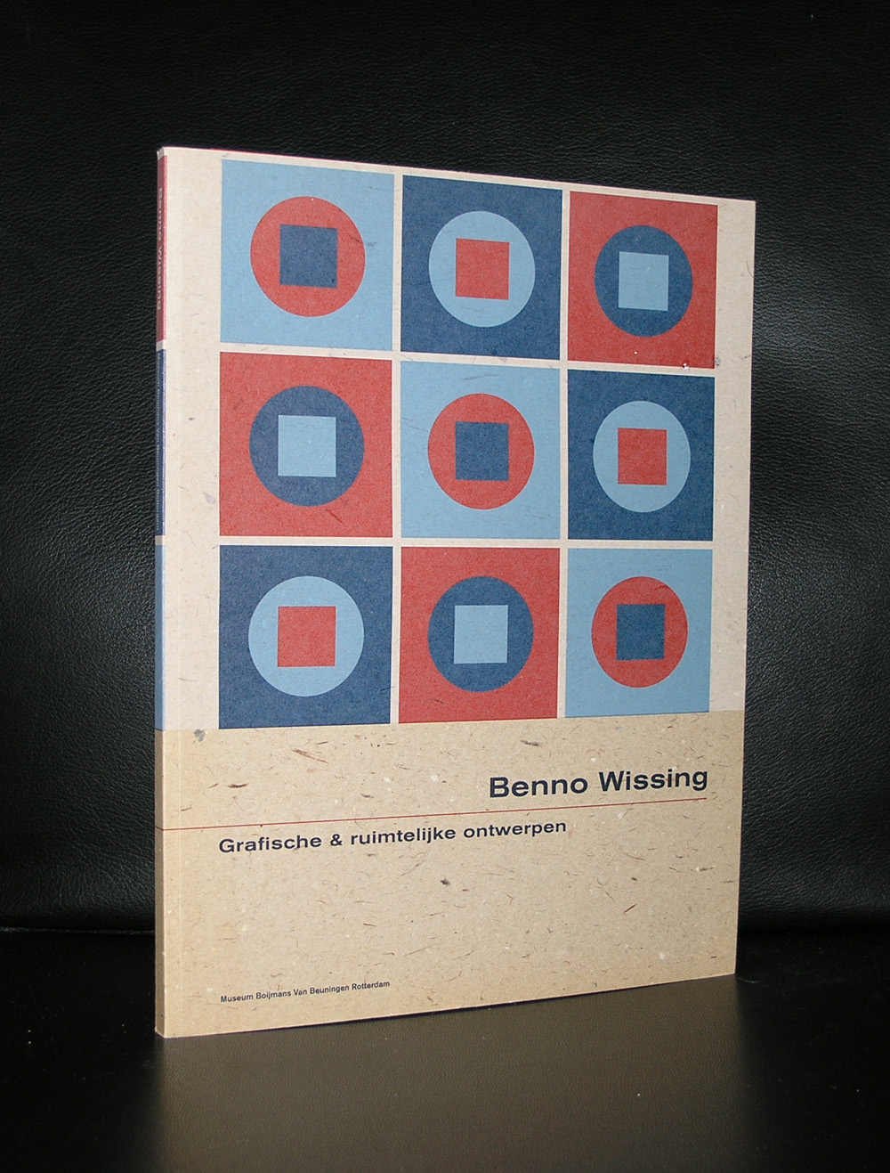
In the dutch museum and art scene there are some classical partnerships regarding the design of museumpublications. There are Willem Sandberg and Wim Crouwel who bot worked in different decades for the Stedelijk Museum. There is again Wim Crouwel and Walter Nikkels who worked for the van Abbemuseum. There are Donald Janssen and Gracia Lebbink who had their designs published by the Gemeentemuseum Den Haag and there is Benno Wissing ( one of the founders of Total Designs) who worked almost exclusively for the Boymans Van Beuningen Museum Rotterdam during 3 decades.
Bernard (Benno) Wissing was a Dutch designer, painter, graphic artist and architect. He trained as a painter at the Art Academy in Rotterdam.
He began his career in 1949 as a designer for the Museum Boijmans in Rotterdam under VP Ebbinge Wubbe. He designed catalogs and posters and established exhibitions. He was one of the founders of Total Design which he worked from 1964 to 1972.
Benno Wissing is for me one of the greatest names in dutch design, but still stands in the shadow of Crouwel and Sandberg. Undeservedly, because his designs are true ” classics”. Just search for Wissing at www.ftn-books.com and find some excellent examples of his truly great designs.
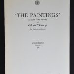
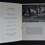
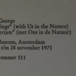
If you ask me…what is the rarest of all Stedelijk Museum catalogues?…the answer probably will be the 1971 THE PAINTINGS catalogue by Gilbert & George, which is published with no. 511. It is only an 8 page catalogue, measuring 8.3 x 5.9 inches, but this one is really a rare collectable artist book. I finally found one for my inventory and it is now for sale at www.ftn-books.com
Artist/ Author: Oliver Boberg
Title : Memorial
Publisher: Oliver Boberg
Measurements: Frame measures 51 x 42 cm. original C print is 35 x 25 cm.
Condition: mint
signed by Oliver Boberg in pen and numbered 14/20 from an edition of 20