Posted on Leave a comment

Wim Crouwel….SM Gedrukt in Japan / 1967

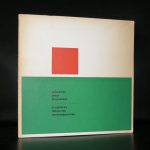
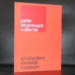
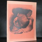
Wim Crouwel is a regular name appearing in my blog. This is not only because i have many titles available at www.ftn-books.com, but mainly because i consider Wim Crouwel the most important graphic designer from last century. There are some that are important too and i think of Gerstner and Sandberg, but Wim Crouwel is in my opnion the absolute best. Wim Crouwel made some 200+ designs between 1960 and 1980 for the Stedelijk Museum, Among them posters, catalogues an folders and many have become iconic for graphic design in the Sixties. There was of course the VORMGEVERS catalogue which is in high demand and extremely hard to find, but the one i would like to discuss now is the GEDRUKT IN JAPAN catalogue, which has become rare and expensive too. It is of great graphici quality and although it is only 20 pages, for me it is the summit in design from the sixties. A simple but highly effective lay out. The use of Magenta on the front . The SM logo and underneath a very very fine line with below it one of the logo’s for the Osaka Art Festival . Published in 1967 with no. 407……it is perfection on the 20 pages.

OLYMPUS DIGITAL CAMERA

Posted on Leave a comment

Donald Judd at the van Abbemuseum

Rudi Fuchs was the admirer and curator who convinced Donald Judd to have a large retrospective at the van Abbemuseum. Judd had his entrance into the dutch Museum scene with Enno Develing who had organized, with all important minimal art artists, exhibitions at the Gemeentemuseum Den Haag in the Sixties . Judd was one of them and since the popularity of Minimal Art in the Netherlands grew steadily. The van Abbemuseum made an exhibition with Judd in 1987, after which exhibitions another one with Judd, Fuchs and Jitta was held on the prints by Donald Judd at the Gemeentemuseum. It was one of the last exhibitions Rudi Fuchs curated for the van Abbemuseum before he switched to the Gemeentemuseum as a director and made this print exhibition. Fuchs was a great fan, because together with the print exhibition he ordered furniture, desks and even a complete parquet floor all done by Judd of which only the floor remains at the Escher Museum at the Paleis Lange Voorhout location. The rest “disappeared” , was damaged,  or was sold during the last 2 decades.

The blog is to point out that this is an important catalogue which is now available at www.ftn-books.com together with some other publications. As mentioned …Enno Develing wast the first European curator who presented the Minimal Art movement and his artists at the Gemeentemuseum Den Haag. Here is the extremely important catalogue of this exhibition which i gladly make available for my readers. Click the MINIMAL ART link below and read the PDF version of this rare and very important catalogue.

MINIMAL ART


Posted on Leave a comment

Aart Klein (1909-2001) …typically dutch?

Schermafbeelding 2018-05-09 om 12.13.22

No definitely not!….Klein is of the most important dutch photographers from the last century and recorded daily life in the Netherlands , but that does not mean that his photographs are typically dutch. Their subject is in many cases dutch, but their appeal is more international than one would imagine. I have sold Klein publications all over the world , including some to Japan. Aart Klein is for me one of the greats from the last century . His black and white photography has a graphic quality, which is rarely seen among his contemporaries.

Schermafbeelding 2018-05-09 om 12.11.02

The Stedelijk Museum devoted a special exhibition to his photographs, but beside this special show he contributed to many other exhibitions with his quality photographs. Aart Klein publications are available at www.ftn-books.com

Posted on Leave a comment

Jackson Pollock and the Stedelijk Museum.

Schermafbeelding 2018-05-08 om 12.10.40

Willem Sandberg was the fan and admirer who initiated the first presentations of Jackson Pollock in Europe. The Stedelijk Museum presented on several occasions his art and during these exhibitions made acquisitions resulting in some of the most iconic and important paintings in their collection. Among them is REFLECTIONS OF THE BIG DIPPER from 1947.

Schermafbeelding 2018-05-08 om 12.09.18

Reflection of the Big Dipper consists of built up layers of paint with dripped enamel as the final touch, concluding the composition. It was around 1947 that Jackson Pollock traded in his brushes for sticks, trowels and knives and began adding foreign matter, such as sand, broken glass, nails, coins, paint-tube tops and bottle caps to his canvases. From this point on, Pollock’s application of paint became his main theme, which he tried to radicalize. With the body of work he thus created, Pollock found a unique position within the concurrent Abstract-Expressionist movement. Reflection of the Big Dipper was exhibited at the Betty Parsons Gallery in 1948, along with sixteen other paintings by Jackson Pollock. The show received positive reviews. Pollock’s works from this time are a transitional step between a more traditional handling of paint and his revolutionary technique of dripping paint on canvases off a large scale.

www.ftn-books.com has a nice selection of Stedelijk Museum  publications on Jackson Pollock available.

Posted on Leave a comment

Wim Crouwel and the Stuyvesant Foundation, 1971

1971 is the year the Stuyvesant Stichting existed 10 years and invited Wim Crouwel for their yearly publication. They had done so on other occasions and Crouwel was their preferred designer. The design in 1971, silver fond, blind printing on the cover and a small font above the middle line.

What strikes me is that in its simplicity and looking much alike the Zero exhibition catalogues form the late Sixties he had done for the Stedelijk Museum. Crouwel found a way to make it special and typically a Wim Crouwel design. The size is familiar. the lay out of the pages too, but the cover is different. He uses a small font for the STUYVESANT STICHTING in a very delicate light blue color on a silver printed fond. This was not the easiest of prints jobs , because beside the silver fond a blind printed title in the cover had to be made. The printer Lecturis did a perfect job with this exclusive publication. It has taken me 15 years to finally find a copy of this highly collectable Wim Crouwel designed book, but now it is for sale at www.ftn-books.com. I now hope it will not take me another 15 years to find the next copy.


Posted on Leave a comment

Michelangelo Pistoletto (1933)

Schermafbeelding 2018-05-03 om 09.02.18

I know his work and recognize it by his reflecting surfaces and mirror like qualities , but Pistoletto is much more than an artist who uses a “Gimmick”. Now , 85 years of age he has proven to be one of the most influential Italian artists from the last century and his works have spread all over the world . (I even have illy collection cups by Pistoletto in my collection ;-).

pistoletto a

Why is he, i think, so important?…. Probably this is because he stayed true to his art and has developed it into a very personal and recognizable form which is now appreciated by many. Pistoletto had had his exhibitions in the Netherlands in the van Abbemuseum and Stedelijk Museum and has built steadily an appreciative audience because of these exhibitions in the Netherlands since his earliest one at the van Abbemuseum in 1986. Arte Povera is Pistoletto ….and within his works he brings together Fluxus and conceptual art. The admiration of Bacon started his art career, but since he has walked his own path of “REFLECTION”.

Here are some of the books www.ftn-books.com has on Pistoletto in collection

Posted on Leave a comment

“Negerkunst uit Centraal Afrika”

taal museum

Yesterday morning there was an article in the Volkskrant about the way art in museums by colored people and minorities must be described . The reason why the dutch museums are also looking for a desirable idiom is that also in dutch history there is a part of their history which is very doubtful. The catalogue which is in the title is the example which was given in the article ( available at www.ftn-books.com ). The exhibition was in those days, (which is very recent history) announced by the journalists and museum as “primitive art by natives inspired by western civilization a way of announcement as if we in Western Europe were civilized and others not.” A complete wrong way of describing the art from these artists. On the positive side…Sandberg was the one who thought these artists deserved a museum platform in the Stedelijk Museum as early as 1957. which was the place for these artists where they could, for the first time, present and show their art , side by side with Malevich and Mondrian. I can really understand why some words and expressions can not be used any longer, however …where a museum decides to remove an object from an exhibited collection and with this action denying some of the history from a country, should not be done…. in my opinion a better way would be to keep it within the collection and add an explanation why the museum thinks different nowadays about an object . This way explaining and not judging. Let the public judge for itself if the object is still beautiful or not.

negerkunst

Posted on Leave a comment

Friedensreich Hundertwasser (1928-2000)

Schermafbeelding 2018-04-10 om 12.18.02

The first time i encountered Hundertwasser his work was in an exhibition at the Stedelijk Museum Amsterdam and the first thought was…..he copies Klimt!

At that time i did not not know much about him, but when you read more and see more of his works you begin to realize that Hundertwasser is as original as Klimt was.

The difference is some 70 years between these 2 artists, but the background, influences and education are all well rooted in the city of Vienna from the beginning of the 20th century. This explains the similarities which one can find in many cases between the works by Klimt and Hundertwasser.

Schermafbeelding 2018-04-10 om 12.23.56

If ever you visit Wien , the Hundertwasser Haus is an absolute must. There are so many aspects about the house and its architecture , that it is impossible to describe it in this blog. However there is a great article on the architecture on the house on the site of the Hundertwasser House;

http://www.hundertwasser-haus.info/en/blog/2011/07/19/the-house-should-not-be-measured-by-normal-standards/

and yes… for the enthousiast collector, ww.ftn-books.com has some nice publications in its inventory including the Wim Crouwel designed Stedelijk Museum one

Posted on Leave a comment

Jeroen Henneman (1942)

Schermafbeelding 2018-04-10 om 11.57.49

Personally i am not the greatest fan of Jeroen Henneman, but i Recognize the importance of the artist for dutch art in the 20th century. Specially the time bracket between 1965 and 1980 is important, because in this period his works found their way into private collections. They were accessible and of high quality, but they never had great appeal to me personally. Nevertheless i encountered his works at auction and exhibitions and i always had an extra look at them, because when you first see them they have something extra, therefore i made the occasional book purchase because i like the institutions were he had his exhibitions. Specially the Nouvelles Images Gallery and the Stedelijk Museum made some great publications with his exhibitions which are both available at www.ftn-books.com

Henneman is certainly one of the best known  “modern” artists in the Netherlands and admired by some well known dutch famous collectors, but i am not one of them. Many dutch people know of his portrait of the former Queen Beatrix and his silhouetted portraits are well known too, but as said….i am not a fan.

Posted on Leave a comment

Wim Crouwel / Total Design- 20 jaar verzamelen / Stedelijk Museum, 1984

Schermafbeelding 2018-04-09 om 10.52.44

Followers of this blog know of my special interest in the publications of the Stedelijk Museum. I have many titles avaialable and ftn-books.com is one of the first sources that is consulted when it comes to publications of and on the Stedelijk Museum Amsterdam. Yet…. one learns every day, even when you have so many catalogues by the Stedelijk Museum available as i do. It has been years ago that i last saw this catalogue which was published by the Stedelijk in 1984 which gives the best and complete overview of their collecting in the period 1963-1984.

Why is this important? Personally i think that this is the period in which the SM made their best and most important purchases. How about important acquisitions like the ones by Kelly, Dubuffet, LeWitt, de Kooning , Mangold , Lichtenstein and Warhol. Just a few names that belong to the most famous ones, but among the hundreds of these acquisitions there is so much quality art acquired that only with these acquisitions one can fill an entire collection and become  with this collection one of the most important Modern Art Museums in the world. The book was compiled by Joosten and designed by Total Design/ Wim Crouwel, which makes it even more worthwhile collecting . It is now available at www.ftn-book.com

20 jaar verzamelen sm