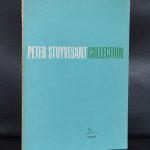
1971 is the year the Stuyvesant Stichting existed 10 years and invited Wim Crouwel for their yearly publication. They had done so on other occasions and Crouwel was their preferred designer. The design in 1971, silver fond, blind printing on the cover and a small font above the middle line.
What strikes me is that in its simplicity and looking much alike the Zero exhibition catalogues form the late Sixties he had done for the Stedelijk Museum. Crouwel found a way to make it special and typically a Wim Crouwel design. The size is familiar. the lay out of the pages too, but the cover is different. He uses a small font for the STUYVESANT STICHTING in a very delicate light blue color on a silver printed fond. This was not the easiest of prints jobs , because beside the silver fond a blind printed title in the cover had to be made. The printer Lecturis did a perfect job with this exclusive publication. It has taken me 15 years to finally find a copy of this highly collectable Wim Crouwel designed book, but now it is for sale at www.ftn-books.com. I now hope it will not take me another 15 years to find the next copy.


ville de richelieu
References:
schoolido.lu
is animal stak a steroid
References:
https://code.antopie.org