Posted on Leave a comment

10 great and iconic buildings , no. 2

This list is invented to make some quick and easy blogs for this month filled with festivities. I chose the buildings because i think they belong to the most important from all buildings realized in the last 100 years.

So here is no. 2. the Rietveld – Schröder house, by Gerrit Rietveld

Rietveld Schroder huis

In 1924, Truus Schröder asked well-known Utrecht furniture designer Gerrit Rietveld to design a new house for her. A recently widowed mother of three, she wanted a dwelling completely attuned to her – and to her unconventional ideas about what a home should be. Having worked with Rietveld in the past, she knew his disdain for tradition. It was a match made in heaven.

Schröder played an important role in the design process. She knew exactly what she wanted: simplicity and a space that freed rather than constrained her…. and the result one of the most iconic houses which is still inspiring for many young architects.

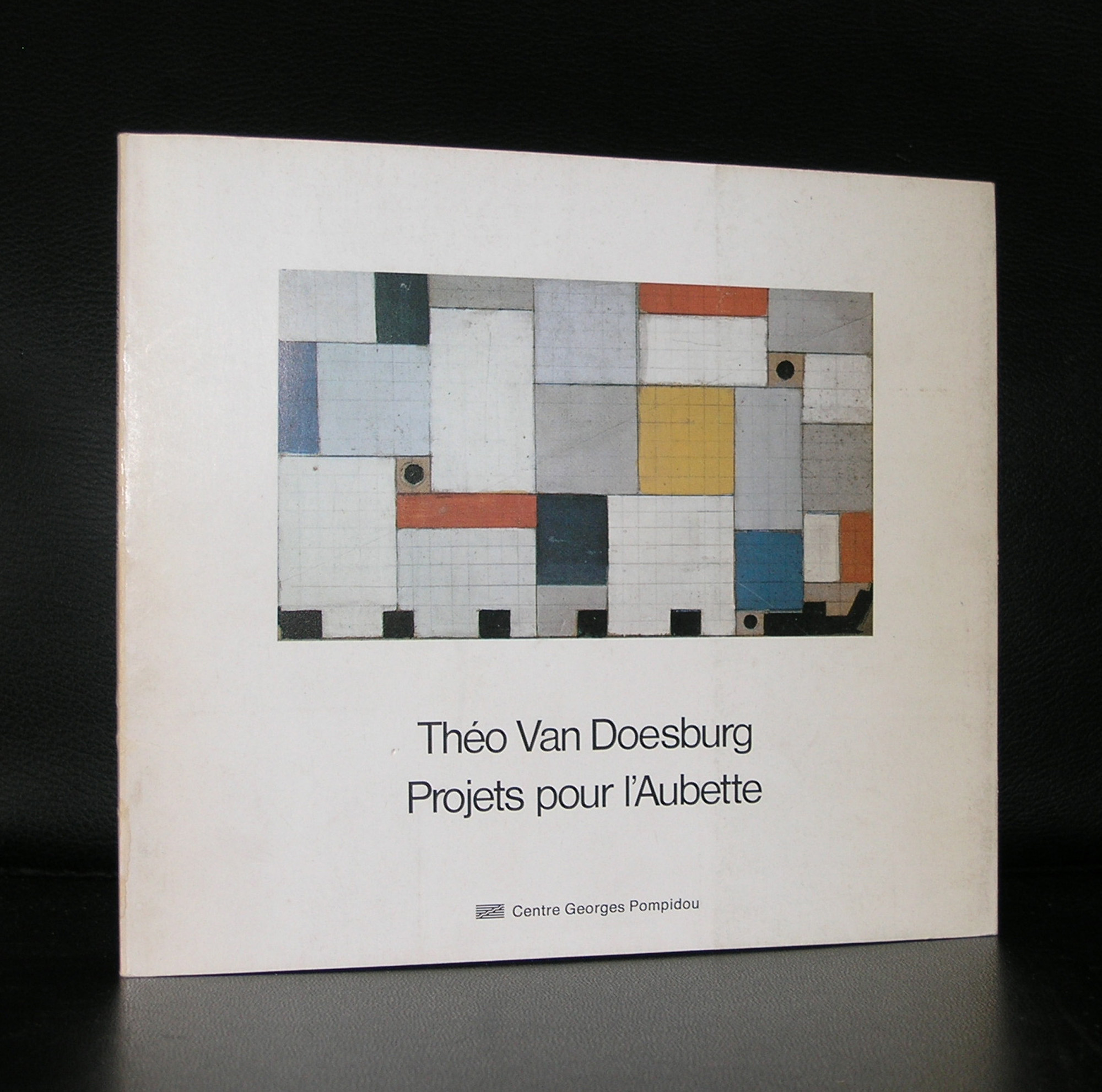
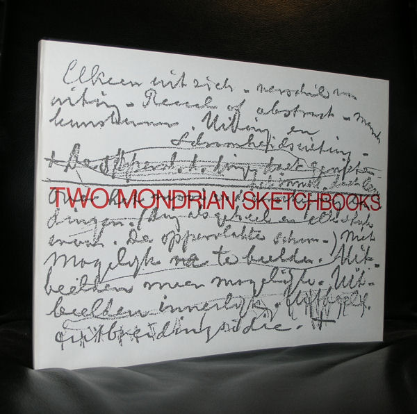
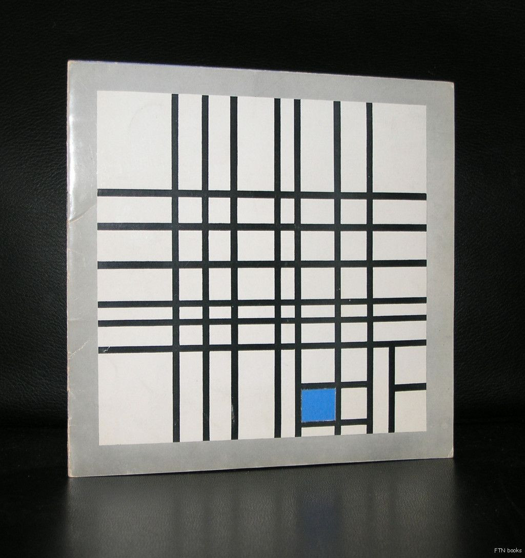
www.ftn-books.com has some nice Rietveld publications available

Posted on 1 Comment

Centraal Museum Utrecht , 1979


Schermafbeelding 2021-08-11 om 15.15.32

It is not the book itself, condition is fair+, but the realisation that all artists included in the book have become highly collectable artist, who’s works you can only acquire at steep prices nowadays. It shows the importance of collecting at an early stage by the museums. It is not difficult to pay millions for a work of art, but when you can see the quality at an early stage you can build a great collection…well done Centraal Museum.

the book is now available at www.ftn-books.com

abstract keus utrecht

Posted on Leave a comment

Chris de Bueger (1948)

Schermafbeelding 2021-01-21 om 16.31.41

Try to find information and a portrait of Chris de Bueger and you will have a difficult time ahead. Because of a publication i bought some years ago ( piece of oil painting on the cover) i started to search fo the artist. No portraits , no text, just some abstract paintings and  apiec of canvas ( painting) on the cover of the blue book.

There is only way to find the maker of this book and paintings and that is study the pages and photographs. Paintings are nice abstract paintings and certainly worth viewing and possibly even collecting. and yes…..on one of the photographs there was the signature of the maker. First i read de Buger, but thanks to Google i found that it had te be Chris de Bueger and now the book is availabe at www.ftn-book.com.

Posted on Leave a comment

Ruud Kuijer (1959)

Schermafbeelding 2020-04-07 om 14.50.56

It takes some time to appreciate the sculptures by Ruud Kuijer, but as his scultures grew in their sizes i started to admire more and more his works. It must have been in the mid Eighties that we once met, shook hands and had a short conversation, but i never have met him since and i did not search for his works until a few years ago i saw pictures of his WATERWERKEN series.

Schermafbeelding 2020-04-07 om 15.00.40

Impressive, complex, extremely large sized sculptures that reminded me in their size and presence of the Richard Serra THE MATTER OF TIME, which is also extremely large and can only be admired within or from a distance. The Waterwerken series can be found on the Ruud Kuijer site, but there is much more to the sculptures by Ruud Kuijer. You can find some nice publications at www.ftn-books.com in which his earlier sculptures can be found and admired including the recently Centraal Museum catalogue from1990.kuijer centaal

The sculptor Ruud Kuijer is known for his abstract sculptures made from ordinary materials such as wood, concrete, iron, rope and threaded rod. His Waterworks project, a line of seven large sculptures situated along the Amsterdam-Rhine Canal in Utrecht, has attracted a lot of attention. Kuijer’s work is involved in many contemporary sculpture exhibitions, private- and museum collections and projects worldwide.

Posted on Leave a comment

Ben Akkerman (1920-2010)

Schermafbeelding 2019-10-17 om 16.22.21

I have always been an admirer of the works by Ben Akkerman. The first time i saw a painting by Akkerman was at the Centraal Museum and since i have been interested in his works. The paintings and drawings i could not afford so instead i started to collect Ben Akkerman publications. The result is that i have collected myself a small but important Akkerman library and the years made me find some duplicates which i now have put up for sale at www.ftn-books.com

Ben Akkerman was , the same as Jan Schoonhoven, an employee for the municipality of Enschede and he painted in the evening in his spare time. Called a ‘hardcore abstract ” painter i personally share his paintings among the Minimal paintings from that era. These are very delicate compositions that are pure minimal art.

Schermafbeelding 2019-10-17 om 16.34.27

The Gemeentemuseum used the “diamond” by Ben Akkerman for almost 10 years in its letters and invitations, but now that the name has changed in the far less appealing name ” Kunstmuseum Den Haag” they left the beautiful yellow diamond shaped logo for one i do not like at all. To commemorate the diamond they collected 30 Ben Akkerman paintings and made a wonderful presentation  to honor Ben Akkerman and its “diamond”.


Posted on Leave a comment

A special PLAY catalogue by Swip Stolk and Frans Haks ( early dutch design 1968)

Imagine the old dutch game of ELECTRO . You habe to find the right combination between question and answer and than the light will light up when the answer is correct. This was the idea behind the play catalogue Swip Stolk designed together with Frans Haks for the ENVIRONMENT exhibition they organied in 1968 fro Studium Generale Utrecht.

Schermafbeelding 2019-01-19 om 13.39.11

For me the importance is not the design of the the play catalogeu but the participating artists. Among them…Morellet, Megert, Struycken, Le Parc and Gerstner.

The “creme de la Creme ” all within one exhibition. This exhibition from 1968 is almost forgotten and one of the reasons is the rare catalogue which was published with this exhibition. Now i have one copy available. Text by Frans Haks, design by Swqip Stolk and produced by Jumbo. A classic among the Sixties catalogues in teh Netherlands anmd well worthdt collecting. Available at www.ftn-books.com

environment a

Posted on Leave a comment

Otto Hamer (1938)…The Killing of Desire

Schermafbeelding 2018-05-10 om 15.00.06

Never heard of the artist before, but what a great find this is. People following the blog know that concrete and constructivist artists are among my favorites. Last week i visited the bookmarket and found an intriguing title ” OTTO HAMER : Mijnheer I.KAA EN DE KUNST” leafing through the book i noticed immediately why his art fascinates me personally . The repetitions of form(s), the use of bright colors and the feel for composition “hit” me. The book itself was a surprise too. Beautiful lay-out, excellent print quality . Designed by Otto Hamer himself together with Aernout Tas this is a highly  accomplished book. To give an impression of Hamer’s work here is the Youtube video i found:

There is not much info to be found on the artist, but i found an article in dutch:

Otto Hamer

and some photo material of his studio and works. In the coming months i will try to find more information, but for the meantime you can start with the sites supplied.

OLYMPUS DIGITAL CAMERA

Posted on Leave a comment

Pieter Laurens Mol / Cervo Pendulum

Schermafbeelding 2018-06-06 om 10.41.49

Sometimes you know a book exists, never seen it, but from stories heard and publications read there is only one conclusion…it must be out there…somewhere.

Cervo Pendulum by Pieter Laurens Mol is such a publication. I learned the book was printed by Rosbeek. At the times i visited this printer in the late Nineties i had never seen a copy. All the times i visited book fairs, markets etc….no copy found. But now finally after over 24 years  i have a copy at www.ftn-books.com available.

mol cervo a

This book is rare, that is for certain, but it is also important. It is one of those little artists books which is worth collecting. Printed by Rosbeek and published on the occasion of the opening of the new medical faculty building of the University of Utrecht. Edition is said to be 250 copies only and of these few will have survived. Text is in dutch and in english, which makes this important book accessible to english collectors too.  An absolute “must have” for the Pieter Laurens Mol collector and it is not very likely that it will show up again in the coming years.

Posted on Leave a comment

100 years ….DE STIJL

It was 50 years ago Sgt. Pepper’s Lonely Hearts Club Band by the Beatles was released on the 1st of June, but 50 years before that date the DE STIJL group was founded in Leiden in 1917 with the publishing of the book de NIEUWE BEWEGING IN DE SCHILDERKUNST by Theo van Doesburg. Leiden , Utrecht ( home of the famous Rietveld huis) and Den Haag ( largest Mondrian/de Stijl collection in the world will be presenting exhibitions on DE STIJL and its influence on Modern Art. One basic thing about DE STIJL. Use of primary colors, dividing the surface in abstract elements. Mondrian and van Doesburg were originally friends and worked along these lines until van Doesburg thought his works were limited by the use of horizontal and vertical lines and wanted to use the “diagonal” too. This cooled down the friendship and van Doesburg decided to leave the group in 1924. Was it the end of the DE STIJL…no certainly not . The group stopped, but the ideas were there and were later found in BAUHAUS and constructivist modern art. To acknowledge the importance of DE STIJL is done now by these many exhibitions and certainly more than a few will be well worth visiting. Prepare yourself and look at the many DES TIJL/ Mondrian /van Doesburg publications available at www.ftn-books.com

PS . there is a very special bank by Ko Verzuu in blue and yellow which is exclusively available at ww.ftn-books.com. This was a prestige edition by the makers of ADO.

OLYMPUS DIGITAL CAMERA

Posted on Leave a comment

A money bank by ADO/ Ko Verzuu

Yesterday i wrote a blog on the Rietveld Schroderhuis in Utrecht. One of the persons who was inspired by this architectural masterpiece ( and DE STIJL in general) was Ko Verzuu, who had at that time his own program to help his patients with activities during the day. He made wooden toys and in this series of wooden toys he developed a wooden bank inspired by the Rietveld building he admired so much. A square 3d wooden hollow block divided with a horizontal yellow rectangular piece. Bottom was screwed on so you could open and empty the bank. Simple and effective and one of those items which is worth collecting and admiring. The ADO manufacturers/SWZ made a special reedition of this blue/yellow bank in 1999 and used it as a promotional item to show their customers the quality of their work. Nowadays it is a collectible and still available at www.ftn-books.com

wilfried