Posted on Leave a comment

Francesco Clemente (1952)

schermafbeelding-2017-02-22-om-09-44-24

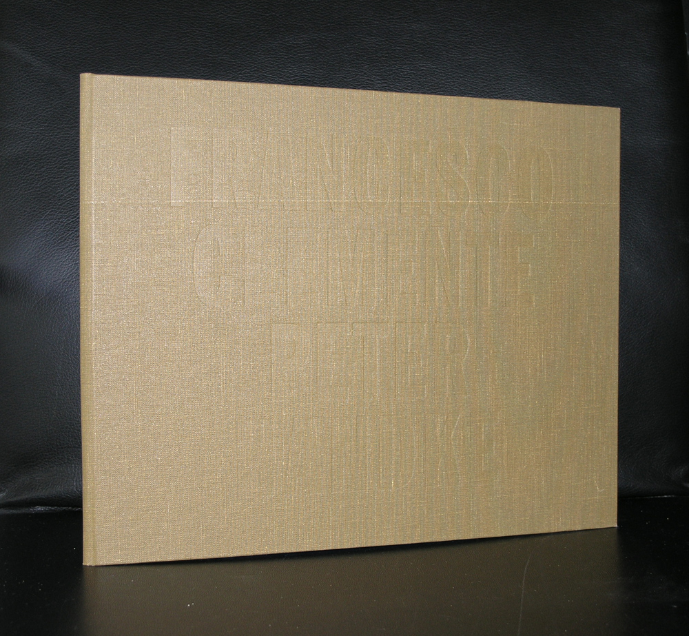
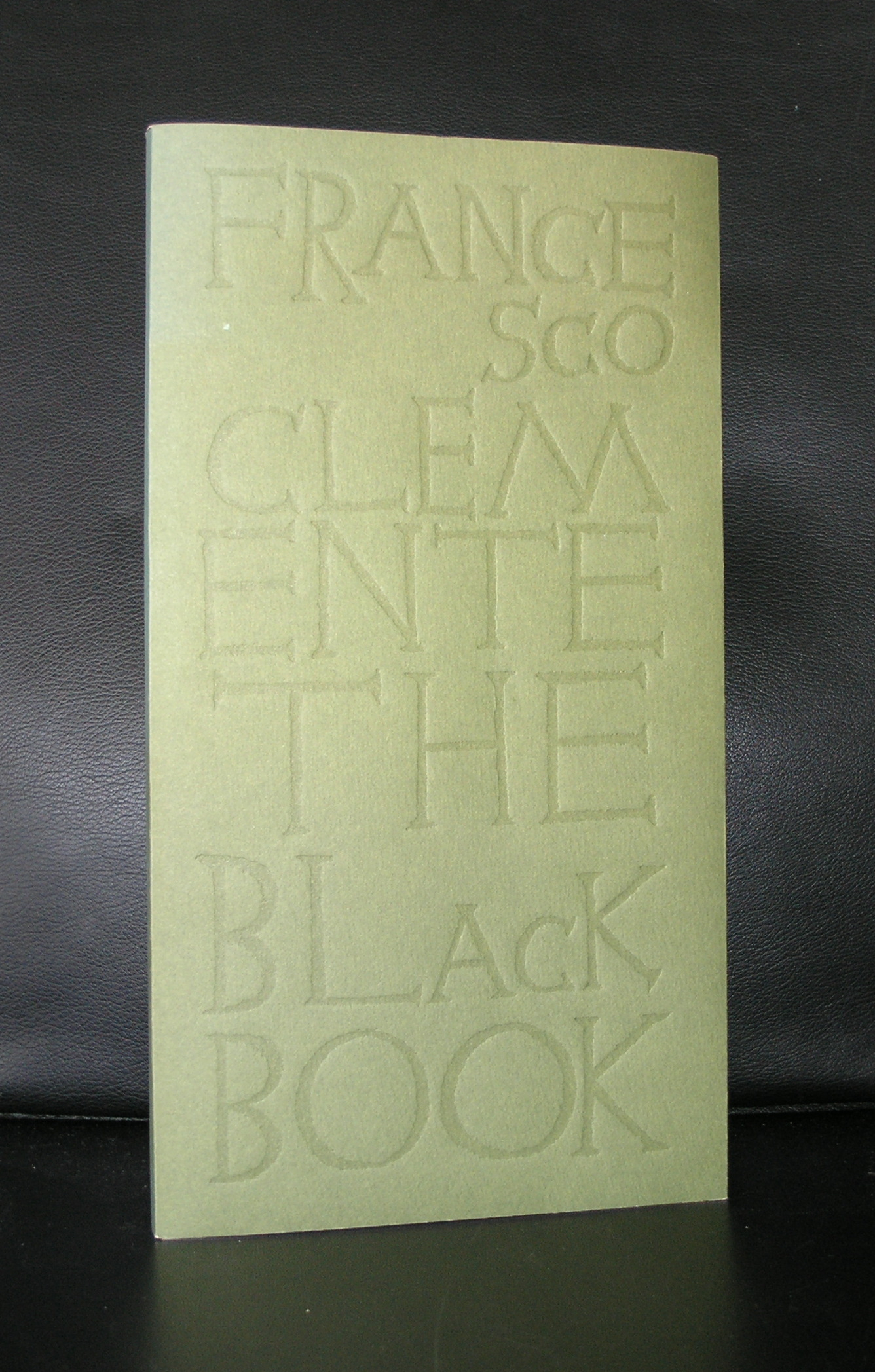
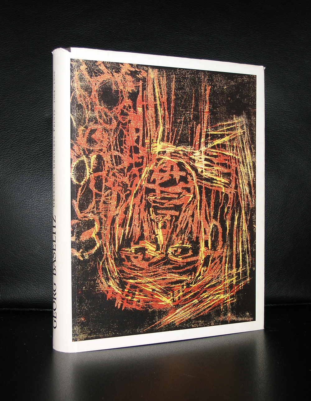
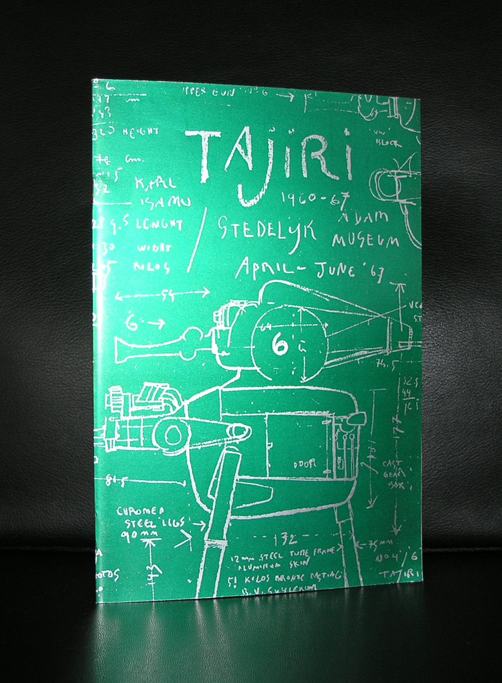
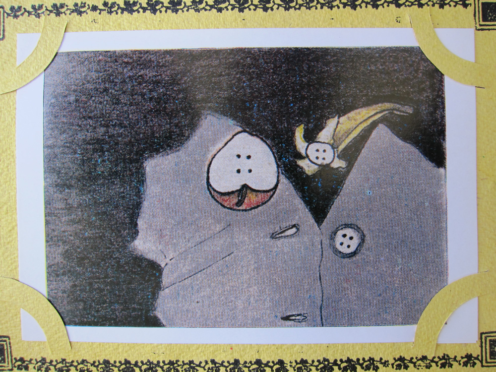
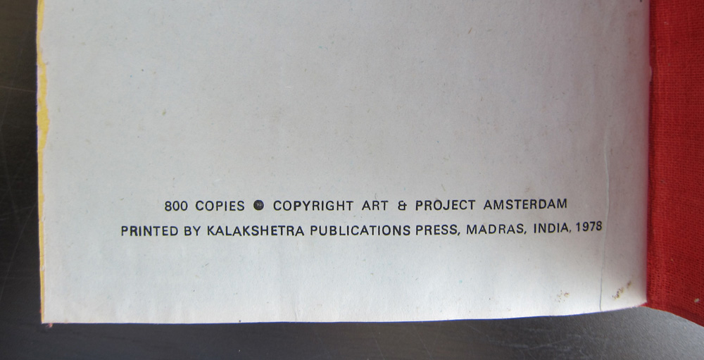
There is no larger Modern Art Museum in the world that has no Clemente in its collection. From Amsterdam to New York the works by Clemente have spread all over the world. But for us in the Netherlands, it was important that Clemente had some exhibitions with the Art & Project gallery and from one of these exhibitions a beautiful little book was the publication result edition of only 800 copies). This and other Clemente books are available at www.ftn-books.com.

Clemente’s work spans four decades. His work is stylistically varied, inclusive, erotic, and nomadic. It embraces diverse mediums and diverse cultures as well, aiming at finding wholeness through fragmentation and witnessing the survival of contemplation and pleasure in our mechanical age.

Clemente’s work is rooted in political utopia and expresses an anti-materialistic stance. In the 1970s he moved from photography to drawing and anticipated the return to painting of the 1980s.

His work is also nomadic. In the 1980s he divided his time between India and New York. While briefly associated with Neo-Expressionism he took an interest in collaborative works both with Indian craftsmen and with painters like Basquiat and Warhol, and poets like Robert Creeley and Ginsberg in New York. In an interview with The Brooklyn Rail, Clemente commented “these poets had been looking at the East for inspiration and I was also anxious to evade the materialism of the West.”

In the 1990s Clemente explored intensely erotic imagery, inspired by the Tantra traditions both of India and Tibet, and turning contemporary preoccupations with identity and sexuality into an occasion to ask questions about the nature of the self. In the 2000s Clemente underwent a darker and grotesque phase, returning in recent years to luminous images of repose and transformation.

Since the 1980s until today, Clemente has also chronicled New York intellectual and social life through a great number of portraits, contributing to the revival of a genre until then somehow discredited.

Clemente’s art has been presented in solo and group shows internationally. Major retrospectives have been held in the 1990s at the Philadelphia Museum of Art, at The Royal Academy in London, at the Centre Pompidou, Paris and at the Sezon Museum of Art, Tokyo. Clemente’s art was also featured in 1999-2000 at the Solomon R Guggenheim Museum, New York, and at the Guggenheim Museum, Bilbao. In the 2000s retrospectives were held at the Irish Museum of Modern Art in Dublin, at the Museo MADRE, Naples and at the Schirn Kunsthalle, Frankfurt. An exhibition of self-portraits and of Clemente’s own version of the Tarot Cards was held at the Uffizi Gallery, Florence in 2011. (the text and information above comes from Wikipedia).

Posted on Leave a comment

Beauty and simplicity at de RIJK Fine art

Last week i was in the Stedelijk Museum  Amsterdam and was very much impressed by the Malevich and “white” rooms with Dekkers and Schoonhoven. White and nothing but white and it reminded me of the current exhibition at de Rijk Fine Art ( Noordeinde 95 /Den Haag).

Excellent, high quality, museum worthy paintings by ao Schoonhoven , Dekkers and Leblanc… in a totally different setting which was more a cosy living room ( including the dog ;-), than a gallery. The simplicity and in the same time complexity of the works, work very well in this setting. They do not need a museum presentation to show their true qualities. This exhibition lasts until the 26th of February so i advise you to take a look at the de Rijk gallery and see for yourself the qualities of this great and important gallery exhibition.

For publications on Schoonhoven, Dekkers and Malevich visit www.ftn-books.com


Posted on Leave a comment

Georg Baselitz (1938)


schermafbeelding-2017-02-17-om-09-31-40

At the time i had not seen that many Modern Art works, the first time i encountered the works by Baselitz i thought of them as stupid, a gimmick, but seeing more of them ..specially the very large onses , i altered my opinion and now i find them impressive and monumental. This proces took some 30 years, but i honestly can say that for me, Baselitz is one of the greatest living artists.

Georg Baselitz, born Hans-Georg Kern in Deutschland near Dresden in 1938, now lives and works between Basel (Switzerland), the Ammersee (Bavaria) and Imperia (Liguria). He has been an influence on international art since 1960, his works developing in the arena of the reception of German expressionism on the one hand, and the lightness of American painting (Jackson Pollock, Willem de Kooning) on the other. His Helden [heroes] group, finger-paintings, fracture and Russian paintings, which focus on his German past are represented in almost all distinguished museum collections. From the late 1960s, Baselitz demonstrated his premiss of visual insight taking priority over the subject by deliberately showing his works upside down. The result is a unique simultaneity of figuration and abstraction. This urge towards permanent variation and change is also evident in his late work. Since 2006 he has produced so-called remix paintings in which, with an unprecedented lightness of touch, he re-examines the iconography of his own historical works. Many Baselitz titles can be found at www.ftn-books.com including the facsimile reprint of the famous Malelade artist book.


Posted on Leave a comment

Jan Bons and Gerrit Rietveld

First of all this great RIETVELD poster is sold to Japan and it was the only one available at this moment, but i wanted to make sure my readers know of its existence. This is such a powerful design by Jan Bons with the Z of the ZigZag chair by Rietveld. If ever there is a Stedelijk Museum poster to be reissued/reprinted again…i will vote for this one. For some other nice Stedelijk Museum posters visit www.ftn-books.com

schermafbeelding-2017-01-12-om-14-59-48

Posted on Leave a comment

Fondation Louis Vuitton

img_20170204_111150

We joined our friends David and Monica this weekend in Paris. Planning this to meet each other half way planet earth took some organization, but it was worth it, because the exhibition of the Sergueï Chtchoukine collection is probably a once in a lifetime opportunity to see all these marvelous paintings in one place. Later i will blog on the exhibition itself, but for now i will focus on the building in which it is presented…the Fondation Louis Vuitton. Starting as a company making high quality bags, travel trunks and accessories out of prepared canvas and leather, the company later became one of the leading companies in the fashion world. Nowadays they are part of the LVMH group. A large holding specializing in luxury goods and one of the wealthiest companies in the world….and that shows, because in the Bois de Boulogne they build a museum which can not be compared with anything i have seen except the other Gehry designed buildings. Guggenheim Bilbao, Vitra in Weil Am Rhein and the Disney Concert Hall in LA), but this one is special….. First of all the layers / shells are all executed in white instead of the aluminium ones in Bilbao and L.A.). constructed and attached to each other with wooden supporting beams and because of the outer layer material, it was possible for Daniel Buren to convert these shells into one of his most complex, impressive and colorful In Situ works ever.

When you walk towards the entrance you get a glimpse of the pattern as it is executed, but when you leave the museum at the other side and walk into the garden, …..get some distance…..there it is …. you see a beautiful building totally covered by a great work of art. I do not know how long the Buren will be visible on the building but as long it is there, try to see it because it is well worth to see this one “live”. Compare it with the Christo In Situ works. Whenever you have seen one there is no photograph which can be compared with seeing the project with your own eyes. The scale in which it is executed makes these works special and so is this Daniel Buren….and Yes the Fondation Louis Vuitton is not the only one who combined these artist together, because books on Vuitton, Gehry and Buren can all be found at www.ftn-books.com

Posted on Leave a comment

Jan Dibbets (1941)

schermafbeelding-2017-01-12-om-14-42-56

One of the first dutch modern artist i learned to appreciate and admire. Also an artist who has had exhibitions all over the world, so a nice selection of his publications is available at www.ftn-books.com

Conceptual artist in the beginning, he began to alter perspectives with modifications of and cutting out elements from photographs and with these new elements he created a new comopistion. A fascinating proces resulting in practically all cases a new way of looking at an object, building or landscape.

schermafbeelding-2017-01-12-om-14-43-12

Because i had to read something on Dibbets i encountered something i did not know before. Thanks to Dibbets , the republic of Albania has a small collection of Modern Art. When Dibbets visited Triana in the early nineties he noticed there was no Modern Art at all. He invited his artist friends to make a donation in art and 57 of his friend donated one or more works to start a collection of Modern Art in Triana. Dibbets himself coordinated the transport and thanks to Dibbets, Triana now has its own collection of Modern Art. A great success and important to know that such a small initiative by an artist can give great results.

Posted on Leave a comment

Robert Jacobsen (1912-1993)….(the other Jacobsen)

Same decade, same museum, same curator and same designer for the catalogue. A week ago i wrote about Arne Jacobsen, but in the sixties another Jacobsen was given an exhibition in the Stedelijk Museum too. Robert Jacobsen had a solo exhibition in 1960 and his friend Willem Sandberg designed the catalogue for it. This time his approach was different because within the catalogue a special compartment was made in which an exhibition poster could be folded and sold together with the catalogue. This meant that most of the catalogues which are sold nowadays, lack the poster because in most cases it is or was sold separately. Both items are Willem Sandberg designs , so both are very much worth collecting. Beside the great design by Sandberg Robert Jacobsen is of course a magnificent artist too and after his Sixties exhibition in the Stedelijk i know of only one location in Europe, the Louisiana Museum, in which his works were presented. Most of his exhibitions took place in museums and galleries the US.

The print beside the portrait of Jacobsen is available at www.ftn-books.com as are the book titles on this page.

Posted on Leave a comment

Niki de Saint Phalle (1930-2002)

A few months ago i dedicated a blog to Jean Tinguely who’s exhibition in the Stedelijk Museum can be seen until the 15th of March. Within this exhibition there are some excellent examples of Tinguely letters illustrated by his wife Niki de Saint Phalle.

img_20161127_164128
Niki et Jean

Of course she was in the beginning the wife of….but on her own she has become famous with a highly original and recognizable oeuvre. Illustrations , sculptures, books and paintings. became her world after she had divorced from her first husband. Autodidact , she first made very masculine art, but in the mid sixties she made a 180 degrees turn and “invented” the Nana. Niki de Saint Phalle’s version of the super woman. An expressive figure painted in bright colors . This became her trademark and this figure was used in multiple exhibitions. As a statue, as an entrance for an exhibition ( Stockholm), as a fountain and hanging from the ceiling as an angel. She made these statues/sculptures from polyester and plastics and because of these frequently used materials she became ill and had to move to the US for the cleaner air in San Diego. This helped her , but after a long sick bed she finally died in 2002.

SInce her art has become more important every year. At auction her works are in high demand. She had major exhibitions in Japan, in the Tinguely Museum/ Basel and Centre Pompidou and every year i notice that her books are sought after more an more. Even the small decals which she made for the Tinguely Museum are sold rapidly. So find still some publications at www.ftn-books.com as long as they last.

Posted on Leave a comment

Shinkichi Tajiri (1923-2009)

Tajiri…. Photographer, Painter, sculptor, graphic artist . He has practically explored every discipline art has. His claim to fame were his large sculptures and specially the KNOTS are more than impressive. As a person he is even more fascinating, because he was in the middle of things, because of his studies and travels he had met many very important artists.

In 1949 he went to Paris to study with Ossip Zadkine and then Fernand Léger. He met Karel Appel and Corneille in Paris and shows at the 1949 COBRA exhibition at the Stedelijk Museum, Amsterdam. In 1951 he went to Germany and taught at the Werkkunstschule Wuppertal. In 1955 he won a Golden Palm at Cannes, for his first short film, The Vipers, because of his experimental use of the language of film. From 1956 he lived in the Netherlands, since 1962 in Baarlo. He worked as a sculptor and painter. He exhibited at the famous Kassel documenta II, 1959; III, 1964 and IV, 1968. From 1969 Tajiri taught at the Hochschule für Bildende Künste at Berlin. 1969 and 1970 Shinkichi took pictures of every part of the Berlin Wall. In 1970 he went to Denmark and directed the award-winning documentary Bodil Joensen – en sommerdag juli 1970 about Bodil Joensen. In 1975 and 1976 he recreated the Daguerreotype: surreal portraits, nudes and daguerreotypes of the Wall.

On this last subject www.ftn-books.com has a very nice publication available. Daguerreotyoes were Tajiri’s other specialty.

Posted on Leave a comment

Miguel Berrocal ( 1933-2006)

schermafbeelding-2017-01-24-om-13-49-23
Berrocal and Dali

100% Spanish and an artist who was in the middle of all in the sixties /seventies. The first time i encountered work by Miguel Berrocal must have been somewhere in 1970. One of the furniture design shops ( Studio 40) had  a little statue with the interlocking pieces which fitted together perfectly and acted like a multi pieces puzzle. I was impressed, but never associated this with art. It more was a gimmick to me. Later i saw the artistic qualities of Berrocal and now for me Berrocal is one of the sculptors who deserves to be recognized as one of the great sculptors from Spain.

schermafbeelding-2017-01-24-om-13-48-30

If it was this statue i do not remember….., but these small statues consisting of several pieces were Berrocal’s trademark. People admired him in those days, but one decade later practically all had forgotten him. I always admired these little, beautiful pieces of art, but never had a chance to acquire one for our collection. However what i did find and added to the inventory of www.ftn-books.com were several rare and highly collectable publications including a Jan van Toorn designed poster. These books are as much collectable as his statues , because the edition size is small and because of the exceptional way these are published they are well worth collecting.