Posted on Leave a comment

Harunobu ( 1724-1770) and Utamaro (1753-1806)

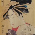
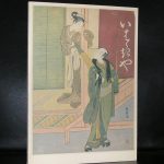
Both are Japanese print masters and there is only a time difference 30 years between these two great Japanese artists, but the difference between them is as large as  a classical painting by Sir Alma Tadema and a Modern painting by Soulages.

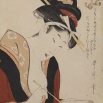
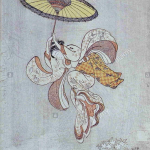
Where Harunobu’s craftmanship is rooted in the tradition of Japanese print making , i find Utamaro’s prints being far more inventive. His lines are clean and do remind me a little of the  outlines used by Herge and Joost Swarte. Classic scenes, actors and geisha’s and even shunga prints, all is mastered by this great Japanse artist. These prints were “In Vogue” by the impressionist artists and that is one of the reasons why so many of them can be found in Western Europe. Monet had them, van Gogh collected them and even made some paintings after them and the Rijksmuseum has thousands of them in their collection from which a selection is now and then on show. These shows are accompanied by some great bilangual catalogues of which the Harunobu and Utamaro ones are for sale at www.ftn.books.com

Posted on Leave a comment

Tomitaro Nachi (1924-2007)

nachi cata f

Tomitaro Nachi was one of the first japanese artist ever to have an exhibition in the Stedelijk Museum. Wim Crouwel designed the catalogue for his exhibition and what makes it extra special is that the catalogue included a rare and beautiful multiple. There is wonderful short movie about this artist which was made at the time of his exhibition at the Stedelijk Museum in 1974.

The catalogue shines. It is like a minimal artist book and reflects the spirit of “Zero” and Kinetic art and was forgotten by most until recently it was sold at a local book auction and fetched a steep price of euro 120,– because it had the original multiple included. www.ftn-books.com has both copies available. The one with and the one without the multiple. Both are worth collecting, but as lng as it is there i would chose the one with the multiple included.

Posted on Leave a comment

Piet Mondriaan / Mondrian’s studio

Schermafbeelding 2018-02-10 om 12.08.14

The studio of Piet Mondrian were works of art of them selves. They acted like a true work “in situ” where every item had its proper place . Because of this, the studio itself became a work of art. This was recognized by many and one of the greatest photographers from last centur even made a series of photo from the Paris studio. The same with the NY studio which was photographed by Arnold Newman.

Kertesz and Newman , two great photographers who realized that Mondrian was a very special painter and made these photographs with one purpose….. so we could see the extraordinary qualities Mondrian had when he approached a painting or an object.

There is onegreat article on Artsy where the studio’s of Mondrian are described.

https://www.artsy.net/article/artsy-editorial-mondrian-turned-studios-giant-abstract-paintings

There are some excellent publications on Mondrian and his studios available at www.ftn-books.com including a paper model kit

OLYMPUS DIGITAL CAMERA

Posted on Leave a comment

Ruri Matsumoto (1981)

Schermafbeelding 2017-09-18 om 13.01.30

Sometimes you encounter works by an artist for which you have an instant liking and admiration. This is the case with Ruri Matsumoto. She was born in Tokyo and had her education in Japan and Germany. This is where she followed lessons with Helmut Federle and Markus Lupertz a.o.. She stayed after her education in Germany and now has her own studio in Dusseldorf, which she will leave for a temporary studio in Berlin until January 2018.

Her works are characterized by the use of  very bright colors and are compositions of almost random like patterns formed with tape, but look more closely….. you will find layers of abstract constructivist forms making a spectacular work of art. Of course art is always something personal and subjective, but i like these paintings very much and because there is this rare chance to see her works at Livingstone Gallery i write this blog to let you know that until the 4th of November some of her works are on show in the PAINTING NOW exhibition, curated by Jan Wattjes.

Schermafbeelding 2017-09-18 om 13.18.07.png

To get an excellent impression of her works please visit:

https://www.rurimatsumoto.com and of course http://www.livingstonegallery.nl/home

for the information on the exhibition at Livingstone gallery in The Hague

Posted on Leave a comment

Japanese posters ( 1977 )…catalogue by Wim Crouwel

The Stedelijk Museum Amsterdam has a history with posters and specially the posters from Japan were presented on multiple occasions within exhibitions on the subject. In 1977 , the “Japanse Poster” exhibition catalogue was designed by Wim Crouwel, who designed a very special catalogue for the exhibition . The catalogue is one of the best from the seventies and instead of the typical Crouwel typography

on the cover there are Japanese letters drawing your attention. Red lettering on a silver background let this one stand out from the rest.

Stedelijk Museum#JAPANSE AFFICHES# Crouwel, 1977, NM

This catalogue was published with number 617 within the series of published Stedelijk Museum catalogues.