Posted on Leave a comment

Willem Hussem (1900-1974) and the “Posthoorngroep”

Schermafbeelding 2017-11-30 om 14.04.42

What about these glasses!….it is the first thing you see when you look at this portrait of Willem Hussem, a dutch painter from the Hague who formed together with Nanninga , Roede and Bohemen the core of the “Posthoorngroep”. The met weekly in the famous cafe de Posthoorn where they discussed art and everything else, but most of all inspired each other to some of the greatest art found in the Netherlands in those days, Among them Willem Hussem was perhaps the most diverse ( painting , sculpture and poetry), but certainly one of the most outspoken member of the group. Willem Hussem his works are spread all over the Netherlands in Museums ( Gemeentemuseum Den Haag, Stedelijk Museum, Dordrechts museum) and many private collections. If you are searching to add a beautiful Hussem to your collection, let me know because i know of the whereabouts of some excellent paintings that are for sale by this great artist and of course www.ftn-books.com has some nice publications available.

hussem paol a


Posted on Leave a comment

Karel Appel and the Congresgebouw Den Haag (1969)

Schermafbeelding 2017-11-14 om 14.16.30

The Congresgebouw is an architectural icon in Den Haag. It was designed by Hans Oud and J.J.P. Oud and opened in 1969. In 1968 Karel Appel was commissioned a large painting on ceramic tiles and this painting is one of the lesser known Karel Appel paintings because not many people realize that they pass it while entering the Congresgebouw / World Forum ( the name what it is called nowadays).

Schermafbeelding 2017-11-14 om 14.15.55

The extremely large tile painting consists of over 1200 separately painted tiles. These together, making it one of the largest Karel Appel paintings ever. If ever you come to Den Haag , this location is well worth a visit because not only there is the Gemeentemuseum nearby, but beside the tile painting by Appel there are sculptures, by Henry Moore, Auke de Vries and Pevsner in the vicinity.

For some nice Karel Appel publications please visit www.ftn-books.com

Posted on 1 Comment

Peter Nadas (1942) ….a photographer


Schermafbeelding 2017-11-07 om 15.12.12

I did not know it because i only know Nadas from his Photography exhibition in the Gemeentemuseum for which an impressive small catalogue was published , but when i looked for the biography on Nadas i noticed that he foremost is known for his writing during the last 3 decades. It is now clear to me that this is the reason why so few books with his photography have been published during his life until now. Still his photography was done in the tradition of his Hungarian countrymen. For example Kertesz must have been a great influence on the photography by Nadas. The book on offer with www.ftn-books.com ( Kindred Spirits) was published on the occasion of the Peter Nadas exhibition in the Fotomuseum Den Haag/2004, in which the qualities of his photographs were shown. Nadas is known as a writer, but these photographs show that he has 2 artistic sides. Beside being a writer …..the other side is definitely being a great photographer.


Posted on Leave a comment

Hendrik Kerstens ( 1956 )

Schermafbeelding 2017-12-16 om 15.30.59

Today i added a book on Hendrik Kerstens to my inventory. At first glance you see a classic portrait , but when you follow his works through several decades, you note 3 elements in the photograph. The model is in most cases Paula, his daughter , who progresses in age, and looks when getting older ….more and more like a “dutch Golden Age” figure by Johannes Vermeer. Secondly the props within the photograph ( mainly hats ) are common household items. Blankets, plastic bags, empty tin cans ….all have a function within the portrait. Modern elements making a classic portrait of a beautiful woman. Hendrik Kerstens is now also represented in the US and his name as an important dutch photographer is now established among the great dutch photographers from his generation.

‘HENDRIK KERSTENS DID NOT TRAIN FORMALLY AS AN ARTIST. HOWEVER, HE WISHED TO DEVOTE HIMSELF TO A MORE CREATIVE PROFESSION AND IN 1995, AT THE AGE OF FORTY, HE LEFT THE BUSINESS WORLD AND TOOK UP PHOTOGRAPHY. HIS WIFE ANNA WORKED FULL TIME TO SUPPORT THIS CHANGE OF DIRECTION. IN A REVERSAL OF MORE TRADITIONAL ROLES, KERSTENS CARED FOR THEIR YOUNG DAUGHTER PAULA, WHILE ALSO STUDYING PHOTOGRAPHY DURING THE DAY. HAVING A CHILD LEFT A DEEP IMPRESSION ON KERSTENS. THROUGH PHOTOGRAPHY, HE EXPLORED THE ACCOMPANYING FEELINGS OF RESPONSIBILITY, VULNERABILITY AND LOVE HE FELT TOWARDS HIS DAUGHTER, STARTING WITH DOCUMENTARY FAMILY SNAPSHOTS.
AS PAULA PHYSICALLY AND PSYCHOLOGICALLY GREW, KERSTENS SEARCHED FOR AN ARTISTIC MANIFESTATION OF THESE CHANGES, LEADING TO HIS INTERPRETATIONS OF THE GREAT DUTCH MASTER PAINTERS OF THE 17TH CENTURY WITH PAULA AS HIS MUSE.’

EXCERPT FROM AN ESSAY BY MARTIN BARNES, VICTORIA AND ALBERT MUSEUM, LONDON

this book is now availabel at www.ftn-books.com


Posted on Leave a comment

Review Gemeentemuseum Den Haag visit 11/12/2017….. CHAOS!

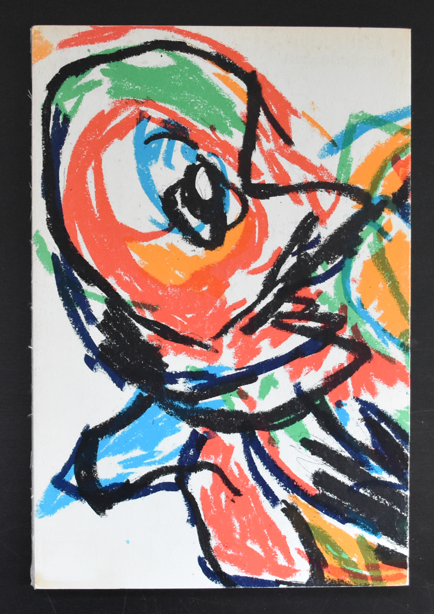
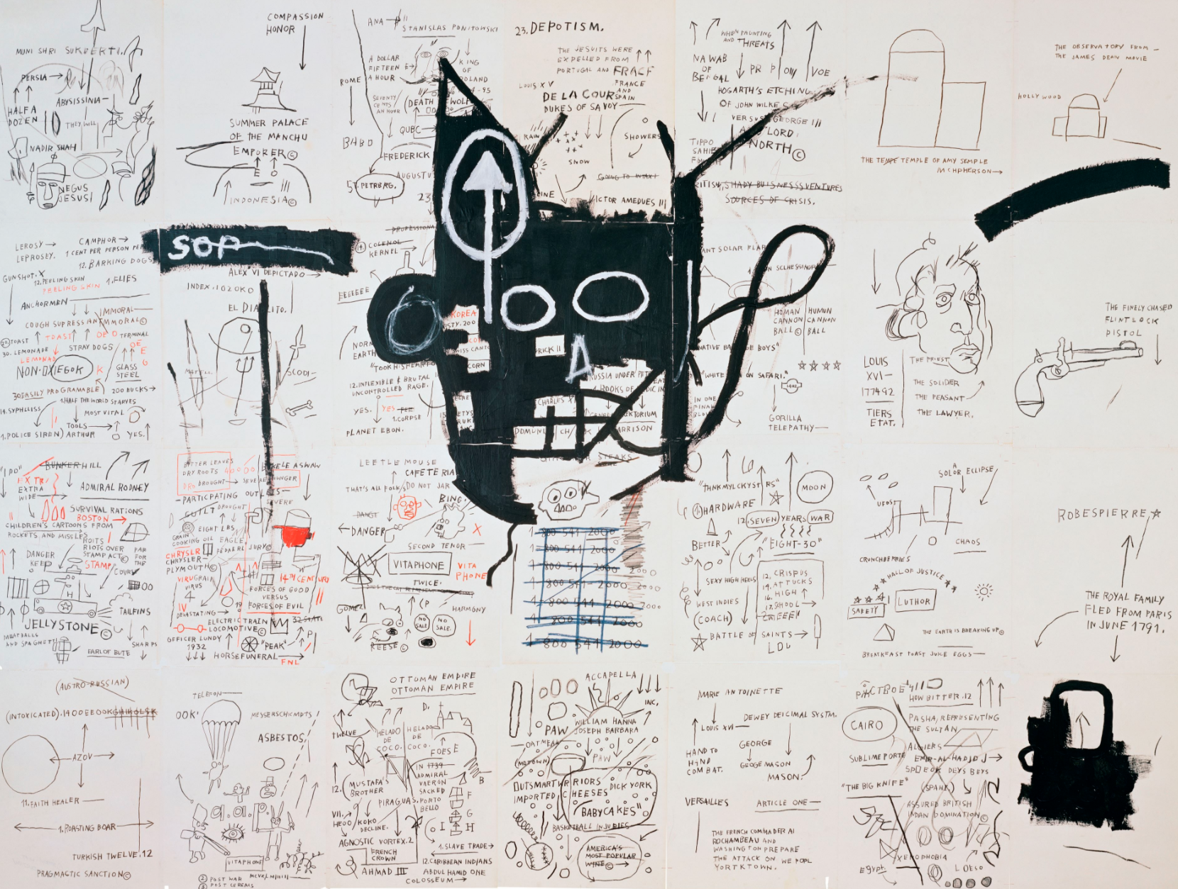
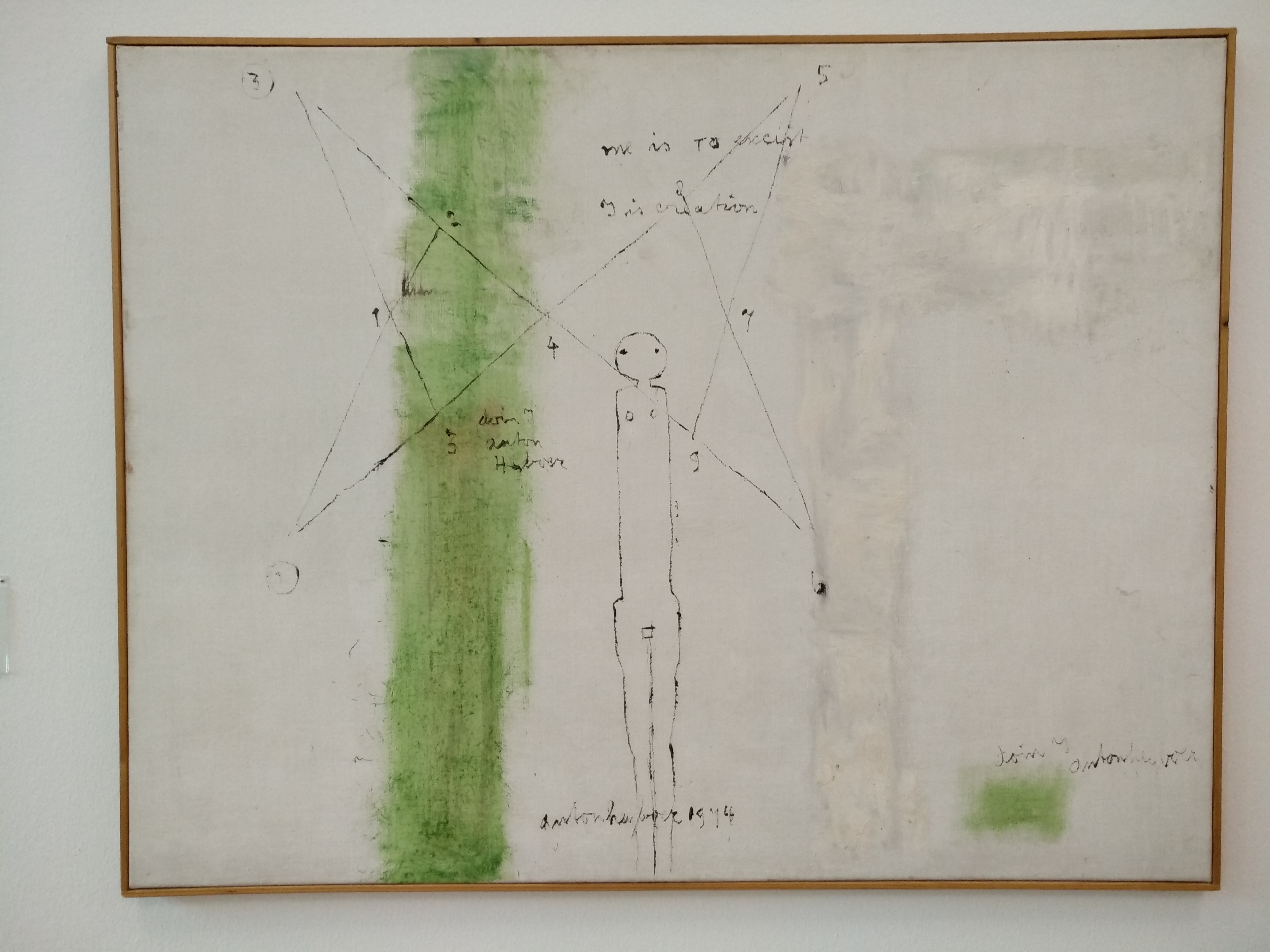
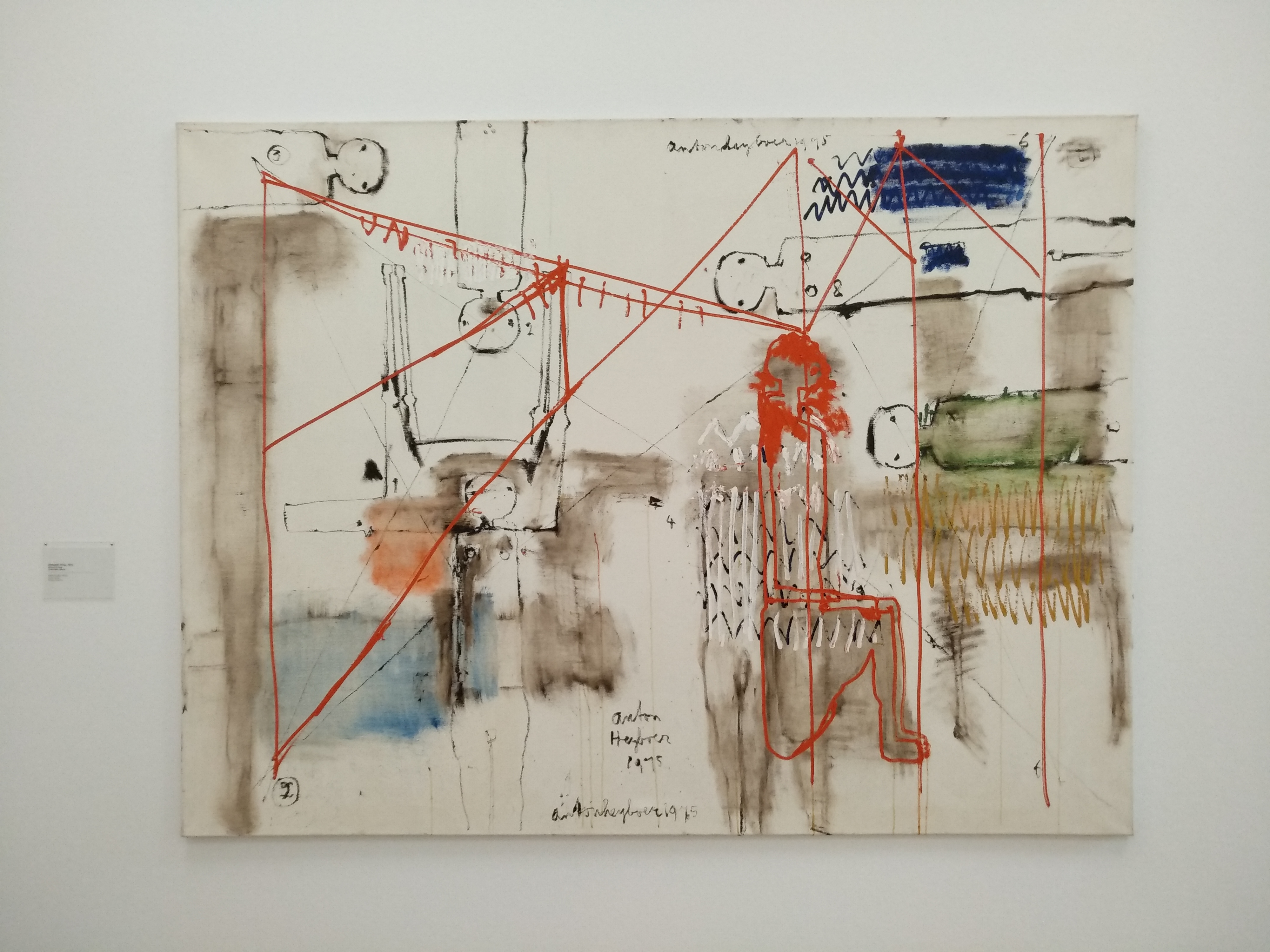
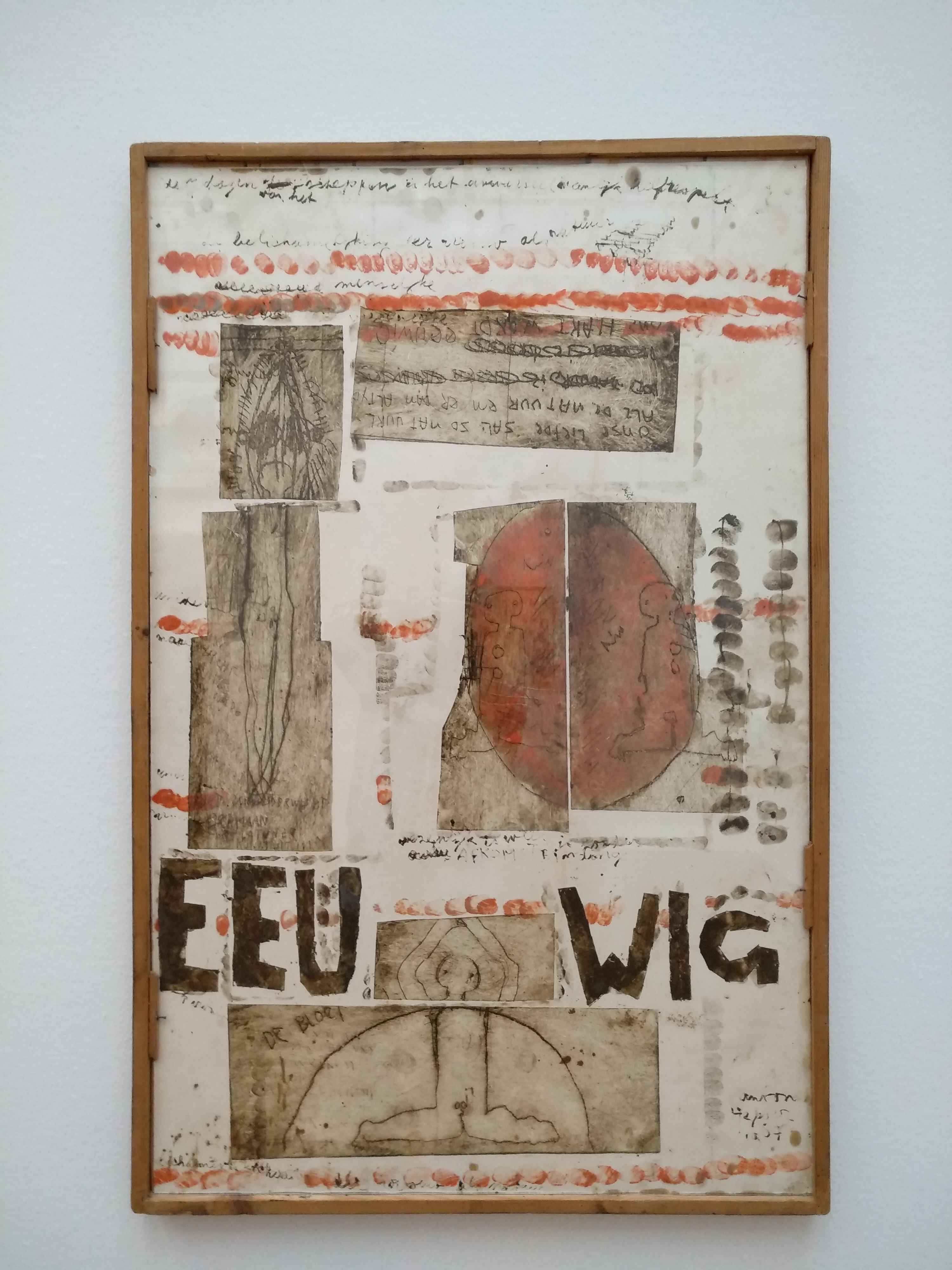
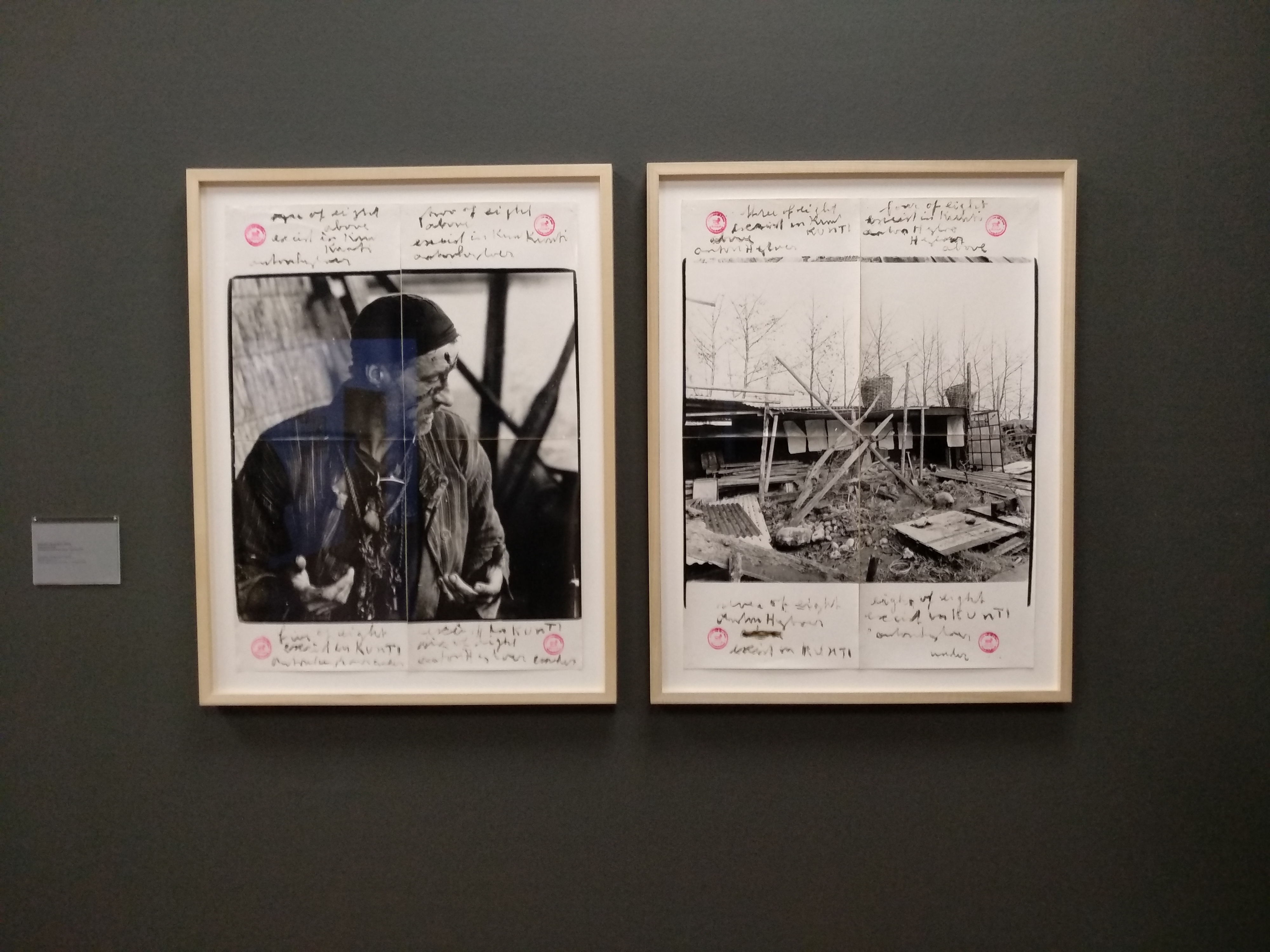
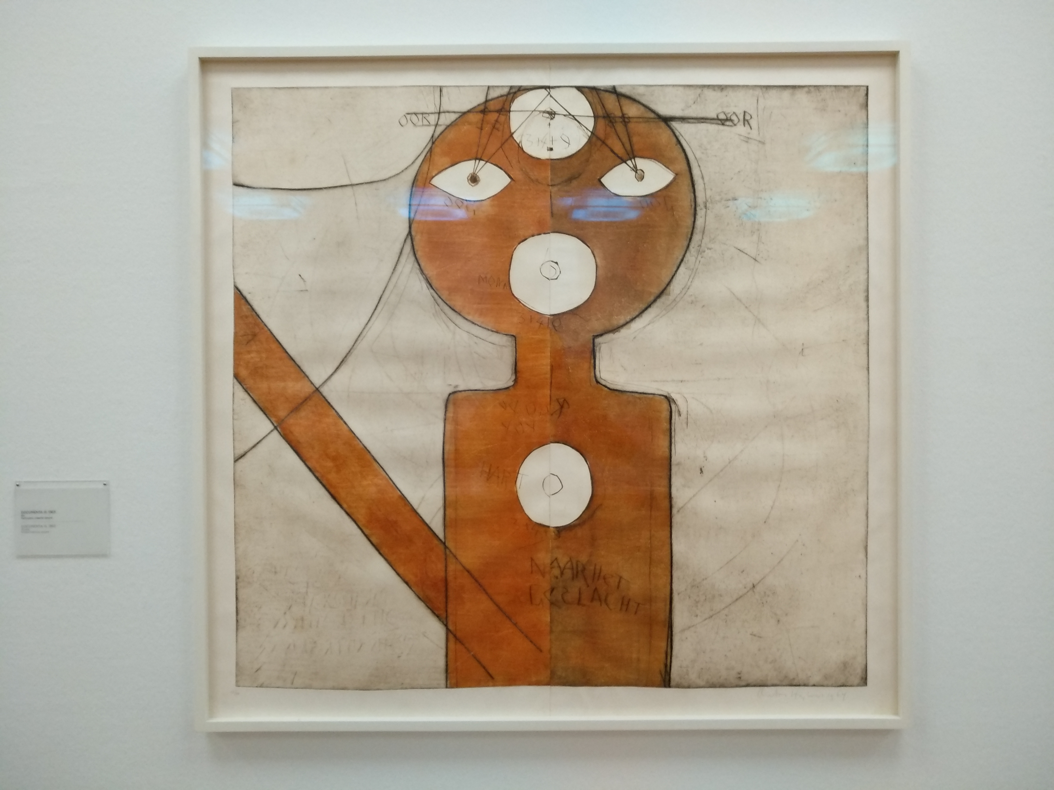
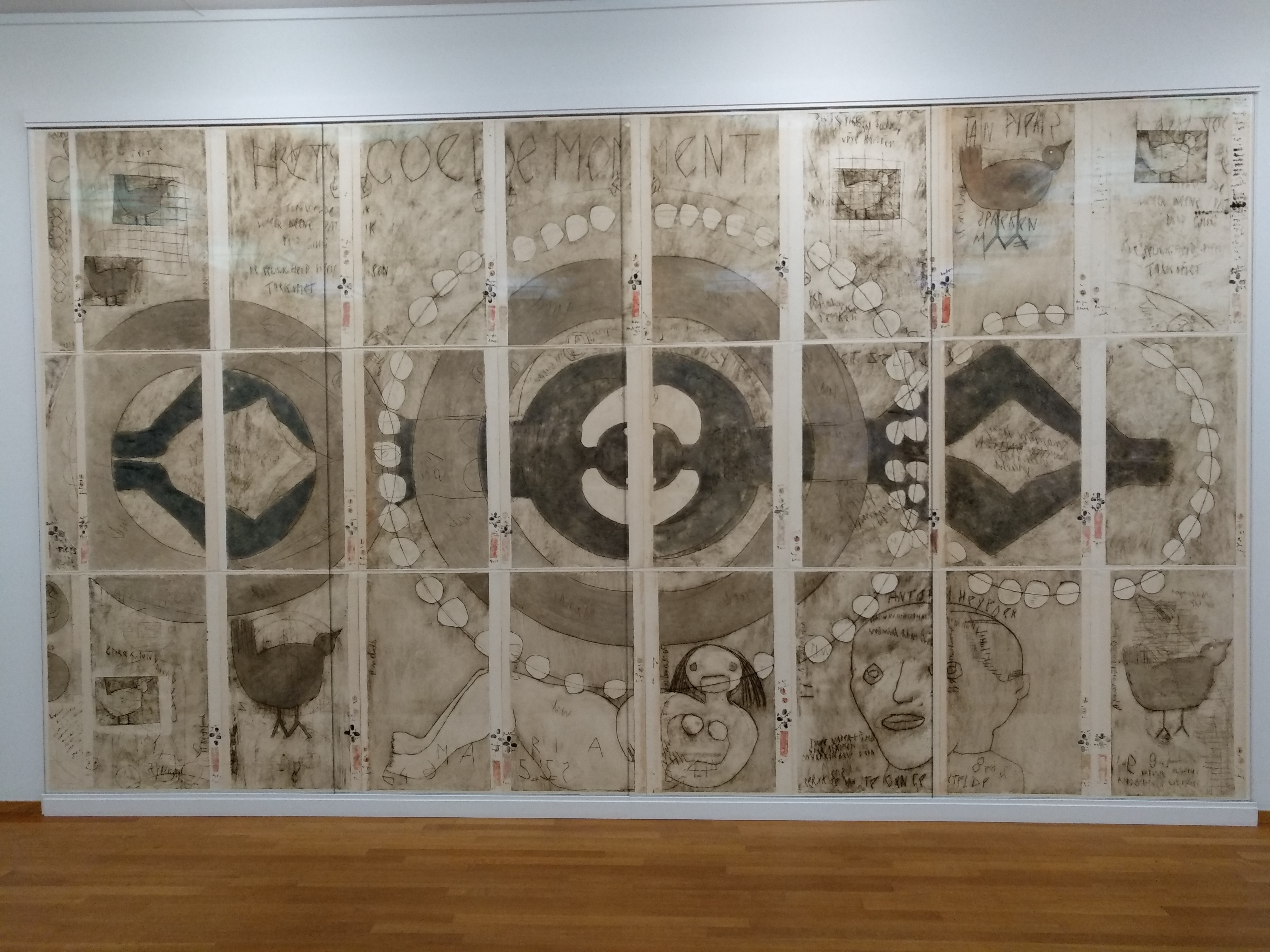
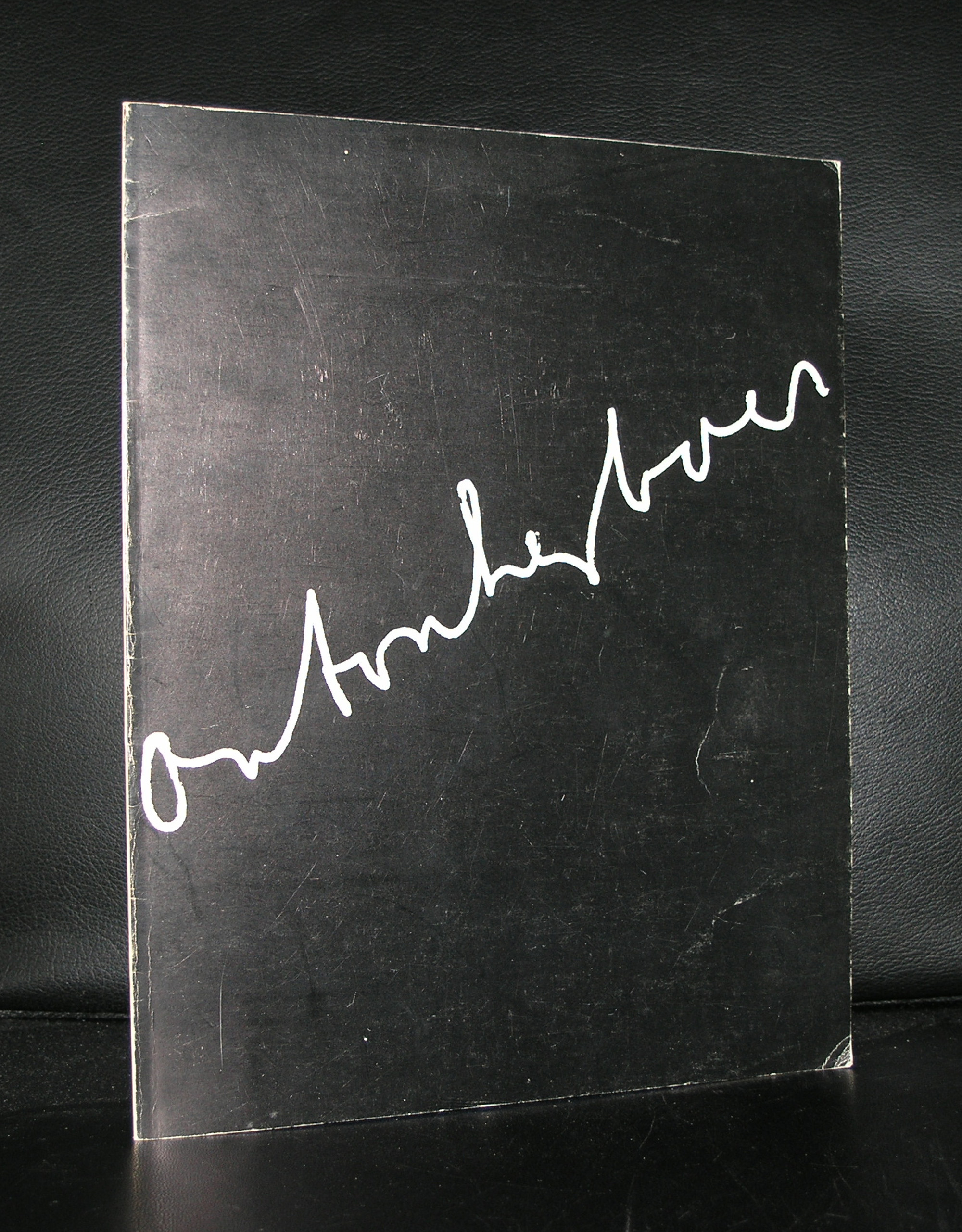
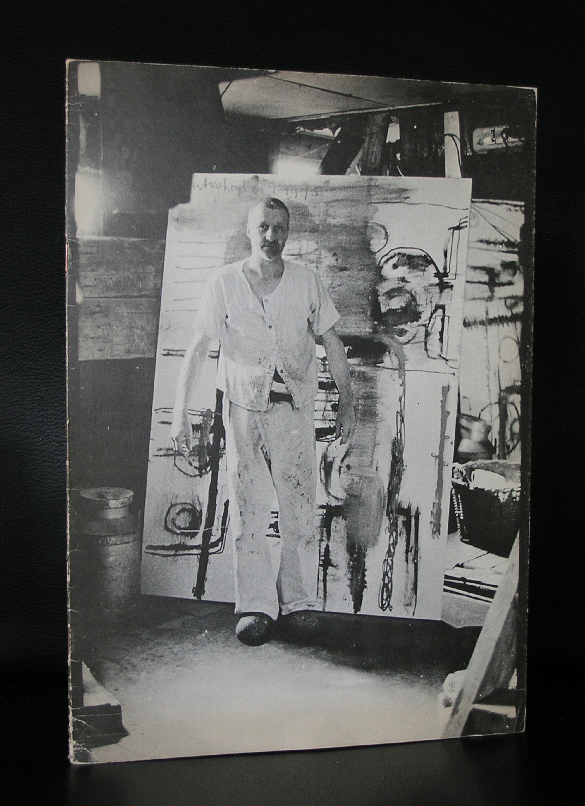
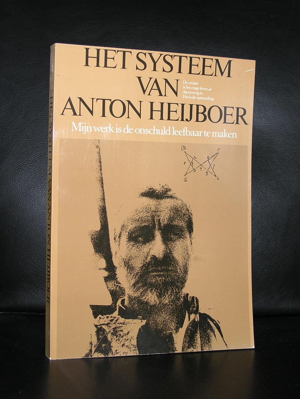
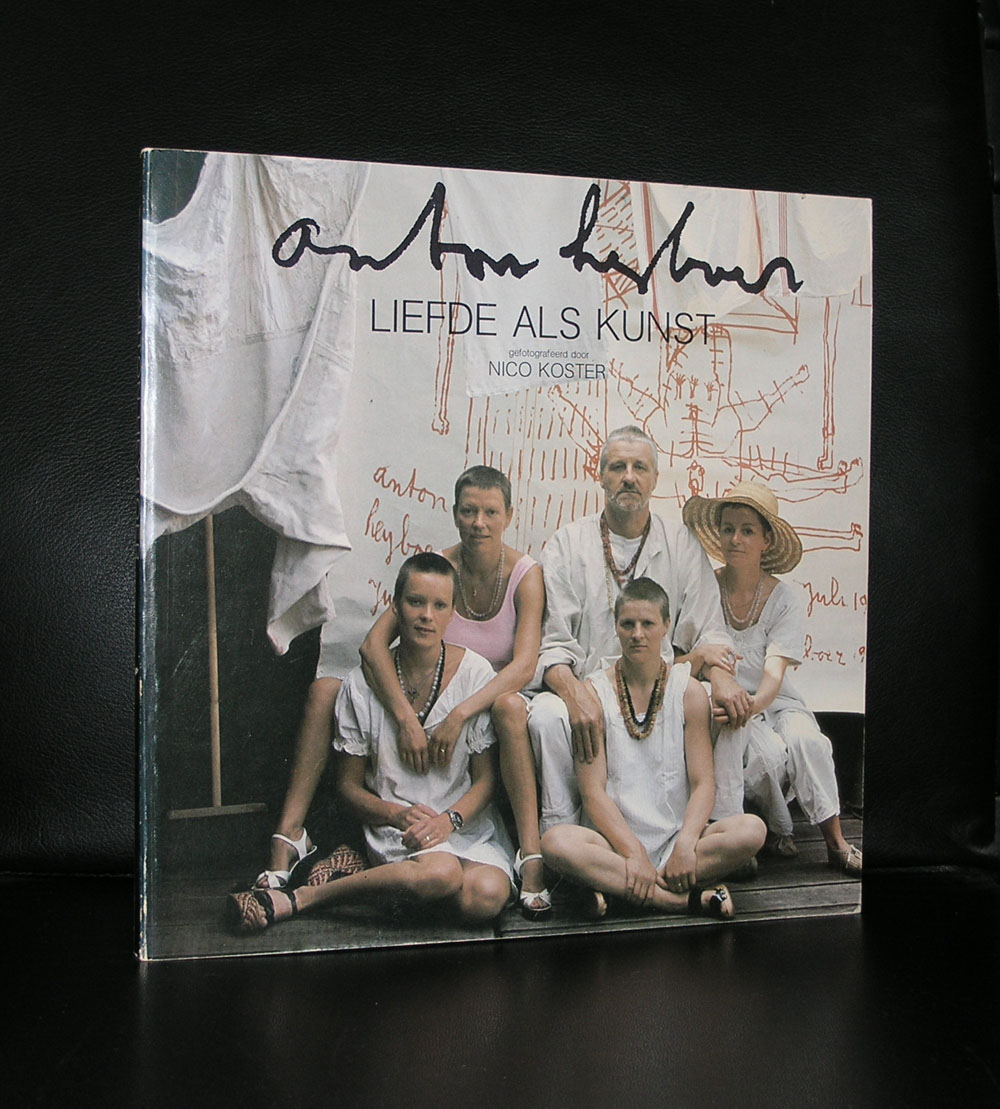
I think i have a right to speak when i say that yesterdays visit at the Gemeentemuseum Den Haag for me personally was “complete Chaos” . Yes, it was a busy Sunday afternoon and there must have been well over 1500 visitors that day, making it hard to find a quiet spot within in the museum. But beside that, the collections and all special exhibitions were filled with too many objects and what is even more important there was hardly any connection between the subjects of the exhibitions. First we re-visited the Heyboer exhibition which was during the last visit a real eye opener and with this second visit confirmed its importance, but after that….when you climb the stairs…. there is an Art Deco exhibition. An exhibition which has some great elements and objects but is so crowded with objects and far too many costumes that the important art is lost among all other items. For instance in the first room there is an extremely important Brancusi sculpture and one of the most beautiful Kees van Dongen paintings ( this was new to me) which are lost because there are too many objects in the room. It would have been so much better just to present the photograph with the Brancusi sculpture, the sculpture and the Salome painting by van Dongen and the room would have been perfect.

Schermafbeelding 2017-11-13 om 14.19.00

Now room after room is filled with too many objects and it is the same with the Steltman special exhibition. Too little space and too many objects and more important, it clashes with the Ceramic exhibition of the Ceramics by Hans de Jong ( a nice selection but again no space enough). The 3 screens with Uta Eisenreich are lost in between the two exhibition parts on the 1st floor in the Projectenzaal are not fascinating enough to stay any longer period in the room than 1 minute or so. There is no cohesion between the presentations and it makes a visit tiring and not interesting enough. But ….there are 2 exceptions  . First there is the mentioned Heyboer exhibition which is a must see and a great chance to discover Heyboer as a painter and certainly one of the most fascinating exhibitions i have seen last year…… It is the Marthe Wery / works on paper exhibition in the Berlage room.

Schermafbeelding 2017-11-13 om 14.13.47

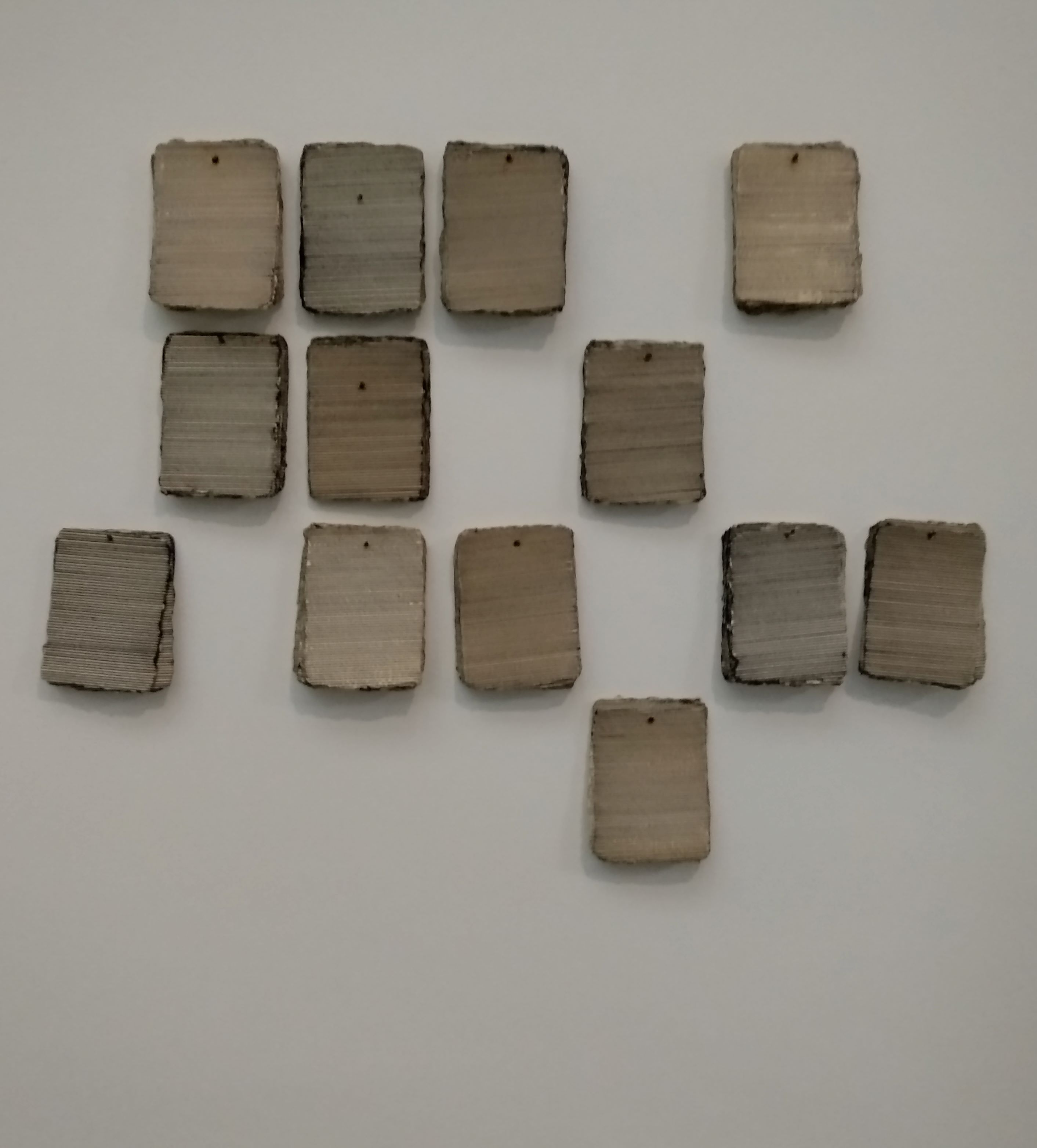
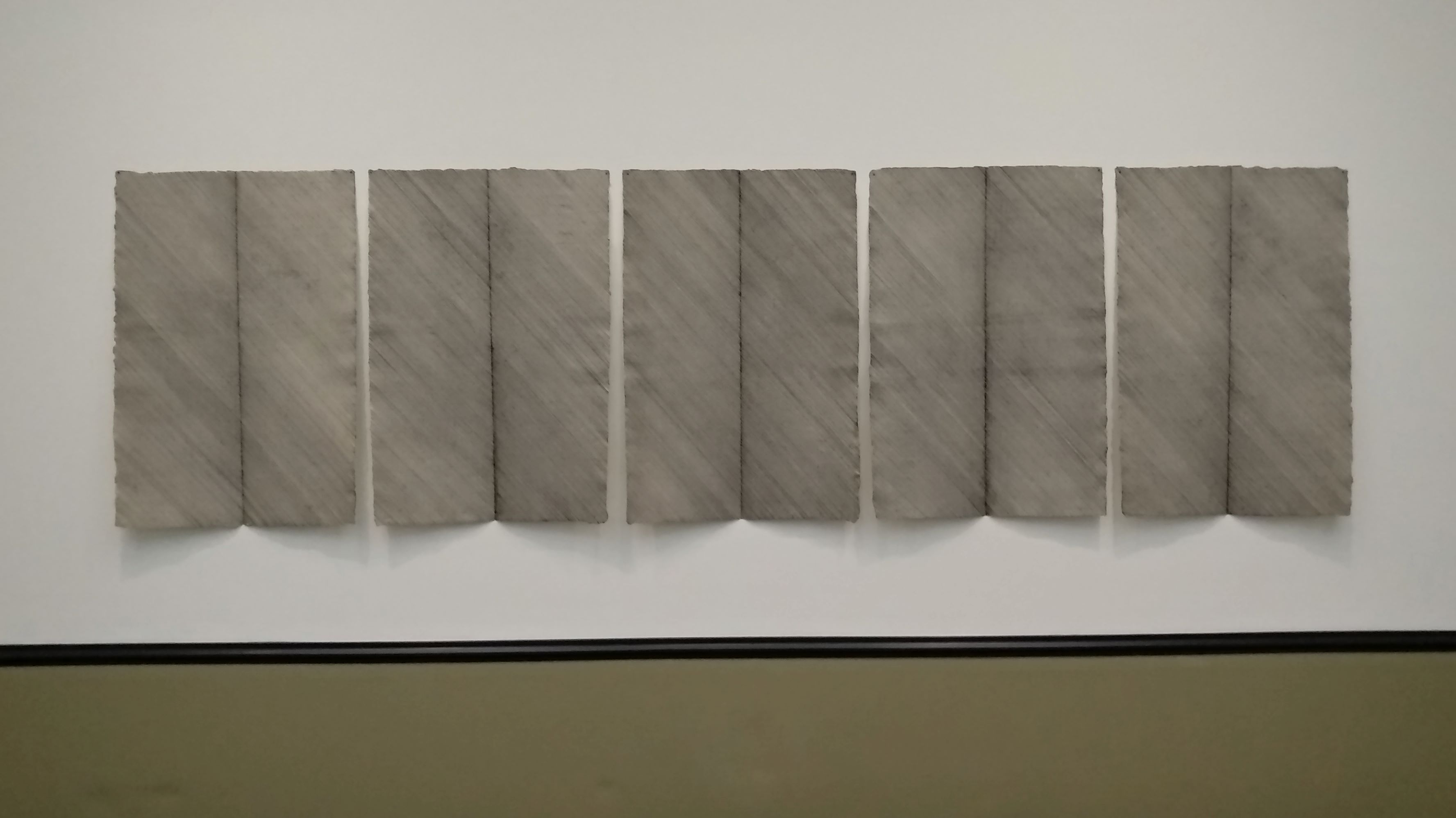
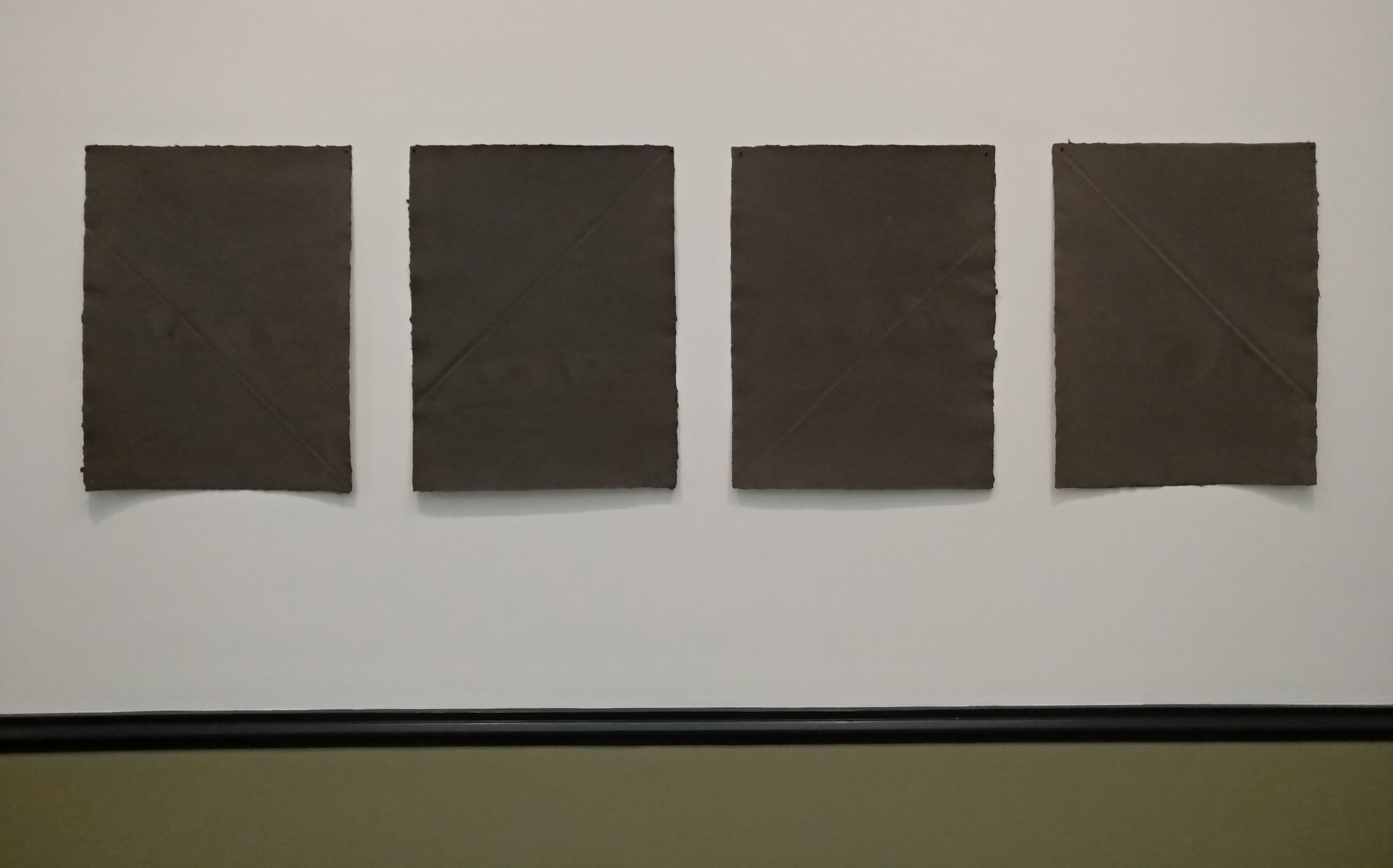
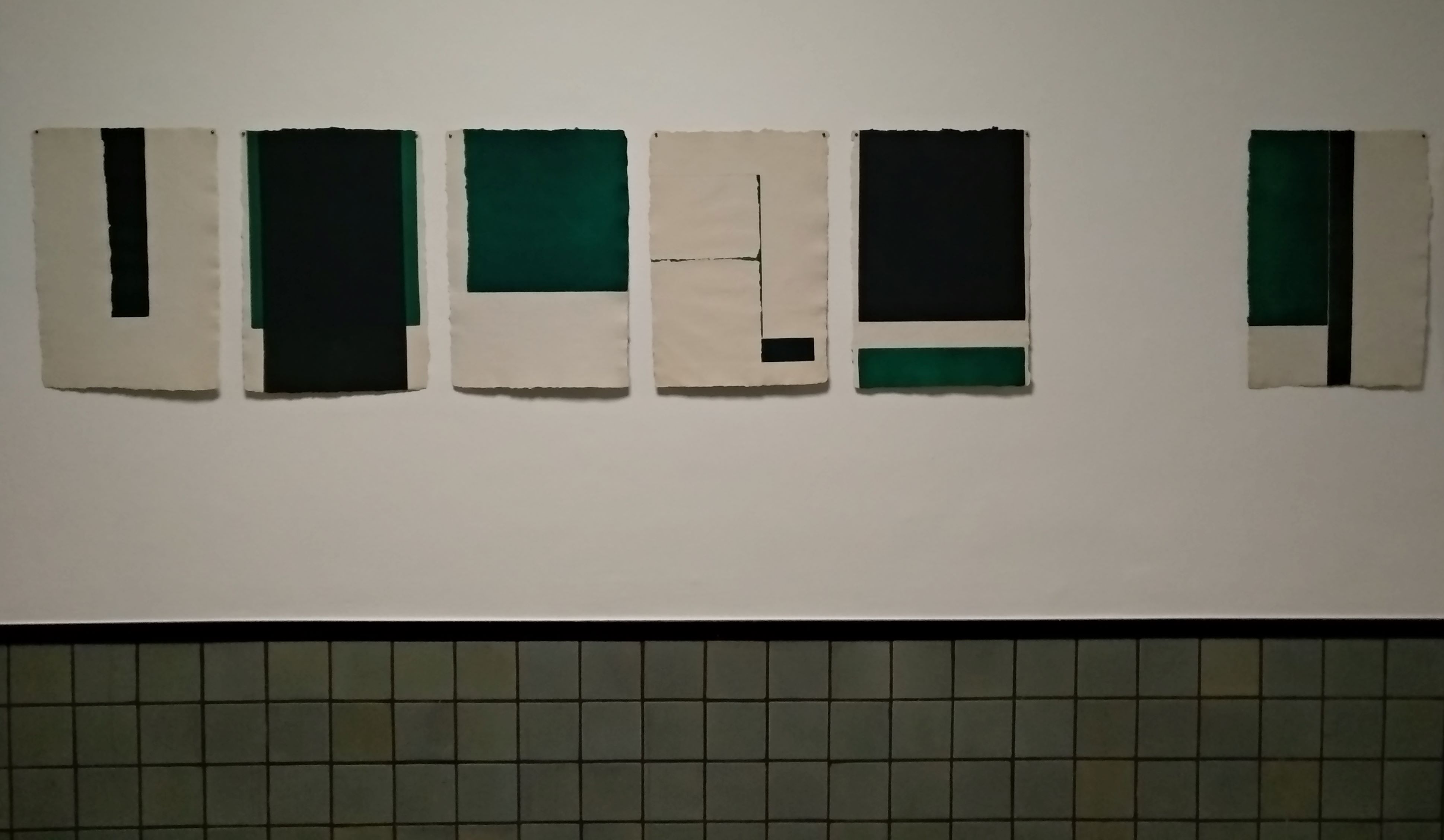
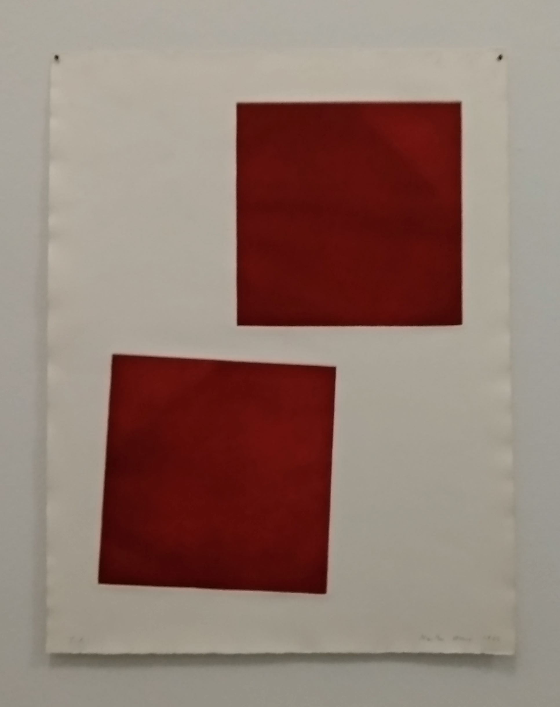
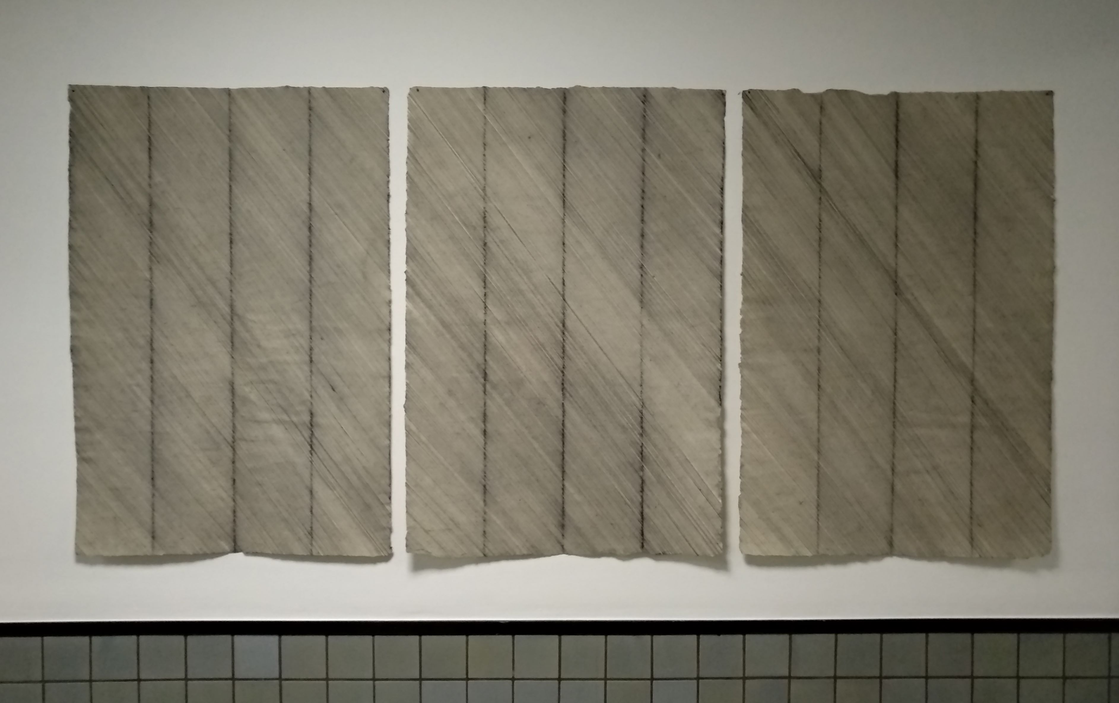
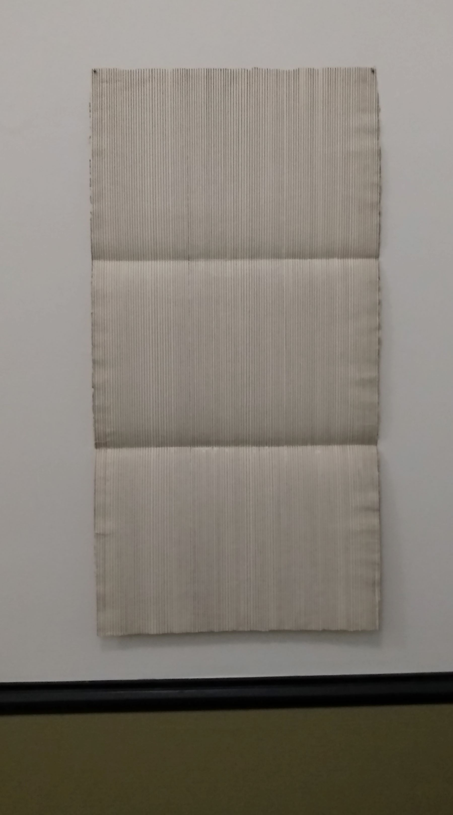
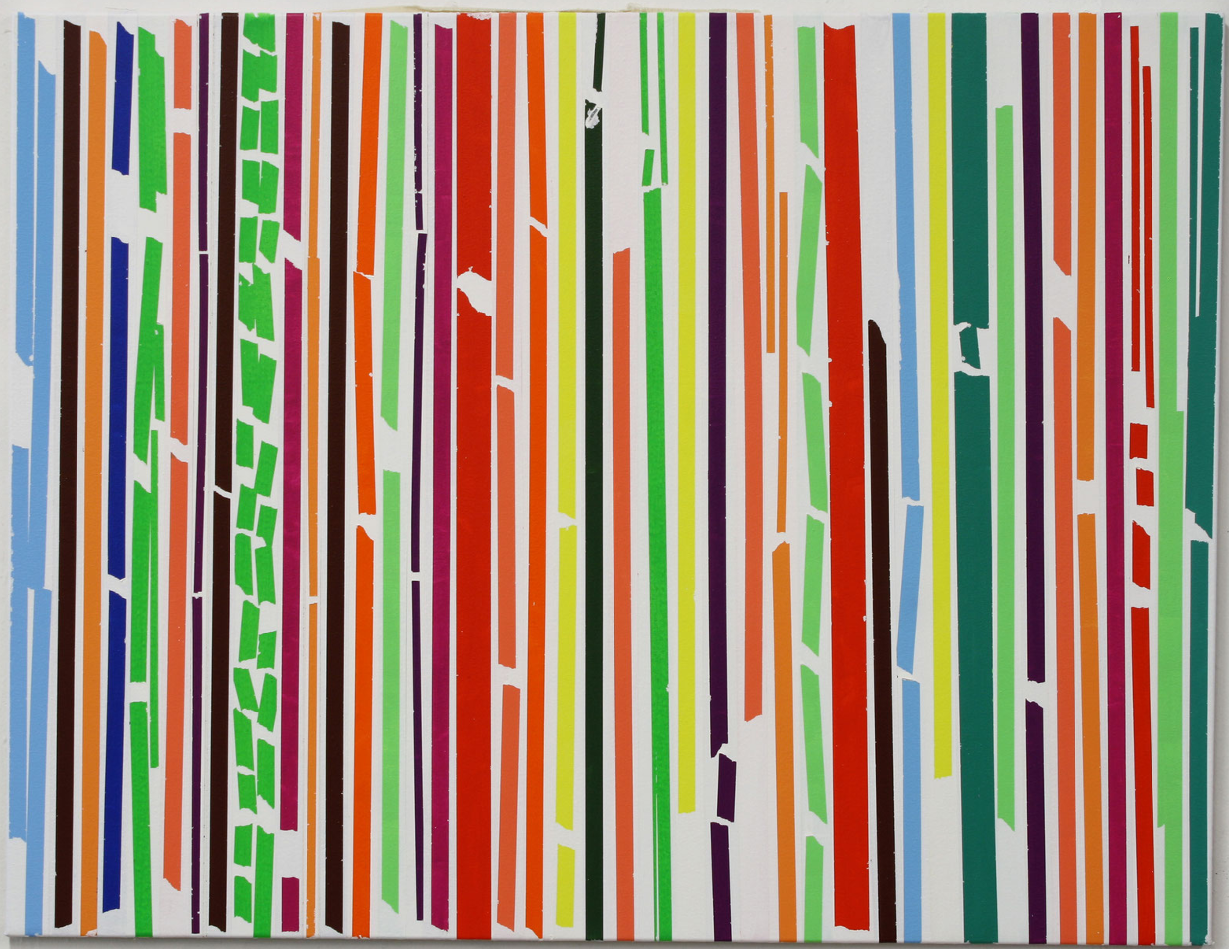
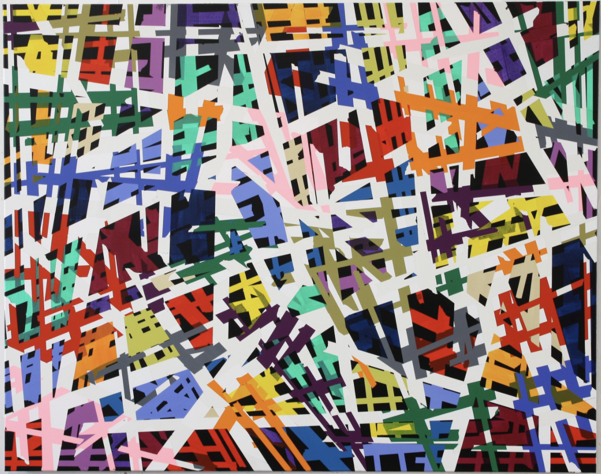
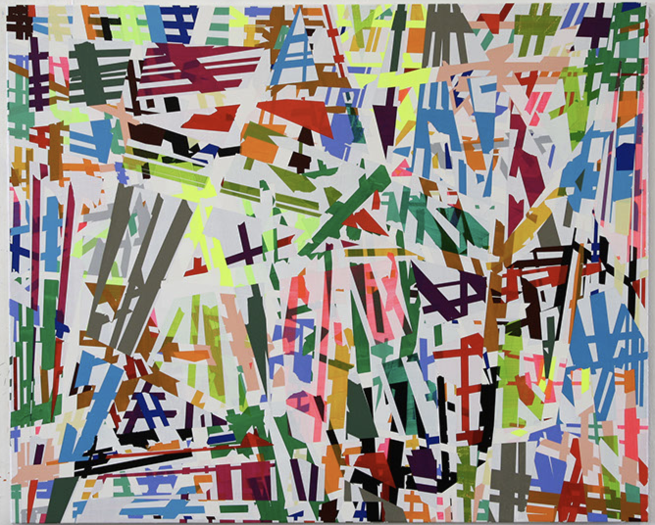
Over many years, Wéry was inspired by paper to create a variety of unique forms of artistic expression, in which the visual experience is always paramount. She used Indian ink to inscribe serene straight lines on handmade paper, the various types and sizes of which contribute to the expressive power of the work. It may be smooth, formal and rational in appearance or, on the contrary, lumpy, tactile and sensually appealing. Wéry used folds in the paper to accentuate or interrupt the drawn lines or, in other works, soaked the paper in acrylic paint and carefully controlled the resulting colour gradient. She frequently created works on two, three or even more panels, installing them in such a way as to create a rhythmic harmony with the surrounding architectural space.

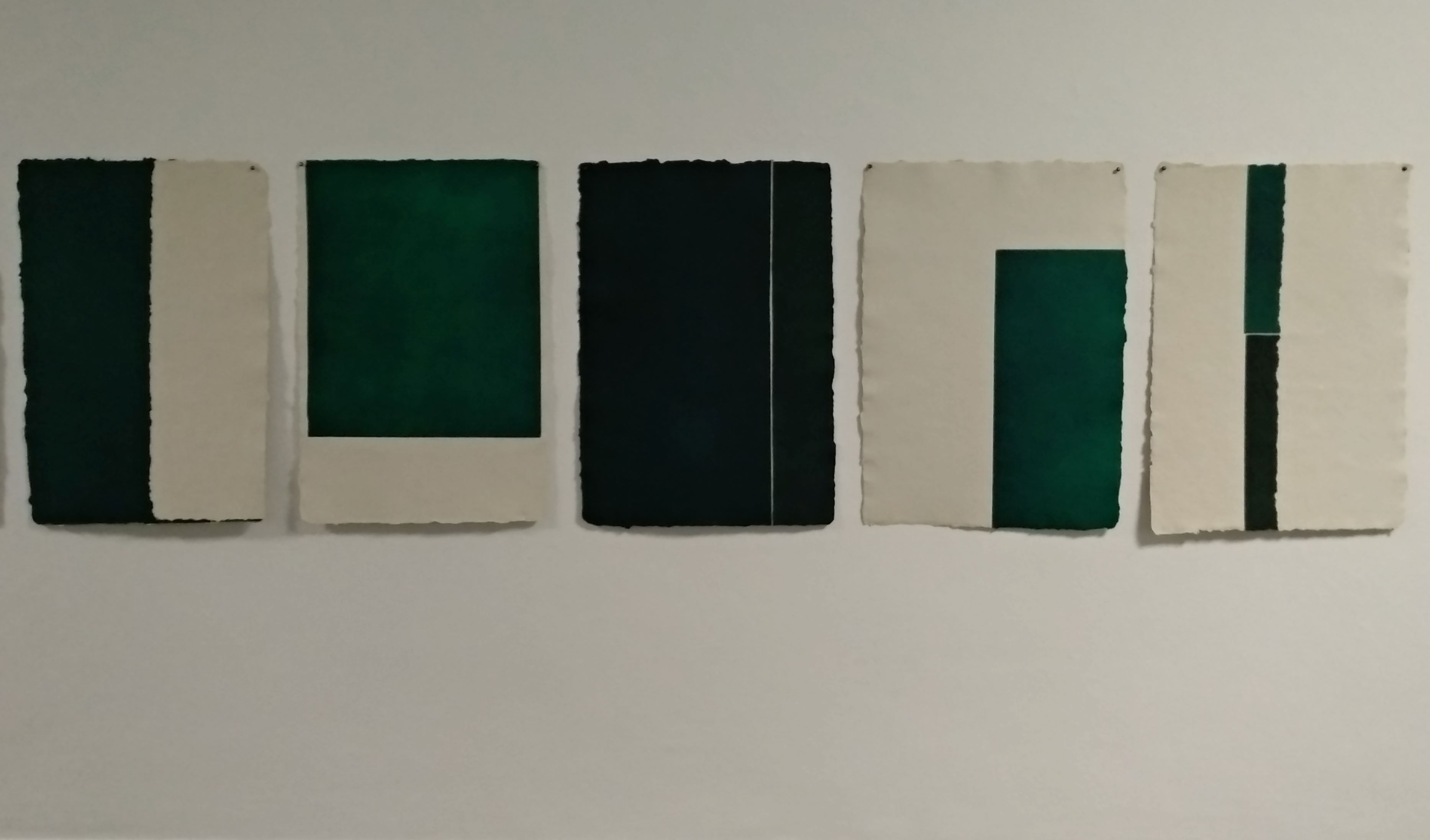
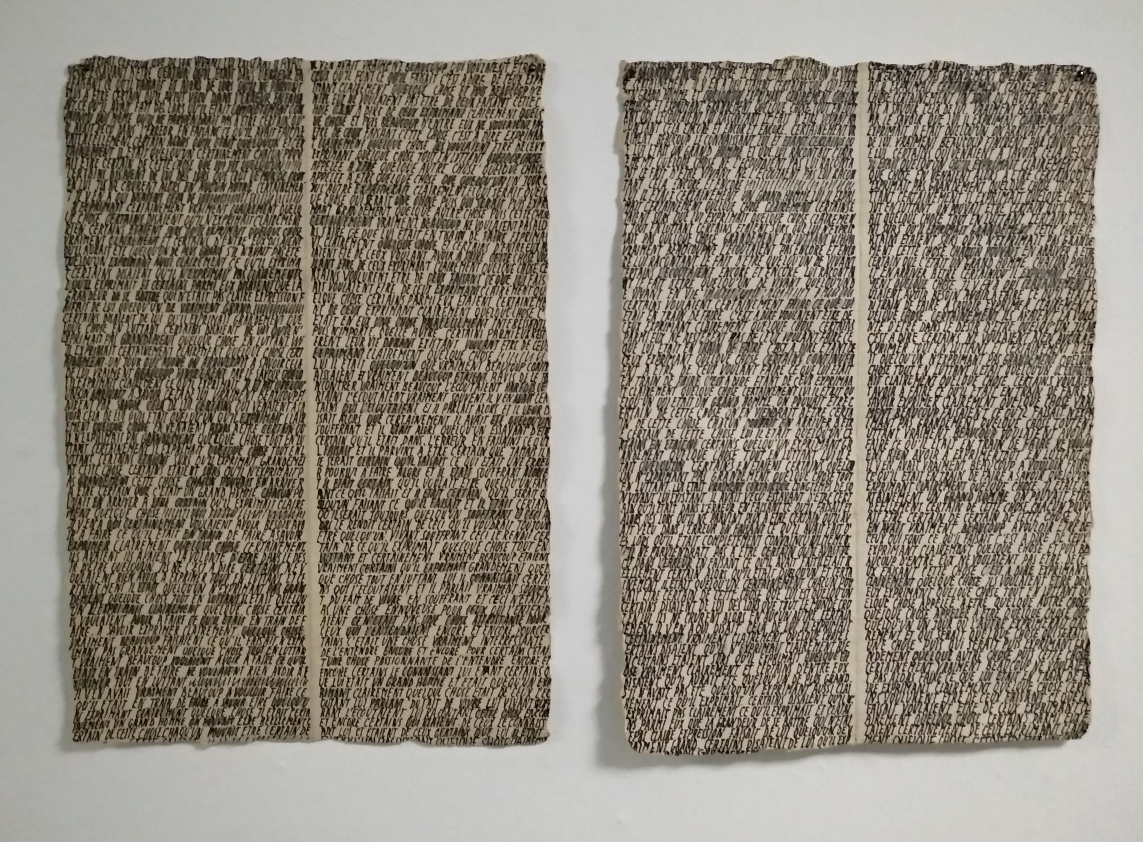
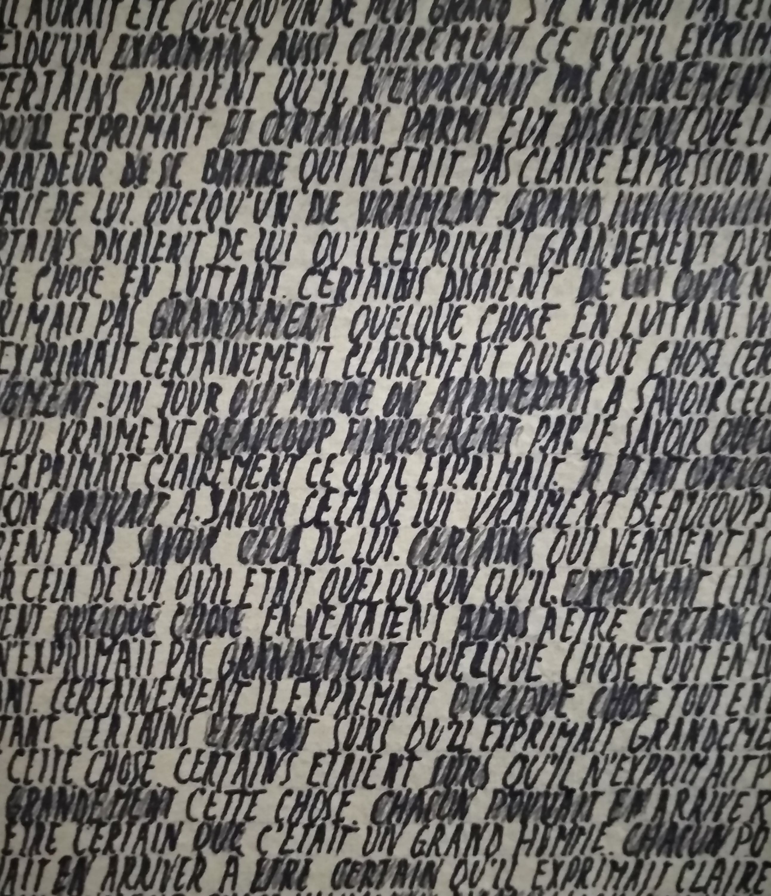
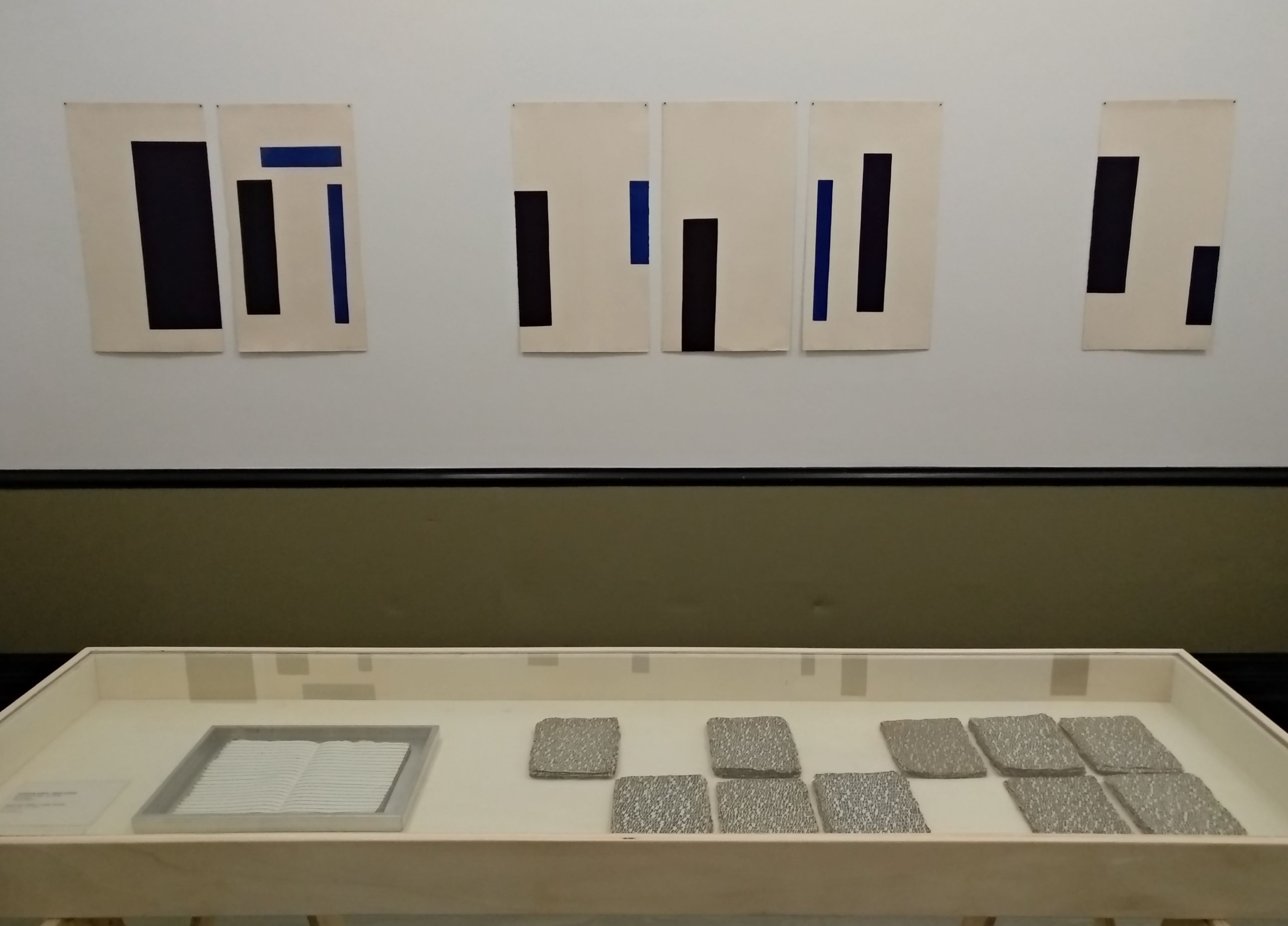
Around 1980, the lines gave way to letters or text. Wéry took texts by people like French artist Henri Matisse or American author Gertrude Stein as the points of departure for what she called her écritures. She also produced aquatints featuring compositions in which coloured geometrical planes interact with the white of the paper. When she began to stack drawings, placing them in bundles on a shelf, hanging them on the wall or standing them on the floor, they functioned as three-dimensional works. (Wery text by Gemeentemuseum Den Haag)

www.ftn-books.com has the very important Marthe Wery catalogue from 1986 available.

OLYMPUS DIGITAL CAMERA

Posted on Leave a comment

Anton Heyboer ( exhibition in Gemeentemuseum Den Haag) and Jean-Michel Basquiat

Schermafbeelding 2017-10-19 om 09.59.30

Yesterday i participated in an auction in which around 15 lots by Anton Heyboer were offered. Some of them were sold but most of them were “unsold” /held up and prices stayed all below their estimates. During the auction the auctioneer urged her audience to go to the Anton Heyboer exhibition in the Gemeentemuseum and since after my lunch i had a spare half hour, i stopped at the museum and visited the Heyboer exhibition. The museum has a long history with Heyboer , because in his early years as a curator for the Museum , Hans Locher organized exhibitions on Heyboer and visited him frequently in his studio in Den Ilp, resulting in purchases and the start of a brilliant Heyboer collection. Later on Heyboer’s works became less and less important . This is the time when he started as a more commercial artist  and sold his works across the street in Den Ilp, in a gallery run by his 5th wife.

But yesterday when i visited the exhibition in the Gemeentemuseum Den Haag ( Heyboer is on show until the 4th of February 2018) i was overwhelmed by the quality of its works from the sixties and seventies. I knew the etchings from the collection quite well, but the paintings were an eyeopener for me and i compared them immediately with the experience i had when i saw similar kind of paintings by Jean-Michel Basquiat in the Beyeler Museum some years ago.

There are many similarities between these two artists and their paintings and when you realize that most of these were made 20 to 25 years before Basquiat made his works you can only admire the Heyboer’s even more. I like this Heyboer exhibition very much and for me it is one of the best the Gemeentemuseum organized in the last 5 years.

and of course there are some nice Heyboer publications available at www.ftn-books.com


Posted on Leave a comment

Rozenburg porcelain ( 1883-1916) ….dutch Art Nouveau

I consider the products by the Rozenburg porcelain factory from The Hague to be the best examples of Dutch Art nouveau ever. Of course many would consider the “Slaolie” poster by Jan Toorop to be the best example of Dutch Art Nouveau, but for me it is all bundled within the eggshell porcelain product by the Rozenburg factory. Hand painted with the most delicate patterns and illustrations these belong to the absolute top in Art Nouveau design, Take a look at these examples .

They are all of the utmost quality and show the best  in design and painting. In the early 80’s  the ultimate book on Rozenburg porcelain was published. Written and curated by Marjan Boot, who later would become head of the design department at the Stedelijk Museum AMsterdam. The reason whhy this book is still the best on the subject is because it contains a special chapter filled with stamps and autographs of the Rozenburg master painters. I am fortunate to have this title available at www.ftn-books.com


Posted on Leave a comment

Jaap Nanninga (1904-1962)

Schermafbeelding 2017-08-31 om 09.58.18

Jaap Nanninga was born in Winschoten in the north of the Netherlands but after travels to Germany and Poland he settled in Den Haag in 1936, where he stayed and worked his entire life. meber of the famous Posthoorn group het met his friends artist for drinks and dinners at the POSTHOORN cafe at the Voorhout in Den Haag ( and yes…it is still there and serves the finest “Bitterballen” in Den Haag. He received his artist eductaion from Werkman and Wiegers and stayed for a short moment with Geer van Velde in Paris. These 3 artists made Nanninga the artist which we know nowadays. Abstract compositions rooted in the Fifties . a little Cobra mixed with abstract expresionism. Many dutch museum have some great Nanninga’s, but one museum i would like to mention specially is the FIGURA painting in the van Abbemuseum collection. Powerful and typically Fifties abstraction.

Schermafbeelding 2017-08-31 om 09.56.29.png

www.ftn-books.com has some nice Nanninga titles available

Posted on Leave a comment

Ruri Matsumoto (1981)

Schermafbeelding 2017-09-18 om 13.01.30

Sometimes you encounter works by an artist for which you have an instant liking and admiration. This is the case with Ruri Matsumoto. She was born in Tokyo and had her education in Japan and Germany. This is where she followed lessons with Helmut Federle and Markus Lupertz a.o.. She stayed after her education in Germany and now has her own studio in Dusseldorf, which she will leave for a temporary studio in Berlin until January 2018.

Her works are characterized by the use of  very bright colors and are compositions of almost random like patterns formed with tape, but look more closely….. you will find layers of abstract constructivist forms making a spectacular work of art. Of course art is always something personal and subjective, but i like these paintings very much and because there is this rare chance to see her works at Livingstone Gallery i write this blog to let you know that until the 4th of November some of her works are on show in the PAINTING NOW exhibition, curated by Jan Wattjes.

Schermafbeelding 2017-09-18 om 13.18.07.png

To get an excellent impression of her works please visit:

https://www.rurimatsumoto.com and of course http://www.livingstonegallery.nl/home

for the information on the exhibition at Livingstone gallery in The Hague

Posted on Leave a comment

Jan Toorop ( 1858-1928)… a 19th century dutch master

Schermafbeelding 2017-08-18 om 13.45.53

If there is one artist who brought impressionism into dutch art, it must be Jan Toorop. Roughly you can divide his artistic career into 4 phases. The first being his impressionist period ( a memberof Les XX), the second his neo impressionist period, the third being his symbolistic period and the last period is his realistic period in which he was converted completely into a Roman Catholic artist. Toorop is interesting because of his first 3 periods. Being born in Indonesia he has a different approach to his subjects and experiments with techniques and colors and uses a color scheme completely different from his dutch contemporaries. They focussed on skies and landscapes , whereas Toorop focussed on people and their surroundings. There are some great examples to be found in the Gemeentemuseum Den Haag of his very early period where he painted with a palette knife and broad brushes. His very atmospheric scenes in London, a city where he lived for a couple of years and where he painted some great paintings. The “Trio Fleuri” is one of the most appealing painting from his London years, together with the Waterloo Bridge painting and both can be seen in the collection of the Gemeentemuseum Den Haag.

and for those interested in Modern Art. A great painting by Toorop that symbolizes the dawn and rise of Modern Art in this world.

Schermafbeelding 2017-08-18 om 13.48.58

There are some nice publications on Toorop available at www.ftn-books.com