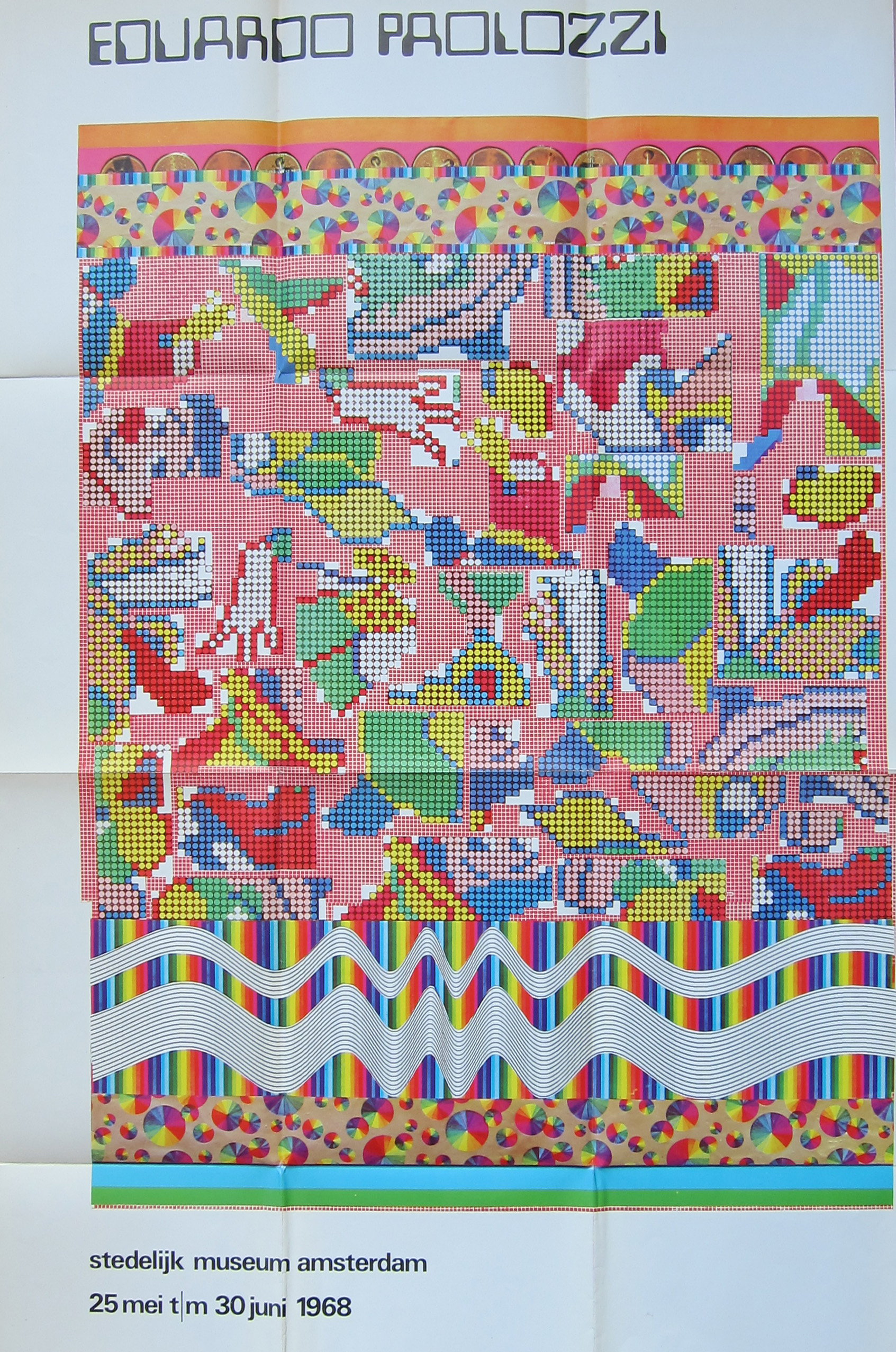
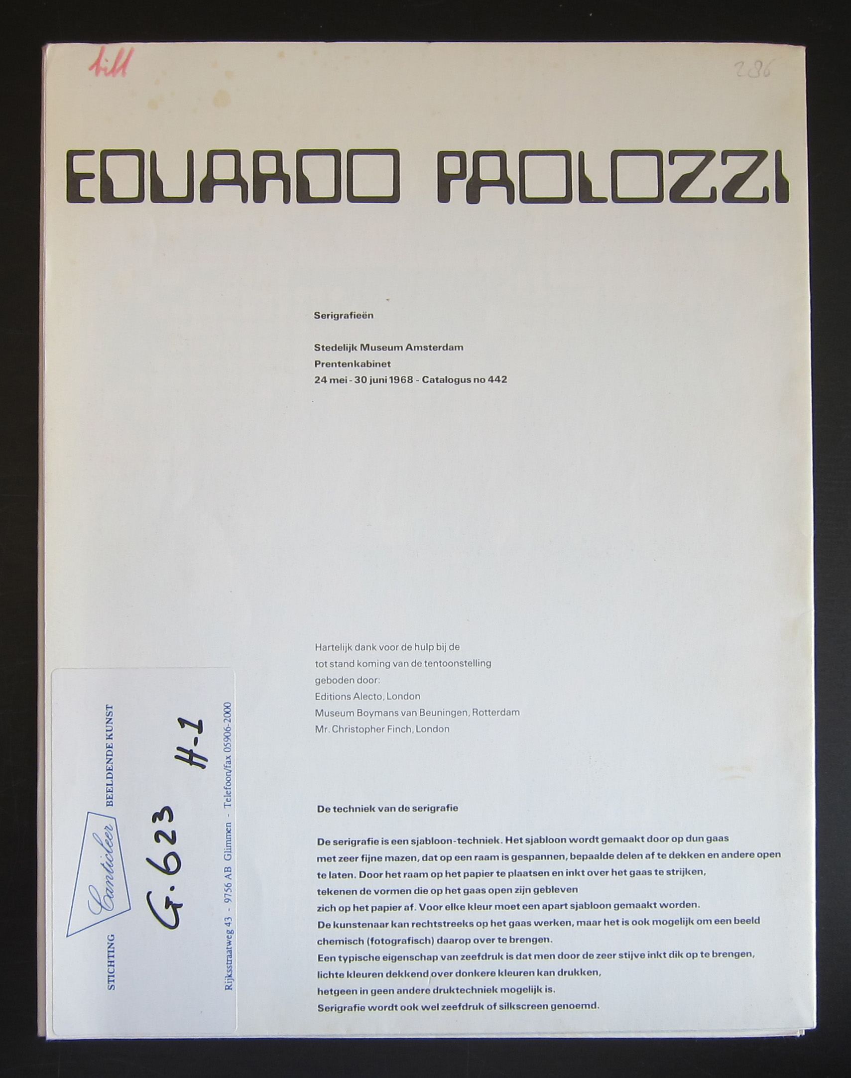
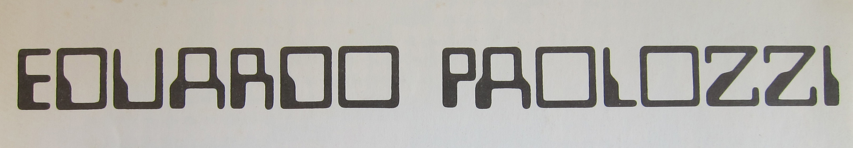
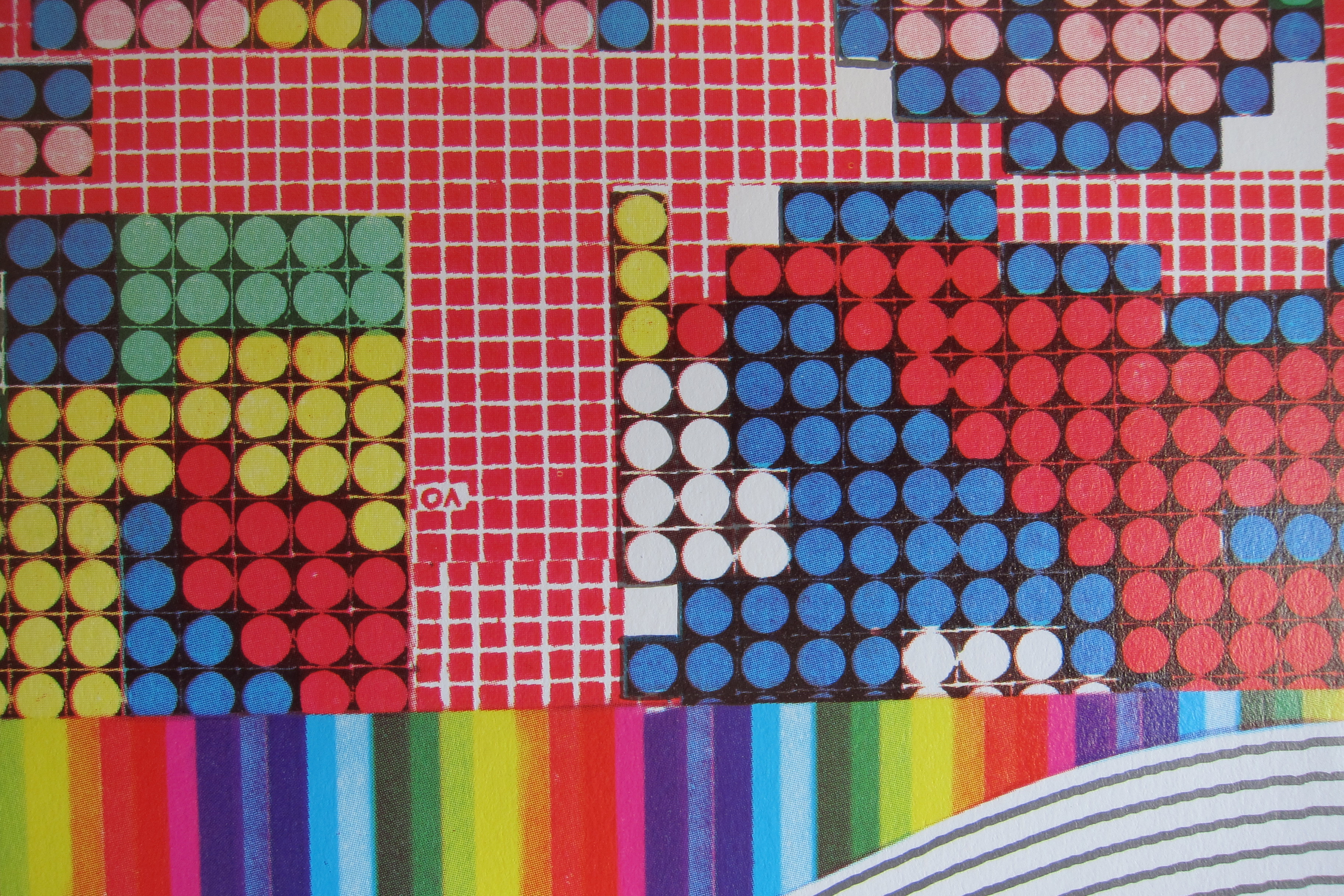
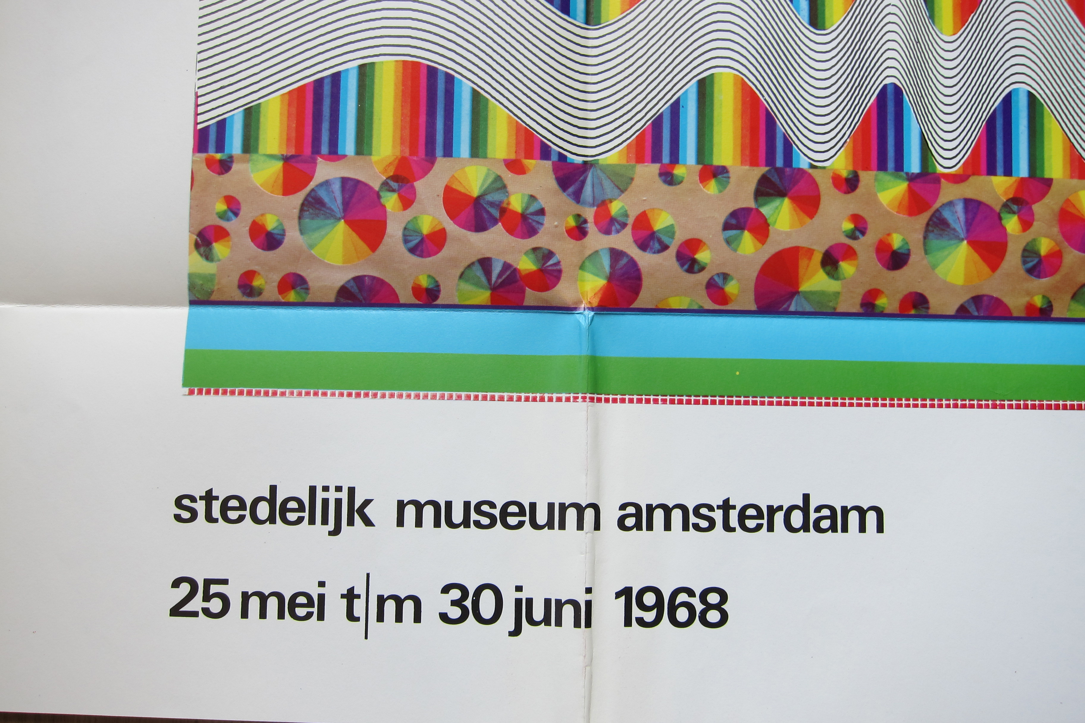
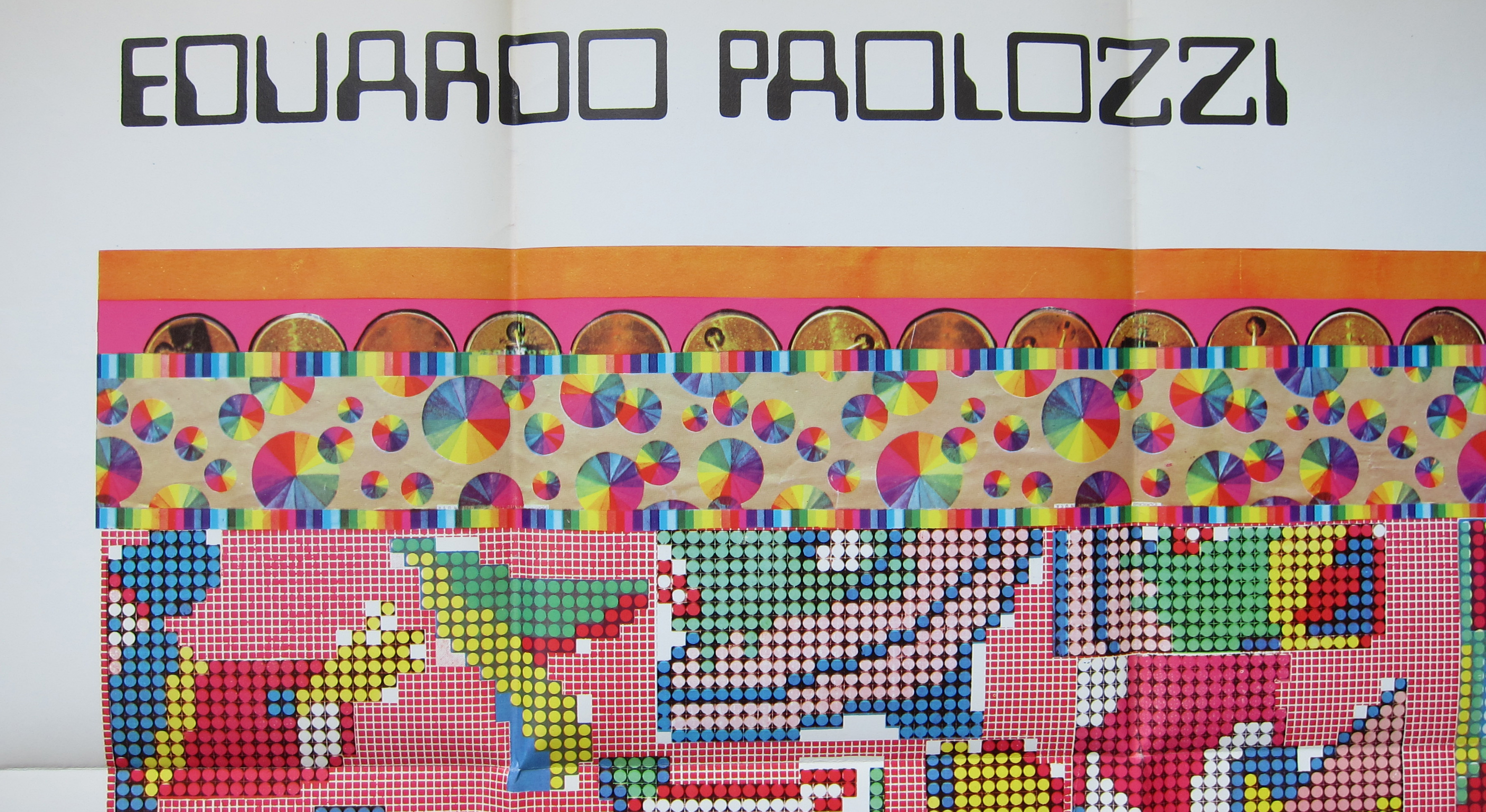
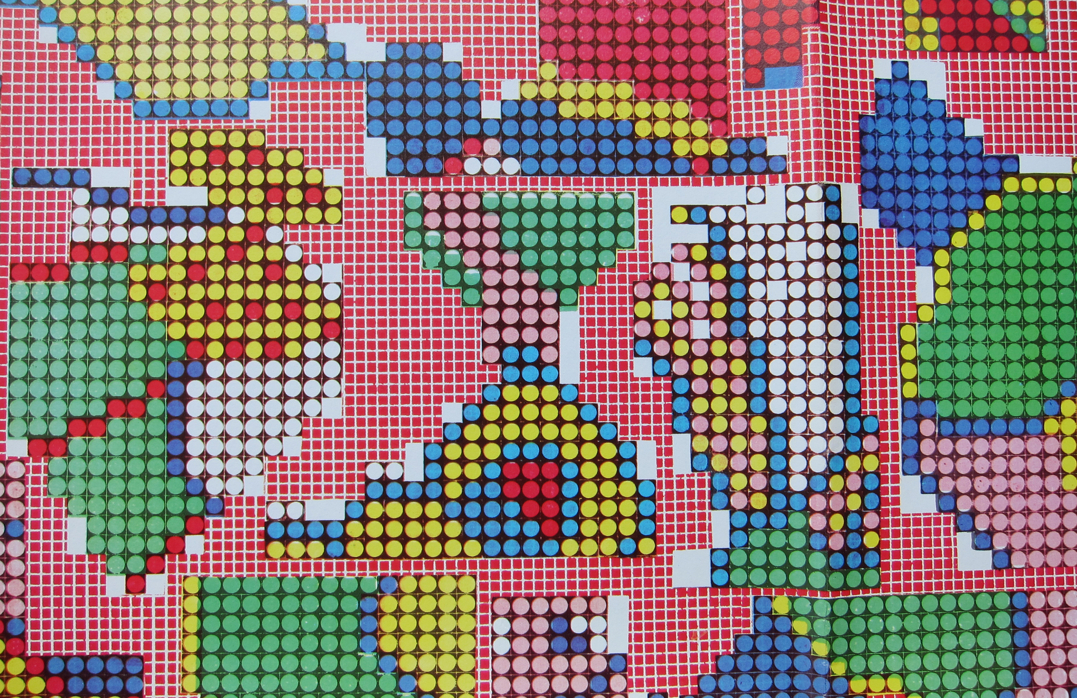
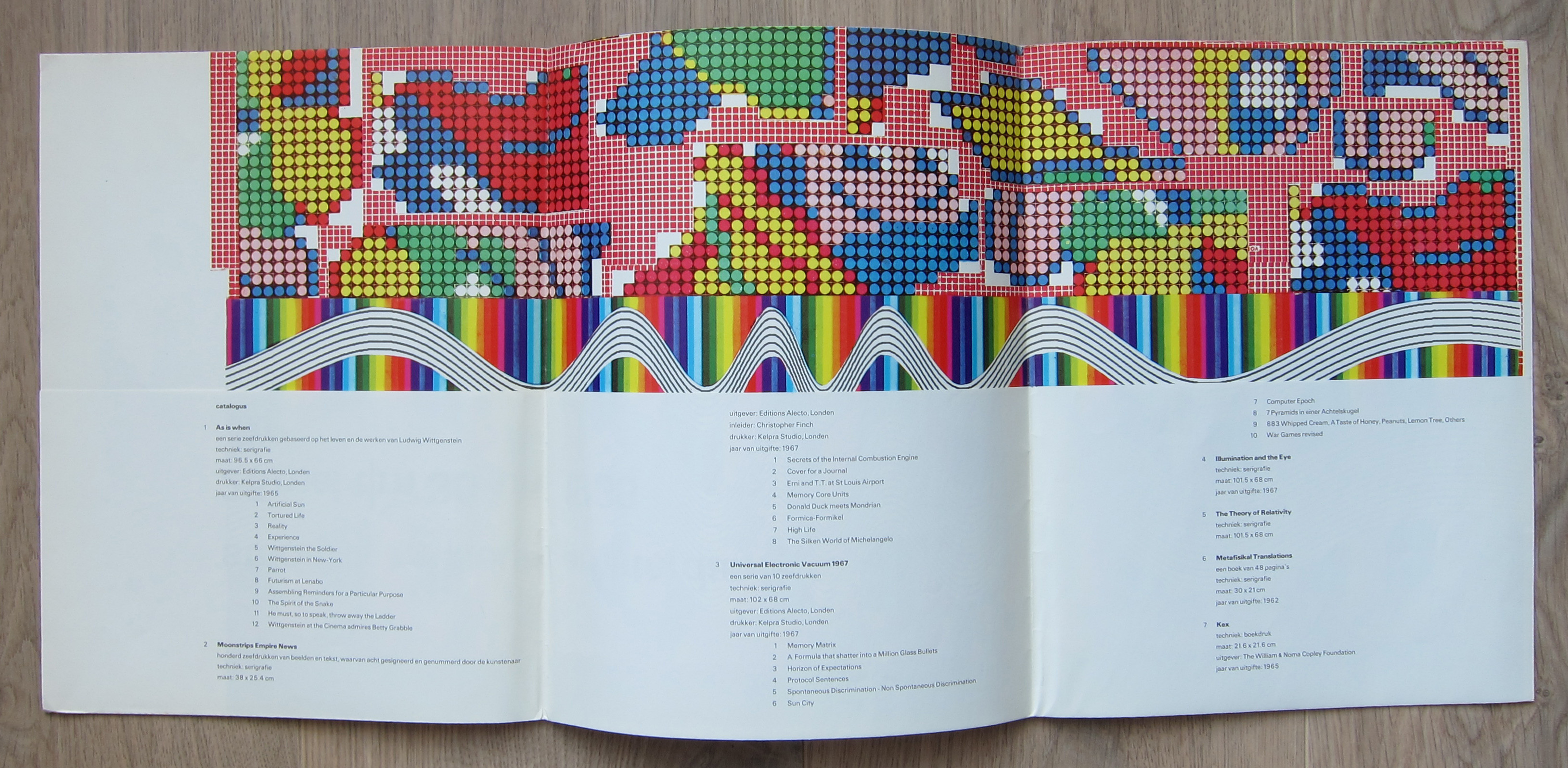
There are multiple reasons to like the publication no 442. of the Stedelijk Museum Amsterdam. Published in 1968 on the occasion of the Eduardo Paolozzi exhibition this is a 100% original work of art . A serigraphie by Paolozzi in his typical Pop Art style. Folded as issued and when folded out an impressive large work of art. Design?….by Wim Crouwel who used the backside of the serigraphie for all the information on Paolozzi. A great Pop Art work of art and available at www.ftn-books.com
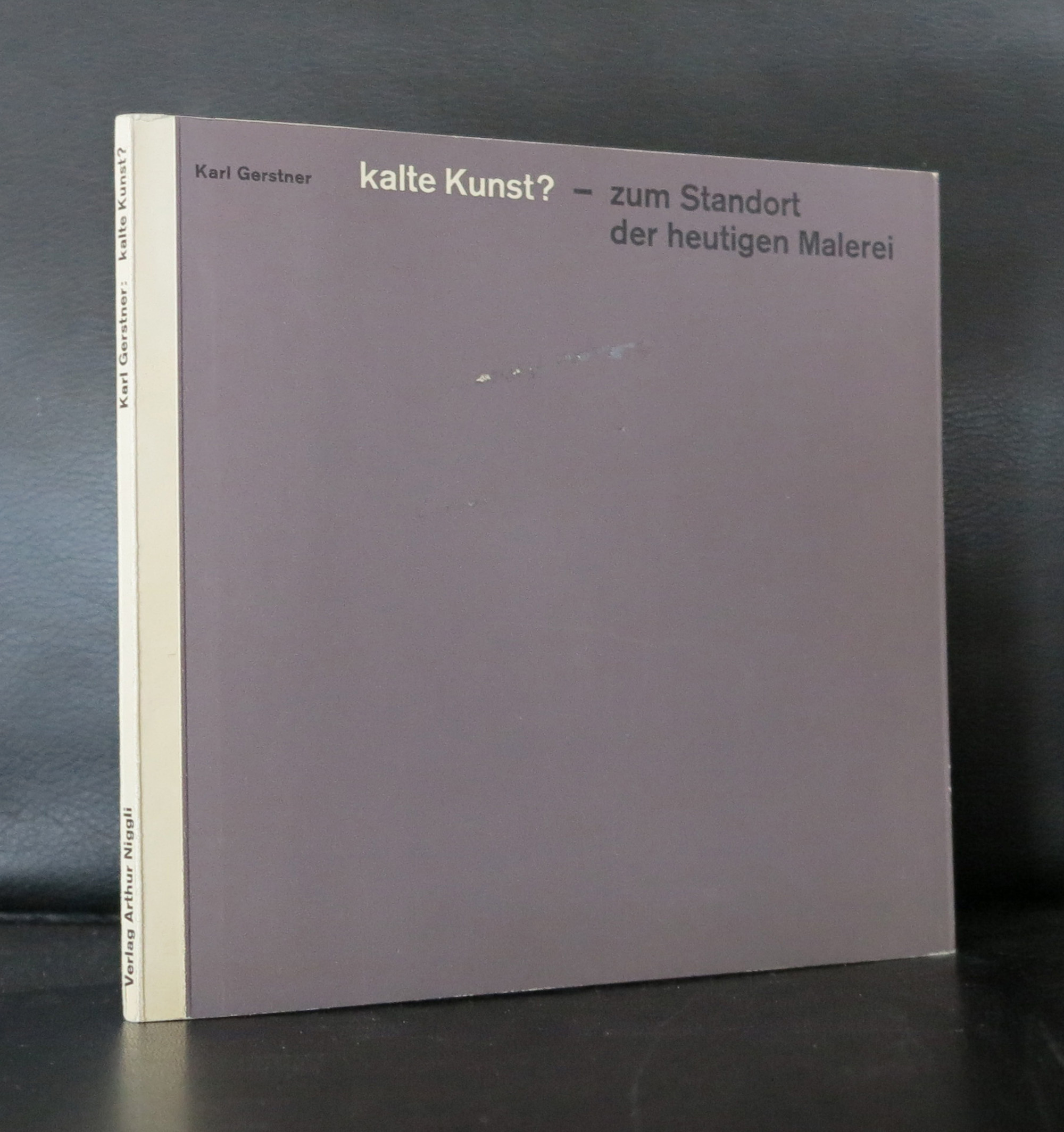
One of the greatest book designers recently died. Karl Gerstner died on the 1st day of this New Year.
If there was one iconic Swiss book from the late Fifties it is probably Kalte Kunst?
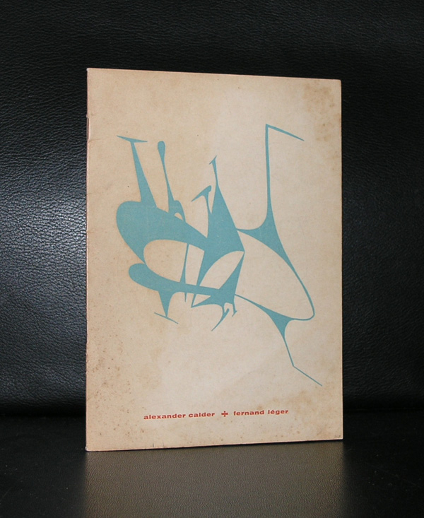
Designed by Karl Gerstner, this book has become an example to many. Look at the early Wim Crouwel designs….influence Gerstner. Benno Wissing…influence Gerstner.
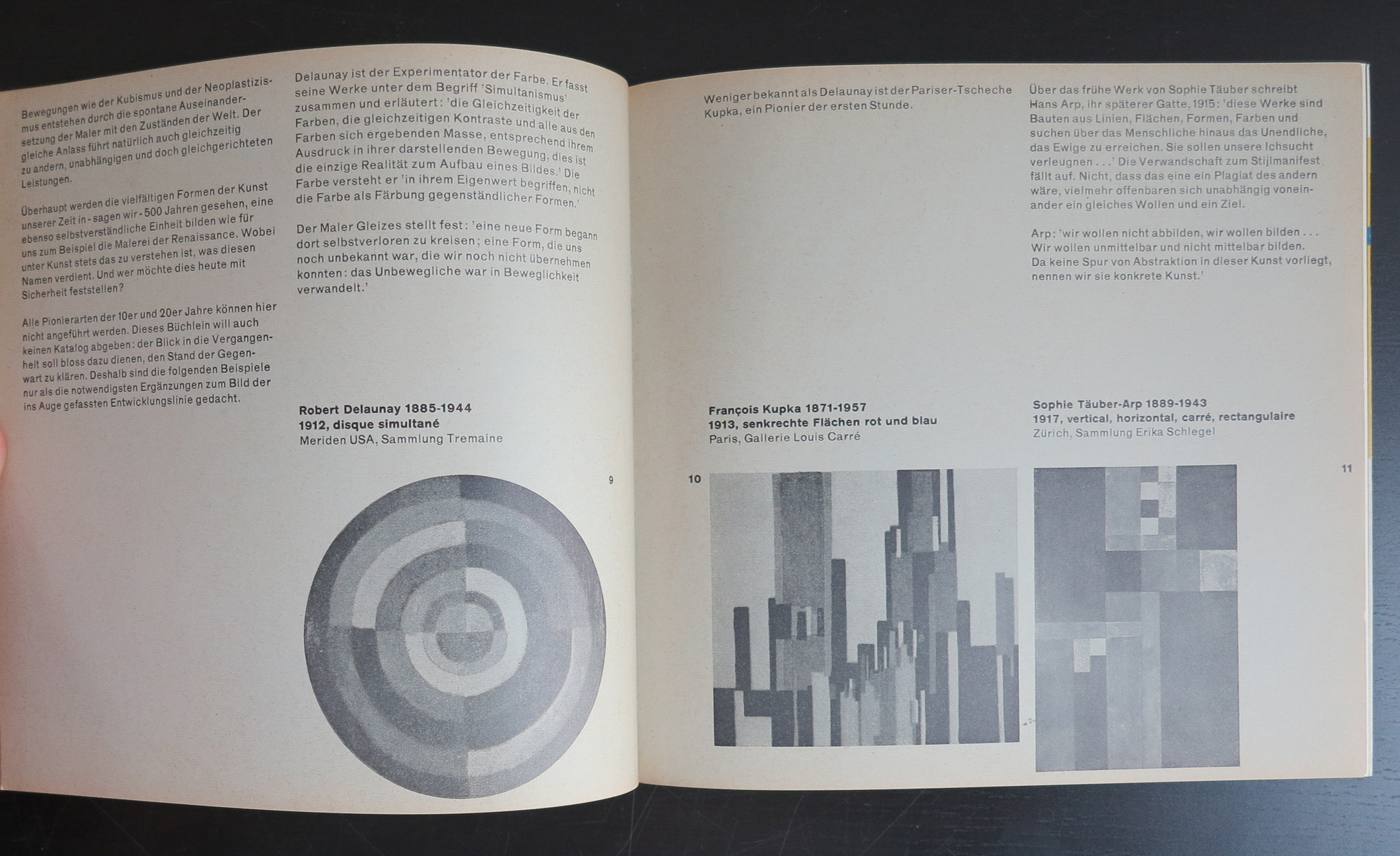
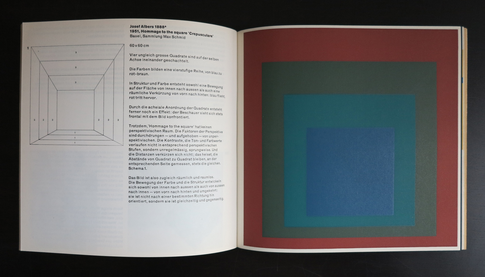
Karl Gerstner is a contemporary designer who’s work is strong and clean, but full of details. Typography and design melt together into a publication which is modern and classic. One of the first of these publications was Kalte Kunst? in which the most modern artist from the fifties were invited to make a contribution, which was placed within the publication. Special prints, silkscreens and litho’s were bound in Kalte Kunst?
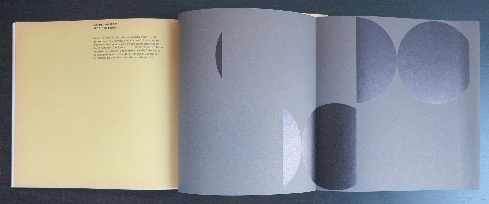
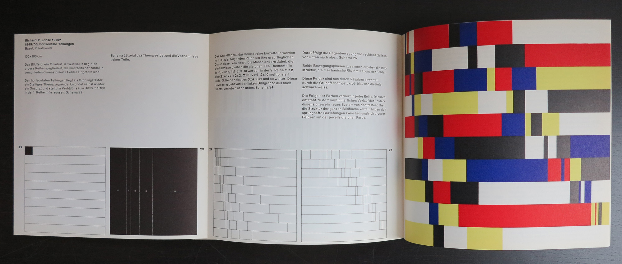
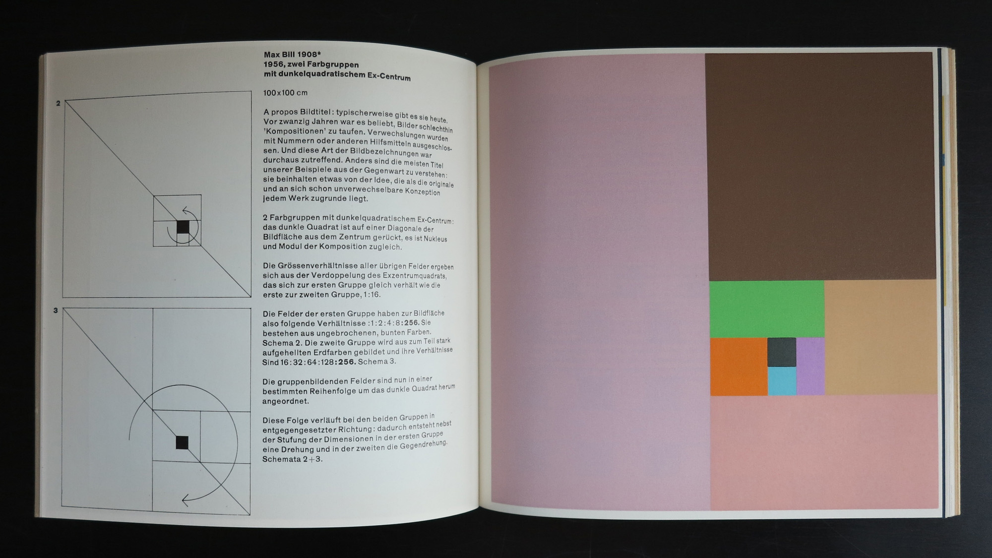
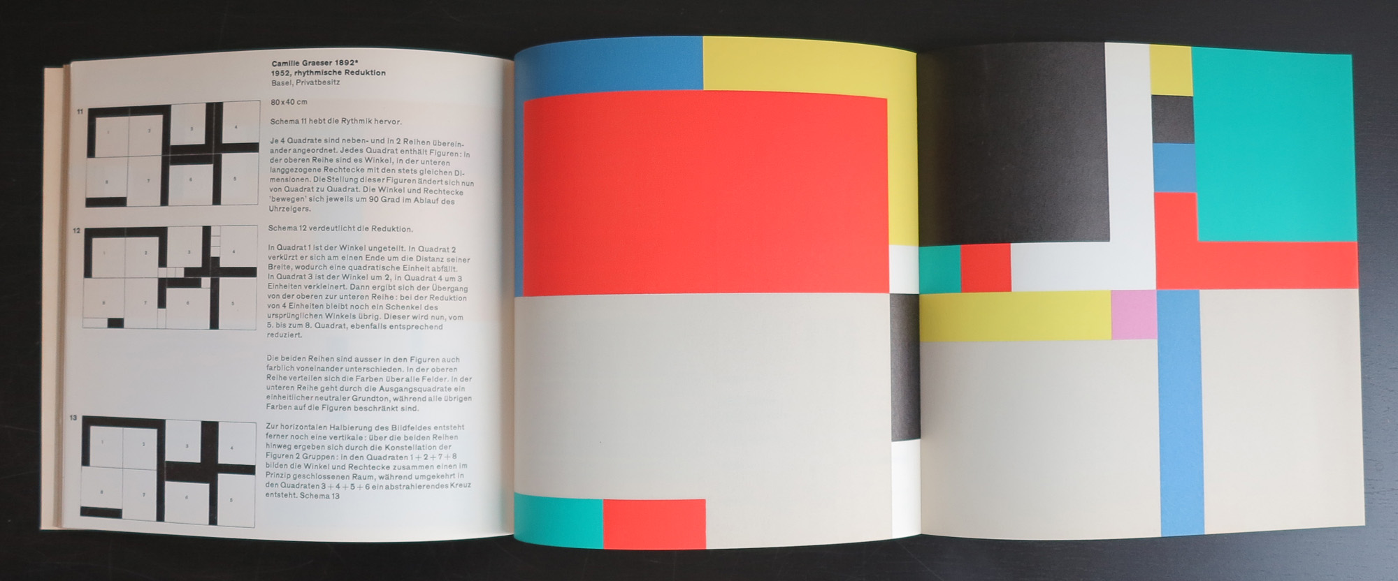
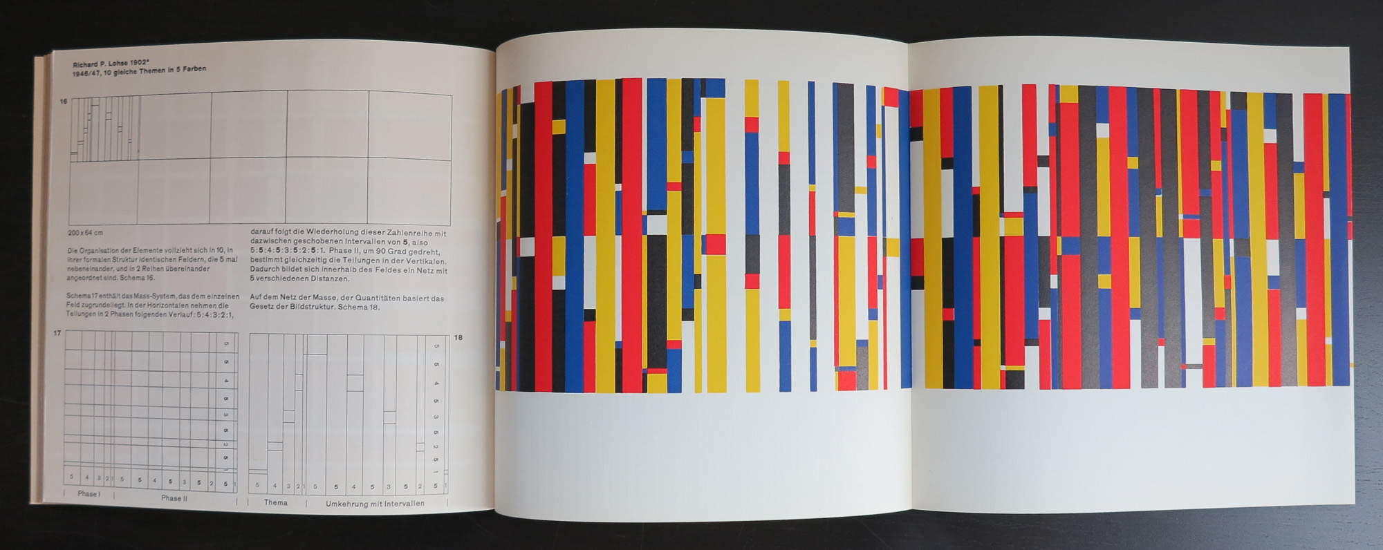
“Kalte Kunst?” (1957, 2 editions, both 1000 copies) was Gerstner’s first authored book where he advocates for a specific form of rational, geometric and mathematical art with examples from Josef Albers, Max Bill, Camille Graeser, Richard P. Lohse, Gerard Ifert, Mary Vieira and Marcel Wyss.
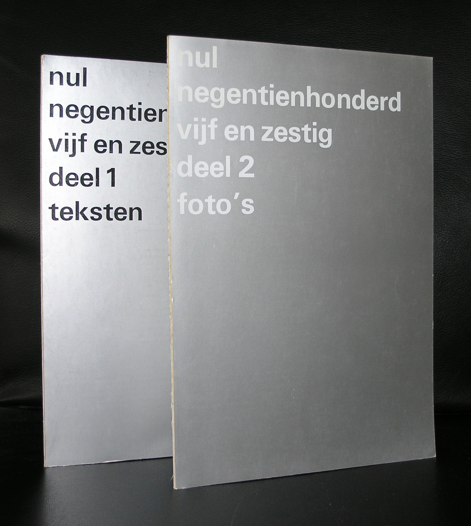
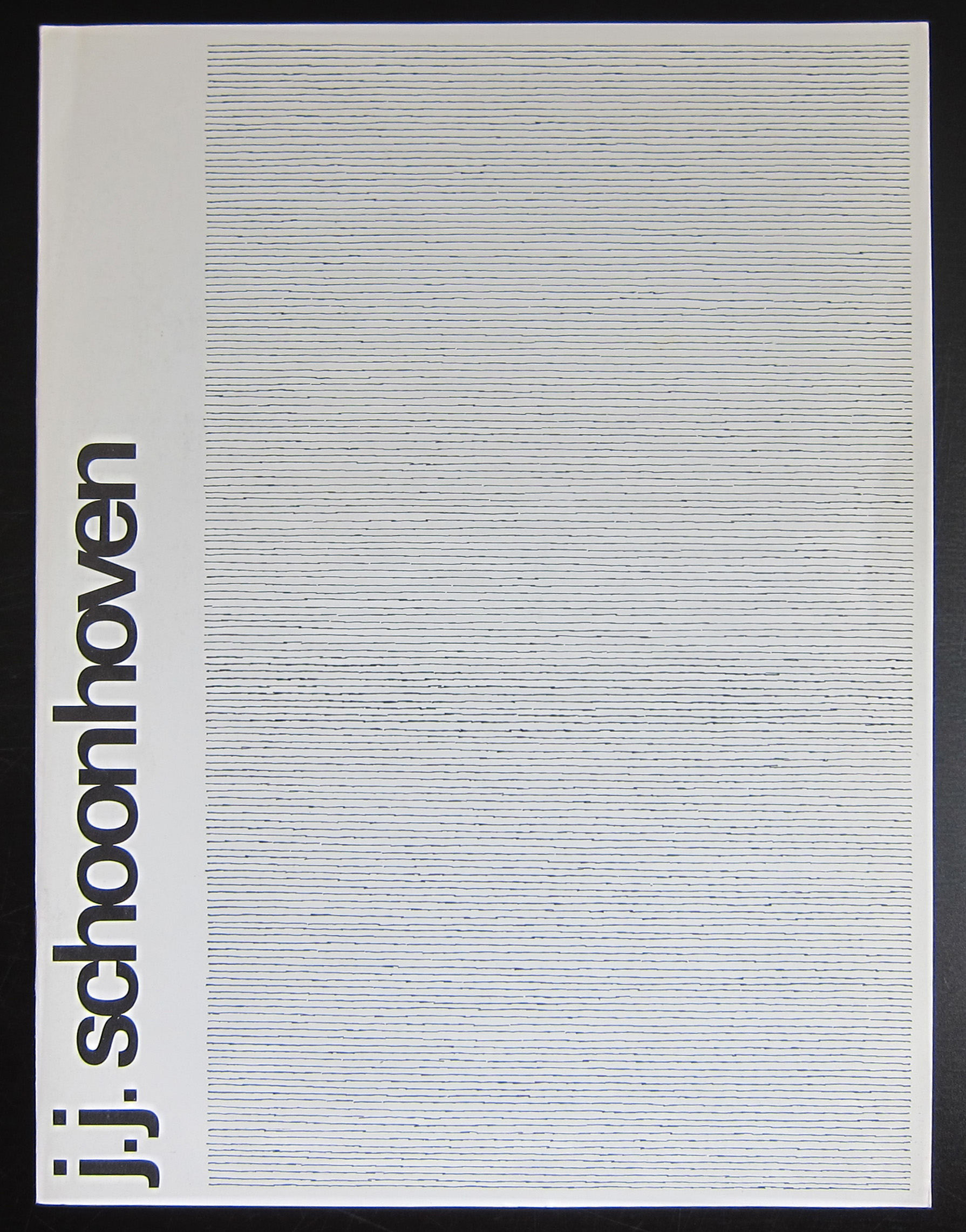
Mid sixties ZERO became an important part within the exhibition and collection program of the Stedelijk Museum. a.0. Jan Schoonhoven being one of the artists being presented. Zero had become “main stream” and accepted and therefore it was time for a large overview of what was and had become ZERO/ NUL. Wim Crouwel was asked for the design of the 2 catalogues. One with text and one with images. Both are exceptional designs executed in a glossy silver , perfect measurements and simple but beautiful typography.
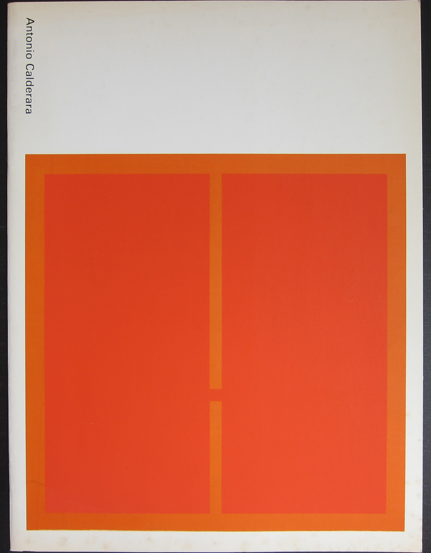
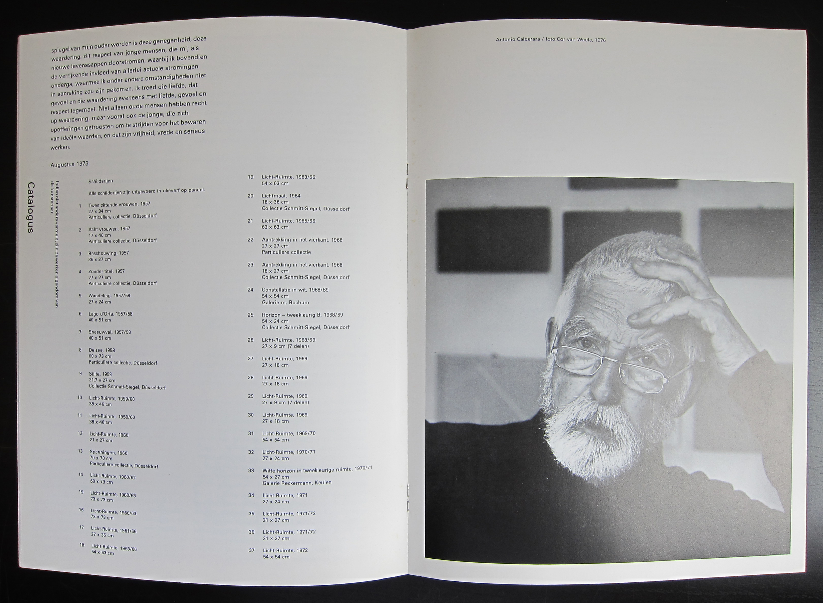
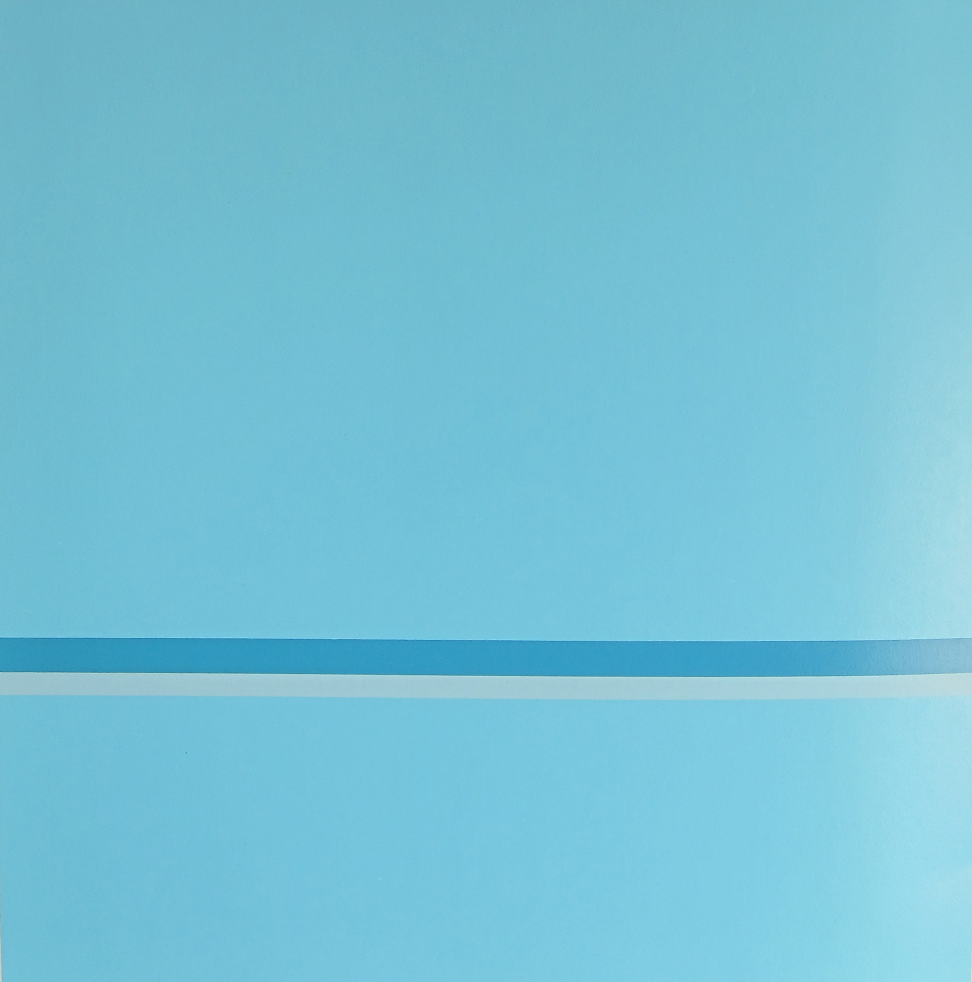
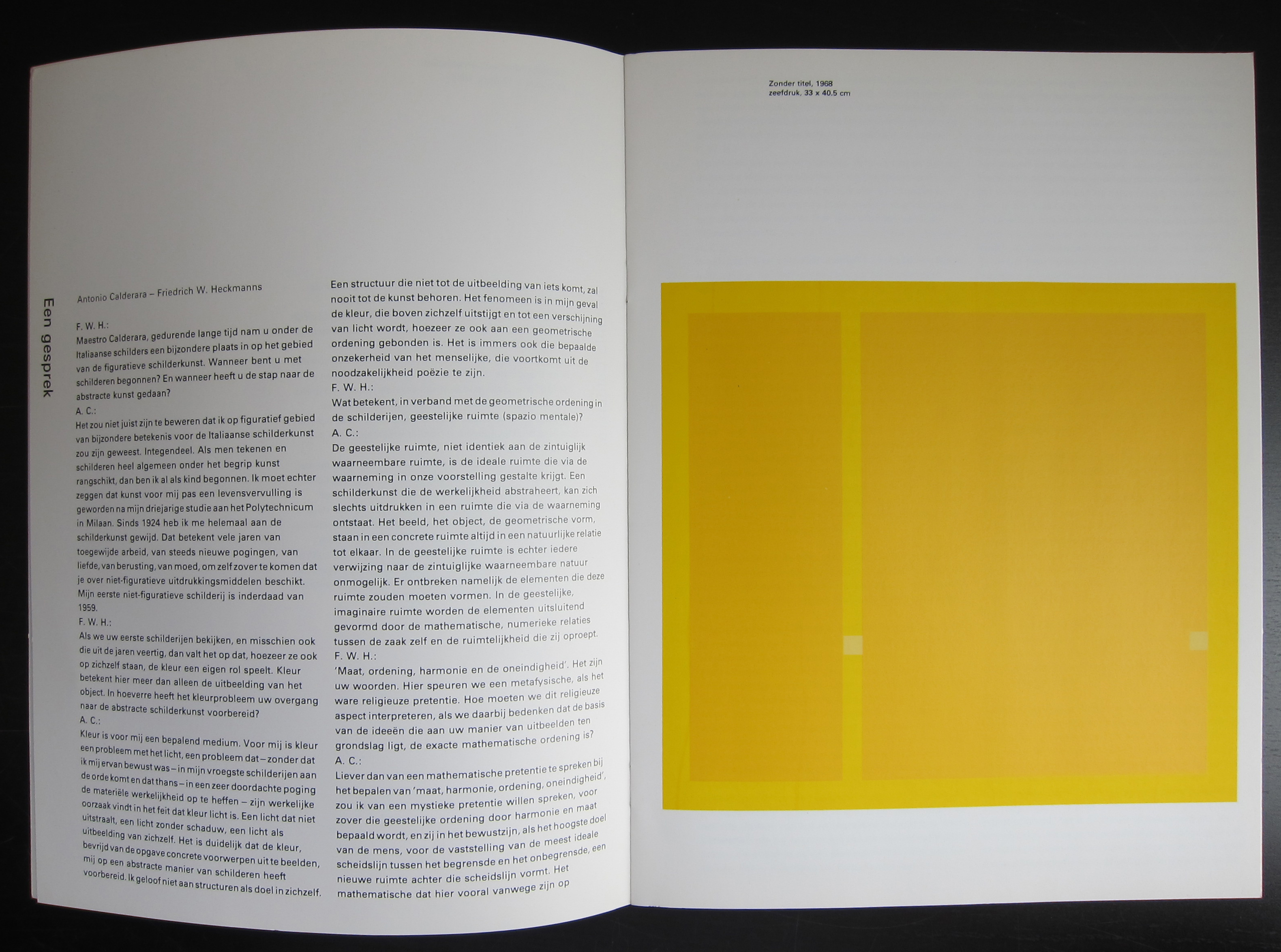
Because of a sale today, i was reminded of the very nice Antonio Calderara catalogue published by the Stedelijk Museum Amsterdam in 1977. The catalogue was designed by Wim Crouwel and what this one makes really special are the 3 original silkscreen prints within this publication. Thin, only 16 pages but with 3 striking silkscreens i consider this as one of the very best seventies Stedelijk Museum publications. Published with Sm catalogue number 616 the catalogue stands out from the others published in the same period. One of the silkscreens is used as cover ( orange /red) and 2 are within ( yellow and sky blue). The very little text and the beautiful impressive photograph of Calderara complete this exquisite publication. This one and others on Antonio Calderara are available at www.ftn-books.com
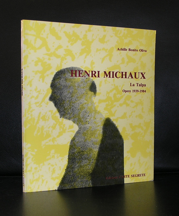
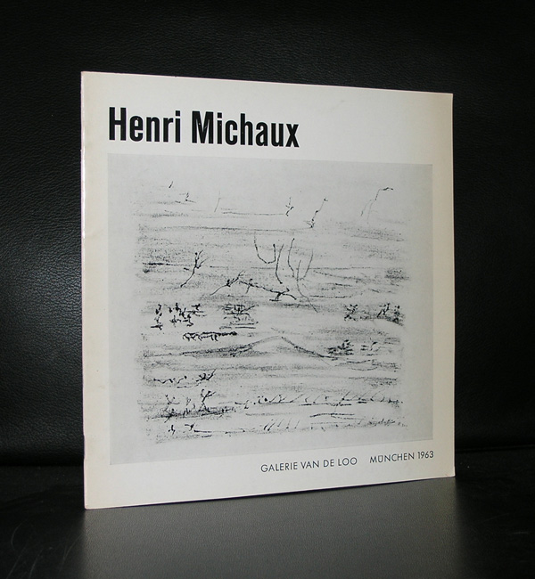
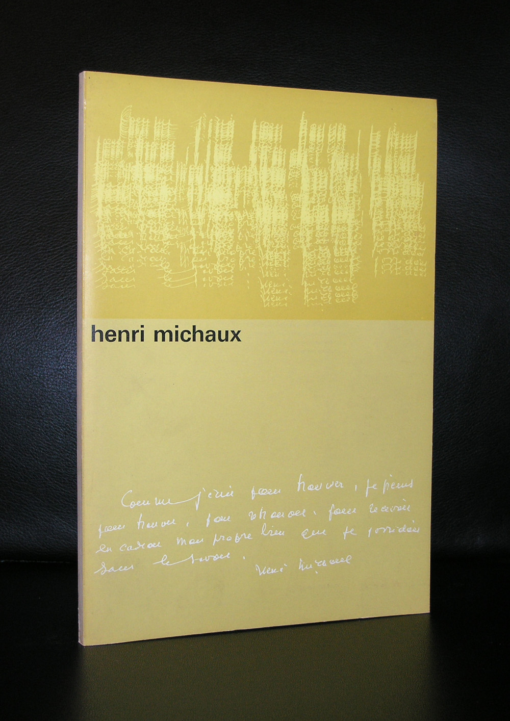
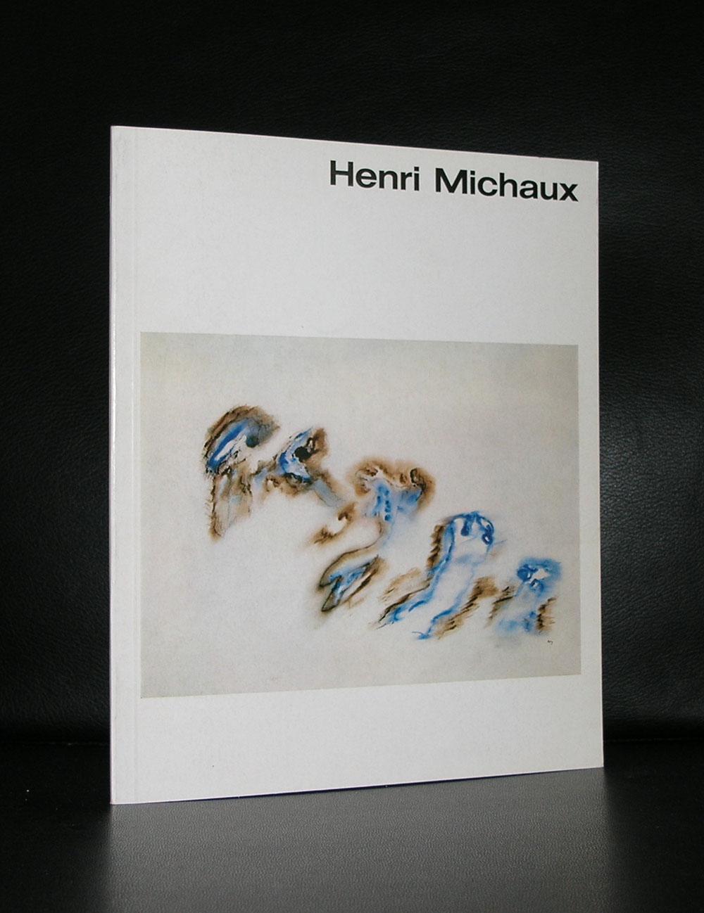
Henri Michaux had two talents. For me, above all , he was a painter, but others would say he was a poet/writer. Michaux was good with language and because of that it was easy for him to derive from his letters, signs and bend them into a completely different language of art and make an abstract composition with them.
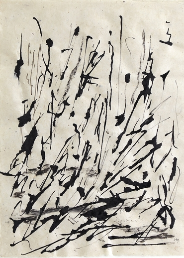
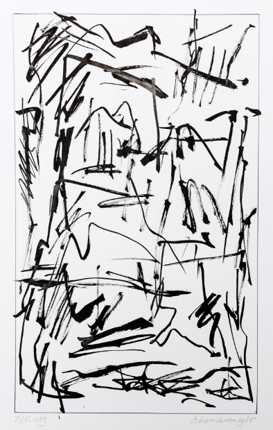
If i had not known a little more about Michaux and of his background as a writer i easily would have categorized him among the ZERO artists. (on the left there is a drawing by Michaux and on the right there is a drawing by Jan Schoonhoven.)
But his “signs” are not made randomly. Some of his most intriguing ones are done under the influence of LSD and Mescaline with which he experimented. Two separate methods in creating great art by 2 artists, resulting in almost the same composition, some 10 years apart from each other ( 1963 and 1974), but both highly intriguing.
The end of this year is near and almost 300 blogs have been published since I started blogging on WordPress. www.ftn-blog.com grew in an excellent way and i am looking forward to keep you informed on my inventory and exploits in art.
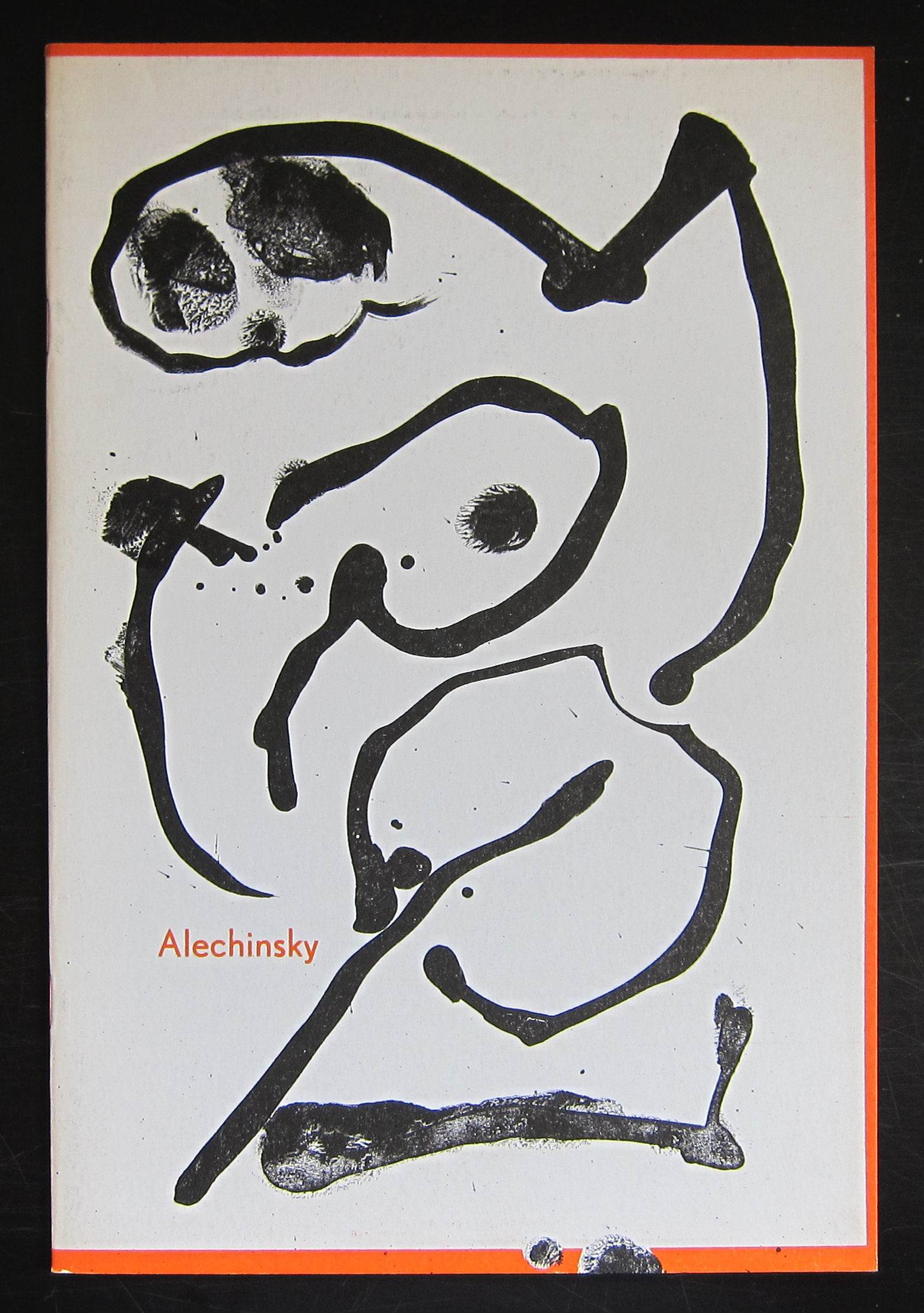
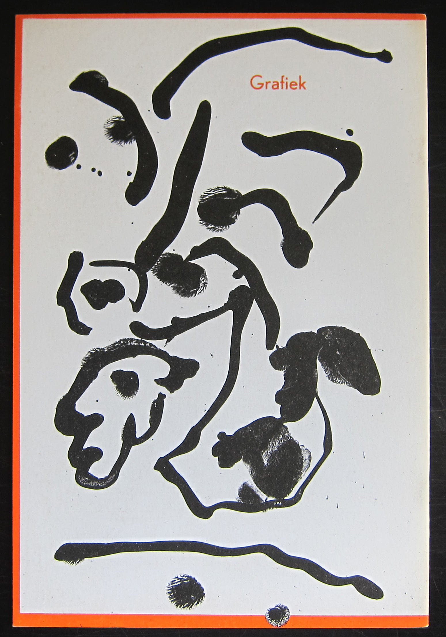
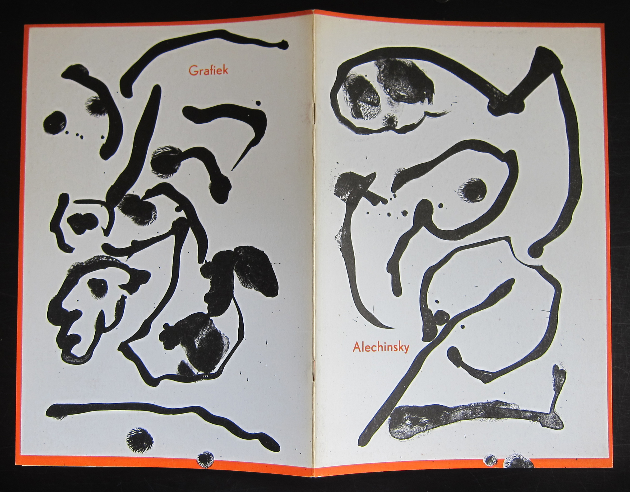
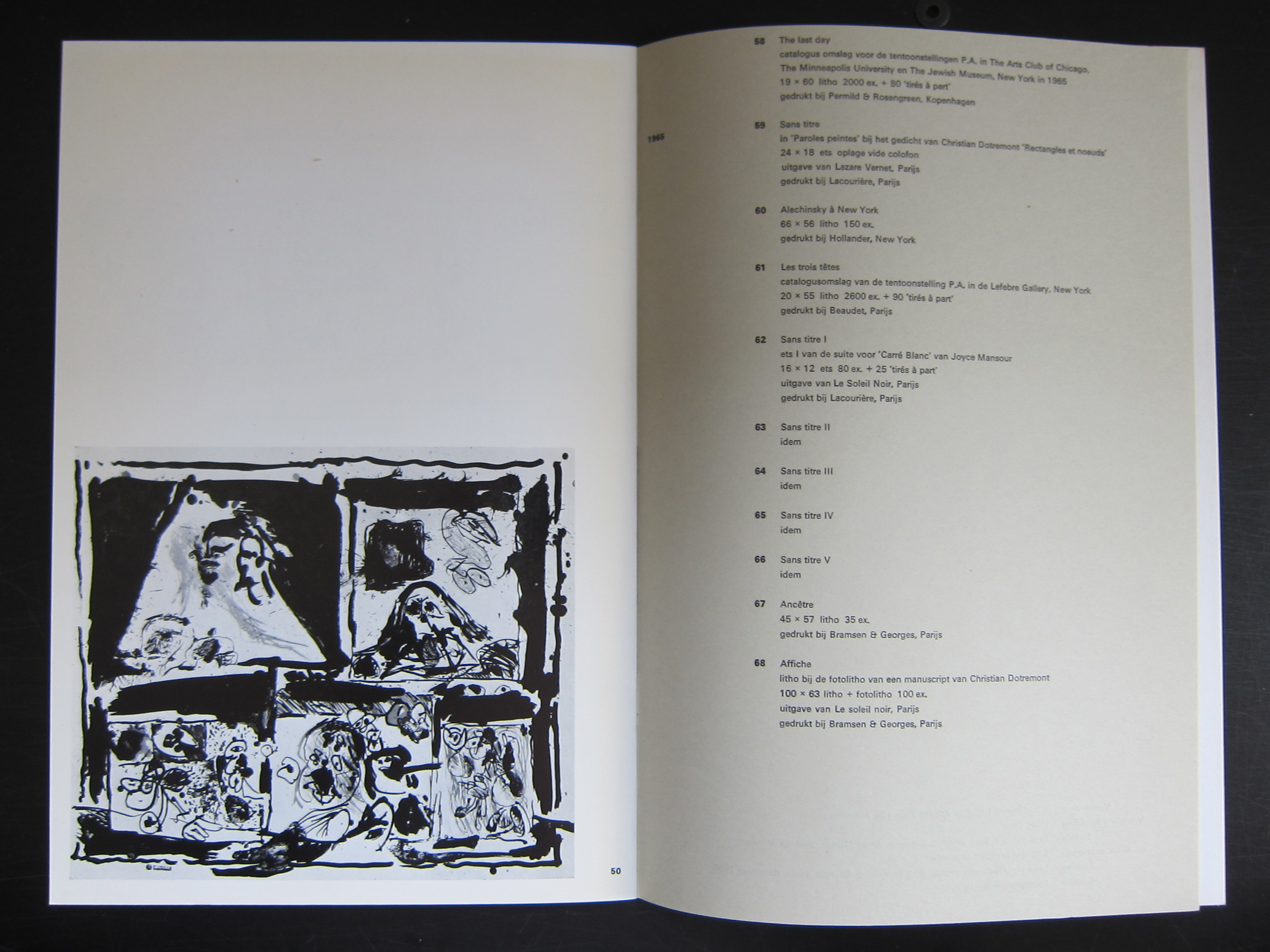
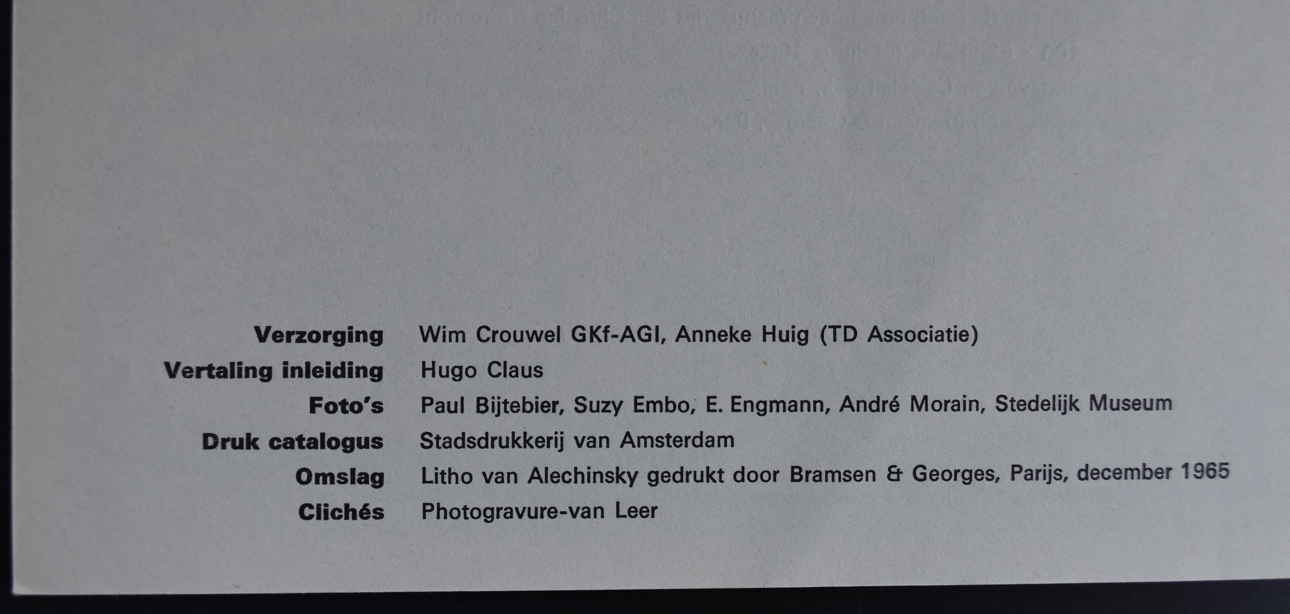
And what better way to end this year with a PERFECT publication by Pierre Alechinsky. In the sixties Alechinsky used original lithographs as cover for his exhibition publications and one of these is the no. 391 he made for the Stedelijk Museum in 1966 for his graphic exhibition. Photographs by Suzy Embo ( see earlier blog this month) and designed by Wim Crouwel. (available at www.ftn-books.com)
Arguably this is one of the top 5 publications the Stedelijk Museum made in the sixties, but for me this is perfection. Simple clean Crouwel design. the photographs are all excellent and the lithograph printed by Bramsen & Georges makes this one really stand out.
A perfect catalogue to end this year and start the New Year.
My best wishes to all my readers and followers for the New Year 2017.
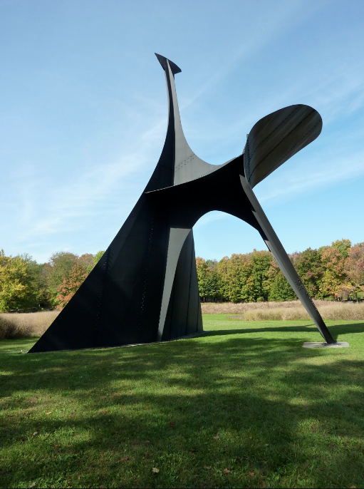
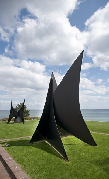
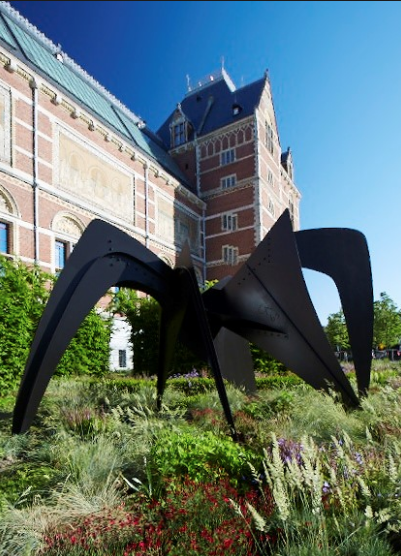
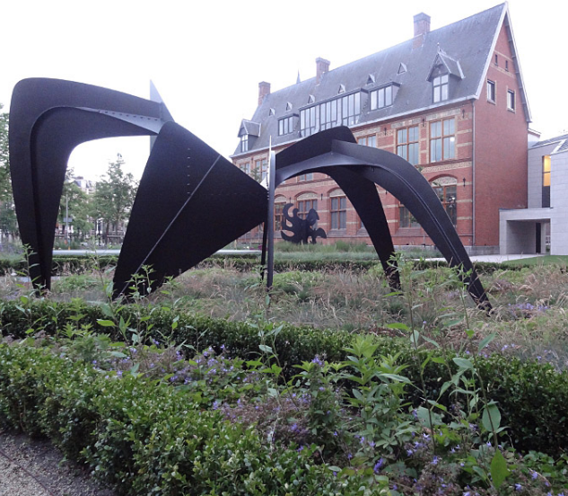
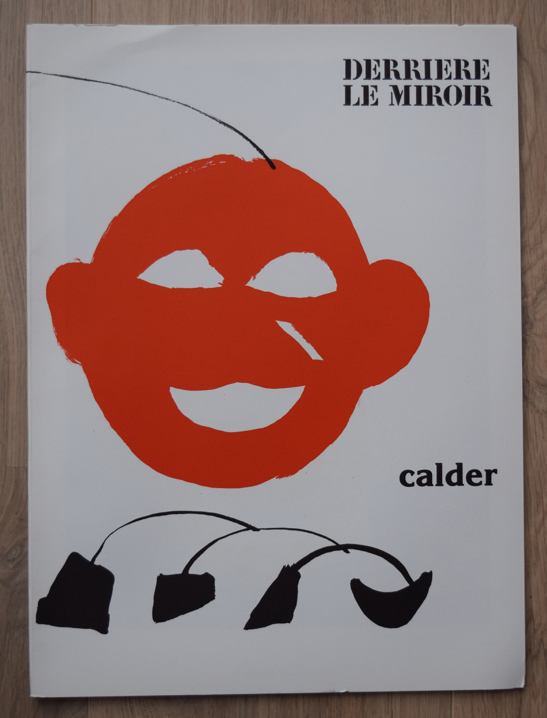
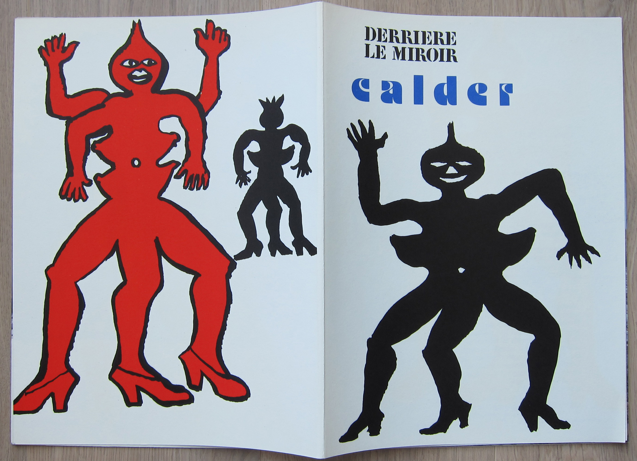
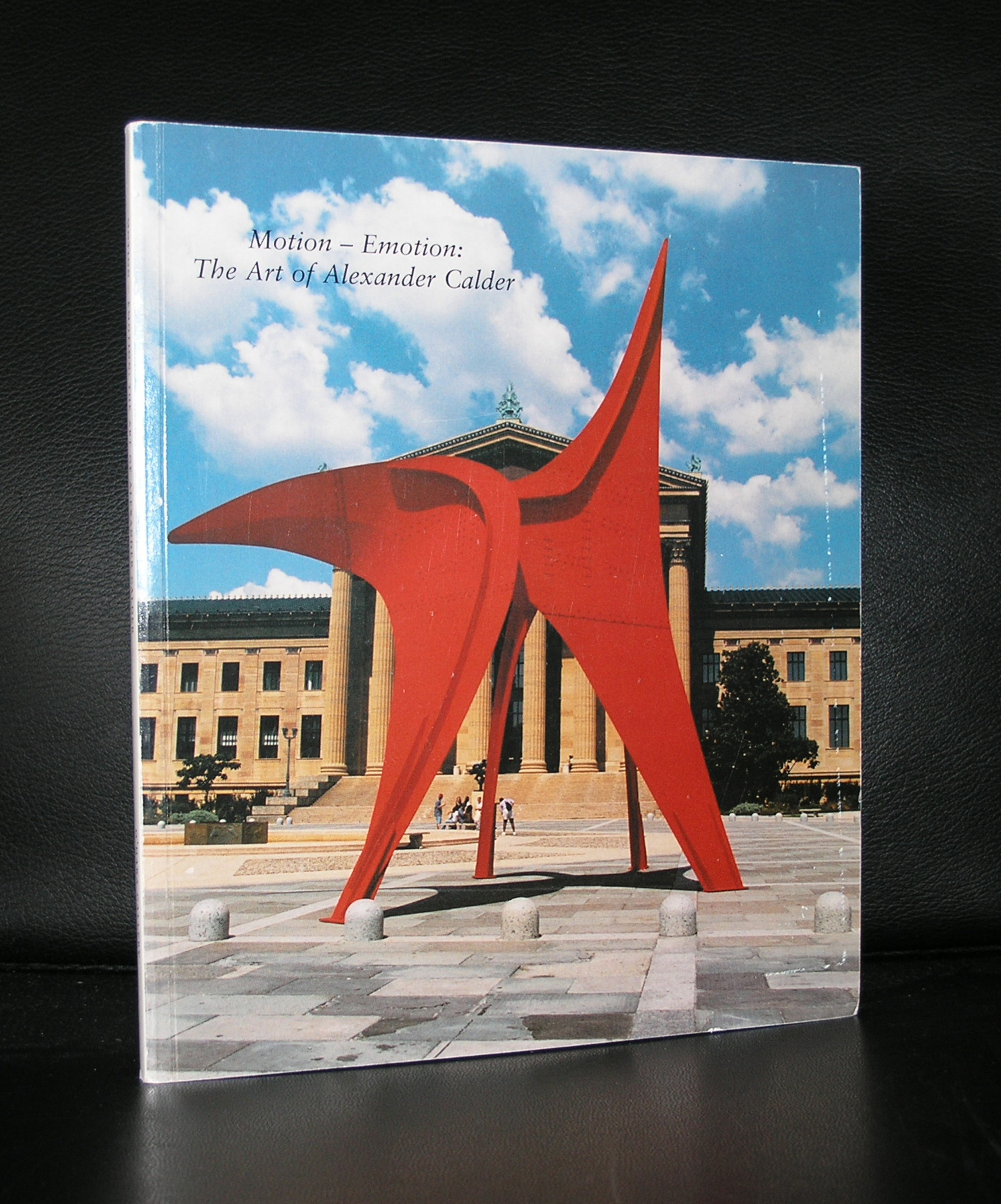
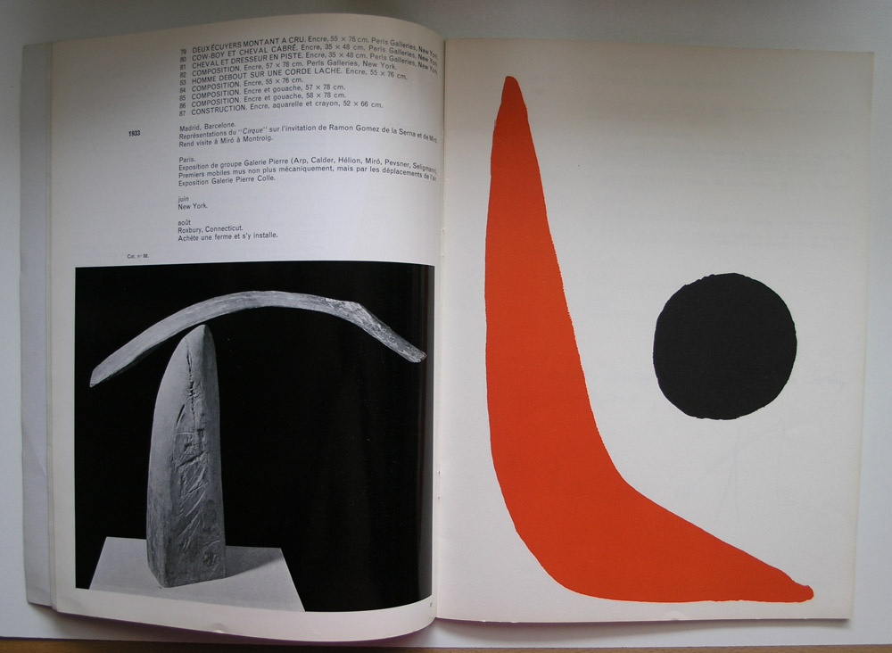
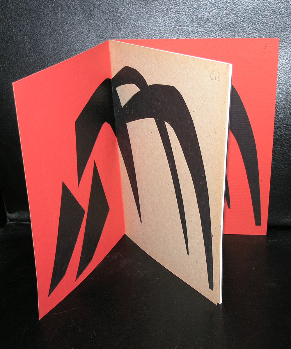
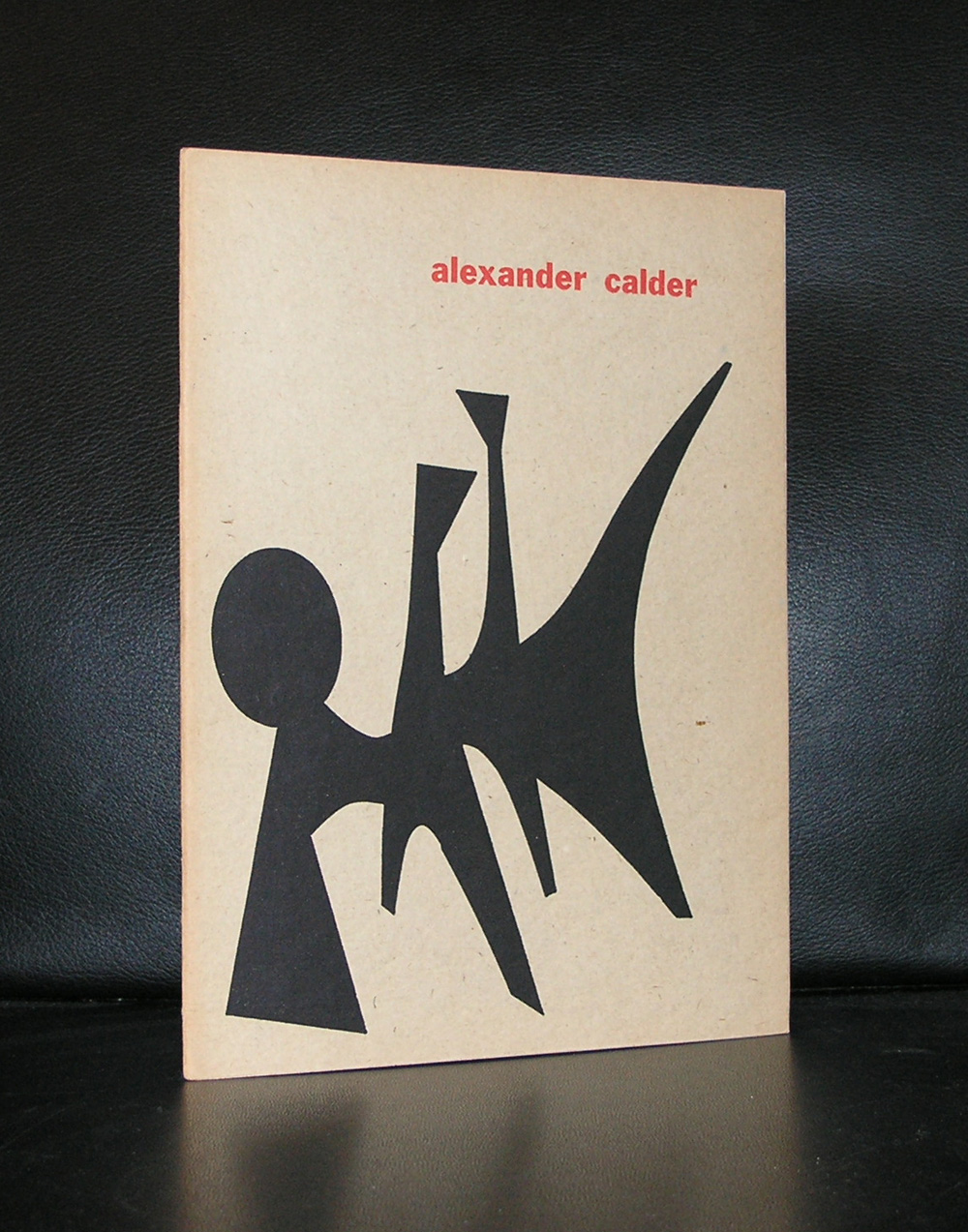
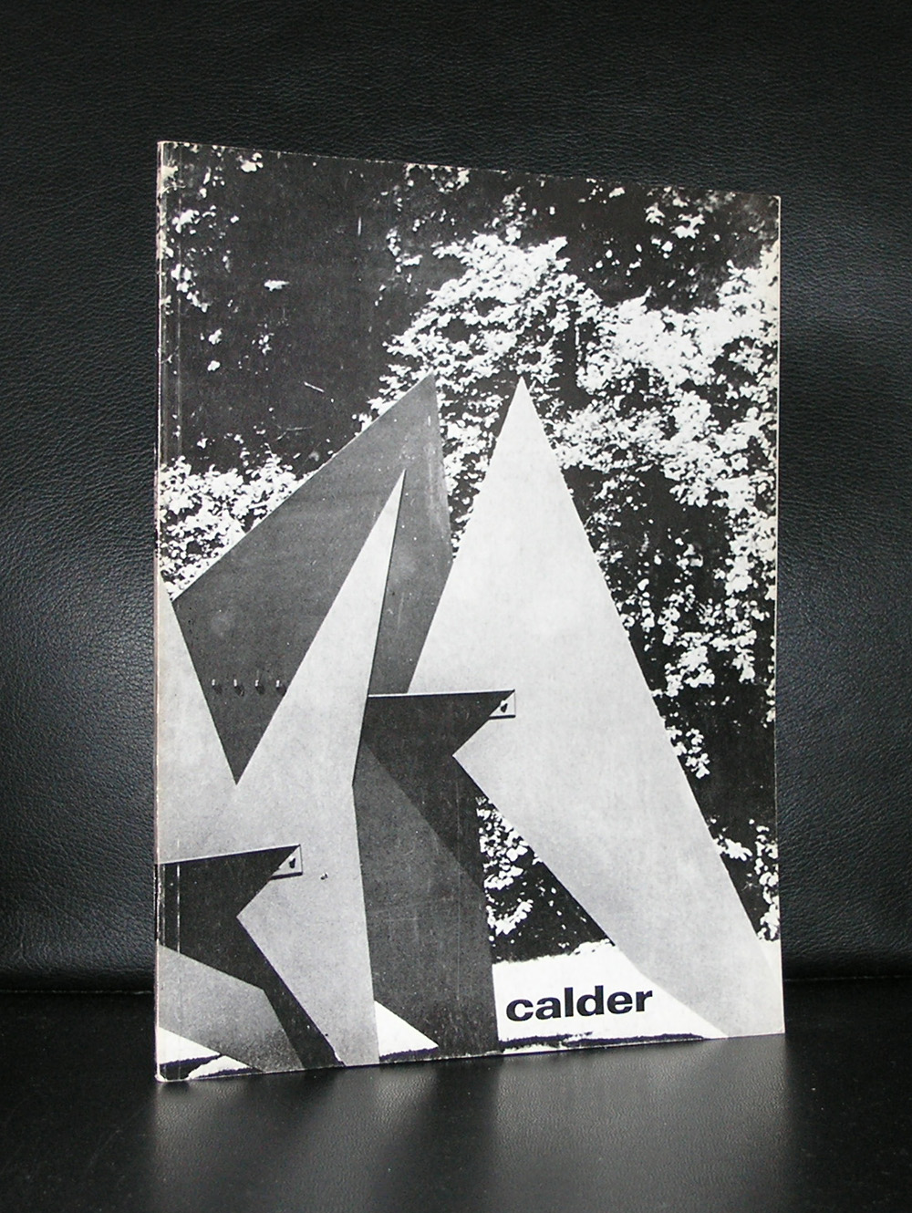
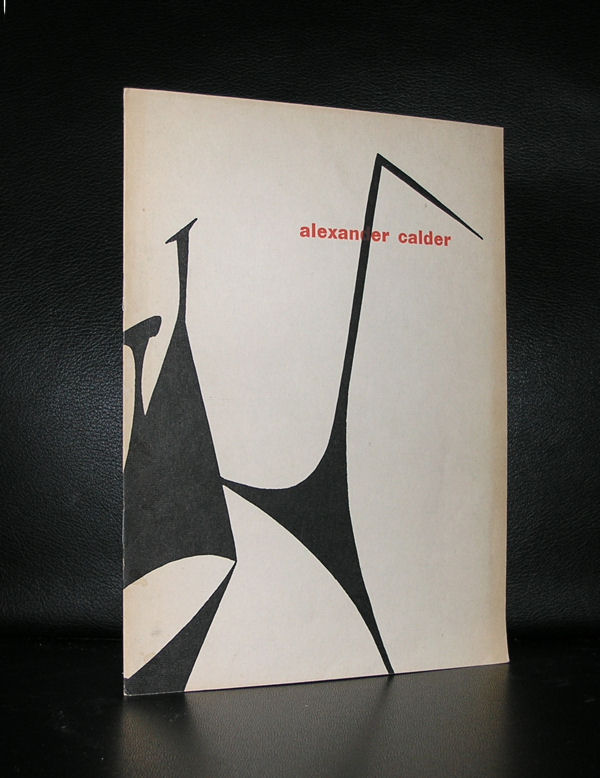
Born in the 19th century . Calder has become for me one of the pioneers in Modern Art. The public knows Calder by name for his mobiles, but for me Calder is the first artist who explored the extreme sizes in sculpture. Later, this was followed by Serra, but Calder must have been one of the very first to make sculptures bigger than a building. A few of these can be found in STORM KING, but these are not the only ones. These very large sculptures are scattered all over the world.
From Denmark to Brazil, the Calder statues are the highlights among other statues in sculpture parks all over the world. It is a pity there is only one large sized Calder in dutch collections. It is the “anteater” from the collection of the Rijksmuseum.
So do not miss them when you are abroad or there is a special exhibition on Calder because they are among the very best in Modern sculpture. I am fortunate to have some great classic Calder publications within the inventory of www.ftn-books.com
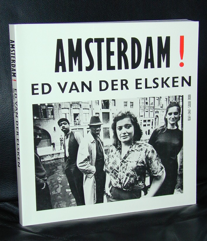
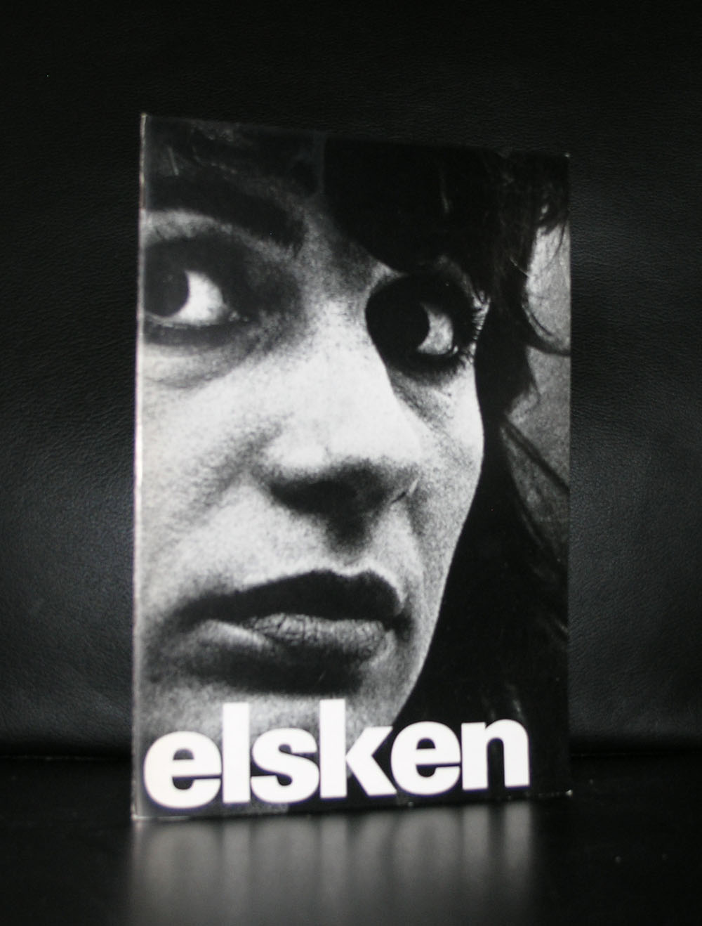
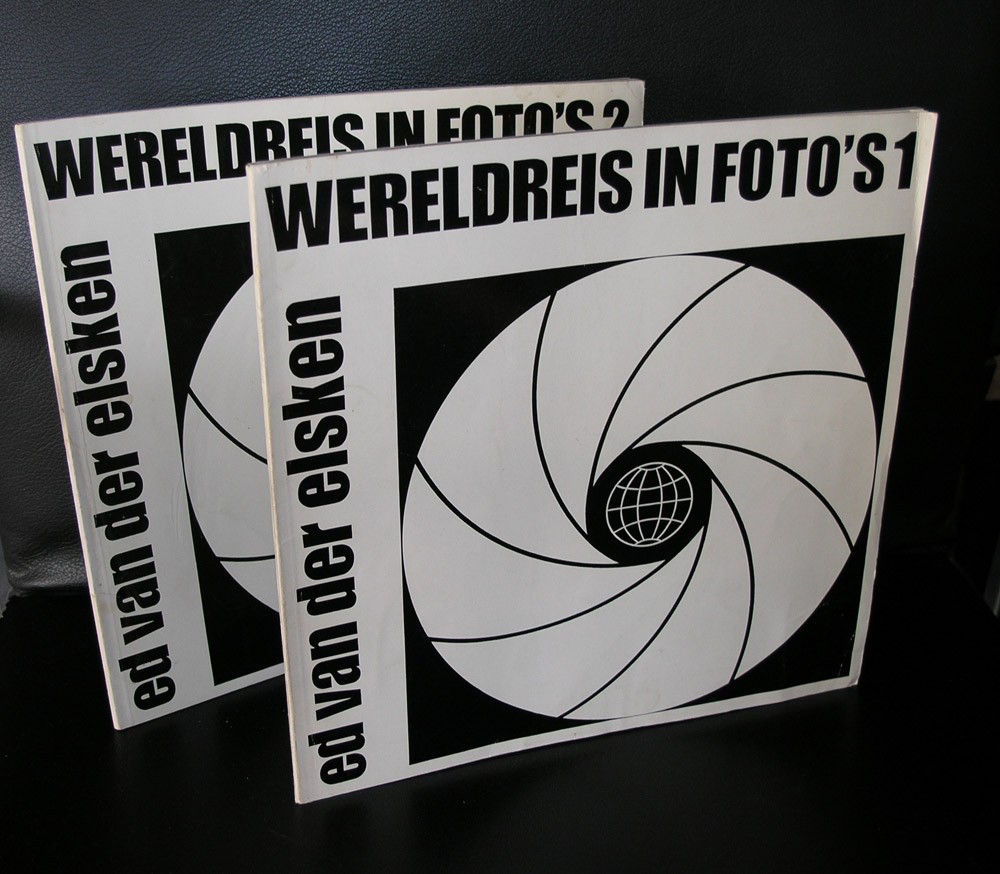
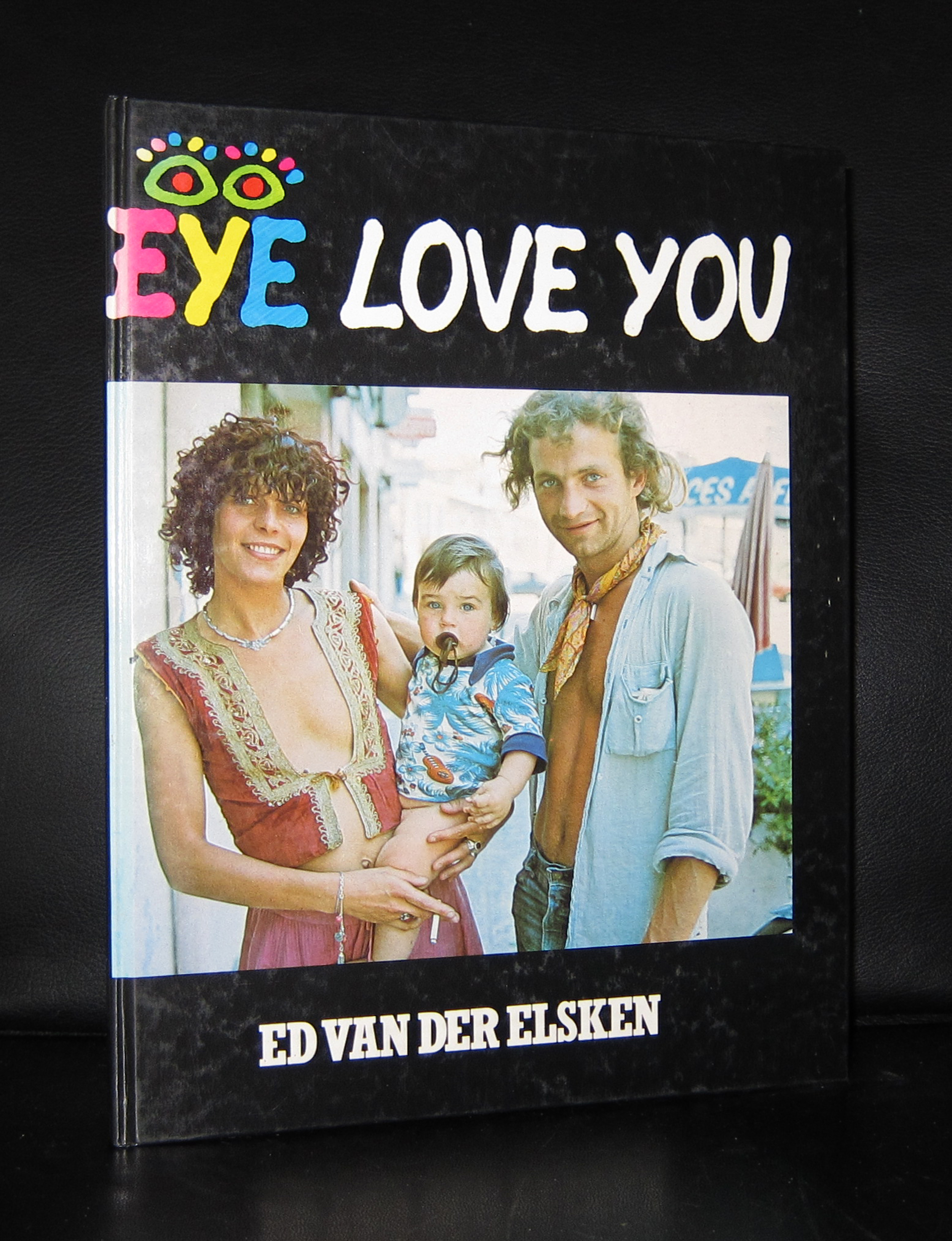
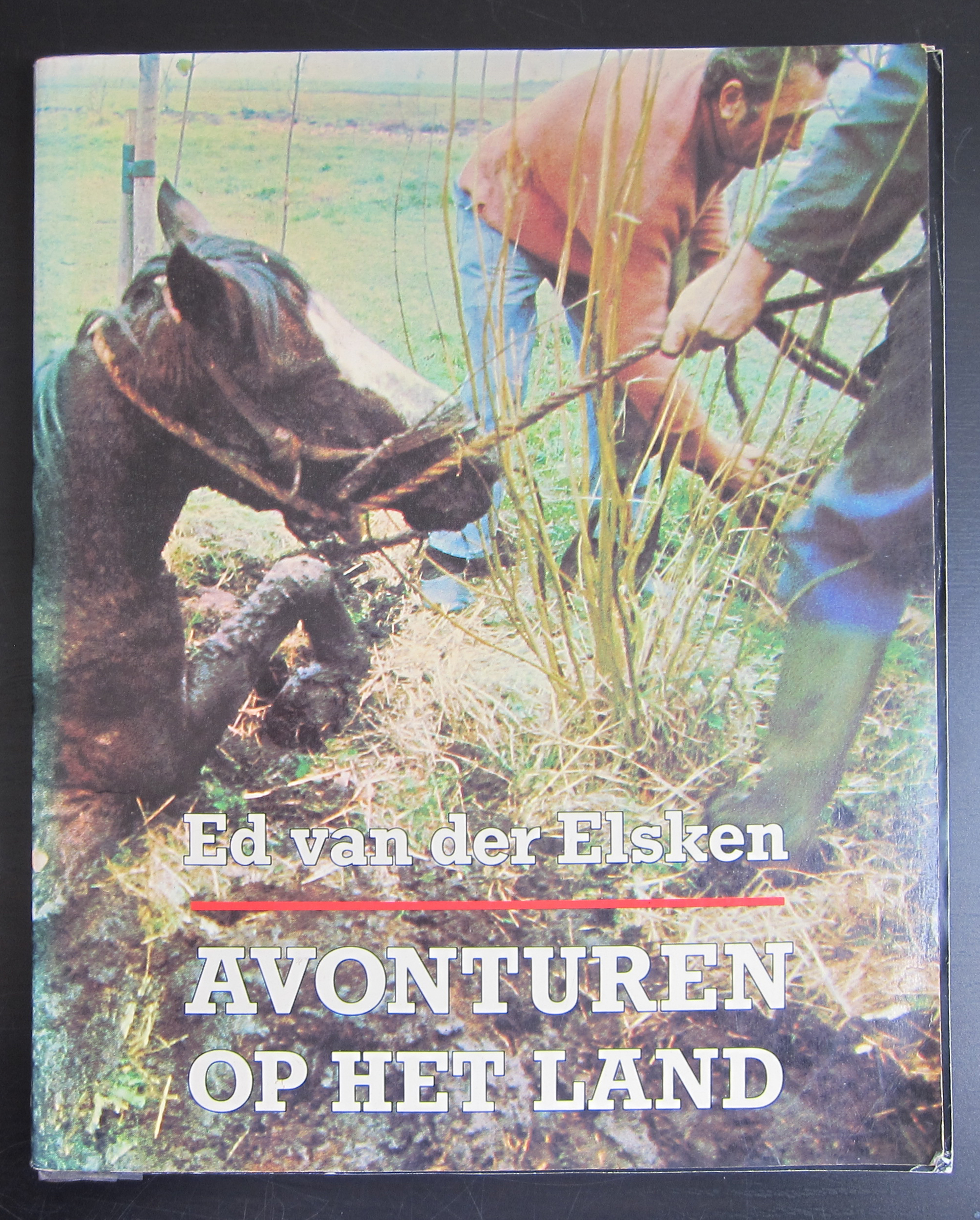
If there is one dutch sixties photographer who deserves world recognition for his entire oeuvre it certainly is Ed van der Elsken. Over 40 years of work in photography and cinema gives a spectacular list of publications:
But there is one which is not on this list published by the official site of Ed van der Elsken. It is the exceptional publication made for the van Abbemuseum in 1961, designed by Wim Crouwel with contributions by Karel Appel ( who made a special inlay) , Schierbeek and Lucebert….photography… YES!, by Ed van der Elsken.
Like some of the others from the above publications this is available at www.ftn-books.com
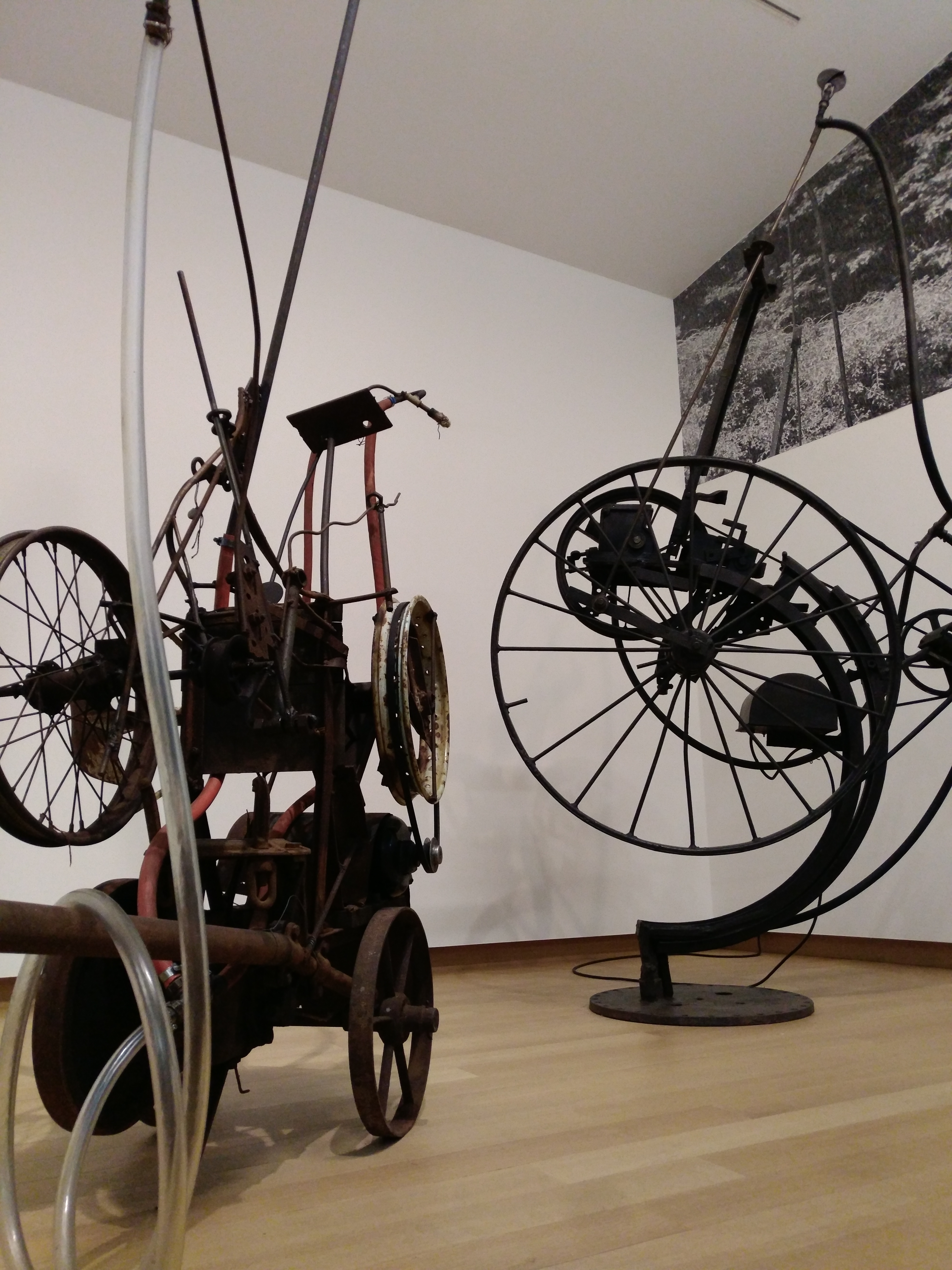
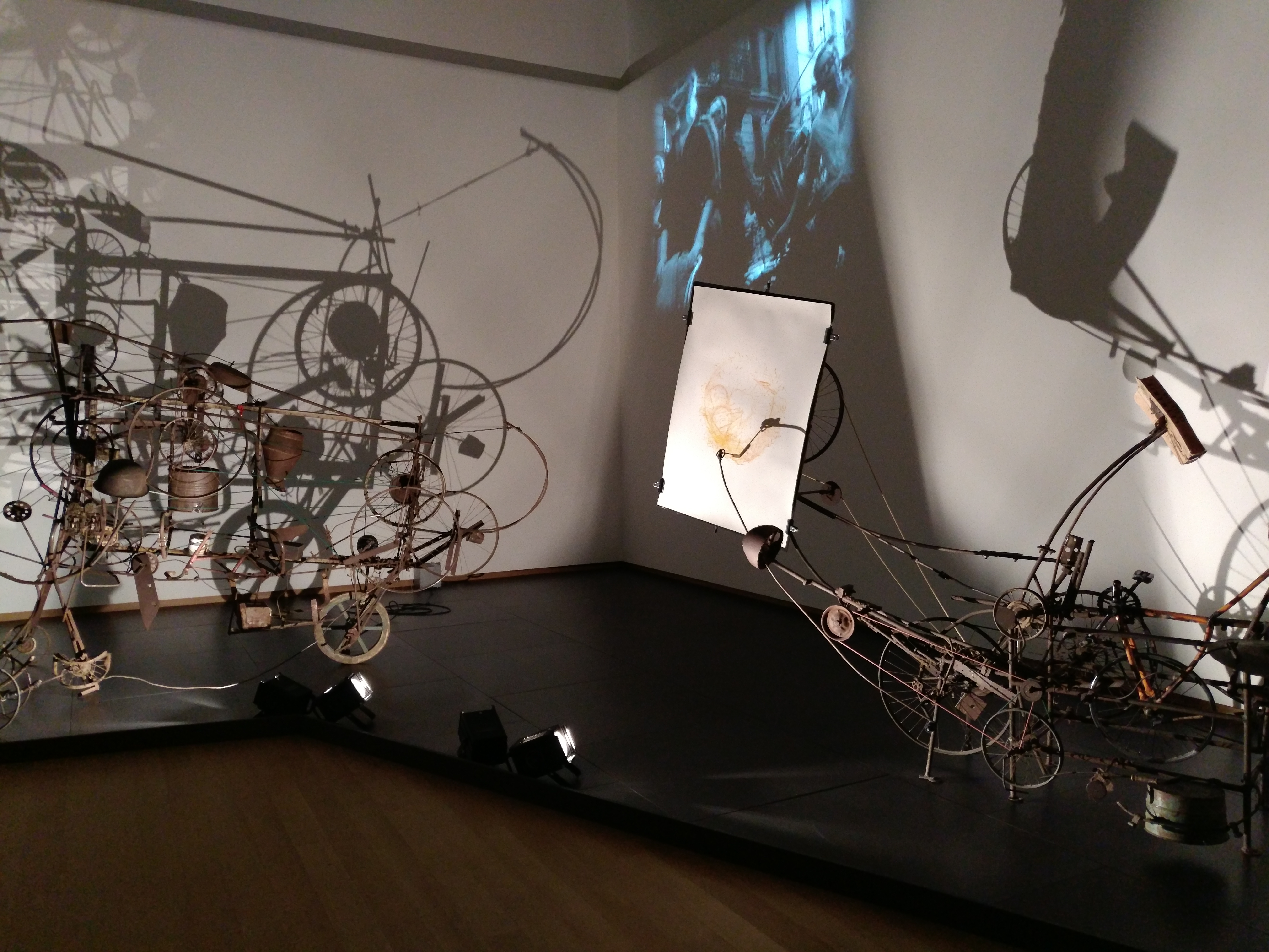
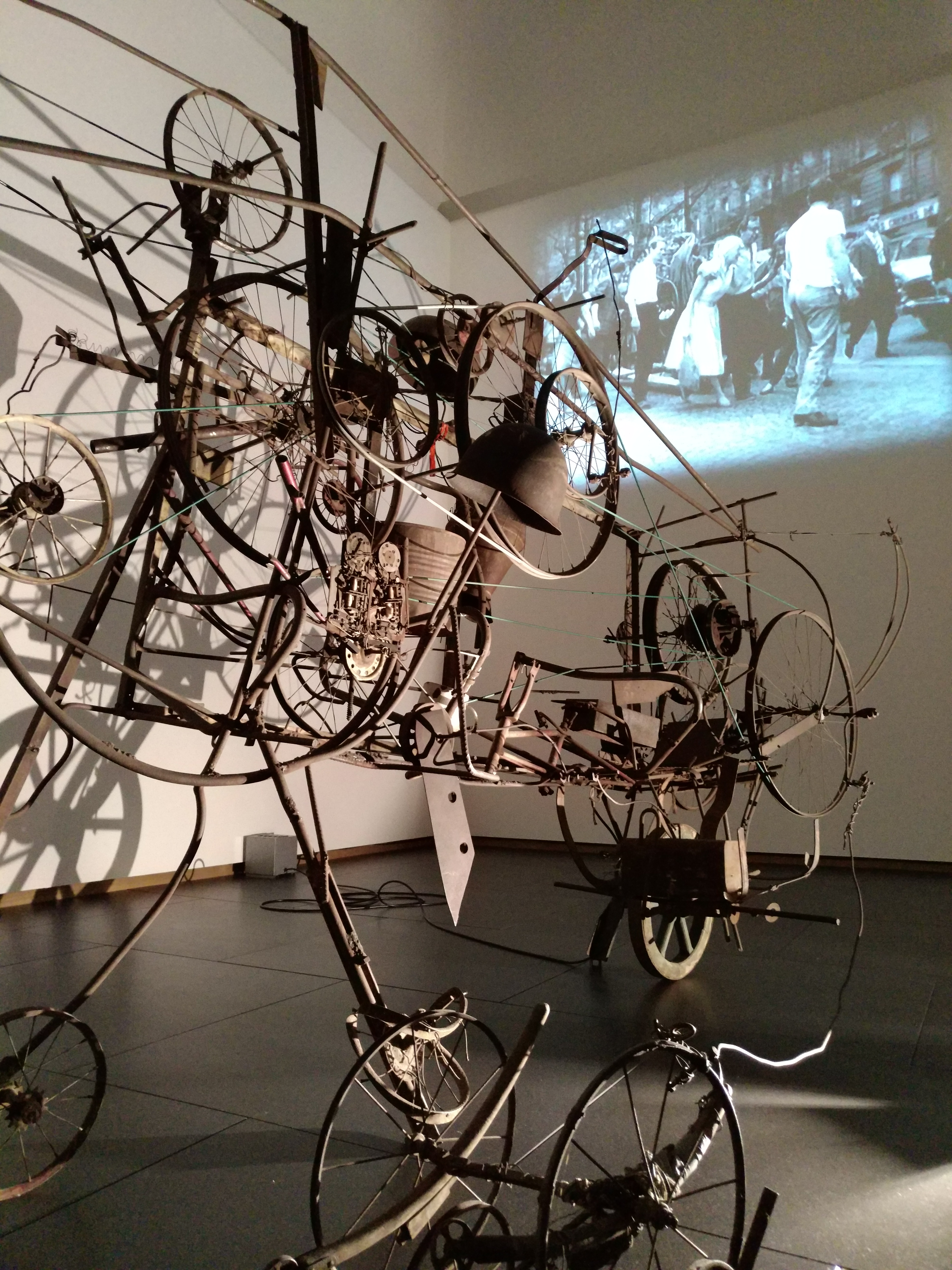
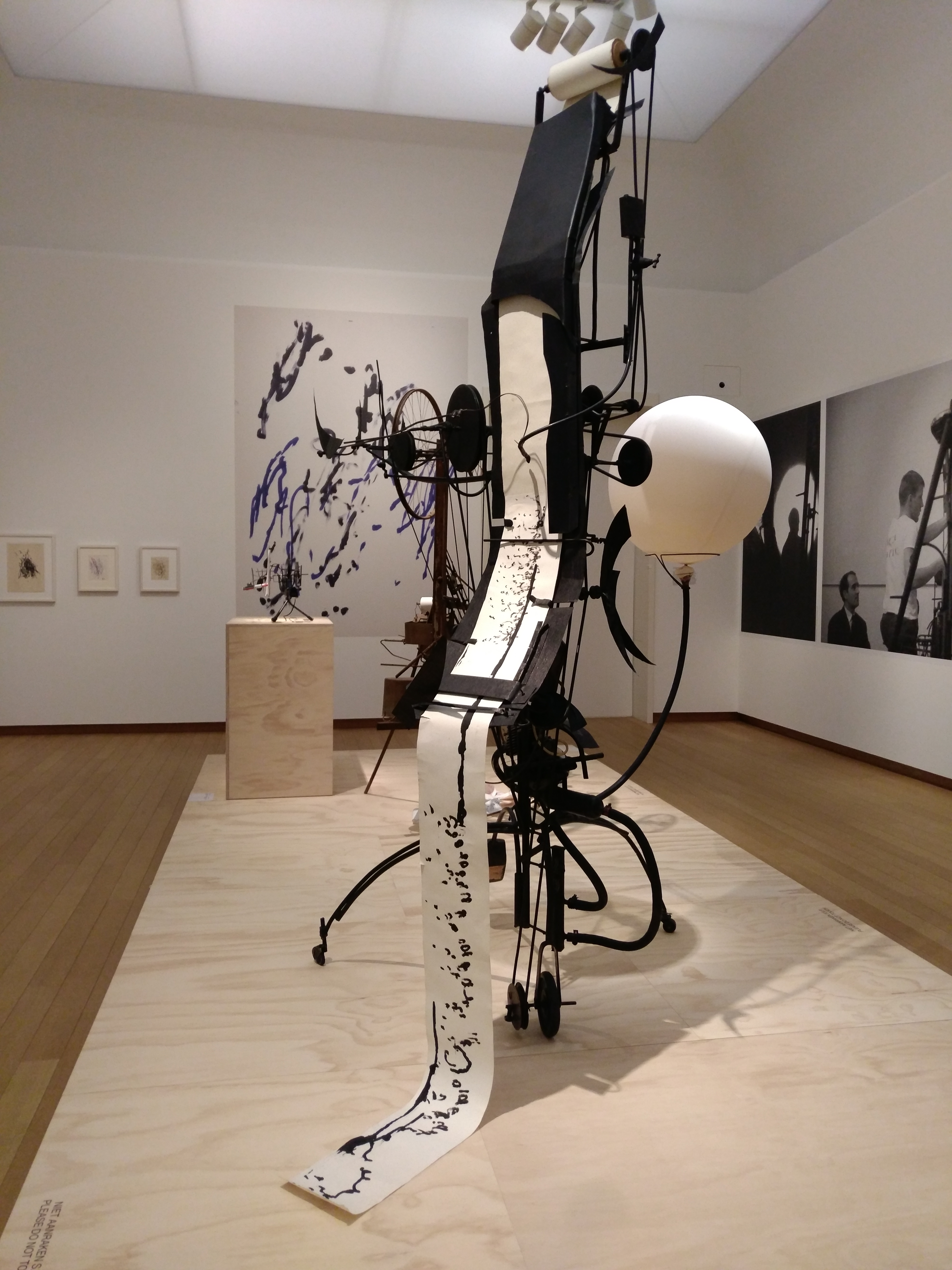
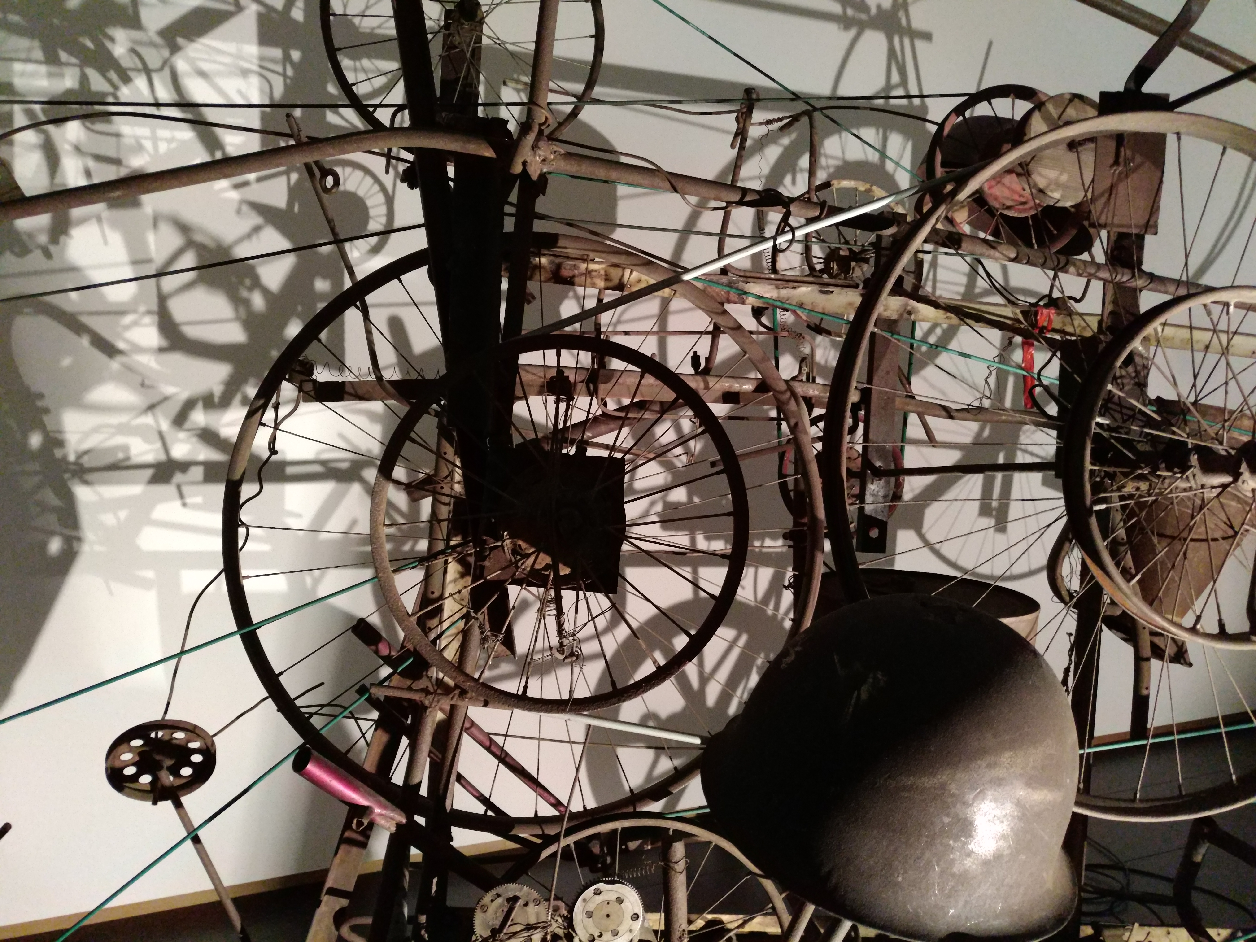
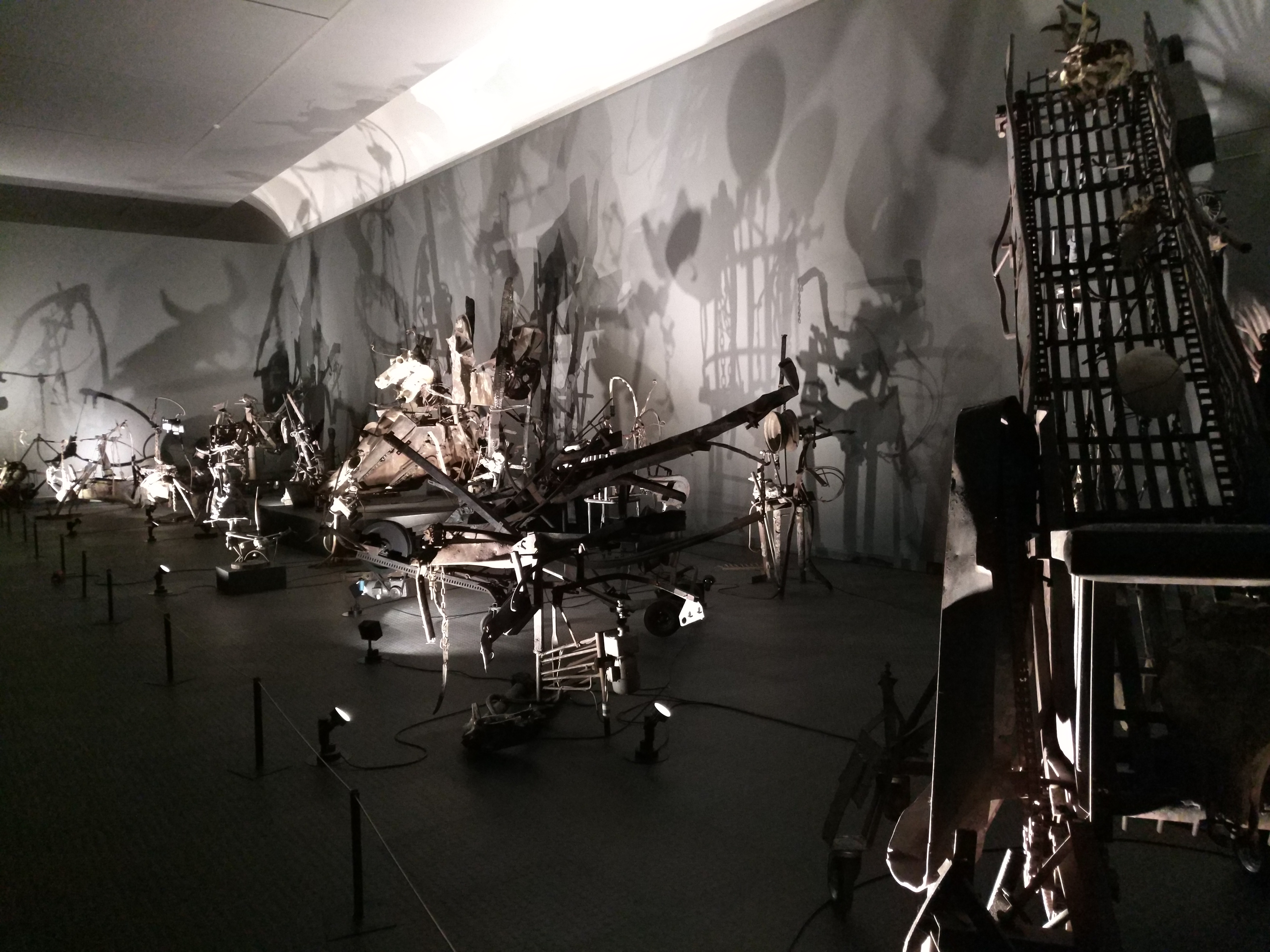
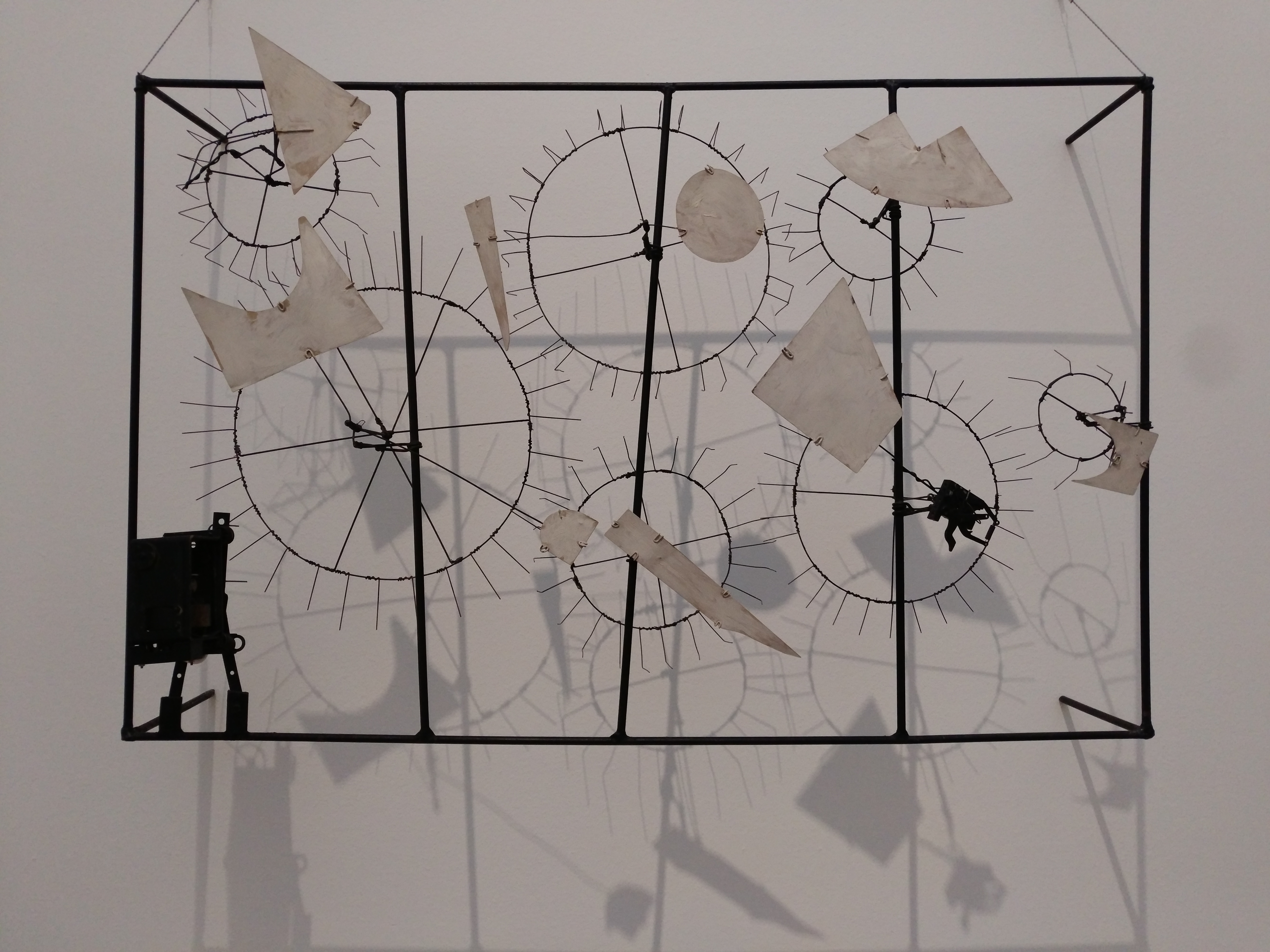
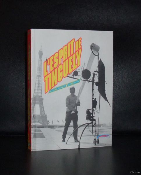
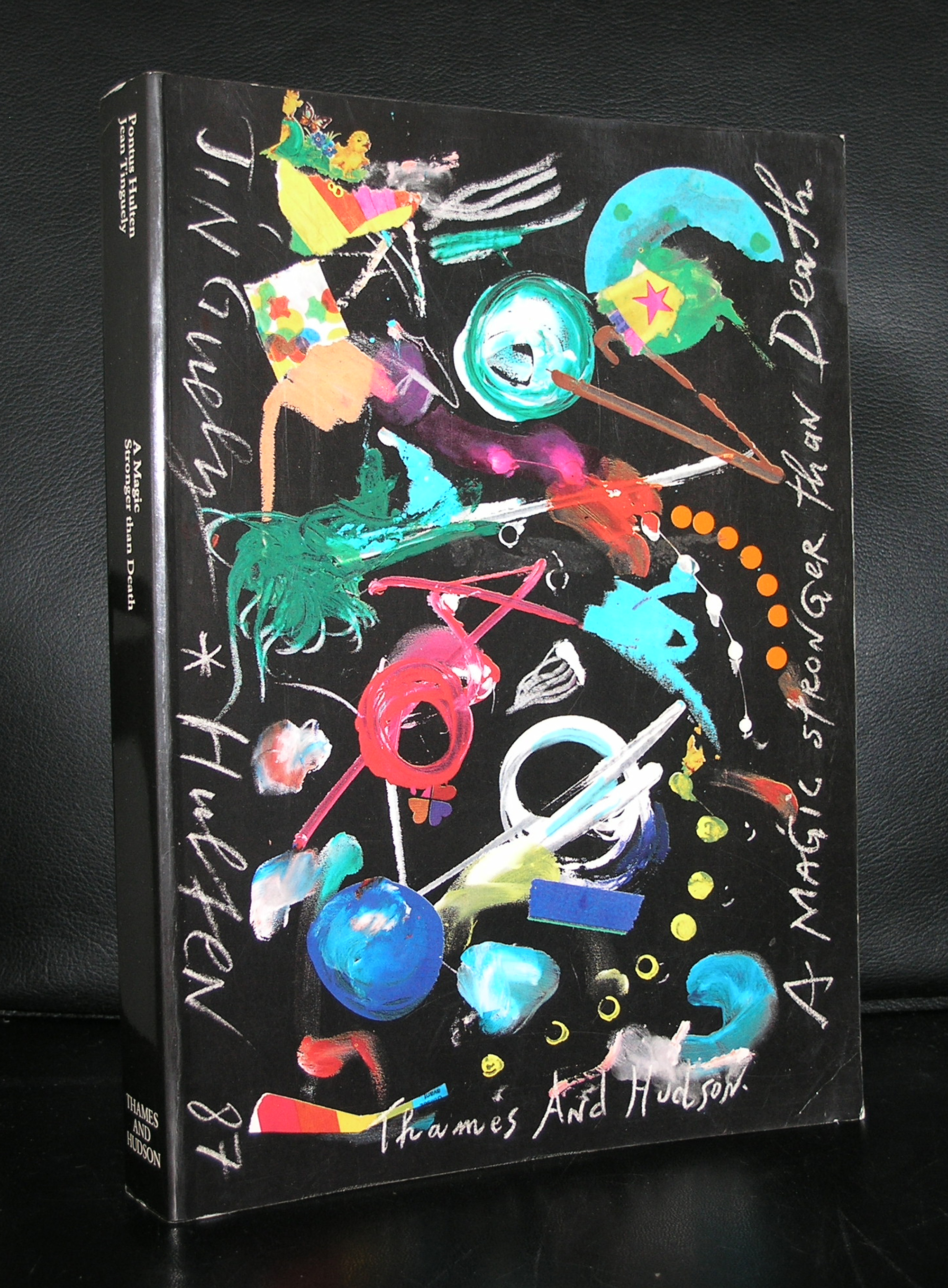
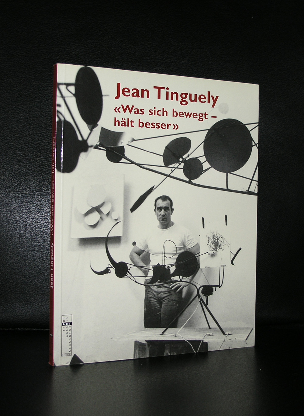
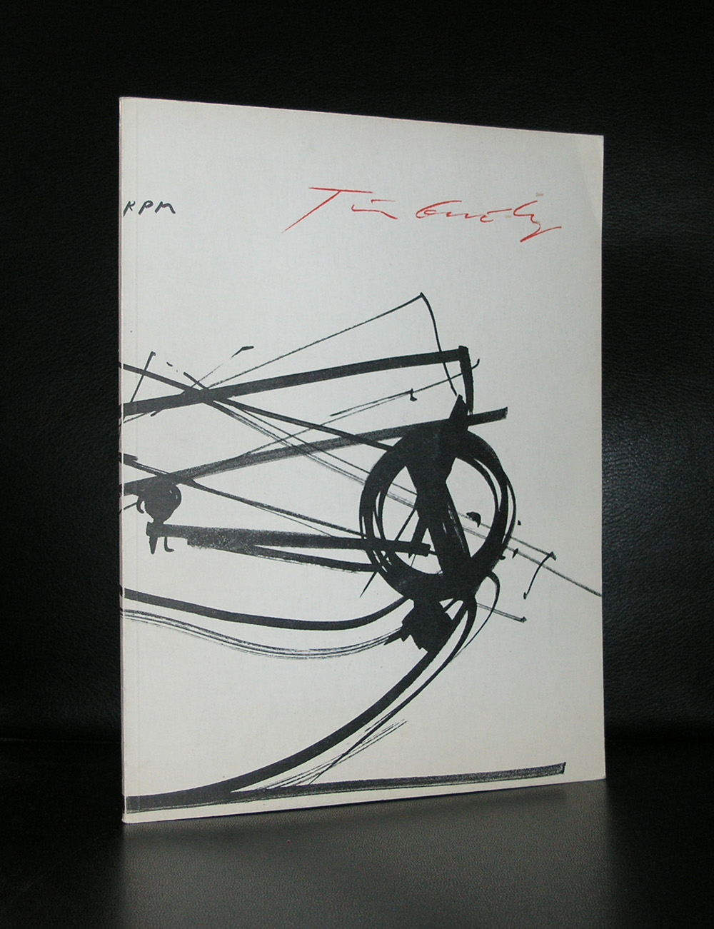
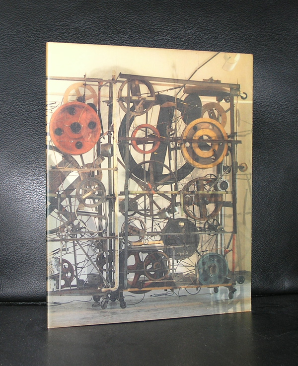
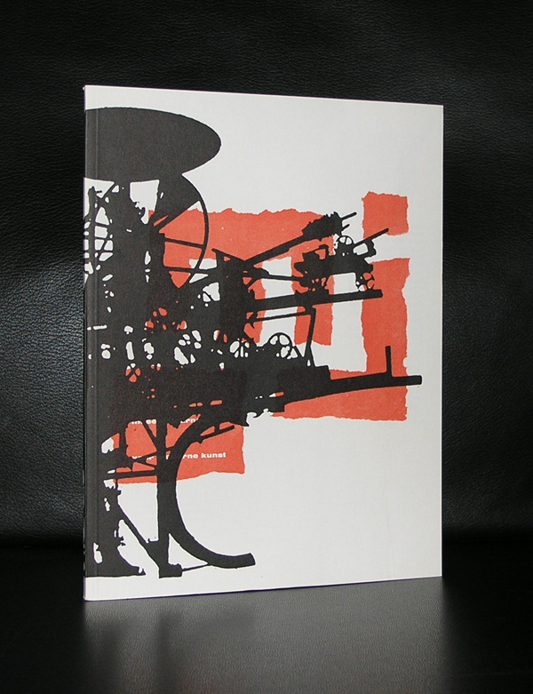
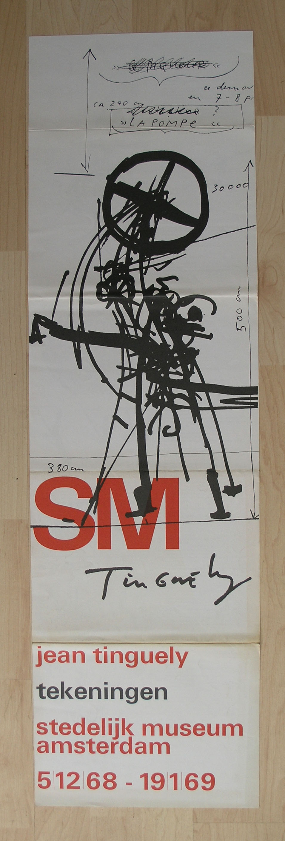
Jean Tinguely ….one of my art heroes …. he had his first exhibitions in the Netherlands in the Stedelijk in the mid sixties and since, his works have been on show in many theme and group exhibitions, but never again in a large retrospective until now.
But now there is one in the Stedelijk Museum and this one is on show until the 5th of March 2017. What can i tell you about this one….it is a nice show, but…….it never has the impact one experiences when visiting the Tinguely Museum in Basel , because it lacks the space, grandeur, size and number of machines/works to show all aspects of his works. I really missed the extremely large mechanical works. I caught one on a video of his funeral
[wpvideo MXStOEUY]
and beside the one in the collection of the Stedelijk there is only one other one, a wall covered with a very large one, but that is all.
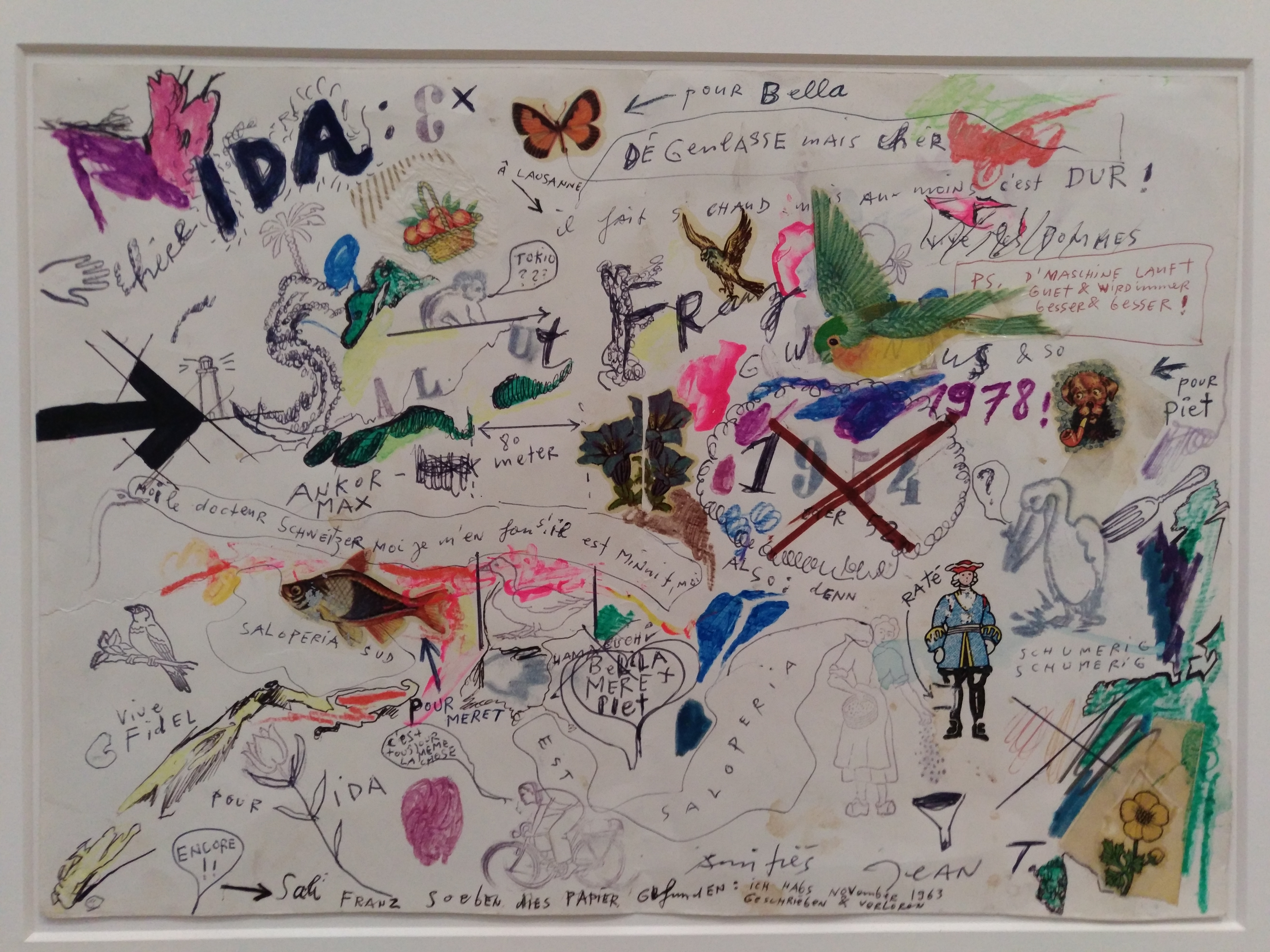
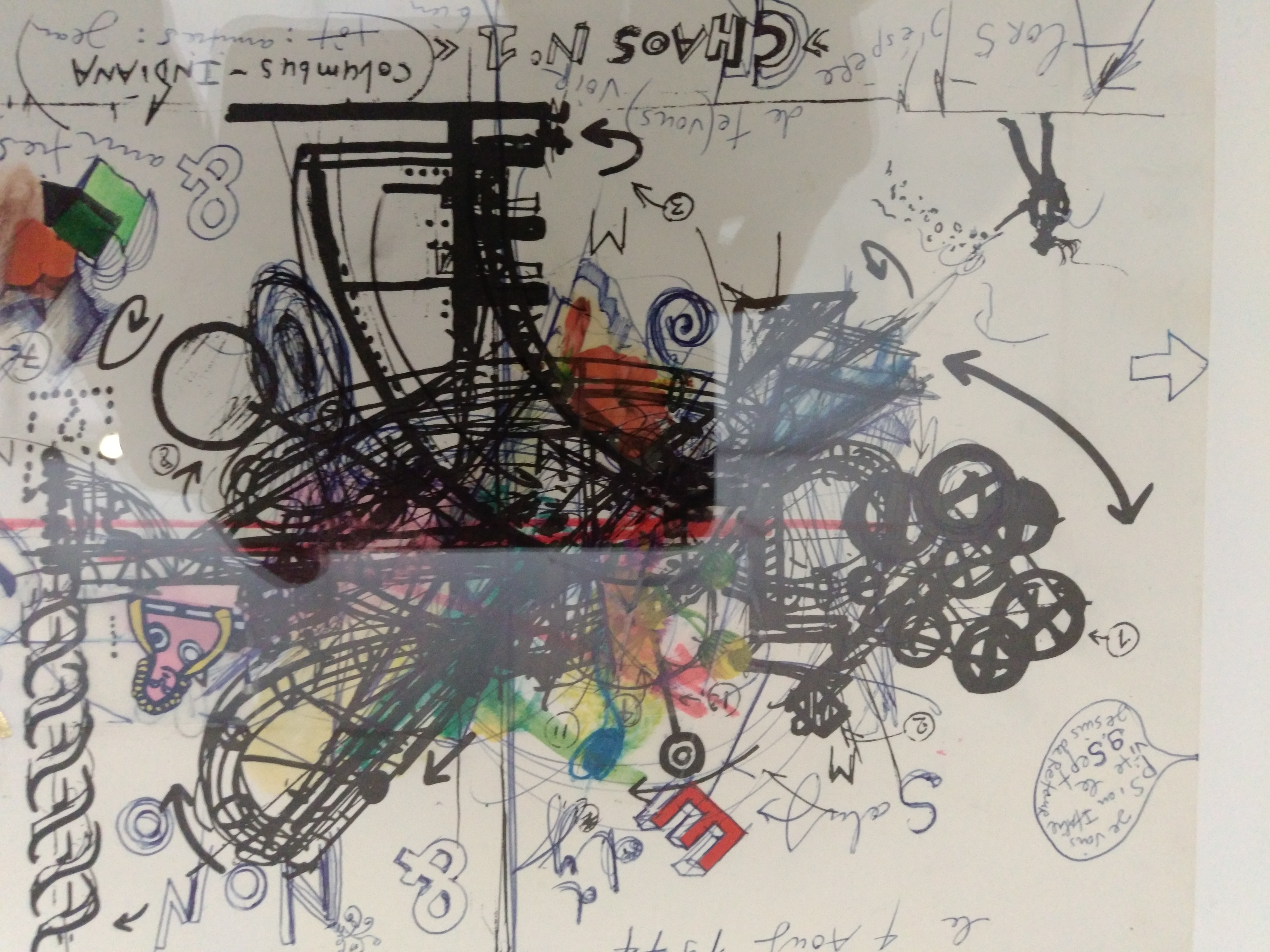
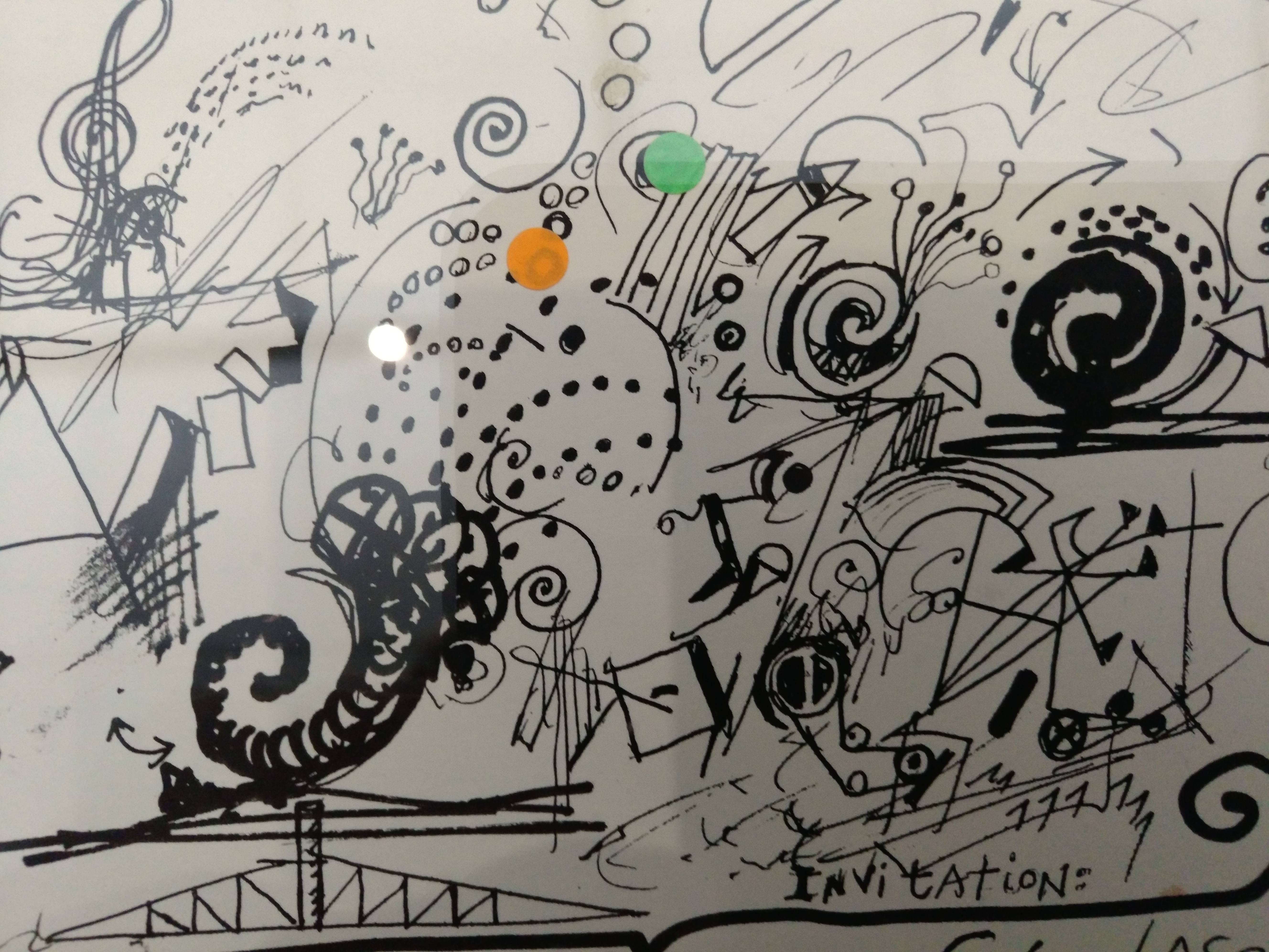
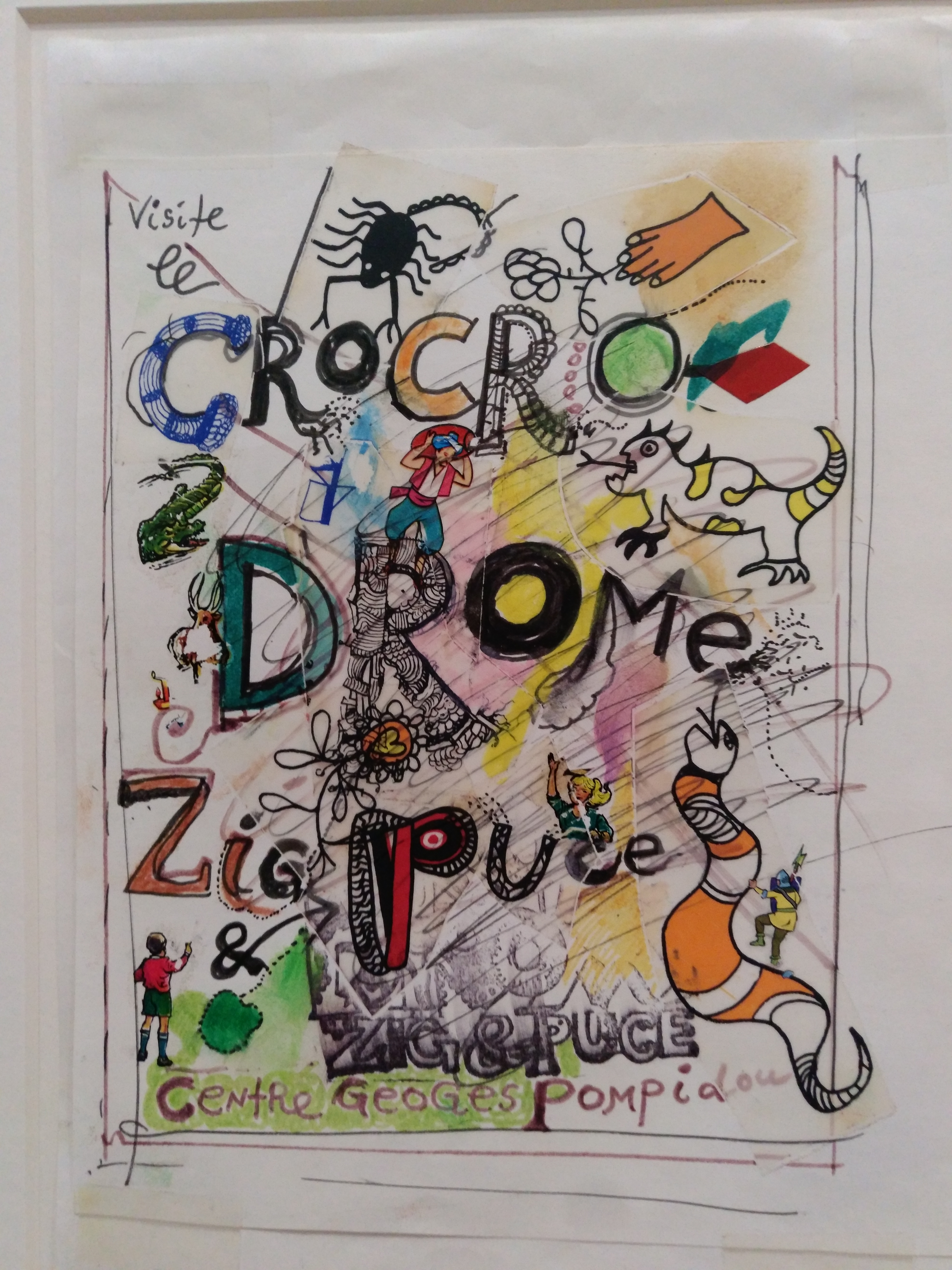
Not that the exhibition is not worth visiting…it really is …. but i was not knocked of my feet. Still i had a chance to make some nice photographs of the (DYLABY documents/ in a blog next week) documents on show and was amazed to see the correspondence Tinguely and Nikki de Saint Phalle had with Edy de Wilde ( the former director of the Stedelijk). On an A4 text, drawings, and illustrations were combined into great works of art.
This is an exhibition to visit for the smaller items like the documents and remember to visit the Tinguely Museum in Basel to get the best overview of his mechanical works.
See the ones in the Stedelijk as an entree to a dinner in which the side dishes steal the show.
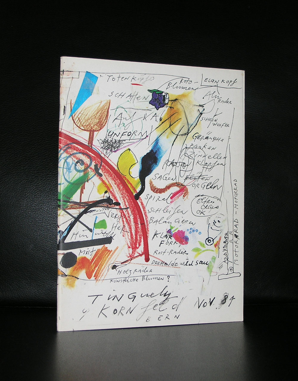
There are a great number of Tinguely publications available at www.ftn-books.com
No….this is not a title for a classic Roald Dahl story, but this is reality. Some museums, but specially the Stedelijk Museum Amsterdam, had a policy to make affordable catalogues for their visitors to accompany their exhibitions in the 50’s and 60’s.
Designed by the best in the business ( Willem Sandberg and Wim Crouwel ) they had the task to produce these catalogues at a low price without being cheap looking. They experimented with low cost papers, small editions, number of pages between 24 and 48, most of the time stapled and a scarce use of color. Only one exception was made ….in some cases an original lithograph by the artist was used as a cover. This is why some of these beautiful catalogues are even more desirable…all because of the original lithograph.
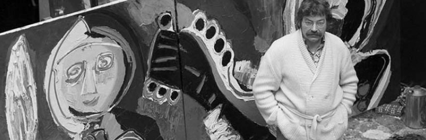
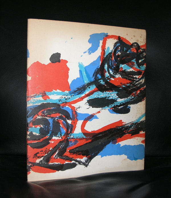
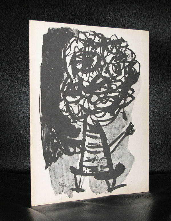
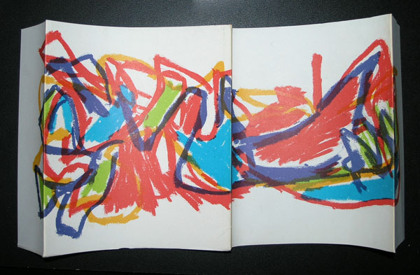
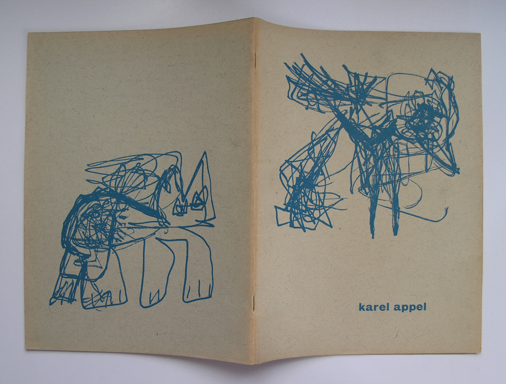
Karel Appel was one of those artist who had his peak in the sixties and was able to demand the best possible catalogues with his exhibitions and Sandberg granted this. The Appel catalogues which were published in the late 50’s and early sixties are among the best from the catalogue series of the Stedelijk and should be present in every serious Karel Appel collection.
Just look at this foldout cover and be convinced yourself that this is special.
For the readers of this blog…i have two of the above 1965 catalogues available at
Artist/ Author: Oliver Boberg
Title : Memorial
Publisher: Oliver Boberg
Measurements: Frame measures 51 x 42 cm. original C print is 35 x 25 cm.
Condition: mint
signed by Oliver Boberg in pen and numbered 14/20 from an edition of 20