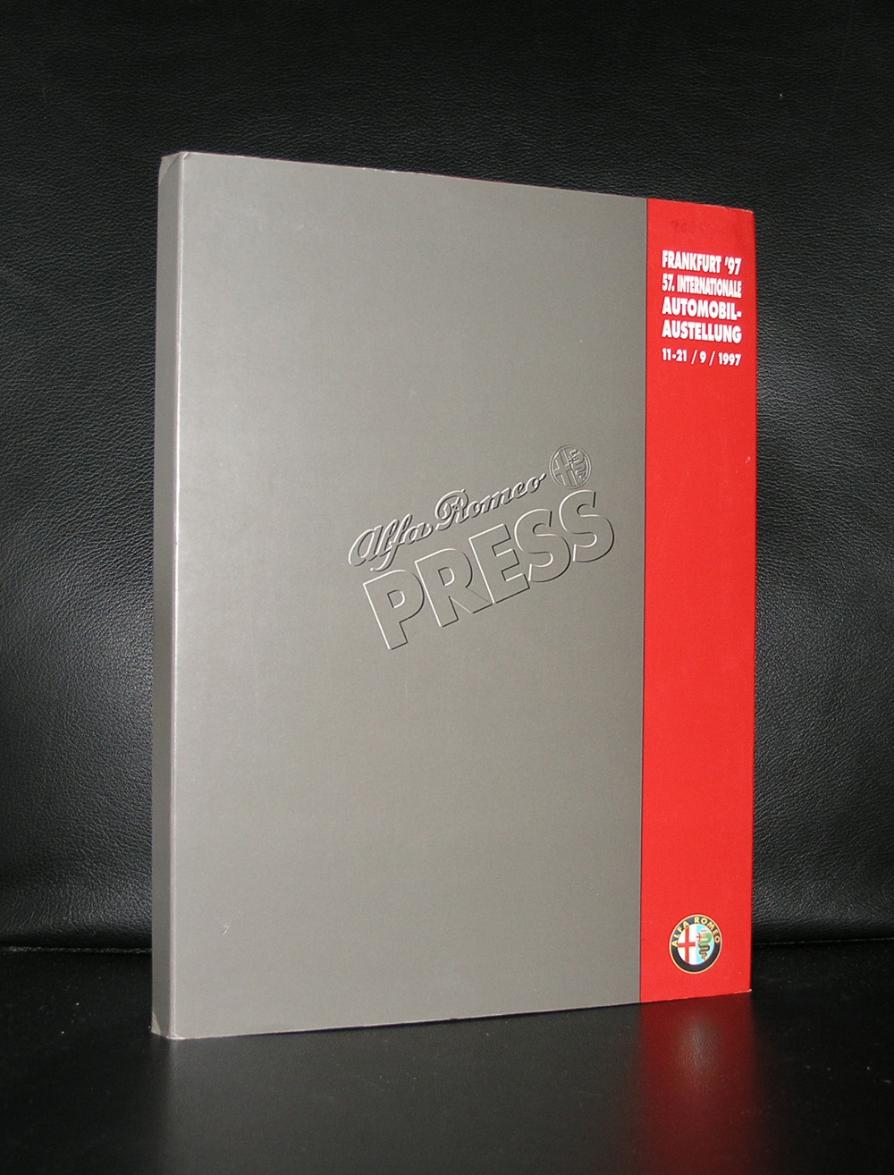
When Rudi Fuchs made it director for the Stedelijk Museum Amsterdam, one of the first acts was to fund his exhibitions with promotional activities by commercial industries. One of the first that got a chance to show his new products within the museum was Alfa Romeo who showed their new models Alfa Romeo GTV and the Cabrio version.
Sketches , clay models and the end product . Every aspect of the creation of these models was shown. Special poster and some leaflets with the exhibition made this a true museum exhibition , but was this the right place for such an event….personally i do not think so.
Although a car can be a “piece of art” it does not belong in an art museum , but certainly can be presented in a car museum. But still it must have been good for the museum funding, because since many other commercial activities have taken place , but none as outspoken as the one for ALFA ROMEO.
Because of my personal interest in cars www.ftn-books.com has some publications on the subject.
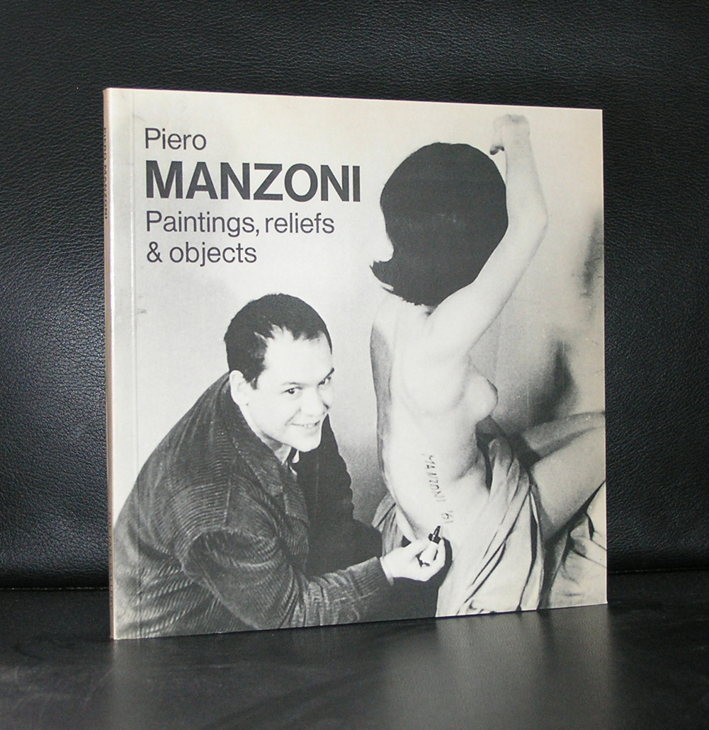
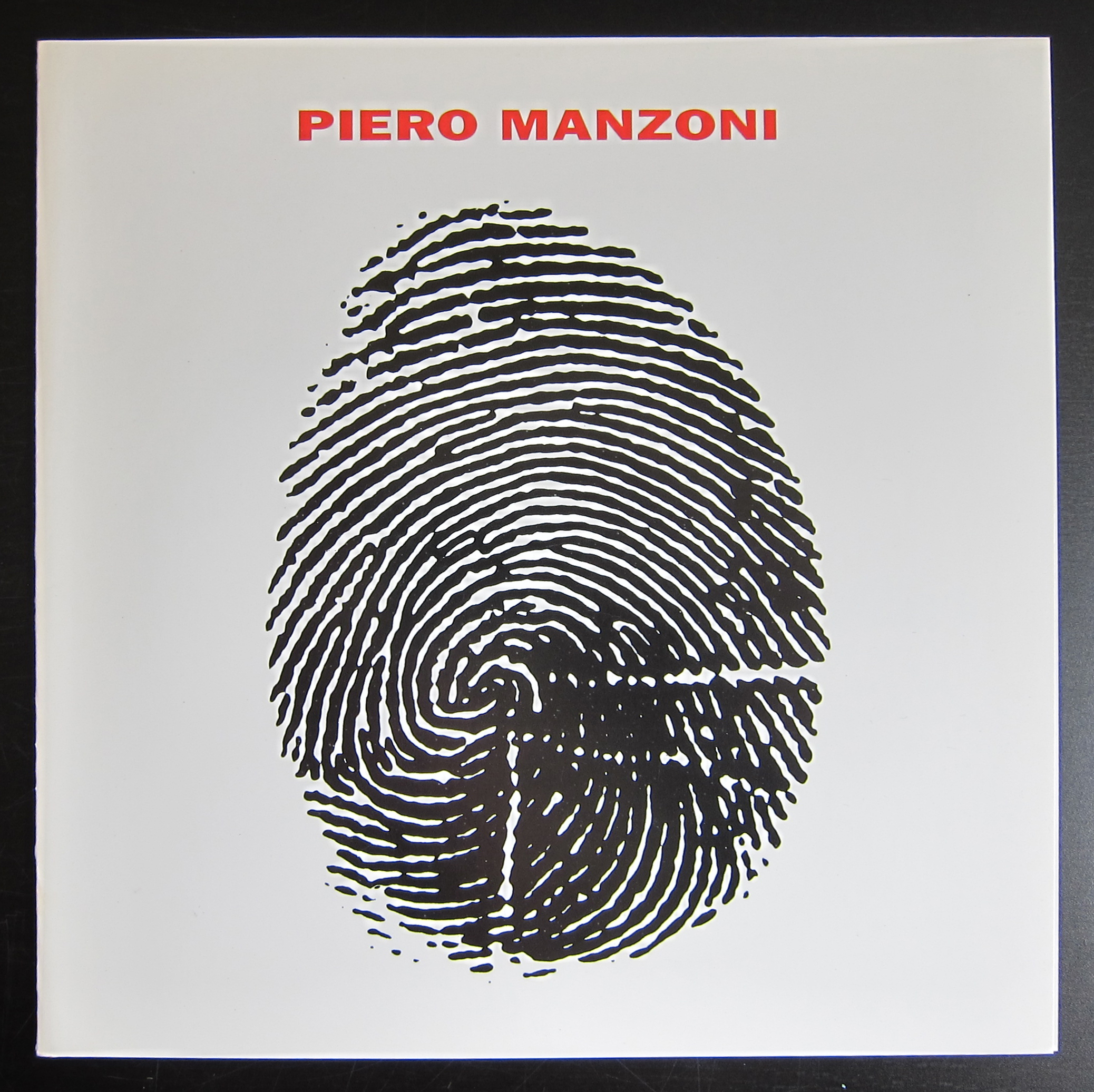
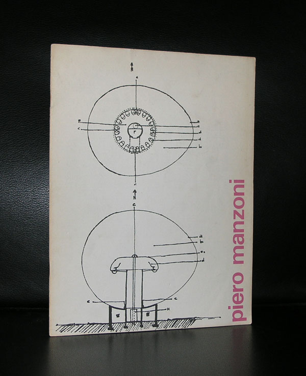
In May 1961, while he was living in Milan, Piero Manzoni produced ninety cans of Artist’s Shit. Each was numbered on the lid 001 to 090. A label on each can, printed in Italian, English, French and German, identified the contents as ‘”Artist’s Shit”, contents 30gr net freshly preserved, produced and tinned in May 1961.’ In December 1961 Manzoni wrote in a letter to the artist Ben Vautier: ‘I should like all artists to sell their fingerprints, or else stage competitions to see who can draw the longest line or sell their shit in tins. The fingerprint is the only sign of the personality that can be accepted: if collectors want something intimate, really personal to the artist, there’s the artist’s own shit, that is really his.’ (Letter reprinted in Battino and Palazzoli p.144.)
It is not known exactly how many cans of Artist’s Shit were sold within Manzoni’s lifetime, but a receipt dated 23 August 1962 certifies that Manzoni sold one to Alberto Lùcia for 30 grams of 18-carat gold (reproduced in Battino and Palazzoli p.154). Manzoni’s decision to value his excrement on a par with the price of gold made clear reference to the tradition of the artist as alchemist already forged by Marcel Duchamp and Yves Klein among others. As the artist and critic Jon Thompson has written:
Manzoni’s critical and metaphorical reification of the artist’s body, its processes and products, pointed the way towards an understanding of the persona of the artist and the product of the artist’s body as a consumable object. The Merda d’artista, the artist’s shit, dried naturally and canned ‘with no added preservatives’, was the perfect metaphor for the bodied and disembodied nature of artistic labour: the work of art as fully incorporated raw material, and its violent expulsion as commodity. Manzoni understood the creative act as part of the cycle of consumption: as a constant reprocessing, packaging, marketing, consuming, reprocessing, packaging, ad infinitum. (Piero Manzoni, 1998, p.45)
Artist’s Shit was made at a time when Manzoni was producing a variety of works involving the fetishisation and commodification of his own body substances. These included marking eggs with his thumbprints before eating them, and selling balloons filled with his own breath. Of these works, the cans of Artist’s Shit have become the most notorious, in part because of a lingering uncertainty about whether they do indeed contain Manzoni’s faeces. At times when Manzoni’s reputation has seen the market value of these works increase, such uncertainties have imbued them with an additional level of irony. ( text on this subject comes from the Tate site : http://www.tate.org.uk/art/artworks/manzoni-artists-shit-t07667)
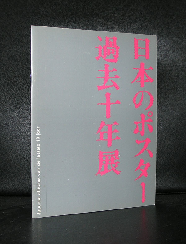
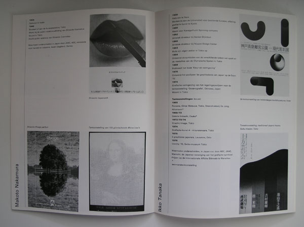
The Stedelijk Museum Amsterdam has a history with posters and specially the posters from Japan were presented on multiple occasions within exhibitions on the subject. In 1977 , the “Japanse Poster” exhibition catalogue was designed by Wim Crouwel, who designed a very special catalogue for the exhibition . The catalogue is one of the best from the seventies and instead of the typical Crouwel typography
OLYMPUS DIGITAL CAMERA
OLYMPUS DIGITAL CAMERA
OLYMPUS DIGITAL CAMERA
on the cover there are Japanese letters drawing your attention. Red lettering on a silver background let this one stand out from the rest.
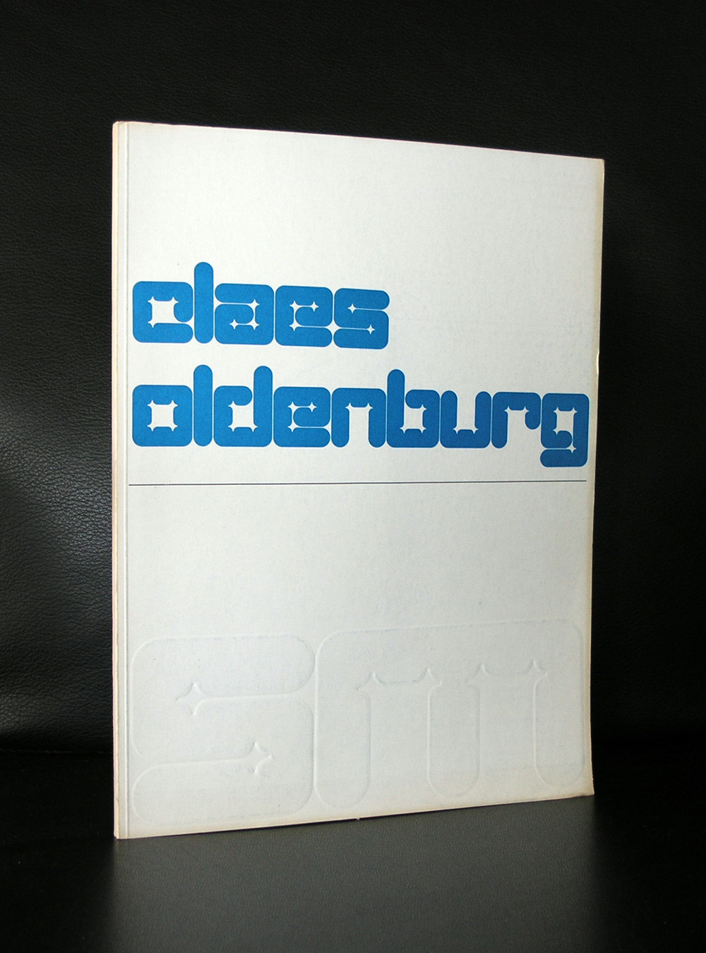
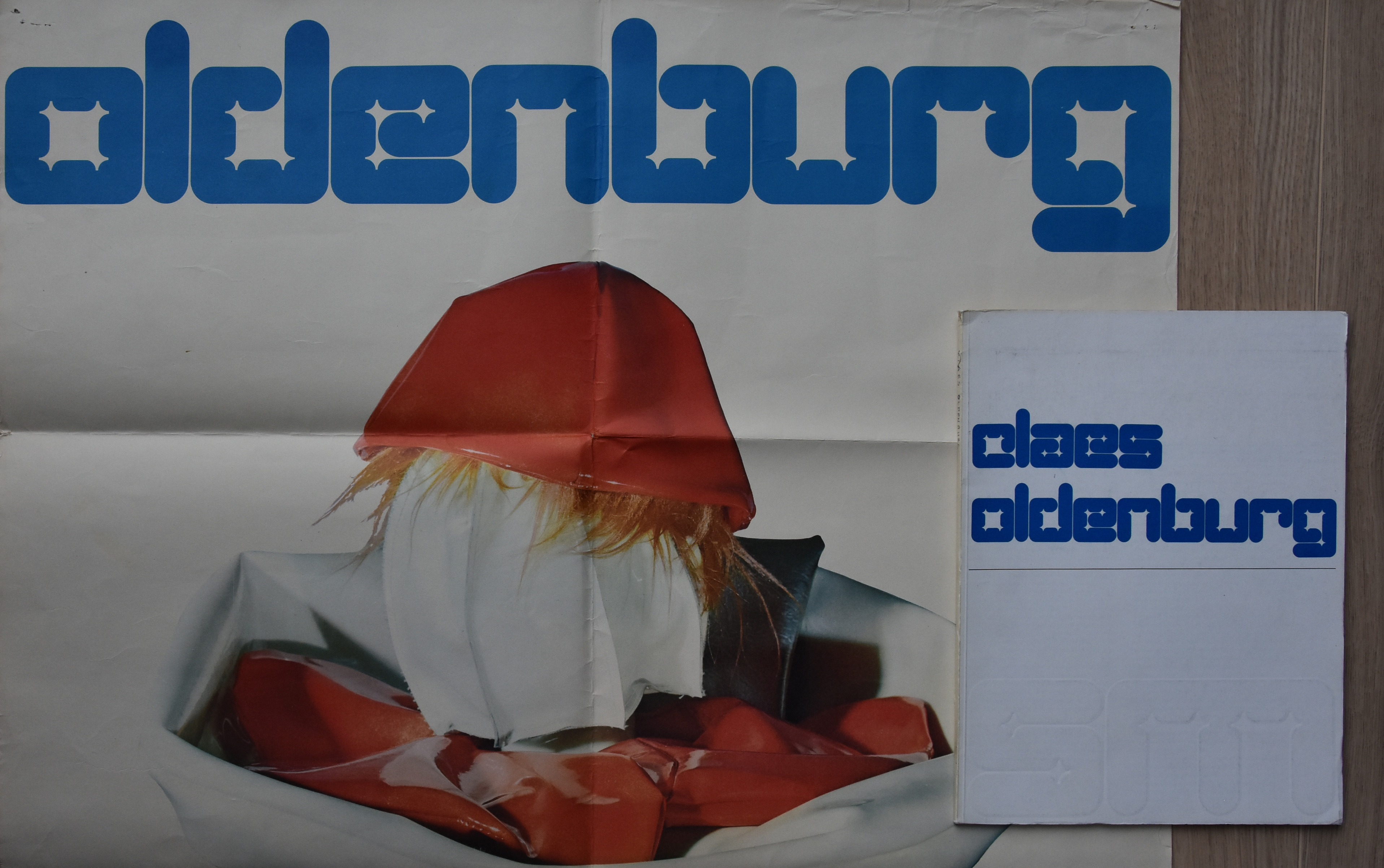
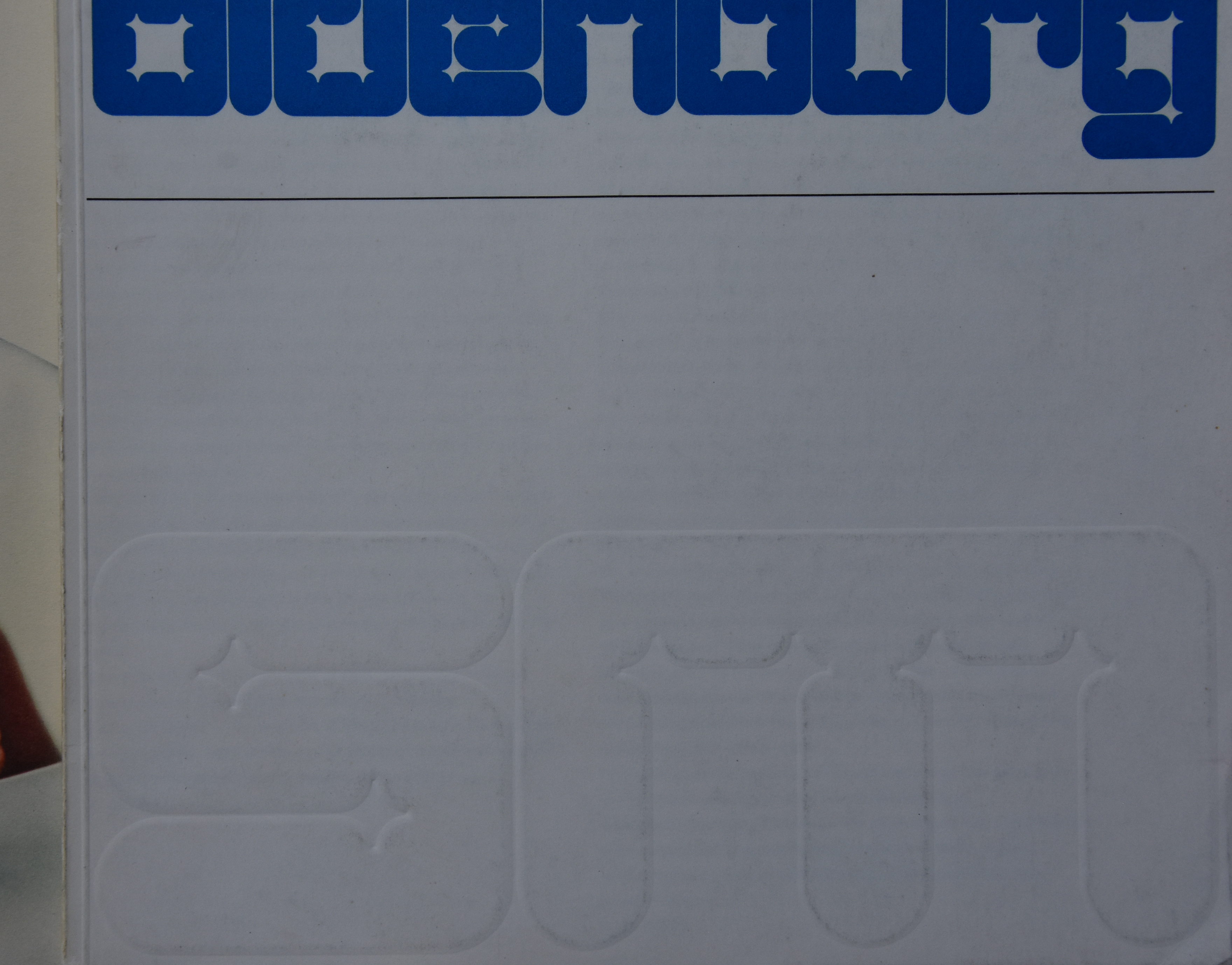
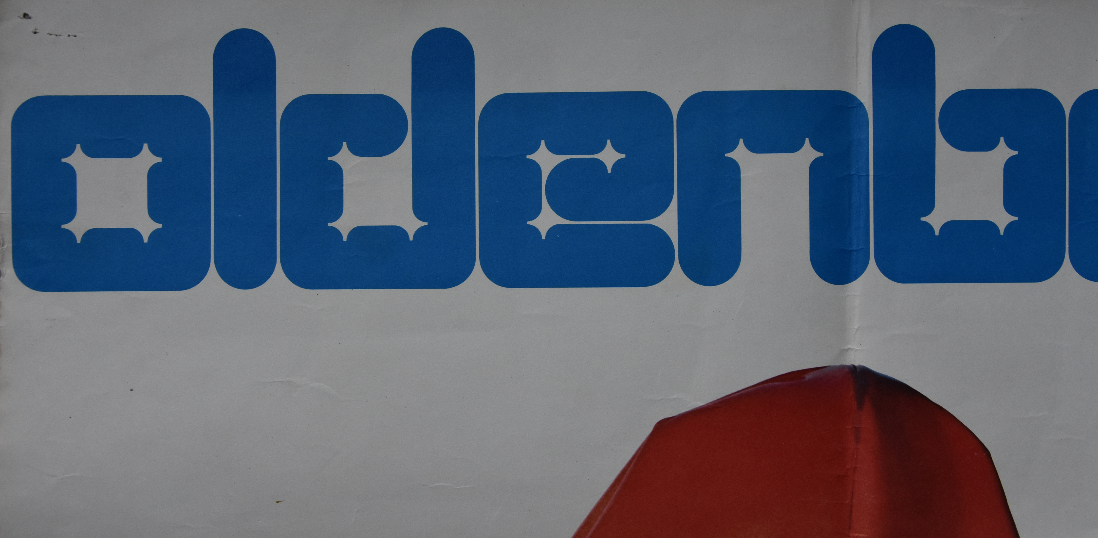
Claes Oldenburg has had 2 solo exhibitions at the Stedelijk Museum Amsterdam. The first in 1970 and the second in 1977. With both exhibitions, catalogues by Wim Crouwel were published , but the one from 1970 has a special lettering by Wim Crouwel. The same letter was used as the one on the poster which was printed in a bold deep blue color. Underneath the title of the catalogue there was in the same letter a blind print of the SM logo. Both items, catalogue and poster are now for sale at www.ftn-books.com. This is a rare opportunity to collectors to add both items to their collections.
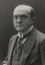
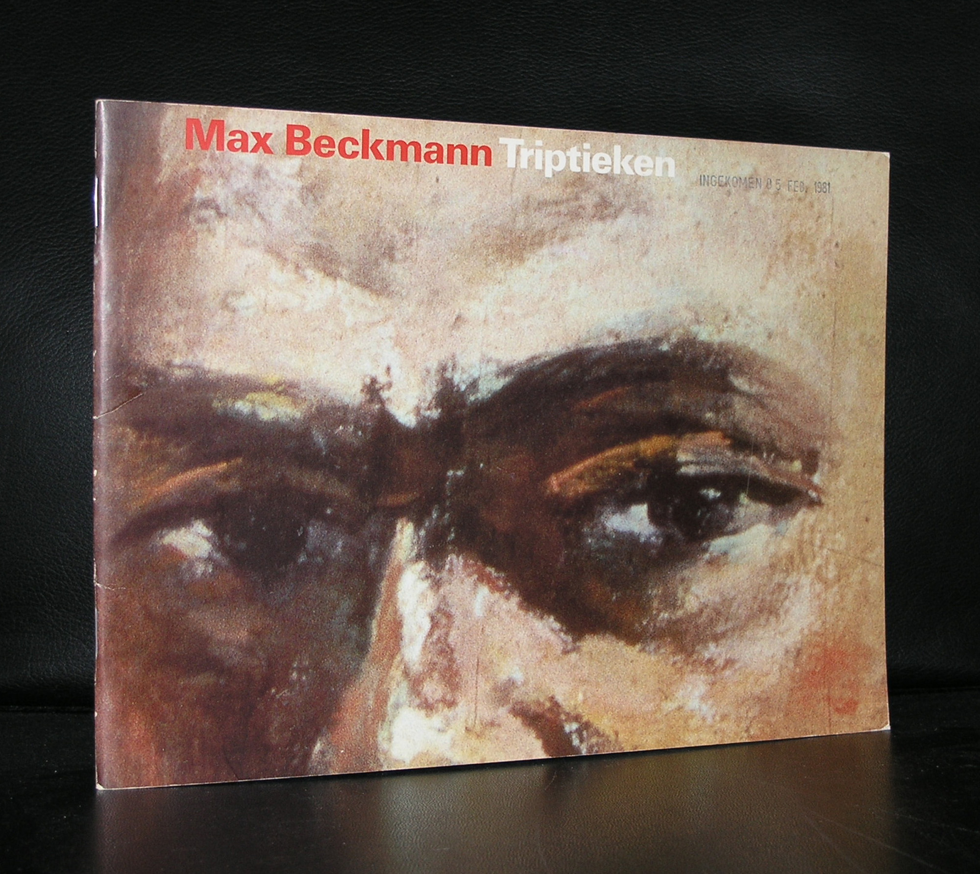
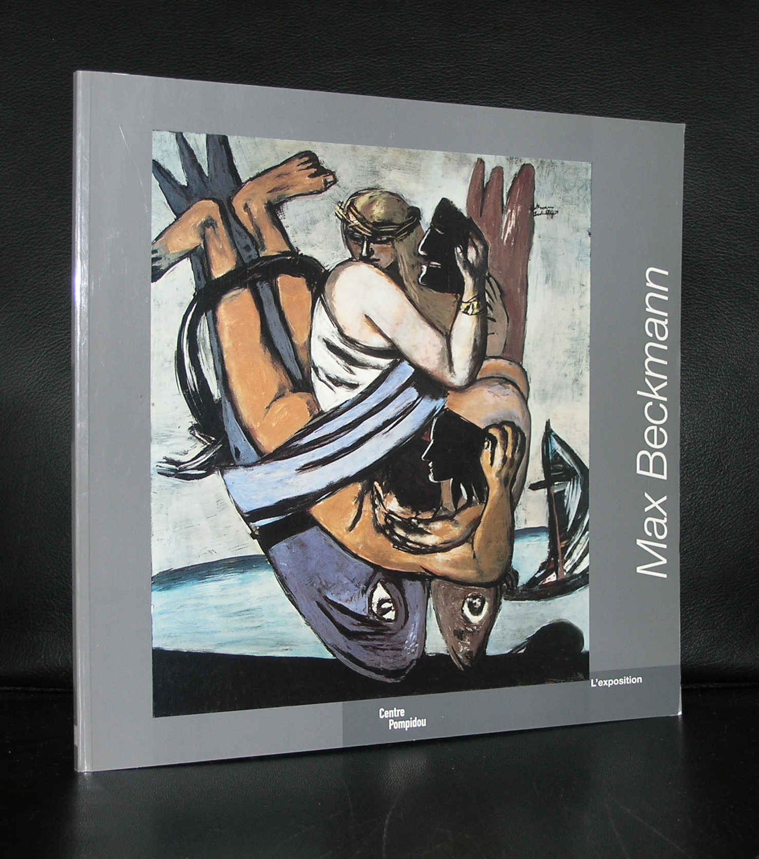
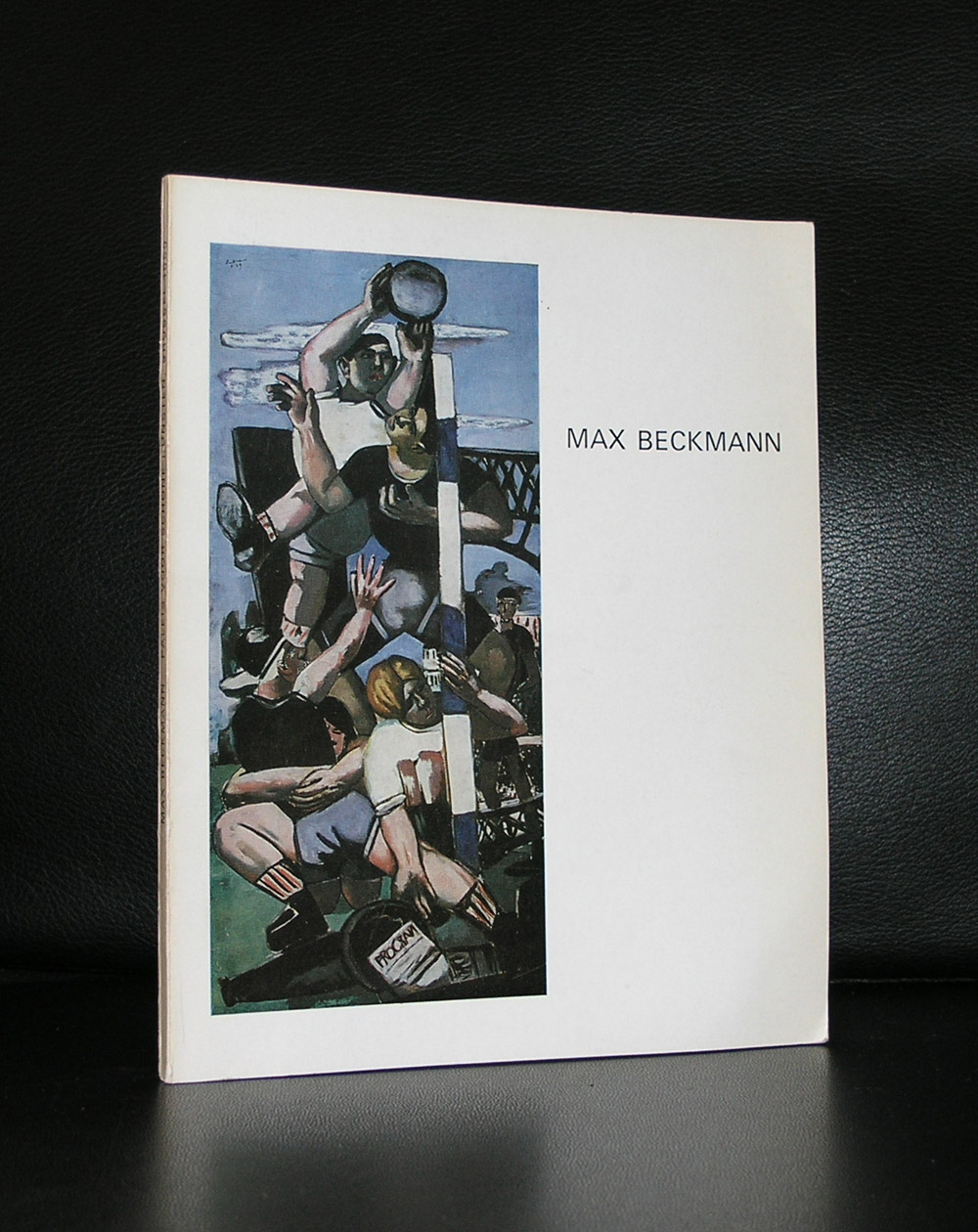
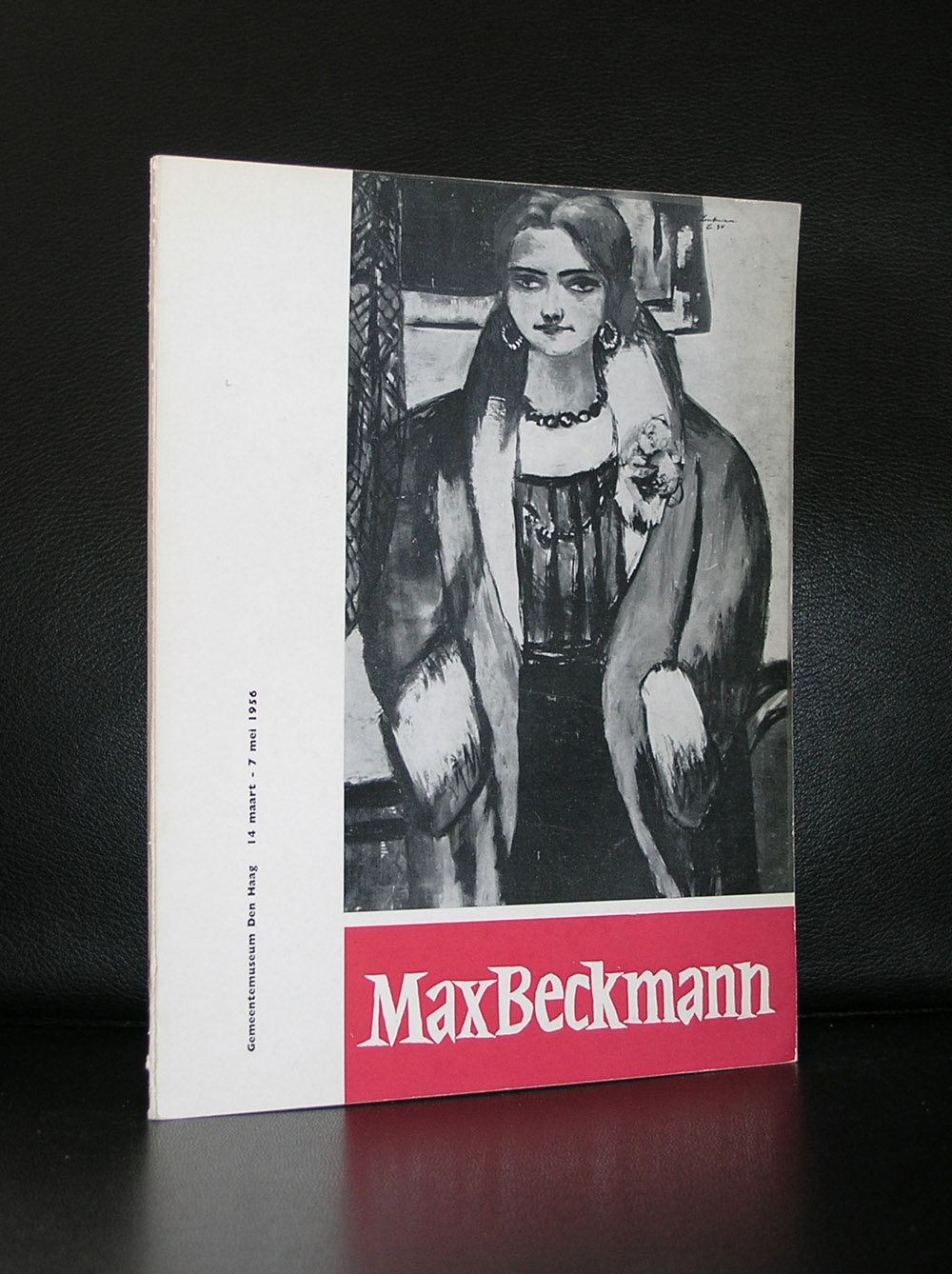
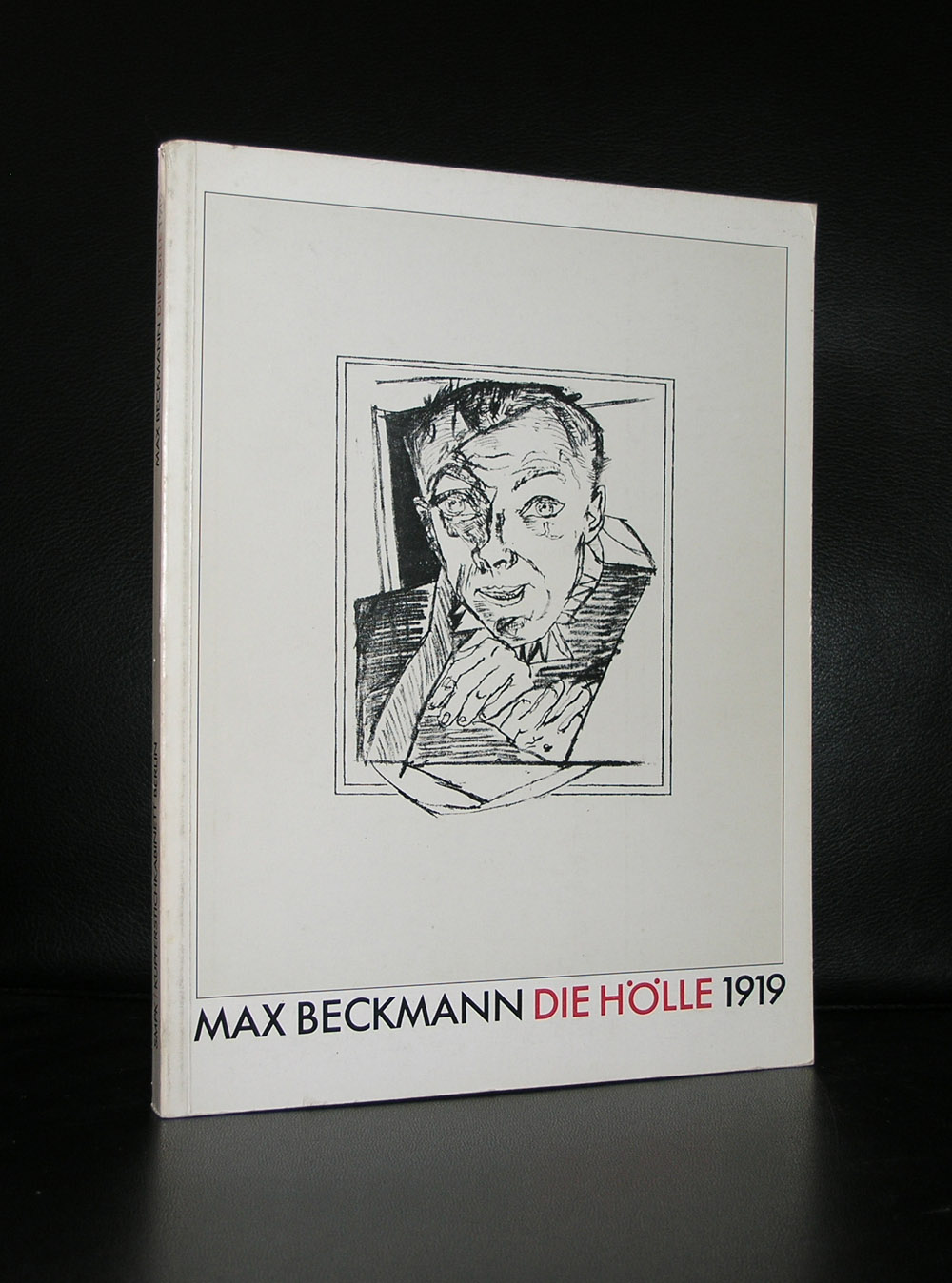
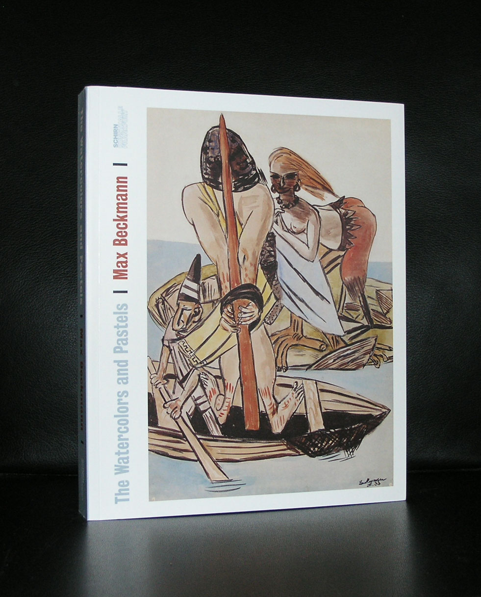
A few blogs ago , i argumented that auction records do not justice to the art itself. A record does not automatically mean that the work is of interest or belongs to the best the artist has ever made. But there are of course exceptions. On June 27 Christie’s London achieved a record for a Max Beckmann painting. “Hölle der Vögel (Birds’ Hell)” 1937-38 was sold to American art dealer Larry Gagosian for £36,005,000 / $45,834,365 / €40,865,675.
Beckmann’s “visceral response to the rise of the Nazi regime in his native Germany is one of the most striking and important expressionist paintings ever made, because it comments on the political situation in Germany. He painted the painting in his Amsterdam studio. It is filled with symbols The nude men scratched and mutilated, youth in the background bringing a Hitler salute and the Hell birds guarding the naked man. If ever there was a comment in art on the rise of Nazi Germany , it is this painting. It was part from an American private collection and probably become part of another private collection again and this is a pity because a work as important as Birds’ Hell should be visible to the public. Is it worth as much money as now paid for. I don’t think so, …….but what an important painting this is.
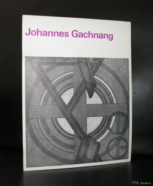
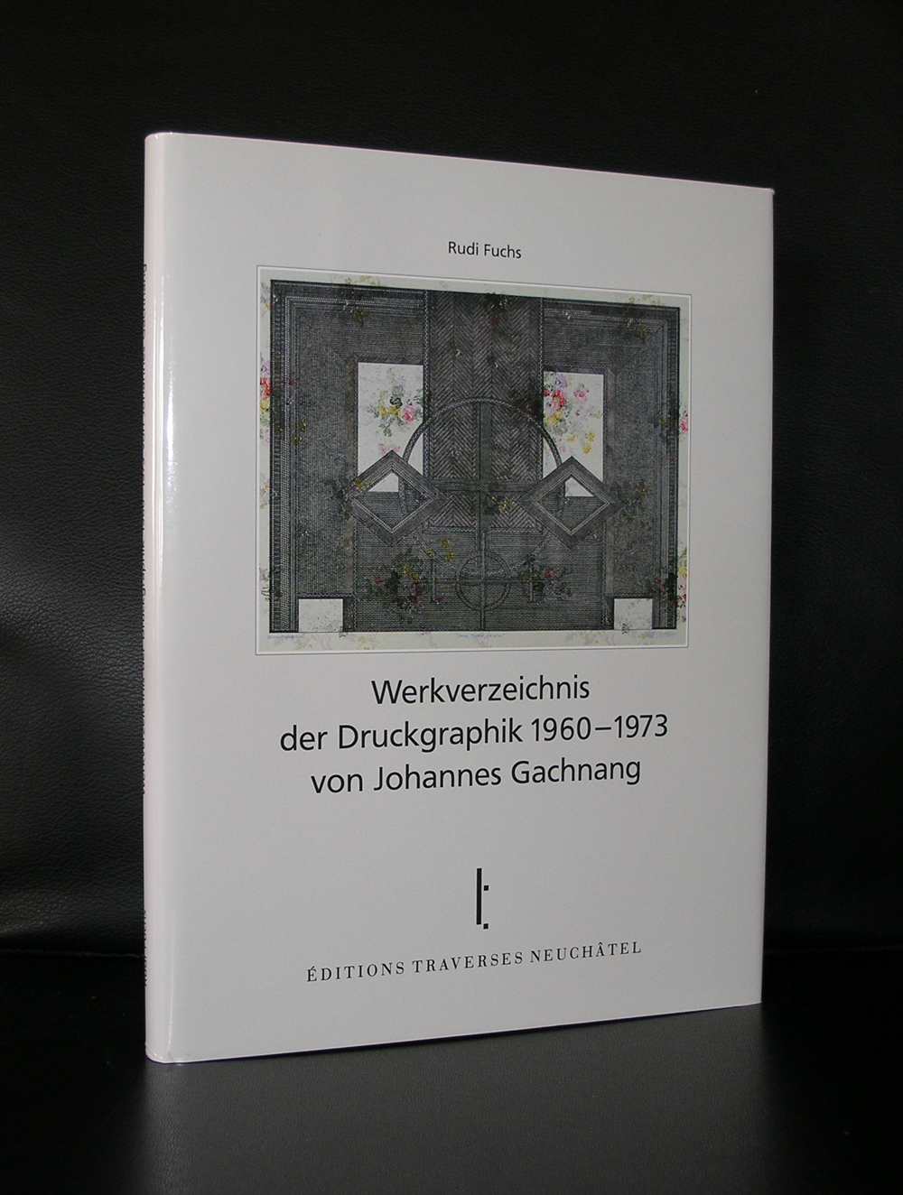
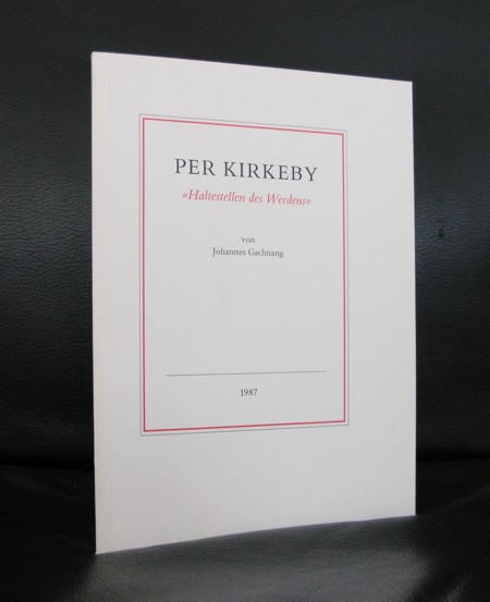
The first time i met Gachnang was during an exibition at the Haags Gemeentemuseum when he visited his friend Rudi Fuchs , who was at that time the director of the Gemeentemuseum. I remembered an unpleasant person, but Rudi wanted the publications by Gachnang to be sold at the shop of the Gemeentemuseum and i was critical about them. It was not that i was not convinced of the art within these publications, but the art by Gachnang was so personal and i thought “strange” that i did not see any selling possibilities for them. Years later, i started to encounter his works in museums and found them far more accessible than i first had thought they were. ALL Gachnang publication have a certain quality and belong to the best publications on art in the last 3 decades of the 20th century and some of them are available at www.ftn-books.com
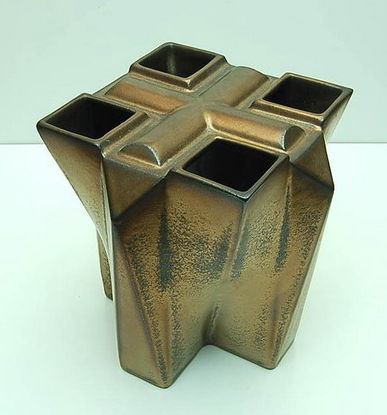
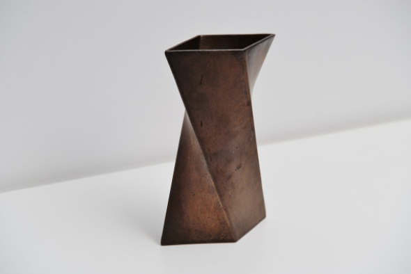
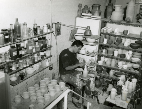
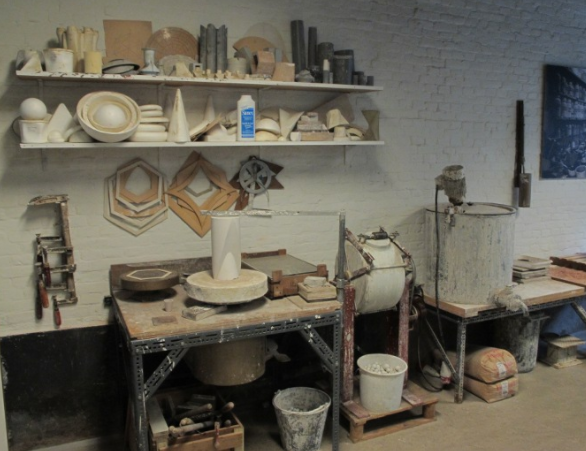
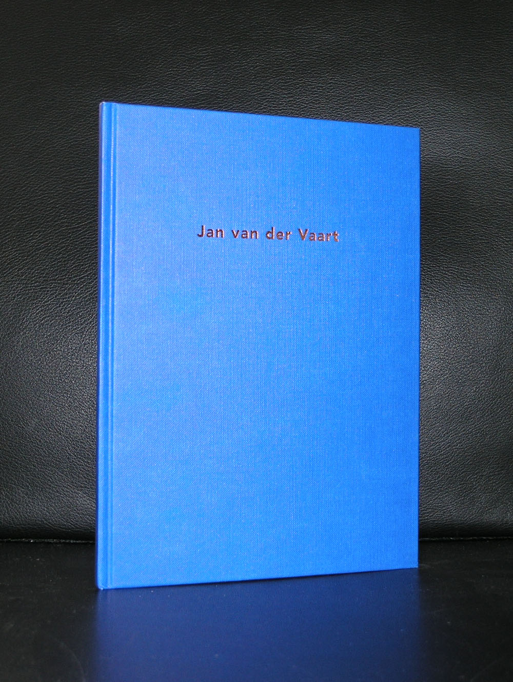
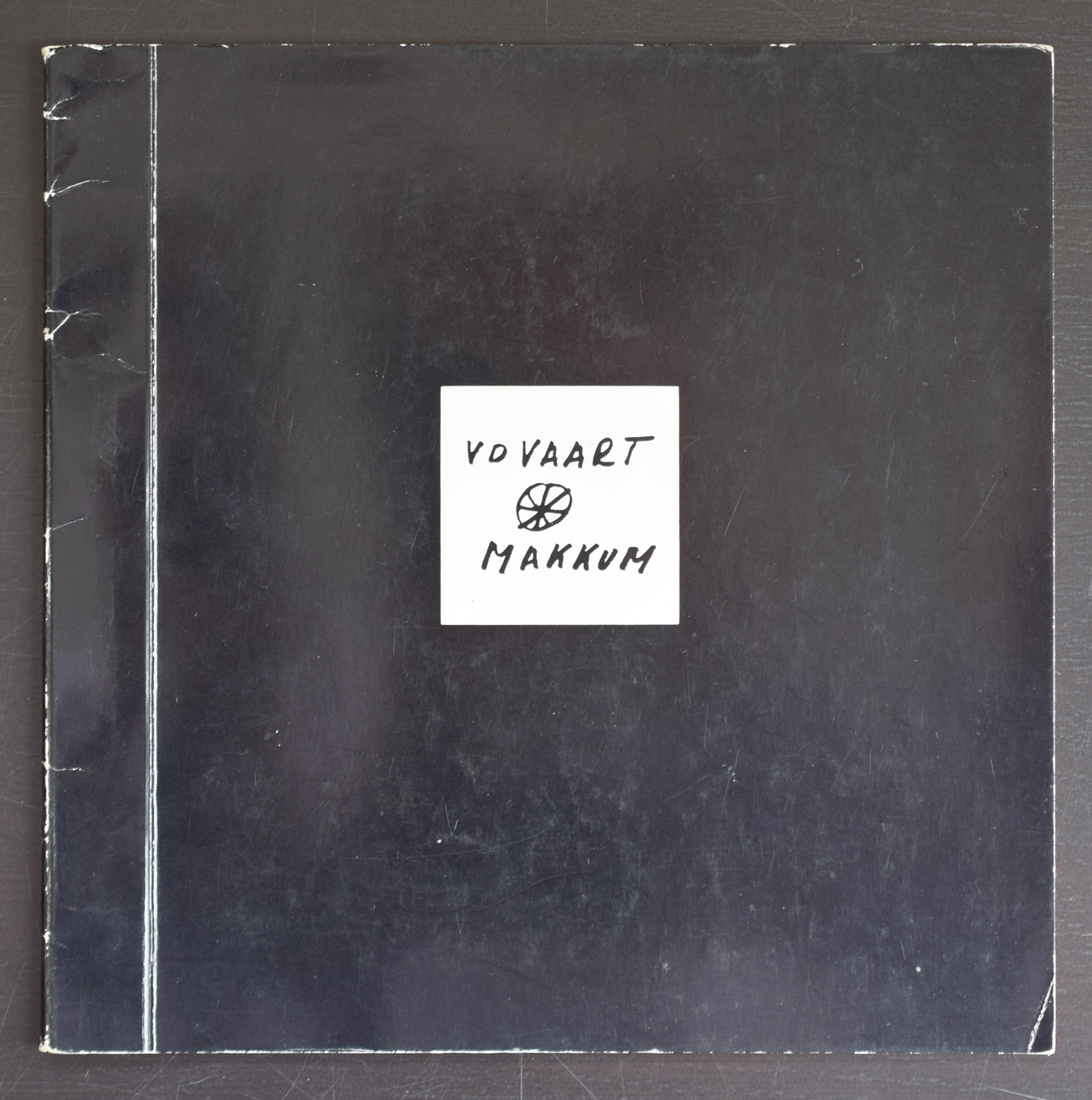
The picture by Eva Besnyo above, i encountered in a Museum Bulletin from 1999 in which Marjan Boot wrote an article on Potst and sculptures. Van der Vaart is a highly original ceramic artist who’s quality is the shapes he created his ceramics in. Forms and shapes which were never before used as a ceramic form, but van der Vaart invented them and made them into real ceramic objects.
The pictures tell a far better story than i can, but there are some remarks to be be made about this blog and the life and exhibitions by van der Vaart. First there is this great photograph of van der Vaart working which was made by Eva Besnyo and secondly one of the most beautiful catalogues Wim Crouwel ever designed was the van der Vaart catalogue from 1975.
Because i get notified by Pinterest which items are shared and saved, i found out that this is one of the most appreciated photographs of all publications on www.ftn-books.com
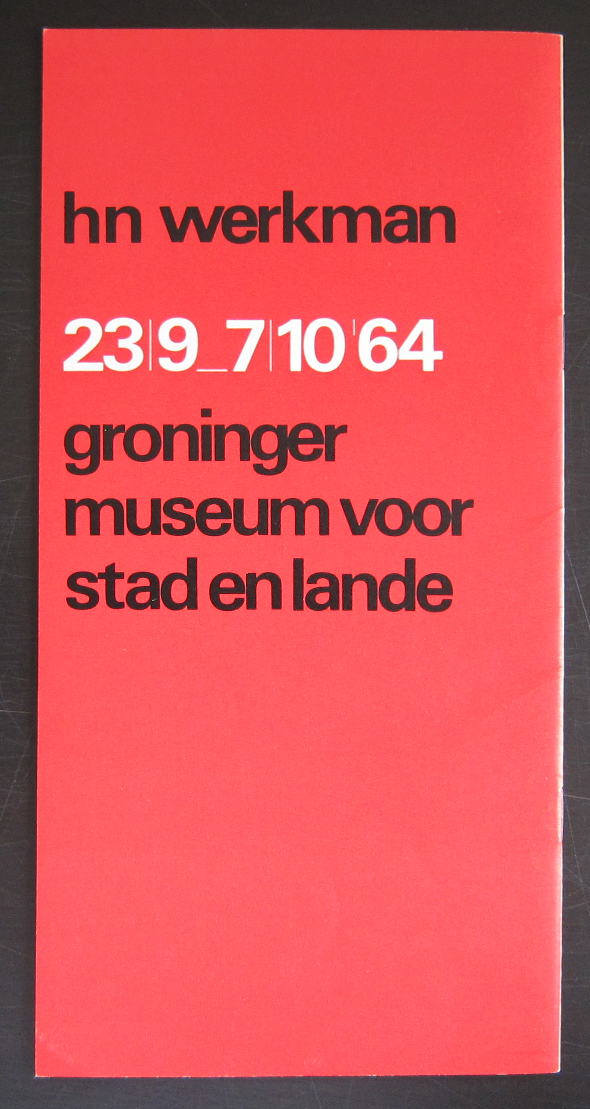
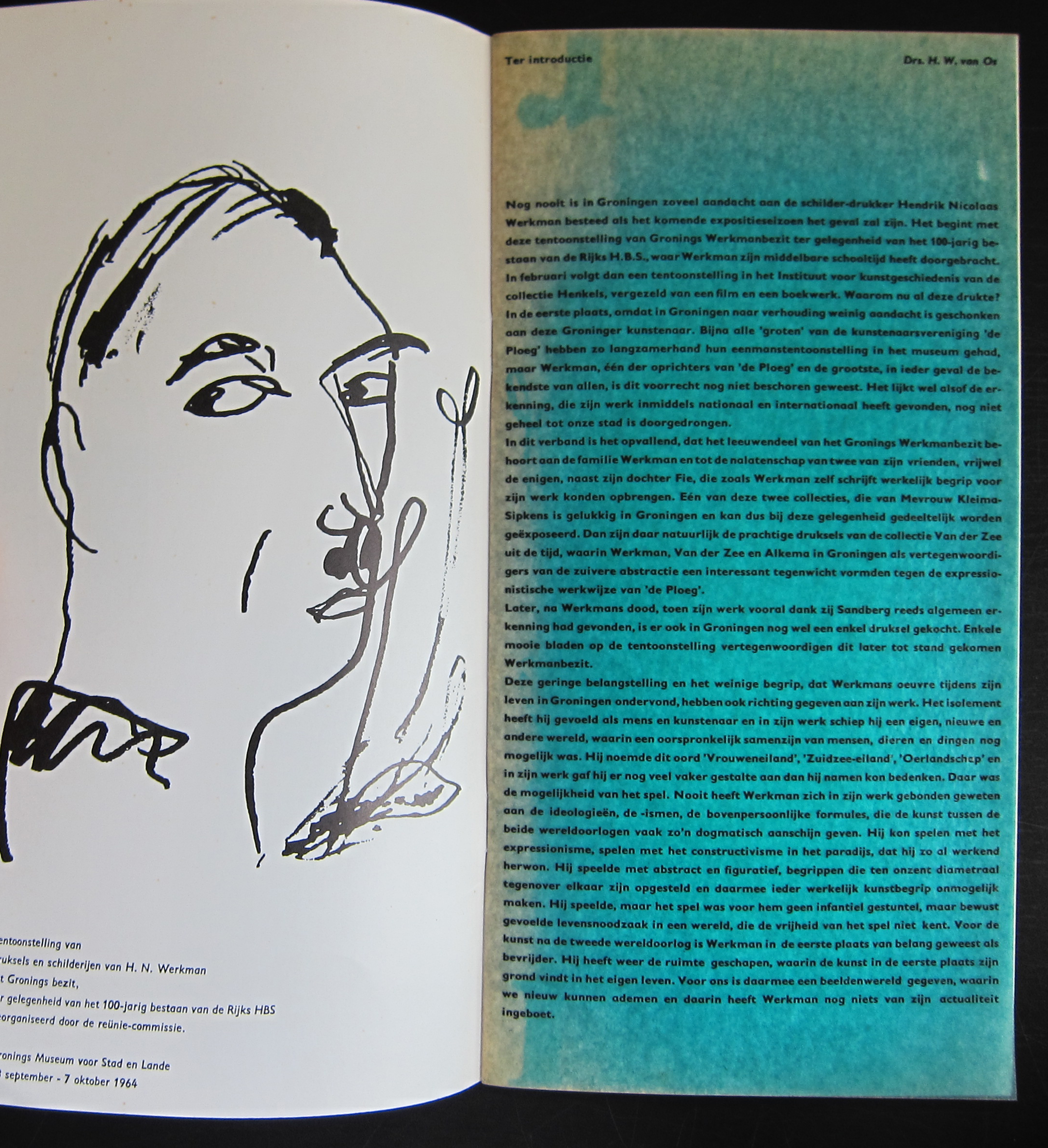
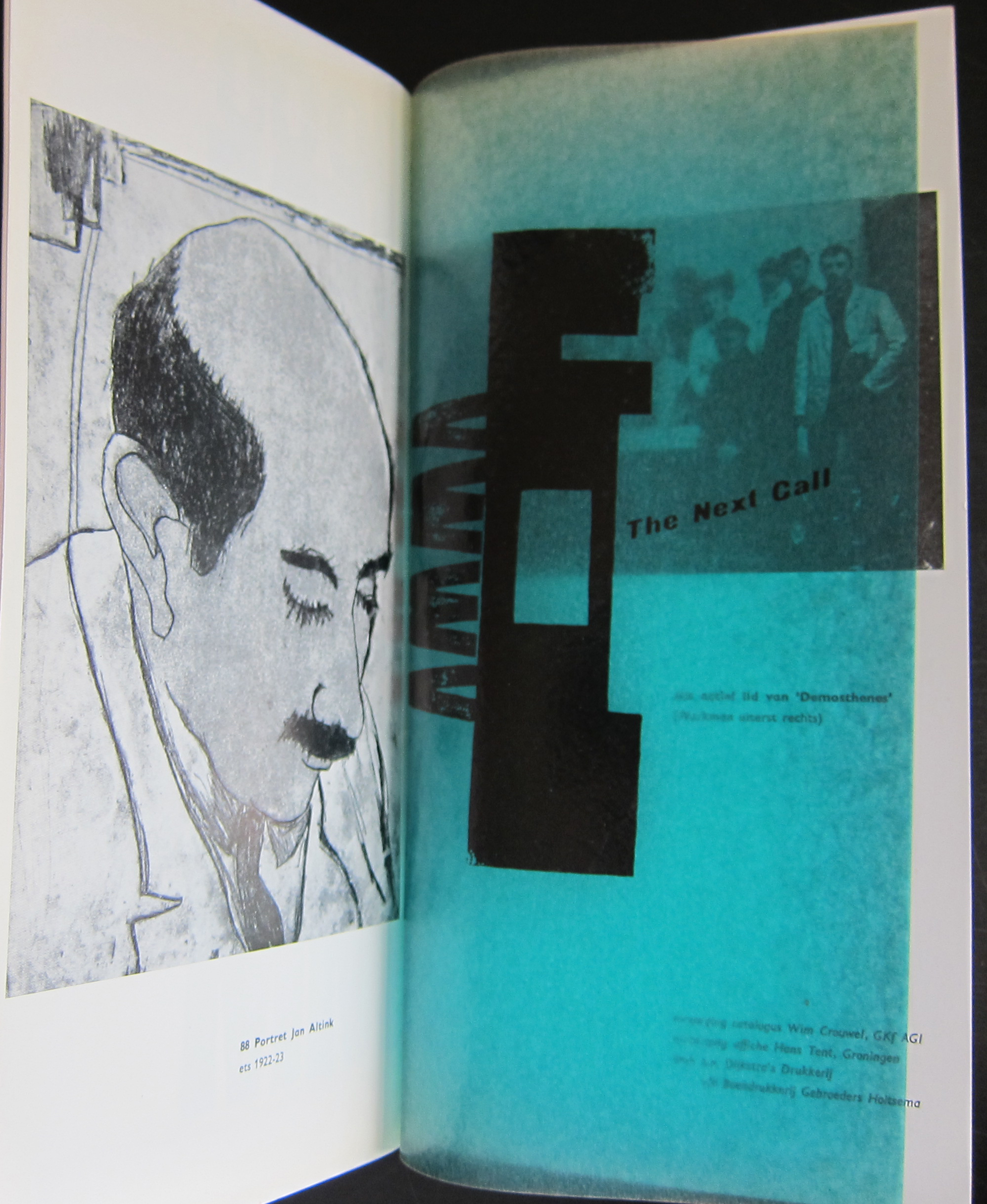
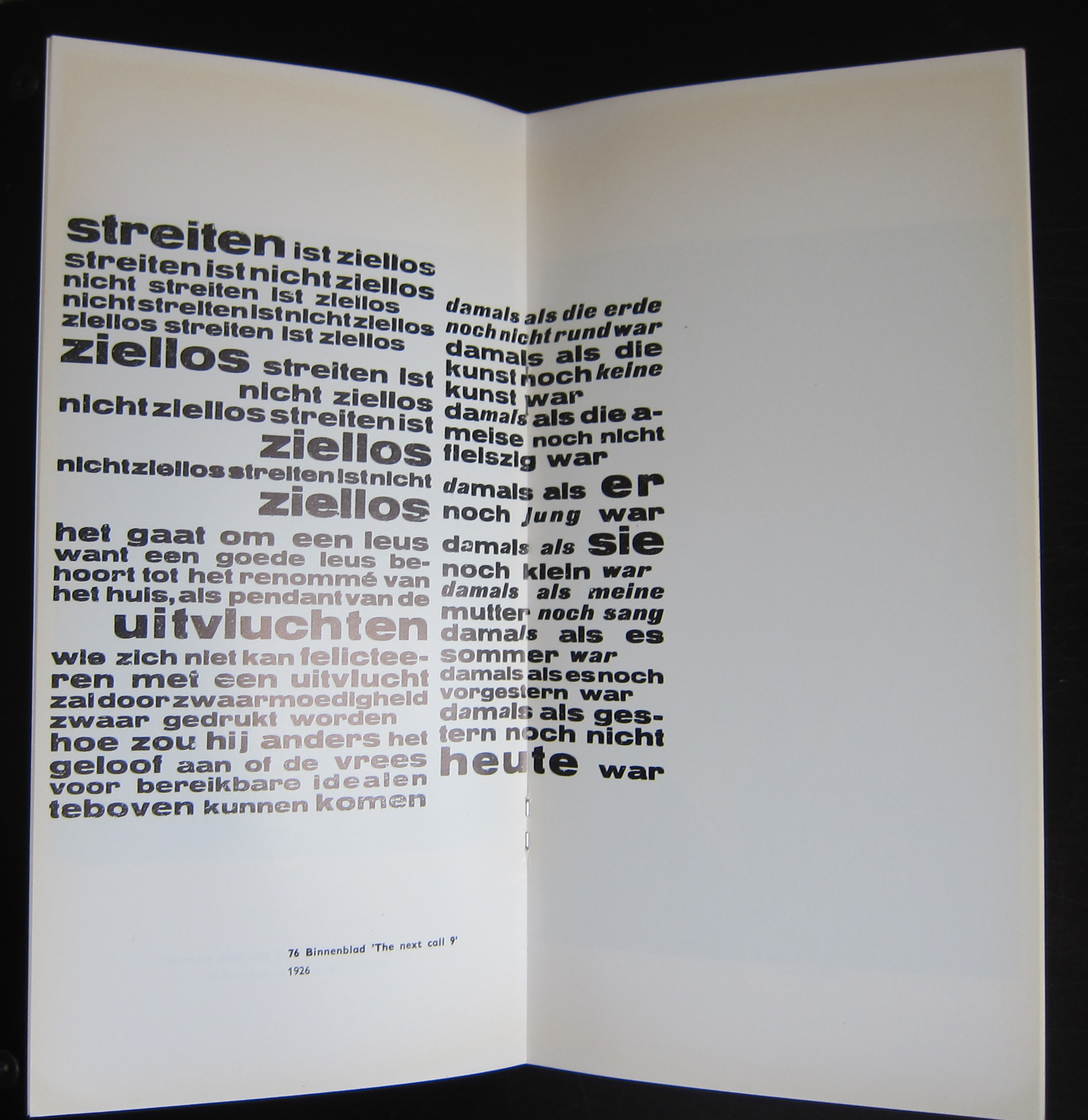
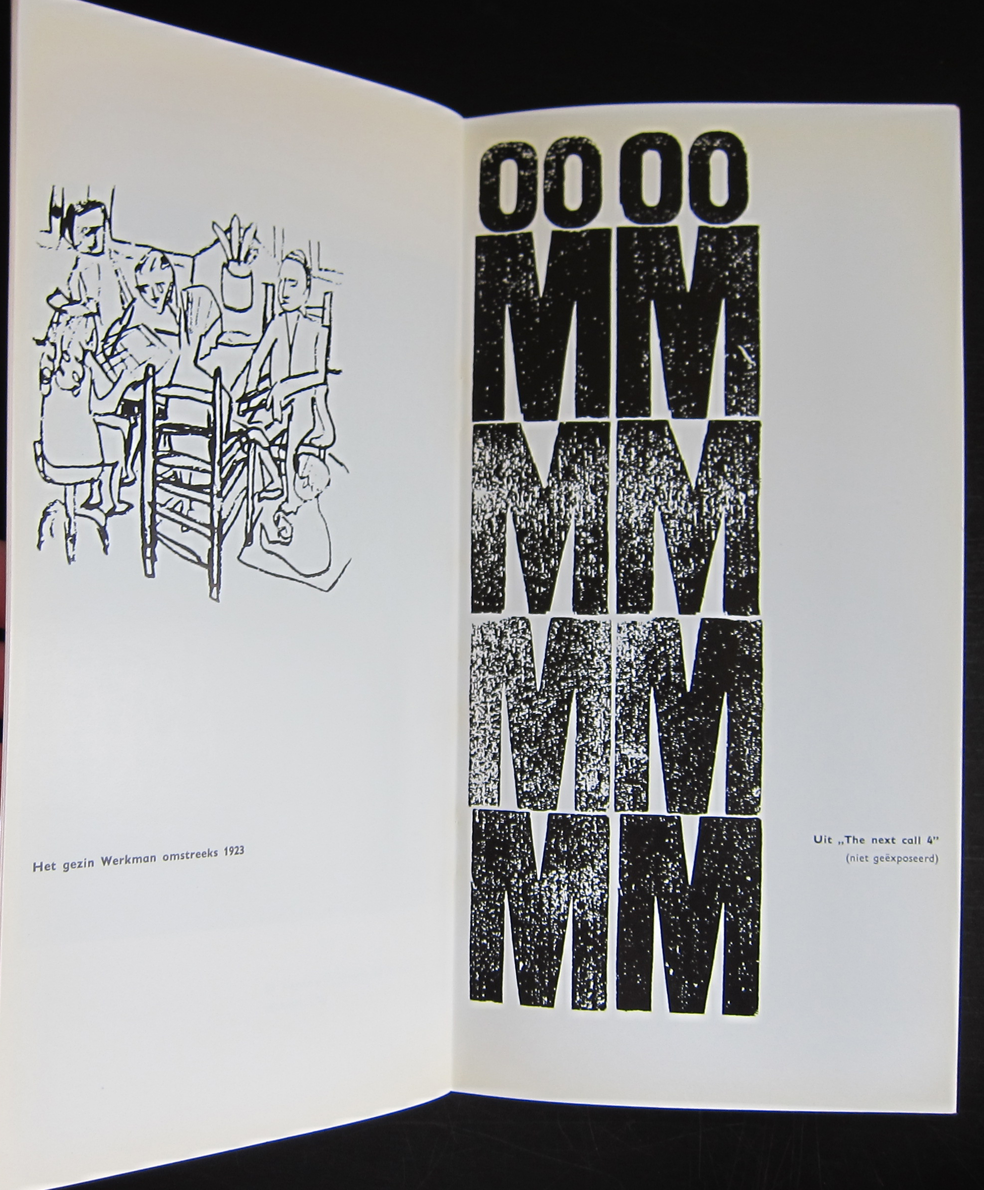
This publication was published on the occasion of the Werkman exhibition in Groningen in 1964 and one of the first designs that Wim Crouwel made for a dutch museum. In this same period he designed the publications for the van Abbemuseum which were followed from the early sixties on by the publications of the Stedelijk Museum. What makes this one special is the condition it is in and the highly unusual appearance. The use of multi colored papers, its odd size and a cover chosen in relation with the Werkman print which is used as a cover. This publication is the top in dutch lay-out and design and must be considered as one of the very best publications of the sixties. Curious?………take a look at
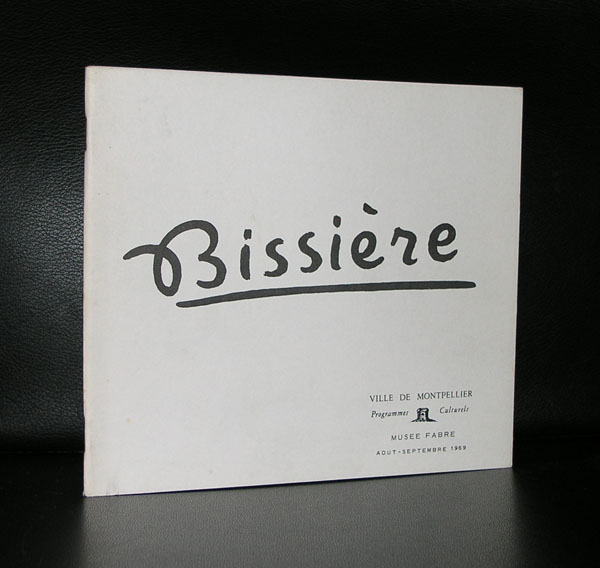
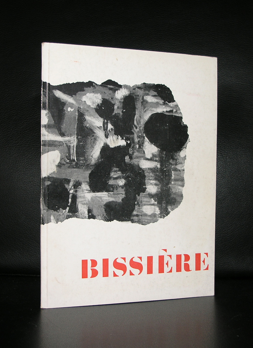
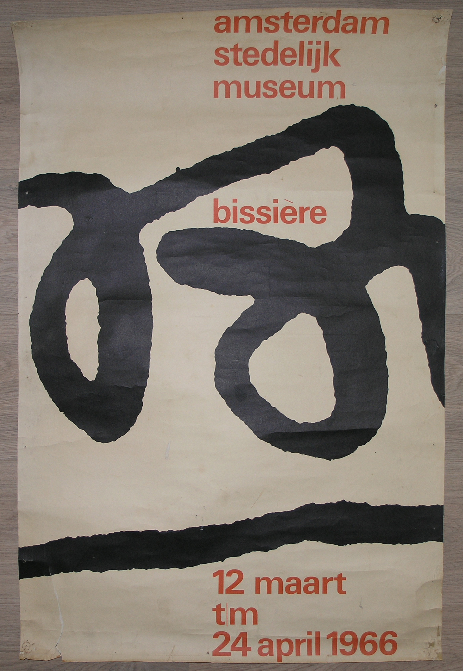
A lyrical abstract artist and related to other abstract French painters like Manessier and Bazaine, Admired by Willem Sandberg , Bissiere received his first Stedelijk Museum exhibition in 1958 and in the early sixties another followed , this time with a spectacular catalogue designed by Wim Crouwel and for me this catalogue is the reason to write this blog, because i find this catalogie one of the very best Wim Crouwel ever made.
Clean, bright with some highly original details, the early smaller size and great typography makes this a Crouwel classic and the art…..well not bad either!
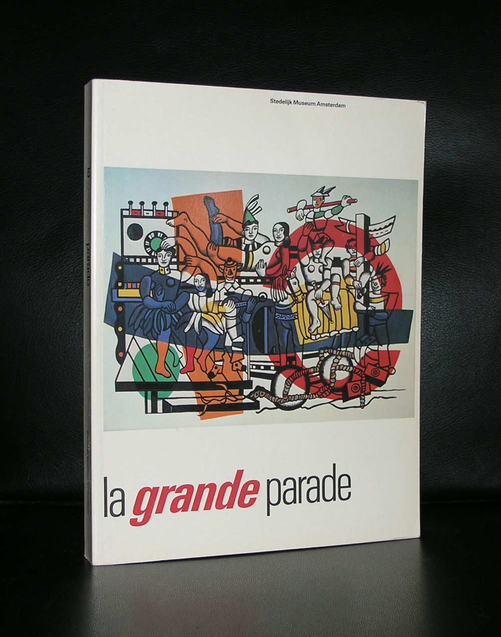
Yesterday i stumbled upon a short note included in one of the catalogues that i have in my collection that the former owner wanted to see the exhibition La GRANDE PARADE in the Stedelijk Museum. I remembered visiting that exhibition and now almost 3 decades ago i realized that this was one of the first blockbuster exhibitions held in the Stedelijk . A great overview of Modern Art from the 20th century curated by Edy de Wilde who showed his special qualities as a collector with this exhibition and said goodbye to this collection as the director of the SM . It has probably the nicest Leger ever made in it and….Willem de Kooning….many many Willem de Kooning paintings ,who is still one of the key artists within te collection of the Stedelijk. Leafing through the catalogue one can only be amazed that so many great art was once in one place. There are not many of these exhibitions any more, because these are far too expensive to organize , but if there is one….go stand in line for a couple of hours and remember in 30 years the exhibition you visited. If it is as good as LE GRANDE PARADE it was well worth the wait. For the catalogues please visit www.ftn-books.com
Artist/ Author: Oliver Boberg
Title : Memorial
Publisher: Oliver Boberg
Measurements: Frame measures 51 x 42 cm. original C print is 35 x 25 cm.
Condition: mint
signed by Oliver Boberg in pen and numbered 14/20 from an edition of 20