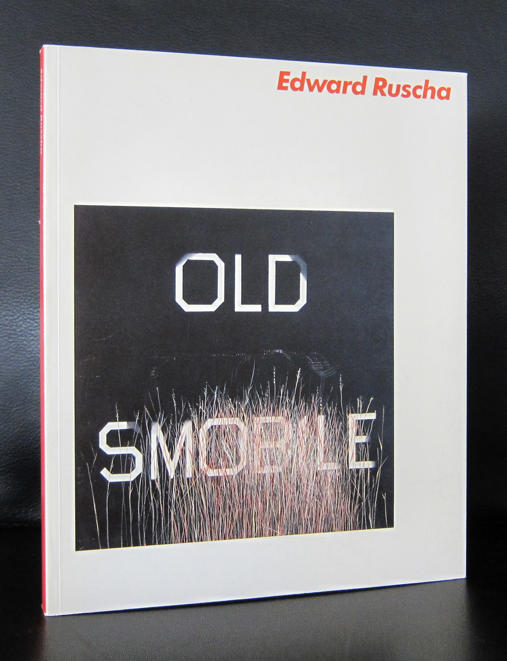
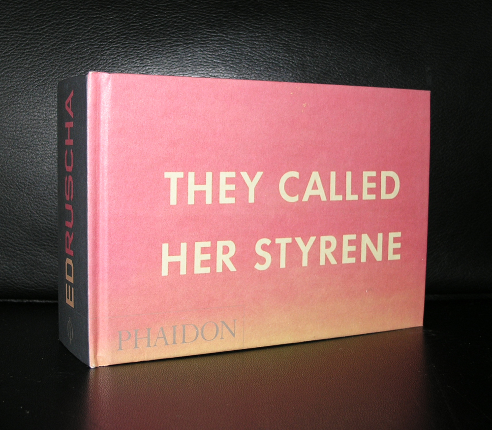
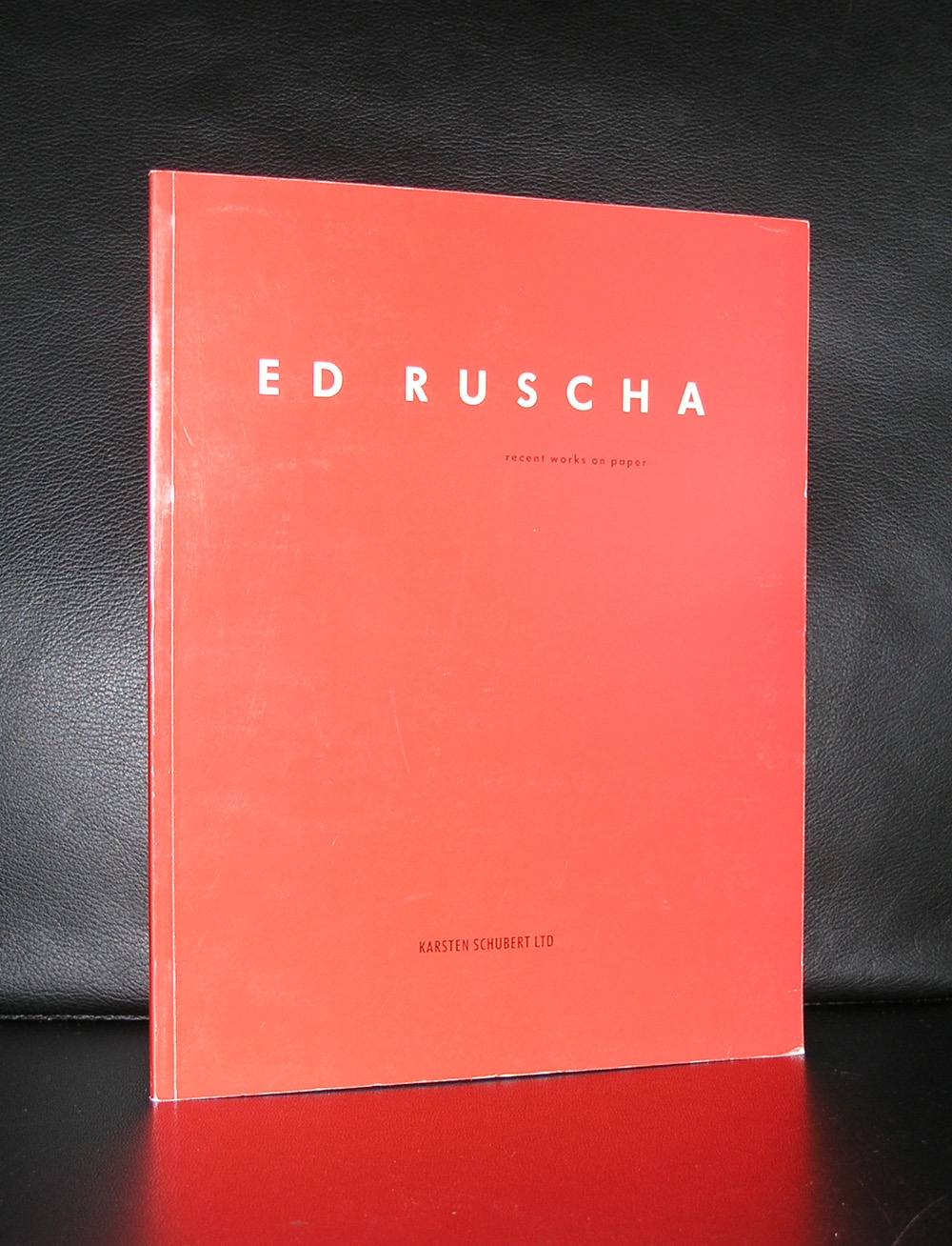
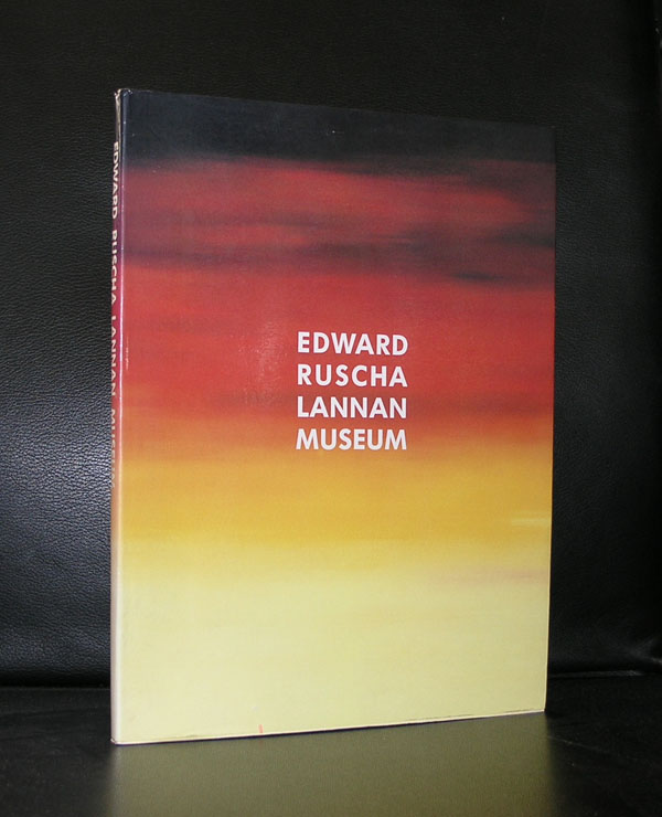
Influenced by Marcel Duchamp, Jasper Johns and H.C. Westermann, Ruscha developed an art form for himself. Ruscha achieved recognition for paintings incorporating words and phrases and for his many photographic books, all influenced by the deadpan irreverence of the Pop Art movement. His textual, flat paintings have been linked with both the Pop Art movement and the beat generation, but for me Edward Ruscha is foremost a Pop Art artist. Possibly this is because one of my favorite Stedelijk Museum catalogues from the Seventies is this 1976 Ruscha catalogue which was designed by Wim Crouwel and filled with typical Pop Art related Ruscha paintings.
Text and image blend into each other , catching your attention with a word or a phrase. Ruscha stayed true to this kind of painting and has since become one of the great names in the world of art. Checking my inventory i found that i have many interesting publications available at www.ftn-books.com. An excellent opportunity to find out why Ruscha is important in the world of contemporary art.
OLYMPUS DIGITAL CAMERA
OLYMPUS DIGITAL CAMERA
OLYMPUS DIGITAL CAMERA
Here is an interesting video on Ed Ruscha by the Tate
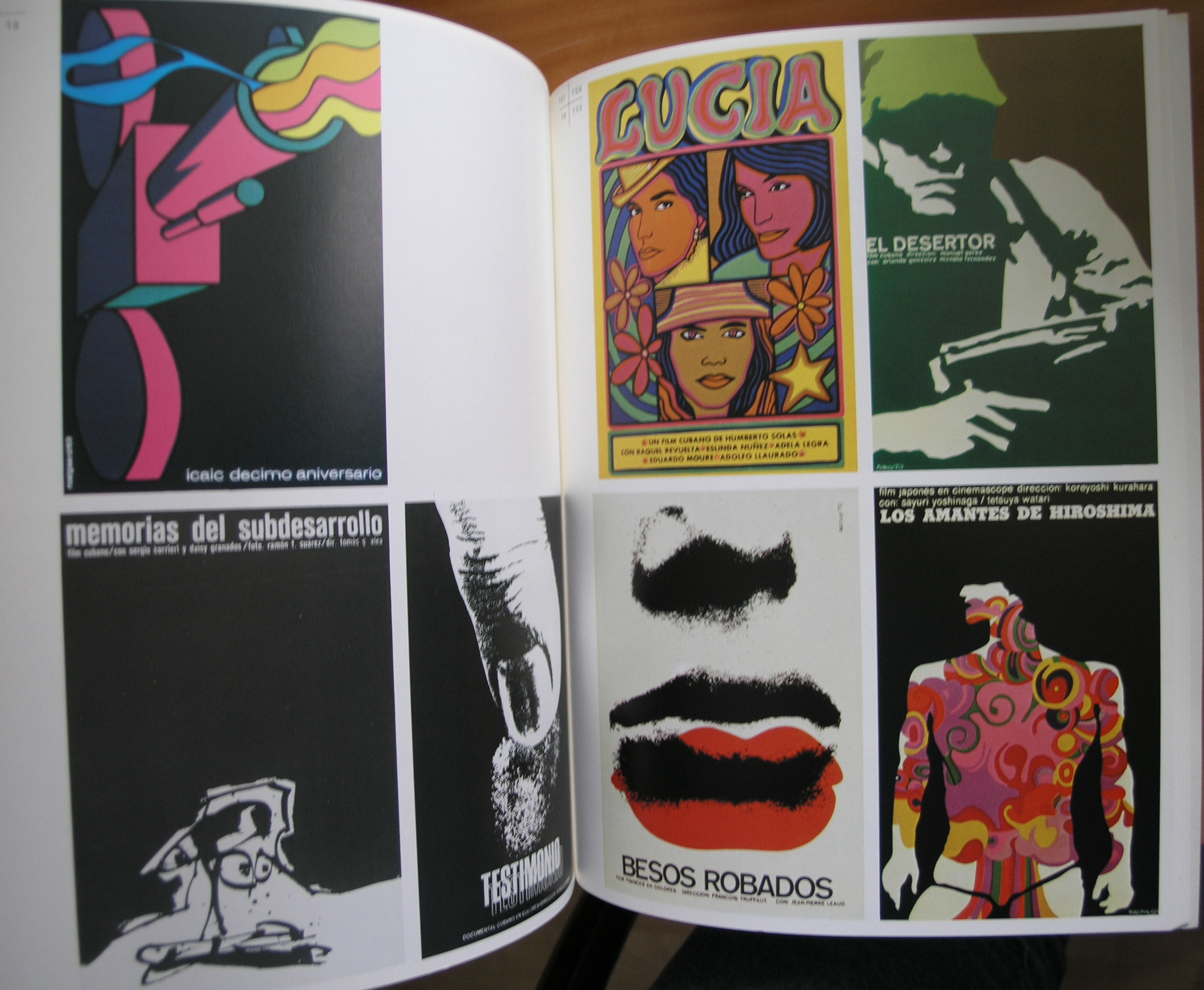
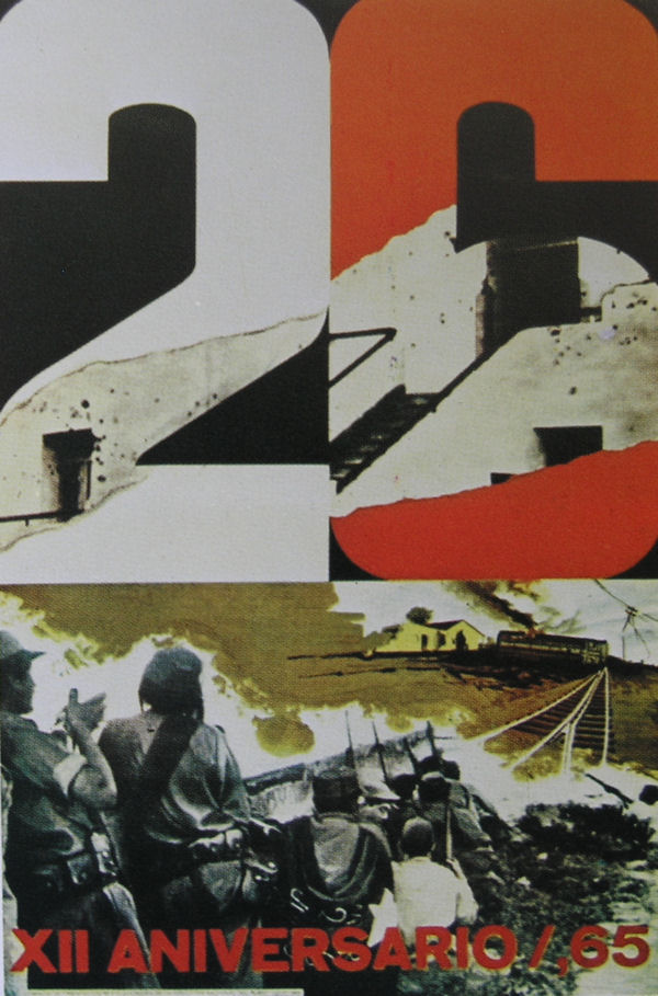
It is 1959 and the end of the Cuban Revolution is celebrated in the town of Havana. Since the beginning of the revolution many posters pro and contra have been published in Cuba and many of them have were great examples of political propaganda. These posters were recognized by the curators of the Stedelijk Museum as being important enough to present them in a special exhibition on Cuban posters. Wim Crouwel was asked to design the catalogue with this exhibition 1971, only 12 years after the end of the revolution .
Because of the power of these posters he decided to use one of the most iconic on the cover. Simplicity all the way. Just the power of the South America shaped fist with simple typography made this one of my favorite catalogues in the seventies of the Stedelijk Museum. Of course it is available at www.ftn-books.com together with many other Stedelijk Museum / Crouwel designed catalogues
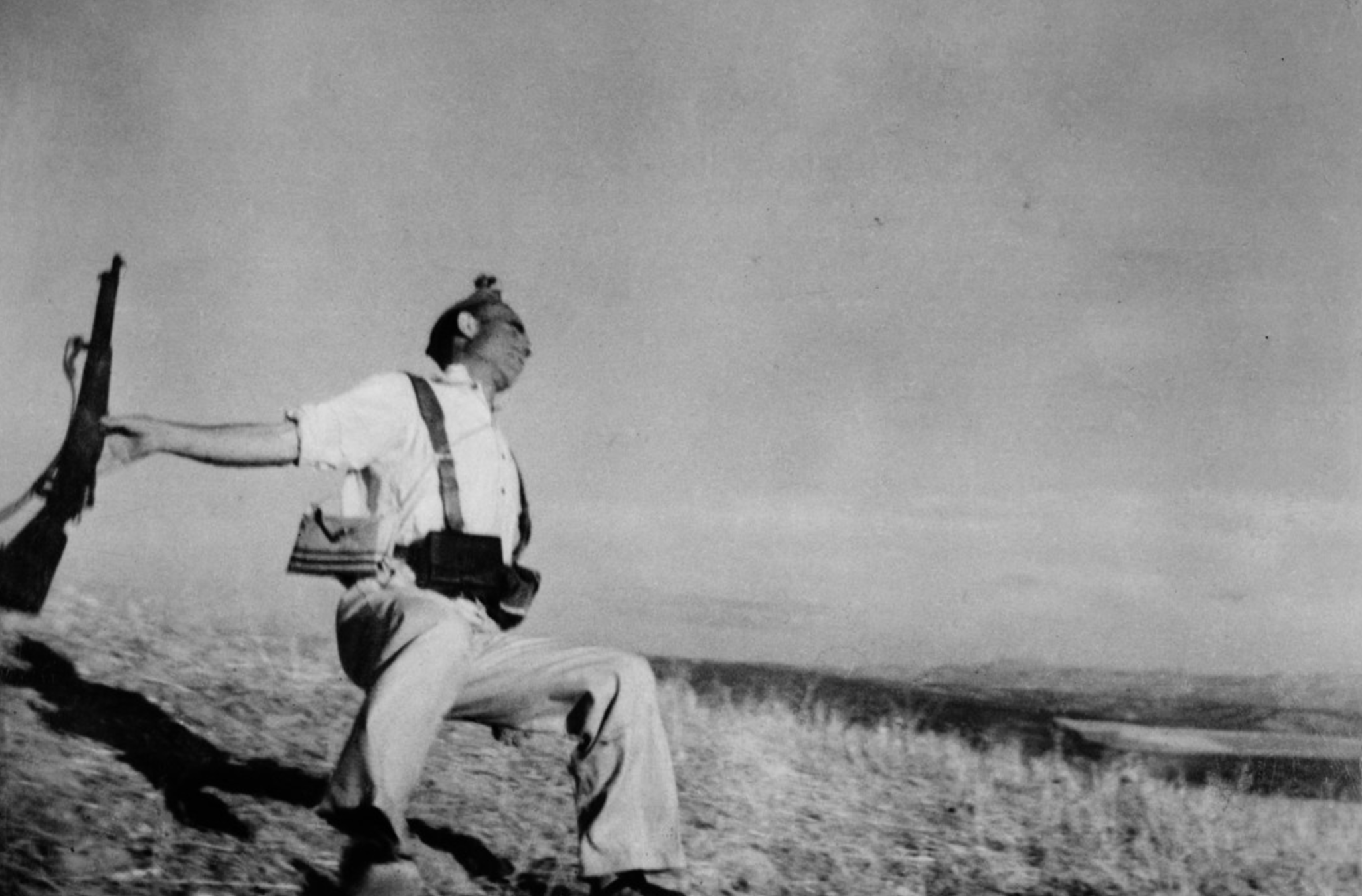
Only 41 years of age , but with an iconic oeuvre he left us.. Some examples of photographs we all have encountered for more than once in your lives. Foremost Capa was a war photographer and left us some iconic photographs. but when you study the Magmum site (https://pro.magnumphotos.com/C.aspx?VP3=CMS3&VF=MAGO31_10_VForm&ERID=24KL535353 ) you discover that beside his war photographs there are some tremendous other photographs to be found within the Magnum archives, but that his most important subject was WAR in all its aspects and cruelties. A true journalist photographer who showed us the cruelties of war . No polished photographs but a raw image of the reality.
What i stumbled upon when searching for material on Capa is that he had an affair with the famous Ingrid bergman. In 1945 after the fall of Nazi Germany, Capa was staying at the Hotel Ritz on Place Vendôme where he met Hollywood actress, Ingrid Bergman. Bergman was traveling around Europe to see the devastation caused by the war, and entertaining the troops. When they met, Bergman was still married to Petter Lindström who she had a baby with. Capa asked Bergman for dinner, and soon after they started to have an affair. In 1946, Bergman asked Capa to come to Hollywood with her, and he did. While Capa was in Hollywood, he visited her at a studio where she was filming, Alfred Hitchcock’s ‘Notorious’. Capa had shot some still photos for the film which he was given no credit for when they were published Hitchcock later made a film with James Stewart and Grace Kelly in 1954, called ‘Rear Window’, loosely based on Capa and Bergman. Bergman wanted to marry Capa and also tried to convince him to quit his job to work in Hollywood. Capa knew that he wouldn’t fit in, and told Bergman that he can’t have a wife and kids because of his duties of work. Their affair ended when Capa left Hollywood for an assignment in Turkey.
There is a great Capa and Magnum publication available at www.ftn-books.com
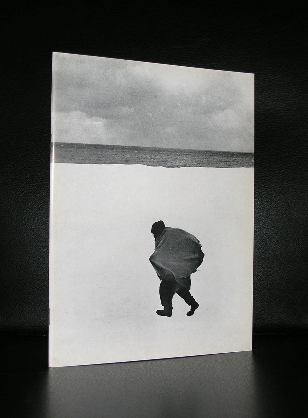
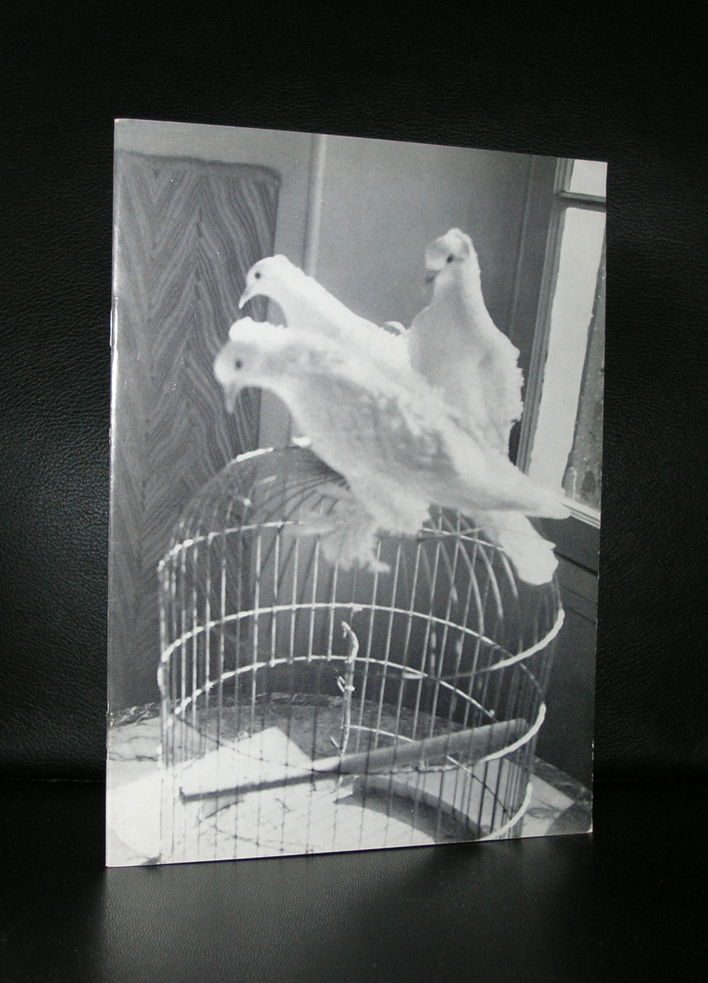
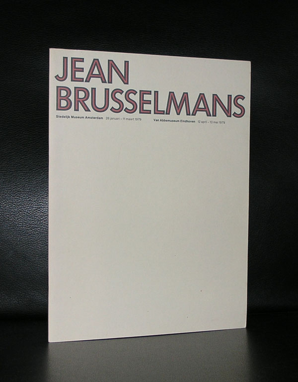
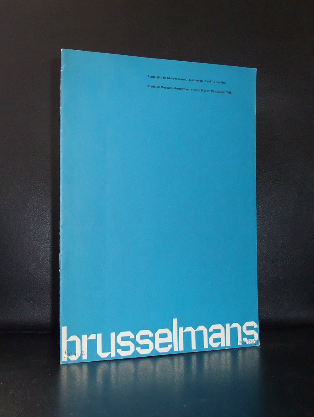
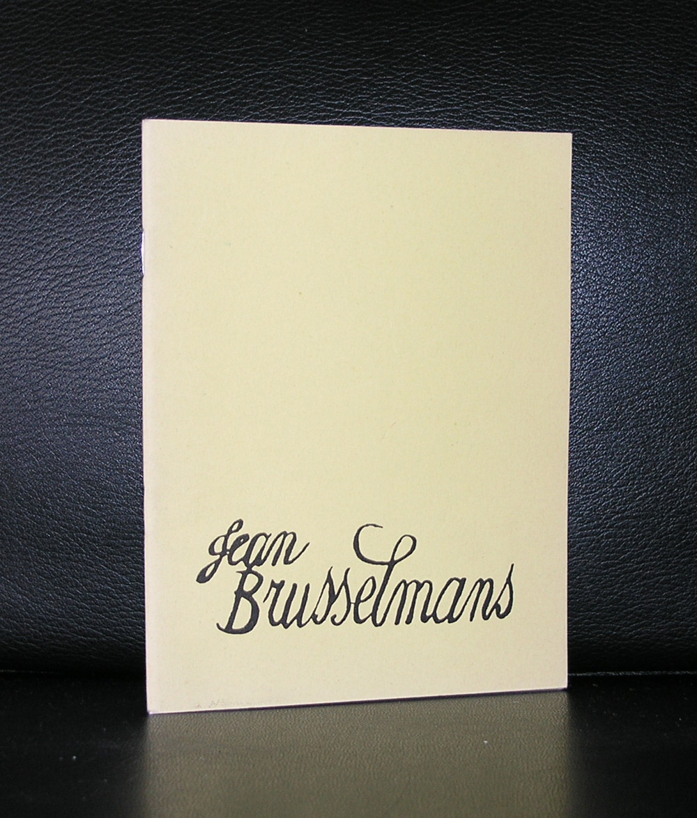
Art Historians have a hard time with Jean Brusselmans. Among them they can not decided wether he is a Fauvist, a Realist or an Impressionist. When you look at his work the first thing that comes in mind is that color and touche are Impressionistic, but look closer and you can distinguish bright Fauve colors which makes the composition a Fauvistic painting.
Perhaps it is best to see that his work is original and that you can recognize it as Jean Brusselmans. Forget the art historians and their division into Art Mouvements. Just look at his work and see that it is Jean Brusselmans.
3 catalogues are available on Brusselmans at www.ftn-books.com of which two are designed by Wim Crouwel
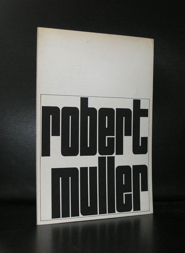
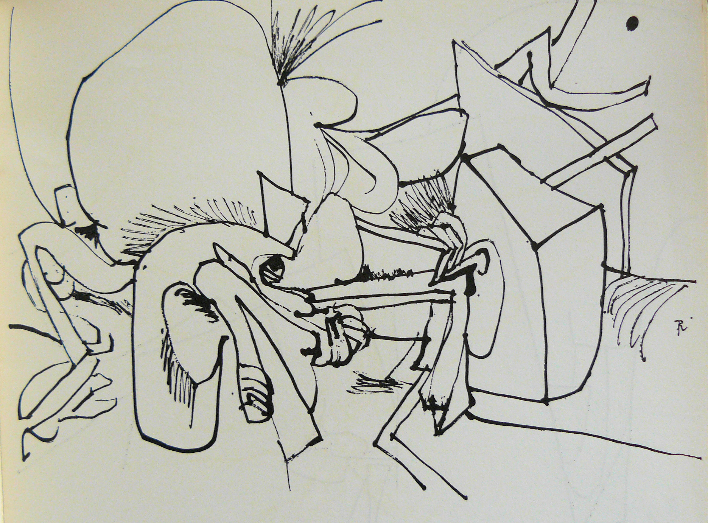
Because of the Robert Mueller that is in the new at these days ai was reminded of the Robert Muller who made some wonderful drawings and sculptures in the sixies and presented those in an exhibition in the Stedelijk Museum in 1968 ( Crouwel designed catalogue).
Try to find some information on Robert Muller at these days and it is almost impossible to find anything except for the books i placed on the internet for sale at www.ftn-books.com. Perhaps Muller is almost forgotten or the other FBI ROBERT MUELLER pushes all information away, but not deservedly. This Robert Muller i admire has made some of the nicest most impressive little sculptures i know of in the sixties and is a typical sixties artist and deserves a place among the best sixties artists.
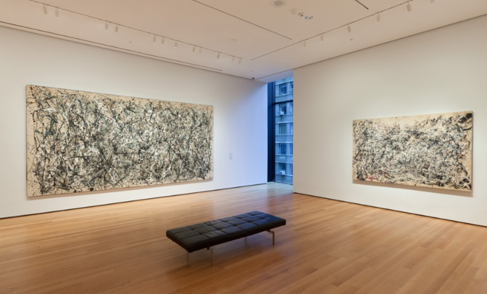
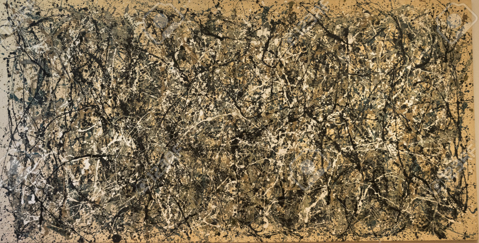
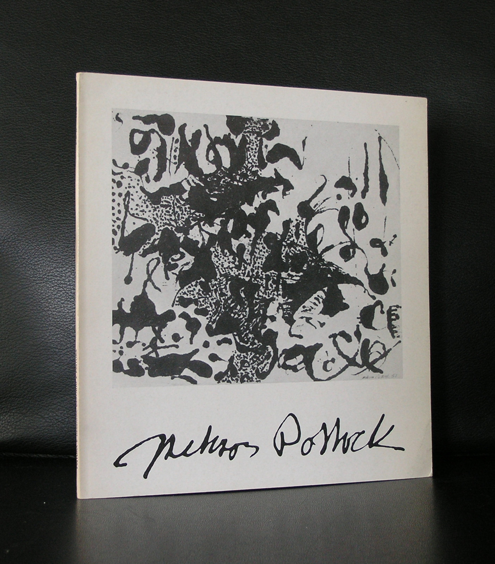
It was 1977. …..the first time i visited the US and went to New York together with my father we visited the museum of Modern Art. In which i saw for the very first time a large Jackson Pollock drip painting. It was an amazing experience and i remember standing in that room …in awe and amazement of such a large , beautiful, impressive, overwhelming abstract painting. The size of it, the spontaneous dripping and the extreme detail when you went close up to it, opened a door to abstract Modern Art for me. Since i have seen many Pollock paintings, but none was so perfect as the very first one i encountered in the Moma. the ONE, number 31, 1950 painting
There are some nice action movies with Pollock painting to be found on Youtube and this is possibly the one that shows best the creating of a Pollock painting.
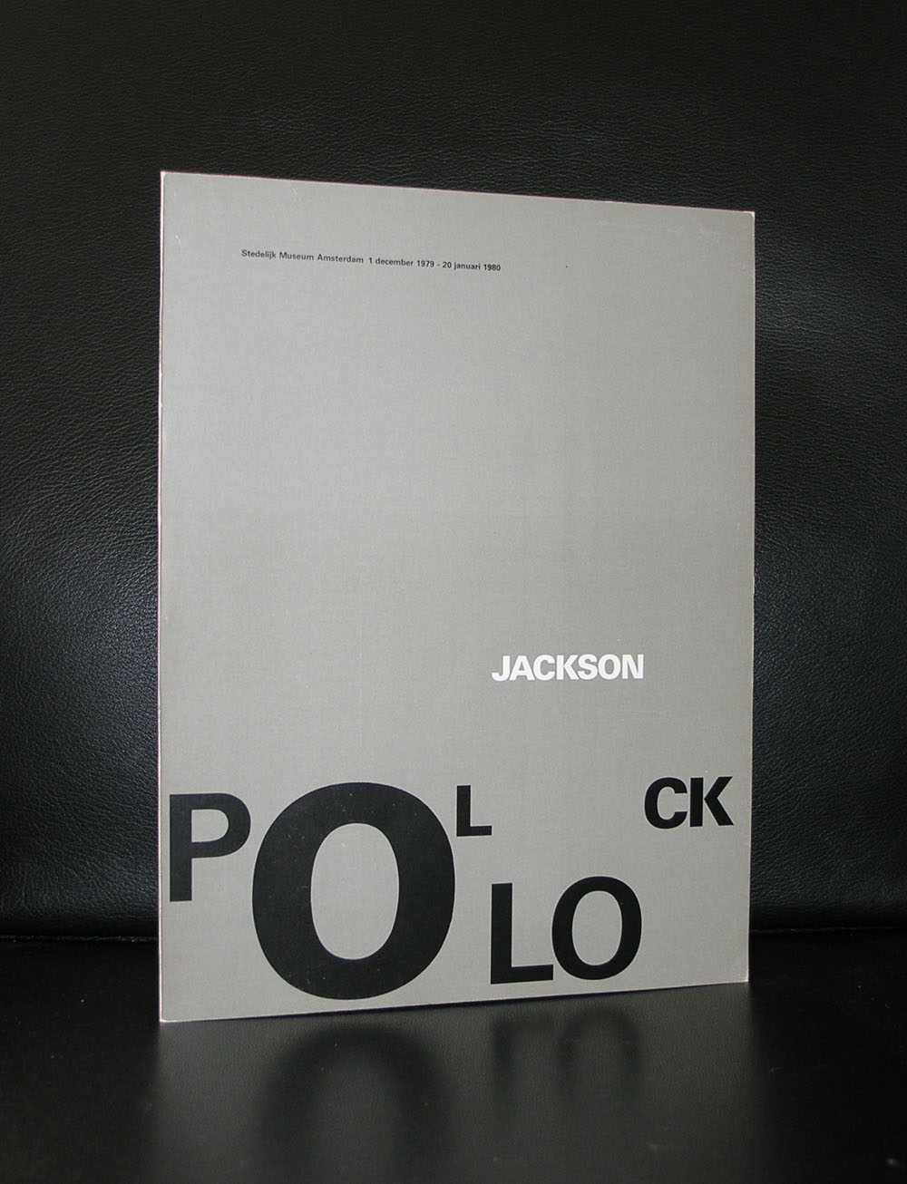
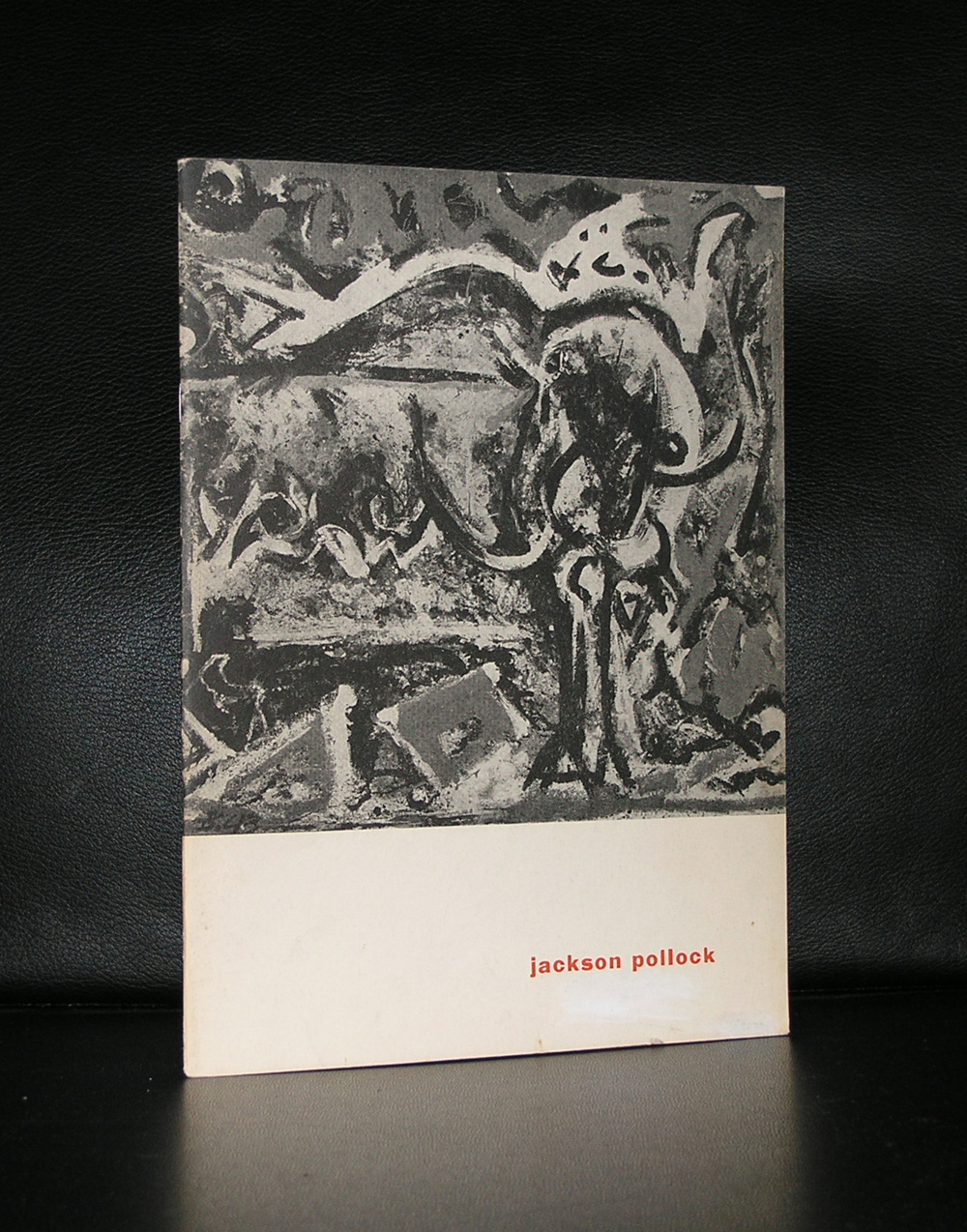
and i am proud to have both Pollock catalogues that were produced for the Pollock exhibitions in the Stedelijk Museum at www.ftn-books.
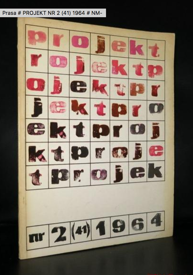
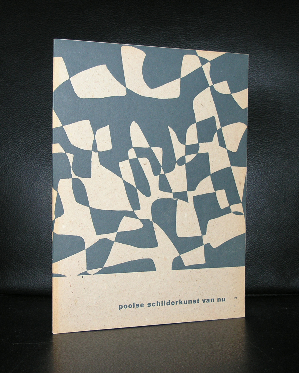
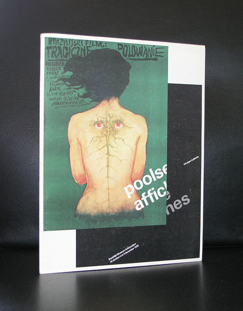
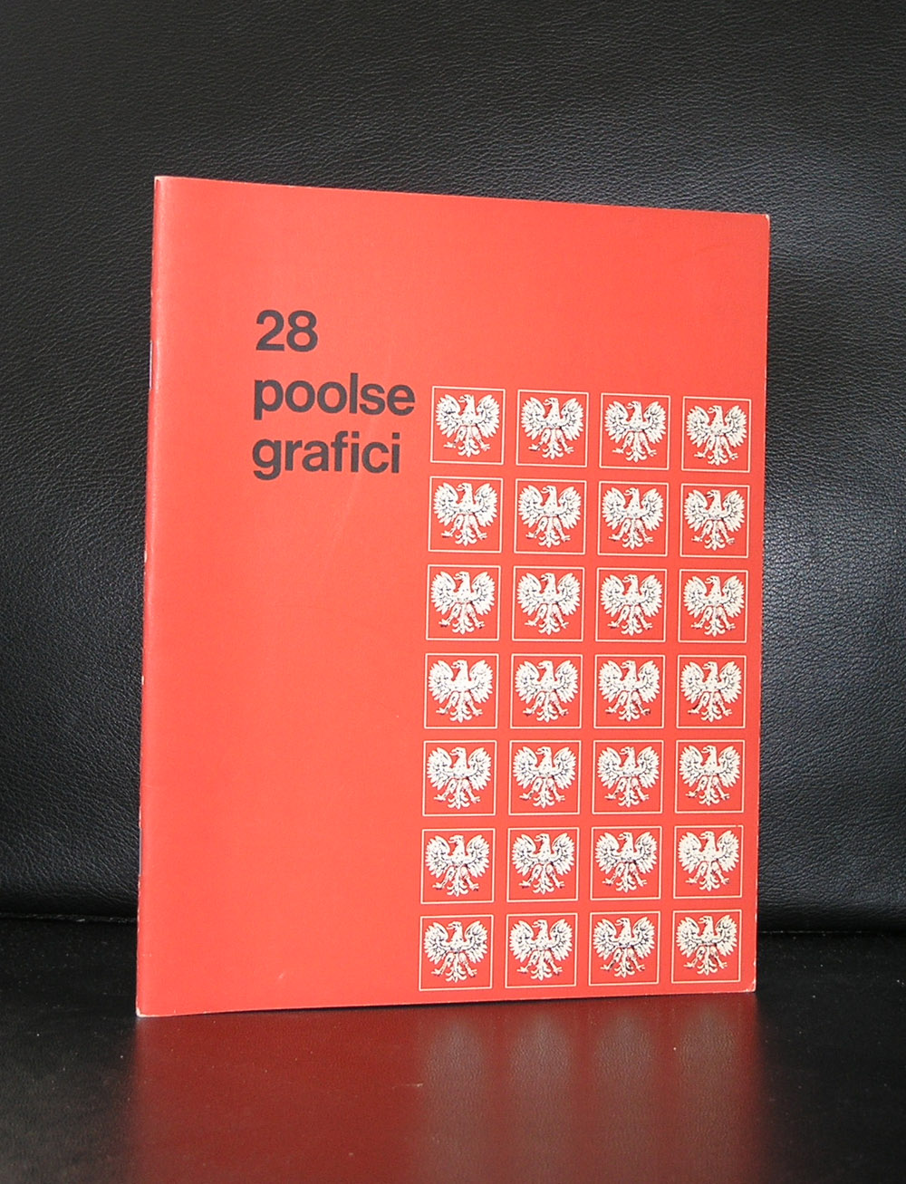
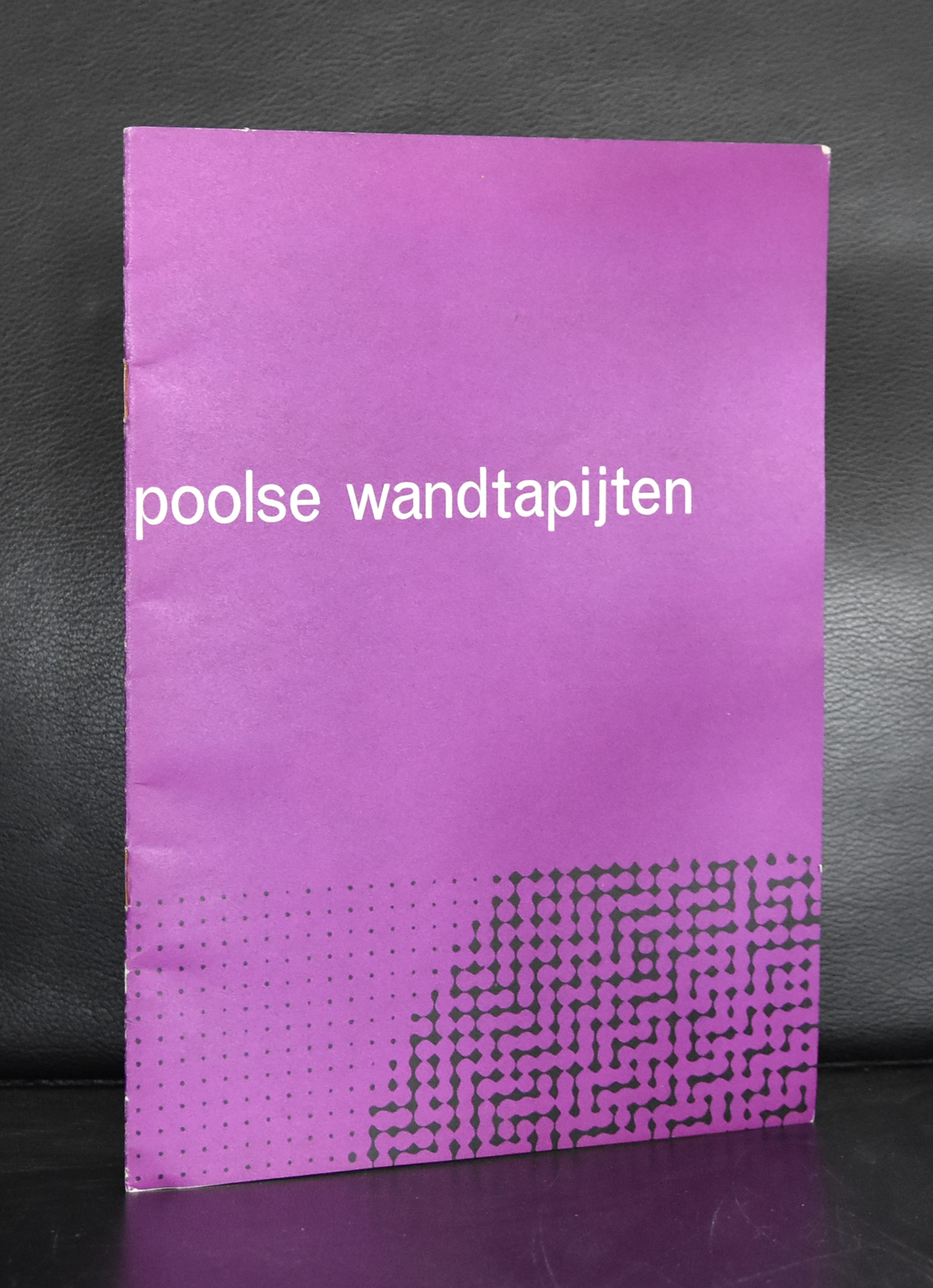
While leafing through my documents, I noticed some very nice and interesting publications from and on Polish art and typography. These are a combination of Russian and western art and typography, making them stand out and being typical for Poland. It is the same with Japanese typography.
A style of typography of its own , but with influences from western typography and design. But back to Poland. This very unique way of design was recognized by Willem Sandberg, who organized an exhibition on Polish posters. Whenever i visit a book) market i always pick them up , because of their appearance and some are worth collecting and selling. Take a look at www.ftn-books.com
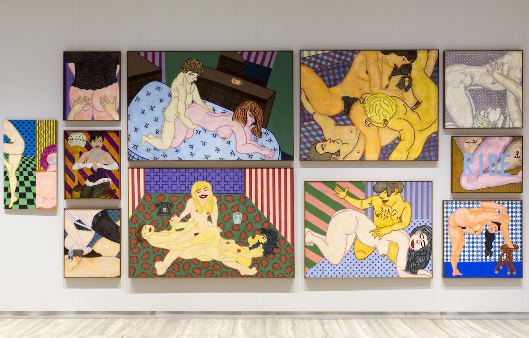
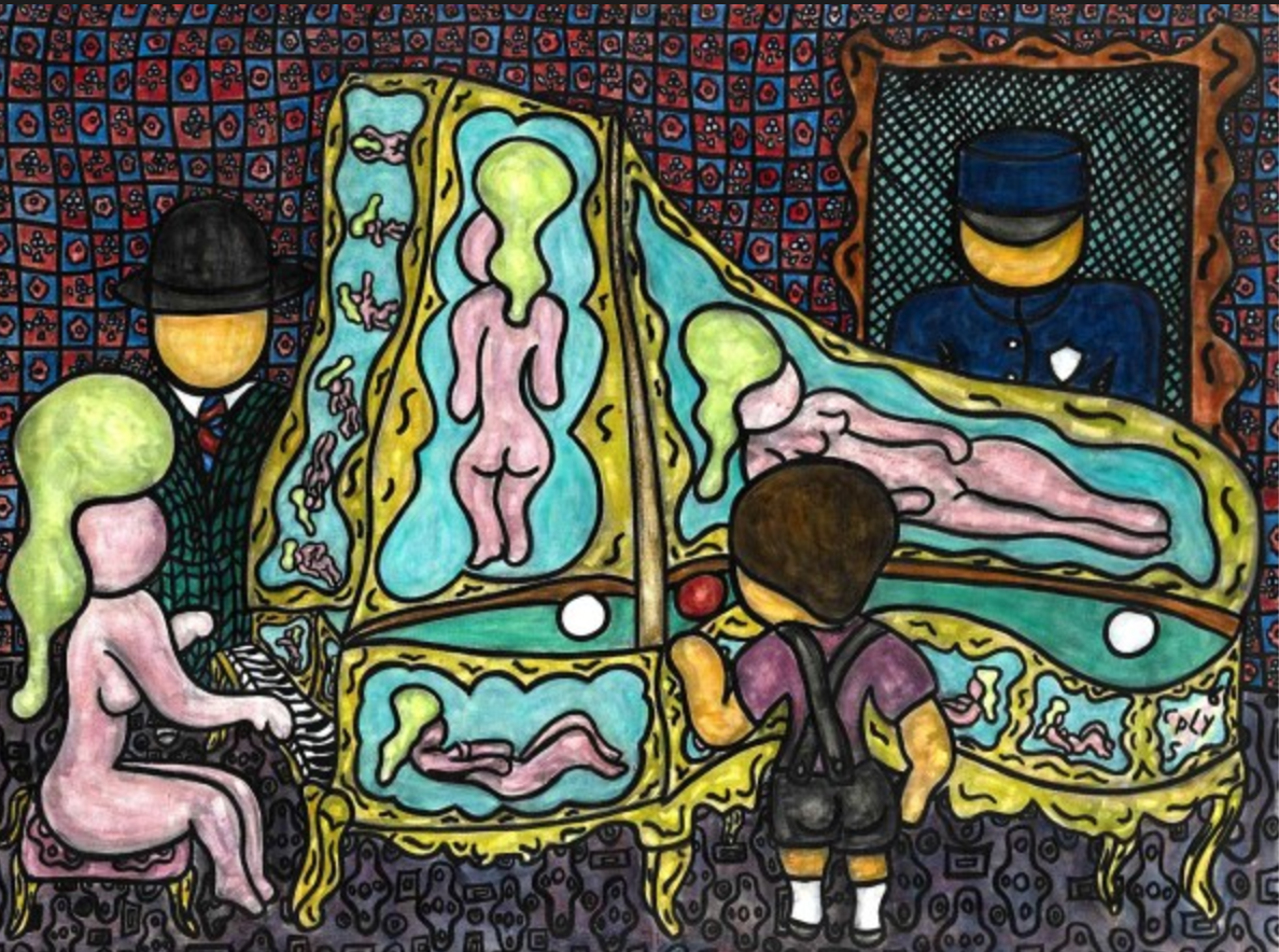
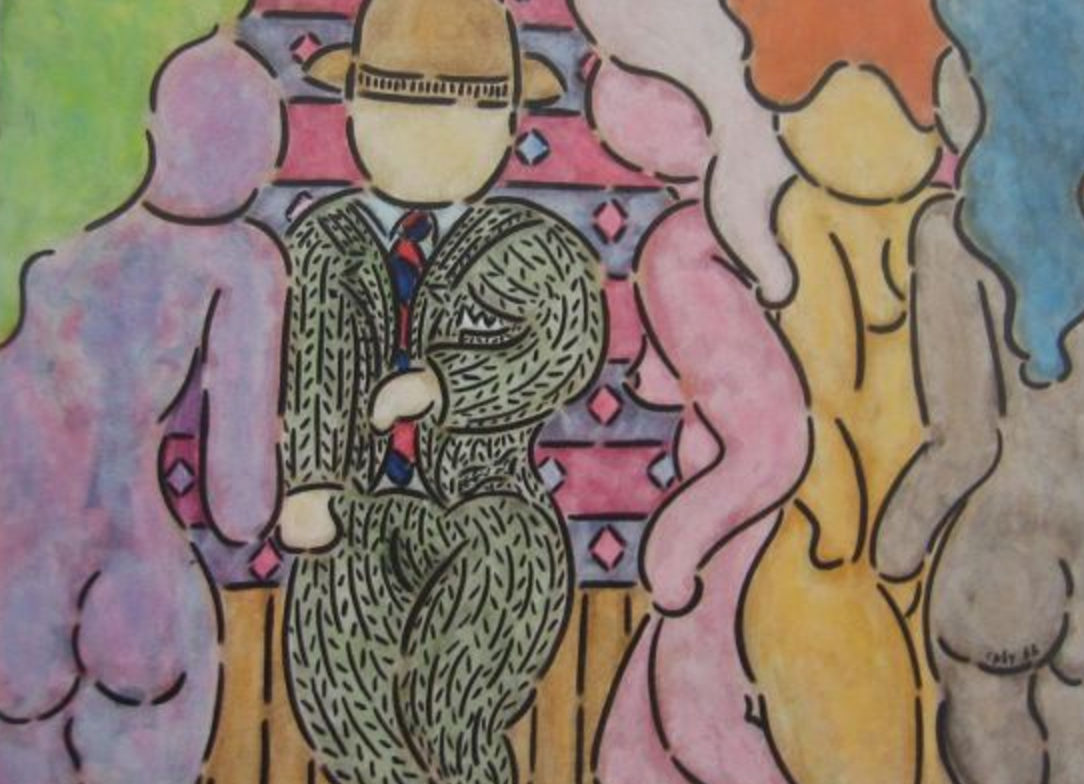
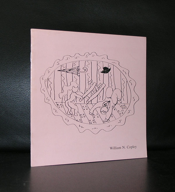
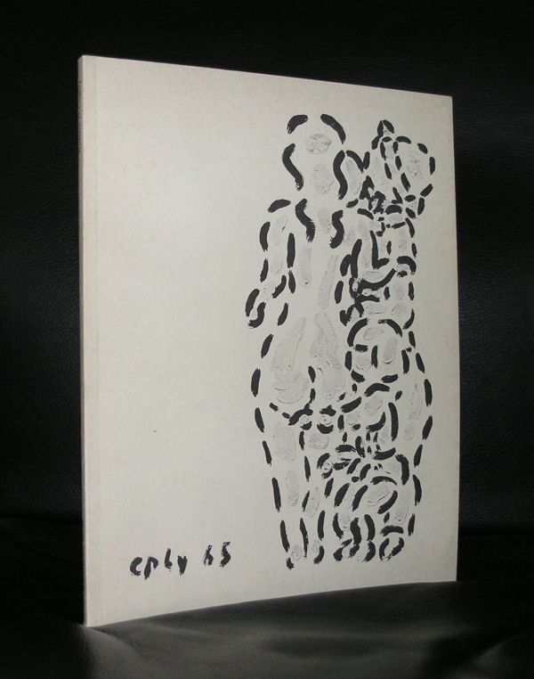
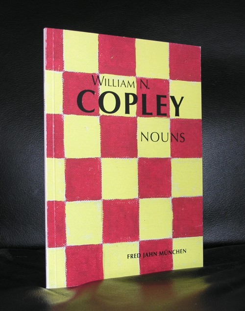
I always believed that Copley was as much appreciated in the US as he was appreciated in the Netherlands and Germany, But the reality must have been different since i read a short article on his life. His sixties works were not appreciated and understood in the US. People thought his work was pornographic, but in Europe there was a different understanding about these works . Here they were thought to be erotic and because of this different approach to these great works, they were presented in a solo exhibition within the Stedelijk Museum Amsterdam in 1966. Accompanied by a great Wim Crouwel catalogue, which is available at www.ftn-books.com.
This appreciation of his art in the Netherlands, must have resulted in the admiration for dutch artist from the sixties and seventies by his daughter Claire who had an influential gallery in the early seventies in which she presented Ader, Dibbets and van Elk who all have become well known outside the Netherlands
If you look at these paintings now you can only ask yourself why these are being found to be pornographic…..These are great “erotic” Pop Art paintings.
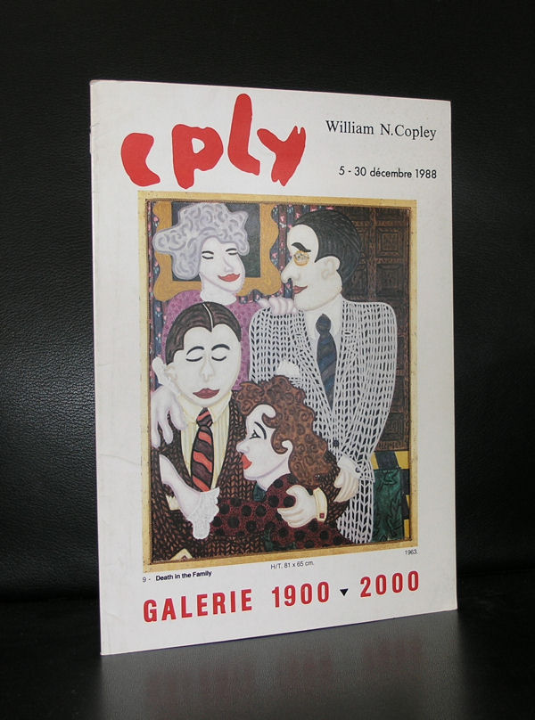
CPLY X-Rated
Copley’s works in the 1970s focused on his own understating of differences and challenges between men and women in romantic and sexual relationships. His works were now erotic, even pornographic. In 1974 he exhibited these new works at what was then the New York Cultural Center in Columbus Circle, New York in a show titled “CPLY X-Rated.” These pieces were a sudden change from his previous romantic whimsical periods. The American public had difficulty with the material, for which Copley expressed, “Americans… don’t know the difference between eroticism and pornography. Because eroticism has always existed in art. And pornography has never necessarily been in art. Copley’s experienced greater feedback in Europe, where the work was then well received. In conjunction with the New York Cultural Center Show there was a special “CPLY X-Rated Poster and Catalog.
The Claire S. Copley Gallery was a Los Angeles gallery on La Cienega Boulevard that existed from 1973-1977. Together with the galleries of Eugenia Butler, Rolf Nelson, Nick Wilder, and Riko Mizuno, the Claire Copley Gallery played an important role in the Los Angeles art scene of the 1960s and 1970sThe gallery provided a venue for emerging American and European minimalist and Conceptual artists, among them Bas Jan Ader, Terry Allen, Michael Asher, Daniel Buren, Jan Dibbets, Ger Van Elk, On Kawara, Joseph Kosuth, avid Lamelas, William Leavitt, Allan McCollum, and Allen Ruppersberg. ( part of the above information was found on Wikipedia)
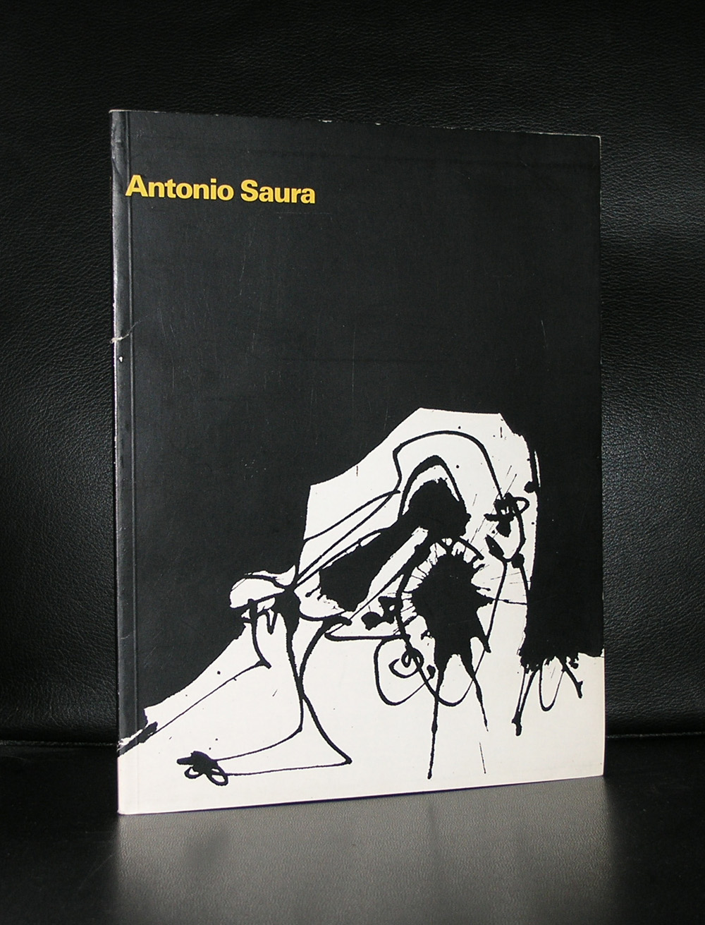
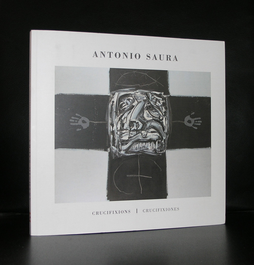
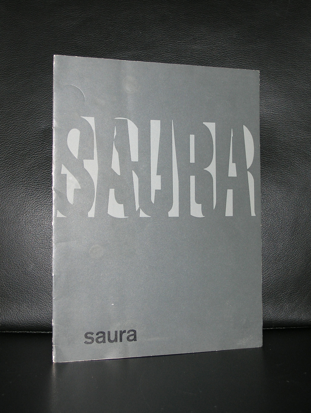
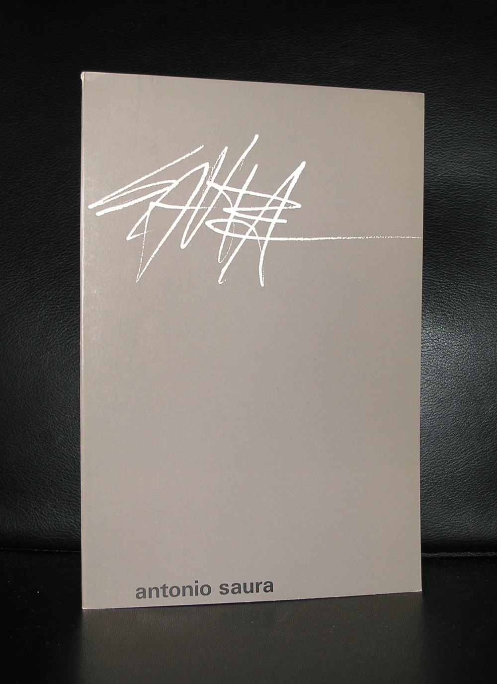
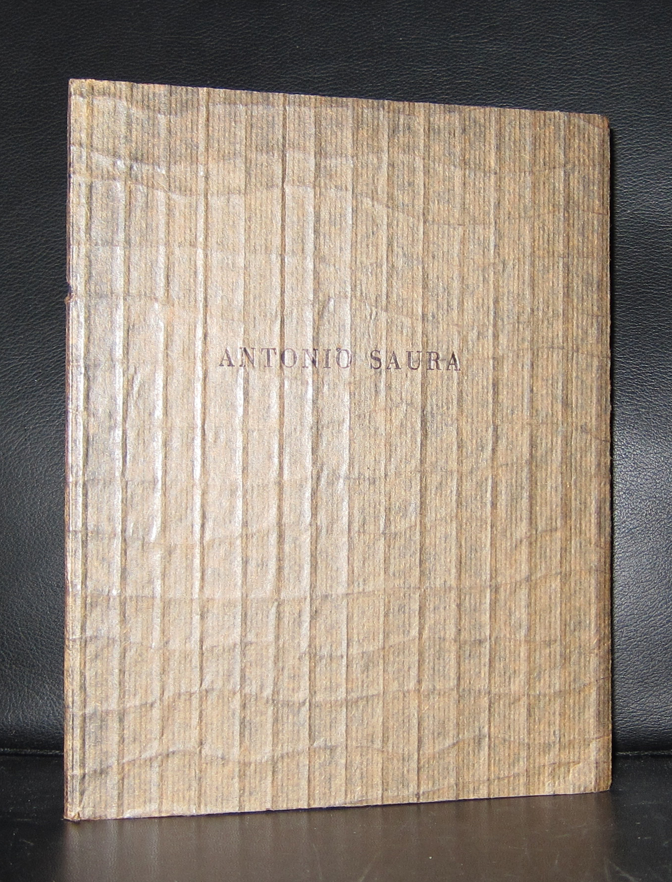
When you mix Jackson Pollock with Jean Dubuffet with a topping of a little bit Picasso you get Antonio Saura. Abstraction at his best, because within the composition one always can recognize something realistic. A face , a body , some houses they are all there if you find the rest to study these great paintings. This is not simple, easy art, but it needs to be savored in a slow way. Because the fist impression is chaos, one tends to walk away from it, but just give it a minute or two and the paintings opens up to you.
La grande foule, 1963, oil on canvas, 220 x 515 cm
It is a pity that there are so few of these fascinating Saura paintings in the Netherlands, but once you have a chance to visit the modern art museums in Spain they are easy to spot and to enjoy. www.ftn-books.com is fortunate to have a nice selection of books on Saura including the Stedelijk Museum catalogue by Wim Crouwel.
Abstract Expressionism and even the dutch version of the drip paintings by Pollock, that for me is the meaning of Gerard Leonard van den Eerenbeemt, who even had a solo exhibition at the Stedelijk Museum Amsterdam ( 1970, supported by a very nice catalogue designed by Wim Crouwel.
Why mentioning van den Eerenbeemt. First because he has a unique style of his own and deserves to become better known outside the Netherlands and secondly because i am auctioning this coming weeks an extremely nice abstract drawing in black ink at www.kunstveiling.nl
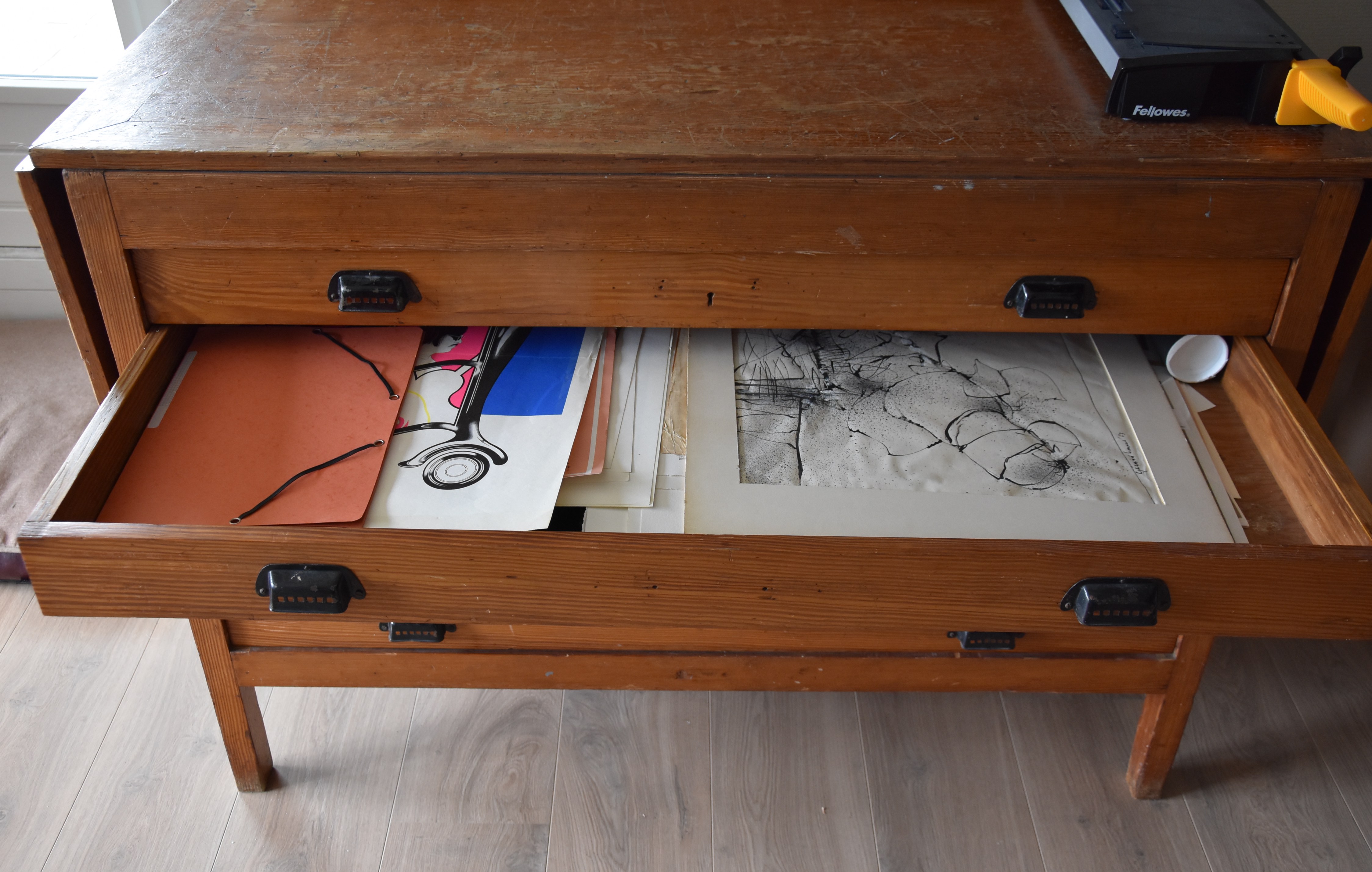
What makes this auction important is the fact that in 1988 his studio with his complete oeuvre and archives was burnt down to the ground, leaving only some 100 drawings in the collection of the Stedelijk Museum Amsterdam and some drawings and paintings in private collections. This makes his work scarce and because of its quality highly desirable and collectable. Please take a look at the auction and of course there is this nice Crouwel publication available at www. ftn-books.com
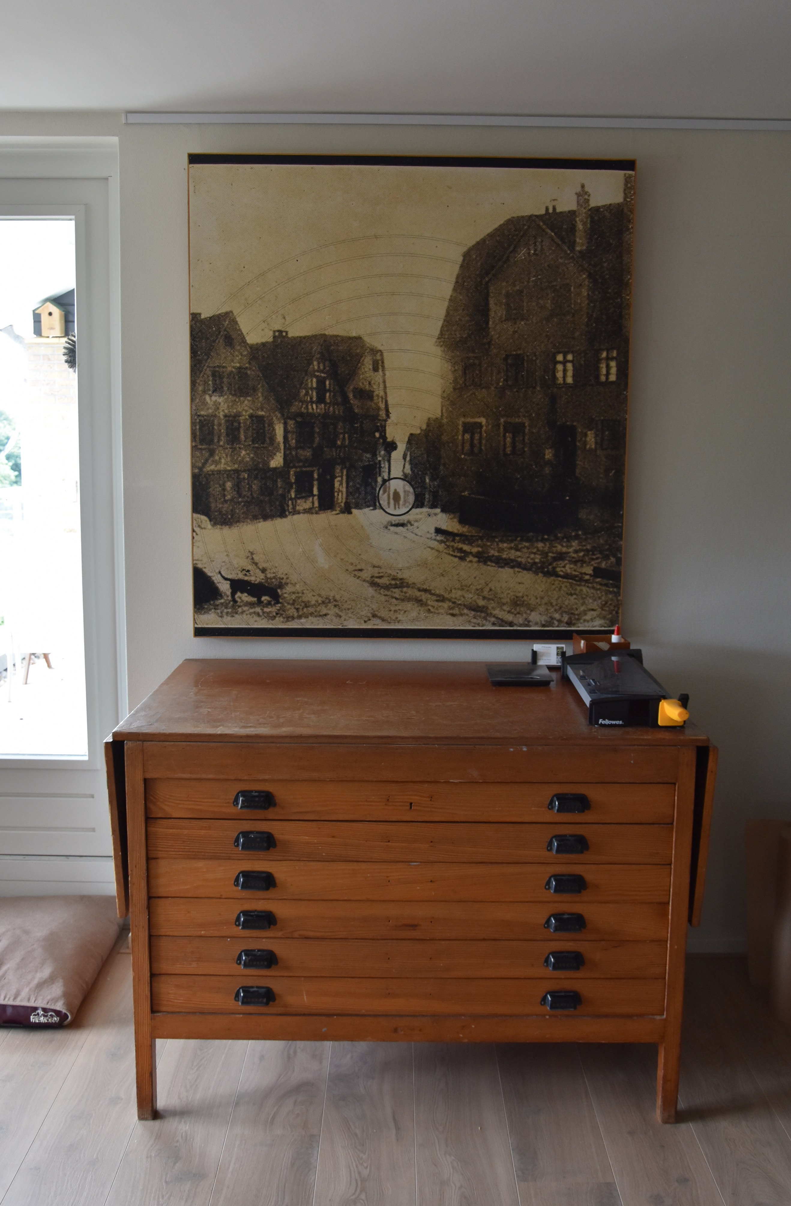
BTW. As you can see the drawing is kept/ flat in a drawer of my “new” acquisition. An “antique” drawings dresser which was formally used in a convent in Bergen op Zoom. I found this on Marktplaats and since, my offices have become much more organized . The picture above it is by Ossip (1953).
Artist/ Author: Oliver Boberg
Title : Memorial
Publisher: Oliver Boberg
Measurements: Frame measures 51 x 42 cm. original C print is 35 x 25 cm.
Condition: mint
signed by Oliver Boberg in pen and numbered 14/20 from an edition of 20