Posted on Leave a comment

Betsabee Romero (1963)

Schermafbeelding 2020-06-05 om 14.42.55

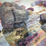
Cars and Tyres. These are the two elements that appear in Romero’s art practically all the time. Covered tyres, ripped tyres, flat tyres……..

This art reminded me of a story my wife told me. The first time she visited New York she was at the Museum of Modern Art and visited a room filled with tyres, she turned around …..she could not understand how this could be art. Since a lot has she changed and we both visited many museum and galleries and even the most extreme art is appreciated. I wonder if she returned to MOMA if she would think the same about the art presented to her. This not an easy form of art which can be consumed like fast food. You have to study the artist a little and when you finally see her art for real it impresses.

Schermafbeelding 2020-06-05 om 14.52.53

Her work can be seen as her response to the issues and problems that she witnesses in the world around her> She succeeds impressively in interweaving reality at the local level with reflections on global developments. The CARS AND TRACES catalogue is now available at www.ftn-books.com

betsabee romero

Posted on Leave a comment

Gary Hume (1962)

Schermafbeelding 2020-09-10 om 16.14.08

The first Gary Hume original i ever saw was the Momart Xmas special he made in 2000. Momart published FUZZY SNOWMAN in an unknown sized edition. But I immediately recognized the quality of the multiple and the artist. Since i have been following his career.

“The snowman is an image to which Gary Hume often returns. His screen print Snowman of 1996 presents a bold orange and brown snowman ‘aglow against a soft sunset pink’. The painting Snowman of 1996 was a brown and red snowman against a rich blue background. Fuzzy Snowman [the present work] is icier with two white circles on a cool blue ground. It is a do-it-yourself artwork with a fuzzy ground an detachable felt pieces. For Hume the snowman is a self-portrait. It is seen from behind, looking toward the horizon and wholly dependent on the season. … With thanks to Honey Luard at White Cube … [and] Mandy Chubb at Fuzzy-felt.”

Publications on Hume are scarce and now i finally have the most important one added to my inventory. It is the Matthew Mark gallery publication which was made for his Kestner show in 2004.

It took me over 15 years to finally add this one , but this is well worth collecting and still at a reasonable price available.

Posted on Leave a comment

Gustave Loiseau (1865-1935)

Schermafbeelding 2020-08-13 om 15.09.23

For me Gustave Loiseau represents the generation just after the great impressionists and Neo impressionists. Influenced by these great artists ,but eventually developing this into a style of his own. Just a similar path that Maximilien Luce also walked.

They were contemporaries of each other and both had a liking of landscapes but they also opened their artistic eyes for the rise of industry and painted these new elements in the landscapes. It was as early as the beginning of the Seventies that I took an interest in art and visited for the first times auction by Christie’s and Sotheby’s and these artist were showing up, because of the artistic and commercial value they represented. Peresonally i like Luce better because of his wider approach to painting nearly all kinds of subjects, but Loiseau is the more poetic one.

gustave loiseau a

There are not many publiucations on Loiseau , but the above is one that is available at www.ftn-books.com

Posted on Leave a comment

A Paradise Lost (1935-1955)

Schermafbeelding 2020-08-14 om 15.01.38

Here is the tile of a book a recently acquired. Title ….A PARADISE LOST and the subject is the Neo-Romantic Imagination In Britain from 1935-1955. To be honest… I never hear of this current in the Art scene, but when I opened the book I was struck with some famous names that i have known for all of my working life in art. Graham Sutherland was the first I recognized and then there was Lucian Freud and later again, Francis Bacon and Edward Burra. Leafing through the book it appeared that these now-famous names were presented together with lesser-known names but their art is not less appealing. It is typical for this Era and balances between realism and surrealism. This is a period which should be more in focus with the larger Museums in the world since it is a bridge between the realism of the early  20th century and the modern, abstract art as we know it. I can only highly recommend this book for those interested in this period. The book is now available at www.ftn-books.com

paradise lost


Posted on 8 Comments

Jacobien de Rooij (1947)

Schermafbeelding 2020-09-04 om 13.58.22

Jacobien de Rooij stands for large-sized paintings and drawings with a common theme. “Nature” is what she paints and draws. She is especially known for her extremely large drawings. Her large-sized drawings are famous and can be found in many Dutch public collections. Bright colours, makes these works when seen from up close like almost abstract works. what she draws or paints is not reality, but her interpretation of landscapes and scenes she has witnessed or seen.

Above just 2 recent examples of her works that illustrate the way she “builds ” her works.

jacobien de rooij

The above publication is available at www.ftn-books.com

Posted on 15 Comments

Giovanni Nicolai ( continued )

Schermafbeelding 2021-03-21 om 09.32.56

With a unregular frequency of once a year i receive an overview of some of the new works by Giovanni Nicolai. He certainly is rooted in classical Italian art from the middle ages until more recent art. Just look at the two paintings below and i saw an immediate resemblance between the two female figures.

Giovanni was one of my first customers who had an interest in Massimo Rao and bought one of my special publications i had in stock on the artist. Since, we have a regular contact in which he sends me by mail pictures of his latest works. Of course there are more than the 4 paintings i have depicted with this blog. But these are now available at reasonable prices. So if interested do not hesitate to contact me and receive your best offer Giovanni and I can give you on this original Italian art. ftnbooksandart@gmail.com

Posted on Leave a comment

van Gogh and Ruscha by David B.

It was a few days ago that David B. published on Facebook some photographs he had taken. Without knowing  where these were taken I immediately ralized that these could have been made some 50 even 120 years ago.

I refer to the Hollywood sign paintings by Ed Ruscha and the landscapes around Arles by Vincent van Gogh.

Without knowing, we have learned to look at objects, landscapes and forms like we are our own artists and  these observations must have influenced us in the way we look at the world around us and take and create our own art with the many pictures we nowadays can take with camera’s and phones. It even proves that art is important for those who have an open mind towards it. Learning from the art and artists they have encountered in museums and galeries, to create their own interprations of the world around them.

www.ftn-books.com has some very nice Ruscha and van Gogh titles available.


Posted on 9 Comments

Max Huber (1919-1992)

Schermafbeelding 2020-11-30 om 16.33.54

Another great Swiss graphic designer. If one looks at all the great and famous names Huber encountered in his life it is no wonder that i admire this designer too. Some of my all time favorites like Castiglione, Bill and Graeser were among his friends and the Swiss school of design belongs together with the dutch designs from the Fifties and Sixities  , in my opion, to the very best graphic design schools of all time.

Max Huber was born in Baar, Switzerland in 1919. He graduated from Kunstgewerbeschule in Zurich under the name Hans Williman. In his formative years, he met Werner Bischof, Josef Müller-Brockmann, Carlo Vivarelli and Hans Falk.

His career began in 1935 in Zurich, where he worked for an advertising agency and later with Emil Schultness at Conzett&Huber. He met Max Bill and Hans Neuburg.

With the beginning of World War II – in order to avoid being drafted in the Swiss army – he moved to Milan to join Studio Boggeri. When Italy entered the war in 1941, Huber was forced to move back to Switzerland, where he began a collaboration with Werner Bischof and Emil Schultness for the influential art magazine Du.

He joined the group Allianz, and in 1942, he exhibited his abstract work at the Kunsthaus Zurich with Max Bill, Leo Leuppi, Richard Lohse and Camille Graeser.

With the end of the war, he went back to Milan. The Italian publisher Einaudi appointed him to creative director for the publishing house. The job put him in contact with the post-war Italian intelligentsia: Cesare Pavese, Natalia Ginzburg, Elio Vittorini, Franco Fortini, Ettore Sottsass, Achille Castiglioni and Albe Steiner.

huber aaa

Posted on Leave a comment

Dan Reisinger (1934-2020)

Schermafbeelding 2020-11-30 om 15.02.21

At auction i bought a small collection of design books , previously owned and collected by Ben Bos, one of the founding members of the Total Design agency. Bos was presented with this chinese edition on Dan Reisinger who wrote a personal note and letter to Ben Bos. These are both included and the book is now fro sale at www.ftn-books.com.

Born in 1934 in Kanjiza, Serbia, Reisinger lost several family members in the Holocaust, including his father. He survived the Nazi occupation in a hideout and as a teenager became active in the partisan Pioneer Brigade, immigrating with his mother and stepfather to the new State of Israel in 1949. Reisinger initially lived in a transit camp and then worked as a house painter in order to earn money from almost any source. He later attended Jerusalem’s Bezalel Academy of Art and Design as the youngest student accepted to the school at that time.

In 1954, Reisinger served in the Israeli Air Force, where he put his design skills to use art directing military publications. During this time in the Air Force he attended a class on postage-stamp design taught by the British graphic designer Abram Games, who became his mentor and friend. Subsequently, Reisinger travelled, studied, and worked in Europe: from 1957 in Brussels and then onto London where, from 1964–66, he studied stage and three-dimensional design at the Central School of Art and Design. He designed posters for Britain’s Royal Mail, and worked for other clients while making intermittent visits to Israel. In 1966 he returned permanently to Israel and established his Dan Reisinger Studio in Tel Aviv. The same year he was commissioned to design the Israeli Pavilion at the Expo ’67 in Montreal.
Reisinger soon became one of the most prolific Israeli designer of his generation and won many prizes. He designed a new logo for El Al (1972), and the 50-meter-long aluminium-cast relief of a biblical quotation in Hebrew on the exterior of Yad Vashem, Israel’s official memorial to Holocaust victims in Jerusalem (1978). He designed three Israel Defense Forces (IDF) decorations: the Medal of Valor, the Medal of Courage and the Medal of Distinguished Service. He also created the logos for the Tel Aviv Museum of Arts, Tefen Museum of Arts, and Habima National Theatre, and the symbol and posters of the 9th-15th Maccabiah Games.

He had his first solo exhibition at the Israel Museum Jerusalem and Tel Aviv Museum of Art in 1976-77, and has since exhibited his works in Israel and around the world in numerous group and one-person exhibitions. In 1998 Reisinger was awarded the Israel Prize – one of the state’s highest honours – the first designer to be the recipient of such an award, exactly 40 years after his first award, the 1958 Brussels Expo first medal for poster design. For his 70th birthday, the Hungarian Government honoured Reisinger with a comprehensive one man show at the Museum of Applied Arts in Budapest.

Posted on Leave a comment

Mark Kadota (1951)

Schermafbeelding 2020-08-21 om 14.26.04

A video, performing, sculptor and painter, artist Mark Kadota splits his time between his homes in Hawaii and the Netherlands. “Living in two very different places allows a unique observation of each place with a new and fresh view.It also lets me get a different perspective of each place,” he says. Kadota’s art covers visual recording and performing arts in the broadest spectrum. He has been on exhibit in galleries throughout the world and his collections are to be seen in several museums in Europe and Hawaii.His video artworks have been shown at the Beijing and London Olympic exhibition halls and have been acquired by Stedelijk museum in ‘s-Hertogenbosch, Netherands. Appointed the honorary city artist for Honolulu USA he is presently finishing a commission for the renovation of the Honolulu city hall

In his Dutch landscape series Kadota updates the concept of documenting landscapes void of any human content in an effort to find spaces of refuge in an age of overpopulation. His main motivation is to create artwork of universal languages, searching for common truths that unite rather than separate. His artwork, at its best, mirrors society and our interior selves, raises questions, and presents communication and reflection. He makes his messages human, poetic, inclusive, humorous, accessible and comprehensible to everyone. As a conceptual artist, Kadota uses both traditional and non-traditional media to explore idea which he expands upon using video, painting, photography, installations, performance, movement, music, poetry, kinetic stage sets, sculpture, ceramics and film. Like many artists he tends to work in series. Kadota cites “I explore the concept through the series of work till I exhaust the idea. Usually I move to the next concept and at times return to former concepts with newfound ideas.”

kadota