There is a reason for using the above photograph in which Marlene Dumas stands next to Rene Daniëls. The iconic book for her first major museum exhibition was published by the van Abbemuseum and dedicated to René Daniëls, who had a cerebral haemorrhage in 1987. They boht attended Ateliers ’63 , but did not study in the same period, but after their studies they met at several exhibitions in which they were presented as young promissing artists from the Ateliers ’63.
After they met at the Stedelijk Museum exhibition they became friends and had several (group) exhibitions together.
With the painting “De gele vingers van de kunstenaar”, she had already begun to establish herself as a promising young artist. Born in Cape Town, South Africa, in 1953, she had moved to the Netherlands to study at the independent art school Ateliers ’63 in Haarlem, near Amsterdam, from 1976 to 1978. Founded in 1963, the institute is now known as De Ateliers and located in Amsterdam. In 1978, at merely 25 years of age, Dumas exhibited her work for the first time as part of the group exhibition Atelier 15 (10 Young Artists) at the Stedelijk Museum in Amsterdam and in 1982 participated in Documenta 7.

Painted in 1985, De gele vingers van de kunstenaar belongs to the breakthrough body of work The Eyes of the Night Creatures that Dumas created after a five-year hiatus from painting, during which time she had primarily created works on paper. While her drawings oeuvre had been already been subject to her first museum solo exhibition at the Centraal Museum Utrecht in 1984, the debut of this series at Galerie Paul Andriesse in Amsterdam in 1985 marked the triumphant return to painting and figuration in Dumas’ practice and signaled the emergence of what would become one of the most daring and influential figurative contemporary painters.
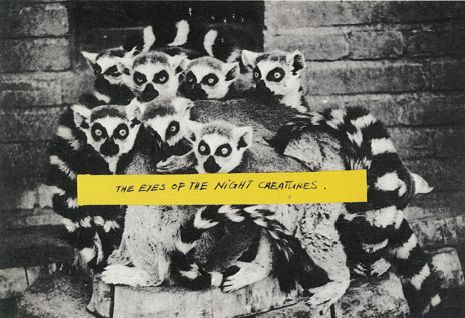
Invitation for Galerie Paul Andriesse, Marlene Dumas, The Eyes of the Night Creatures, 1985
Many of the works from the series now reside in public collections, including the Stedelijk Museum, Amsterdam, the Van Abbemuseum, Eindhoven, the Museum voor Moderne Kunst, Arnhem, the Art Institute of Chicago and the Centraal Museum Utrecht.
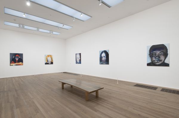
Installation view of The Eyes of the Night Creatures series in Marlene Dumas, Image as Burden, Tate Modern, London, 2015
It is important to remember that the art world in Amsterdam at the time was very small, with only two major contemporary art galleries and many of the artists, gallerists, critics and curators knowing each other very well. Recalling the great lineage of French Impressionist bourgeois café scenes, De gele vingers van de kunstenaar captures a late night art world gathering of friends that smoke, drink and talk.
The diptych is indeed based on photographs that Dumas took during nights out with her friends in Amsterdam. On the left, eminent artist and close friend René Daniëls is depicted holding a cigarette with yellow fingers, evocative of fresh paint, but also the staining that occurs from extensive smoking — hence the corresponding title.
De gele vingers van de kunstenaar speaks to a particular moment in time in which Dumas and René Daniëls were on the rise as the most promising young painters in the Netherlands. While Dumas and Daniëls did not overlap in their studies at Ateliers ’63, they had notably been included in the 1978 Stedelijk Museum group exhibition Atelier 15 (10 Young Artists).
The catalogue MISS INTERPRETED which is now available at www.ftn-books.com honours this friendship and the appreciation of Daniels his art by Marlene Dumas.