Posted on Leave a comment

L wig Mies van der Rohe (1886-1969)qΩ“Ω~ |’| §

Schermafbeelding 2019-02-14 om 15.19.14

When i think about Ludwig Mies van der Rohe, three of his designs i remember instantly. The first …a chair by Mies van der Rohe, One i always wanted to own and when i finally had one i did not think it was comfortable enough so i sold it. The chair… a Barcelona chair.

Schermafbeelding 2019-02-14 om 15.16.32

The one he designed for the Barcelona Pavillion. It was designed for the World exhibition from 1929 and after the exhibition it was demolished, but a group of spanish architects recognized its importance and had it rebuild in the Eighties from last century. I finally had a chance to see it for myself when i visited Barcelona for the first time around 2005. We walked over there since it is only a 10 minutes walk from the Fundacio Joan Miro.

The last one is the Seagram building which is one of the skyscrapers i admired when i first visited New York together with my father. A building i remembered well and of which i recognized style elements when i visited the Neue Nationalgalerie in Berlin some 30 years later. Ludwig Mies van der Rohe is a force in design and has made his mark on many of last centuries greatest designs. Some of his classic publications are availabel at www.ftn-books.com

œcv

¿≥

Posted on Leave a comment

Theo Eissens (1952-2015)

Schermafbeelding 2019-02-14 om 14.44.10

I had never heard of Theo Eissens until i received the catalogue by Eissens SPRING BRUNNEN, which is now available at www.ftn-books.com. He photographs his surroundings and alters it by putting colored grids as an overlay on his photgraphs. It makes the works having a typical Eissens signature.

The catalogue which is for sale is the 2008 catalogue, but on 22 March 2015 the exhibition Theo Eissens – Berlin Calling opened at the Livingstone gallery with a series of new works: unique silkscreened images on canvas of abandoned and burdened places in and around Berlin.
Berlin played an important role in the life of Theo Eissens (Amsterdam 1952-2015). The title of this publication refers to the frequent trips he made from Amsterdam to Berlin and vice versa, and the recurrent long and short periods he lived and worked there, starting in 1992.
He worked at the Bethanien ( the same place as RONALD DE BLOEME worked at ) and exhibited with artists like A.R. Penck and Bruce McLean (1996, Galerie im Parlement, Druckwerkstatt Bethanien, Berlin) and was able to immerse himself in German (art)history.


In 2004 his focus shifted from prints on paper to works on canvas and wood panel. His ‘new’ concept involved photography combined with abstract and geometric shapes in acrylic paint. His extensive experience with printing techniques enabled him to use a silkscreen to literally transfer a photograph onto canvas and merge the image with parts painted in acrylic.
This development in his work led to the 2008 catalogue and exhibition Spring Brunnen. .

In 2015 Theo Eissens died unexpectedly, leavind us an important but small collection of impressive art works.

eissens.jpg

Posted on Leave a comment

Bernard WILLEM Holtrop (1941)

Schermafbeelding 2019-02-11 om 16.07.36

When i compare artist with each other  , the artist that comes to mind is  Pettibon. I think the best way to compare WILLEM is by comparing his drawings with the ones made by Raymond Pettibon.Prins Bernhard comic by Willempettibon brush a

Put them next too eachother and you see a resemblance in the directness and of course the use of black and white within them. But WILLEM is not only known for his Black / white drawings , but also for his political drawings and … some great illustrations. Among them… the illustrations he had done for FROM A -> Z by Rebecca Rass, published by Thomas Rapp in 1969 and available at www.ftn-books.com

rass

Here is a part of the biography on WILLEM published by the Lambiek gallery:

Born and bred in de Veluwe, one of the most conservative regions of Holland, Willem has become one of the world’s most unpredictable and sardonic cartoonists. While studying Fine Arts between 1962 and 1967, it all started with some early comix and cartoons for magazines like De Legerkoerier (The Army Courier), and with Willem’s contributions to the legendary student magazine Propria Cures. There, he got in touch with Roel van Duyn, the editor of the paper for the hippie movement Provo.

Since Provo at that time didn’t have an illustrator, Willem started working for them right away. In 1966 he caused quite a stir by portraying the Dutch queen Juliana as a prostitute in one of his cartoons for the Provo publication God, Nederland & Oranje. What followed was a persecution for lese majesty and a fine of 200 guilders. Following the demise of the Provo movement, his work appeared in De Nieuwe Linie in 1967. He moved to Paris, France in the following year, where his first cartooning work were contributions to L’Enragé during the May 1968 student strikes in Paris.

He subsequently became a regular contributor to Hara Kiri as well as its follow-up Charlie Hebdo. Willem’s beloved themes such as fat women, biological warfare, crabs, small children and police violence were all represented in the many political cartoons, illustrations, puzzles, comix and texts for the magazine. He also served as a promotor of Dutch comic abroad with his own publication Surprise. He was eventually editor-in-chief of Charlie Mensuel. He also appeared in Benoît Lamy’s documentary ‘Cartoon Circus’ (1972), a Belgian documentary about cartoons and comics,  in which he was interviewed alongside SinéPichaRoland ToporCabuJean-Marc Reiser, François Cavanna, Professeur Choron, GalGeorges Wolinski, Joke and Jules Feiffer.

Ever since the late seventies, Willem has been contributing controversial daily cartoons to the French left-wing daily Libération. All through these years his output has been prolific, resulting in a veritable mountain of book publications, which are almost without exception hard to find. Luckily, in 1998, the editor Jean-Pierre Faur published the anthology ‘Deadlines’, a beautiful overview of the works of one of the most internationally renowned Dutch graphic artists.

Posted on Leave a comment

JESS Collins ( 1923-2004 )

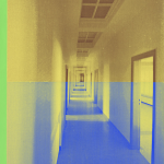
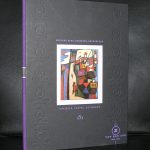
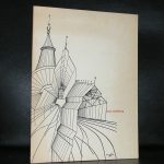
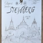
I became interested in this artist because i recently i acquired one of Jess his first publications, which is available at www.ftn-books.com An artist on the cross roads of  Modern Art, collage and comics

For more information on the artist you must visit jesscollins.org where i found the following text:

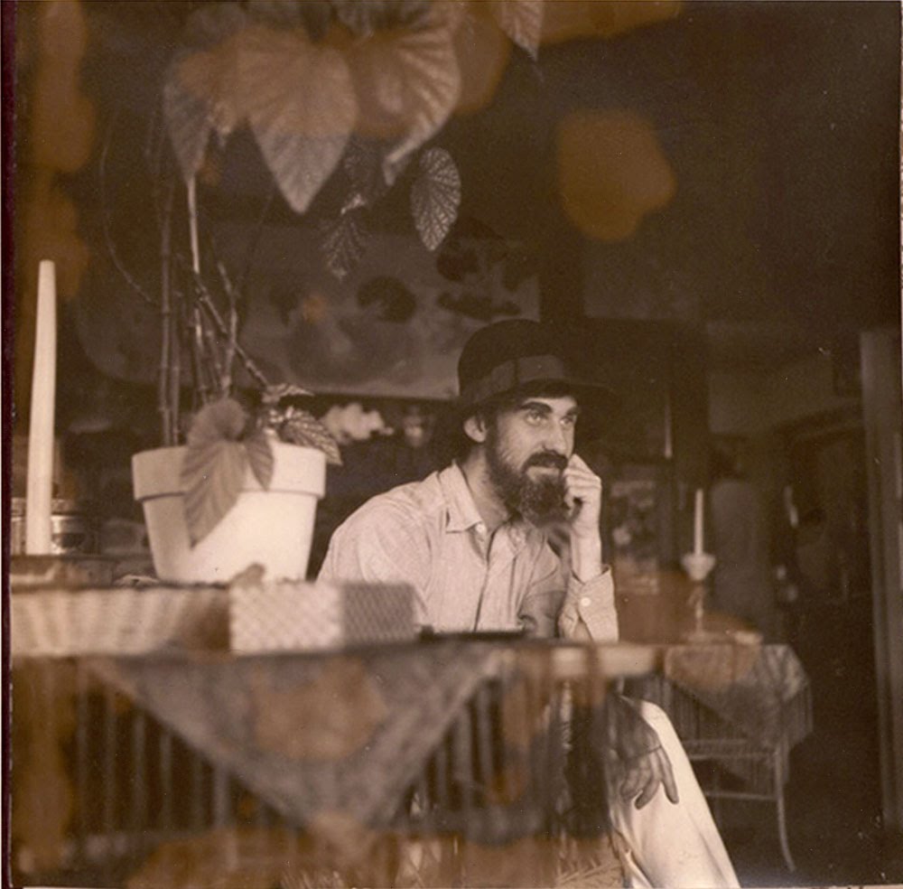
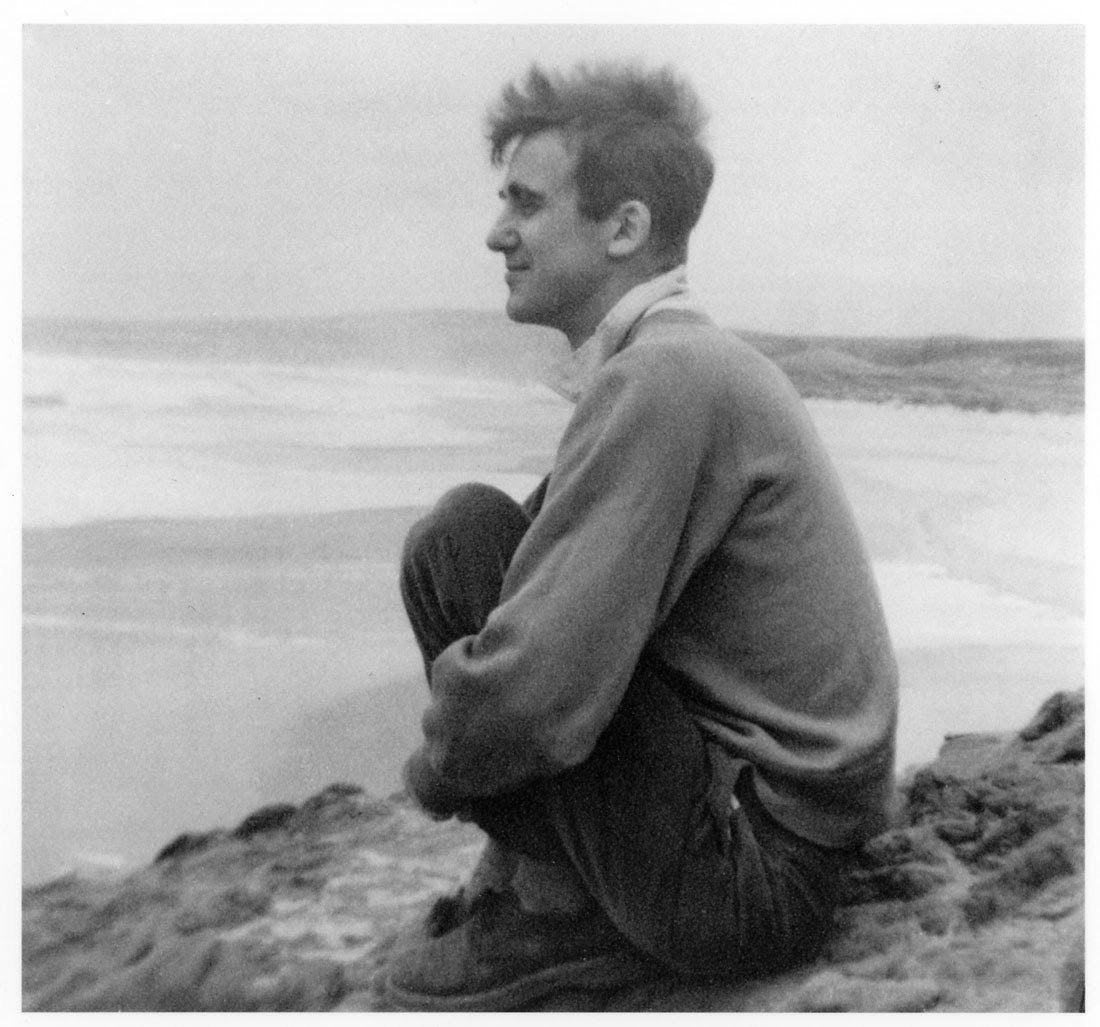
JESS was born in 1923 in Long Beach, California, the younger son of a civil engineer and a homemaker. Originally named Burgess Franklin Collins, he later broke with his family and changed his name to “Jess.” In childhood, Jess read the L. Frank Baum Oz books, Poe and Proust; listened to the music of Beethoven, Mahler, Sibelius and Brahms; and made scrapbooks with a great-aunt, which he credited as one origin of his later collage work.

In 1942, Jess began studying chemistry at the California Institute of Technology but was drafted into the Army Corps of Engineers in 1943. In a very junior role, he worked until 1946 at the Manhattan Project in Oak Ridge, Tennessee, on the production of plutonium for the atomic bomb. Following the war, he completed his degree at Cal Tech with honors in radiochemistry and went to work at the Hanford Atomic Energy Project in Washington.

During his time at Hanford, Jess began to study painting in adult education classes, while at the same time growing concerned about the nature of his participation in atomic energy work: “I was involved with nuclear energy, the direction it was going seemed questionable, nightmarish in many ways.” In 1948, he was visited by a terrifying dream that foretold the destruction of the world in 1975. Within months, he had left his job, decided to pursue art full-time, moved to the San Francisco Bay Area, and found his way first to the University of California at Berkeley and soon to the California School of Fine Arts, now the San Francisco Art Institute.

At CSFA, he studied with Elmer Bischoff, Edward Corbett, David Park, Hassel Smith and Clyfford Still. Taking inspiration from Clifford Still’s aesthetic breadth and tolerance, Jess explored both abstraction and figuration, learning from Still “a poetics of materials.” As he said later to Michael Auping, “I personally didn’t see any reason to make a dichotomy between abstraction and representation… It was all paint.” His interest lay in the redemptive powers of imagination and myth, which he regarded as one with the materials: “I don’t see that much difference between the spiritual and the material. All matter is energy, and all matter and energy are infused with spirit.”

Jess & Robert Duncan Biography

When Jess met poet Robert Duncan in 1950, they soon discovered their shared love of Baum’s Oz books and James Joyce’s Finnegans Wake, and the future of their lifelong romantic relationship, domestic household, and artistic collaboration was established. The 2013-14 exhibition and catalogue, An Opening of the Field: Jess, Robert Duncan and their Circle, documented the brilliant artistic fecundity of their bond and its importance to San Francisco artistic and literary communities. Their idea of the “household,” a place of domestic love but also of spirited, generative collaboration, became central to the development of their art and poetry.

Throughout the fifties, Jess experimented with technique in still lifes, portraits, and landscapes, paintings that shimmer with narrative potential. Jess described some of these works as “mythic landscapes, in the sense that a certain abstract chaos is slowly coming to order. All of the creation myths depict some kind of chaos transforming into order or image. I sometimes thought of these early landscapes as vaguely analogous to a creation myth.”

Inspired in part by a gift from Duncan of Max Ernst’s surrealist collage book Une semaine de bonté  (1934), Jess also began making collages, or in his term, “paste-ups,” in the early fifties, combining text and image fragments of engravings, photographs, comic strips, and jigsaw puzzle pieces. These works, becoming ever more complex over time until they were comprised of hundreds or even thousands of distinct elements, led critic Jed Perl to compare Jess and Joseph Cornell as “….American originals, highly sophisticated artists who weren’t afraid to be seen as outliers or cranks.”

The thirty-two works in Jess’s important Translation series, begun in 1959, are painted, enlarged reproductions of found images including photographs, children’s book illustrations, post cards, pages from old Scientific American magazines, Krazy Kat cartoons, and illustrations of art, science and math subjects. Every image is combined, either within the painted surface or on the backs of the canvases, with literary texts from a wide variety of sources including Wordsworth, Blake, Gertrude Stein, Plato, Aztec and Mayan poems, scientific texts, Kandinsky, Gaelic songs and Edward Lear.

Jess biography

Thickly painted, the surfaces are highly textured, sometimes rough, and occasionally billowing. Describing the colors, Jess explained, “I want to get the level of light that was in the original. My colors are absolutely imaginary, not realistic. At my best, I want to pay homage to the original and a completely imaginary complex of color that is my translation of that original.” Of the Translations, Michael Auping has said, “The mysterious irony of the ‘Translations’ is that they are highly reverent copies that are, in themselves, entirely original, which of course brings into question whether or not they are copies at all. The ‘Translations’ are not secondary to the ‘originals’ but are, in Jess’s words, ‘spiritually coexistent’ with them.”

For his later Salvages series, instead of copying, or “translating” a painting onto a canvas from a found object, Jess painted, or repainted, directly over his own earlier discarded canvases or paintings found in thrift shops. Leaving the thinner surface of the original painting bare in places, he built up a thicker layer of paint around fragments of the original images, adding texture and new images, encouraging unexpected meaning to develop. Like the Paste-Ups and Translations, the Salvages derive from images and texts found and saved, and add new beauty and mystery as the found materials are reinterpreted, expanding allegorical dimension in the process.

Jess on a beach near Pigeon Point biography

Narkissos, Jess’s most ambitious project, was begun in 1959 as a pencil drawing for a painting to be based on the myth of Narcissus but gradually evolved into a large scale mixed media work. It combines a monumental graphite rendering of the figure of Narcissus with pasted-up fragments of Jess’s own hand-drawn images as well as found sources of the Narcissus myth and its many iterations in literature, art and popular culture. The magnificent “unfinished” work is now in the collection of the San Francisco Museum of Modern Art.

Although it has often been written that Jess was a recluse who rarely left the house, in fact, though he did avoid crowds and large social gatherings, he was a domestic flaneur, a householder walking the streets of San Francisco to buy groceries, visit the post office, drop in on friends, lunch in his favorite Mission District eateries, and most importantly, to scavenge his way through the multitude of thrift and used book stores liberally sprinkled throughout the city in search of the materials that formed the foundation of nearly all his artwork. As he told Michael Auping when asked about the title of his Salvages painting series, “I’m always out shopping….Really all my work – Paste-Ups, Assemblies, Translations – comes from salvaging. I salvage loved images that for some reason have been discarded and I come across them…….I put forward a new layer of sentiment that, combined with the old, may hopefully allow the image to have a new life or at least a half-life.”

Jess 1994 biography

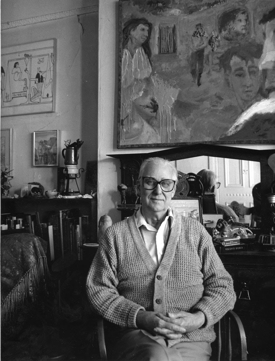
Aside from a period of travel with Duncan in the mid-fifties to Europe and Black Mountain College, Jess lived and worked in San Francisco for the remainder of his life. His large, Victorian home with Robert Duncan in the Mission District became a treasure house of art and literature, a household filled with artworks by Jess and their many friends, Robert Duncan’s vast library, their recorded music collection, and the many beautiful, rare and often slightly chipped or worn domestic objects salvaged from thrift shops with which they entertained their large but intimate circle of friends. In this home these two men, both passionately engaged with the world, created a world of imagination.

Jess’s first solo show was in 1950 at the Helvie Makela Gallery in San Francisco, soon followed by a show at the King Ubu Gallery, a small but important venue for alternative art founded in 1952 by Jess, Duncan and their close friend Harry Jacobus. Gradually Jess’s work became widely known through solo and group exhibitions in prestigious galleries and museums throughout the country. Works by Jess are now included in the collections of the Metropolitan Museum of Art, the Whitney Musuem, The Museum of Modern Art, the National Gallery of Art, the San Francisco Museum of Art, the Fine Arts Museums of San Francisco, and numerous other major museums. Attention to his work continues to grow, most recently as a result of the touring exhibit, “An Opening of the Field: Jess, Robert Duncan, and Their Circle.” Acknowledging the mark of a painter whose work was nourished by a community of affection, art critic Peter Frank wrote, “He sought approval of his friends – as well he should, given their own poetic standards – but not of the art world; even so, his art paralleled and even anticipated so much of his time’s art.”

paste ups

Posted on Leave a comment

Henk Peeters….ECHT HENK PEETERS


Schermafbeelding 2019-02-11 om 15.02.27

A blog on a  very speciual multiple that was published on the occasion of the Henk Peeters Retrospective at the Gemeentemuseum Den Haag in 2011. On that occasion a reprint of the famous Nul/Zero 1964 catalogue was made in a small edition. It is the catalogue with the ZERO presentations by Armando, Peeters and Schoonhoven. All of these legendary artists have now passed away, but Peeters realized the importance of that catalogue and from that facsimile edition Peeters took some 20 copies and made multiples out of them by Stitching the front , back and inner work together and sign them with ECHT PEETERS. This has become one of the rarest of the later Peeters multiples and now one of those multiples is for sale at www.ftn-books.com

echt peeters bb.jpg

Henk Peeters (b. The Hague, 1925-2013)) was the most active member of the Dutch Nul group, notably with regard to the organization; he made the international contacts, organized the international ZERO (Nul) exhibitions at the Stedelijk Museum Amsterdam, and wrote on the theory of art. It was also he who first actively participated in international exhibitions with artist groups such as the German ZERO, the Italian Azimuth, and with artists Yves Klein, Yayoi Kusama and Lucio Fontana. He initiated the (utopian) project “Zero on Sea,” with more than fifty participating artists from over ten countries, and remained true to the fundamental concept of the Nul movement right up to his death in 2013. He sought to use his works of art to make the viewer conscious of his environment; he wanted to bring about a sensitive consciousness-raising, as it were. The materials that Peeters selected for his works frequently had a very tactile appeal, while he simultaneously created a certain untouchability; thus he stuck candle tapers behind plastic foil, or placed mesh in front of cotton wool. He also used fire on canvases, leaving behind traces of thick smoke, or burned holes into plastic, the so-called “Pyrographies.” With these – often white – works he was visually closely related to the German ZERO artists, but there was also a clear relationship with Nouveau Realisme; Peeters also used ready-mades, which he bought in inexpensive stores and isolated in the work of art. In these, he had a preference for modern, clean, industrial materials, such as plastic and nylon. He once said: “with my work, I have always wanted it to look just as fresh as if it was in the HEMA (the Dutch chain store). It must not be artified… I had no need for artistic cotton wool.” Henk Peeters also worked with natural processes, such as light and water reflections, and with ice, rain, snow and mist. Art and life should be joined together inextricably. And thus, in 1961 Henk Peeters became a work of art himself, when Piero Manzoni appointed him as one; this was certified and signed by the Italian artist. Until his death (Hall (NL), 2013), Henk Peeters restored artworks from the Nul period and remained an active spokesman for the group.

Posted on Leave a comment

the “Billy Rose sculpture garden” at the Israel Museum

I have never visted Jerusalem, but because of a recent acquisition for my inventory i want to share the experience of an actual visitor to the garden who truly enjoyed it. The catalogue of the sculpture garden is available at www.ftn-books.com

billy rose

It was a sunny Sunday morning, and I was strolling through a peaceful garden. This was the Billy Rose Art Garden, in the grounds of Jerusalem’s Israel Museum. The Museum has some impressive exhibits, including the Dead Sea Scrolls and extensive collections of art and archaeology. But the Scrolls would have to wait for another time: I was here for the sculpture.

Walking Through the Billy Rose Art Garden

I had the garden almost to myself. The sounds of birdsong and distant church bells competed for my attention. The paths were lined with fragrant plants. And there were sculptures everywhere, in perfect harmony with their surroundings.

Completed in 1965, the Billy Rose Art Garden was the work of Isamu Noguchi, an American sculptor. He followed the principles of Zen design, using a variety of different materials such as concrete, gravel and water, and featuring mostly native plants. The garden is set on a steep hillside, so that panoramic views of the city are incorporated into the landscape.

Sculptures Old and New

Some of the sculptures are by well known artists. As you enter the garden you are greeted by a statue of Adam by Auguste Rodin. Later on, a sculpture by Henry Moore poses against the city skyline. But others are more modern, often by contemporary Israeli sculptors. There is a giant stainless steel apple core, and the appropriately named “Turning the World Upside Down”, which reflects and inverts its surroundings.

The modern sculptures have not always been admired by everyone. It is said that Billy Rose, the American showman who founded and gave his name to the garden, commented that they should be “melted down for bullets”! Modern visitors might well disagree. For myself, I enjoyed the juxtaposition of old and new, and the pleasure of turning every corner to find something different.

Posted on Leave a comment

Swip Stolk (1944-2019)


Schermafbeelding 2019-03-12 om 11.13.44
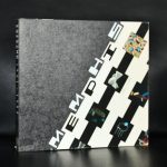
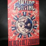
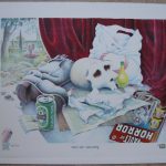
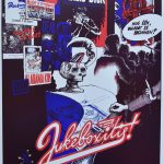
Swip Stolk is certainly one of the great names in dutch graphic design. He died last sunday at the age of 75 . There are some iconic designs by Stolk that are worldwide famous. Specially the peeing poster for the Serrano exhibition drew attention from all over the world. There was a typical Swip Stolk styke of design. He broke with the minimal designs of the sixties ( Crouwel and Wissing) and invented his own exuberant style of design which was soon to become the “house style” of the Groninger Museum for which museum he made for nearly two decades many important book and publication designs.

there are several important Swip Stolk designs availabel at www.ftn-books.com

Posted on Leave a comment

Peter Pontiac (1951-2015)….Infanticide


Schermafbeelding 2019-02-08 om 11.40.02

This is the farewell exhibition of the Groninger Stripmuseum . It stops after this appealing exhibition in which comic artist show that beside their talents as comic artists they are in many cases also serious and very accomplished painters. Here is the painting that struck me most. It is INFANTICIDE by the late Peter Pontiac.

Schermafbeelding 2019-02-08 om 11.34.36

I am an admirer of Peter Pontiac for a long time now and this painting shows in an excellent way that there is more to his art than his stand alone comics. www.ftn-books.com has some nice Peter Pontiac items and limited editions available.


Posted on Leave a comment

Saul Steinberg (1914-1999)

Schermafbeelding 2019-02-07 om 13.48.30

….and now for the other Steinberg…SAUL STEINBERG.

First i must say that writing a blog on Steinberg, can not do justice to the excellent site , which the Steinberg foundation has constructed on the life, times and art of Saul Steinberg. You can visit the site at : http://saulsteinbergfoundation.org

But some personal notes on the artist. Saul Steinberg is a very well known artist in Europe. He had his exhibitions at the Maeght galleries in the Sixties and Seventies and both the Stedelijk Museum and the Boymans van Beuningen museum in the Netherlands organized exhibitions on the artist. In the beginning i always had considered Steinberg to be an illustrator and not the artist he later became to me. Later i realized to look at his art in a way that his drawings were meant to be seen. A citation from his site makes this clear :

Saul Steinberg defined drawing as “a way of reasoning on paper,” and he remained committed to the act of drawing. Throughout his long career, he used drawing to think about the semantics of art, reconfiguring stylistic signs into a new language suited to the fabricated temper of modern life. Sometimes with affection, sometimes with irony, but always with virtuoso mastery, Saul Steinberg peeled back the carefully wrought masks of 20th-century civilization.

This is an artist to be discovered by a far larger audience. At this moment i think he is the lesser of both Steinberg’s  i recently wrote a blog on, but perhaps time will prove me wrong and i will think of his art just the way around in a few years. www.ftn-books.com has some nice and rare Saul Steinberg publications available.

Posted on Leave a comment

weekly Piet Dirkx : SHALL I COMPARE THE TO A SUMMER’S DAY


dirkx shall i compare
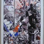
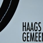
This is a line from a Shakespeare sonnet . Piet Dirkx finds his titles everywhere and notes them on cigarboxes and Moleskine note books  and this is probably one of the most illustrous of all. The work of art is also exceptional. The first time i saw it was at the first Piet Dirkx exhibition in the Ravesteijnzaal at the Haags Gemeentemuseum and this was the second work i acquired for my collection and never regretted it. It is long work of art , measuring aprox. 200 cm and its height being ca. 15 cm. The lat is tiles and signed and dated by Piet Dirkx. The work consists of 14 small paintings on wood , placed on a special lat.