Posted on Leave a comment

Total Design (1963-2000)

This text was taken from the site ” MEMORY OF THE NETHERLANDS ” and gives an excellent idea what TD was.

The corporation Associatie voor Total Design NV, Total Design for short, was established in 1963. Until then, practically all major design commissions from Dutch clients had been contracted out to foreign agencies. There were no large design agencies in the Netherlands at the time. Total Design was established with a view to filling this unsatisfactory gap.

Total Design’s board of management in 1963; from left to right: Friso Kramer, Dick Schwarz, Benno Wissing, Ben Bos, Paul Schwarz and Wim Crouwel (photography: Jan Versnel)

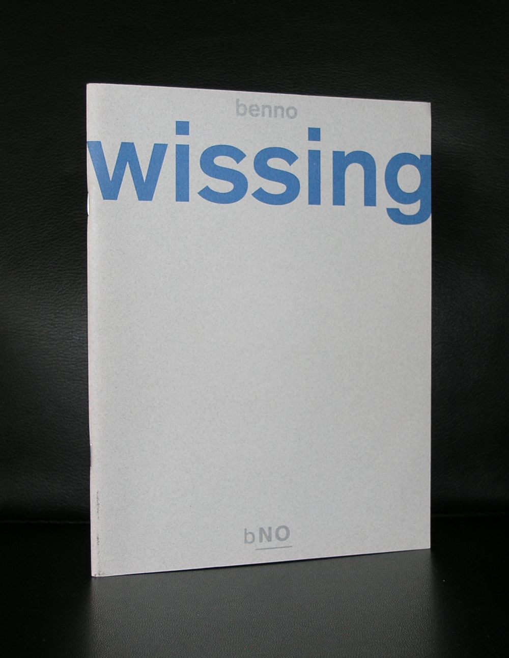
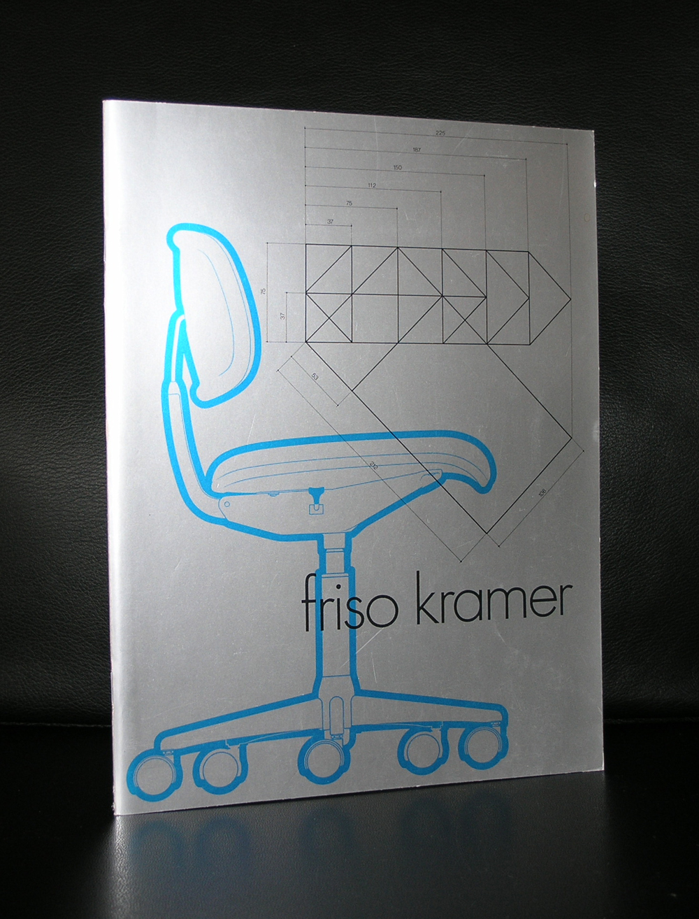
The founders were Wim Crouwel (graphic design), Friso Kramer (industrial design), Benno Wissing (graphic and spatial design) and Paul and Dick Schwarz (organization and finance). Before long, Ben Bos, an experienced copywriter and designer, joined the team.

This mixed group had such wide ranging experience that it was able to execute complex ‘total’ commissions from a variety of clients in industry, trade and transport, and the government and cultural sectors.

Years of success
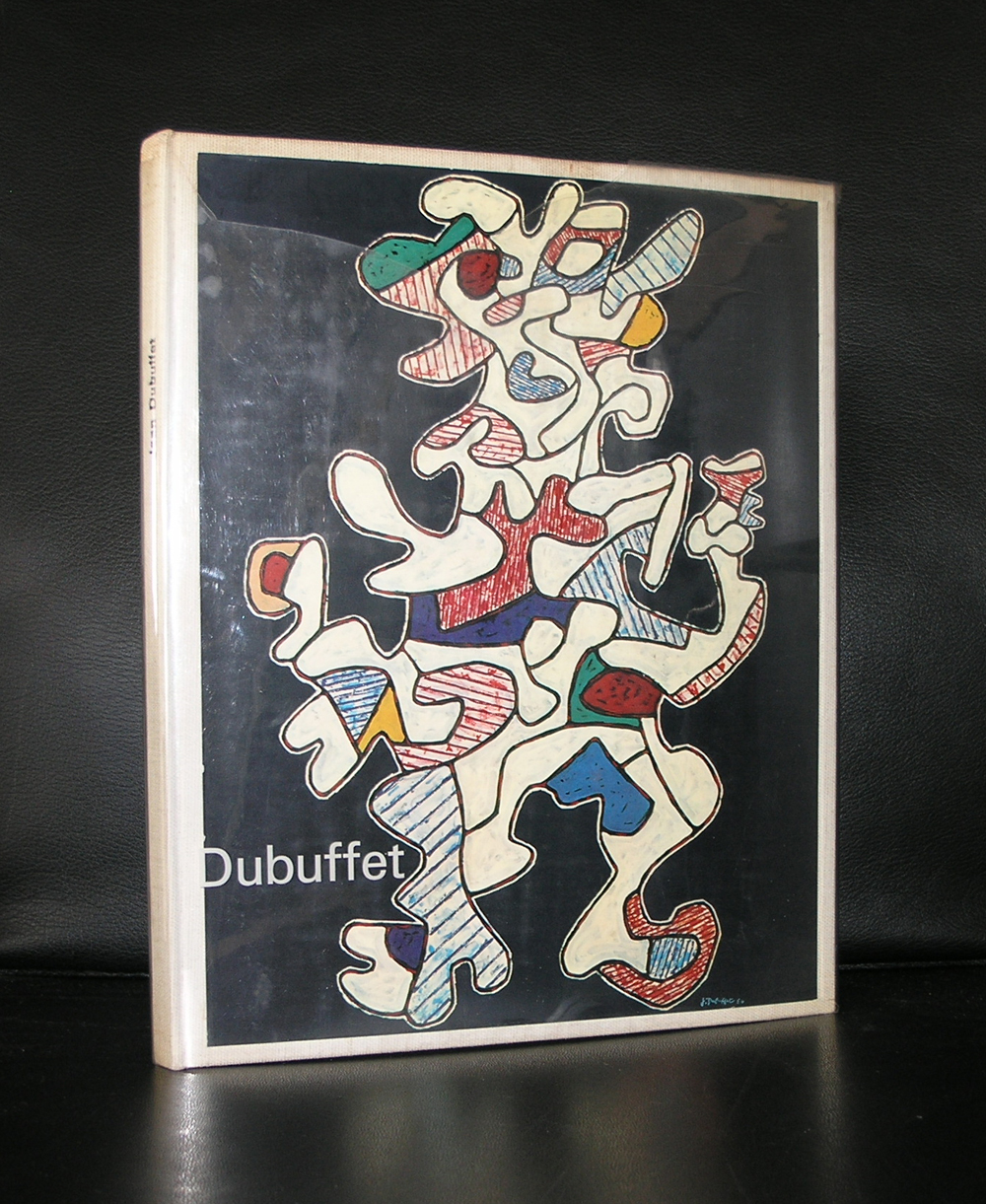
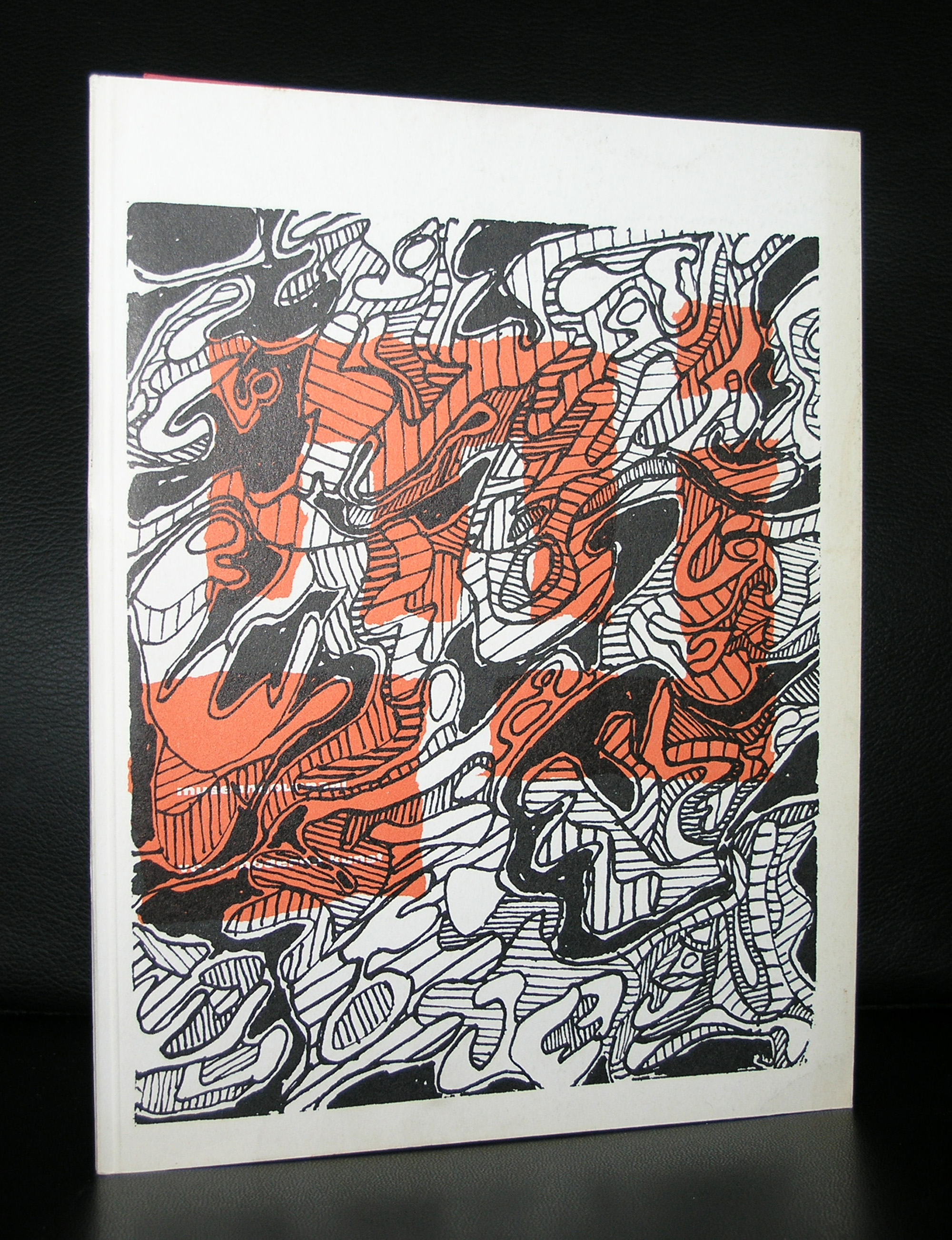
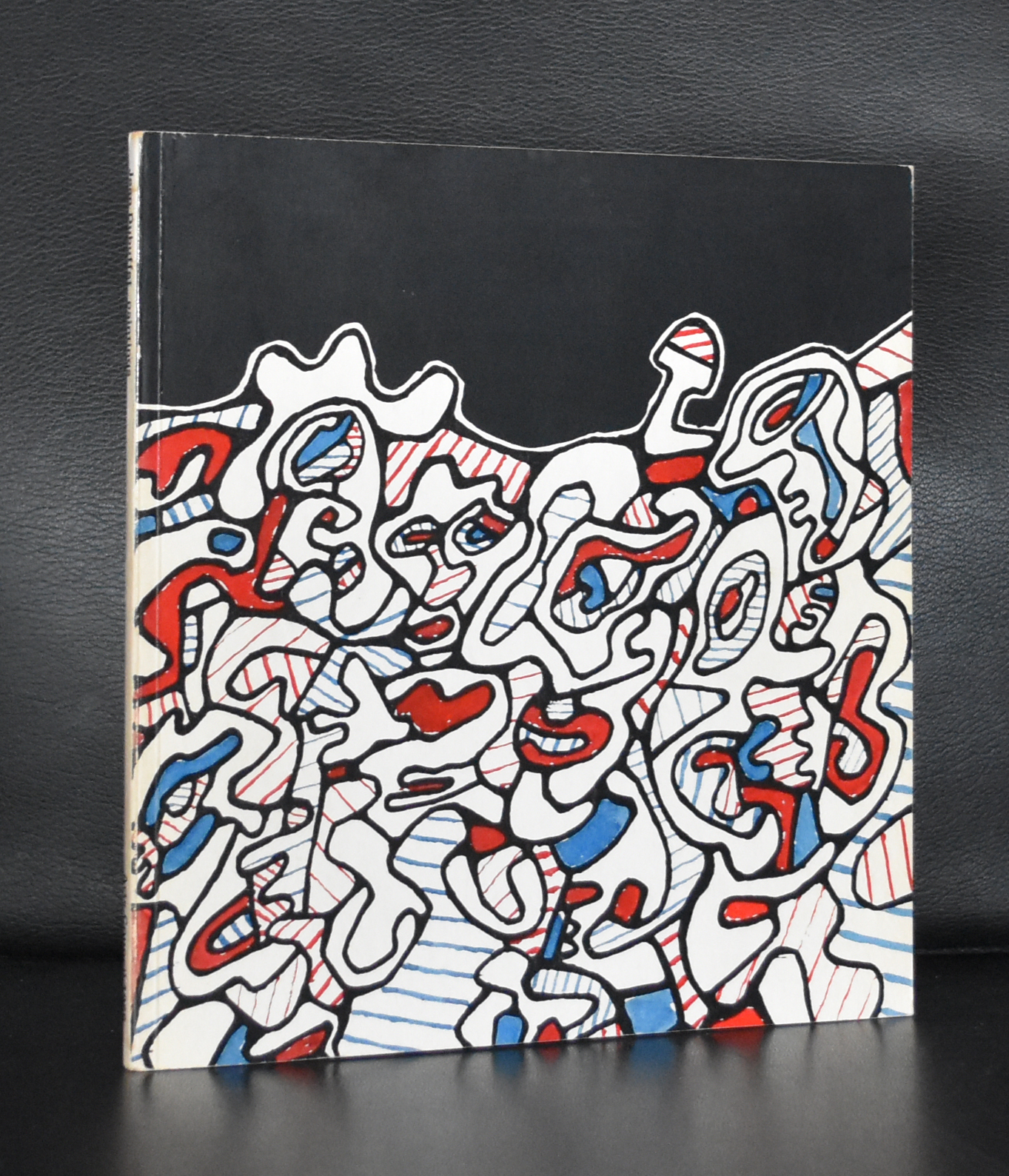
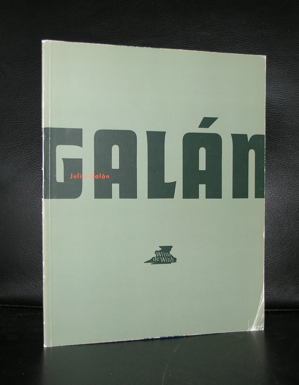
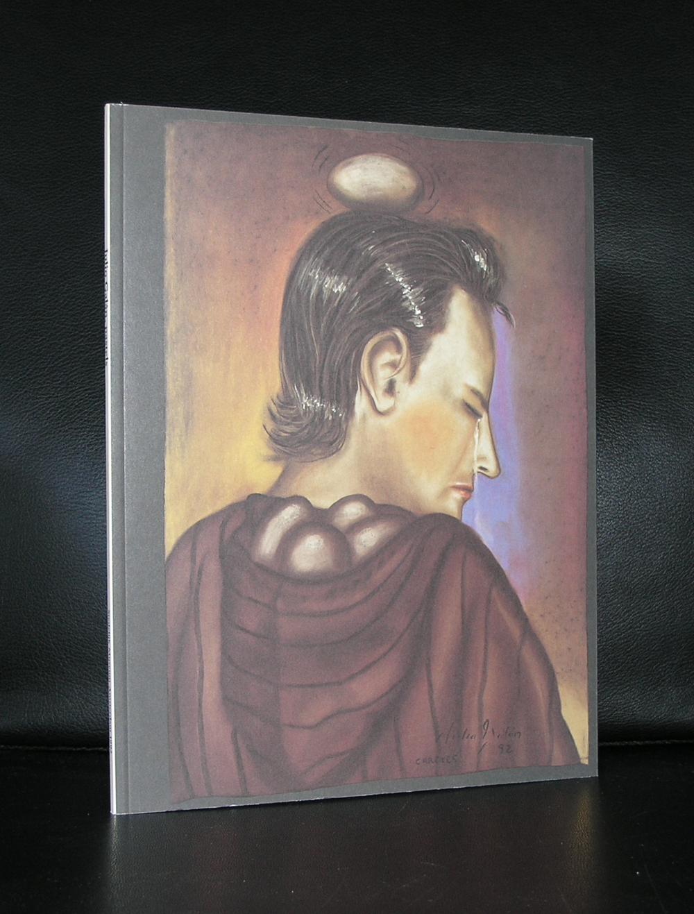
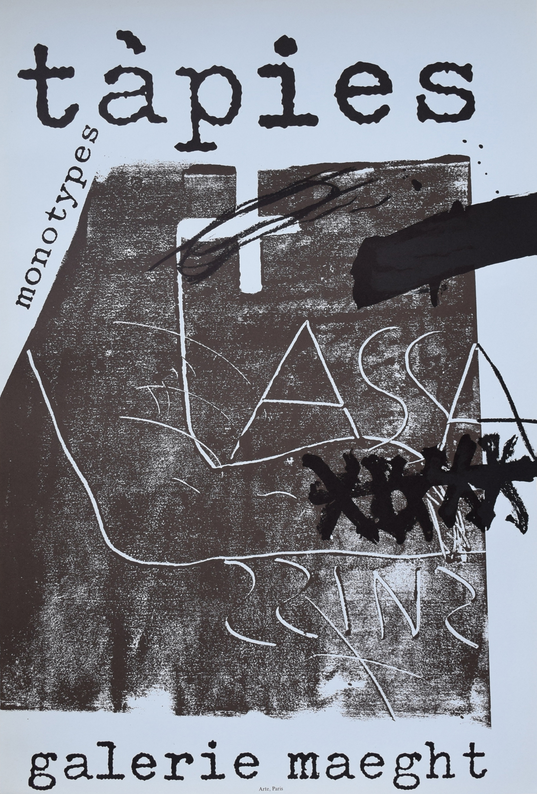
The 1960s were the most successful period for Total Design: its staff size increased enormously and the agency managed to hold on to various clients for a long time. Some of them, like Randstad and the Amsterdam Stedelijk Museum, ( of which many books are available at www.ftn-books.com) were extremely loyal to Total Design.

In those years, other important clients were Schiphol airport, De Bijenkorf, Steenkolen Handelsvereeniging (SHV), including its oil division PAM, Stichting Kunst en Handel (Arts And Business Foundation) and the Peter Stuyvesant Collection of paintings; a major commission dating back to that period was the design of the Dutch pavilion for the 1970 Osaka World’s Fair.

Poster ‘Holland Nestival Finale’ for the Holland Festival, 1978 (design by Anthon Beeke, Total Design)

Changes
In the 1970s, Total Design underwent great changes. The agency received mainly graphic commissions and created many house styles.

The composition of the staff changed as well. Some important designers from the very beginning decided to leave the agency. Friso Kramer had left already in 1967; in 1972, Benno Wissing, Anne Stienstra, Hartmut Kowalke and the Schwarz brothers followed. Wim Crouwel, Ben Bos and Hans Wierda became the managers.

The agency’s intricate and obscure management structure was replaced by semi-independent design teams. As a result, a new generation of designers, trained by the agency itself, got a chance to prove themselves.

A period of less cohesive views on design and style dawned. Designers like Jurriaan Schrofer, Anthon Beeke, Paul Mijksenaar and Andrew Fallon introduced a lively and fresh approach to design commissions. Loek van der Sande was taken on as office manager. Work for the Dutch Post Office PTT, the Amsterdam city transport company, the Holland Festival, the Globe Theatre as well as for other clients began in the 1970s.

Total Design experienced many further changes in the 1980s and 1990s. Jelle van der Toorn Vrijthoff joined the management team in 1982. He championed young talent and in particular new techniques. Sometimes his views were diametrically opposed to those of the old guard. Wim Crouwel left Total Design in 1985, Ben Bos followed in 1990. They were the last two designers who had been involved with Total Design from the very beginning.

New orientation
Much had changed, also in the field of design. Total Design no longer had the renown of the early years. Many more design agencies had sprung up in the Netherlands through the years.

In 1988, Hans Brandt began to develop the design agency into a strategic communication agency. In de 1990s, Total Designed shifted from being a classic design agency to becoming an organization that put the emphasis on identity development, corporate branding and reputation management. In 2000, the name Total Design was changed into Total Identity.

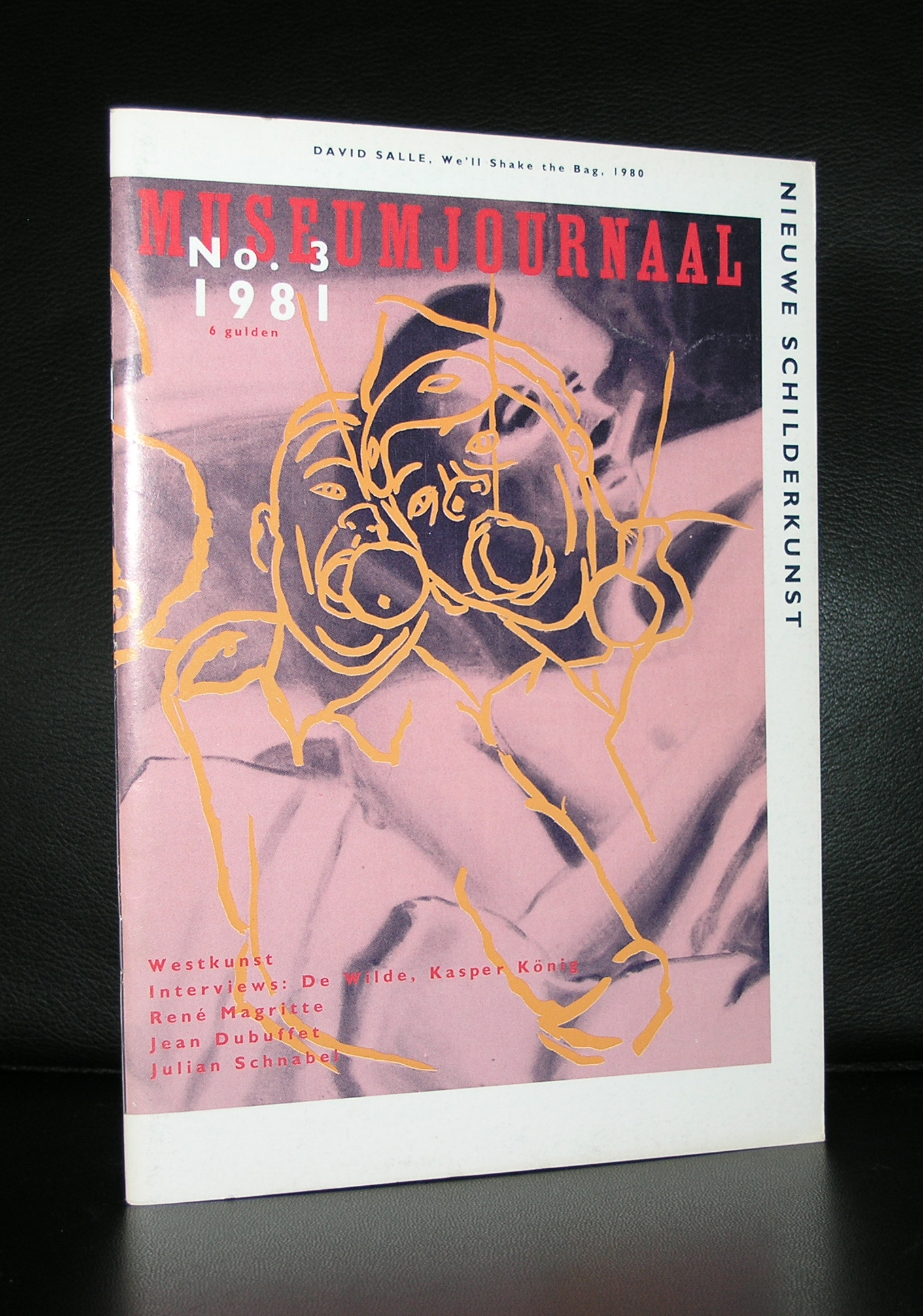
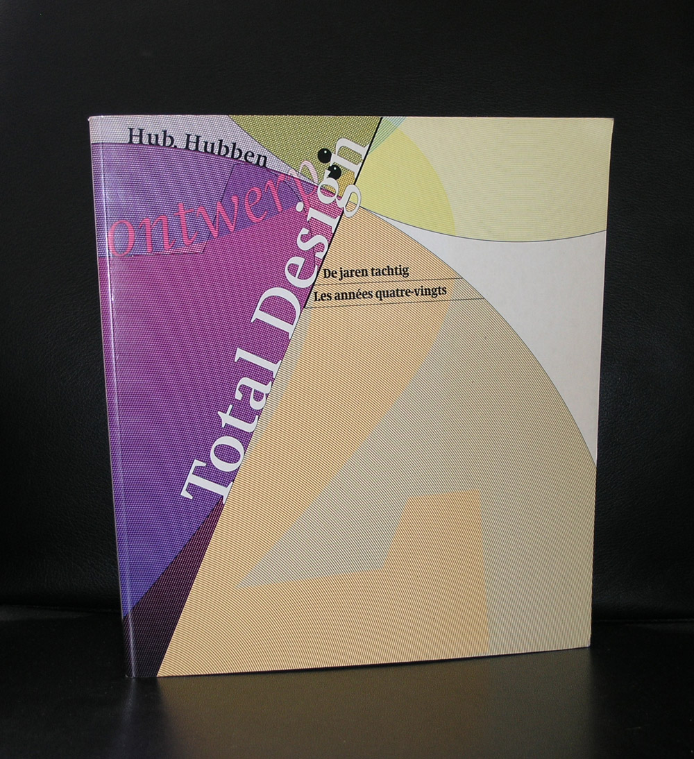
An excellent story in the history of Total Design, but to see the true meaning of the TD office you have to experience and see their designs. Beside the Stedelijk Museum publications there are some special Total Design books available at www.ftn-books.com

Posted on Leave a comment

Breyten Breytenbach (1939) in the Netherlands

Schermafbeelding 2017-05-18 om 10.19.00.png

Most people know Breytenbach as a South African poet, but less know him as a painter. Because of the language, dutch and South African are related to each other, Breytenbach had a large following of admirers over here and galeries in the past decades invited him, not only recite his poems , but also to exhibit his works of art. This is the reason why www.ftn-books.com, has some nice publications. Not many , but worth wile to check them out.

Posted on 2 Comments

André Kertész (1894-1985)… a leporello

Schermafbeelding 2017-05-16 om 11.52.43

André Kertész is one of the most important and influential photographers from last century. Not only his works cover all important decades from the century, but also his innovative way in seeing and photographing subjects made him famous during his life. One of the special items i have in my inventory is a leporello on the studio of Piet Mondrian. A selection of photographs resembling the classci still lifes of the dutch painters from the golden age. Great photography which proves the quality of these photographs. This leporello is available with other great Kertesz titles at www.ftn-books.com

Posted on Leave a comment

Michael Dudok de Wit (1953)

Linda on Cyprus gave me some time in catching up with Game of Thrones and the movie i was looking forward LA TORTUE ROUGE/The red turtle an animation movie by Michael Dudok de Wit, who’s career i have been following since the win of Father and Daughter.

Schermafbeelding 2017-05-13 om 07.30.45

I can not recommend this movie enough. It has a rare quality…it is poetic, dramatic, lifting up and all those qualities combined in a movie made by the Ghibli studio’s with only a sound track to support the story. Ghibli became famous with the Miyazaki movies they made ( the last THE WIND RISES i can also recommend),

Schermafbeelding 2017-05-13 om 07.42.51

but with this de Wit movie they struck gold again and in the combination of these 2 there must be another Golden 3 decades in front of them. Go see THE RED TURTLE and take a look at the books i have on dutch animation at www.ftn-books.com

Posted on 1 Comment

Sonia Delaunay (1885-1979)

Schermafbeelding 2017-05-02 om 12.06.20

Sonia Delaunay… I always thought she was french, but she lived in France because she married Robert Delaunay, but was born in Ukrainia. She became known as the cofounder of the Orphism art movement, noted for its use of strong colors and geometric shapes. Her work extends to painting, textile design and stage set design. She was the first living female artist to have a retrospective exhibition at the Louvre in 1964.

In short she was one of the first female modern artists to became known all over the world. Her patterns, tissues and paintings have been of influence to many modern artists after her, including the hard edge and kinetic artists who combined her use of colors and patterns into their own works of art. Art Deco fashion could not have existed without Delaunay tissues she had fabricated for her costumes.

Schermafbeelding 2017-05-02 om 12.07.01

A fascinating artist who’s patterns and paintings look still very modern and one of those artists who made her publications very special by using serigraphs, lithographs and pochoir prints as a cover. Making these publications stand out from the others and turning them into very desirable collectable items. There are a few available at www.ftn-books.com

Posted on 1 Comment

Jean Dubuffet (1901-1985)

It was early February that we visited Paris and ended our 3 day’s in this city with a visit of the Musee des Arts Decoratifs, Situated next door to the Louvre it is much less known, but the reason to visit was the Bauhaus exhibition which was held over there.  However , it was not the Bauhaus exhibition , but de exquisite Dubuffet collection which won me over. Because www.ftn-books.com has a large inventory of Dubuffet publications ( 24 available items) i searched for this blog the internet and found a great short synopsis on this Art Brut artist.

Schermafbeelding 2017-04-28 om 12.59.47

Jean Dubuffet disliked authority from a very early age. He left home at 17, failed to complete his art education, and wavered for many years between painting and working in his father’s wine business. He would later be a successful propagandist, gaining notoriety for his attacks on conformism and mainstream culture, which he described as “asphyxiating.” He was attracted to the art of children and the mentally ill, and did much to promote their work, collecting it and promulgating the notion of Art Brut. His early work was influenced by that of outsiders, but it was also shaped by the interests in materiality that preoccupied many post-war French artists associated with the Art Informel movement. In the early 1960s, he developed a radically new, graphic style, which he called “Hourloupe,” and would deploy it on many important public commissions, but he remains best known for the thick textured and gritty surfaces of his pictures from the 1940s and ’50s.

Key Ideas

Dubuffet was launched to success with a series of exhibitions that opposed the prevailing mood of post-war Paris and consequently sparked enormous scandal. While the public looked for a redemptive art and a restoration of old values, Dubuffet confronted them with childlike images that satirized the conventional genres of high art. And while the public looked for beauty, he gave them pictures with coarse textures and drab colors, which critics likened to dirt and excrement.
The emphasis on texture and materiality in Dubuffet’s paintings might be read as an insistence on the real. In the aftermath of the war, it represented an appeal to acknowledge humanity’s failings and begin again from the ground – literally the soil – up.
Dubuffet’s Hourloupe style developed from a chance doodle while he was on the telephone. The basis of it was a tangle of clean black lines that forms cells, which are sometimes filled with unmixed color. He believed the style evoked the manner in which objects appear in the mind. This contrast between physical and mental representation later encouraged him to use the approach to create sculpture.
http://www.lesartsdecoratifs.fr/francais/musees/musee-des-arts-decoratifs/parcours/galeries-thematiques/galerie-jean-dubuffet/
Posted on Leave a comment

King Willem-Alexander and Queen Maxima into Zero art ( Staudt and Leblanc)

HRH King of the Netherlands, Koning Willem-Alexander and Queen Maxima collect Zero art. It was yesterday evening that there was a 90 minute interview with King Willem-Alexander on the occasion of his 50th birthday on prime time television.  An open and honest interview in which i learned to appreciate more the person Willem-Alexander is. I am still opposed to a King or Queen as head of state, but this was the first time i admired this King and learned that he and his wife Maxima appreciate Zero art. At the beginning of the interview , where Wilfried de Jong ( interviewer) was received in the entrance hall of the kings home, villa Eikenhorst. Willem- Alexander showed 2 of the works from his collection, the first was a work by Klaus Staudt ( he referred to it as being from a german artist) and the other was not mentioned at all , but i am for 99% sure it was a TORSIONS painting by Walter Leblanc.

Schermafbeelding 2017-04-27 om 09.40.42

Both great works of art and it makes me curious about the other works in their collection. To celebrate the Kings birthday there will be a 10% discount today on the entire inventory of www.ftn-books.com and an invitation to the King to look at the great books i have in my collection on ZERO art.

We live nearby and it will be an honor to show you some nice ZERO publications.

discount code only the 27th and the 28th of april: Koningsdag2017


Posted on 3 Comments

Julio Galan (1958-2006)

There are not many publications on this fantastic artist, but www.ftn-books.com has two of them. In 1992 the Stedelijk Museum had a large retrospective exhibition on him and this catalogue is one of the 2 available books on Galan.

Julio Galan Romo was born in Muzquiz, Coahuila, and grew up in Monterrey, attending private schools. He began to paint while studying architecture at the University of Monterrey and received encouragement from the Monterrey art dealer Guillermo Sepúlveda. He had his first exhibition at Mr. Sepúlveda’s gallery in 1980. A precocious talent with a prickly, flamboyant personality, Mr. Galán began showing in Monterrey at age 20. In the late 1980’s and 90’s, he was Mexico’s best-known young artist. Julio was in effect a second generation Neo-Expressionist. He came to New York in 1984, in the heyday of this polymorphous painting style, whose freewheeling strategies of collage, fragmentation, cultural borrowing and dreamlike suspension were formulated by David Salle, Julian Schnabel and Francesco Clemente, who were influenced by Sigmar Polke. Galan, already strongly influenced by the self-scrutiny of Frida Kahlo, filtered Neo-Expressionism’s lessons through a personality and cultural heritage as polymorphous as the style. Throughout an astoundingly varied, often uneven range of images, he laced references to his childhood and his sexual identity with allusions to Catholicism, the Mexican Baroque, pre-Columbian cultures, retablos and folk art. The result was a kind of postmodern Symbolism: overripe, often perverse, yet mesmerizing. Julio Galán’s works often had the heat of colorful circus murals that had been defaced by a very sophisticated vandal. Their torturous dreamlike settings tended to be haunted by a handsome young man or boy-child who strongly resembled the artist. He underscored this preoccupation by frequently having himself photographed in different roles, for example as Jesus wearing the crown of thorns, or as sensitive bohemians, Mexican Indians and women in black gowns or veils.

Although he never exhibited these self-portraits as his art, they were invariably used in his exhibition catalogs to inflammatory effect: it was like Salvador Dalí channeling Cindy Sherman. In 1985, the young painter made his gallery debut at the Art Mart Gallery in the East Village and began to exhibit widely in Europe. In New York, he also exhibited at Anina Nosei, Ramis Barquet and Robert Miller, where he had his last solo show in 2001; he was included in the 1995 Whitney Biennial. A survey of his work was organized by the Museum of Contemporary Art in Monterrey in 1994. His work has been exhibited individually in Mexico, Argentina, USA, Holland, Spain, Italy, England and France. He was the recipient of numerous awards, from fine art institutions like the Arvil Gallery in Mexico City, Vitro Art Center in Monterrey, Mexico, Salon de la Plastica of the Palacio de Bellas Artes in Mexico City, and the Concurso Nacional de Artes Plasticas in Aguascalientes. Julio Galan died on August 4th 2006 after suffering a brain hemorrhage in Zacatecas, where he spent the last years of his life.


Posted on Leave a comment

GÜNTER BRUS (1938)

Schermafbeelding 2017-04-18 om 14.16.48

First of all aq uote by Peter Weibel…GÜNTER BRUS, An observer of the second order, he explored the contexts of body and painting, the body’s social and sexual functions, the social and cultural functions of painting. By treating painting and body as a single system, and by analysis of these media of expression, he ultimately pursued an anatomy of society and its social systems.”

It was one of the first artists Rudi Fuchs introduced to the collection of the Gemeentemuseum Den Haag and since that occasion , GÜNTER BRUS fascinated me. Specially his drawings are my favorites and 2 years ago i saw some movies by Brus in Vienna in an exhibitions on Aktionismus. Self mutilation does not make this an easy art form, but fascinating it is. You do not have to watch the video, but for those interested know that this is not a pleasing art form and could be shocking to some. There are some more examples to be found on you tube and for those interested in Brus, know that there are some nice publications available at www.ftn-books.com

https://youtu.be/8kiAG1M67Io


Posted on Leave a comment

Antoni Tapies (1923-2012)

Schermafbeelding 2017-04-17 om 12.13.29

It must have been some 12 years ago that i first visited Barcelona and found myself amazed and surprised by this city full of Gaudi and other modernista marvels, but the best find for me was the discovery and first visit of the Fundacio Antoni Tapies.

Schermafbeelding 2017-04-17 om 12.07.20

The building itself is already worth visiting and the inside is even more spectacular. An old facade houses a very modern museum inside which houses the works donated by Antoni and Theresa Tapies. I loved its collection and it proved to me that Tapies his art is timeless, very spanish and cosmopolitan at the same time. Tapies is possibly , next to Picasso and Dali , the most important spanish name in Modern Art. He often uses large canvasses and on them paints with “earth” colors impressive abstract compositions and uses  matter in them.

In these matter paintings , the materials used are no longer simple media used to express an idea; they are the idea itself. That process produces a complete identification between material and form, between concept and language. Those works become opaque surfaces, walls on which the artist writes his graffiti and attaches the forms of objects or people. His identification with the work through his surname (in Catalan Tàpies means “walls”) expresses a more profound desire to break with Western dualism and blend with the material in a continuous formlessness.
Over the post-war years there was a general interest among artists on both sides of the Atlantic in material. Awareness of the atomic bomb and the new scientific discoveries aroused a strong curiosity in science, the new ideas about space-time and substance, while inventions such as the electronic microscope provided a new view of nature.
At the same time, Tàpies had developed an interest in Eastern philosophy, because of its emphasis on material, the identity between man and nature and its denial of the dualism of our society.

There are some excellent Tapies publications available at www.ftn-books.com